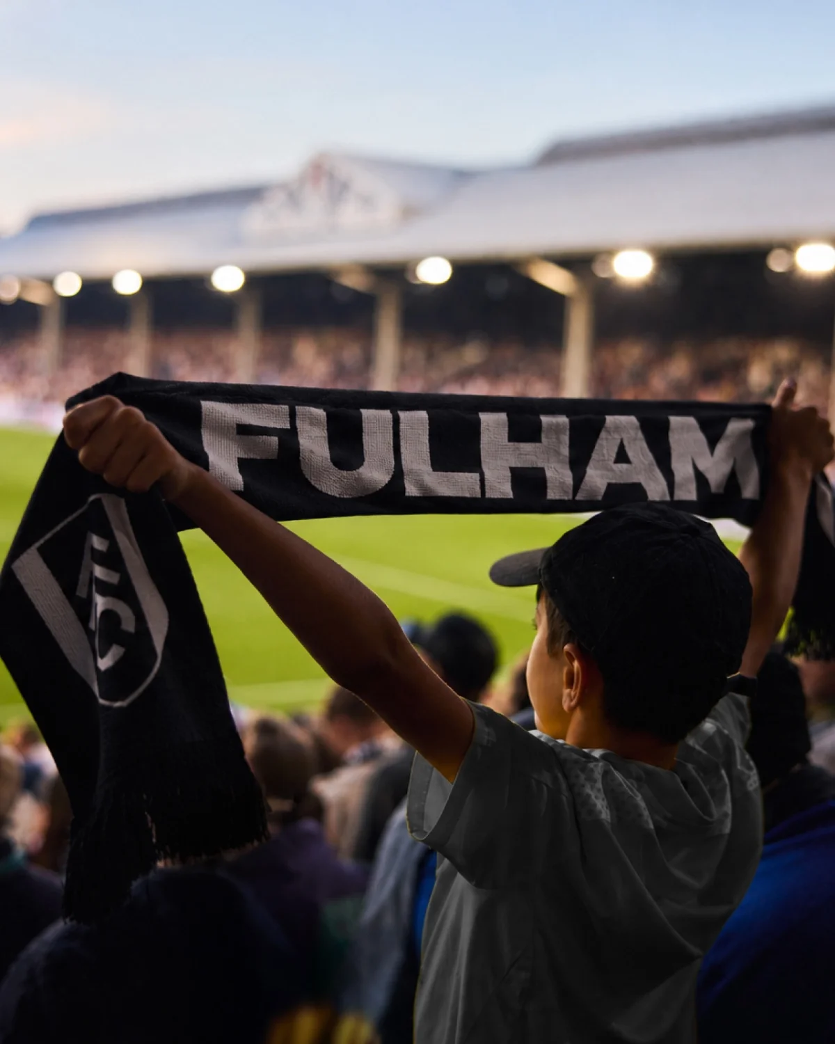
Fulham FC’s Craven Cottage Lettering Becomes a Bespoke Identity System
Music and type foundry F37 turn lettering from Fulham’s historic stadium into a flexible type family rooted in the club’s own visual history.
Latest stories
Music and type foundry F37 turn lettering from Fulham’s historic stadium into a flexible type family rooted in the club’s own visual history.
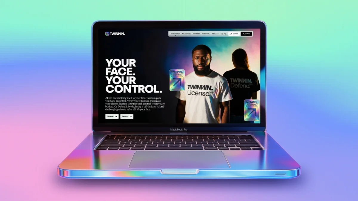
UnitedUs gives Twinnin a people-first identity built around a holographic trust mark and two clear choices: license a likeness or defend it.
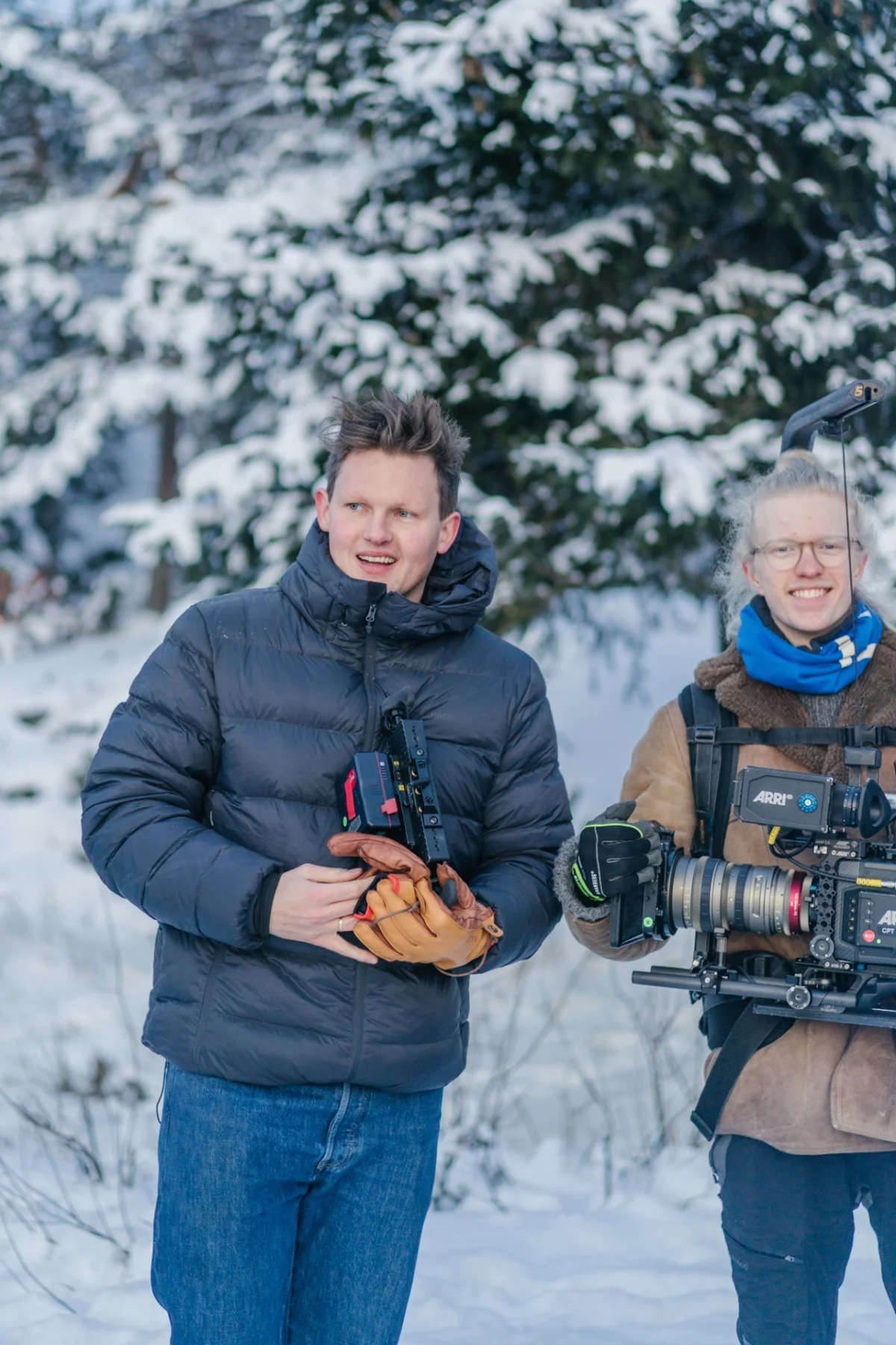
VisitOSLO and NewsLab bring back Halfdan for a snowy Christmas musical, shifting the deadpan Oslo film into a new season and format.
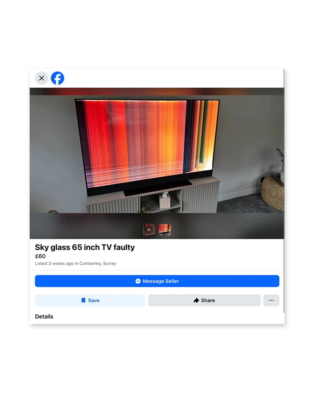
Casey Roarty recasts awkward, blurred Marketplace photos as expressive images, finding human detail in the clutter of second-hand listings.
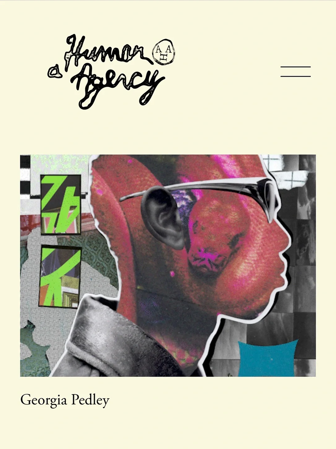
A hand-drawn wordmark, soft cream palette and “For Humans. By Humans.” motto give A Human Agency a crafted identity built to frame its artists’ work.
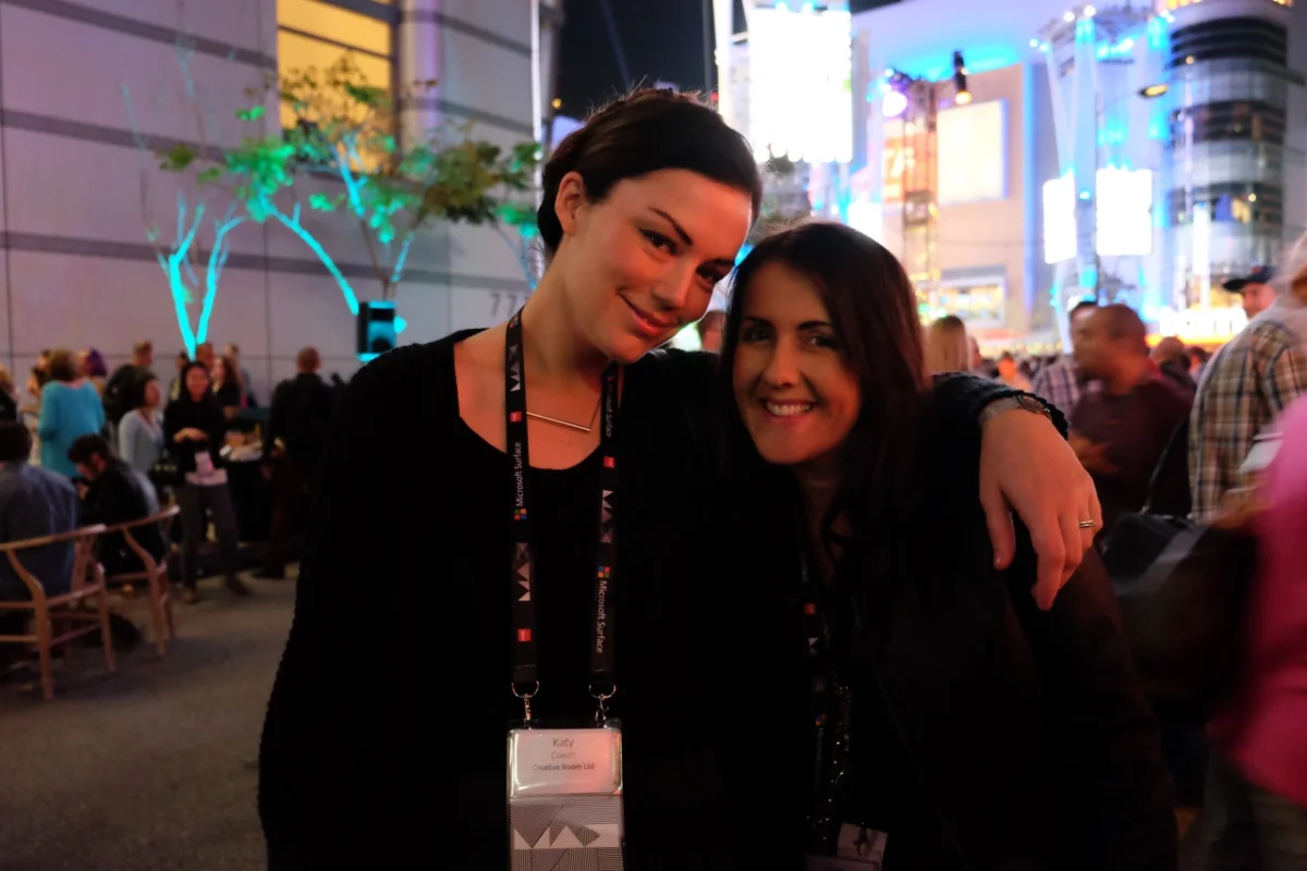
Creative Boom’s founder returns to Adobe MAX in 2026, bringing a journalist’s questions and a decade of growth in independent publishing.
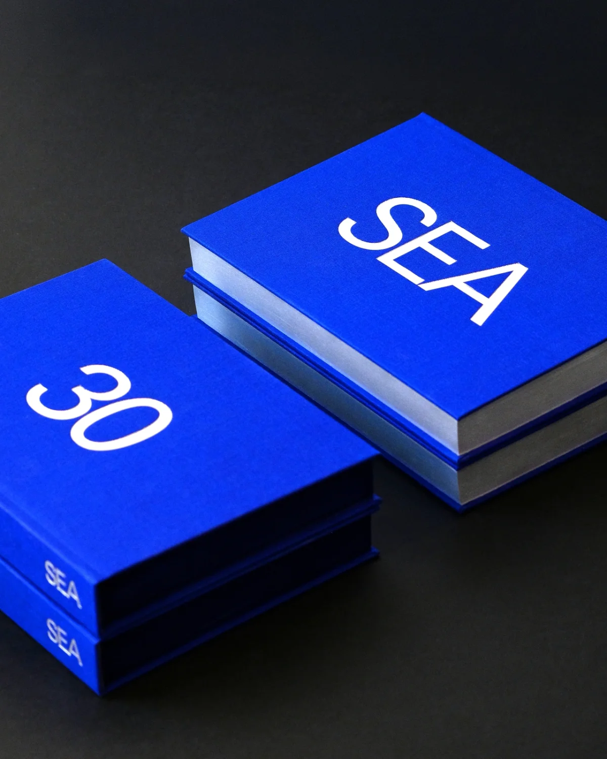
SEA marks 30 years with a silver-edged book, long client relationships and a close-knit team still looking for what to make next.
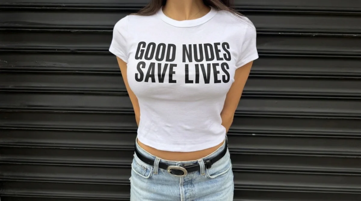
Yard NYC’s New York street posters recast “send nudes” as a prompt to photograph your own breasts and notice changes over time.
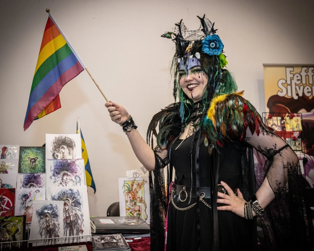
Thought Bubble marks its 20th year with 600-plus exhibitors, eight artists picked by its directors and panels on craft, careers and comics.
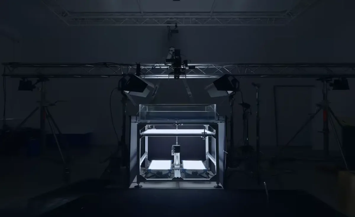
Fred Again and NEST Acoustics shaped Apple Music’s new sound-led identity by recording musical notes as ripples in mineral oil.
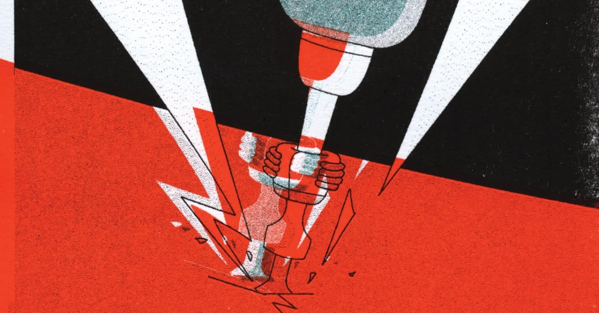
Michelle Gruppetta’s debut short pairs trigger sounds with grainy, high-contrast riso animation to convey the daily pressure of misophonia.
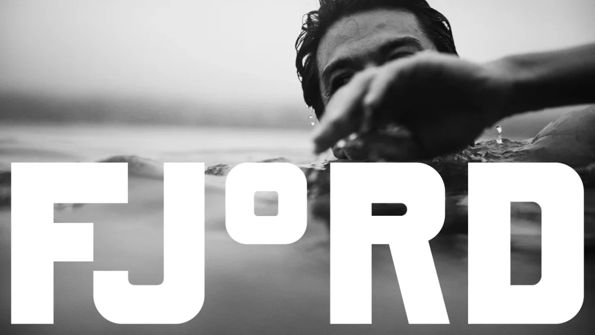
DutchScot gives Fjord a stark black-and-white identity built around custom type, temperature graphics and tactile details.
Stocksy’s five prepositions offer a practical way to brief images around authorship, audience, context, tension and convention.
A fan-built stage model, a cryptic teaser and a joined-up visual language give Lego and Daft Punk’s collaboration room to grow.
Glasgow’s International Assembly runs 12–22 November, pairing talks with hands-on workshops, a student Live Project and a 190-work poster exhibition.
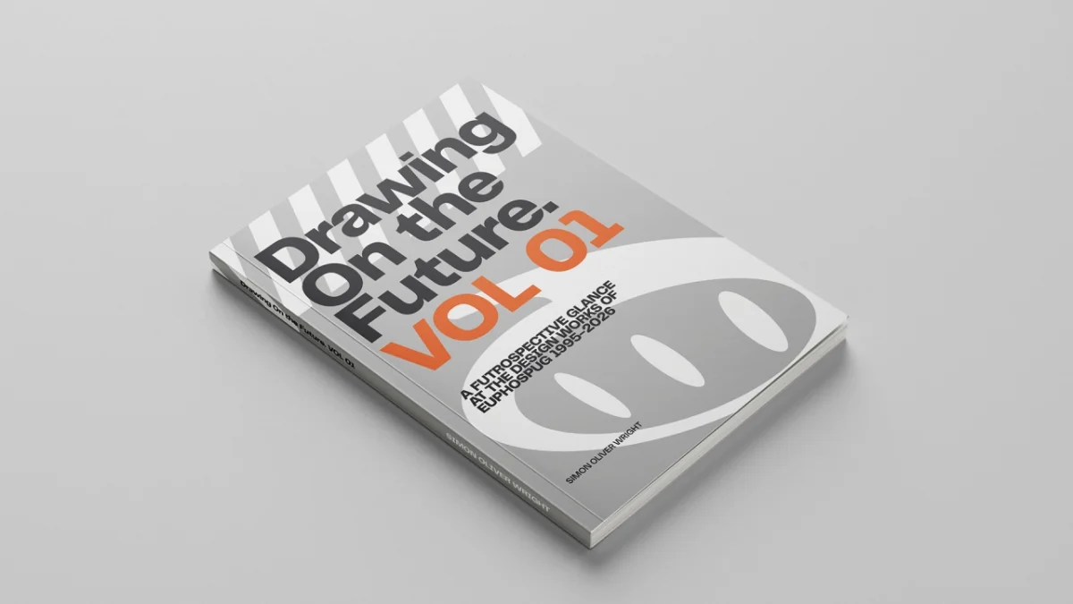
Two volumes gather Simon Wright’s flyers, sketches and experiments from Perth’s underground music scene, showing how design and DIY print culture met.
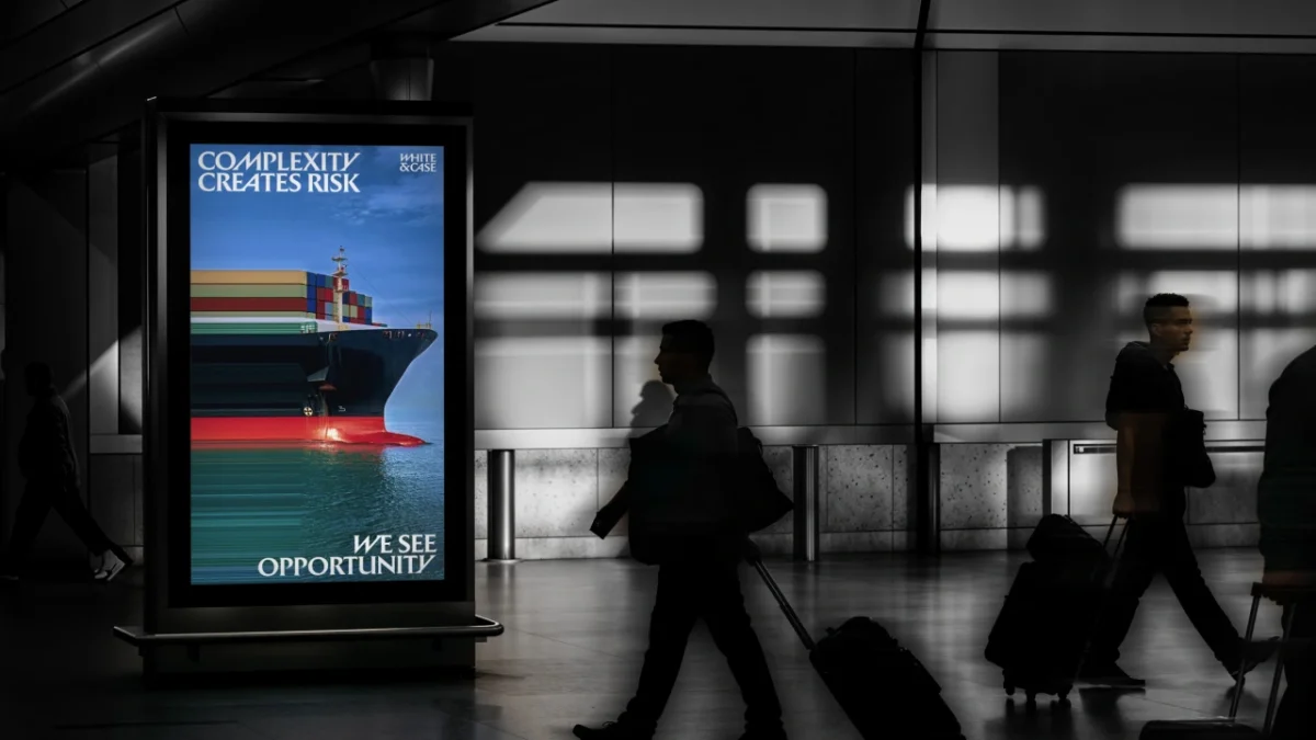
Uncommon gives White & Case kinetic serif typography, a high voltage palette and image effects built around the firm’s idea of complexity as opportunity.
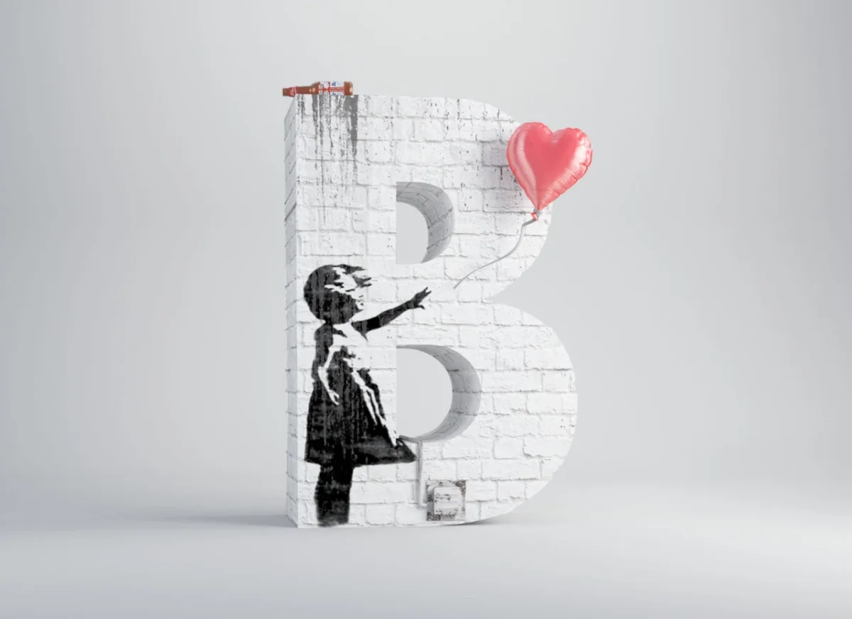
César Cid builds an alphabet from artists’ colours, shapes and materials, translating familiar art into sculptural 3D forms.
Elena Amabili’s new photo book records 153 hotels, from austere concrete towers to buildings balanced above lakes and hillsides.
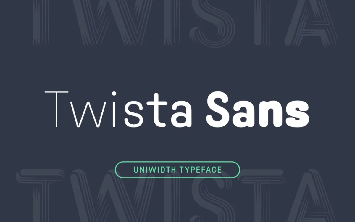
From uniwidth sans serifs to lace-built displays, October’s type releases explore flexible layouts, legibility and the marks of handmade processes.