 Graphic Design
Werf’s Rotterdam Identity Turns Shipyard Slipways Into a Bold 20° Graphic System
andstudio builds Werf’s bar identity around a 20° angle, two typefaces and colours that shift with the ships in its working Rotterdam yard.
Typography & Fonts
Graphic Design
Werf’s Rotterdam Identity Turns Shipyard Slipways Into a Bold 20° Graphic System
andstudio builds Werf’s bar identity around a 20° angle, two typefaces and colours that shift with the ships in its working Rotterdam yard.
 Typography & Fonts
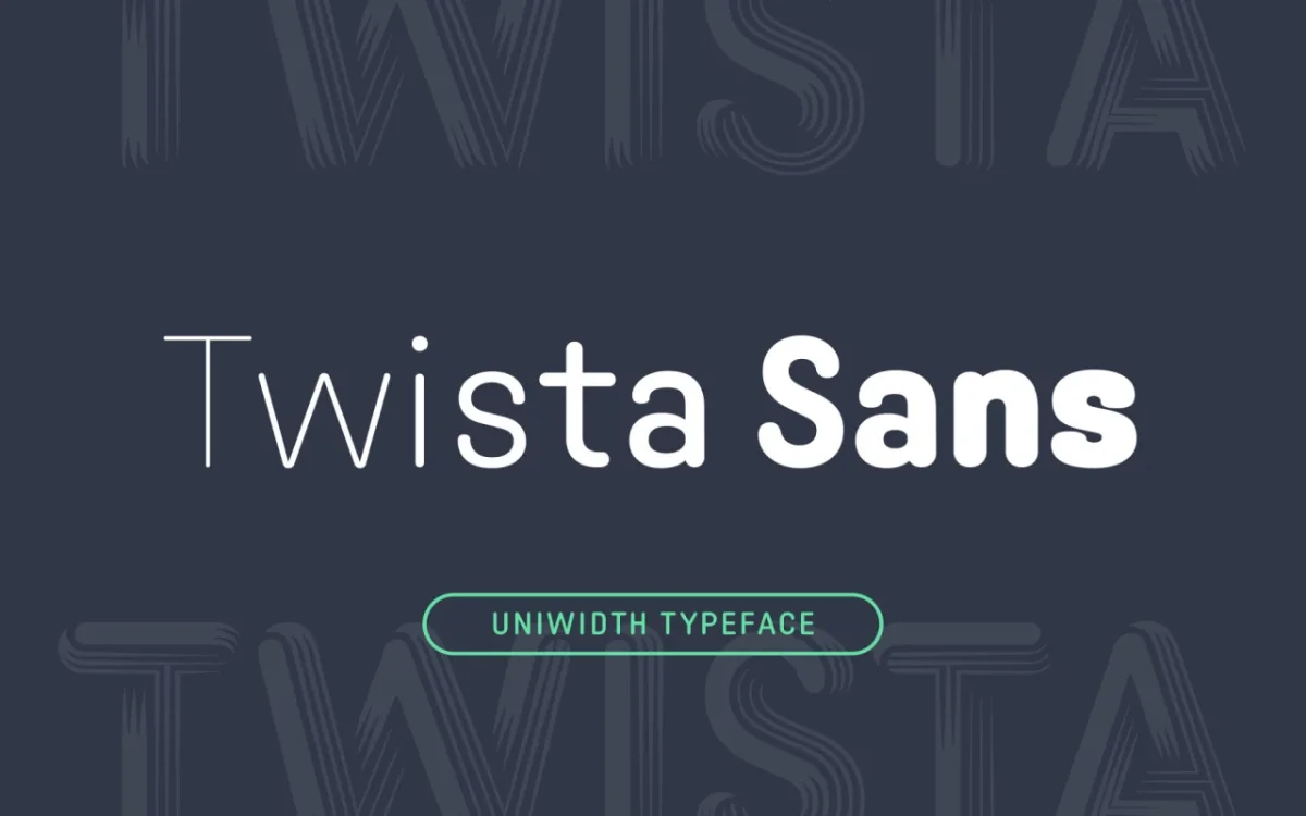
23 New Typefaces for October 2026: Variable Fonts, Handcrafted Lettering and Industrial Slabs
From uniwidth sans serifs to lace-built displays, October’s type releases explore flexible layouts, legibility and the marks of handmade processes.
 Graphic Design
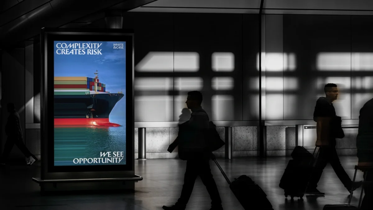
White & Case’s Catalyst Blue Rebrand Turns Complexity Into Visual Energy
Uncommon gives White & Case kinetic serif typography, a high voltage palette and image effects built around the firm’s idea of complexity as opportunity.
 Graphic Design
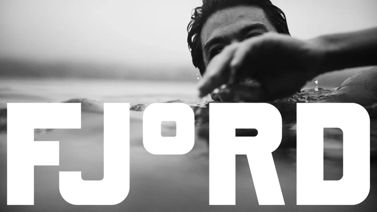
Fjord’s San Francisco Bay Sauna Brand Turns a Degree Symbol Into a Visual System
DutchScot gives Fjord a stark black-and-white identity built around custom type, temperature graphics and tactile details.
 Graphic Design
Pentagram Builds Storefront Gala 2026 Identity from Grand Central Oyster Bar Lettering
Natasha Jen’s team turns the Oyster Bar’s bold lettering into a custom alphabet, vivid event graphics and animated social posts for Storefront Gala 2026.
 Graphic Design
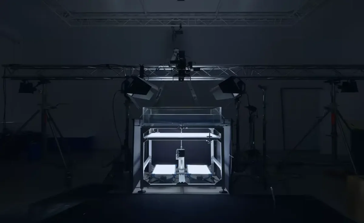
Apple Music’s Ripple Logo Turns Fred Again’s Composition Into a Visual Identity
Fred Again and NEST Acoustics shaped Apple Music’s new sound-led identity by recording musical notes as ripples in mineral oil.
 Graphic Design
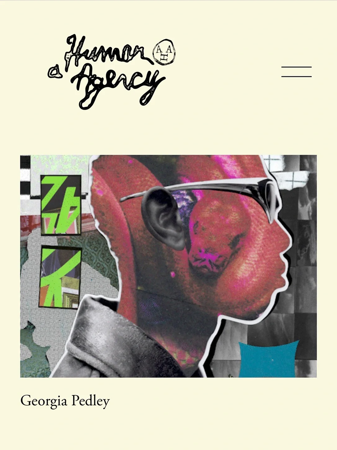
Davy Denduyver Gives A Human Agency a Hand-Stamped Identity for Its Fifth Year
A hand-drawn wordmark, soft cream palette and “For Humans. By Humans.” motto give A Human Agency a crafted identity built to frame its artists’ work.
 Graphic Design
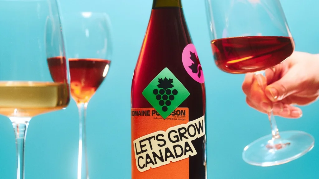
Caserne Gives Let’s Grow Canada a Bold, Modern Food Identity
Caserne’s identity pairs a geometric maple leaf, vivid colour and expressive typography to make Canada’s food system feel human and contemporary.
 Typography & Fonts
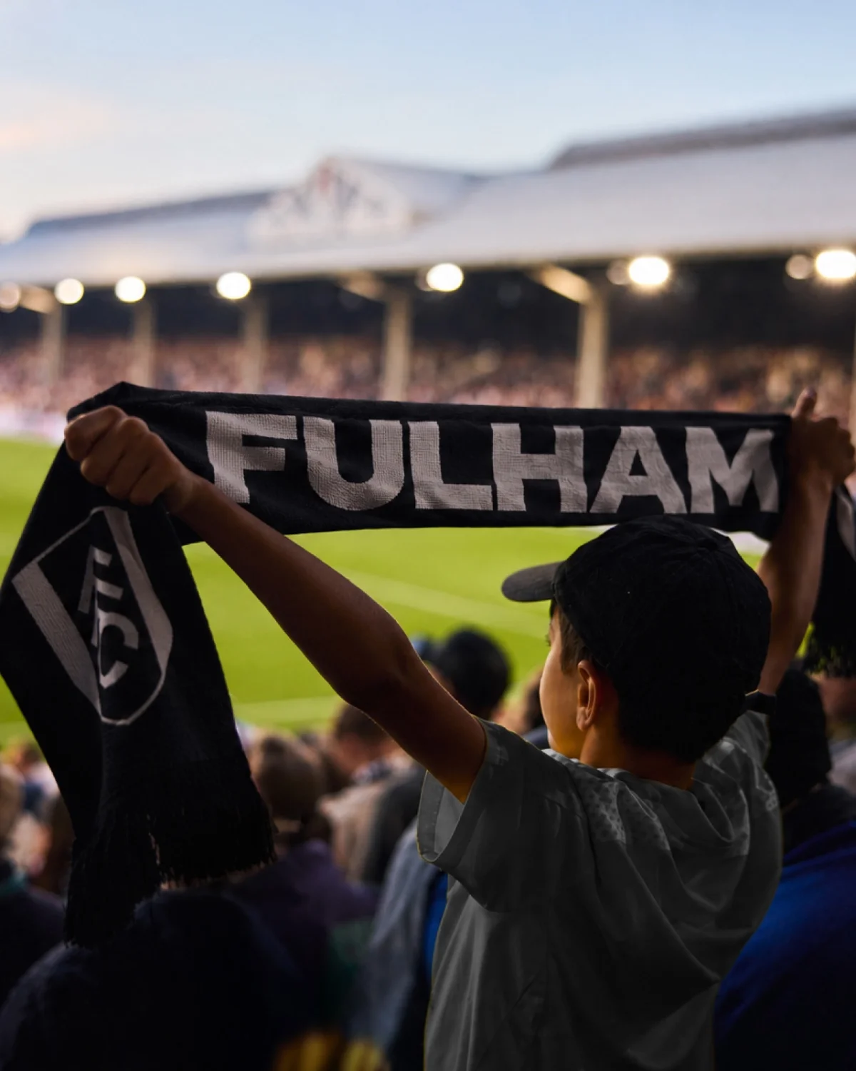
Fulham FC’s Craven Cottage Lettering Becomes a Bespoke Identity System
Music and type foundry F37 turn lettering from Fulham’s historic stadium into a flexible type family rooted in the club’s own visual history.
 Graphic Design
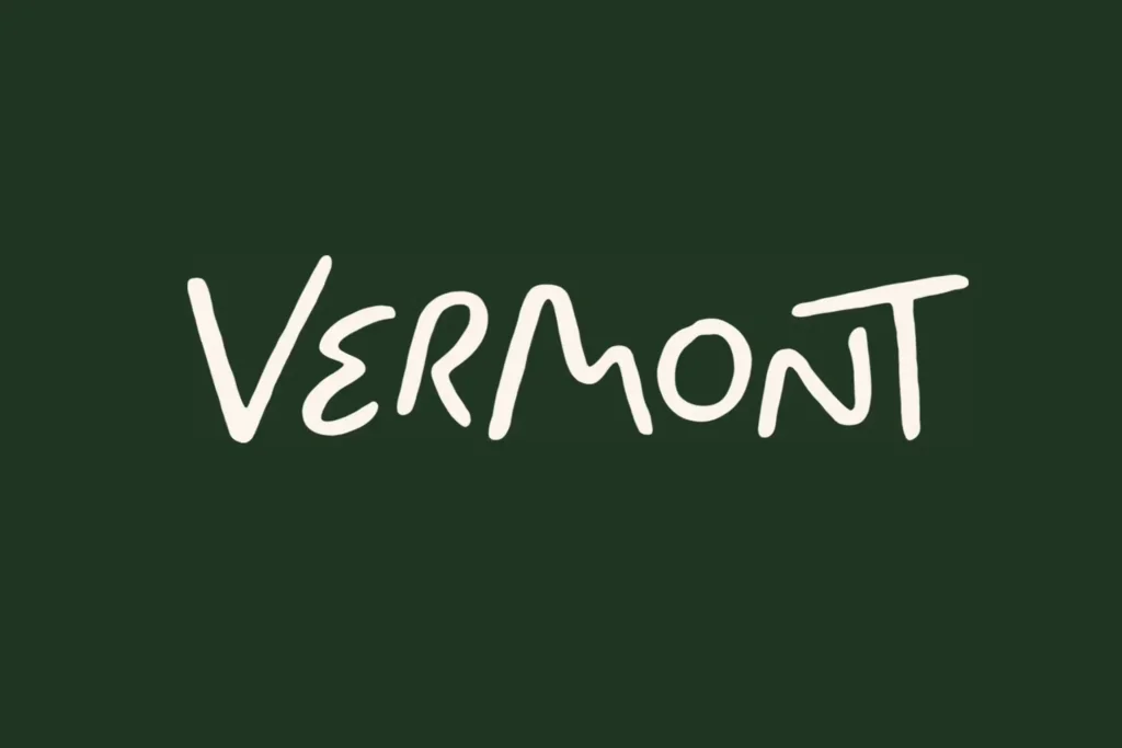
DNCO’s Vermont Identity Uses Local Icons, Meso Type and Seasonal Colour
DNCO builds Vermont’s first consumer tourism identity around local signs, handmade details and a palette that shifts with the seasons.
 Graphic Design
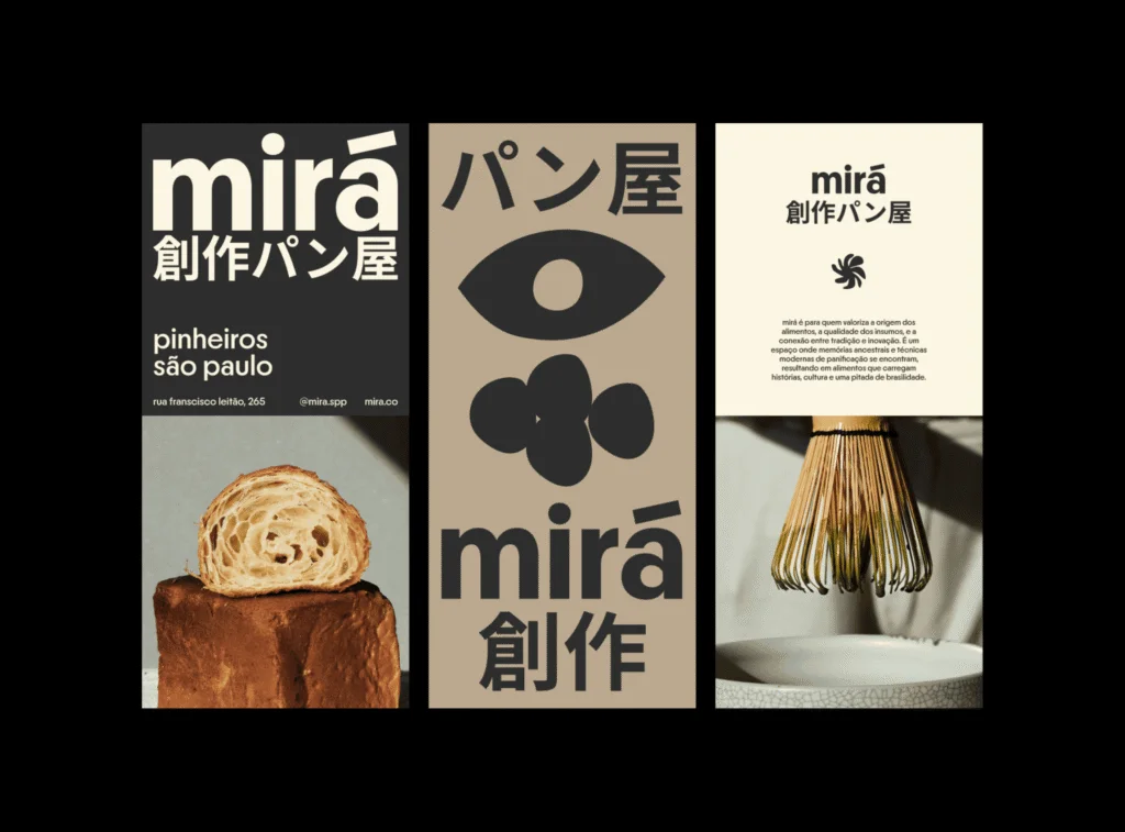
Mirá Bakery’s Identity Turns Japanese-Brazilian Food History Into Fluid Design
Estudio CRU gives São Paulo bakery Mirá an identity shaped by Japanese-Brazilian food traditions, irregular forms and Nikkei Maru typography.
 Graphic Design
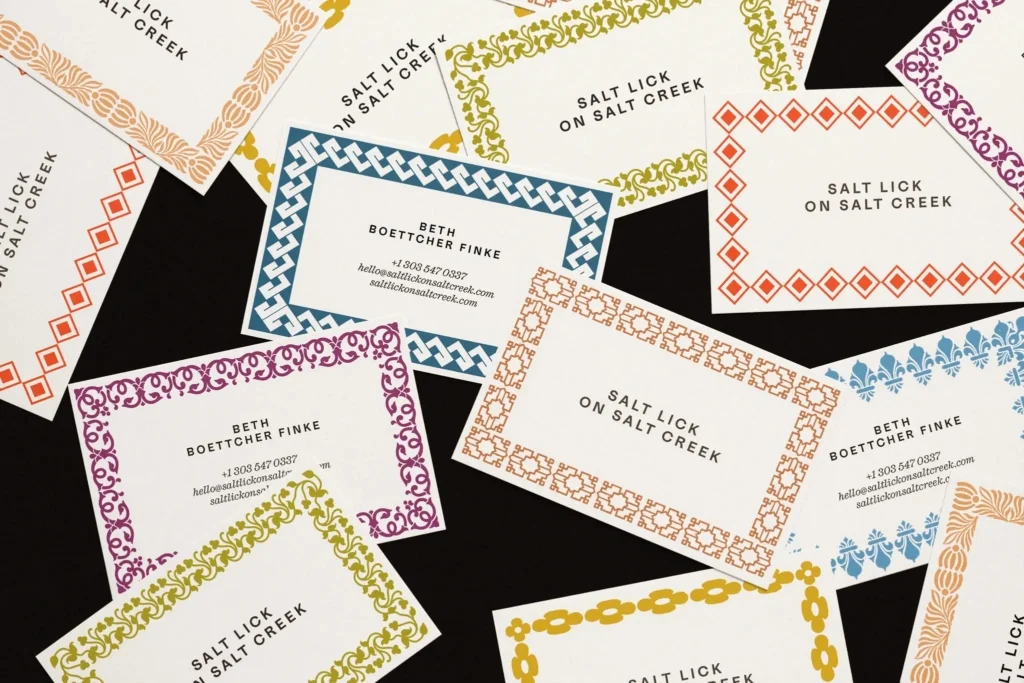
Order Gives Colorado Lavender Farm Salt Lick on Salt Creek a Type and Pattern Led Identity
Order’s identity pairs historic type and modular borders with product packaging for a Colorado lavender farm, though the brand’s wider offer remains hard to pin...
 Typography & Fonts
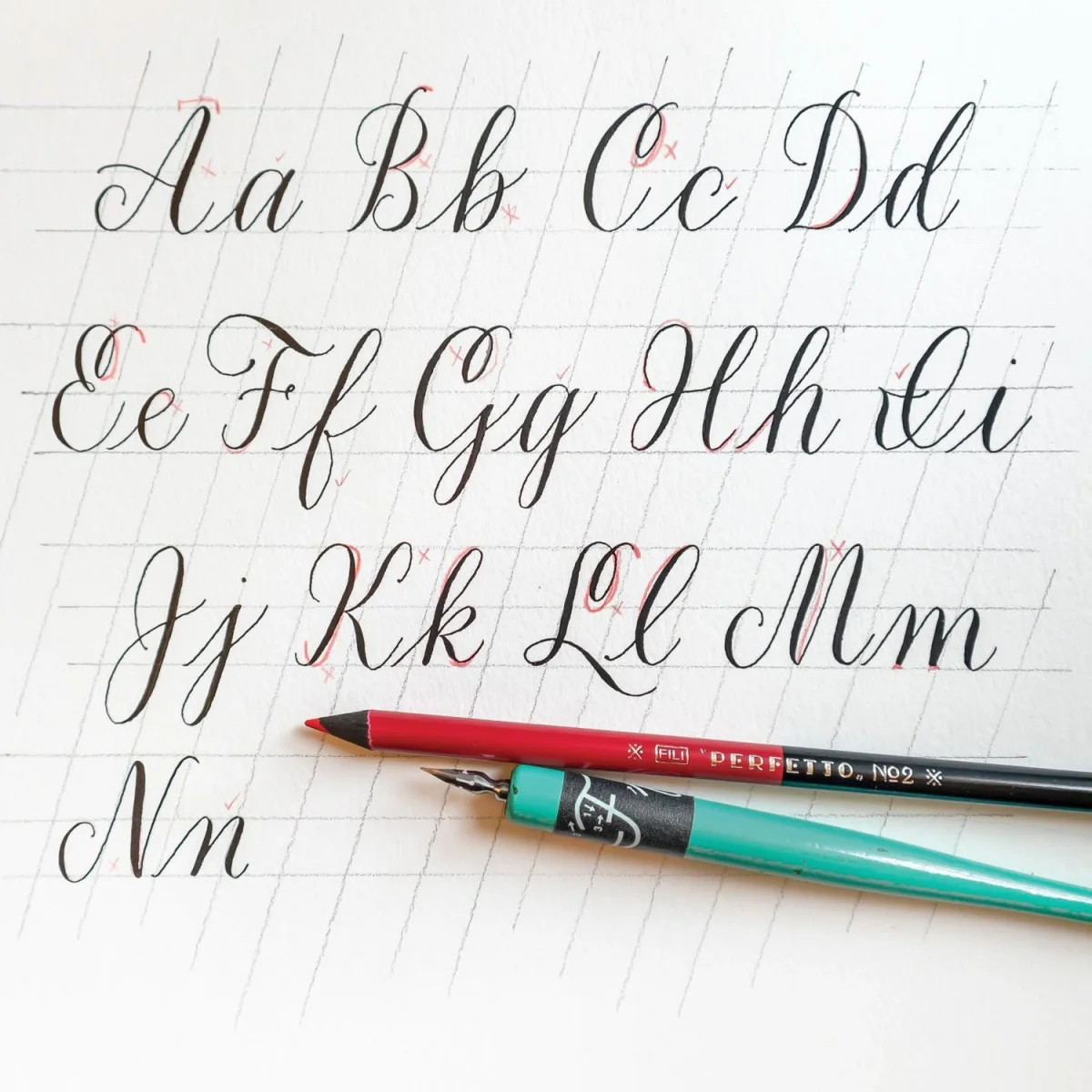
Modern Calligraphy Alphabet: Build Letters from Repeated Strokes
A practical guide to the shared shapes, pen lifts and letter connections that make a modern calligraphy alphabet easier to practise and adapt.
 Typography & Fonts
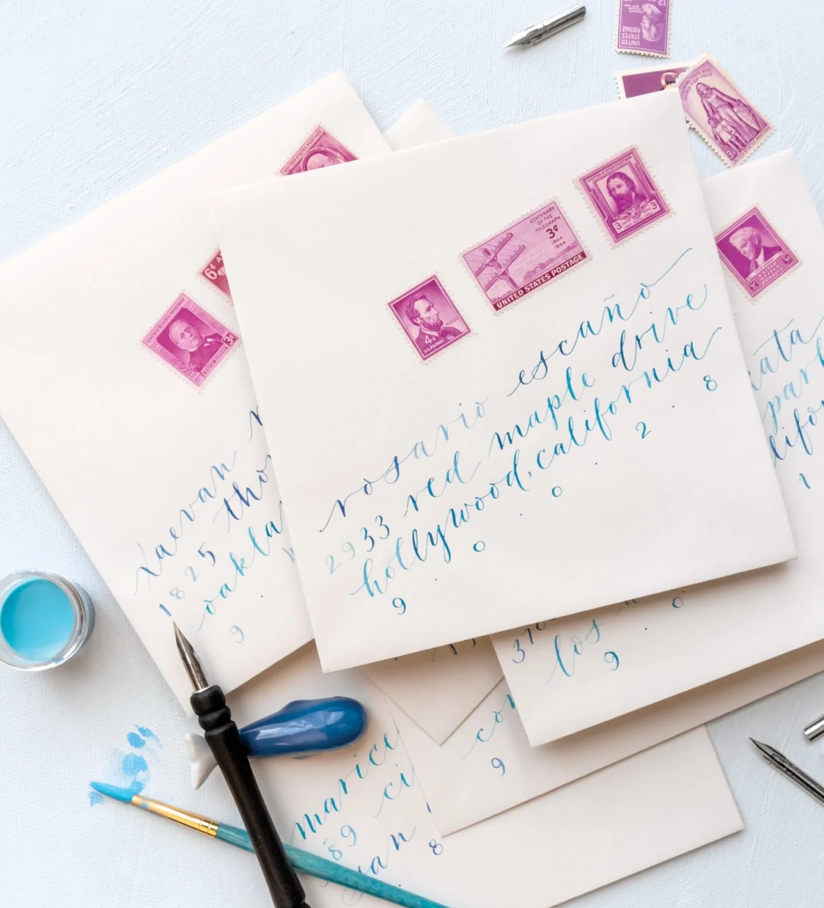
14 Design Choices for a Distinctive Modern Calligraphy Style
From baseline bounce to stroke weight, 14 practical adjustments show how to shape modern calligraphy with intention.
 Graphic Design
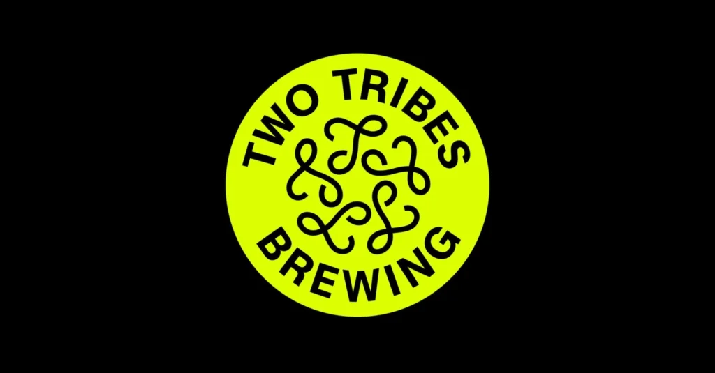
Two Tribes Brewing’s Neon Identity Pairs a Strange Logo with Familiar Beer Packaging
All Purpose gives Two Tribes a fluorescent palette, looping emblem and contrasting type system, while its cans retain familiar beer-label cues.
 Graphic Design
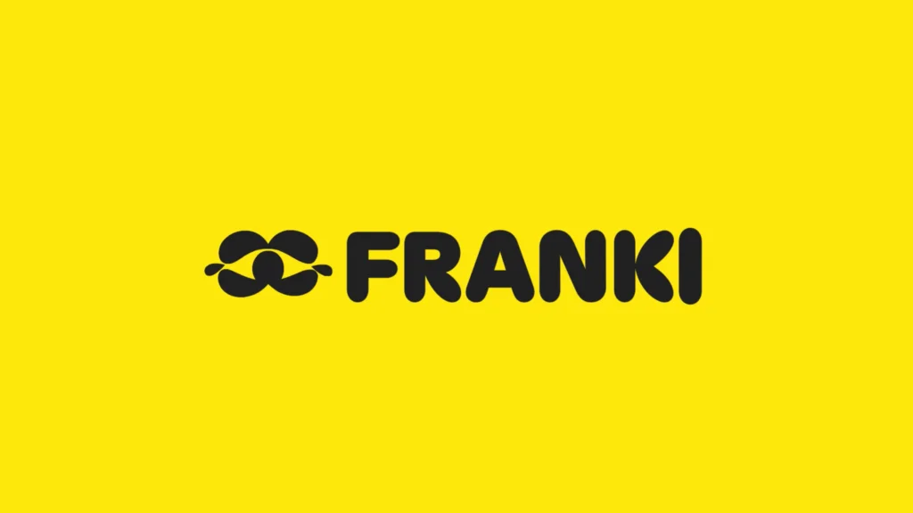
Koto Gives Franki a Warm, Playful Identity for Restaurant Discovery
Koto pairs Franki’s vivid yellow palette, rounded typography and animated eye symbol with a friendly identity for its community-led restaurant app.
 Graphic Design
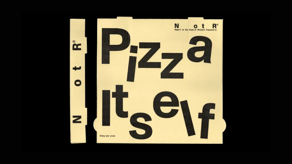
Vrints-Kolsteren Builds Napoli on the Road’s Identity Around Four Moving Letters
For Napoli on the Road, Vrints-Kolsteren pairs tumbling NotR typography with travel-inspired graphics, spare colours and an adaptable layout.