Tuesday, October 6, 2026 · Graphic Design
Koto Gives Franki a Warm, Playful Identity for Restaurant Discovery
Noted by Emily Gosling · 500 reads
Koto pairs Franki’s vivid yellow palette, rounded typography and animated eye symbol with a friendly identity for its community-led restaurant app.
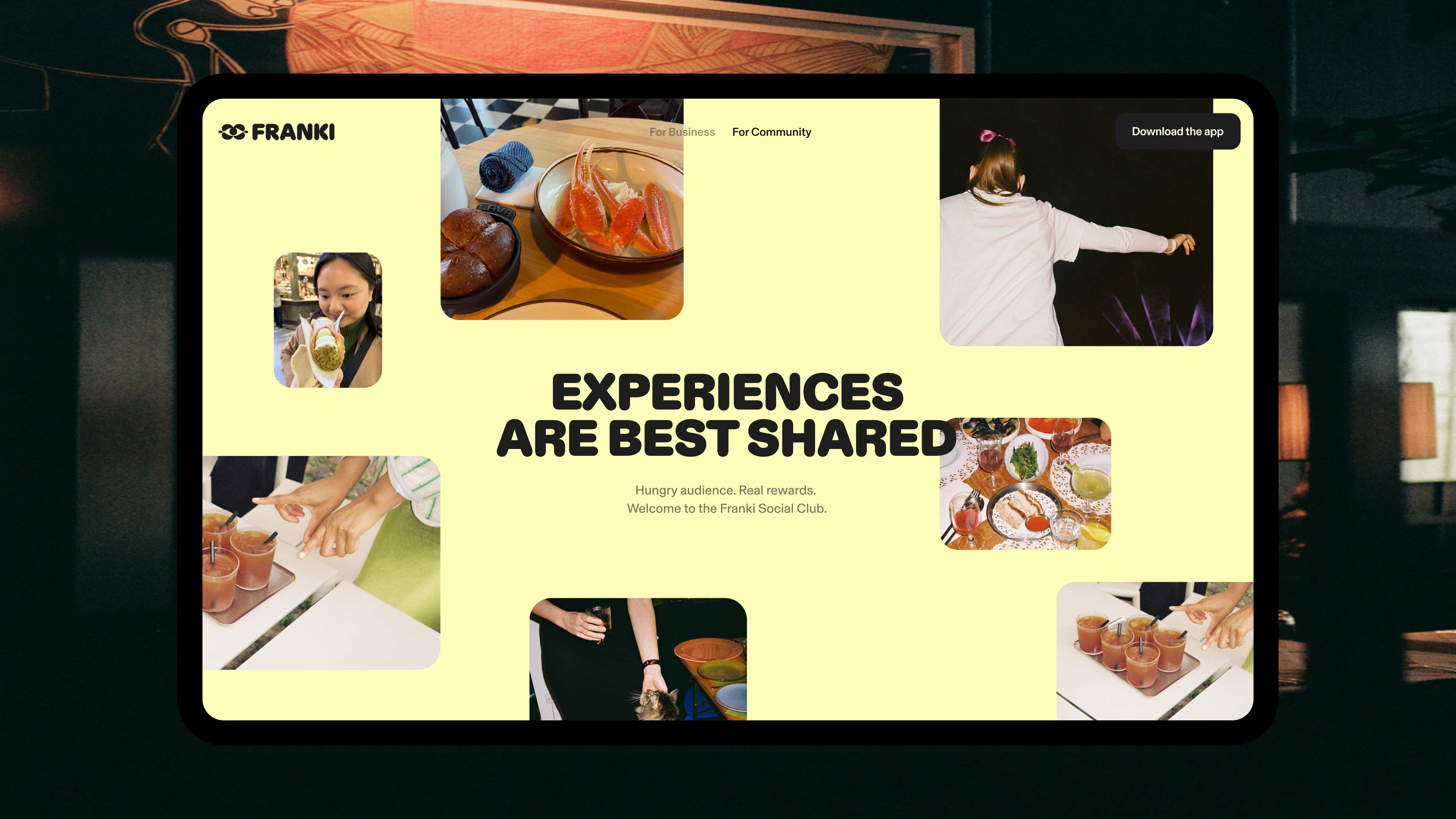
Franki’s new identity has a clear job: make a restaurant discovery app feel less like a directory and more like a guide from someone who knows the neighbourhood. Designed by Koto, the branding uses vivid yellow and black to catch the eye, then softens that punch with rounded lettering, warm photography and a shape-shifting symbol. The result gives the app a distinct personality while pointing back to its central idea: finding places worth sharing.
Franki was founded in 2020 by Austin, Texas-based Eugene Varricchio and Nick Bennett, then expanded more broadly the following year. The platform brings together short-form video recommendations, often made by local customers, personalised restaurant discovery and rewards. Users can earn cash back when they pay at participating restaurants with a card linked to the app. They can also receive rewards when their recommendations prompt other people to visit.
For restaurant owners, Koto describes Franki as “a merchant-funded, performance-based alternative to traditional advertising.” Businesses pay when the platform connects content with an actual visit and transaction. That model gives the identity a practical communication challenge: it needs to speak to diners and restaurant operators, while helping Franki stand apart from established services such as Google, Tripadvisor and Yelp, as well as newer video-led discovery apps.
A colour system built for recognition
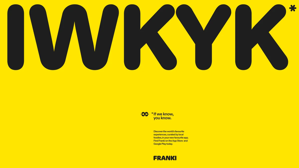
The palette makes the first impression. Bright yellow and black deliver a sharp, high-contrast pairing, with gold adding a more polished note. A limited supporting range—pale yellow, white, off-white and charcoal—keeps the system focused and gives the bolder colours room to do their work. That simplicity should help the brand remain recognisable across the app and its wider communications.
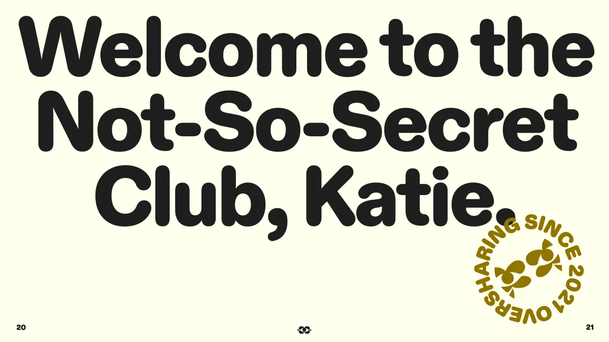
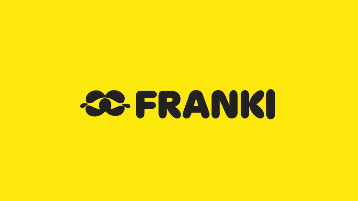
Warmth comes through in the type and art direction. Franki’s all-caps wordmark has rounded, plump forms and playful quirks, including a particularly distinctive K. It’s cute without making the whole identity feel like a children’s product. For supporting typography, Koto uses Diatype Rounded from Berlin-based foundry Dinamo. Its bold, curved shapes give the brand an easygoing voice; the typeface’s rounded forms are described by its designers as “oddly mechanical.” That slight tension helps it feel suited to a digital product without losing its human touch.
On the website, Basel Grotesk by Geneva-based foundry Optimo takes on the workhorse role. Its straightforward, legible forms balance the more expressive display lettering. Together, the type choices give Franki space to be sociable in one setting and clear in another.

An eye for discovery
The identity’s most flexible asset may be its animated eye-shaped symbol. It suggests looking closely, spotting somewhere new and passing that find along. Its changing form brings motion to the idea of discovery, while its simple outline should make it adaptable across different placements. The symbol also gives Franki a visual shorthand for curiosity—something the product can use whether it’s introducing a restaurant or prompting a user to share a recommendation.
Photography supports the same outward-facing idea. The art direction is cheerful and experience-led, without relying on overworked effects or glossy restaurant imagery. It presents dining as something people do together in real places, which matters for a digital platform whose value depends on moving users from a phone screen to a local business.

Personality with a strategic question
Koto says the brand’s positioning centres on “make time dance,” an idea intended to frame Franki as an insider’s guide to spending time well and discovering experiences worth sharing. The phrase feels more abstract than the product’s practical promise. Its purpose becomes clearer in the identity’s lively tone, but the connection between the slogan and choosing a restaurant may take some explaining.
The verbal identity draws on the Jester archetype. Koto describes its voice as “lively, open and never too self-important,” favouring warmth, wit and honesty over exclusivity or expertise. That gives the brand permission to sound accessible, though a friendly voice can become overfamiliar. The copy sometimes uses a person’s first name, a choice that may work for some users and feel too chummy to others.
Archetypes remain a familiar branding tool, despite their roots in Carl Jung’s 1919 essay “Instinct and the Unconscious” and the substantial distance between that early psychological framework and today’s simplified set of twelve brand personas. The Jester label provides Koto with a concise direction for Franki’s voice, but the stronger evidence is in the work itself: the rounded wordmark, animated symbol and approachable photography all make the intended personality visible.
For a platform built around local knowledge and real-world visits, that human quality is the identity’s most useful achievement. The yellow and black help Franki get noticed; the typography and imagery make it inviting; and the eye symbol ties the system back to discovery. The pieces give the app a recognisable character that can encourage people to explore, contribute and share.

 ===


