Thursday, October 8, 2026 · Graphic Design
Two Tribes Brewing’s Neon Identity Pairs a Strange Logo with Familiar Beer Packaging
Noted by Emily Gosling · 639 reads
All Purpose gives Two Tribes a fluorescent palette, looping emblem and contrasting type system, while its cans retain familiar beer-label cues.
A beer identity built on contrast
All Purpose’s rebrand for Two Tribes Brewing finds its character in a tension: a loud neon identity sits alongside packaging that still feels at home in the familiar world of beer labels. The London studio uses colour, typography and an unusually ambiguous emblem to give the brewery a distinct visual voice without making “independent” the whole story.
Founded in 2017 by veterans of London’s 1990s club scene, Two Tribes is based at Tileyard in King’s Cross. Its brewery and Campfire taproom also host music and food. That mix gives the identity several jobs to do: it needs to work on beer, in a venue, and across a broader cultural programme. All Purpose, a London-based studio, rebranded the company earlier this year.
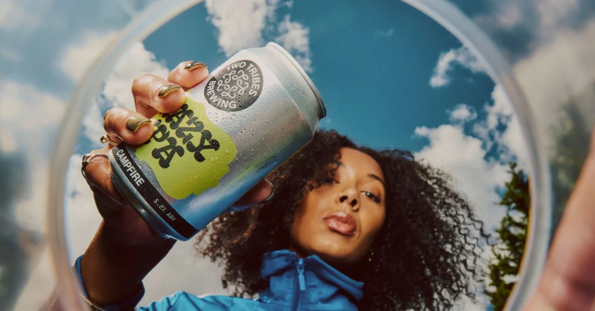
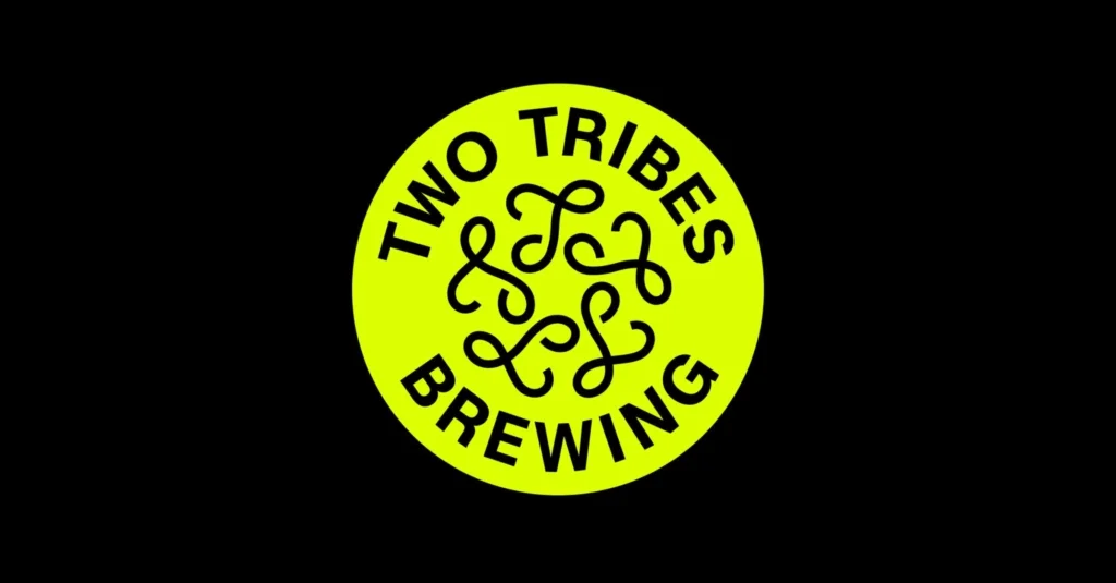
The strongest signal is a fluorescent yellow and black palette. Acid yellow is a forceful choice in a category where labels often lean on heritage cues, earthy colours or familiar craft tropes. Against black, it reads quickly and gives the identity an almost electric presence. The colour also changes the feel of the round badge: a recognisable beer-label structure becomes sharper and more contemporary.
A symbol that resists a quick read
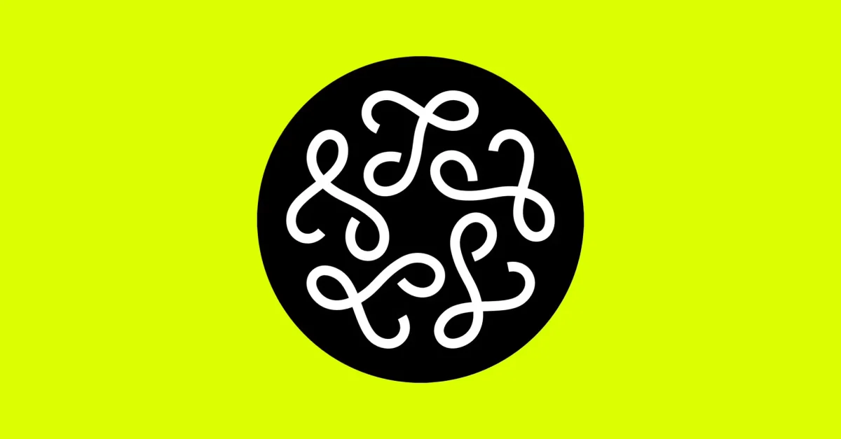
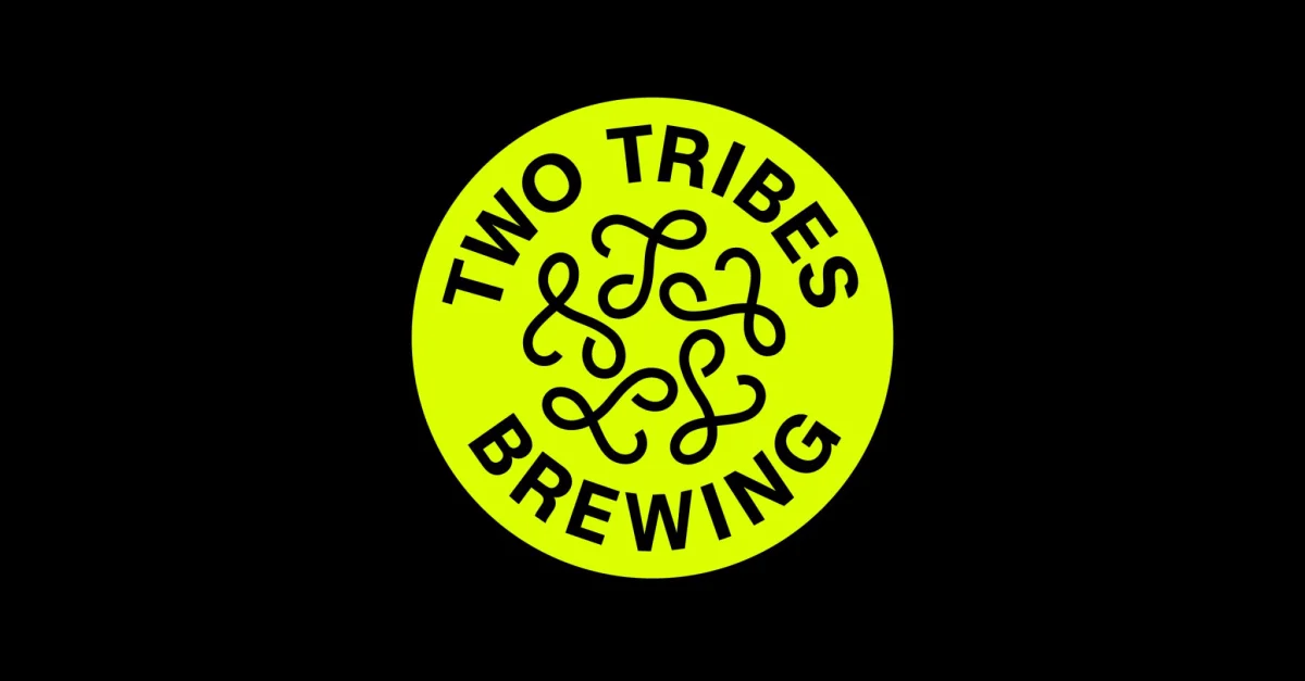
At the centre is a circular emblem containing five looping, ribbon-like forms. They twist together without settling into an immediately legible letter or illustration. Each shape seems to have its own path, yet the group holds together as one mark. That uncertainty gives the symbol a small but useful invitation: viewers may pause to interpret it, then accept that the open-ended quality is part of its appeal.
The emblem also sits inside a circular wordmark. “TWO TRIBES BREWING” follows the perimeter in a heavy sans serif, surrounding the knot of forms. Badges and seals are well-established devices on beer packaging, so the structure offers instant category recognition. Here, oversized lettering and vivid colour give it a less nostalgic character. The identity can borrow the grammar of a traditional label while making its own tone clear.

Two typefaces, two different voices
Melange Grotesk, from Munich-based foundry Kimera, is the main brand typeface. Its mix of early, neo- and geometric grotesque references gives the system a measured backbone: slightly geometric proportions, open terminals and low contrast keep the lettering clear without making it feel plain.
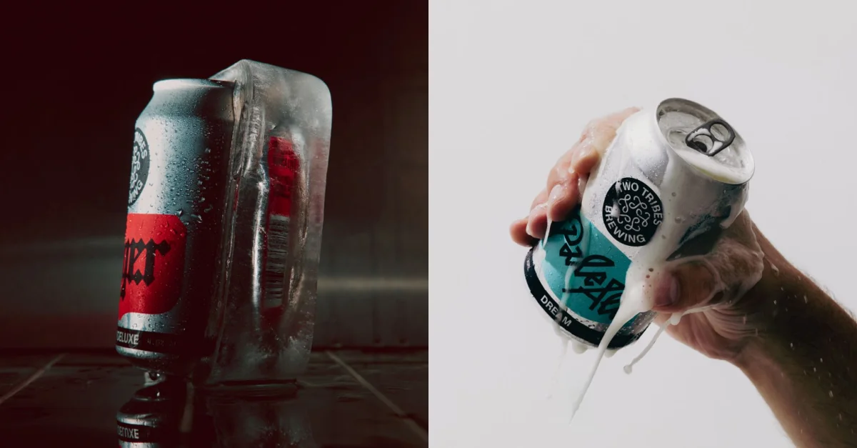
Alongside it, OCR-X comes from Swiss foundry Maxitype in collaboration with Eurostandard. The monospaced variable typeface revisits the 1966 OCR-A system, bringing a machine-readable reference and a more technical, utilitarian tone into the mix.
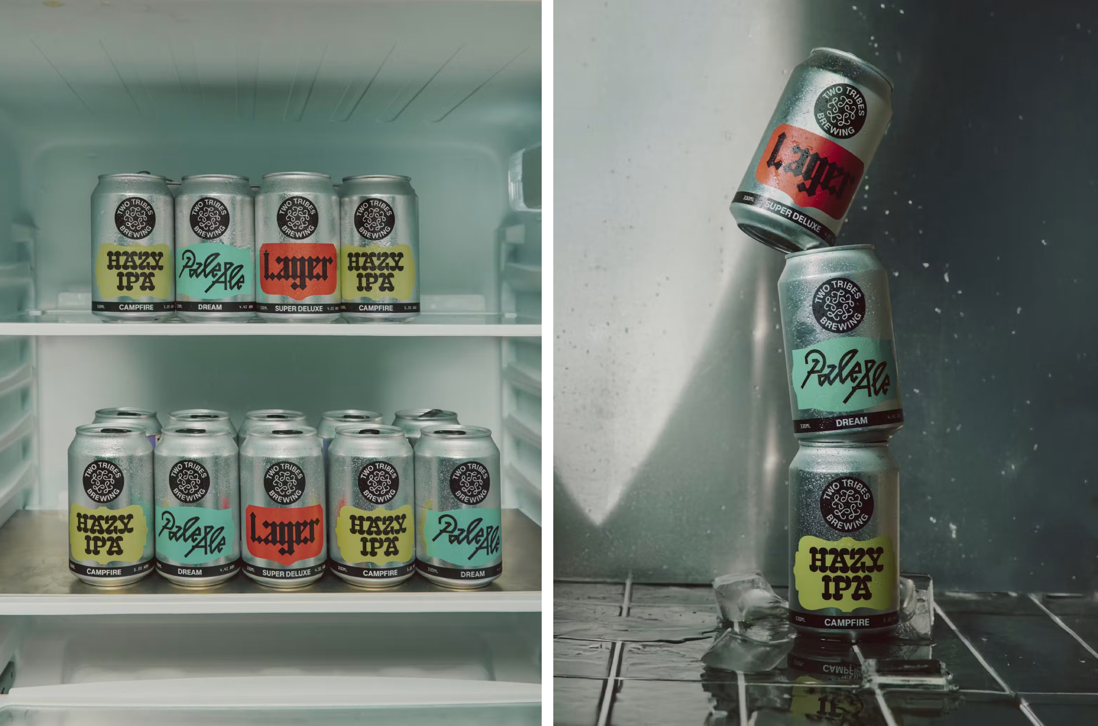
The pairing creates a productive contrast. Melange Grotesk gives the identity order; OCR-X adds a sharper, coded quality; the emblem supplies movement and ambiguity. Across the packaging, each beer receives its own typographic treatment, colour combination and geometric framing. These shifts can distinguish one product from another while the shared visual ingredients keep the range connected.
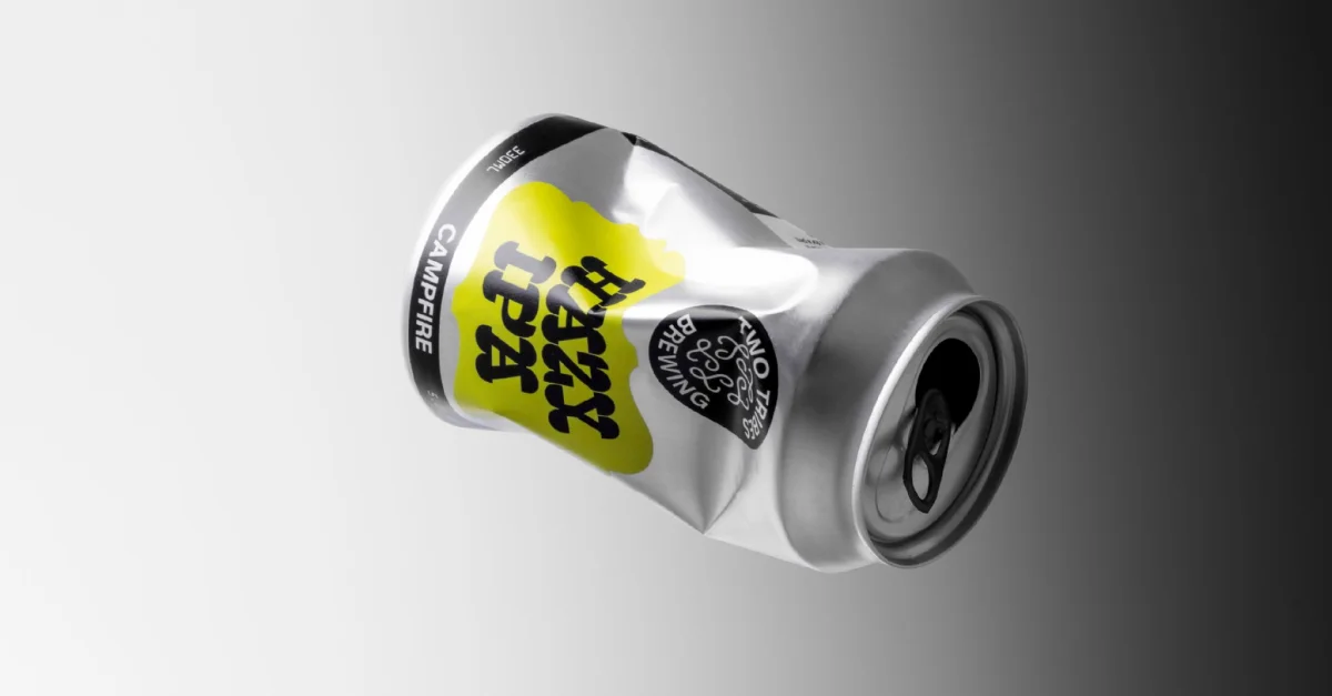
Packaging keeps a foot in the category
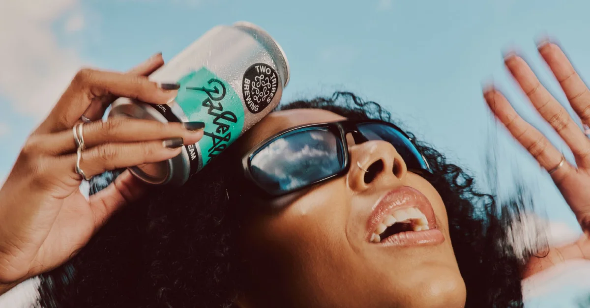
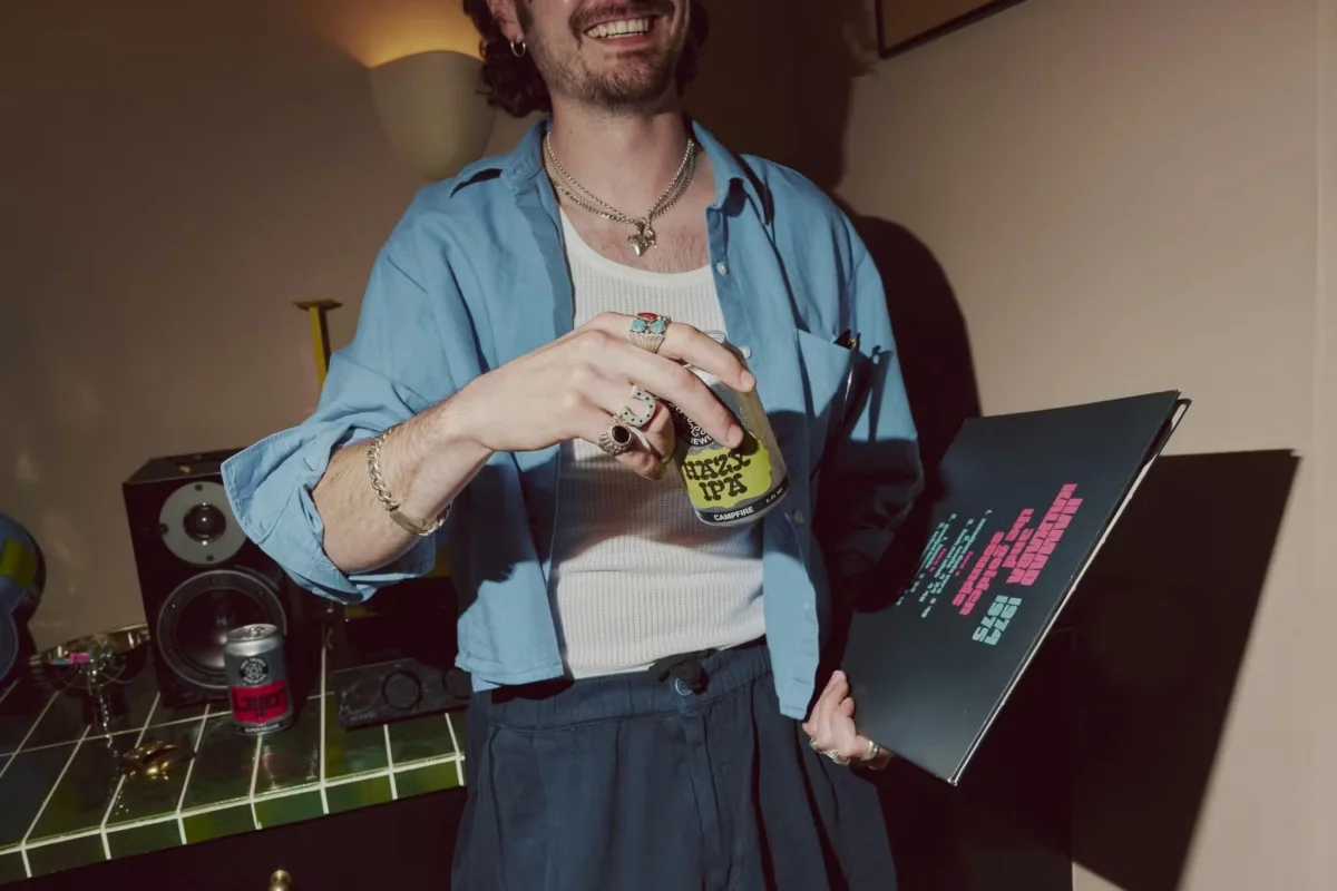
There’s a notable gap between the identity’s loudest elements—the wordmark, badge and colour palette—and the appearance of the cans. The reviewer encountered a Two Tribes IPA while writing about the rebrand on a Eurostar train, and found the packaging less aligned with those headline brand devices. That distance could make the system feel less unified, but it also leaves room for the cans to speak in a more familiar beer-label language.

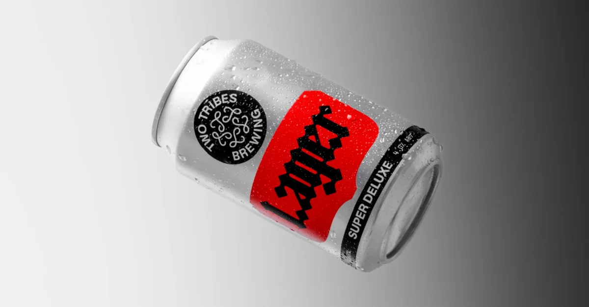
The cans are described as effective, especially in their use of the two typefaces. Keeping some of the packaging closer to craft beer conventions may help the products feel legible to shoppers who already know the category, while the broader identity carries the more striking visual gestures. This is a practical division of work: shelf packaging can communicate the beer, and the larger system can express the brewery’s wider personality.
All Purpose’s most interesting decision is to make independence felt through the design rather than spell it out as a theme. Familiar label structures provide a point of entry; fluorescent colour, contrasting type and a peculiar looping mark keep the result from becoming predictable. The identity has enough flexibility to appear across cans and cultural spaces, while retaining details that reward a second look. The next test is how consistently those elements connect as the brand moves between the packaging and the venues it represents.