Tuesday, October 13, 2026 · Graphic Design
Order Gives Colorado Lavender Farm Salt Lick on Salt Creek a Type and Pattern Led Identity
Noted by Emily Gosling · 632 reads
Order’s identity pairs historic type and modular borders with product packaging for a Colorado lavender farm, though the brand’s wider offer remains hard to pin down.
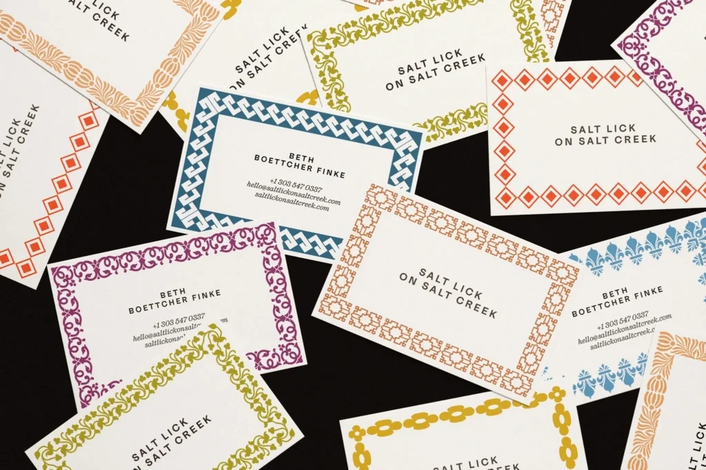
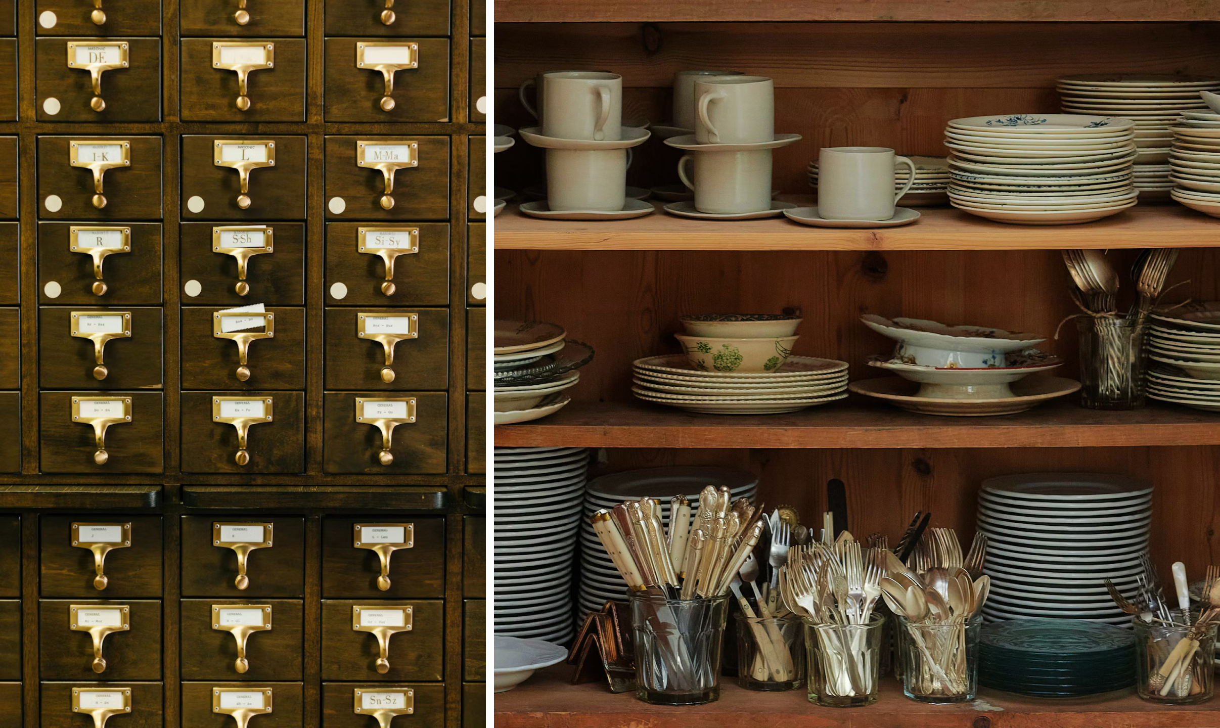
Salt Lick on Salt Creek has the visual language of a place to linger: menus, fabric labels, tea bags, swing tags and atmospheric photographs of horses and open country. Yet the first challenge for a viewer is working out what the brand offers. It’s a lavender farm in the Colorado mountains, southwest of Vail Valley, with personal care products made using lavender grown there. The identity by Brooklyn-based studio Order gives that story a distinctive frame, even as its broader ambitions remain less clear.

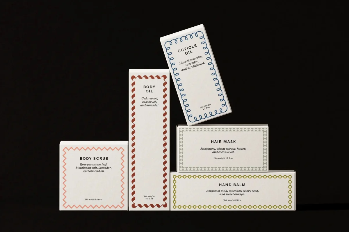
Owner Beth Boettcher Finke’s farm is described as one of the world’s highest-elevation lavender farms. Its product range includes cuticle oil, body oil, face moisturiser, body scrub and a product named “hair moisturiser.” The brand’s language also speaks of gathering, hospitality and experiences, while suggesting that access is limited to Finke’s friends and family. That leaves a gap between the inviting imagery and the practical picture of what customers can visit or take part in.
A farm identity beyond the expected lavender cues
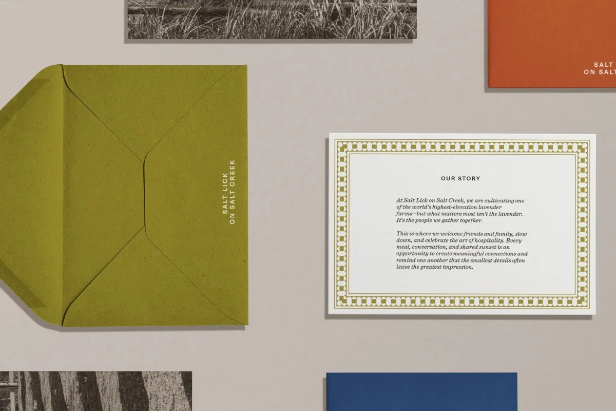
Order’s brief covered the farm and its products, with Colorado’s visual history and Finke’s collections as reference points. The result sidesteps the familiar shortcuts of purple palettes, botanical drawings and spare wellness branding. Instead, it builds character through typography, ornament and a range of colours tied to the farm and its menu.
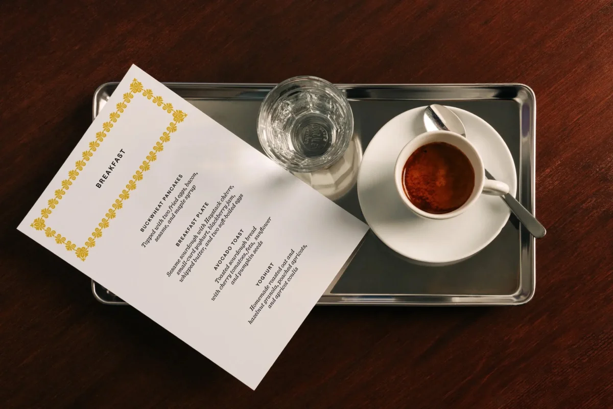
The identity has a composed, almost formal air. Its typography brings together Medium by Lineto and Caslon Ionic by Commercial Type. The pairing sets a functional, contemporary face against one with a more historic flavour. It suggests the formality of an invitation without tipping into costume-like nostalgia.
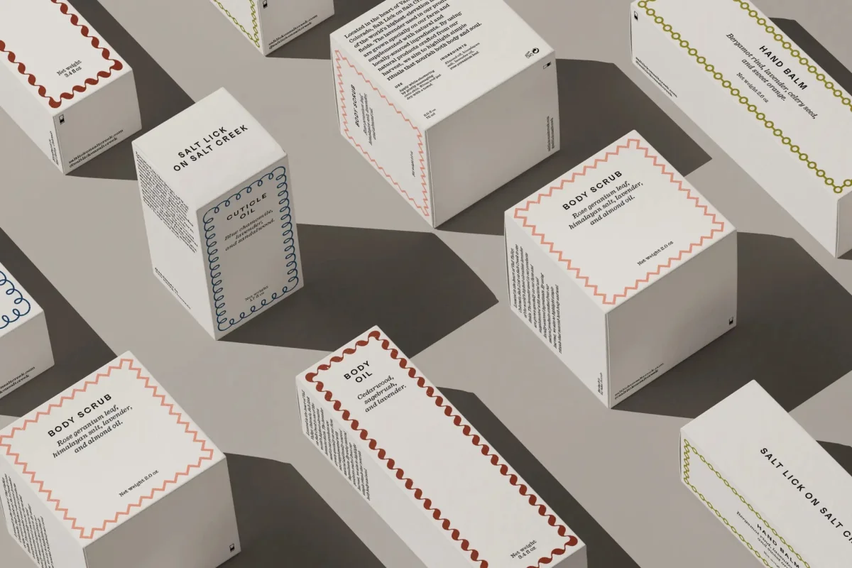
That balance gives the system room to appear across quite different formats. Product labels and packaging need to communicate what’s inside; menus and printed pieces can carry more atmosphere. The type choices offer a shared voice for both, keeping the identity recognisable without forcing every application into the same layout.

Historic borders made flexible
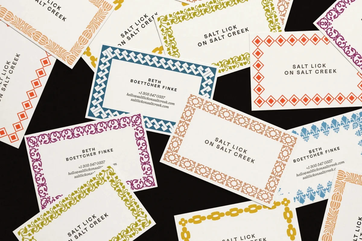
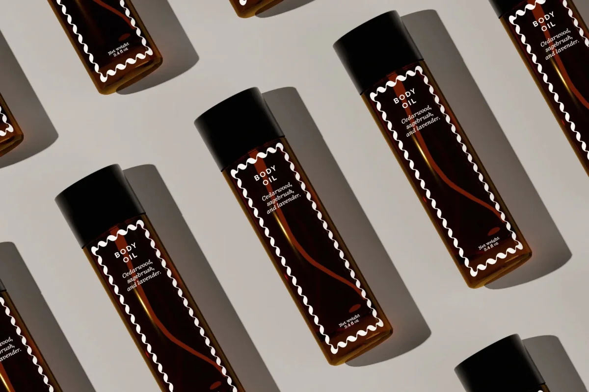
The most distinctive element may be the pattern library. Order drew its source motifs from the American Type Founders Company’s Desk Book of Type Specimens, published in 1900, then digitised more than 50 borders. The modular pieces can be combined, rearranged and adjusted to fit different formats, so printed matter and packaging can vary while retaining a recognisable visual thread.
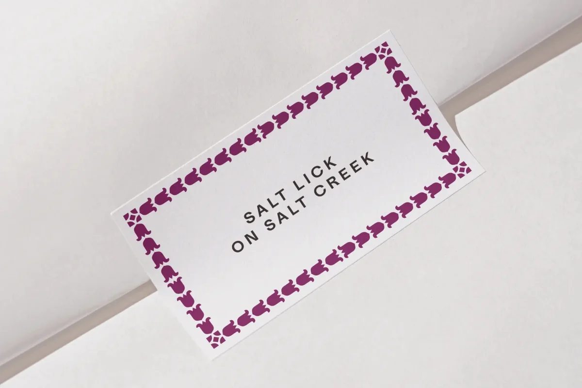
These frames do more than decorate a label. They bring the mechanics of historical print into a working identity, where ornament and information can share the same space. The detail is noticeable up close but remains restrained enough to keep the products legible. It’s a useful reminder for designers working with archival references: a source can shape a system through its construction, not only its surface style.
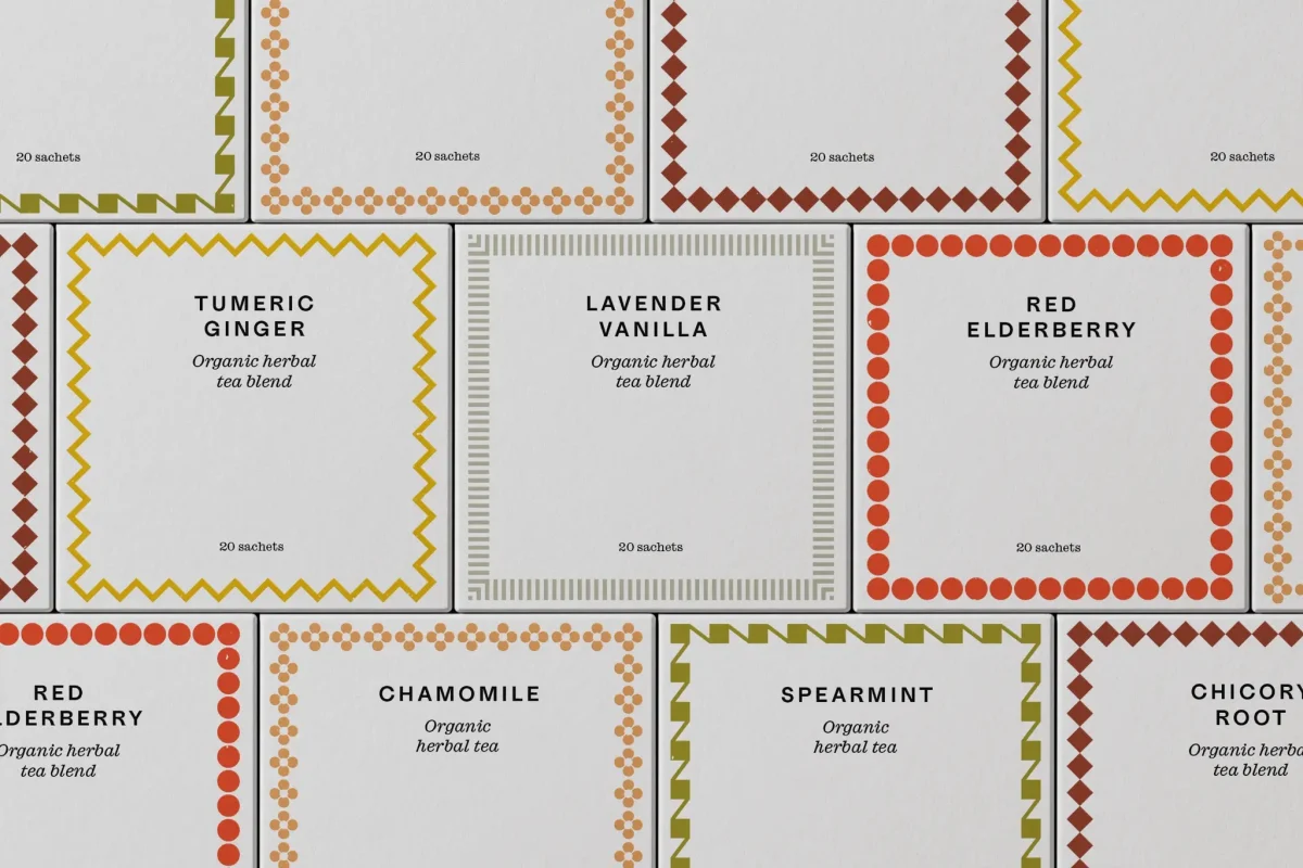
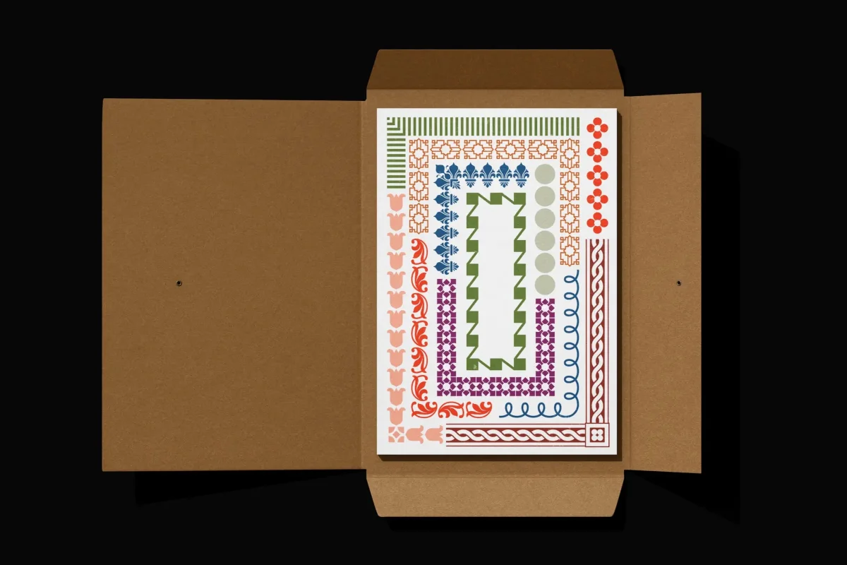
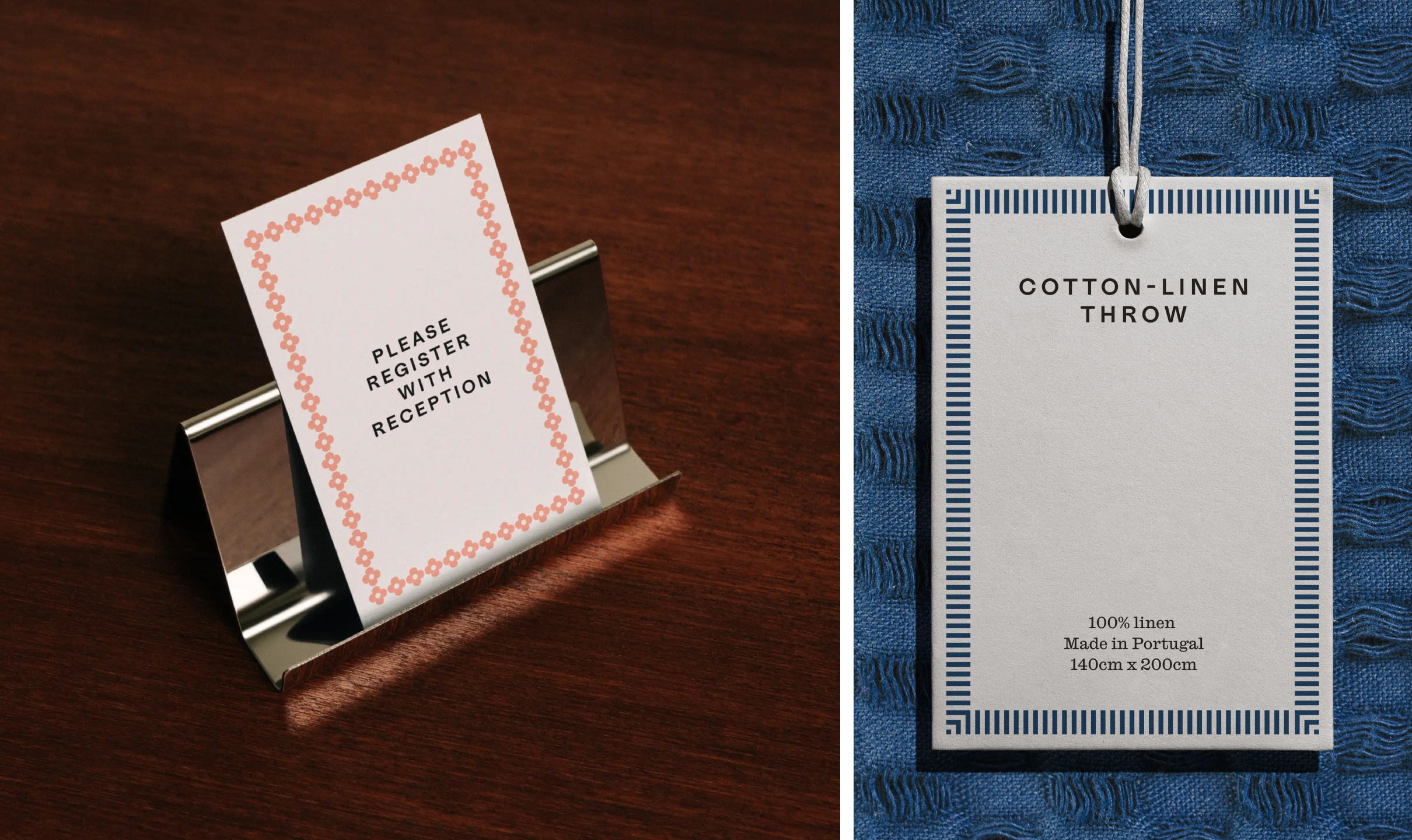
Colour follows a similarly flexible approach. Rather than assigning one shade the job of representing the whole brand, the palette draws on natural hues associated with the farm and its menu. Colours can suggest the scent, flavour or texture of a particular product, while each takes its place within a broader family. That gives the packaging a way to distinguish items without breaking the overall look.
Atmosphere meets practical information
The photography, shot by Pacific Northwest photographer Kyle Johnson, leans into black and white. Horses, rural views and glimpses of the farm create a romantic, cinematic mood. That approach gives the brand a sense of place, but it also sits slightly apart from the tidy typography and carefully controlled borders. The images can feel more dramatic than the rest of the identity asks for.
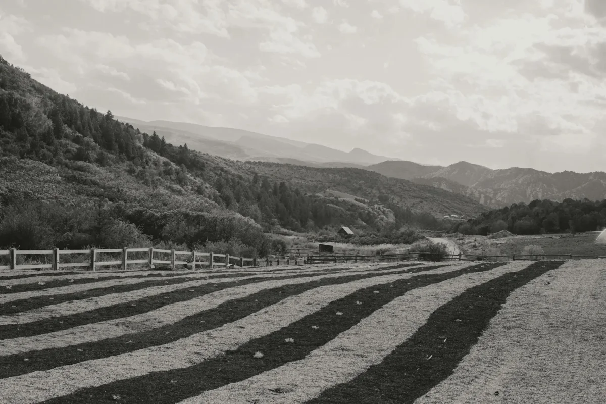
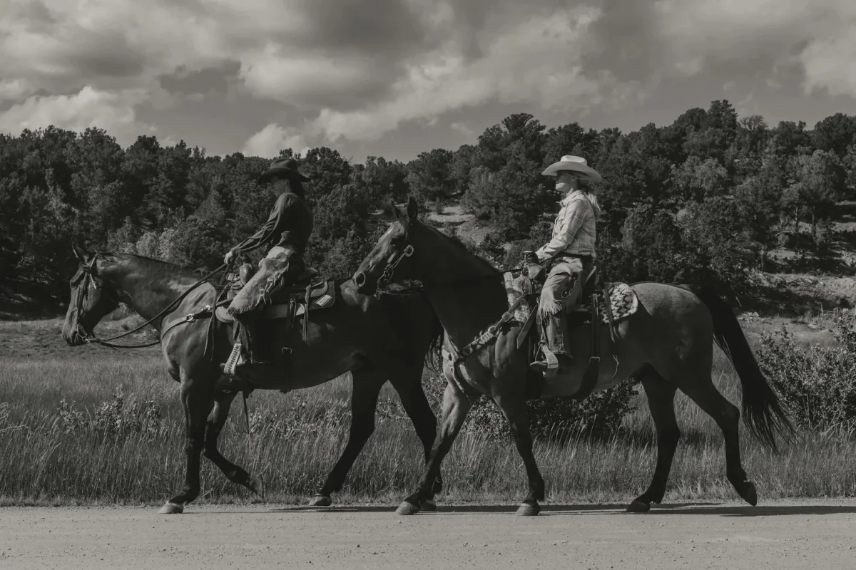
That tension could make sense if the farm experience is central to the business. The source material, however, gives few specifics about who can visit or what hospitality means in practice. For a company selling personal care products, that uncertainty matters: a customer needs to understand the product offer as clearly as the atmosphere surrounding it.
Website development by Joyful Talk brings together the shop, a booking system and the farm’s story. Across the site and printed applications, the identity has to carry both kinds of information: what the farm feels like and what it sells. The type, palette and borders provide a strong toolkit for doing that, while the photography gives the brand an emotional setting.
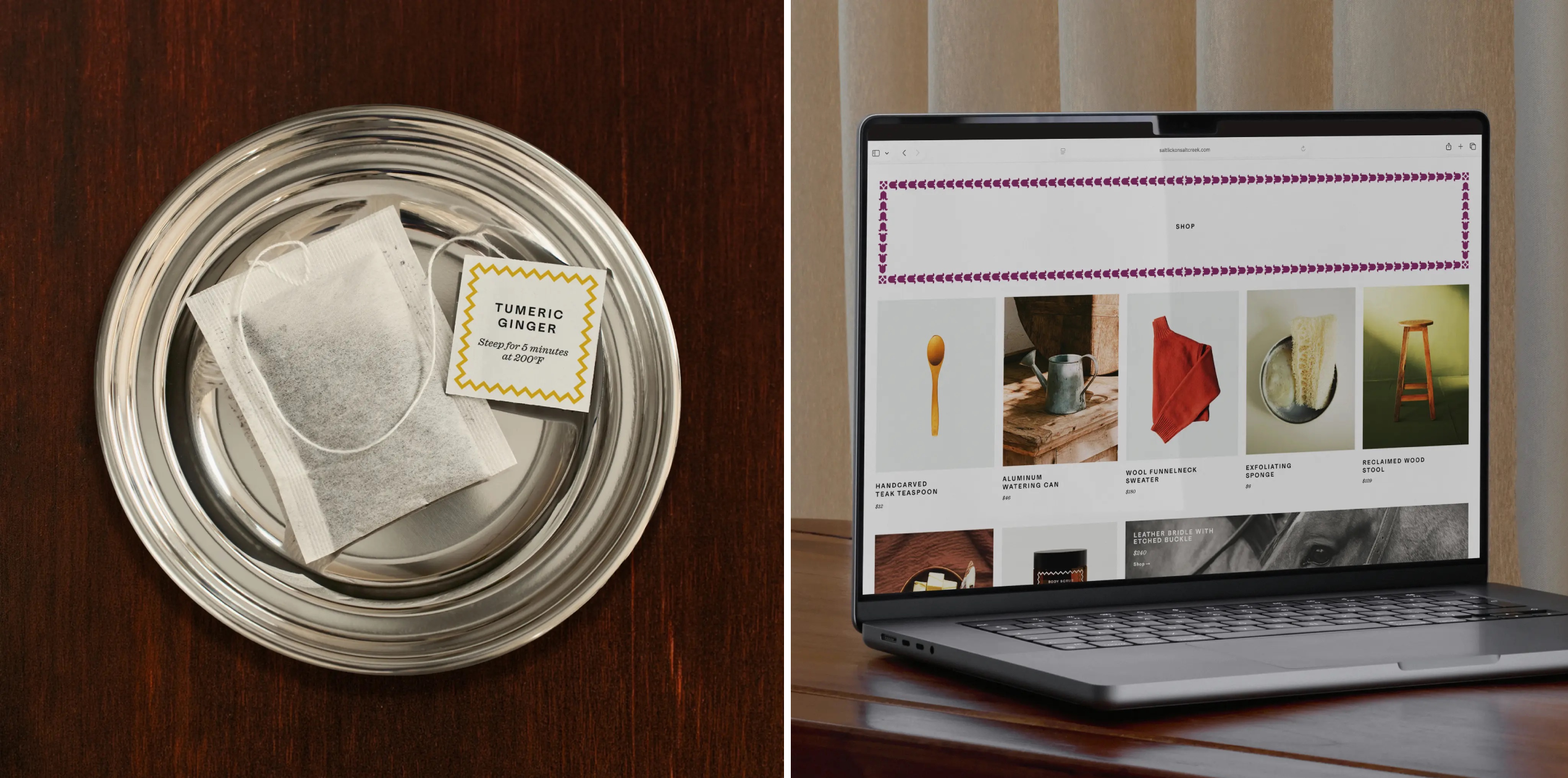
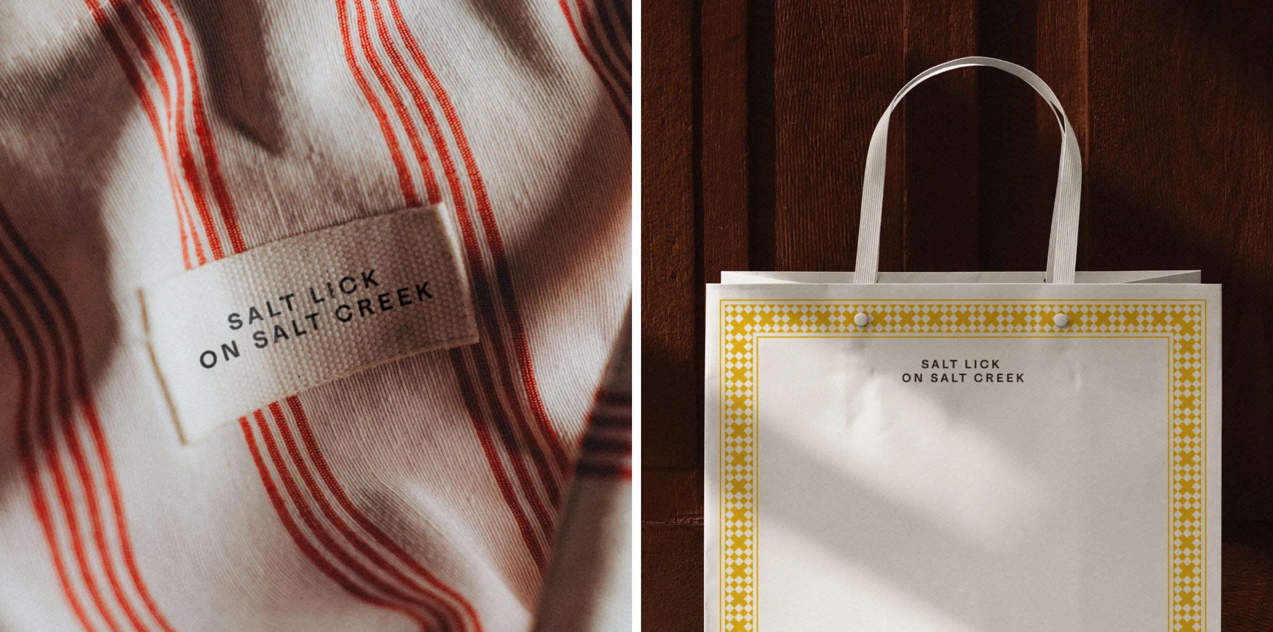
Order’s strongest decision is to build the identity around references that can do practical work. Historic borders add distinction across labels, tags and other formats; the type pairing holds together formal and functional needs; and the varied colours give individual products room to register. The system feels considered and adaptable, with a clear sense of place that doesn’t depend on obvious lavender imagery.
For designers, the project shows how a specific design history can become a flexible set of tools rather than a period costume. For Salt Lick on Salt Creek, the next useful design move may be equally concrete: make the offer and access to the farm as easy to understand as the borders are to recognise.


