Tuesday, October 27, 2026 · Graphic Design
Werf’s Rotterdam Identity Turns Shipyard Slipways Into a Bold 20° Graphic System
Noted by Emily Gosling · 418 reads
andstudio builds Werf’s bar identity around a 20° angle, two typefaces and colours that shift with the ships in its working Rotterdam yard.

Werf’s identity takes its cue from a working shipyard without leaning on the familiar imagery of boats, ropes or weathered timber. Designed by Vilnius-based andstudio for the Rotterdam bar and bistro, it distils the site’s ramps and slipways into a single 20° angle, then carries that graphic gesture through the venue’s menus, posters, packaging and digital presence.

That decision gives the identity a useful kind of specificity. Werf is inside Stadswerf Koningspoort, a historic shipyard that remains active, maintaining and restoring Dutch flat-bottomed boats and inland vessels. The name means “wharf” or “shipyard,” and guests can watch the work from the cosy houtloods, a historic timber storage shed, or from the waterfront terrace. The setting is central to the experience; andstudio’s challenge was to make it felt in the graphics without simply illustrating it.
A slipway reduced to one angle
Andstudio looked specifically at the shipyard’s ramps and slipways, which launch vessels towards the North Sea. Instead of borrowing surface details from the site, the designers translated its structure into a graphic rule: a 20° tilt. That angle recurs across the identity, linking the work to the yard through form rather than literal depiction.


The same diagonal also carries a second association. Andstudio says it recalls gestures familiar in hospitality: lifting a glass or tilting a bottle of ageing champagne. That gives the device room to work across both sides of Werf’s identity, connecting the industrial setting with the social rituals of a bar and bistro.
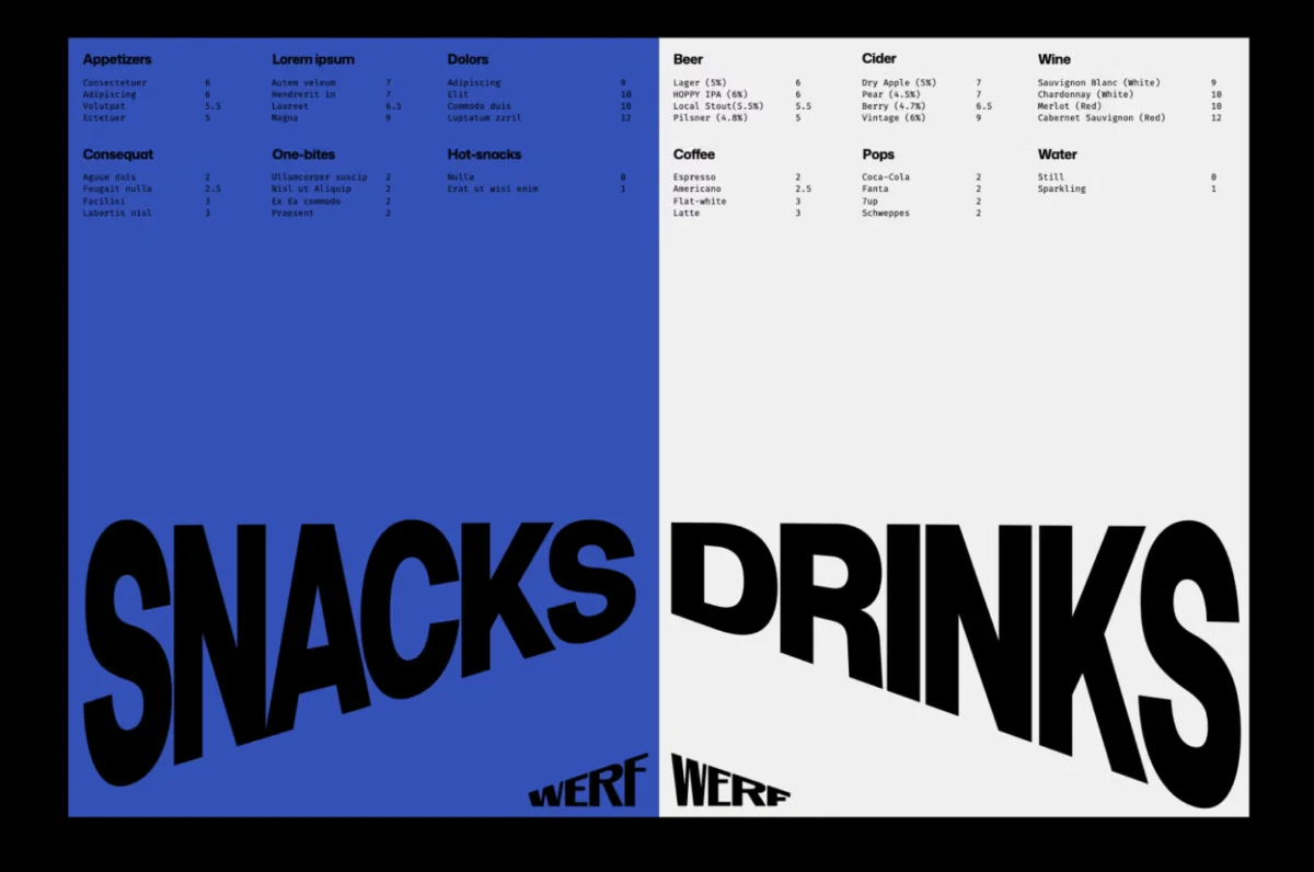
A repeatable angle is a practical choice as well as a conceptual one. It can shape a wordmark, a poster composition or a menu detail without requiring a new visual idea for each format. The result, as seen in the identity’s printed applications and moving logo, is recognisable through a small number of decisions. The system stays legible while changing scale and context.

The mark’s simplicity also makes the relationship between source and abstraction easy to grasp once it’s explained. The diagonal doesn’t depict a shipyard ramp; it gives the ramp’s incline a new job. For designers, that’s the useful move here: find a distinctive property in a place or product, then turn it into a rule that can travel across a whole identity.

Two typefaces, clear roles
Typography follows the same preference for clarity and economy. The main logo and wordmark use Mona Sans, a variable font designed by Jakarta-based Deni Anggara and inspired by industrial-era grotesques. Its sturdy character suits the identity’s blocky graphic forms, while the variable format gives the wordmark room to adjust without adding another typeface to the system.

Fira Mono, designed by Erik Spiekermann and Ralph du Carrois and released through Berlin-based foundry Carrois, handles supporting text. It appears in smaller text details and on Werf’s website. The contrast between the two faces gives the system hierarchy: Mona Sans anchors the identity, while Fira Mono brings a more measured, informational voice to the supporting material.
Using two families helps the graphic angle remain the main organising feature. The type choices provide distinct roles without competing for attention, and their industrial associations connect with the shipyard context without turning the design into a period reference. For a venue whose character comes from a place still at work, that balance feels especially apt.
Colour that changes with the yard

Colour brings variation to the system. The palette is contemporary and slightly unexpected, but one of its applications ties it directly to the shipyard: the seasonal menu takes its colours from the vessel moored there at the time. That makes the identity responsive to the place without changing its underlying visual structure.
It’s a restrained way to make the surroundings part of the design process. The 20° angle supplies continuity; shifts in colour can register the changing scene at the yard. For a brand with multiple printed and digital touchpoints, that division is useful: the core device holds recognition, while colour gives individual applications room to feel particular.
Werf’s visual system is bold and economical, with each element doing more than one job. The angle points back to the slipways and also echoes a gesture at the bar. The type pairing distinguishes the wordmark from supporting information. The palette can vary with the shipyard while the graphic structure stays consistent.
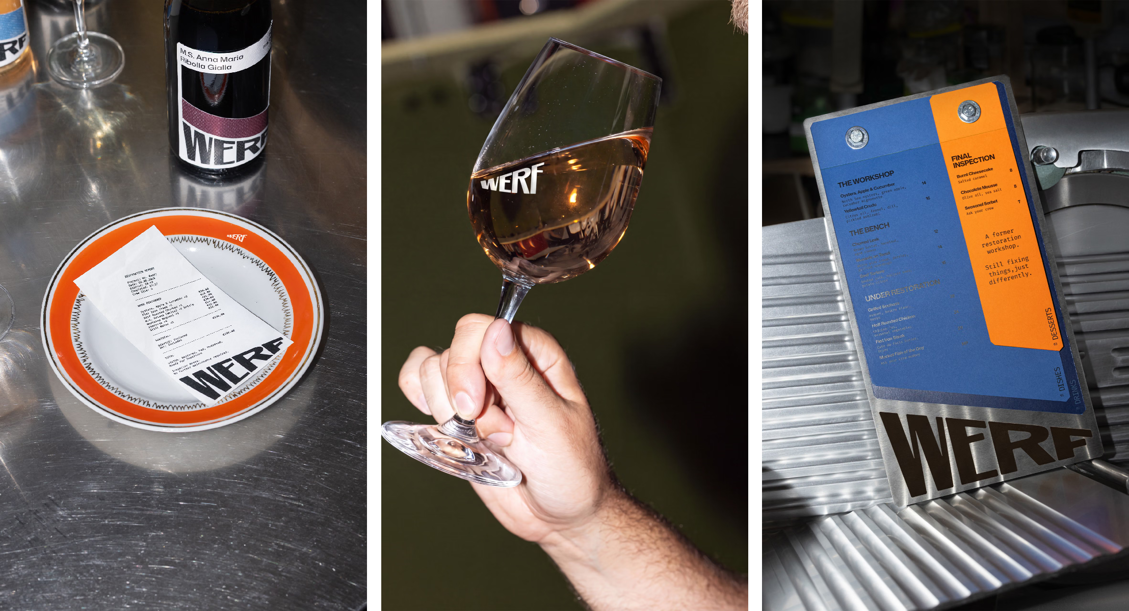
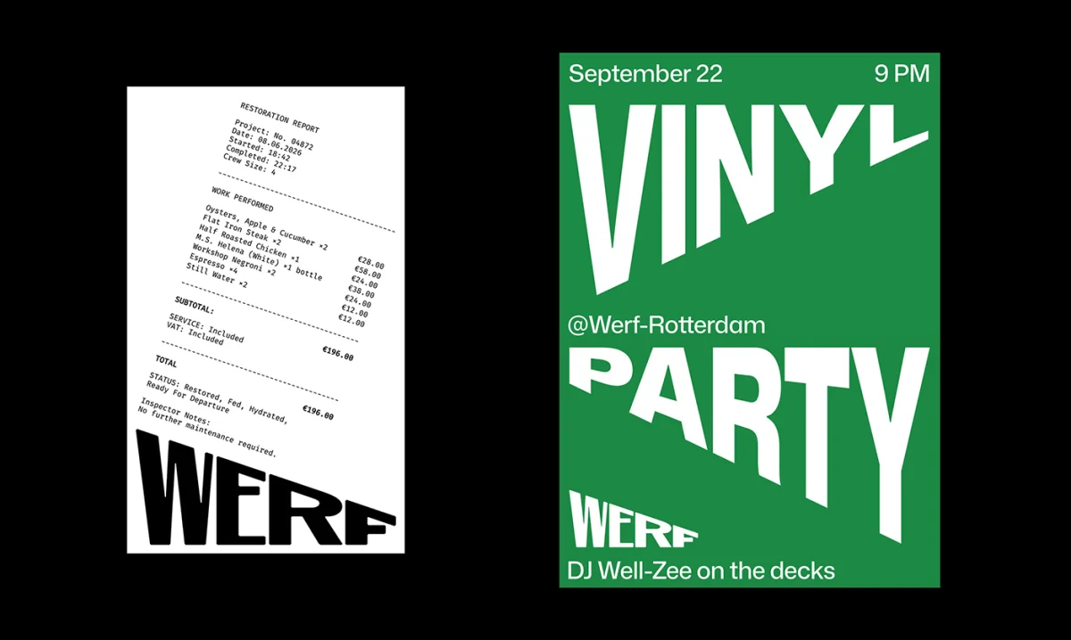

Andstudio’s identity shows how a place can inform a design system without dictating its imagery. By turning the incline of a shipyard ramp into a compact, repeatable rule, the studio makes Werf’s setting present across the brand—even when the graphics aren’t depicting the yard directly.