Tuesday, October 27, 2026 · Graphic Design
23 New Typefaces for October 2026: Variable Fonts, Handcrafted Lettering and Industrial Slabs
Noted by Tom May · 550 reads
From uniwidth sans serifs to lace-built displays, October’s type releases explore flexible layouts, legibility and the marks of handmade processes.
October’s type releases treat letters as both working tools and visual material. Variable axes and alternate glyphs give designers room to tune a layout; clay, lace and historical lettering bring physical traces into the forms. The range runs from practical sans serifs to display faces that sit close to illustration.
Here are 23 new releases and updates, with details on what each family offers and where its design might fit.
Variable systems for flexible layouts
Twista Sans by Viktor Nübel
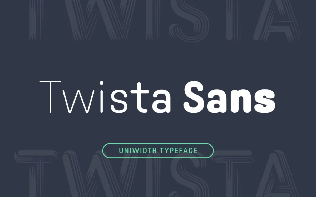
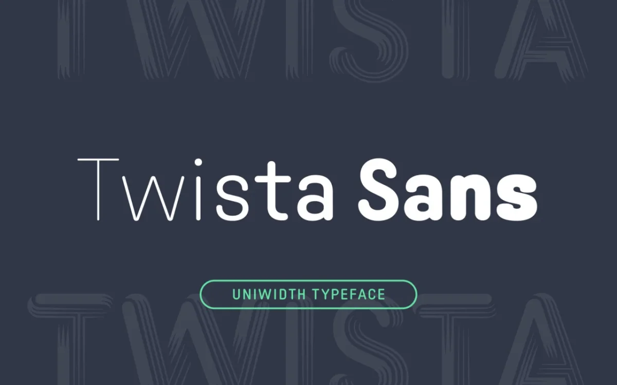
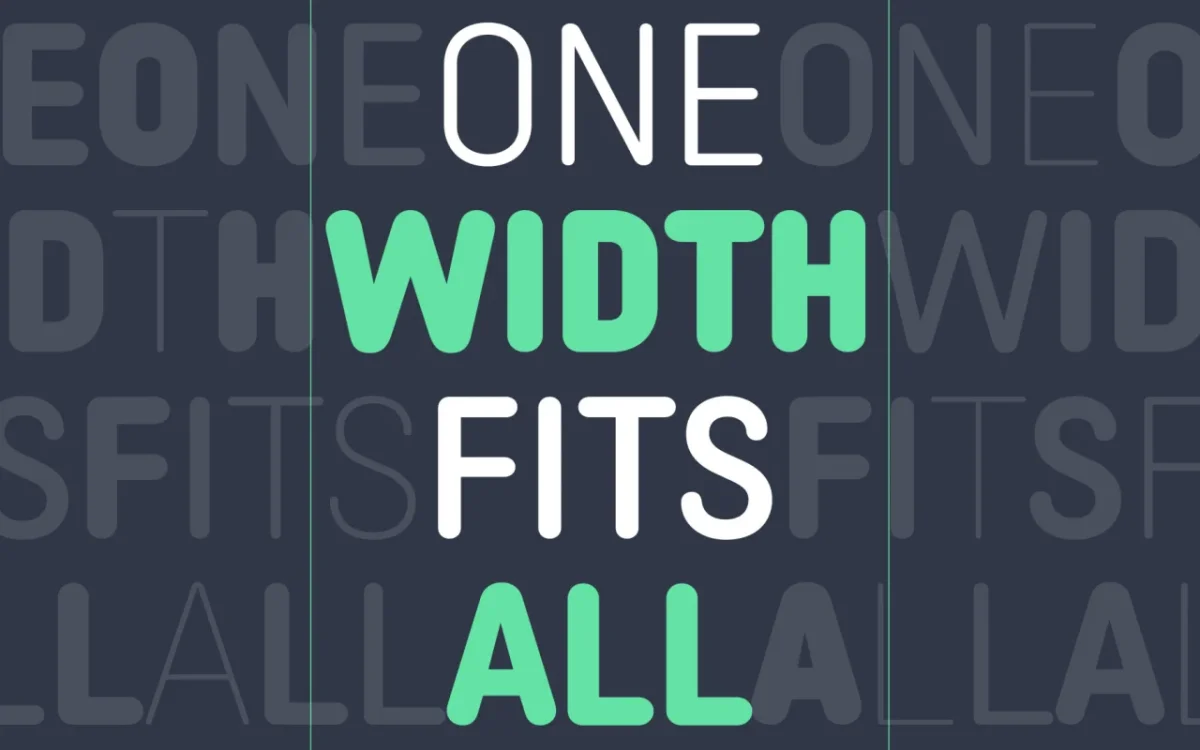
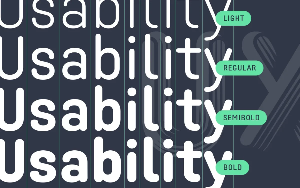
Twista Sans is proportional, but every glyph has the same horizontal width. That uniwidth construction lets designers change weight without causing text to reflow, a useful property for interface states, hover effects and animation. Nübel designed it as a sans companion to the display face Twista, with packaging, branding and editorial among its potential uses.
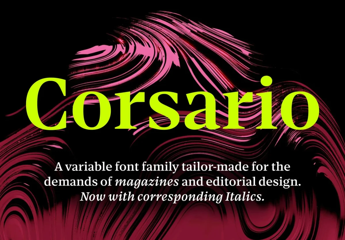
Corsario by Felix Braden
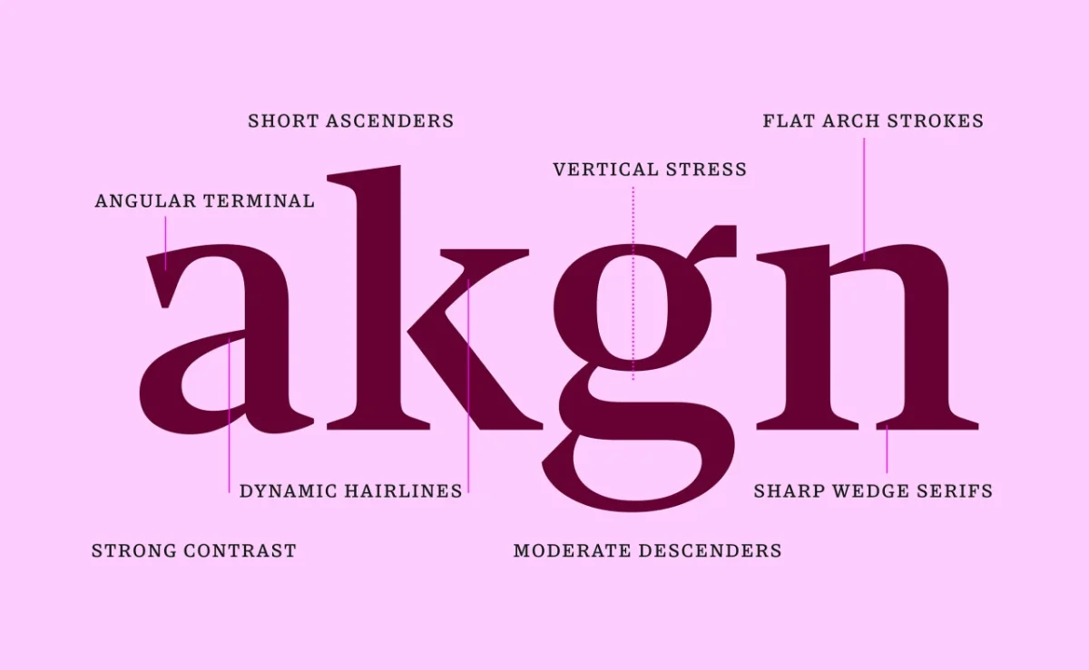
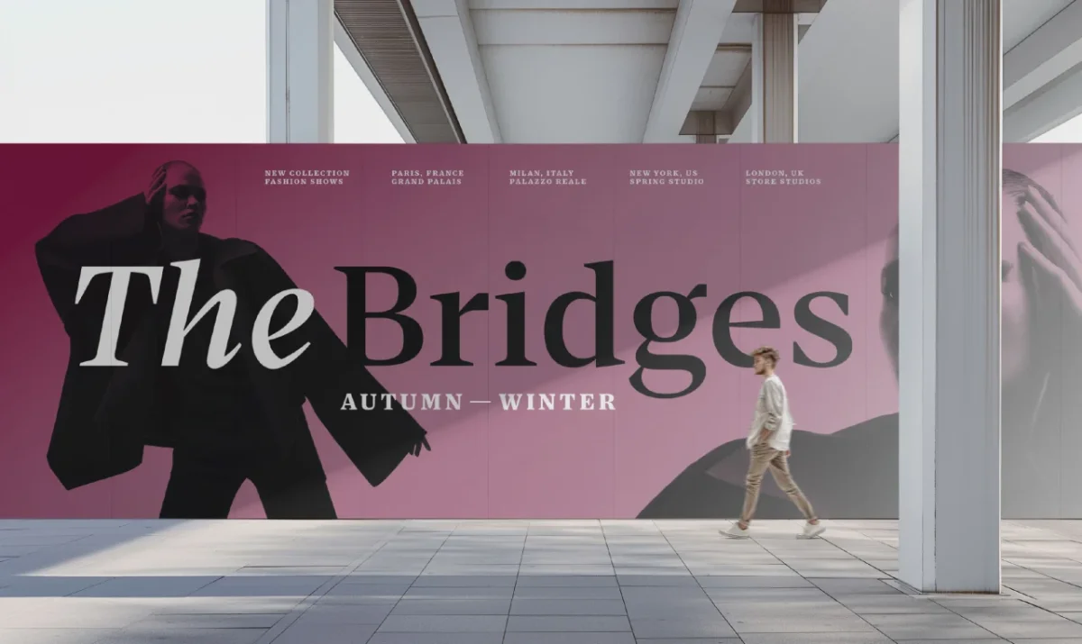
Five years in the making, Corsario draws on the British transitional style, with sharp, prominent serifs. Its 54 styles make the variable family adaptable across editorial scales: one font file can serve elegant headlines and smaller captions.
Hyperspace Cargo by Swell Type
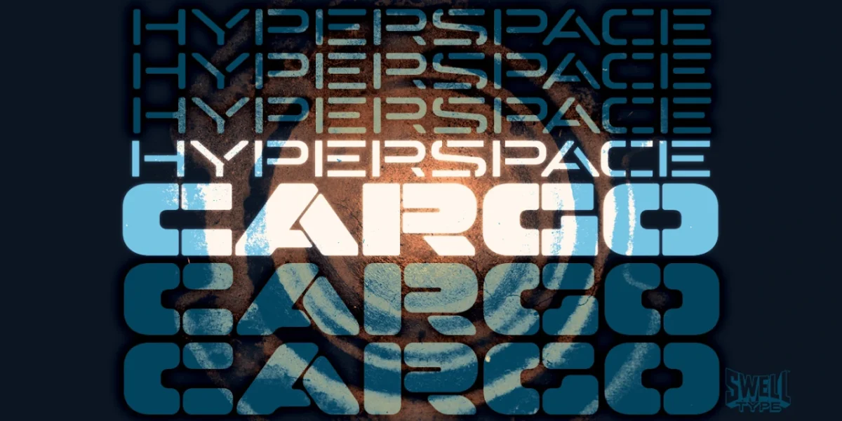
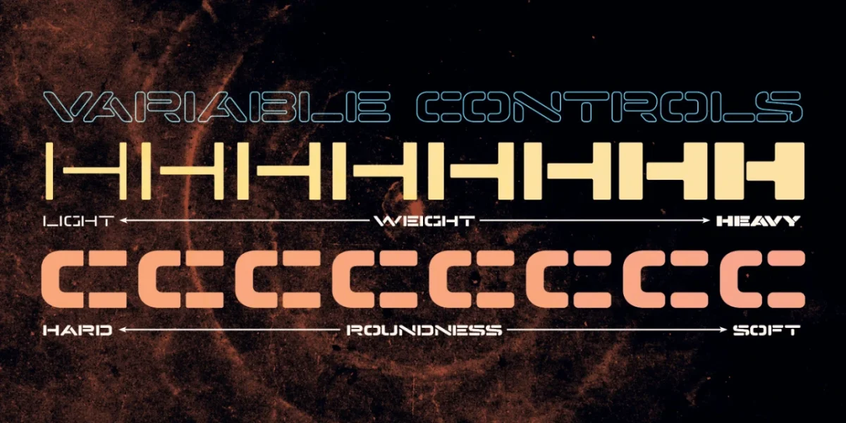
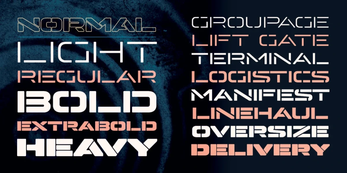
Derived from Hyperspace Race, this all-caps stencil ranges from Light to Heavy. Its variable version has Weight and Roundness axes, shifting the forms from hard-edged to soft. Horizontal-line stylistic alternates add options, and the typeface supports Cyrillic, Greek and Vietnamese.
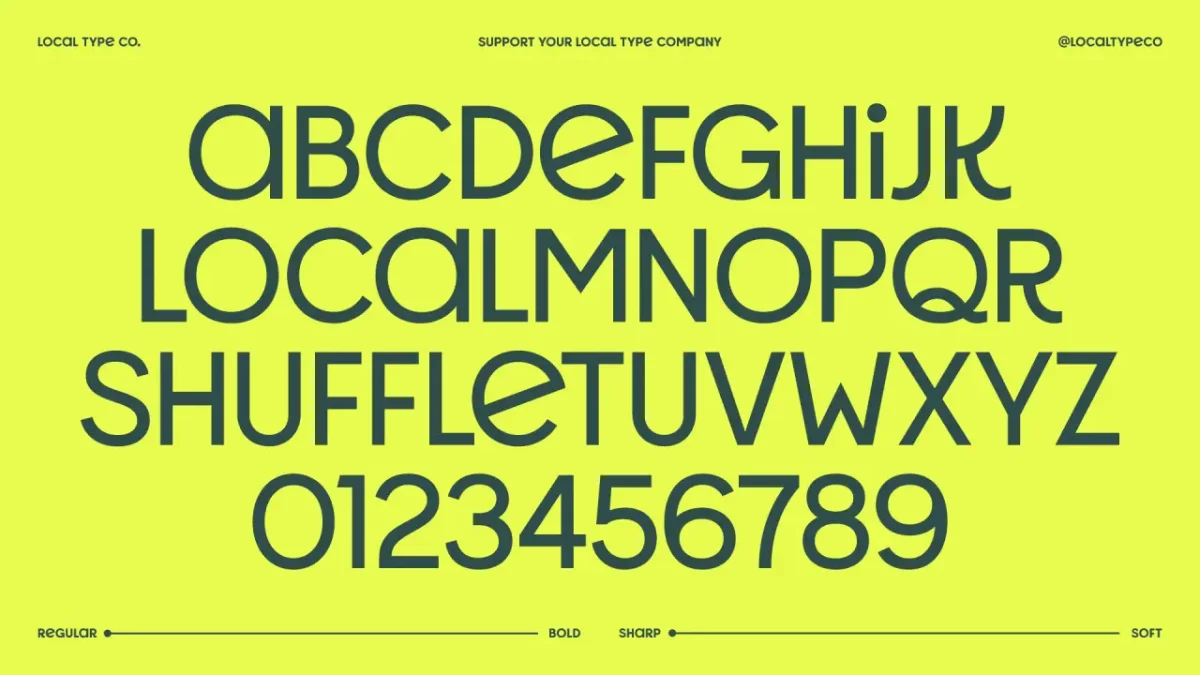
Shuffle by Local Type
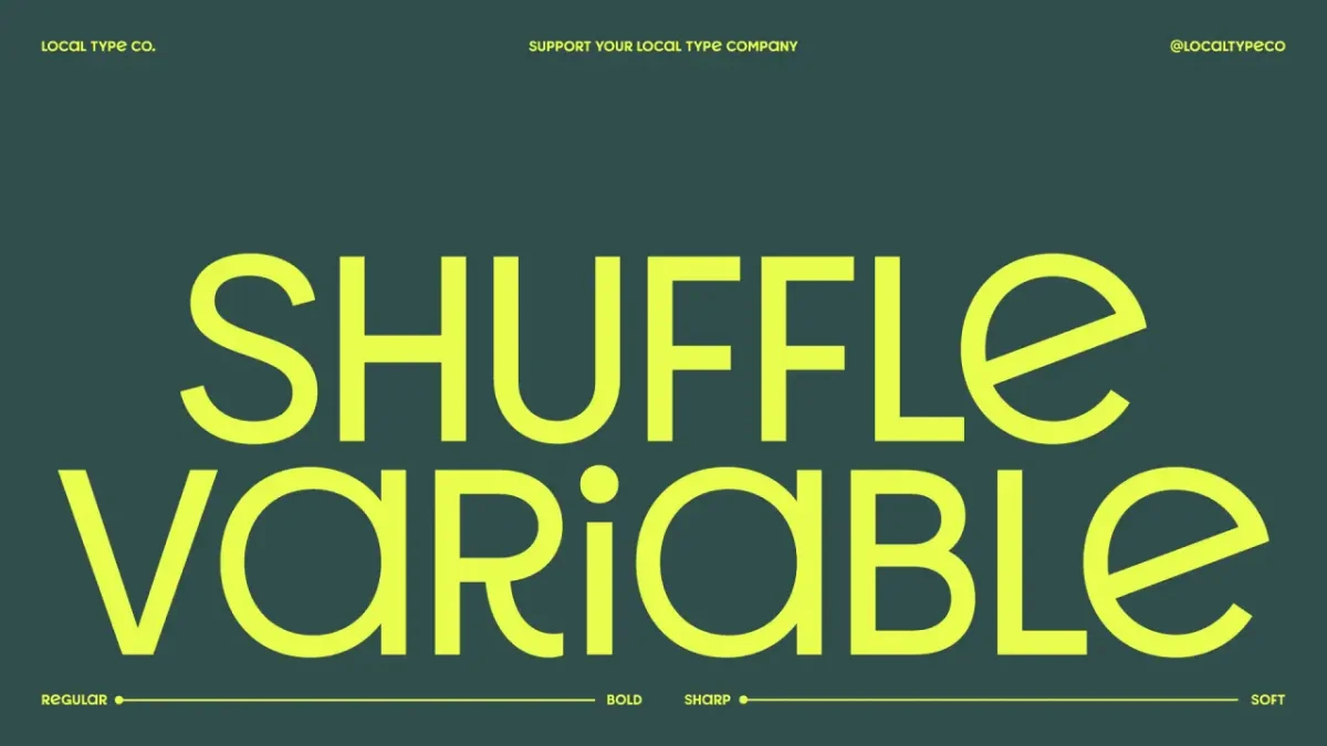
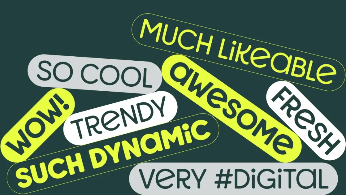
João Luiz Wittkowski’s first release for Local Type, his Valencia-based foundry, was developed for a children’s healthcare centre in Brazil. Its two variable axes control weight and bounce, taking the display face from bold and exuberant to lighter and sharper. Twelve static styles are available, and one style is free for personal and commercial use.
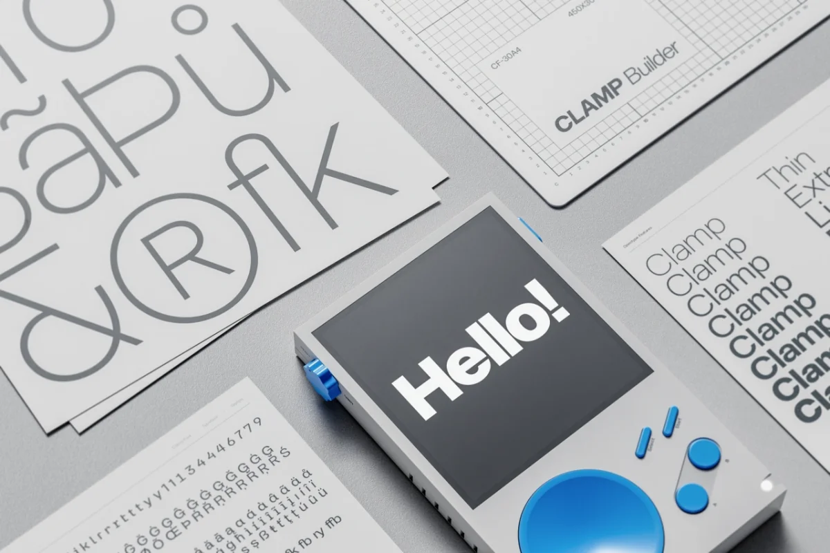
Clamp by Daniel Iglesias
Clamp builds multiple personalities into one type system. OpenType alternates let designers change its character for different contexts without switching to a separate style.
Legibility, proportion and historic references
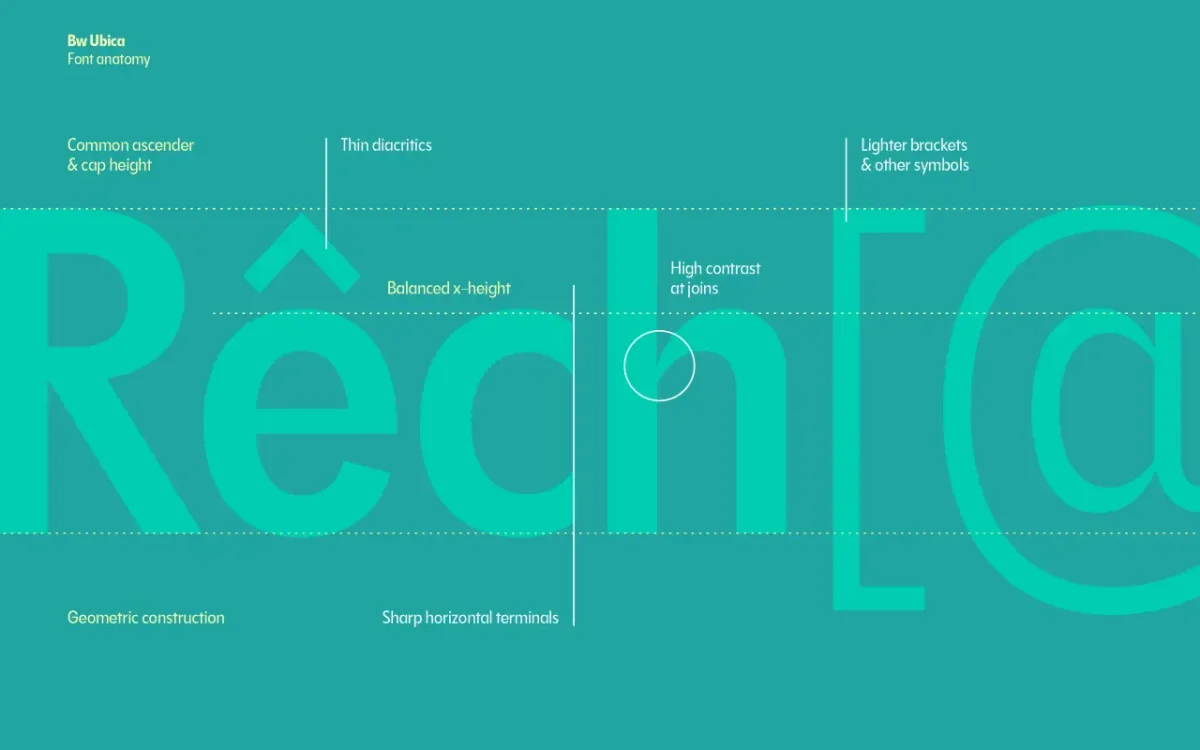
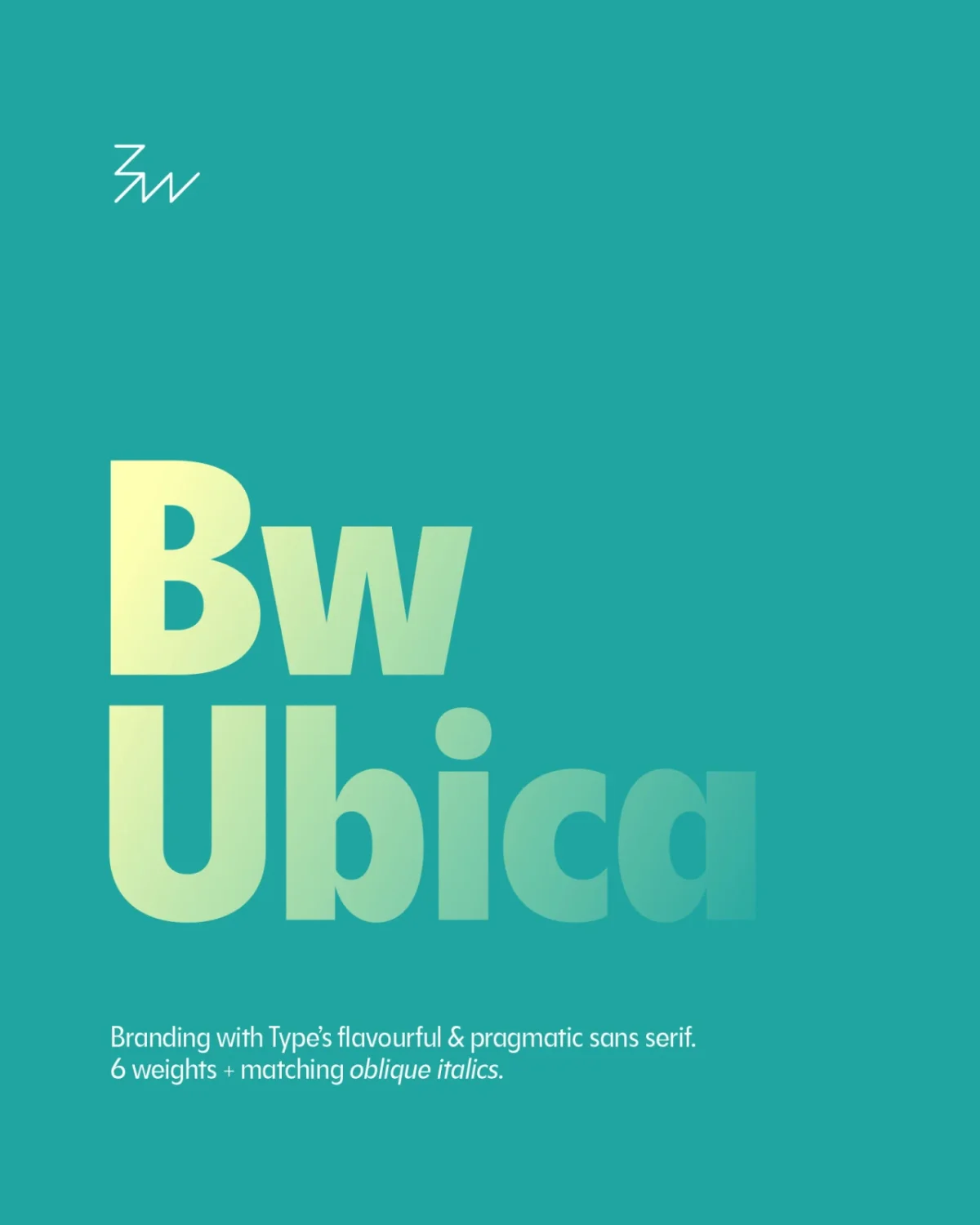
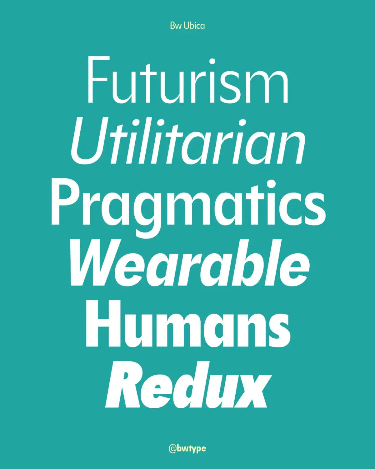
Bw Ubica by Branding with Type
Available in 12 styles, Bw Ubica pairs sharp geometric construction with a balanced x-height and slightly condensed proportions. Its aim is legibility with enough character to hold together across editorial layouts, interfaces and product sleeves.
Thalo by Signal Type Foundry
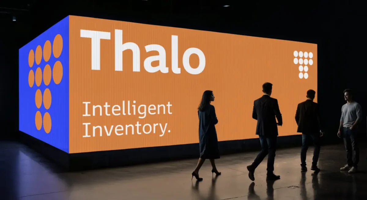
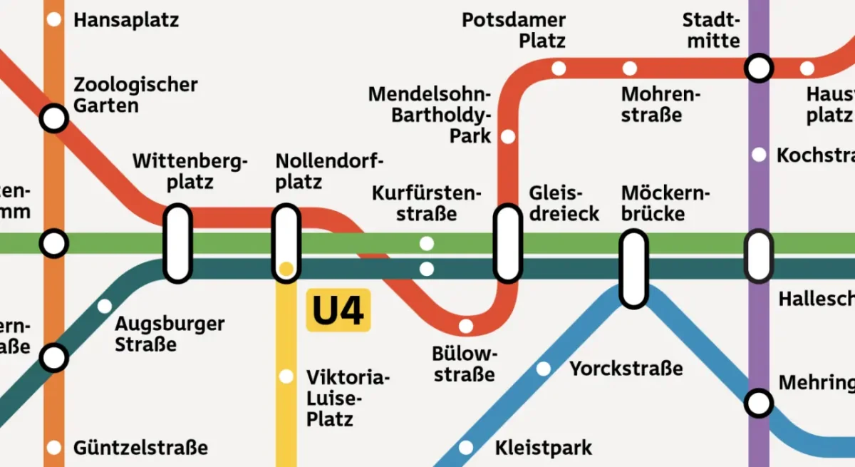
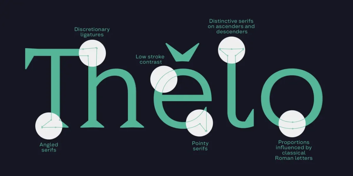
Max Phillips designed Thalo, a humanist sans, for signage and timetables with accessibility in mind. Low contrast, generous spacing, open counters and apertures support clear reading. The shapes of b, d, p and q aim to reduce confusion for dyslexic readers, while I, l, 1 and i are drawn to look distinct. That clarity also suits branding and editorial work.
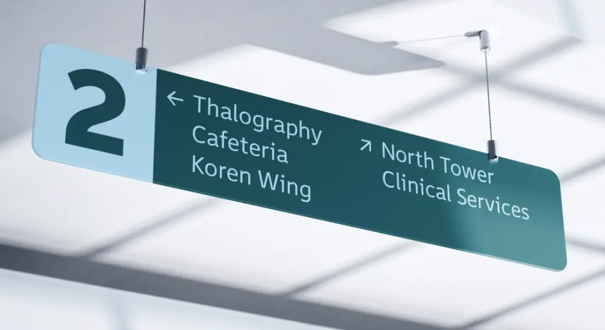
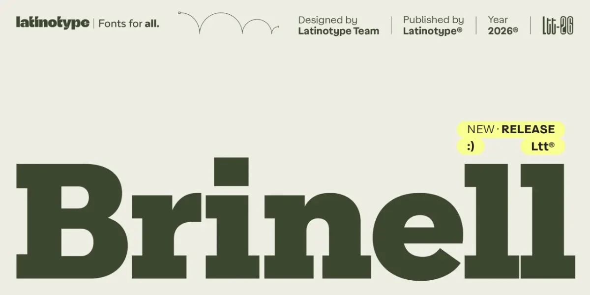
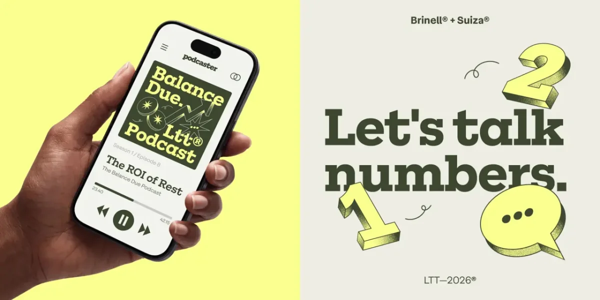
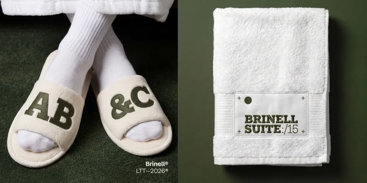
Brinell by Latinotype
Named for the Brinell hardness scale, the slab serif takes cues from Rockwell and other industrial designs. Latinotype has pared back some serifs, flattened contrast and cleaned up the proportions. Small irregularities, including the terminal on the a, preserve a warmer, less mechanically corrected feel.
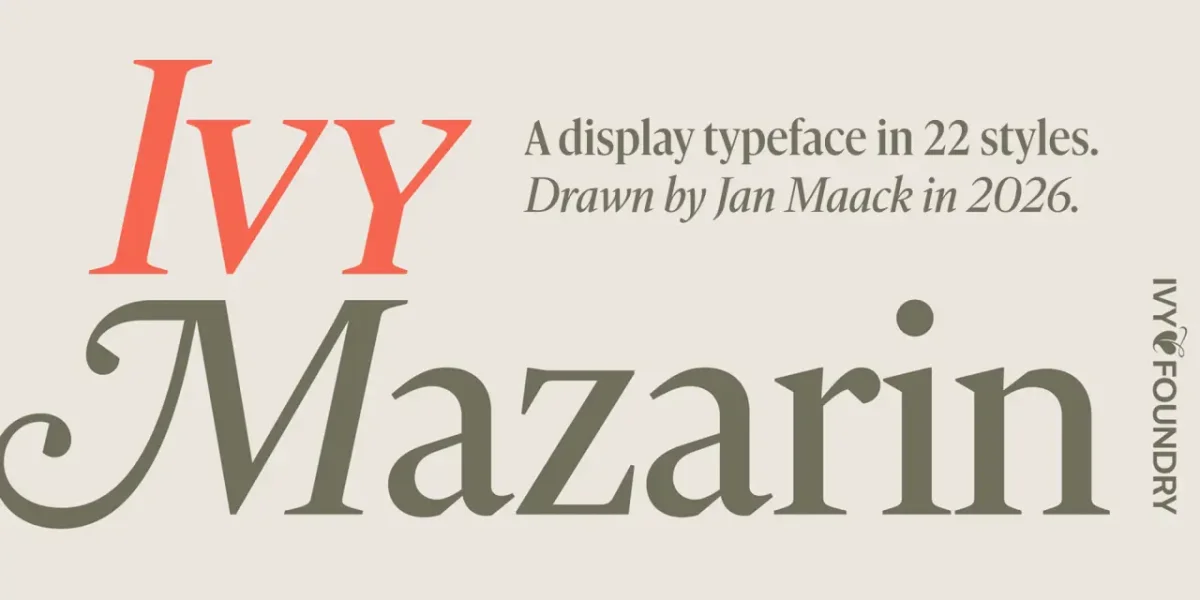
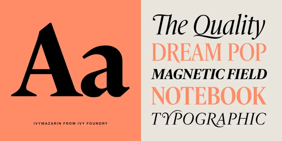
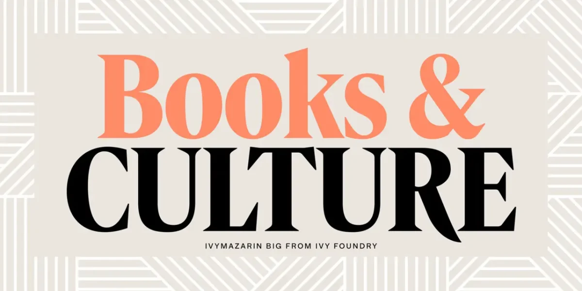
IvyMazarin Big by Ivy Foundry
Jan Maack reinterprets Astrée, a 1921 Garamond interpretation commissioned for the Imprimerie Nationale in Paris. Rather than simply reproduce the source, he draws out its display qualities: dramatic contrast, generous proportions and a grand scale. The release has 22 styles and is credited as drawn in 2026.
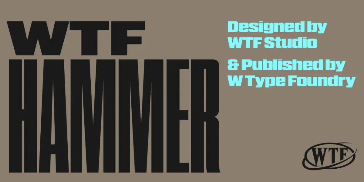
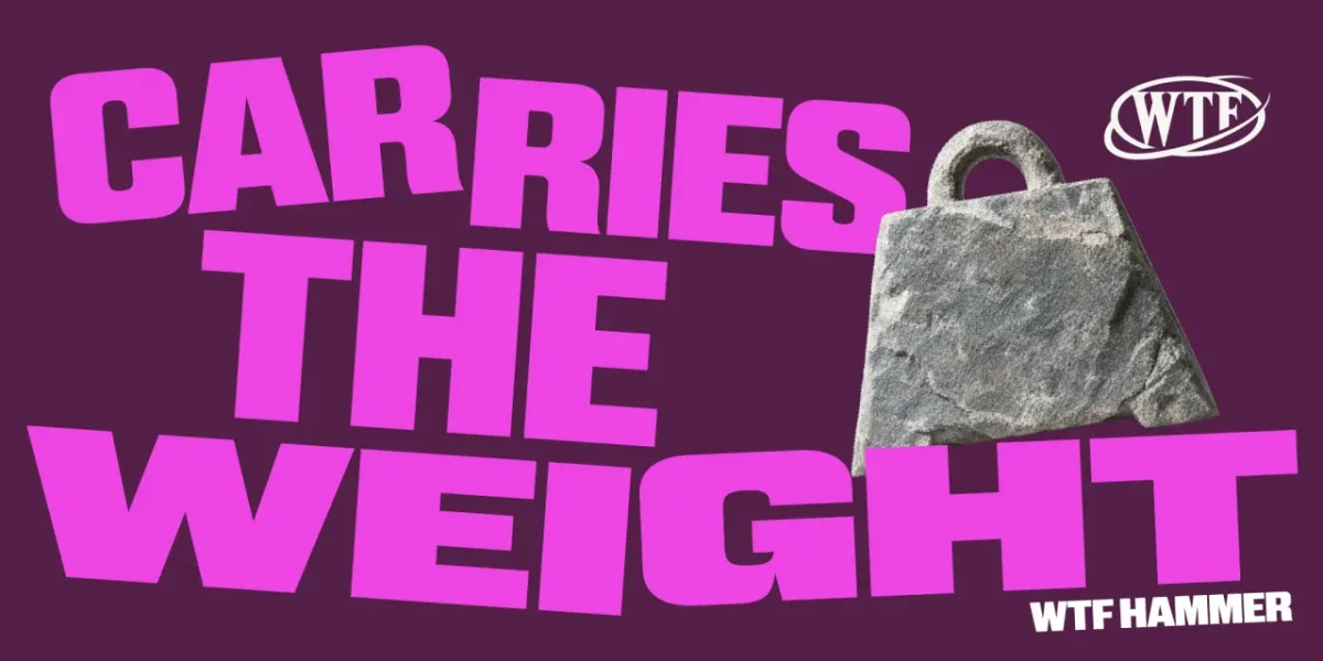
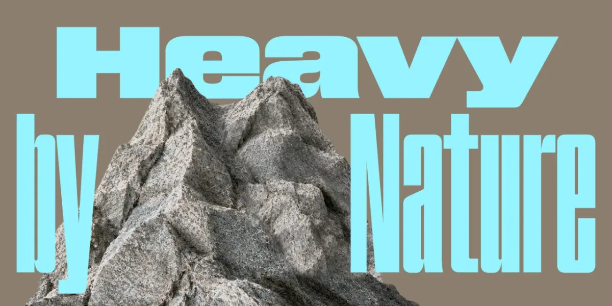
WTF Hammer by W Type Foundry
Hammer explores proportion through 12 width variants, each with a matching italic. Moving between widths gives a layout contrast and rhythm without changing the basic typographic voice.
Blubird by Rajesh Kumar
This narrow sans serif offers nine weights, 36 styles and two optical sizes, Display and Text. Dedicated italics extend its range from high-impact settings to more refined typographic use.
Handmade marks, pattern and display
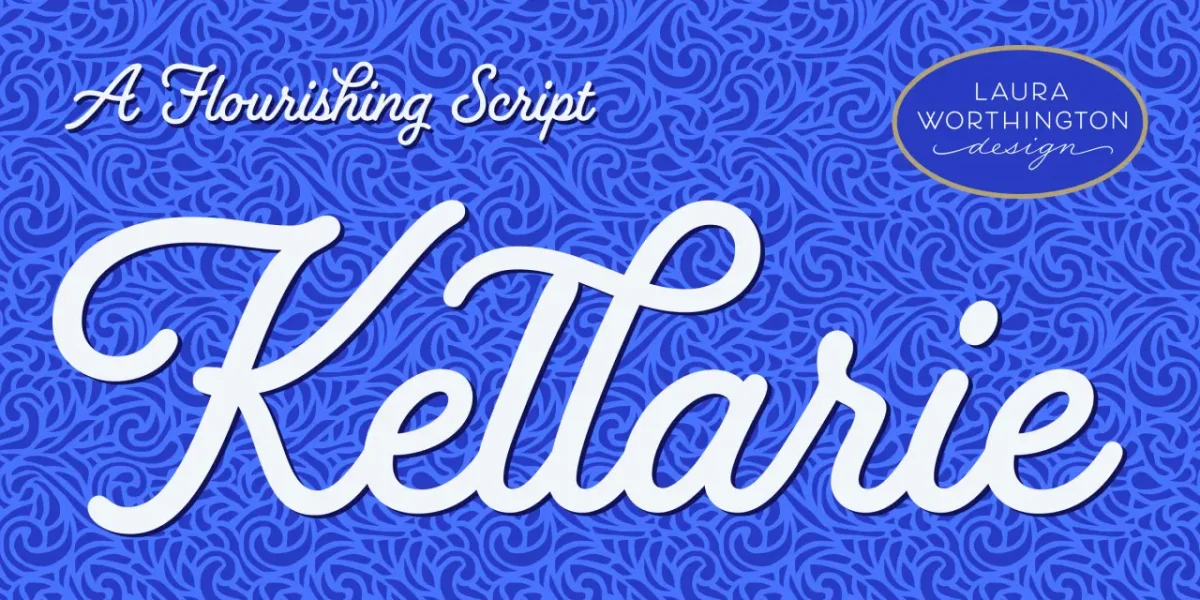
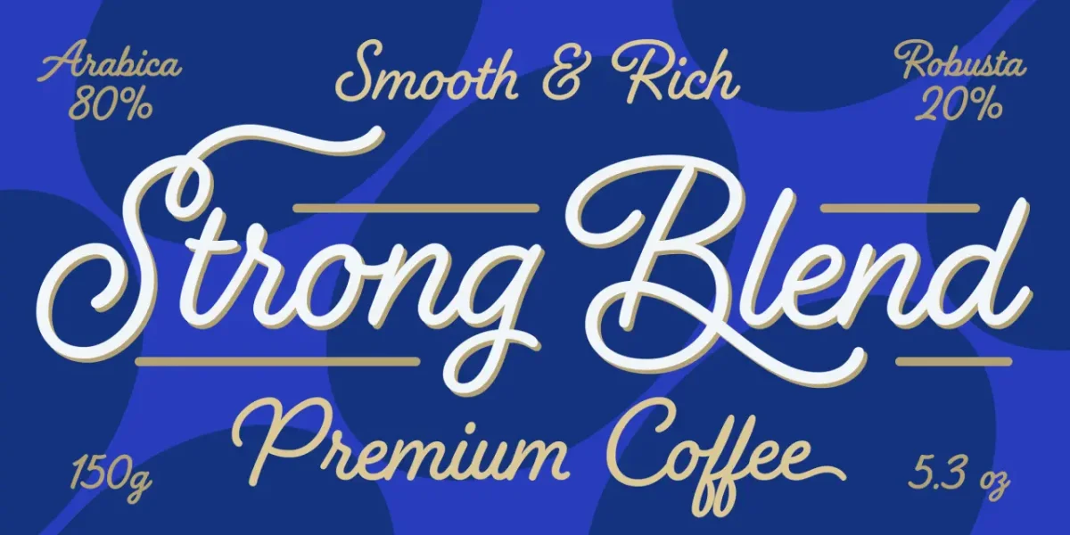
Kellarie by Laura Worthington
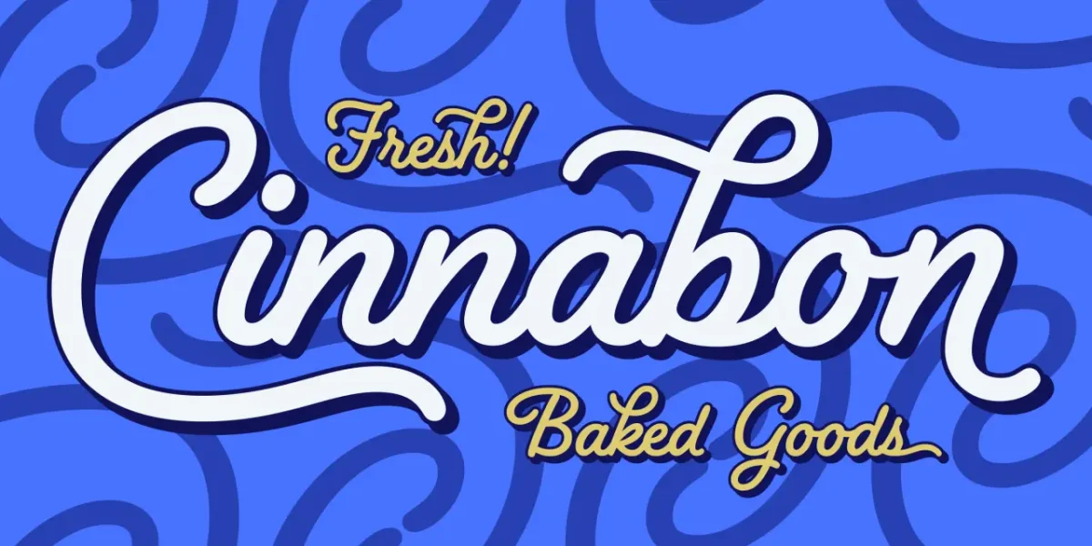
Kellarie’s compact lowercase, lively slant and buoyant rhythm give it the feel of hand lettering. Sweeping capitals, loops and curls add expressive detail, making the script a fit for packaging, stationery and editorial headers.
Triode by MuirMcNeil
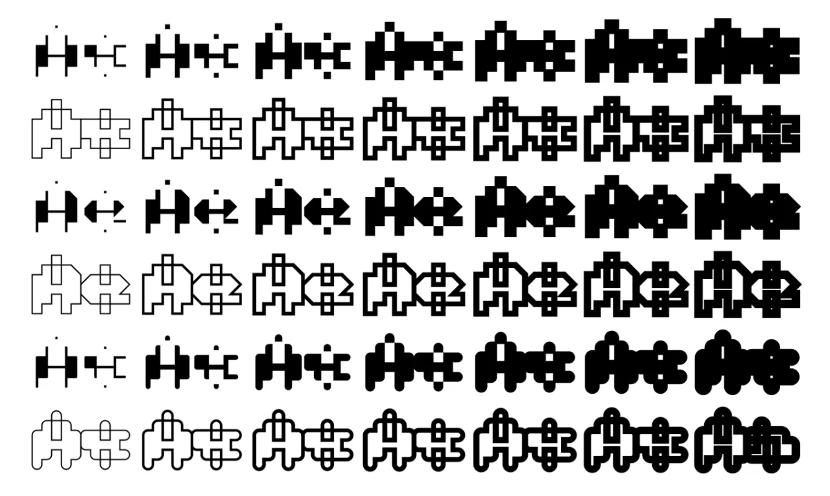
Triode works between typography and visual art. Its geometric components can be layered, combined and offset, so language can meet pattern, image and texture. MuirMcNeil marked the release with 40 unique colour posters, each 50 × 70 cm.
Mourn by Nina Type
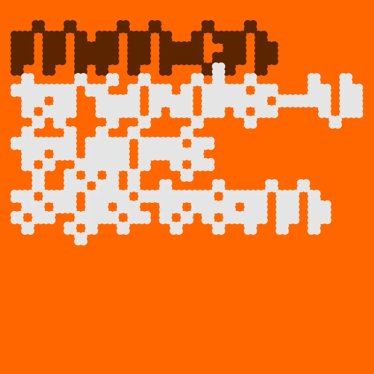
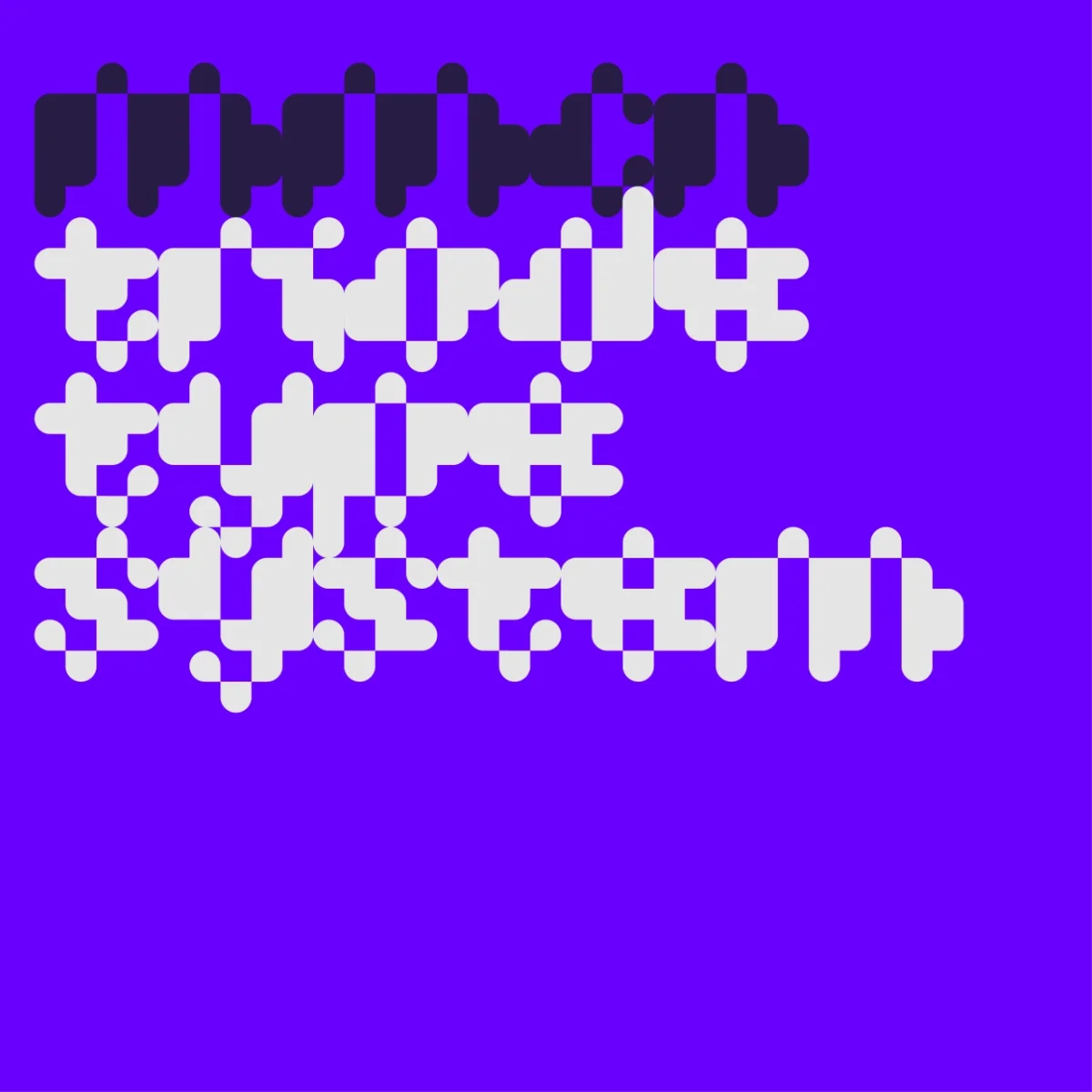
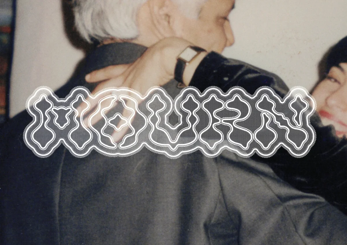
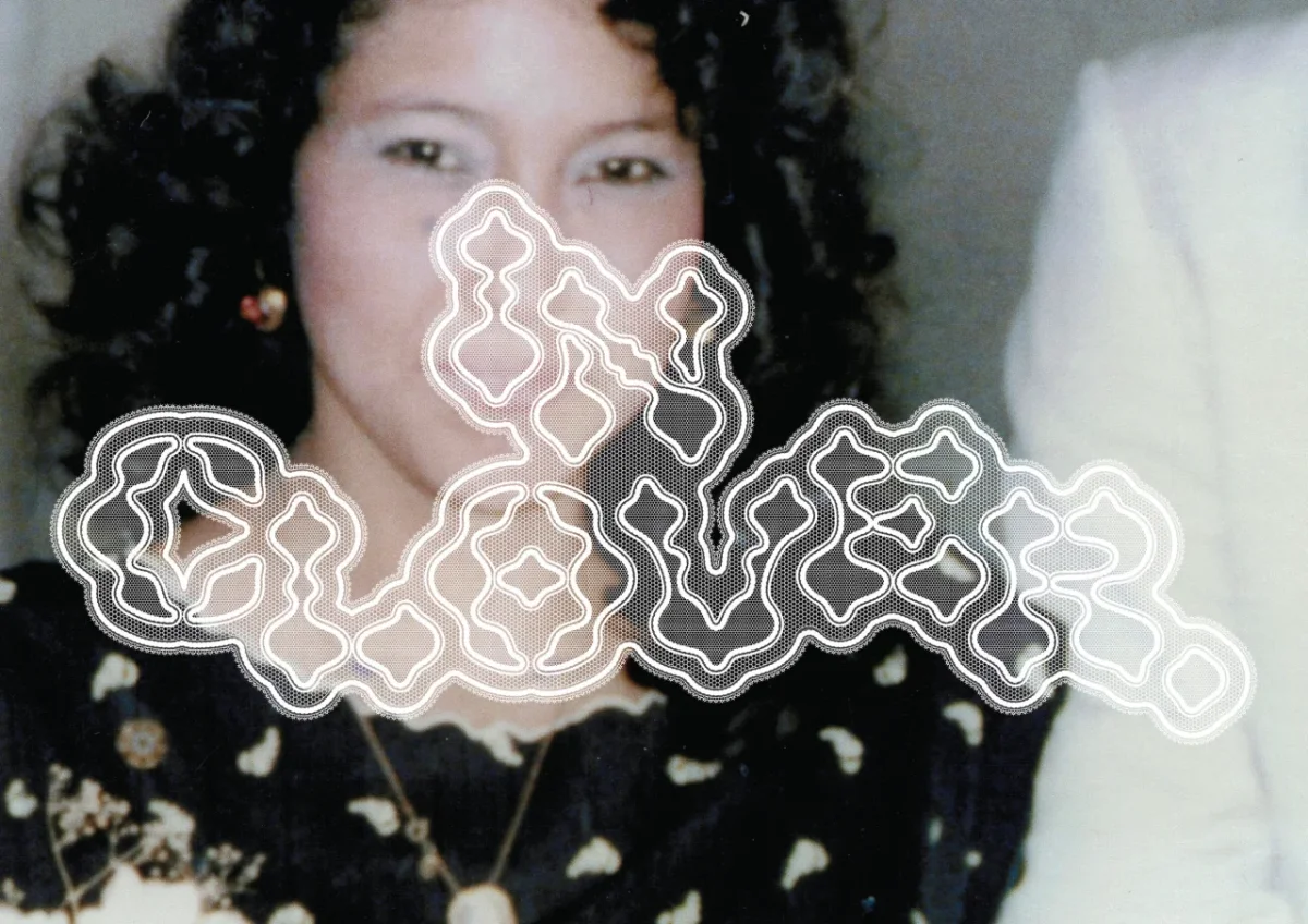
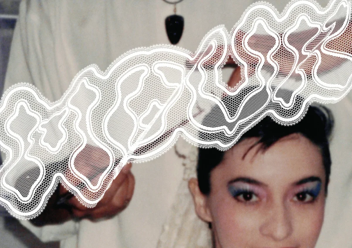
Mexican designer Ubaldo Ortiz spent two years shaping this display face around the structure of bobbin lace. He built each character before weaving lace patterns around it. Mourn launches his Nina Type studio, whose other typefaces are the sharp serif Osé and the everyday sans Nina Sans.
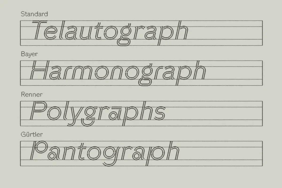
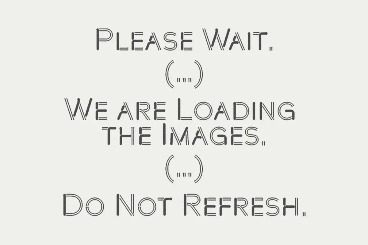
Pen by DDOTT × Morula
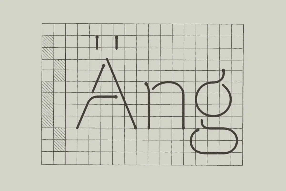
Pen turns the marks left when a pen hesitates, corrects or pauses into the central idea of a typeface. Designer Dominik Thieme introduced the project with a live plotting performance in Barcelona. Its release also includes an essay on automated drawing and writing.
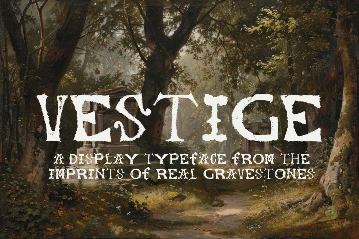
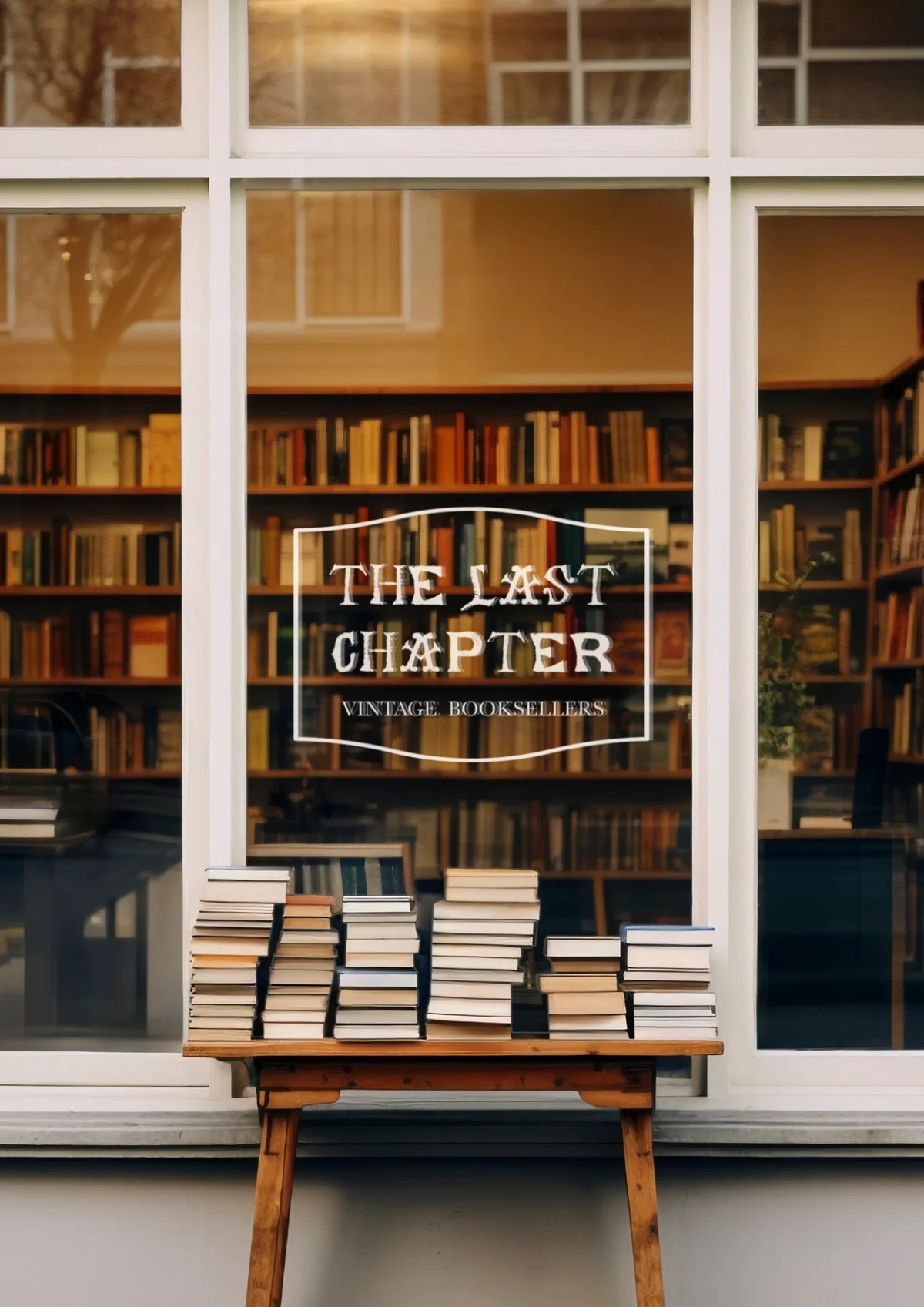
Vestige by Claire Wilde
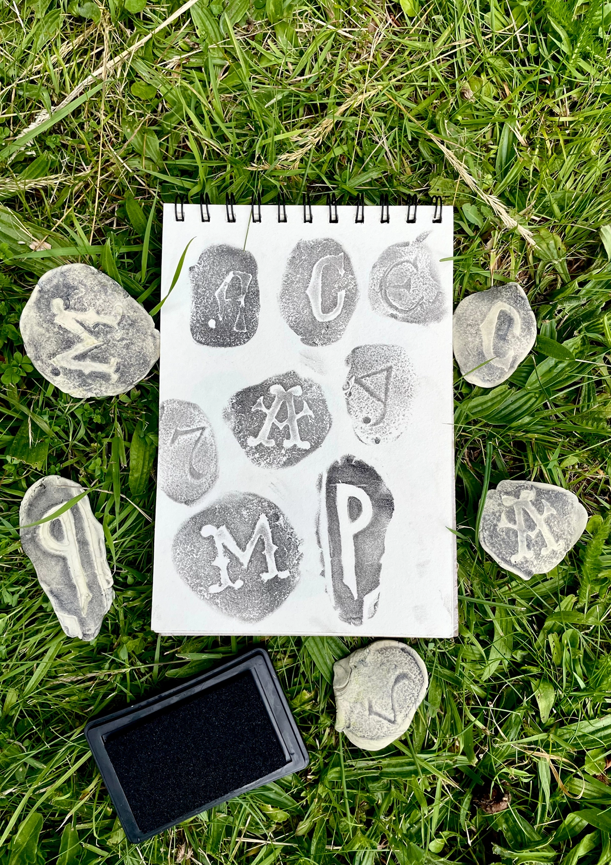
Wilde made this uppercase display face from clay impressions of lettering on gravestones. The worn, irregular marks remain part of the design, carrying the texture of the source into the finished forms. Her process documentation has reached 147k views.
Puerile Grotesque by Applied Systems Design Studio
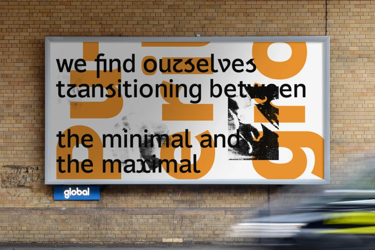
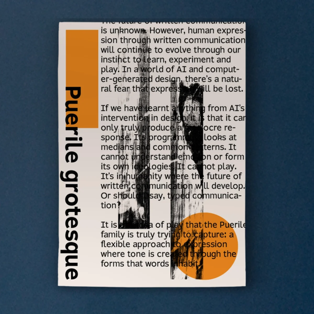
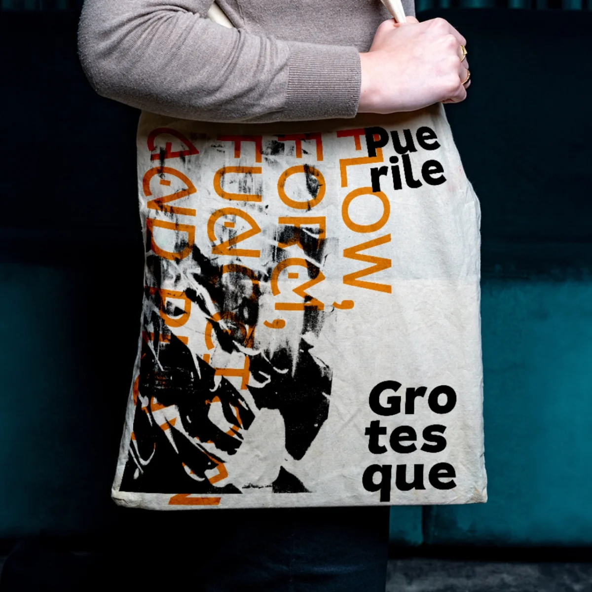
Alister Shapley’s typeface asks what play can mean in letterform structure. Where its companion, Puerile Display, explores ornament and expression, Puerile Grotesque tests the underlying shapes. Together, the two make a complementary family that challenges convention in different ways.
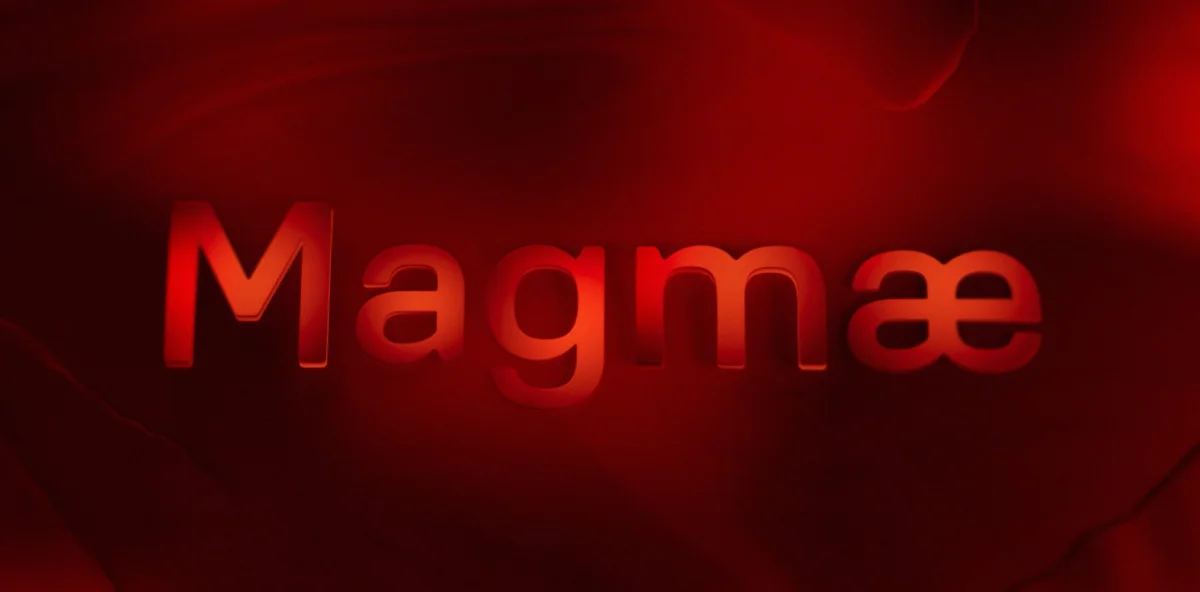
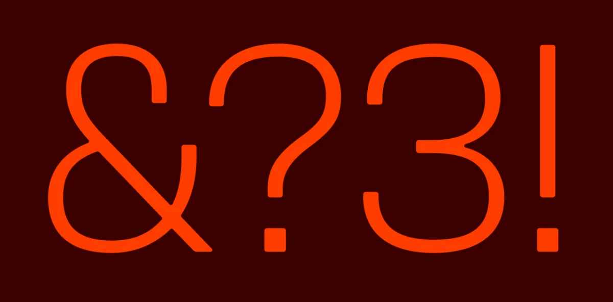
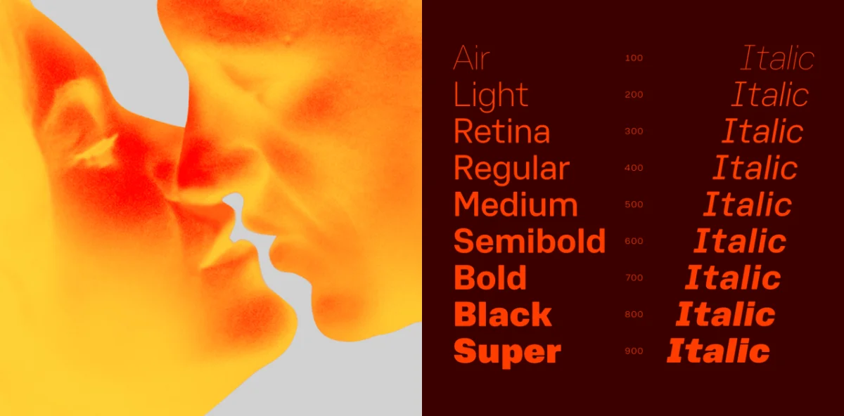
Magmæ by Arillatype
Pedro Arilla and Cristina Villellas named this industrial face for molten rock beneath Earth’s crust. Its mechanical digital skeleton meets fluid curves, while squared counters sit inside soft outer contours. That tension gives Magmæ a raw character suited to packaging, industrial branding and architecture-related projects.
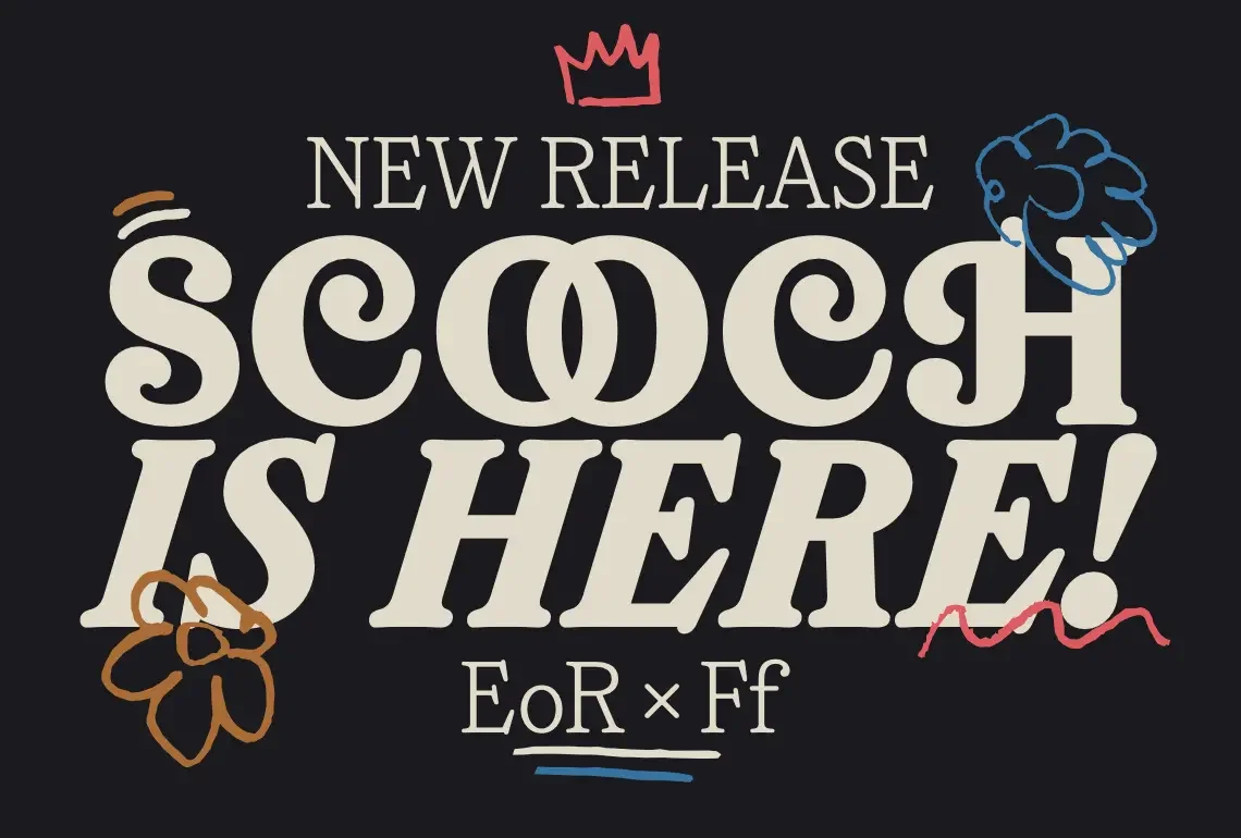
Scooch by Fred Wiltshire
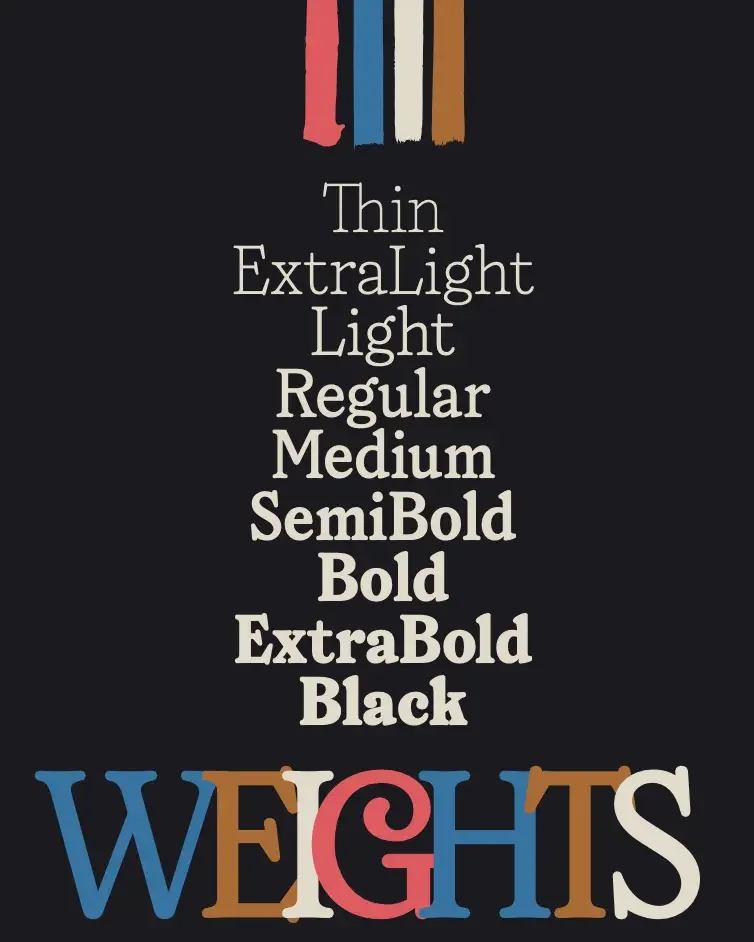
Scooch balances lively display details with a more controlled lowercase. Its swash capitals draw on 19th-century display faces, while a simplified t runs through the family as a consistent feature. The serif family can also function as text when a project needs it.
GS Merca by GS Type
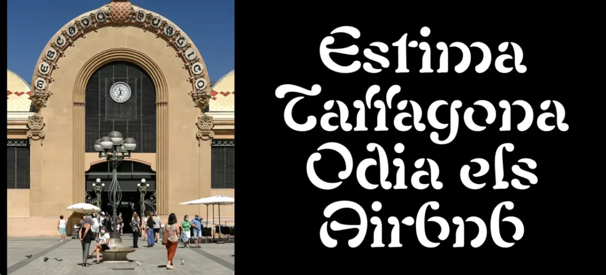
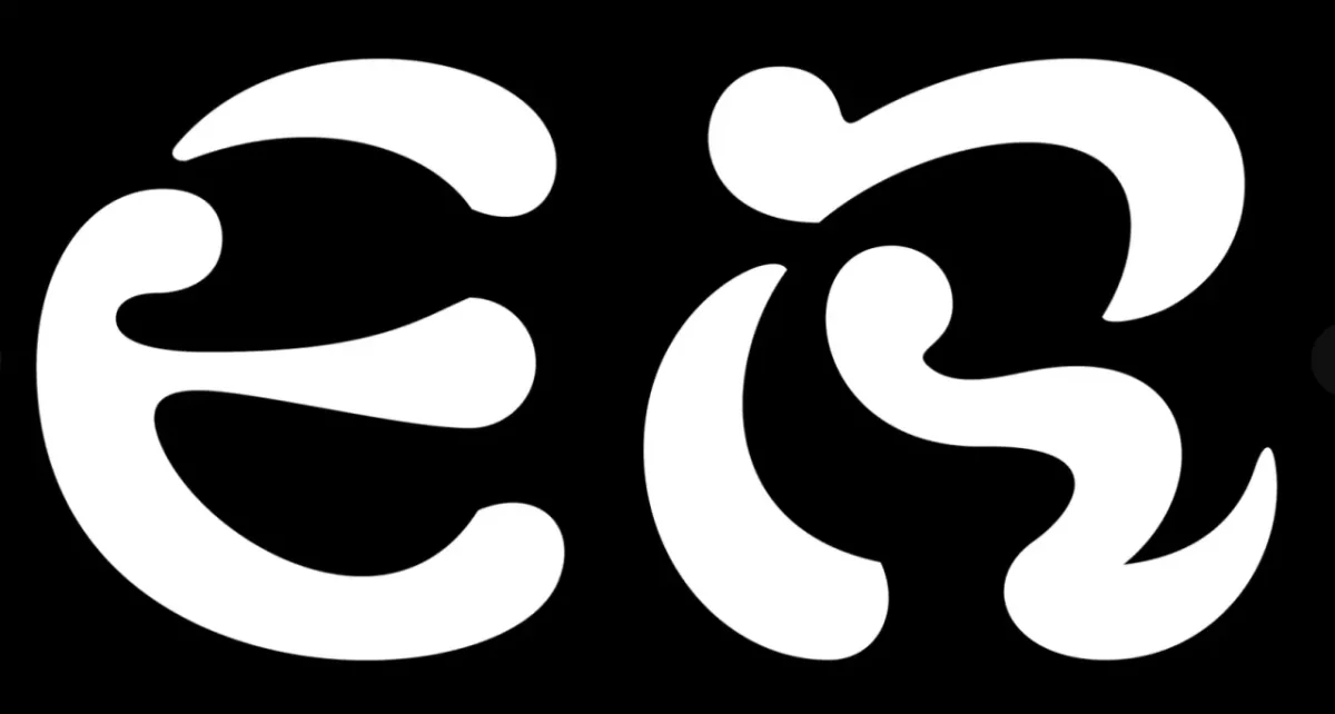
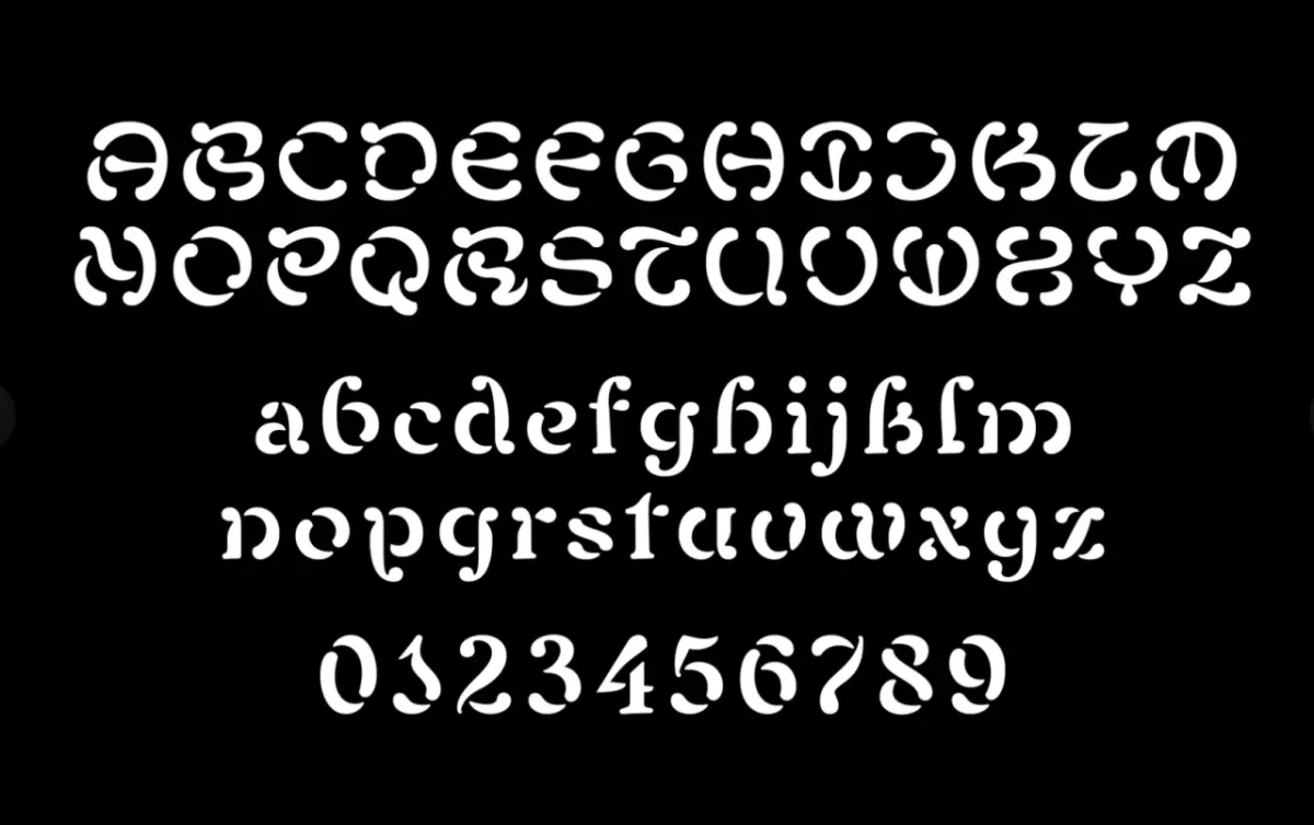
Gerard Sierra found the starting point in ornate lettering on the façade of a 1920s Art Nouveau market in Tarragona, Spain. The typeface preserves that character while adding a stencil-like edge; its lowercase extends the visual language into more contemporary settings.
Thorn Serif by Type Forward
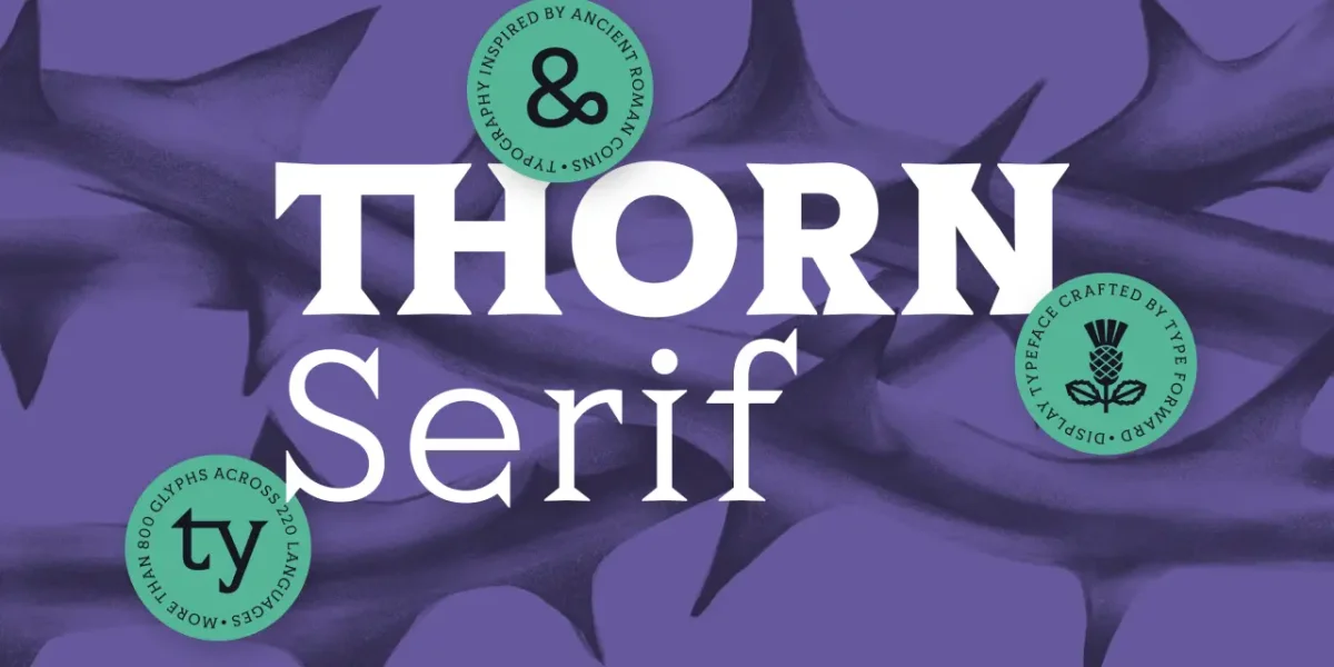
Ancient Roman coins inform Thorn Serif’s compact proportions, heavy serifs and low-contrast construction. Type Forward translates those raw, distinctive forms into a contemporary family.
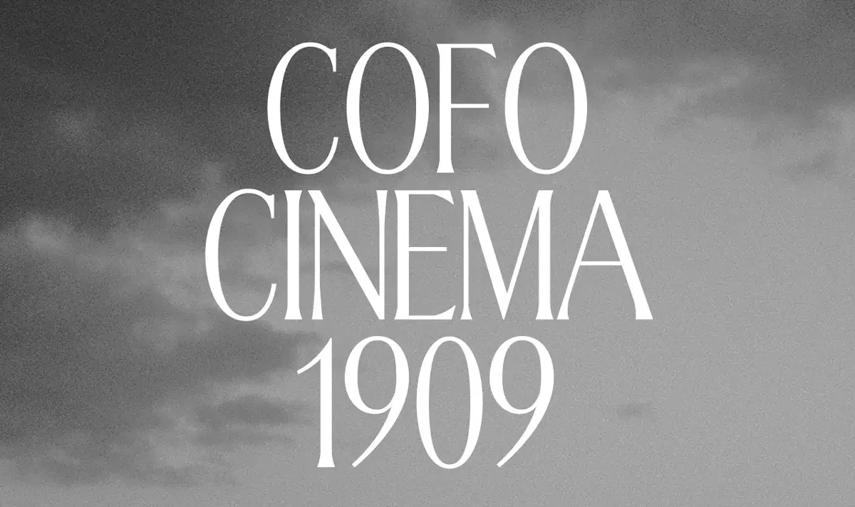
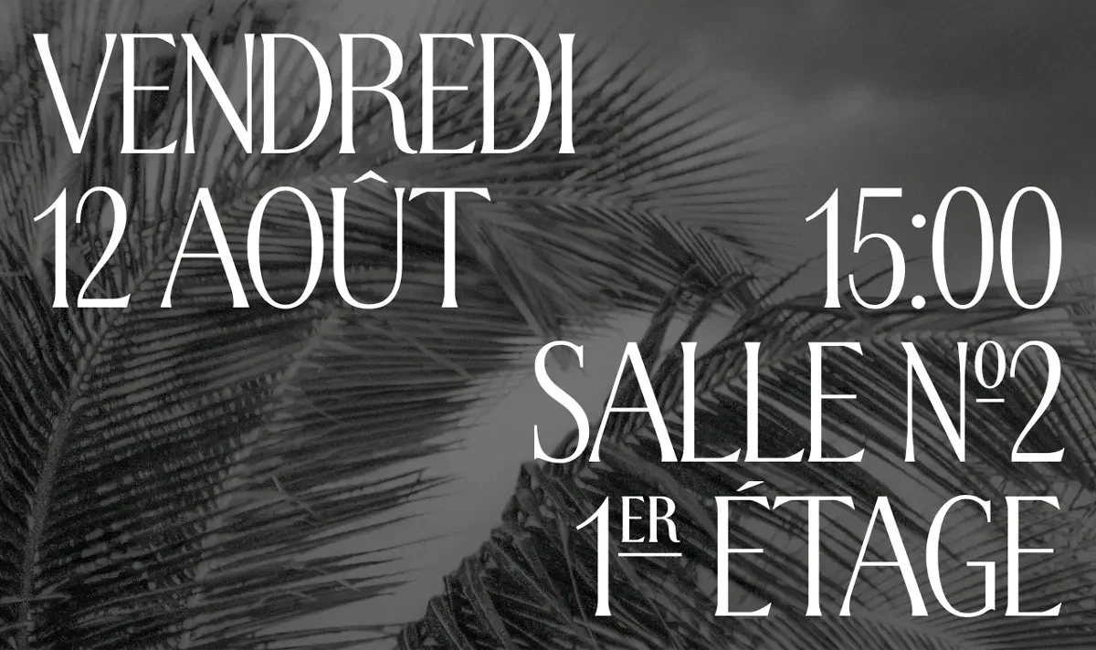
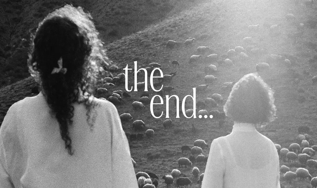
CoFo Cinema1909 by Contrast Foundry
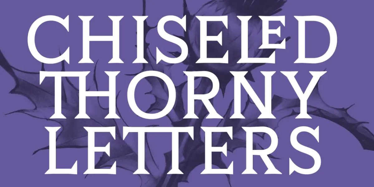
First made for one of the world’s oldest cinemas, Cinema1909 takes inspiration from metro-station lettering. Contrast Foundry’s latest update adds lowercase, ordinals and broader language support. Its decorative elegance suits compact headlines where space is limited.
Altus Grotesk by Type Innovations
Alex Kaczun, formerly principal type designer at Linotype-Hell and a contributor to the Adobe PostScript Font Library, brings that experience to his solo foundry. Altus Grotesk combines stylised, sharp-cornered capitals with circular forms and generous proportions for logos, posters and headline branding.
Across these releases, the most useful question is how a typeface changes the job of the layout. Twista Sans keeps widths steady as weights change; Hyperspace Cargo and Shuffle let designers tune form along variable axes; Thalo focuses on distinguishing letters for clearer reading. Other families turn material history into a visible part of the design. For teams choosing a face, that gives October’s crop a practical range: adaptable systems for production, and distinctive forms with a clear point of origin.


