Wednesday, October 14, 2026 · Graphic Design
Mirá Bakery’s Identity Turns Japanese-Brazilian Food History Into Fluid Design
Noted by Lisa Cain · 504 reads
Estudio CRU gives São Paulo bakery Mirá an identity shaped by Japanese-Brazilian food traditions, irregular forms and Nikkei Maru typography.
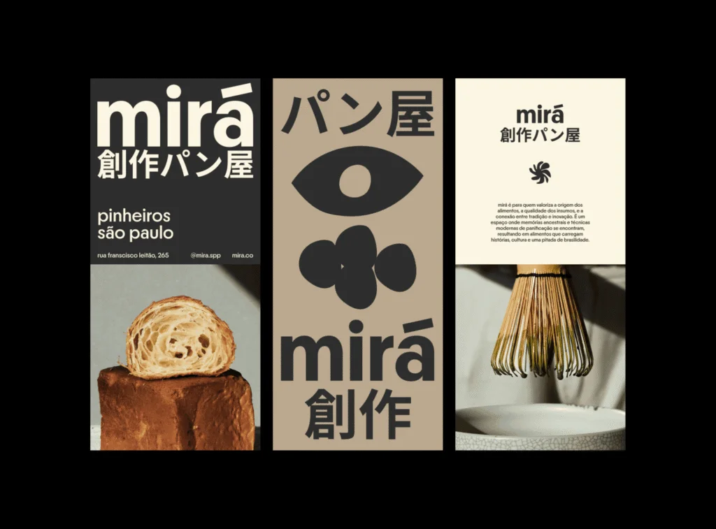
Mirá’s visual identity takes its cue from a history of adaptation rather than a checklist of Japanese and Brazilian symbols. For the artisanal bakery in São Paulo, Rio-based Estudio CRU built a flexible system around the variation of breadmaking, with typography, photography and colour bringing the work into focus.
The bakery pairs Japanese fermentation techniques with Brazilian ingredients, drawing on research, memory and haute cuisine. That combination has deep roots in São Paulo: Brazil is home to more than two million people of Japanese descent, the largest Japanese diaspora outside Japan. Japanese immigration began in 1908, and families adapted familiar food methods to ingredients available in their new home.
Miso and soy sauce were among the foods they made. Pickled papaya, watermelon and chayote show how those practices shifted in response to local produce. Mirá’s offer sits within that longer exchange. The identity has to make the relationship legible without reducing it to a visual shorthand for two national cultures.
A system built around variation
Estudio CRU looked to the process of baking for a form language. Its shapes are organic, fluid and deliberately irregular, echoing the fact that the same recipe can produce loaves with different forms. The identity’s elements can change from one application to another while still reading as part of Mirá.
That flexibility gives the system a practical foundation. A bakery’s identity has to appear across different materials and sizes, from prominent brand moments to everyday product presentation. A set of forms that can shift while retaining a recognizable character can respond to those changing needs. Here, variation isn’t a decorative layer added after the concept; it comes directly from the work of making bread.
The approach also avoids treating cultural reference as a collection of instantly recognizable motifs. Instead of leaning on familiar visual symbols, the studio connects the identity to the histories and routines behind the food. That choice gives the work more room to express the bakery’s particular mix of technique and ingredients.
Typography carries everyday history
Nikkei Maru is the identity’s typeface. Its inspiration comes from lettering found on immigrant-run shops, restaurants, hotels and other small businesses across the Americas. That reference connects the bakery’s typography to everyday commercial life and to Japanese migration across the region, rather than using type as a broad marker of cultural difference.
Japanese text describes Mirá as a creative bakery. Oversized Latin typography adds a contemporary presence, while generous spacing gives the layouts room to breathe. The contrast lets the two writing systems take distinct roles within the identity, with neither needing to turn into a decorative accent.
The earthy colour palette supports the work’s food focus. Paired with the irregular forms and spacious typography, it helps the identity feel grounded in materials and making. The available description doesn’t name specific colours or type sizes, so the palette’s exact shades and the system’s detailed typographic rules remain open to interpretation.
Photography looks closely
The photography brings the viewer close to the objects themselves. Bread appears almost geological when seen in cross-section, with its interior treated as a landscape of texture and structure. Matcha whisks receive similarly careful attention, photographed with the detail often given to fine jewellery.
That close view gives the identity a way to show craft without relying on explanatory copy alone. The bread’s cut surface can communicate the result of fermentation and baking through visible texture; the whisk images draw attention to a tool used in preparation. Together, the images connect the bakery’s ingredients, methods and finished work.
The photographic approach also holds the system’s different parts together. Typography can establish the brand’s presence, and the forms can shift across applications, while detailed imagery keeps attention on food and tools. The result described by Estudio CRU’s identity is a creative bakery with a specific cultural and culinary context, rather than a themed setting.
Fusion with a history behind it
Cross-cultural branding can flatten a complex relationship when it depends only on recognizable symbols from each place. Mirá’s identity points toward a more grounded way to approach the subject: look at how people, ingredients and techniques have met over time, then find visual decisions that relate to those connections.
For designers, the useful lesson is to locate the story inside the project before reaching for a familiar visual cue. In Mirá’s case, the history of adapting Japanese food practices to Brazilian ingredients gives the identity its context, while baking’s natural variation offers a visual principle the system can use. Those ideas give the work a clear foundation across lettering, form and photography—and leave room for the bakery’s own making to remain the focus.


