Thursday, October 15, 2026 · Graphic Design
DNCO’s Vermont Identity Uses Local Icons, Meso Type and Seasonal Colour
Noted by Emily Gosling · 684 reads
DNCO builds Vermont’s first consumer tourism identity around local signs, handmade details and a palette that shifts with the seasons.
Vermont’s new tourism identity gives the state a visual vocabulary beyond the familiar picture of covered bridges, fall leaves and maple syrup. Created by DNCO for the Vermont Department of Tourism and Marketing, the work is Vermont’s first dedicated consumer tourism brand. It aims to turn existing goodwill into visits by showing the range of stories and experiences behind the postcard view.
The brief grew from a recognition that Vermont was generally regarded as an appealing place, but that affection didn’t necessarily translate into people choosing to go there. The state sits in New England, bordering Canada to the north, Massachusetts to the south, New Hampshire to the east and New York to the west. It produces more than 50% of the maple syrup made in the US, and is known for its wooden bridges. Those are useful associations, but they leave much of the place out.
Research on the road
DNCO, a London- and New York-based agency focused on place branding and wayfinding, began with field research. The team travelled more than 400 miles, visited 14 towns and spoke with visitors and local stakeholders. That process surfaced details that could give the identity a stronger point of view: DNCO says Vermont has the country’s highest density of artists and writers, and that its farm-to-table culture took shape well before the phrase became widely used.
Those findings informed a broader idea of Vermont as a place with a strong storytelling culture and a quietly progressive streak. They also gave the designers material beyond scenic shorthand. For a place identity, the research matters because it can turn broad impressions into visual references with local meaning.

Typography with a handmade feel
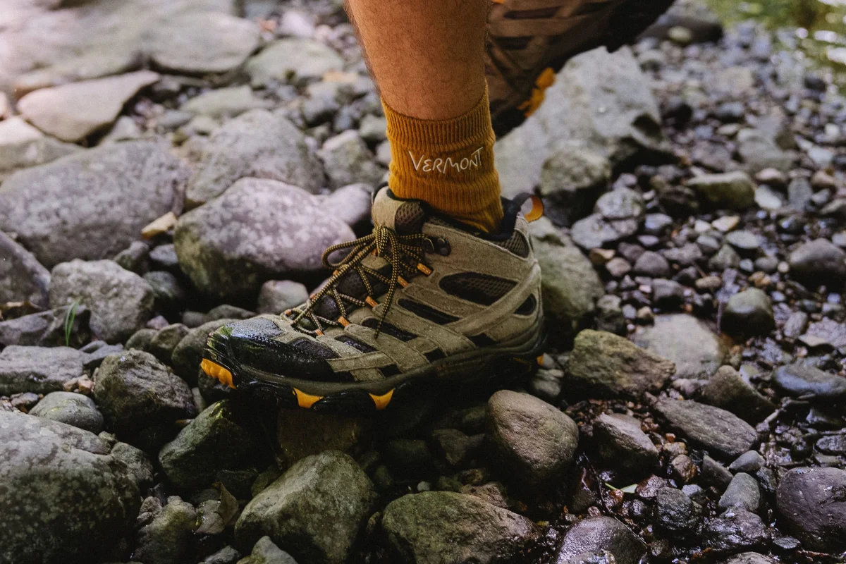
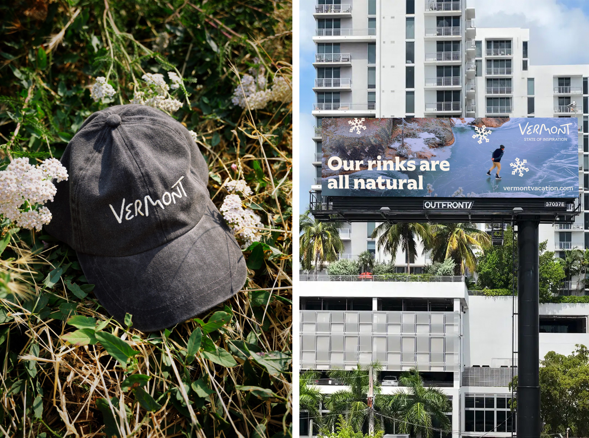
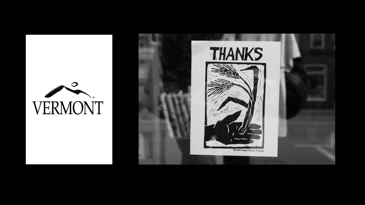
The wordmark, developed by DNCO and refined by lettering artist Rob Clarke, makes its references explicit. The “e” suggests a winding road, the “m” rises into hills, and the “o” evokes a moon over mountains while echoing the state administrative logo. There’s care in those forms, though the loose, hand-drawn treatment can read as overly playful. That’s a question of tone: the mark risks feeling less assured than the rest of the identity.
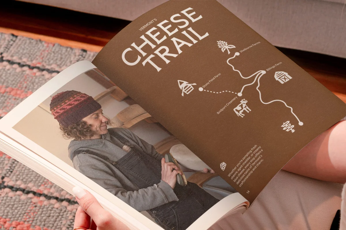
The supporting typography gives the system a steadier counterpoint. DNCO uses Meso, by London foundry Sociotype, in a range of weights. Its character draws on 1970s experimental serifs and the appearance of carved stone, lending the identity a crafted quality without pinning it to one historical period or place. That ambiguity lets the type feel rooted and contemporary at once.
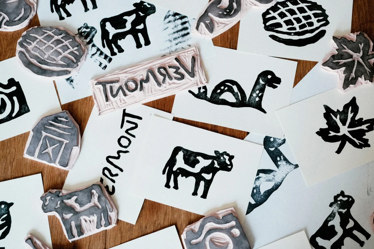
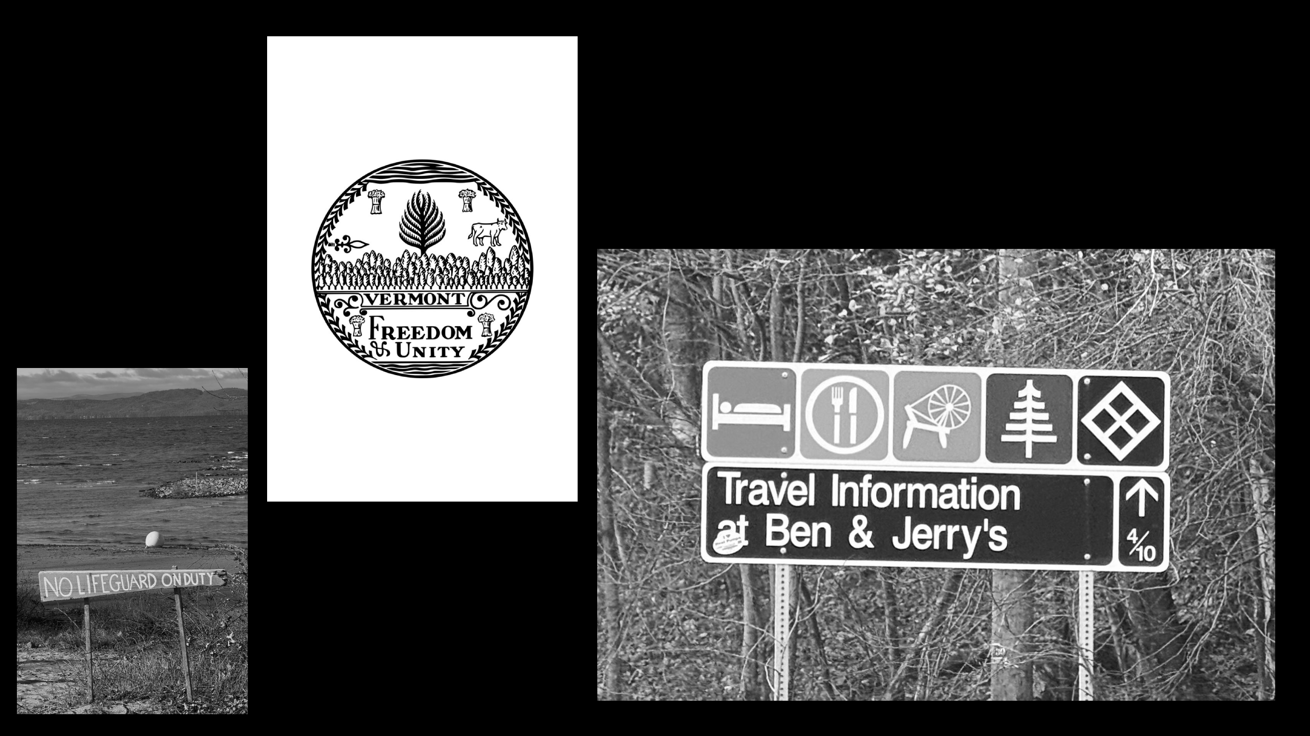
Handmade references run through the broader system, too. They come through most clearly in the icon library, developed by artist Alyssa McCabe, who has long-standing ties to Vermont. The icons draw on symbols from the state’s road signs, seal and administrative logo, as well as typographic ornaments in books by Vermont writers. The sources span practical navigation and print culture, bringing different parts of the research into one visual set.
The library covers food, landscape and culture, then adds more particular local references, including Champ, the supposed monster of Lake Champlain. Those details give the icons a role beyond decoration: they can tell visitors something specific about the place, rather than simply signal that it has countryside.

A palette built to change
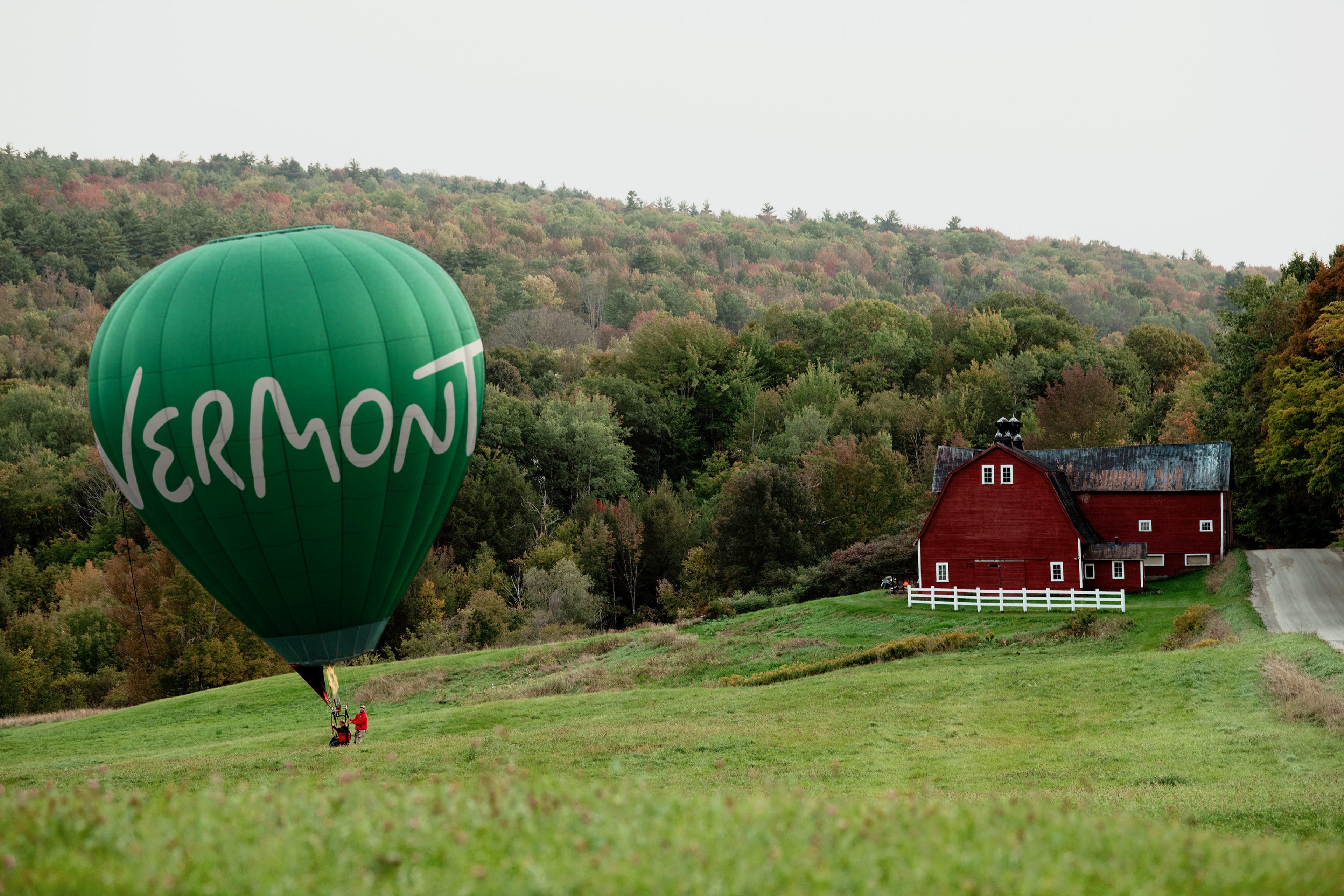
Colour follows the seasons, moving from spring greens to the deep reds and oranges associated with autumn foliage. The choice draws on an immediate association with Vermont, but the system’s purpose is more specific than simply looking seasonal: it’s designed to shift with the year and reflect the changing appearance and experiences of the place.
That seasonal logic connects the palette to the rest of the identity: the research, local references and crafted details all give the system reasons to feel particular to Vermont. The wordmark may be the least convincing element, but the icons and typography do much of the work of expanding the state’s image beyond rolling hills and syrup.
For designers working on place identities, the useful lesson is in the process: travel, observation and local sources can supply a visual system with material that familiar scenery alone can’t. DNCO’s work gives Vermont a way to tell more of its own story—and makes the seasonal change part of that story’s visual expression.


