Tuesday, October 20, 2026 · Graphic Design
Caserne Gives Let’s Grow Canada a Bold, Modern Food Identity
Noted by Emily Gosling · 638 reads
Caserne’s identity pairs a geometric maple leaf, vivid colour and expressive typography to make Canada’s food system feel human and contemporary.
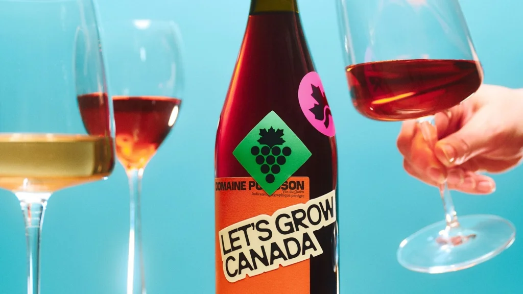
Caserne’s identity for Let’s Grow Canada makes a clear choice: present food and agriculture through contemporary graphic design, not familiar rustic shorthand. The Montréal studio builds the visual system around a geometric maple leaf, vivid colour, an unusually condensed headline face and a broad set of illustrations. Together, those elements give a wide-ranging subject a distinct visual voice.

Let’s Grow Canada launched in February 2026 as a long-term national movement initiated by Farm Credit Canada. Its aim is to strengthen people’s connection with the food that sustains them by celebrating the people who produce it, highlighting Canada’s agricultural strengths and encouraging ideas that can shape food’s future. Caserne worked on the identity and branding with agency Small Giants.
The name sets an inviting tone without turning into a heavy-handed instruction. “Grow” can refer to crops, knowledge and possibility; “Let’s” frames the effort as something shared. That balance matters for an initiative with a broad remit: it offers an open invitation, while the design supplies enough character to keep the message from feeling sentimental.
A maple leaf with room to grow
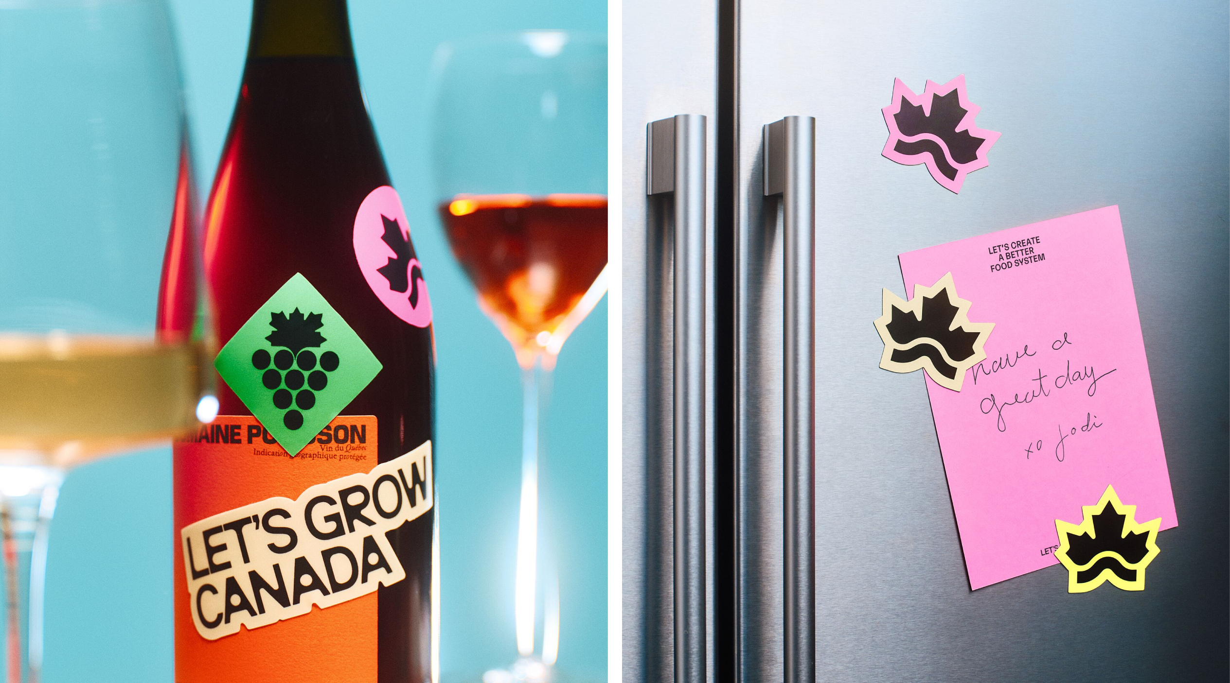
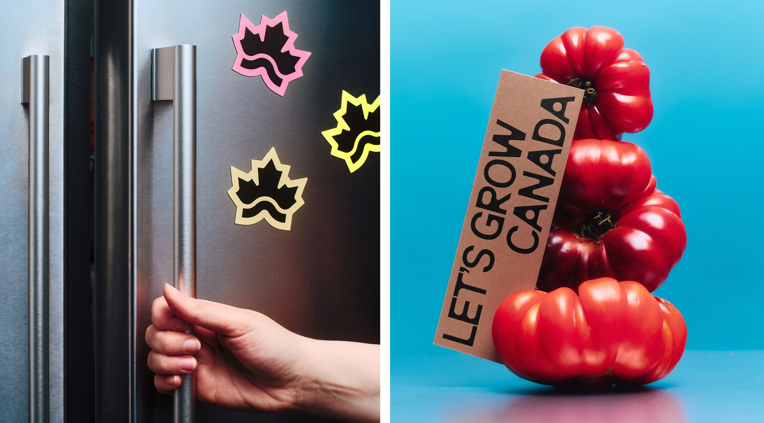
The primary mark reshapes the familiar maple leaf into crisp, angular geometry. Its points rise above a low, extended line that can read as a hill or a horizon. That combination connects the national symbol to cultivated land and open space, while the horizontal form gives the logo a sense of scale suited to an initiative spanning the country.
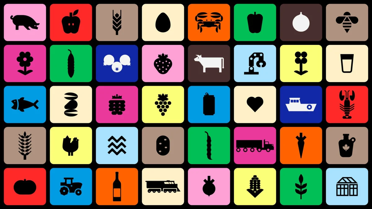
Because the leaf is simplified rather than reproduced literally, it can work beyond the main logo as a standalone graphic. Its straightforward construction should also translate across different sizes, from compact digital uses to large-format layouts. The same directness carries into the icon collection, illustrated with Benjamin Lamingo. More than 40 symbols cover parts of the food system, including poultry, dairy, fish, aquaculture and greenhouse produce.
The icons share the logo’s clean geometry and lively character. They’re designed to be quick to recognise, but they also do useful editorial work: together, the symbols make a complex network of products and processes easier to picture. That helps the identity communicate agriculture as a connected system rather than a single rural scene.


Typography that rejects the obvious
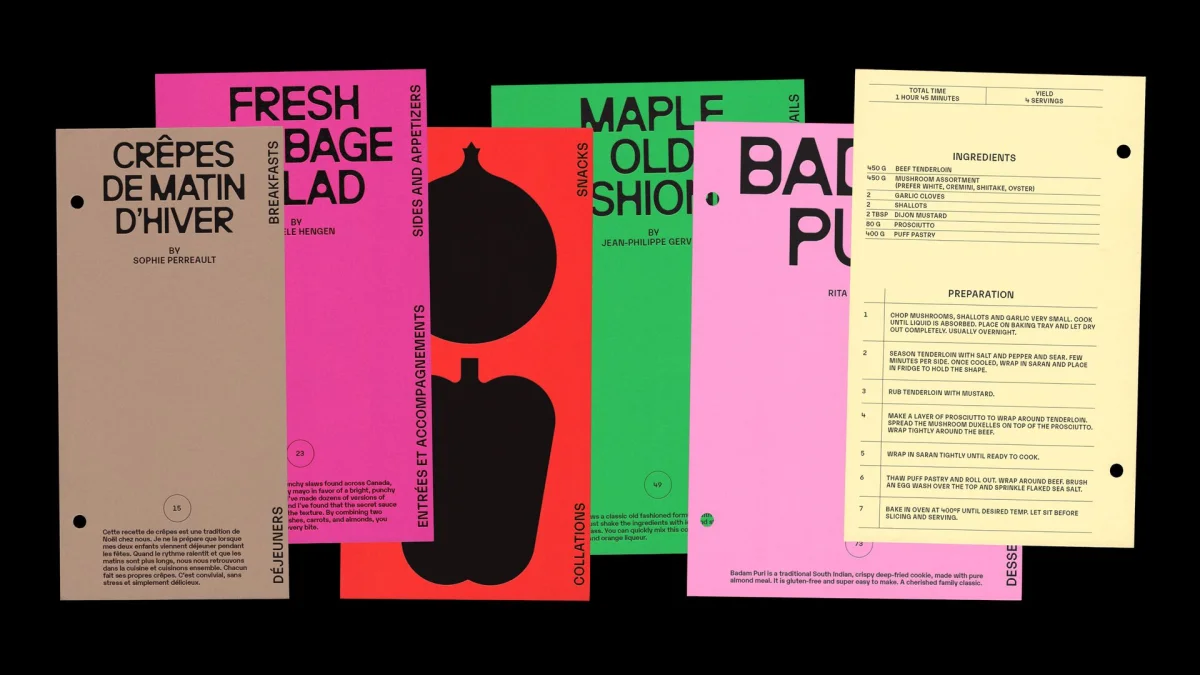
The headline face, Neue Brücke by Italian foundry Studio Claus Due, is a condensed neo-grotesque with geometric construction. Its dense, tightly spaced letters give headlines a strong presence, and the narrow proportions help fit substantial wording into limited space. It’s an unexpected choice for a food-focused identity—and that’s part of its value.
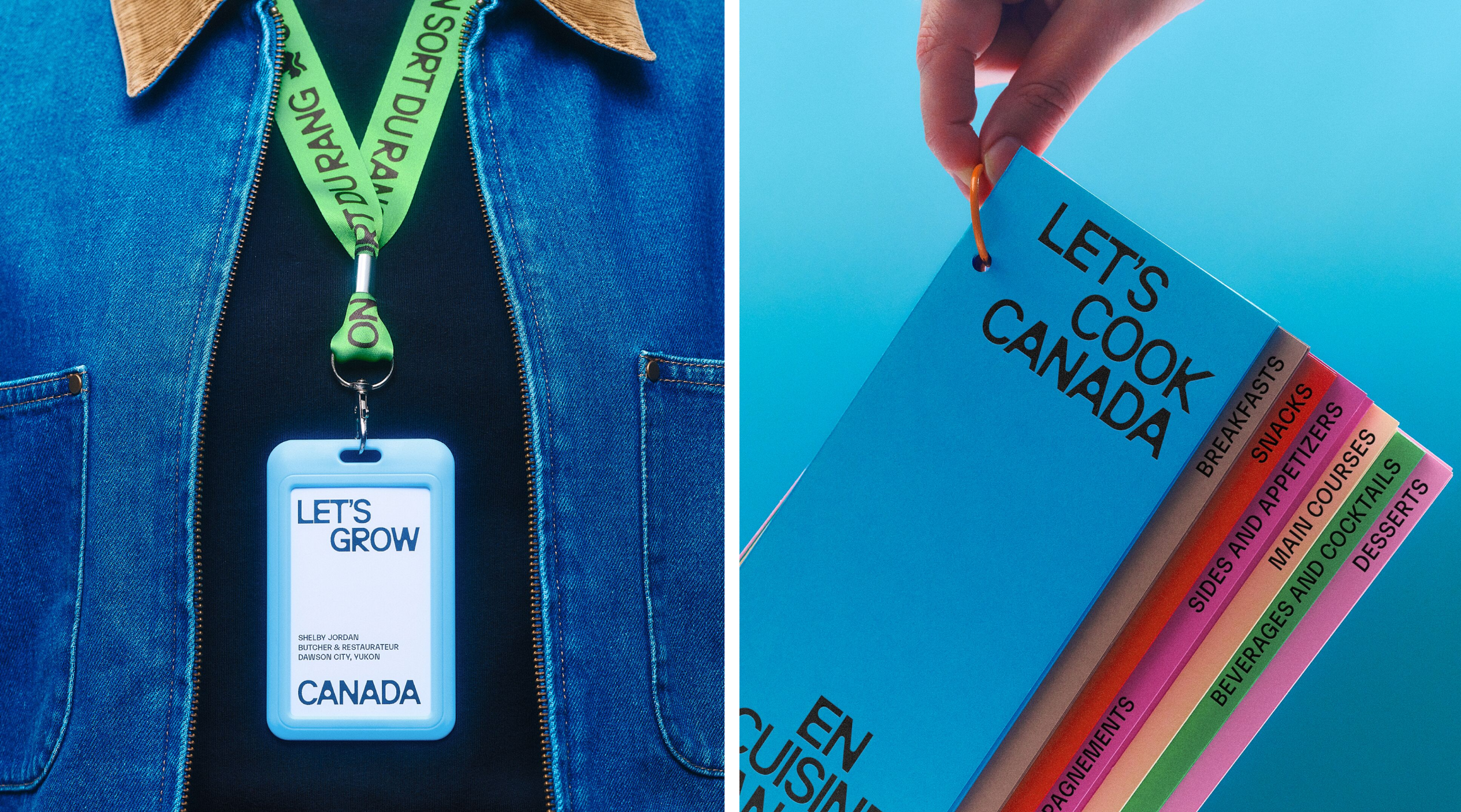
Rather than evoke farm equipment or pastoral nostalgia, Neue Brücke makes the system feel graphic and current. Its weight can stand alongside expressive photography and illustration without disappearing. Karelia by Monokrom adds a second neo-grotesque voice, bringing a different rhythm to the typography. Neue Haas Grotesk handles longer passages and functional information with a more neutral, readable tone. The three typefaces have distinct jobs, giving the identity both energy and practical range.
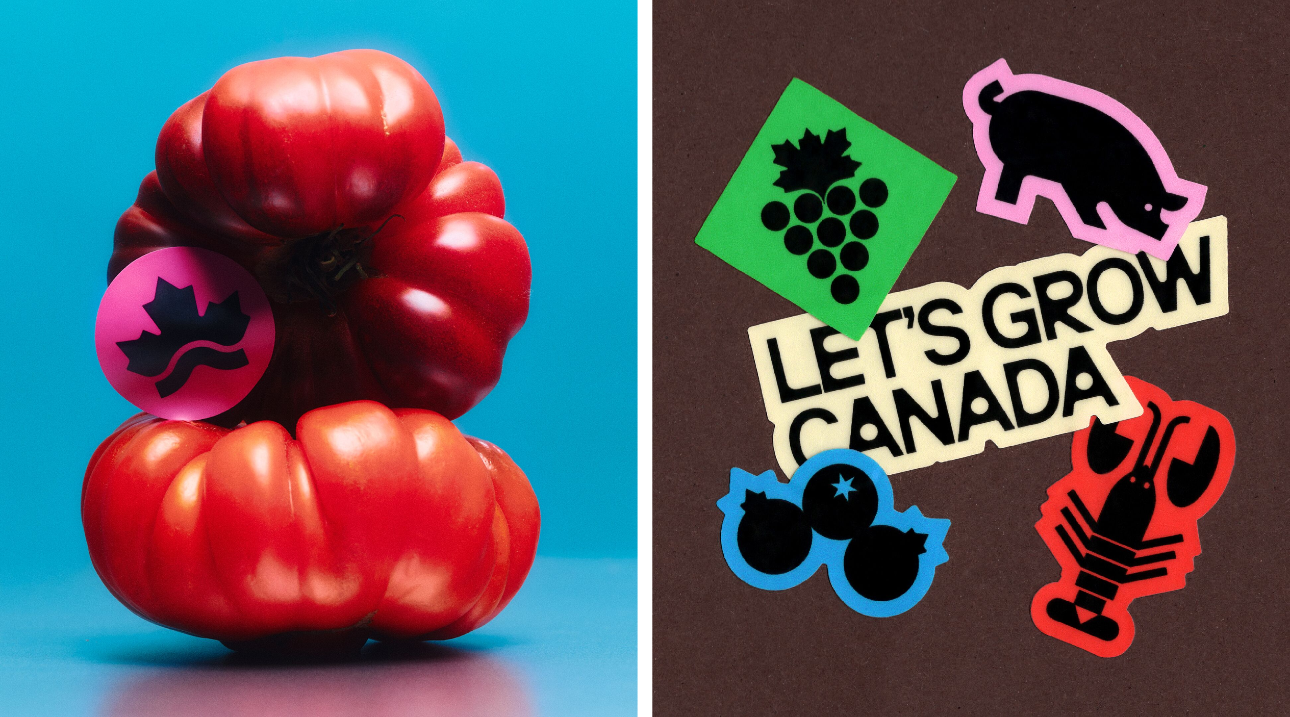
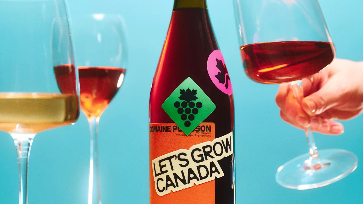
Colour follows the same logic. Saturated hues sit alongside lighter, cleaner tones, avoiding the reds, greens and browns commonly associated with agricultural branding. The brighter colours can appear in blocks, support the icons or provide backdrops for type and photography. This gives designers several ways to vary an application while keeping the overall system coherent and allowing images to breathe.
Photography and digital applications
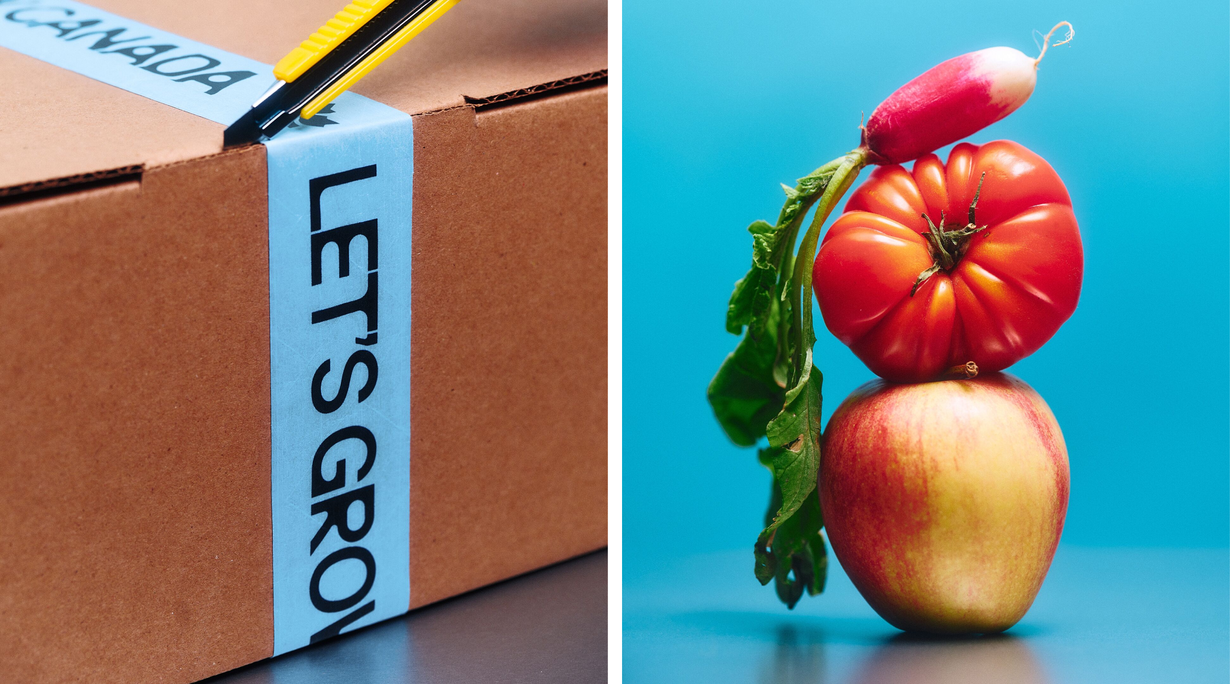
Photography brings a polished, editorial sensibility to the visual language. Art direction ranges from stacks of glossy tomatoes to broader landscape imagery, keeping the subject vivid without leaning on sentimental scenes. Nathan Lang handled the studio photography, with set design by Sarah Lamarche.
For the website, Caserne collaborated with Montréal-based Locomotive on web design and Pure Cobalt on development. The experience brings together stories about people in food production and information about Canada’s agricultural strengths. Photography, motion and typography give these different kinds of content a shared visual frame, while allowing the identity to respond to what each page is showing.
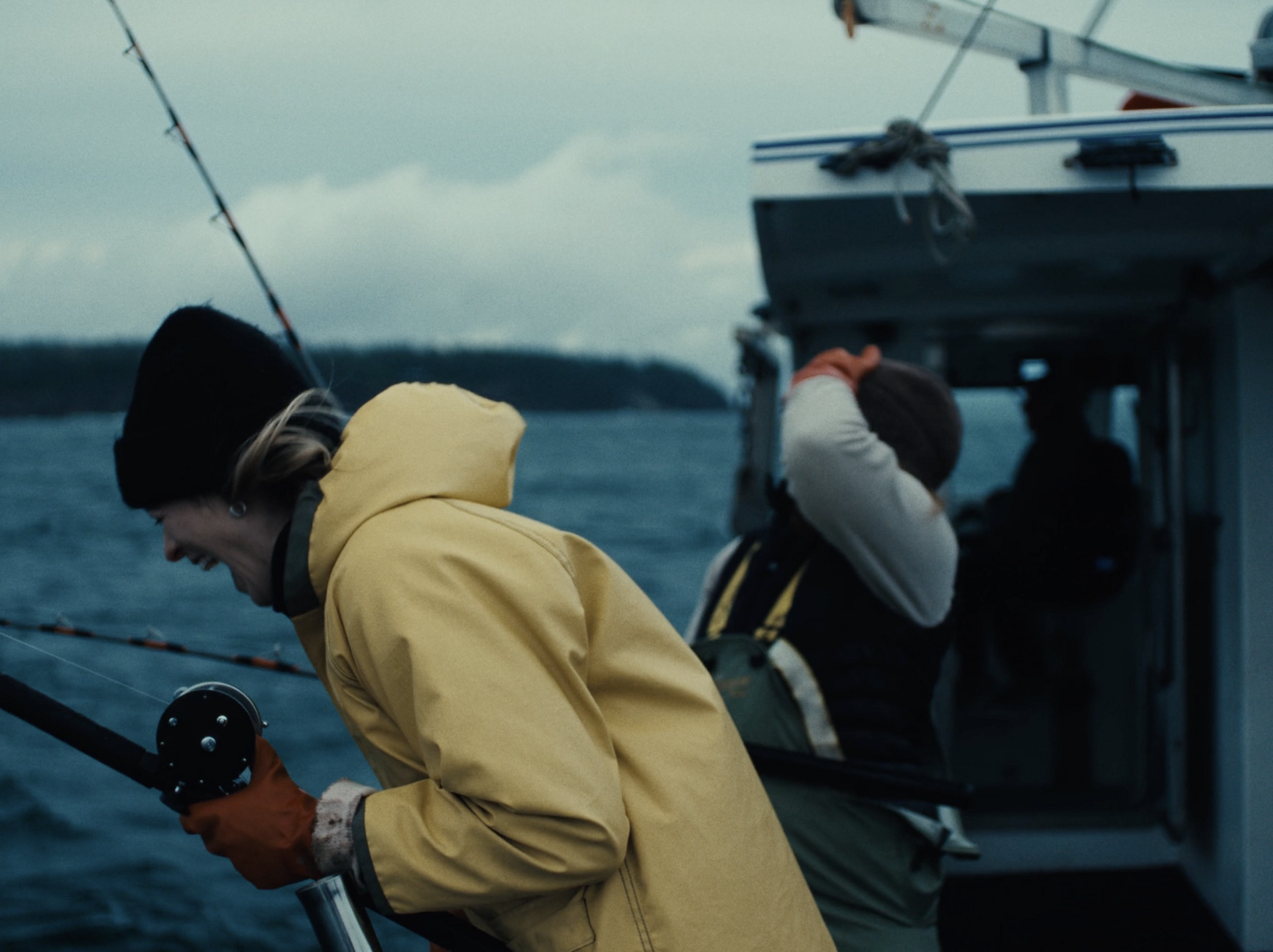
The launch film, directed by Vincent René-Lortie and produced with Small Giants, extends the identity into moving image, placing the people behind the food system at the centre. Across print, digital and film, the system’s strength comes from the same practical idea: use recognisable forms, flexible colour and typography with enough character to make a large subject approachable.
Caserne gives Let’s Grow Canada a visual presence that feels optimistic without asking for an earnest, folksy tone. For designers working on broad public-facing subjects, the useful lesson is how much can be done by giving each element a clear role: the leaf anchors the identity, the icons make its scope visible, and the type and colour keep the system lively across formats.