Thursday, October 22, 2026 · Graphic Design
Pentagram Builds Storefront Gala 2026 Identity from Grand Central Oyster Bar Lettering
Noted by Emily Gosling · 528 reads
Natasha Jen’s team turns the Oyster Bar’s bold lettering into a custom alphabet, vivid event graphics and animated social posts for Storefront Gala 2026.

The Grand Central Oyster Bar’s lettering gives Pentagram’s identity for Storefront Gala 2026 a strong sense of place. Natasha Jen and her team in New York took the restaurant’s distinctive sign as the starting point for a custom alphabet, then used it across the event’s printed pieces, screens and social posts. The result draws on a familiar piece of New York design history while making the typography do the work of a flexible event system.

Storefront for Art and Architecture, a Manhattan-based nonprofit, explores connections between architecture, art and the wider world through exhibitions, public programmes, publications and events. Its annual gala provides a significant part of the organisation’s funding. Pentagram has designed the event identity since 2012.

The 2026 gala took place on 28 September at the Grand Central Oyster Bar. It honoured artist Mel Chin, arts leader Deana Haggag and architecture firm SO–IL. The venue shaped the identity’s central design decision: build on the restaurant’s existing logo, designed by graphic designer and professor Rudolph de Harak, rather than invent a visual language detached from the occasion.


The Oyster Bar mark is built from tightly set letters with thick black outlines and vivid fills. Its forms have an exuberant, almost hand-doodled energy: the “O,” “S” and “R” in particular hint at lettering you might spot on a notebook or skateboard. That looseness stands out against the restaurant’s tiled vaults and dark wood, where the sign’s compact, colourful shapes make a confident contrast.
Pentagram extended the reference into a complete alphabet that could spell out the gala’s name and carry the graphics across different formats. The letters have broad, block-like strokes, clipped corners and angular counters. An octagonal “O” with a diamond-shaped opening establishes the geometry that recurs through the rest of the set. That shared construction gives the alphabet a clear internal logic even as the individual shapes retain some of the original sign’s eccentricity.


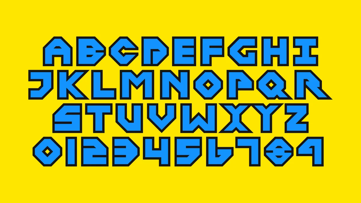
“Storefront Gala 2026” appears in compact stacks and stepped arrangements. Rotated numerals interrupt the tight alignment, while the heavy outlines allow adjacent characters to meet and lock into larger shapes. The typography shifts between reading as a name and acting as a constructed graphic. There’s a satisfying tension in that setup: the alphabet feels carefully engineered, but the compositions have enough irregularity to avoid looking mechanical.
The reference has echoes of Bauhaus in its interest in shape and construction, though the effect here is more playful than austere. The bespoke lettering is doing several jobs at once: it forms the wordmark, supplies the main graphic motif and creates patterns across the applications. A smaller sans serif handles the practical event details, giving the display letters room to dominate without asking them to carry every piece of information.
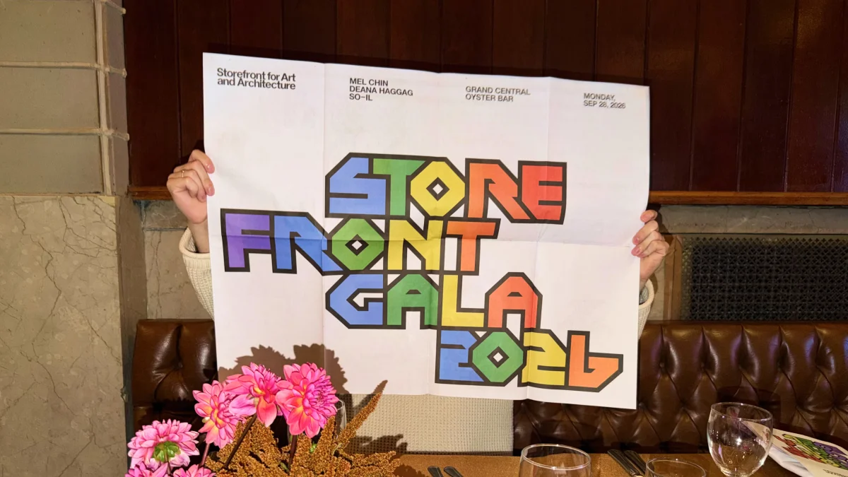
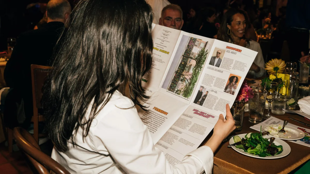
The palette runs through bright blue, green, yellow, orange, red and purple. Black borders keep the colours distinct when the letters crowd together. Across posters, digital announcements, a folded programme, screen graphics and embroidered caps, the system alternates between white space and saturated backgrounds. One especially vivid candy pink adds another note to the mix. On white, the many-coloured letters become the focal point; on a single-colour field, the outlines and contrasting fills gain extra punch.

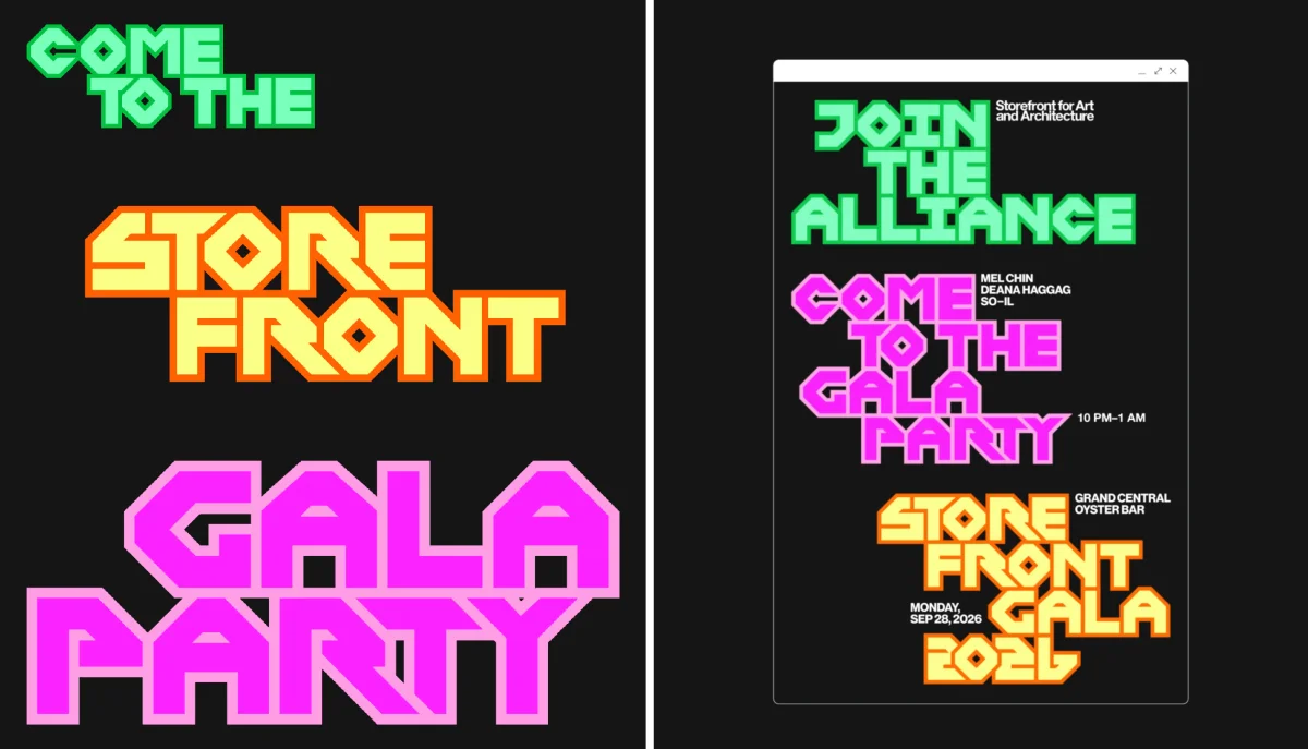
Motion gives the alphabet another dimension in the social graphics. Letters move, change colour and shift form, turning the static system’s controlled stacks into a more open-ended sequence of variations. That flexibility follows from the typeface’s role as the identity’s main visual material: once each letter is designed as a distinct shape, animation can rearrange and transform the parts without losing the family resemblance.
Building a whole event identity around a recognisable restaurant logo carries a design challenge. The source mark has its own history and following, so a close reference could easily feel like an imitation or a nostalgic flourish. Here, the connection is grounded in the gala’s venue. The custom alphabet carries over the Oyster Bar lettering’s bold outlines, colour and unusual geometry, while expanding those ingredients into a system with new compositions and uses.
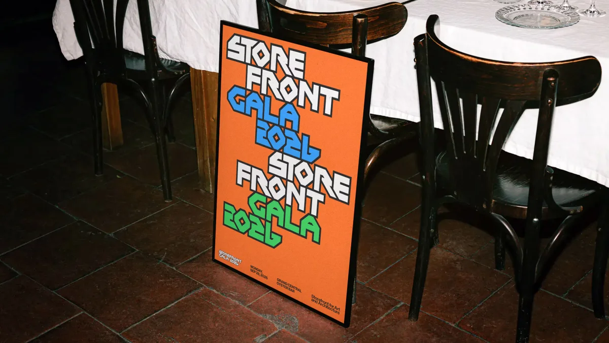
That balance is the identity’s most useful lesson for designers working with a strong local reference: the source needs to inform the system’s construction, not just decorate it. Pentagram’s extended alphabet gives the reference enough range to move from a compact gala name to oversized poster lettering, print details and animated screens. The 2026 identity keeps its visual anchor specific to the place, then lets the letters carry that idea across the event.