Thursday, October 1, 2026 · Graphic Design
Vrints-Kolsteren Builds Napoli on the Road’s Identity Around Four Moving Letters
Noted by Emily Gosling · 915 reads
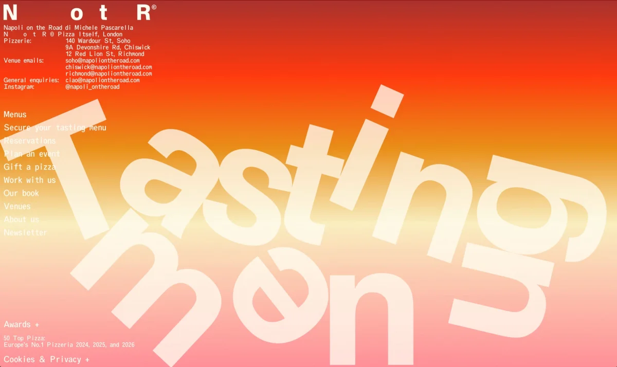
For Napoli on the Road, Vrints-Kolsteren pairs tumbling NotR typography with travel-inspired graphics, spare colours and an adaptable layout.
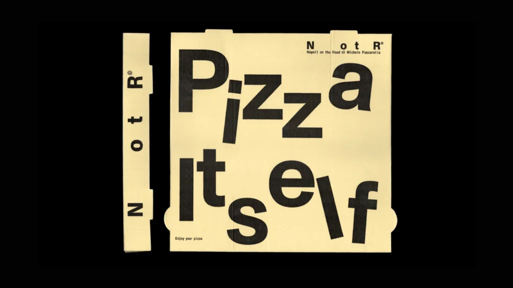
Napoli on the Road’s new identity turns a practical naming decision into its central graphic idea. Antwerp studio Vrints-Kolsteren shortens the restaurant’s name to NotR, then gives those four letters room to drift, bunch up and travel across the brand’s applications. The result links the pizzeria’s mobile beginnings to a visual system that can stretch from a compact label to a restaurant sign.
Napoli on the Road was founded in 2016 by pizza chef Michele Pascarella. It began as a street food operation in a three-wheeled Ape Piaggio truck fitted with a wood-fired oven, serving locations including farmers’ markets around London. The business now has three London outlets: Soho, Chiswick and Richmond. The article, published on 1 October 2026, reports that the pizzeria was named Europe’s No. 1 Pizzeria for three consecutive years, 2024 to 2026, and was recognised as the World’s 5th Best Pizzeria 2025 by the 50 Top Pizza World Awards 2026.
A name that carries the movement
The identity takes its cue from that first travelling kitchen. Rather than illustrating a vehicle or relying on a literal road motif, Vrints-Kolsteren makes movement visible in the lettering itself. The widely spaced characters in NotR seem to occupy separate points along a route; their changing positions bring a sense of motion to an otherwise spare composition.
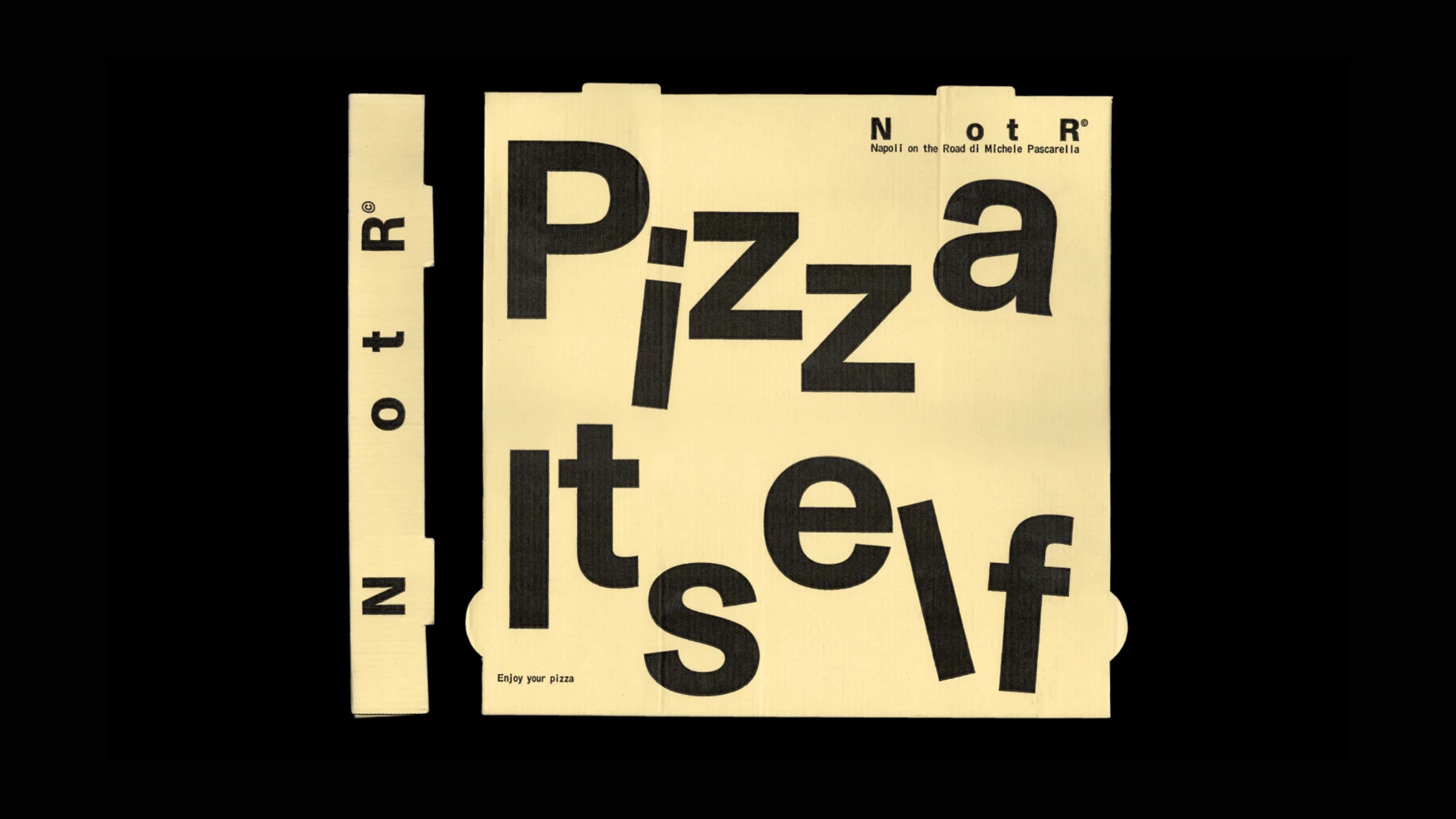
That abbreviation also gives the system a useful working format. “Napoli on the Road” is a long name to repeat across small labels, packaging and menus. Four letters can sit inside a stamp-like block, spread out across a wider surface, repeat as a pattern or be cropped at the edge of a layout. The identity gains variety from adjusting a small set of elements, rather than introducing a different graphic device for every application.

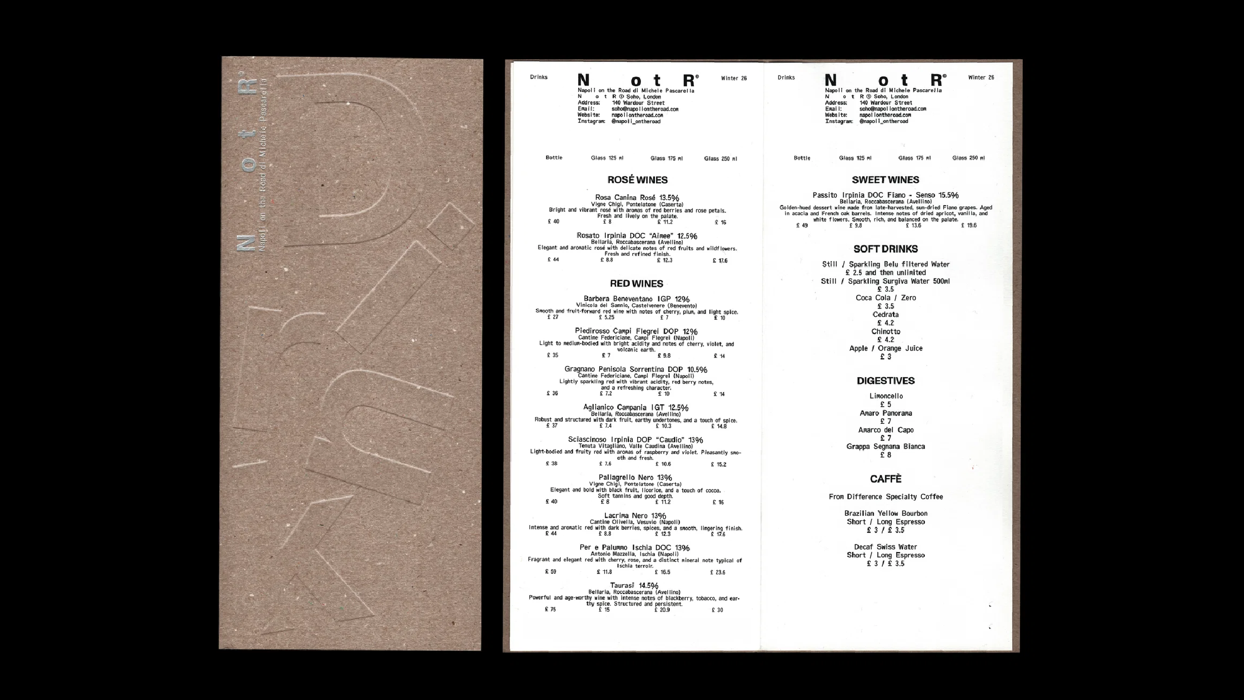
Two typefaces, two kinds of order
Typography holds the system together. Vrints-Kolsteren uses two typefaces from Berlin foundry ABC Dinamo: Monument Grotesk and Oracle Triple. Monument Grotesk supplies a sturdy, straightforward voice. Oracle Triple adds a more peculiar rhythm: its monospaced construction recalls codes, labels and industrial information, while its unusual proportions keep that functional reference from feeling purely technical.
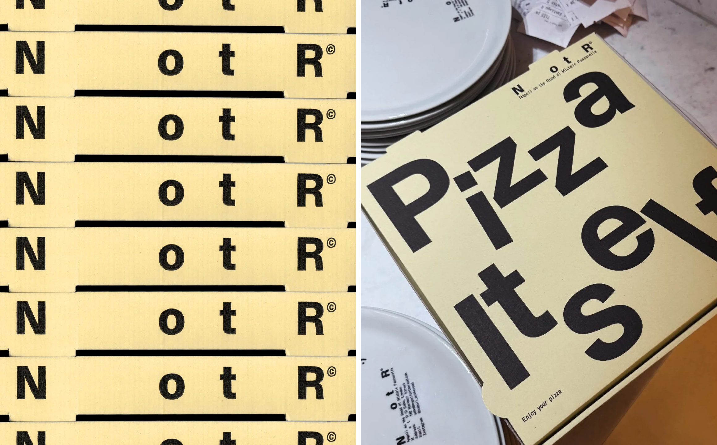
The typeface’s designers describe Oracle Triple as “an exploration of a strict rhythm with silly results.” Each letter’s bounding box is divided into thirds, and different characters occupy different numbers of those units. That system gives the lettering its distinctive mechanical structure, but the uneven forms introduce a quiet visual joke. In the NotR identity, this tension suits the brand: the layouts borrow the order of transport labels, while the typography keeps them from looking generic.

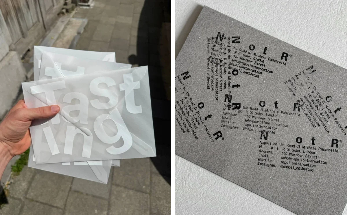
Graphic traces of a journey
Across the applications, the studio draws on the everyday graphics associated with moving goods: stamps, labels, codes and markings. These references make the identity feel as if it is in transit, with each piece of packaging or printed matter acting like a parcel between stops. Boxes and menus become part of the same visual language, rather than isolated branded objects.
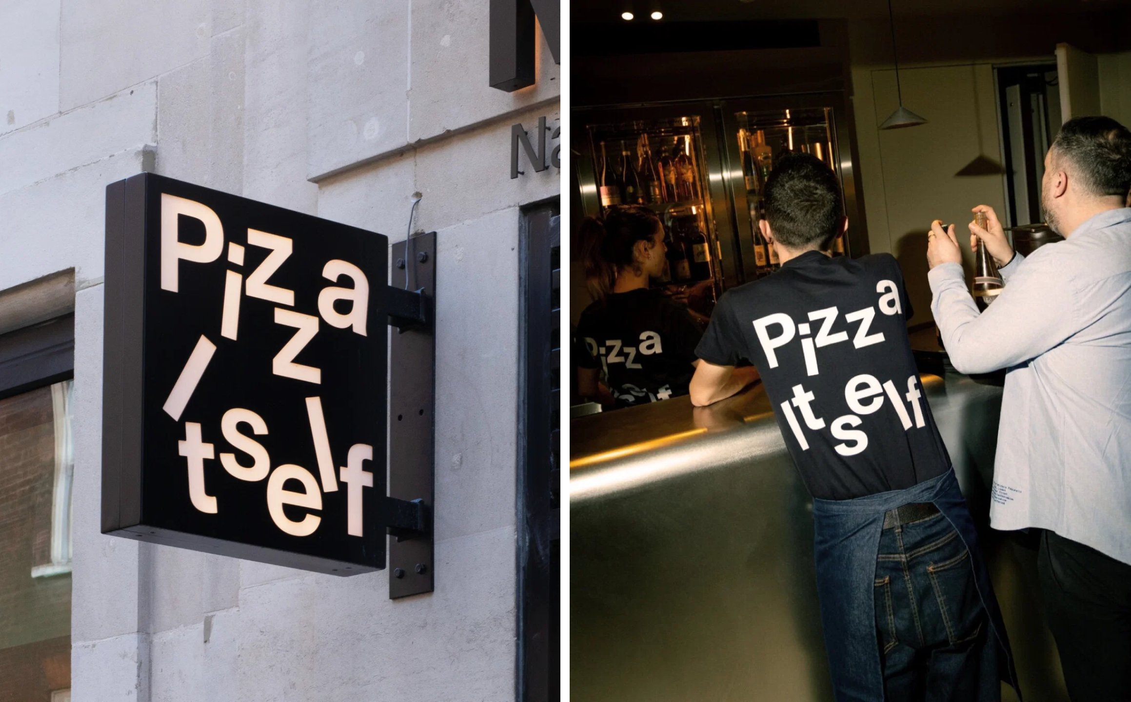
The palette keeps the system restrained: black, white and creamy off-white. That limited range gives the type and spacing more room to do the expressive work. On signage, the words can become more abstract, with copy such as “Pizza Itself” standing in for a full brand name. Recognition comes through the identity’s repeated visual choices, not simply through printing “Napoli on the Road” everywhere.
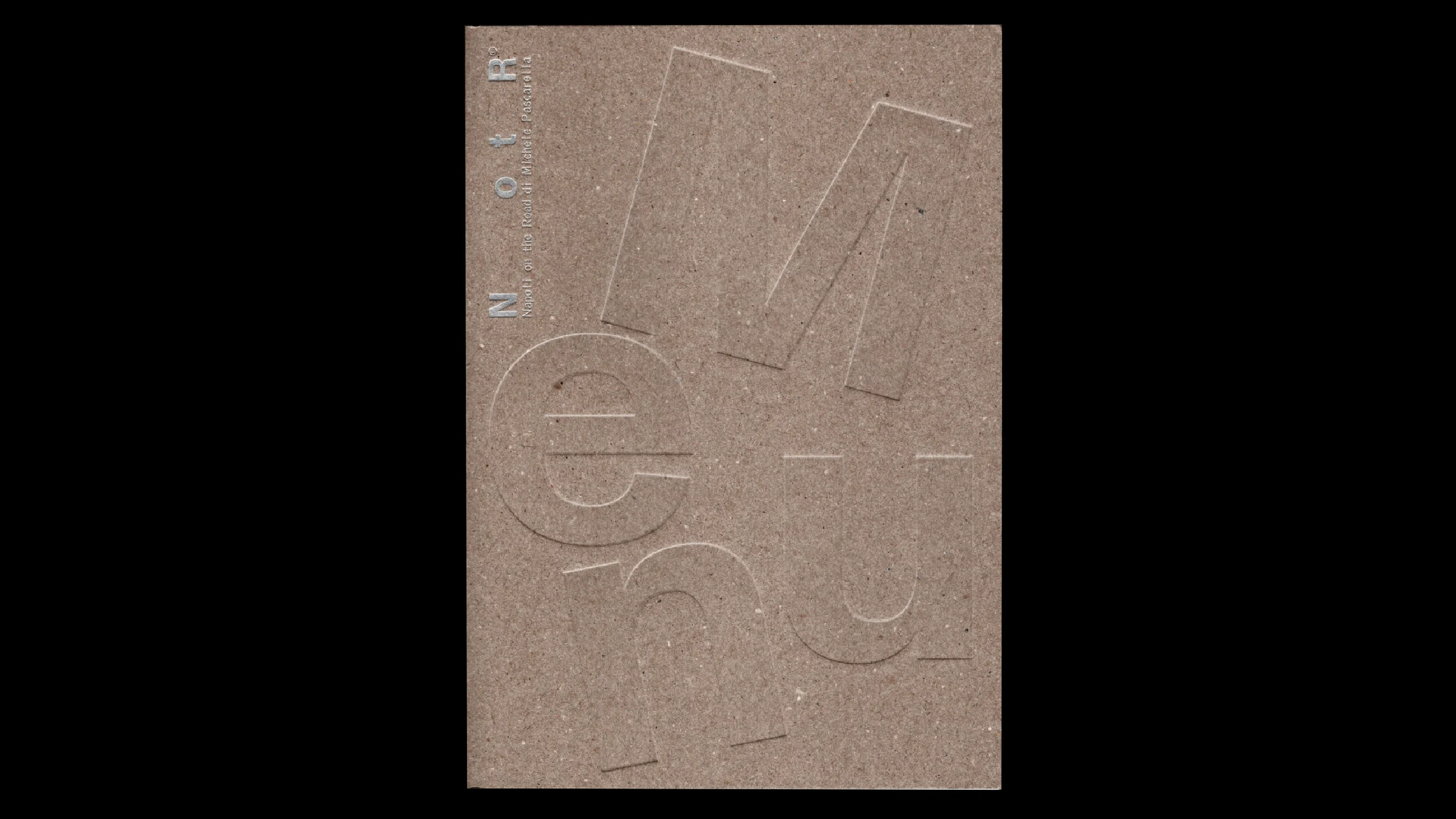
That flexibility supports ambitions beyond the restaurant’s immediate category. The source says NotR has spoken about extending into music, art, fashion, travel and culture. The identity’s mix of utilitarian references and loose typography gives it room to appear in those settings without leaning on food imagery as its only cue. A menu and a piece of cultural material can share a visual language while serving different purposes.
My read is that the strongest decision here is the link between the brand’s history and its graphic behaviour. The travelling truck becomes generous letter spacing; the operational details of transport become labels and codes; the minimal palette lets those gestures stay clear. For designers, it’s a useful reminder that a flexible identity can grow from one well-chosen constraint. In this case, four letters carry the route.