Wednesday, September 30, 2026 · Graphic Design
Riff’s Pasta Packaging Makes Room for a Dinner-Time Riff
Noted by Lisa Cain · 578 reads
Designed by Center for Daniel Humm and Mark Ramadan’s meal range, Riff pairs bold colour and plate imagery with a product built for improvisation.
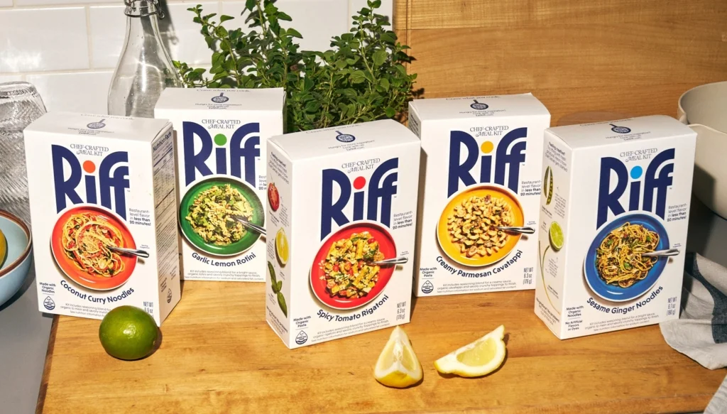
Riff’s packaging makes a clear promise: dinner can start with a box and end wherever the cook takes it. The shelf-stable pasta and noodle meals leave room for add-ins, so the design’s direct, open approach fits a product that offers a starting point instead of a finished performance.
Created by chef Daniel Humm and CPG entrepreneur Mark Ramadan, Riff brings Humm’s food experience into a format for evenings when cooking from scratch feels like too much. Humm is known for the tasting menus at three-Michelin-starred Eleven Madison Park. Here, the meal comes in a cardboard box: pasta or noodles, seasoning and a crunchy topping, cooked together in one pot in around 20 minutes.
A meal with room to change
The product sits between a fully prepared convenience meal and a recipe that asks the cook to provide every ingredient. Follow the box as it comes, or add whatever suits: vegetables, herbs, leftover chicken or lemon. The base meal is ready to go, but the cook still has a say in how it turns out.
That flexibility gives the name its point. Riff takes its cue from music, where a repeated phrase can become the basis for improvisation. The idea translates neatly to dinner: the packaged meal sets the rhythm, and the cook decides whether to keep it simple or add another layer.
For design teams, that product idea offers a useful way to judge the packaging. Does it make clear what comes in the box? Does it leave the possibility of personal additions legible, without making the meal look incomplete? Riff’s visual approach leans into clarity. The package foregrounds the brand and the dish, keeping the proposition easy to grasp at a glance.
One mark ties the range together
Center carries the improvisational idea into a visual system built around an oversized Riff logo. Its scale makes the name the most prominent feature on the box. Across the range, the dot over the “i” changes colour to match the plate shown below, giving each variety a distinct cue while keeping the products recognisable side by side.
This is a compact way to create variation without asking every package to look unrelated. The shared wordmark supplies consistency; the colour shift helps distinguish one meal from another. When several boxes are grouped together on a shelf or in a cupboard, those small changes can help shoppers spot a preferred variety while still reading the products as one family.
The colours also have a connection to Humm’s earlier work. The palette was partly inspired by his watercolour paintings of vegetables in his book Eat More Plants. That reference brings a trace of his restaurant world to a very different kind of meal. It gives the colour choices a source beyond simple flavour coding, while keeping the system tied to the food itself.
The plate gets space
Riff gives the meal a large visual presence, pairing the prominent logo with a big plate image. There’s little competing for attention. The result looks straightforward and food-led: viewers can connect the brand to the dinner it’s offering without working through a dense set of graphic elements.
That restraint also suits the product’s flexible character. A crowded package could make the meal seem like a fixed recipe with one correct outcome. A clear image of the dish, alongside an assertive name, communicates the basics and leaves the possibility of variation to the cook. The packaging doesn’t need to illustrate every possible addition; those will depend on what’s already in someone’s fridge.
There’s a practical design lesson here in matching visual emphasis to a product’s job. The box has to be recognisable and show what the customer is buying, but it also has to make the meal feel approachable. Riff’s large-scale mark and plate do that work quickly. The colour variation helps organise the range, while the restrained layout keeps the central proposition in view.
Designed for a lower-effort evening
Convenience food is often framed as a choice between doing everything yourself and doing nothing at all. Riff occupies the middle: one pot, around 20 minutes, and the option to add ingredients. That distinction matters to the design because the package needs to signal both ease and participation. It can’t suggest that the cook must follow a demanding recipe, or that there’s nothing left to do.
Center’s system appears to make that balance through a few direct decisions: a dominant logo, a plate with plenty of space, and colour changes that identify the different varieties. The music-inspired name reinforces the same thought. Each part points toward a meal that’s ready to begin, but open to adjustment.
For teams designing food ranges, Riff is a reminder to let the product’s actual use shape the visual story. When a meal is meant to be adapted, the package can communicate a dependable base without prescribing every detail. Riff’s box starts the conversation; what goes into the pot after that is up to the cook.


