Tuesday, September 29, 2026 · Graphic Design
JKR’s Tropical Smoothie Cafe Identity Turns Palm Trees and Orange Type Into a Brand System
Noted by Emily Gosling · 382 reads
JKR builds Tropical Smoothie Cafe’s identity around a palm tree T, vivid orange type and a custom display font, extending the sunny mood from cups to interiors.
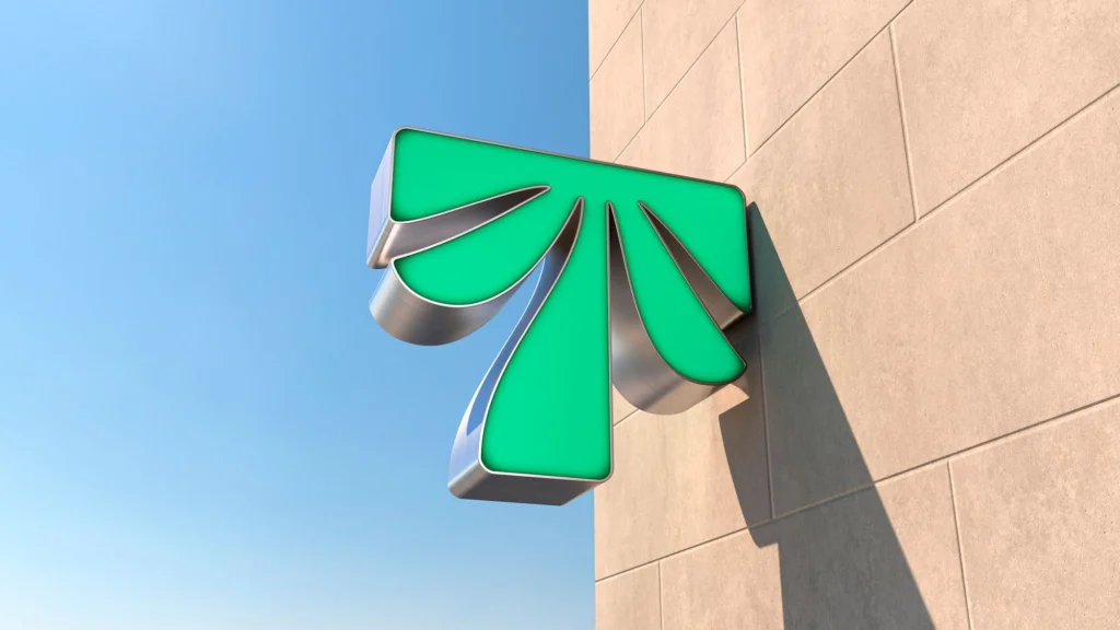
For Tropical Smoothie Cafe, JKR’s new identity makes the name its own design brief. A palm tree, vivid orange lettering and fruit-forward imagery establish the expected tropical cues, then carry them across packaging, signs, interiors and uniforms. The system’s strength is its clarity: it treats “tropical” as a feeling guests can recognize, rather than a destination the brand needs to depict literally.

The identity was created by JKR for a US smoothie chain founded in 1993. The company now has franchises in more than 1,700 locations across the country. Its expansion over roughly the past decade prompted the brand overhaul, which also covers the guest experience. A central part of the brief was bringing the existing tagline, “Eat Some Good!”, to life. The source article is dated 29 September 2026.
A simple symbol with room to travel
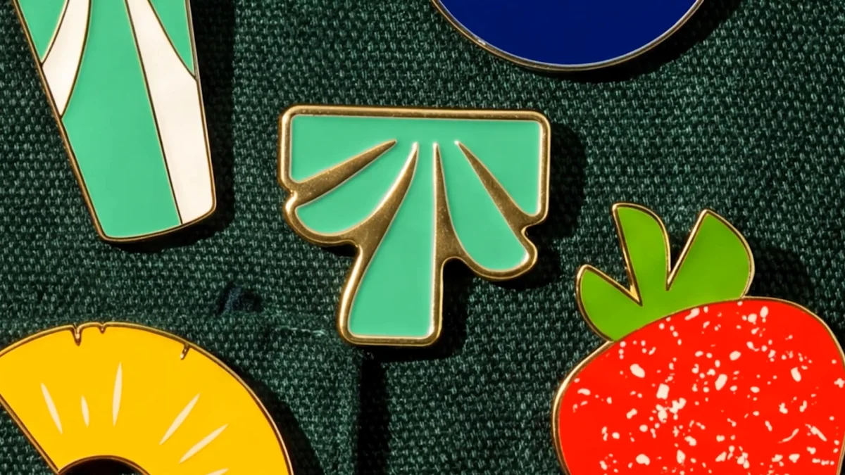
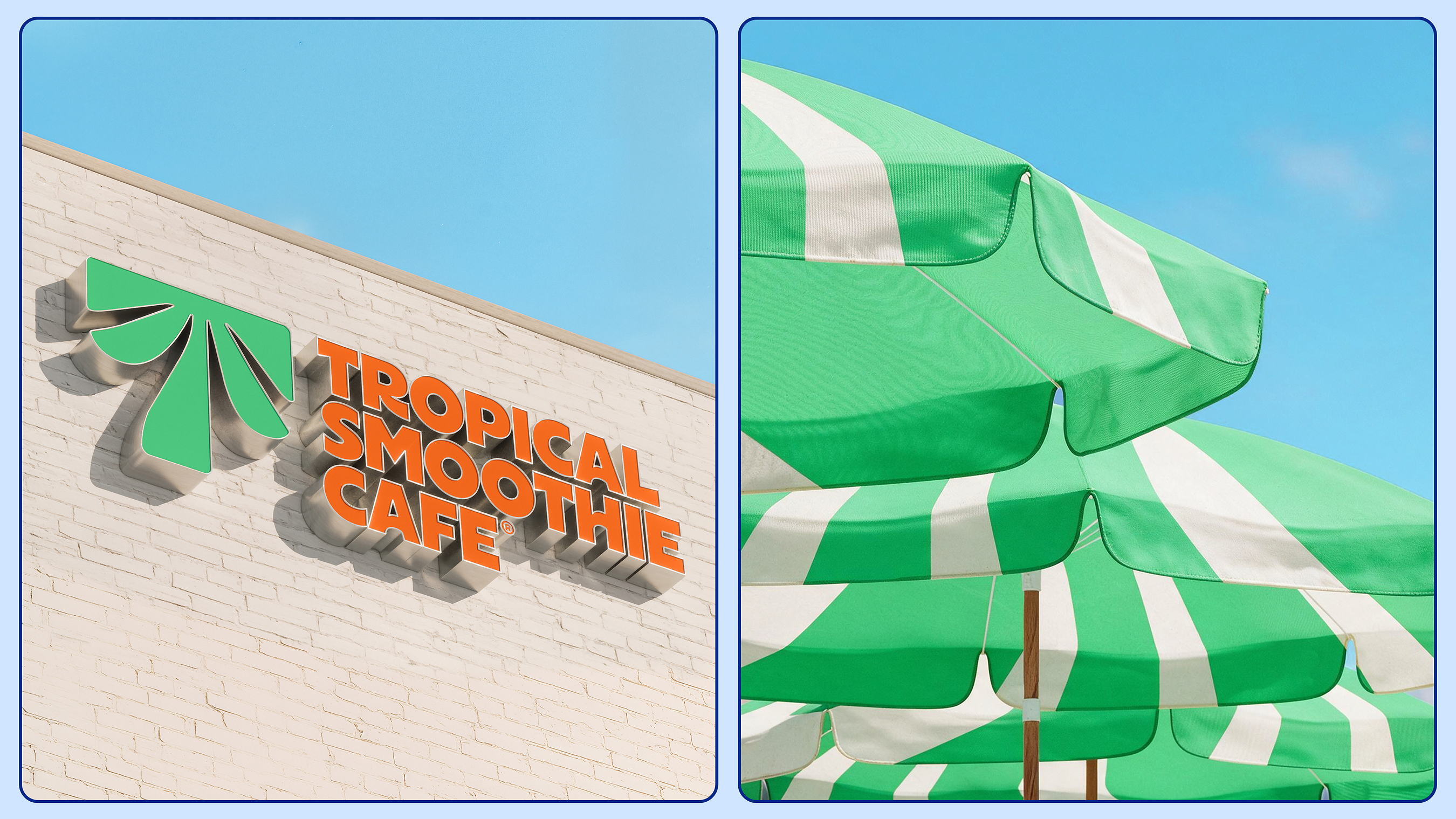
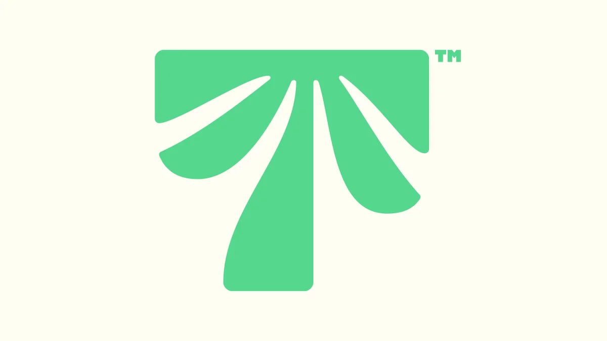
At the centre is a palm tree reduced to a compact mark that also hints at a capital T. Its flat top gives the silhouette a graphic, letter-like structure; the fronds below keep the plant legible. The symbol appears in green, while the all-caps wordmark uses a conspicuous orange. Both choices are direct, high-visibility signals, suited to a brand that needs to read across storefronts and takeaway cups.
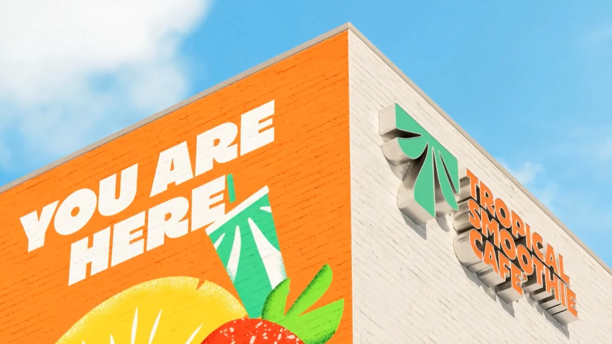
That directness feels deliberate. JKR’s strategy treats tropical less as a specific place and more as a sunny, relaxed sensibility. The distinction matters for a chain whose identity has to work across many locations: the system can suggest warmth through colour, imagery and tone without relying on a literal scene of beaches or palm-lined resorts. The result is familiar, but familiarity is part of the point.
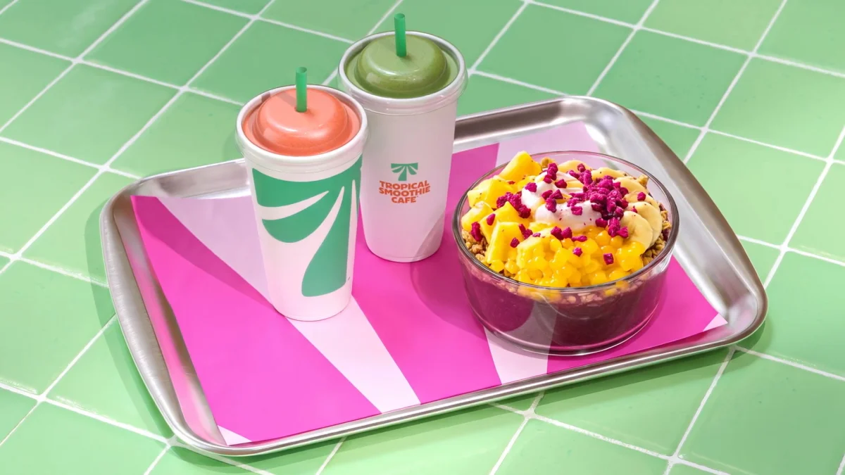

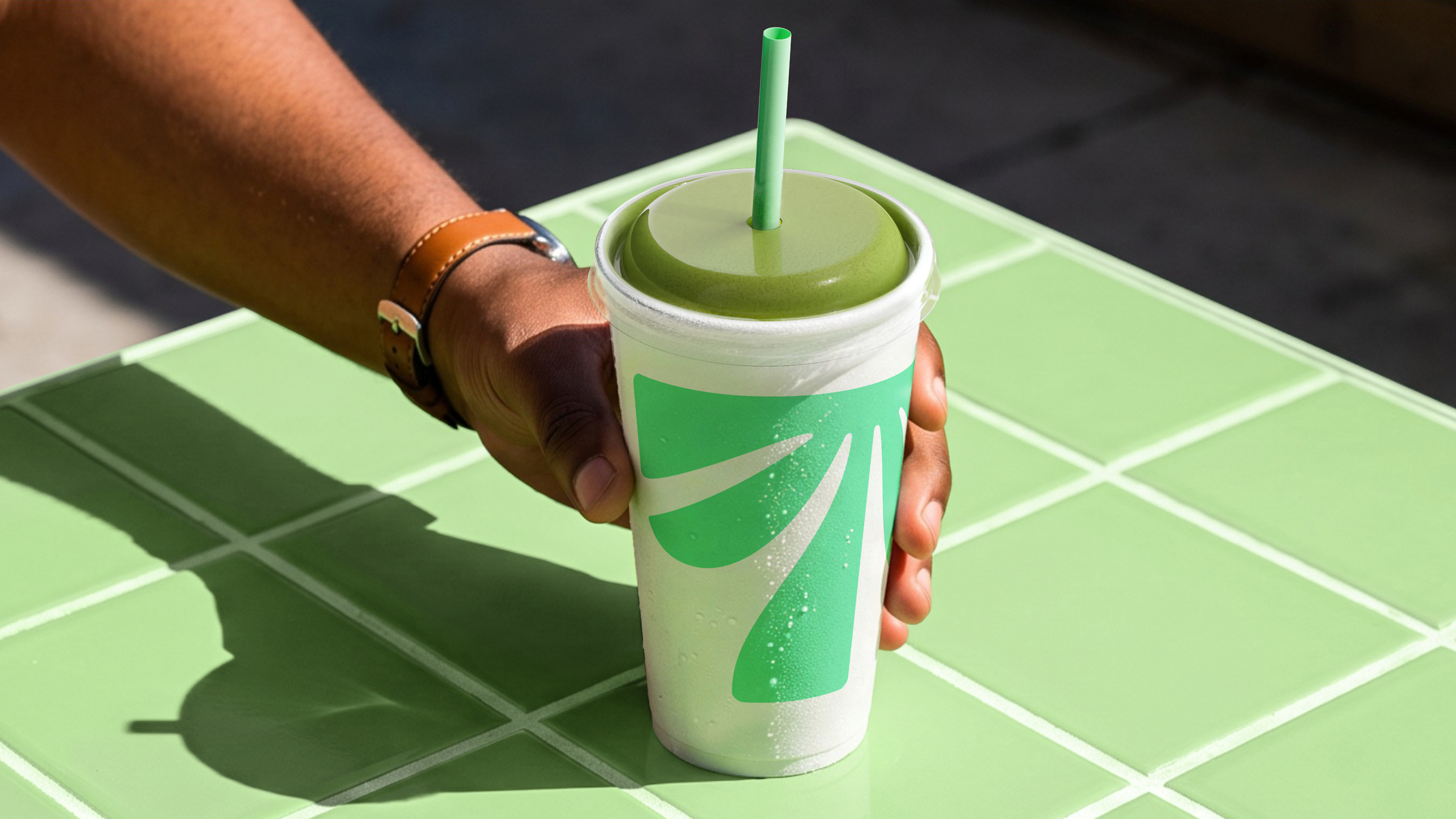
The logo also shows how a brand can use a well-known visual shorthand without making every application equally loud. On cups, the pale green palm-tree T sits with a green straw, leaving breathing room around the mark. That restraint lets the symbol do its job at a small scale, while the straw quietly supports the fresh, better-for-you impression without making a specific health claim.
Energy comes from contrast
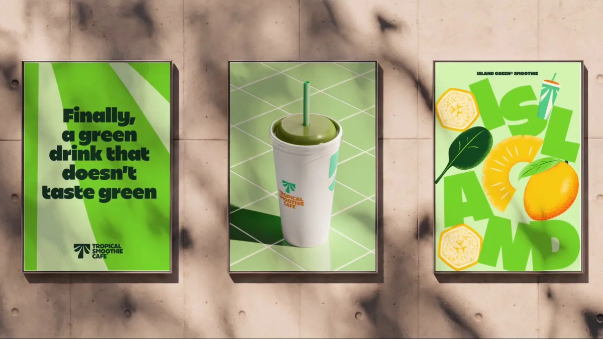
Other touchpoints push the visual volume higher. Posters and food-focused imagery combine Sway Display, a custom brand font designed by London-based Studio Drama, with tightly framed, brightly lit photographs of food. The type is playful but remains legible; the photography is saturated and punchy, giving fruit and meals a bold presence. Texture in the illustrations helps temper the vivid palette, so the system isn’t just a field of flat colour.
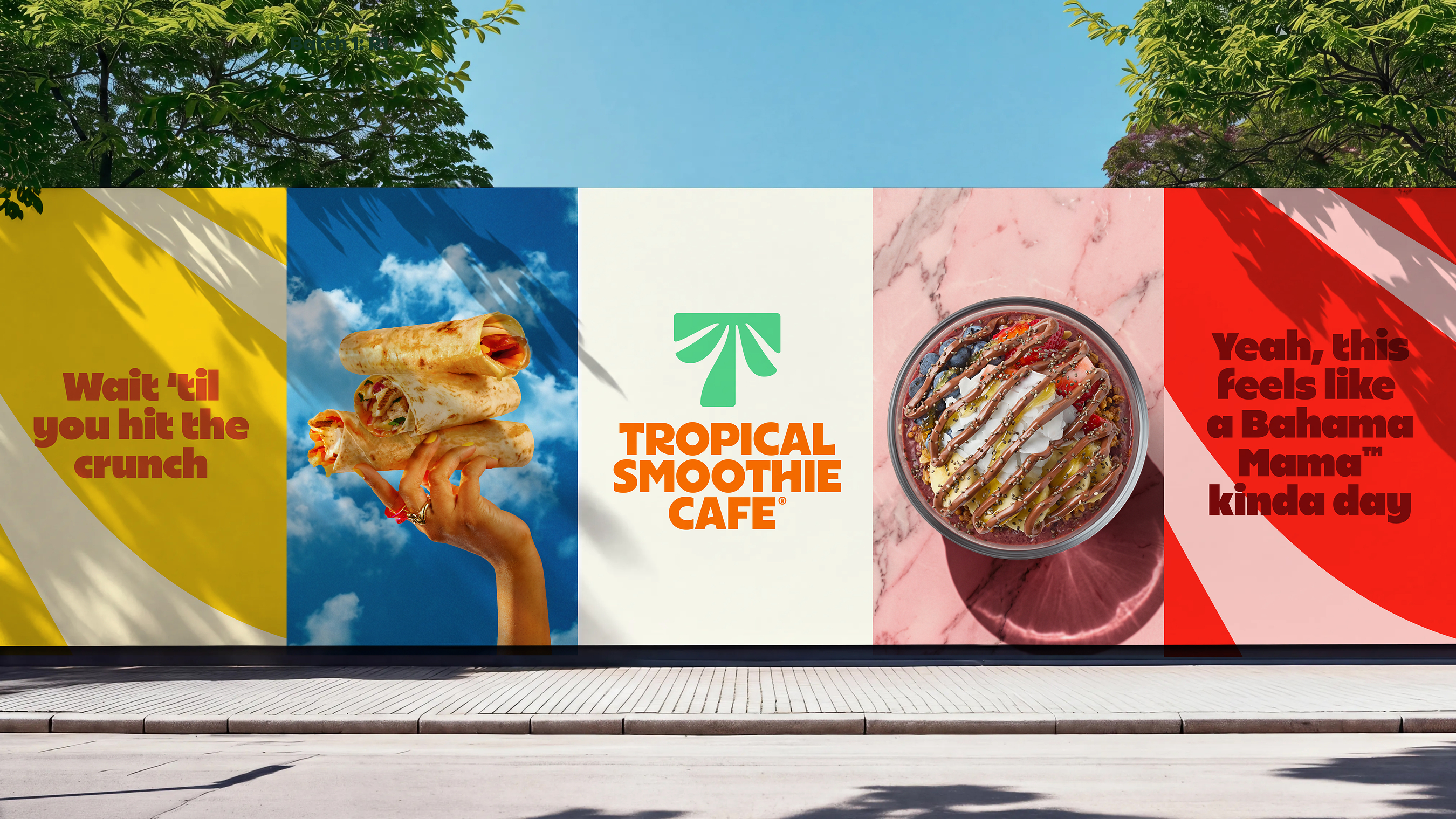
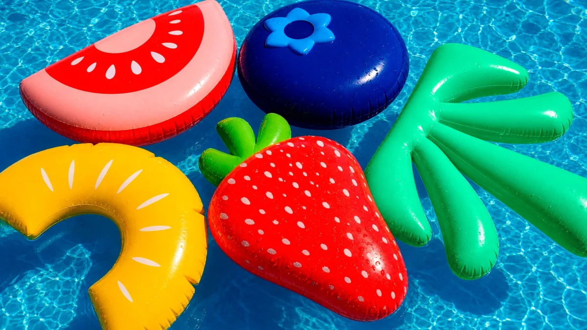
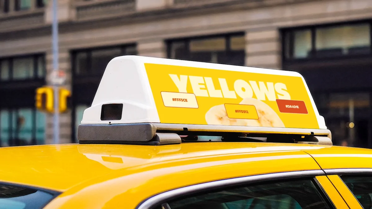
The illustrations stay close to the menu’s world, featuring fruits, vegetables and the occasional burrito. That focus gives the artwork a useful role: it can add character and variety without introducing a separate visual language. Across posters and other graphic pieces, the font, illustrations and photography can each carry attention, while the recurring colours tie them back to the logo.
Copy keeps the same plain-spoken approach. “Tropical State of Mind” spells out the intended mood in a few words, and “Eat Some Good!” gives the wider identity a short, energetic line to build around. These phrases don’t ask the audience to decode an elaborate metaphor. They work alongside the visual cues, reinforcing the promise of an easy, upbeat stop.
A system built for everyday encounters
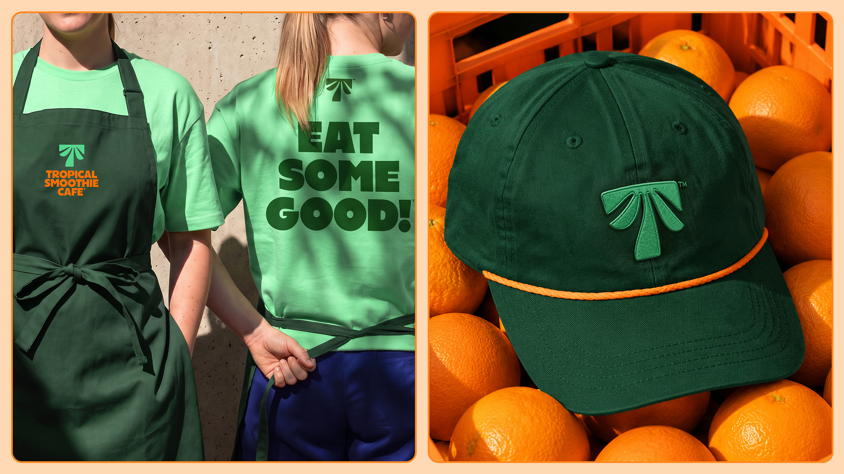
The identity extends beyond the menu and cup to storefronts, interiors, merchandise, uniforms and outdoor advertising. That breadth gives the brand repeated points of recognition: a guest might first notice the orange wordmark on a sign, then see the same palette and palm device on packaging or clothing. For a chain with more than 1,700 locations, consistency across those encounters can help make a broad rollout feel like one brand.
There’s a useful design lesson in the balance between the quieter and louder applications. The cup can rely on one restrained symbol, while a poster can combine custom typography, illustration and exuberant food photography. Each piece doesn’t need to carry every brand asset at once; the repeated colour, mark and tone give the system its connection. JKR’s approach suggests that a clear central idea can support plenty of expression around it.
For teams working on a familiar category, this identity is a reminder that recognizable cues can still feel considered when they’re shaped into a coherent system. Here, the palm tree, orange type and sunny language all serve the same emotional brief. The practical test will be how consistently that lively feeling holds across the many places guests encounter the brand.


