Tuesday, October 27, 2026 · Graphic Design
White & Case’s Catalyst Blue Rebrand Turns Complexity Into Visual Energy
Noted by Tom May · 700 reads
Uncommon gives White & Case kinetic serif typography, a high voltage palette and image effects built around the firm’s idea of complexity as opportunity.
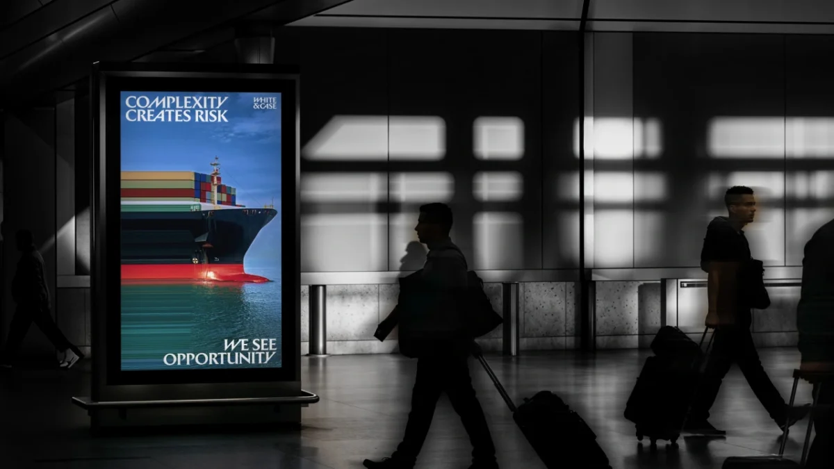
White & Case’s new identity makes a clear case for using visual energy to stand apart in a restrained category. Created by Uncommon Creative Studio, the rebrand replaces the familiar navy led look with sharp serif lettering, vivid blue and photography stretched into streams of colour. It’s the New York based firm’s first major identity change in 13 years.
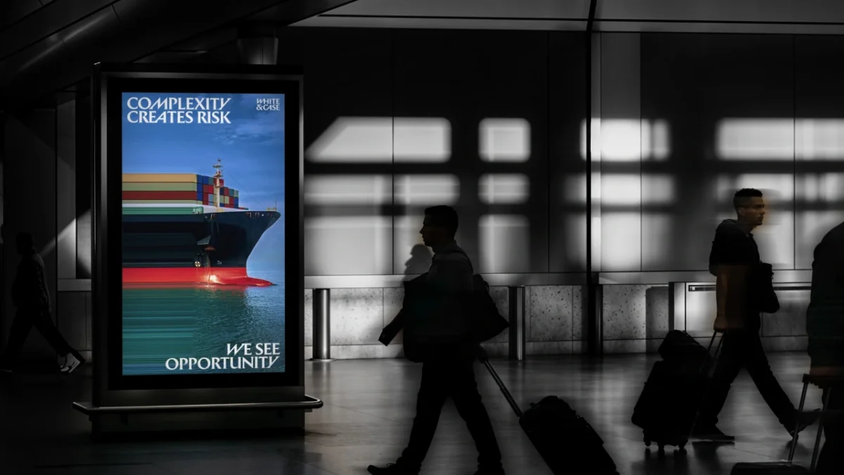
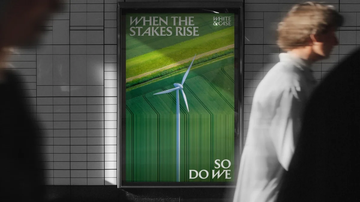
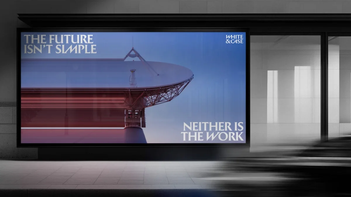
The design starts with a strategic shift: White & Case wants to present complexity as a source of opportunity. That idea appears in outdoor advertising, where “Complexity creates risk” is answered with “We see opportunity”. Other headlines connect pressure with response: “When the stakes rise” sits alongside “So do we”, while “The future isn’t simple” leads into “Neither is the work”. The copy gives the visual system a consistent argument to make across different settings.
Serif lettering built to move
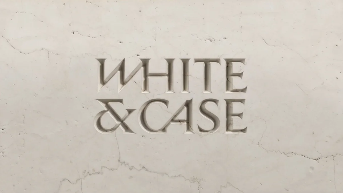
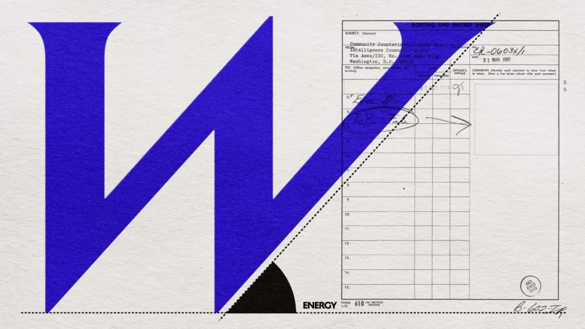
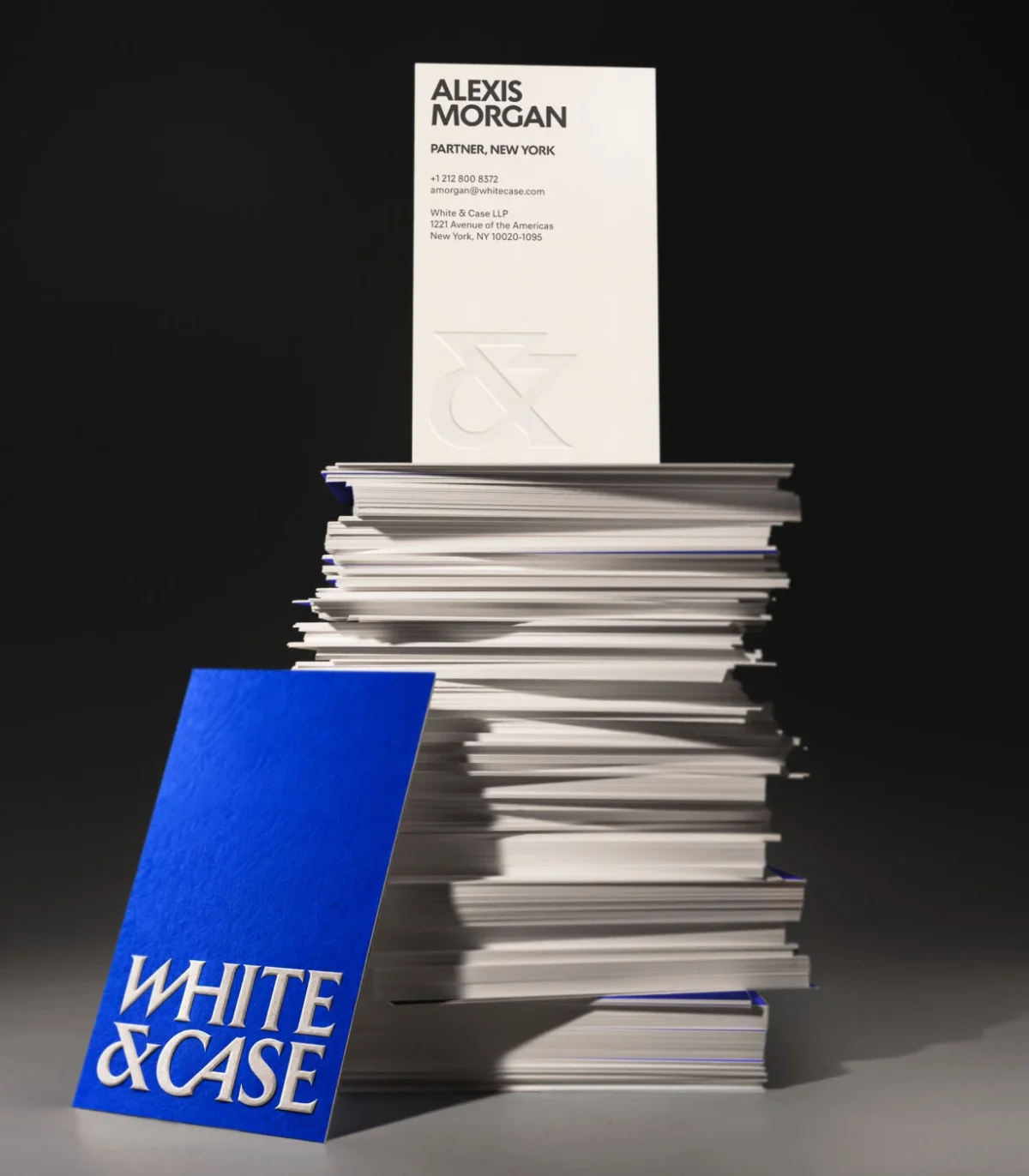
The wordmark draws from Roman stone carving and the inscriptions on Trajan’s Column, a reference that brings a sense of permanence to a system designed to feel in motion. Its compact, stacked arrangement uses diagonal cuts through letters such as the W. Those angles make the lettering appear to lean forward, giving the mark a directional quality without abandoning the authority associated with carved capitals.
Uncommon carries the same cut and movement into custom headline serifs. Oversized phrases such as “Forward energy” become graphic elements in their own right: the letterforms are assertive, and their scale gives short messages a physical presence on posters and screens. The result pairs a historical reference with a contemporary pace, a useful tension for a firm seeking both durability and distinction.
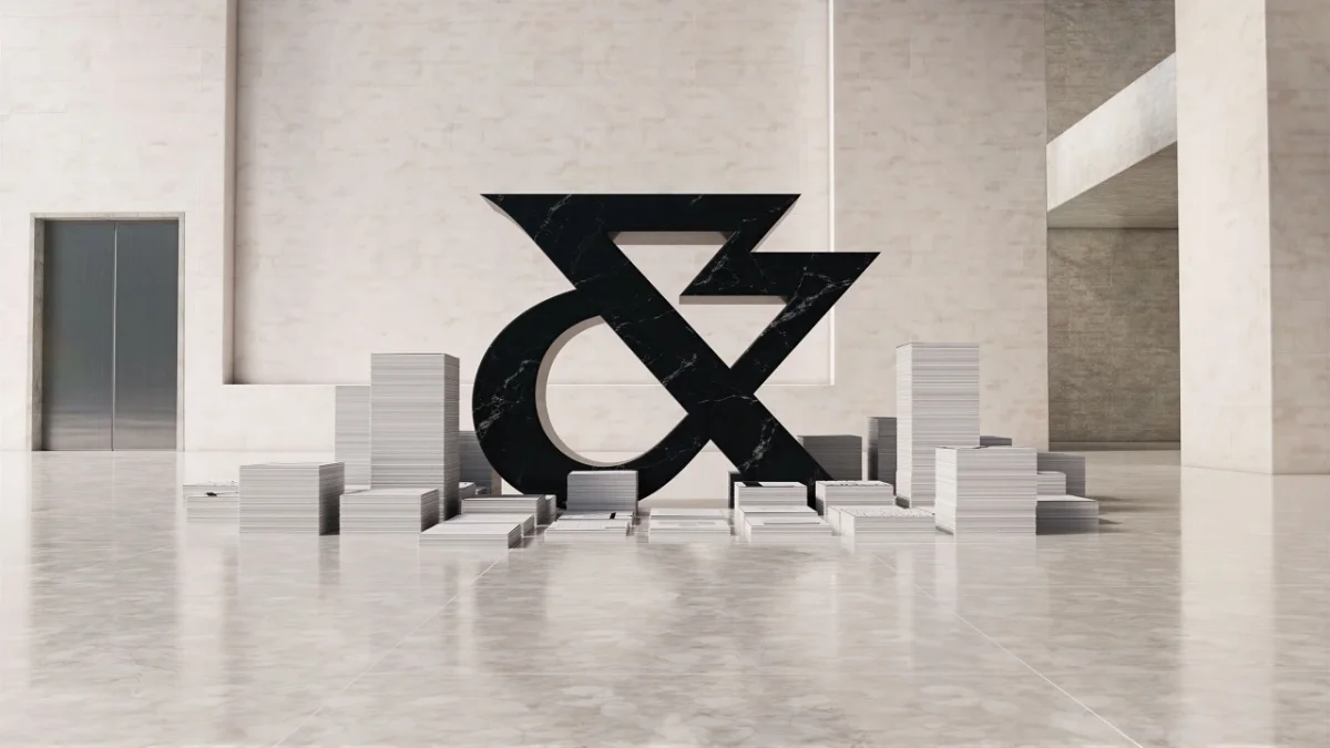
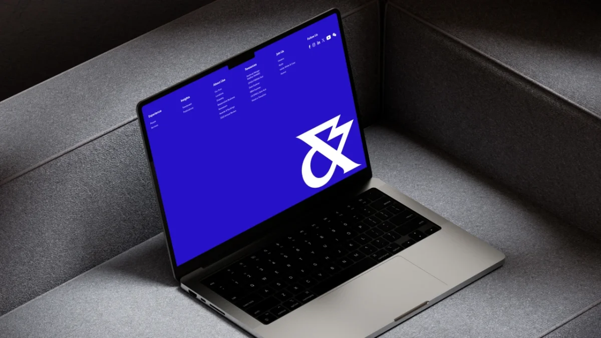
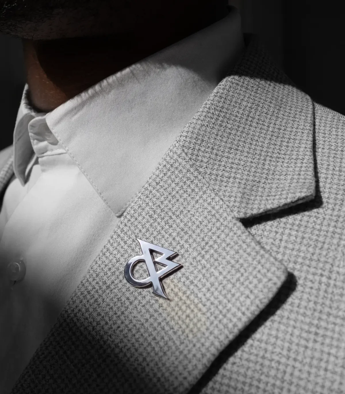
The ampersand gets its own role as a standalone monogram. It can sit on a small item such as a lapel pin or expand into a large sculptural form, as shown in a gallery like setting. That range gives the identity a compact symbol that can work independently of the full name.
A palette with a clear centre
Catalyst Blue takes the leading position, replacing the navy traditionally associated with the firm’s category. Uncommon describes it as a colour from the highest energy end of the visible spectrum. Marble White and Ink Black provide contrast, while Ion, Thermal, Solar and Ultraviolet extend the palette. The names reinforce the energy concept, but the core blue does the main recognition work: it appears on logos, headlines, signage and everyday brand materials.
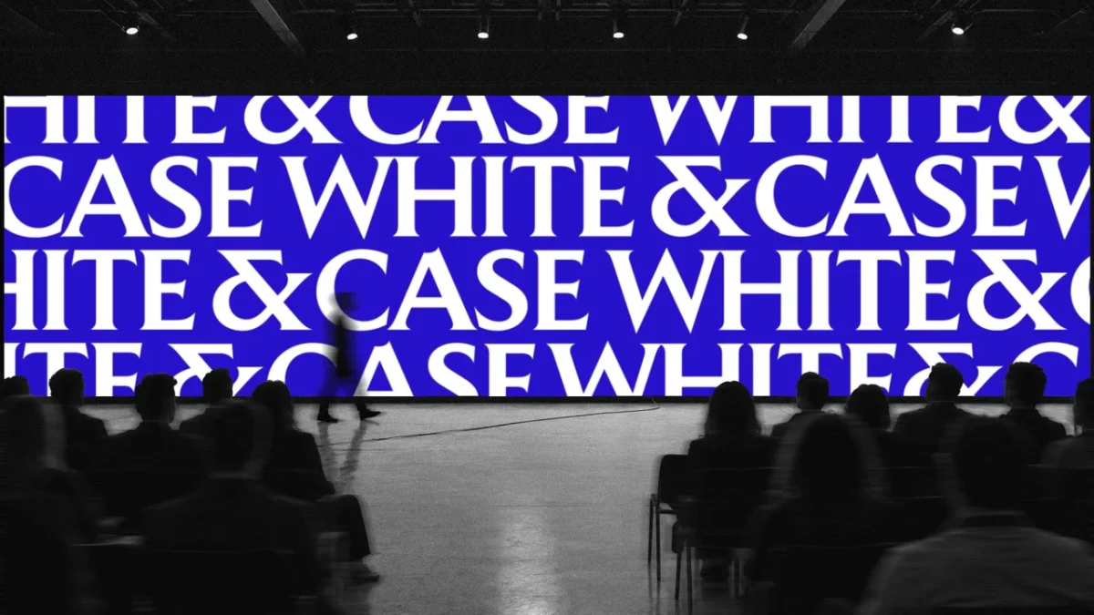
That colour system also helps the identity behave consistently across very different applications. A blue screen can carry a repeated wordmark at large scale; a small badge or scarf can use the same signal in a physical setting. The palette remains vivid, while black and white give layouts room to shift between high impact messages and more restrained information.
Photography becomes a data stream
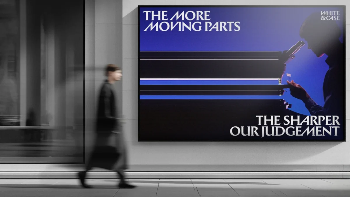
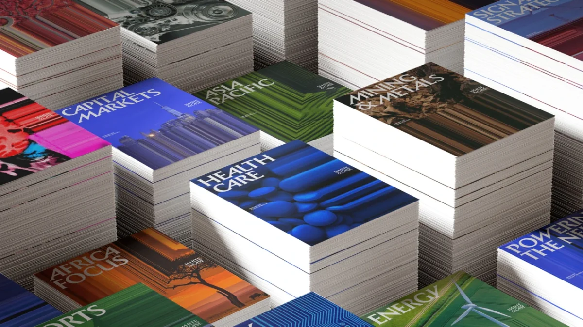
Energy Studio is the identity’s proprietary image tool. It applies an “energy effect” by pulling part of a photograph into sharp streaks of colour. A volcano, skyline or wind farm can therefore shift from a straightforward scene into something that suggests information moving through a system. The transformation connects the image treatment to the firm’s message about navigating complexity, while giving campaign photography a recognisable visual signature.
The effect appears across imagery of infrastructure, landscapes and city scenes. A billboard showing a satellite dish pairs the image with a headline about work that isn’t simple; another visual turns a wind turbine setting into a backdrop for a message about rising stakes. In each case, the treatment adds motion to still photography and supports the copy rather than acting as decoration on its own.
One system across firm communications
White & Case CMO Jason Hill says the firm’s clients are “sophisticated business leaders navigating a complex world” and describes its category as increasingly competitive. The identity responds by giving the firm a stronger visual presence while keeping complexity at the centre of its message. Uncommon global chief design officer Lisa Smith says the studio set out to pull White & Case from a “sea of sameness”.
The rollout covers digital recruitment platforms, client collateral, pitch materials, paid advertising and a podcast, as well as a brand film titled The Power of Complexity. That range puts pressure on the system to scale from moving image and public displays to documents, clothing and small branded objects. The examples show the same ingredients adapting to each format: the angled serif, Catalyst Blue and the image effect can each carry recognition, even when the full logo isn’t the focal point.


The rebrand’s strongest idea is the way it makes several design choices pull in the same direction. Angled type suggests momentum, the blue palette supplies intensity, and Energy Studio turns complexity into visible motion. For designers working on identities in conservative categories, the practical lesson is to give a strategic idea a role in the typography, colour and image treatment, then make sure those elements can travel across the full range of brand touchpoints.


