Tuesday, October 27, 2026 · Graphic Design
César Cid’s Artphabet Turns Famous Artworks Into 3D Letters
Noted by Dom Carter · 981 reads
César Cid builds an alphabet from artists’ colours, shapes and materials, translating familiar art into sculptural 3D forms.
A Campbell’s soup can shaped like an A sets the logic of The Artphabet: each letter should carry enough of an artist’s visual language to be recognisable, even after the original image has been reshaped. César Cid, creative lead at Madrid-based studio CESS, made the 26-piece 3D typographic series as a personal project combining his interest in art and digital form.
The work begins with a familiar challenge for designers: how far can you simplify an image before its identity disappears? Cid’s answer is to treat each artwork as a set of usable visual ingredients. Colour, silhouette, texture and material become parts of a letter’s structure, rather than decoration placed on top of a finished character. That shift gives the series its sculptural quality: the letter and the art reference are designed as one object.
The Artphabet was inspired by 36 Days of Type, the annual typography challenge. Cid used the alphabet as a framework for exploring different visual worlds, then selected artists whose work could be translated into distinct forms. The project’s initial premise was to pair each artist with a letter bearing their initial. That constraint couldn’t cover all 26 letters, so the series makes room for visual associations that take precedence over a strict initial match.
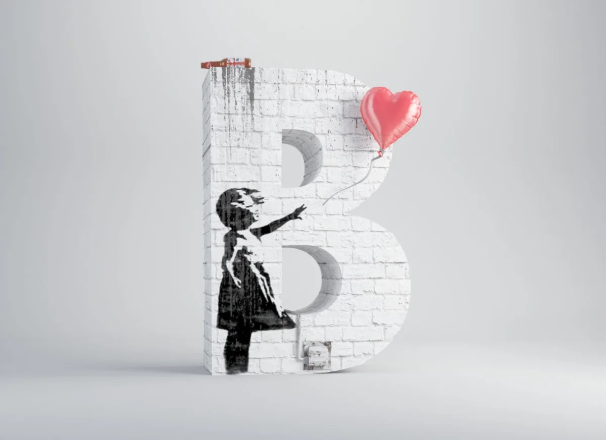
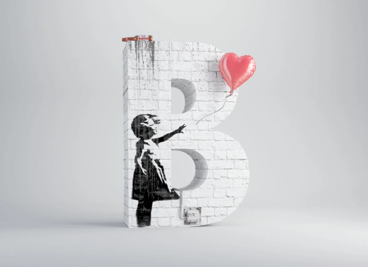
The B draws on Banksy’s Girl with Balloon. A stencilled figure reaching towards a pink, heart-shaped balloon sits against a white, brick-textured letter. The image’s spare silhouette and single bright accent do much of the identifying work; the brick surface helps bring the reference into the letter’s physical form. The design reads at two scales: as a bold character and as a compact scene.
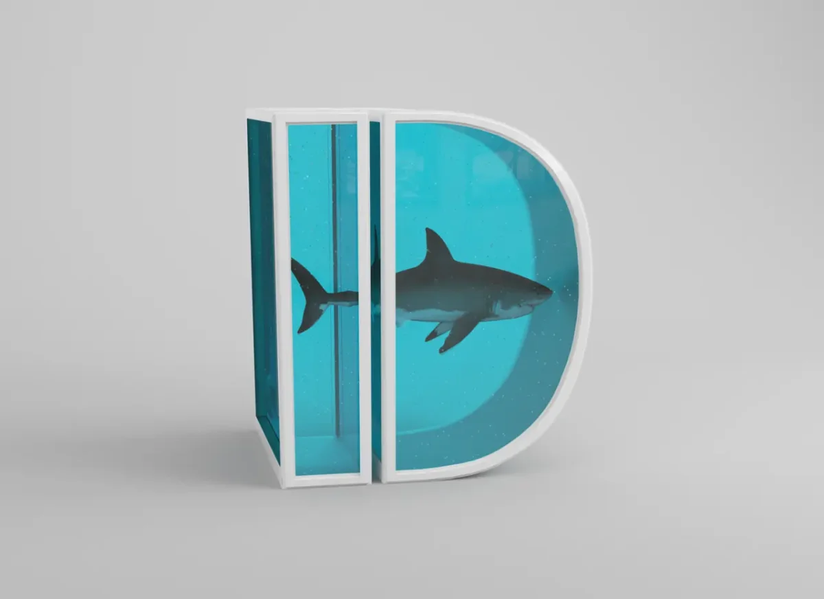
For D, Cid reworks Damien Hirst’s 1991 installation The Physical Impossibility of Death in the Mind of Someone Living. The shark and its tank become the contents of a turquoise, three-dimensional letter. The tank’s liquid colour and enclosed display are central to the reference, while the letterform supplies a new frame. Rather than paste a reproduction onto a typographic surface, Cid reconstructs the work’s key elements as part of the object.
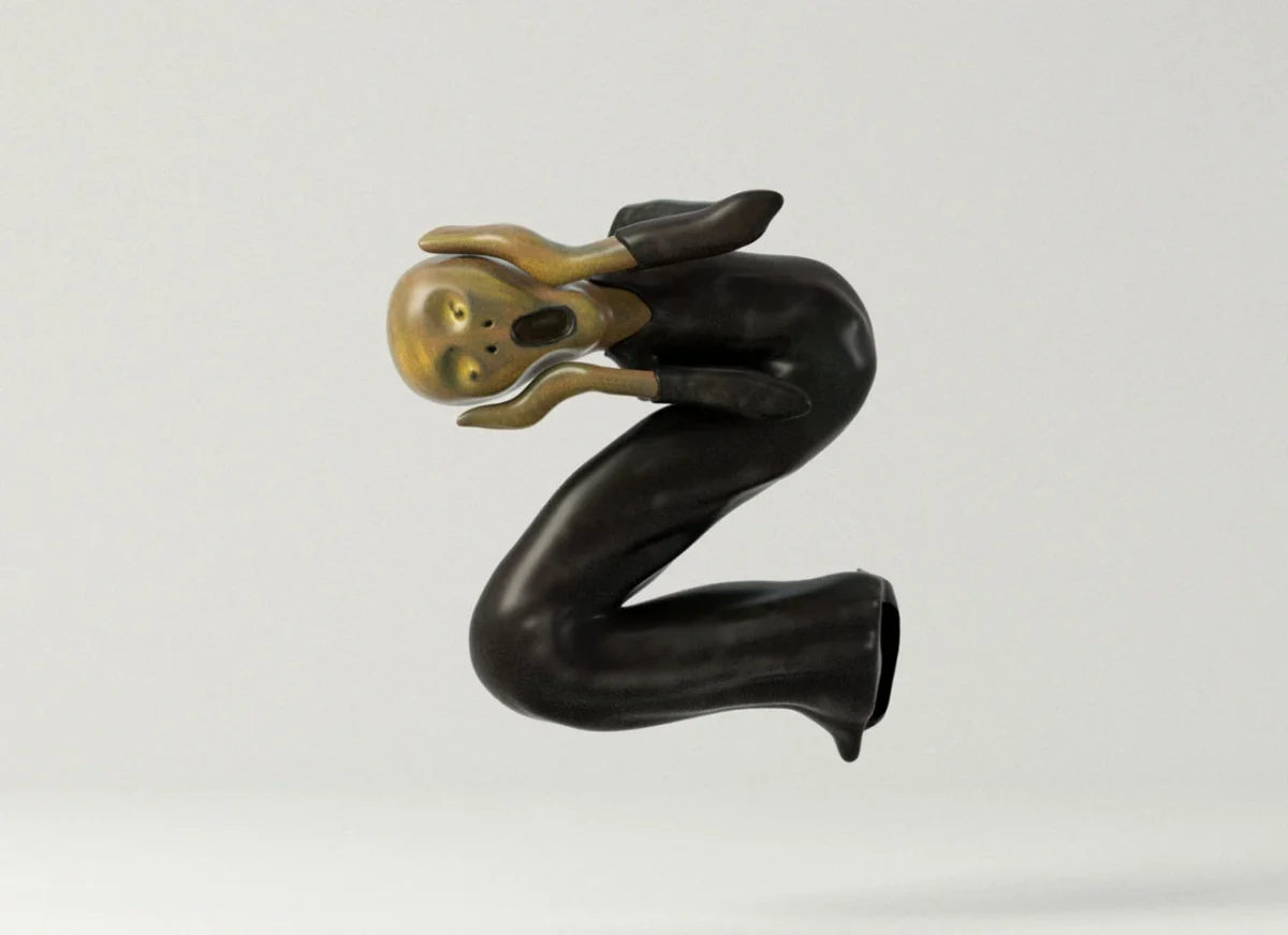
That approach also allows the alphabet to accommodate a reference that doesn’t fit its artist’s initial. Edvard Munch’s The Scream becomes Z: the figure’s alarmed face and the work’s forceful, jagged energy are translated into a zig-zagged form. Cid describes the project as a way to study artists more closely and understand the details that distinguish one style from another. The letter assignments make that act of looking concrete: each one asks which features can survive a change of scale and medium.
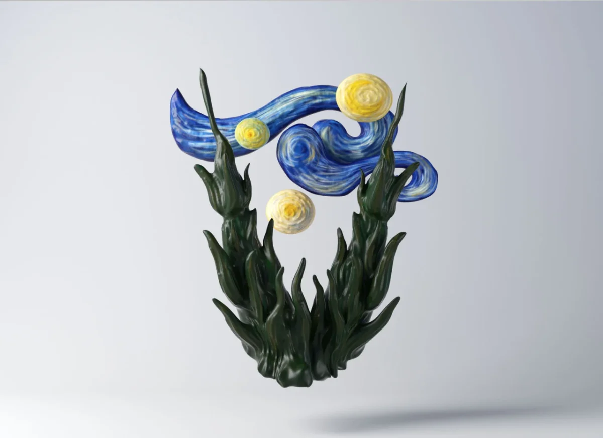
Vincent van Gogh’s Starry Night informs V through swirling blue and yellow forms, with dark green stems beneath. The treatment depends on movement as much as colour: the curved shapes suggest the painting’s restless surface while still tracing a readable character. This is where the series’ three-dimensional format matters. A letter can hold layers, projections and materials that a flat image would have to suggest through shading alone.
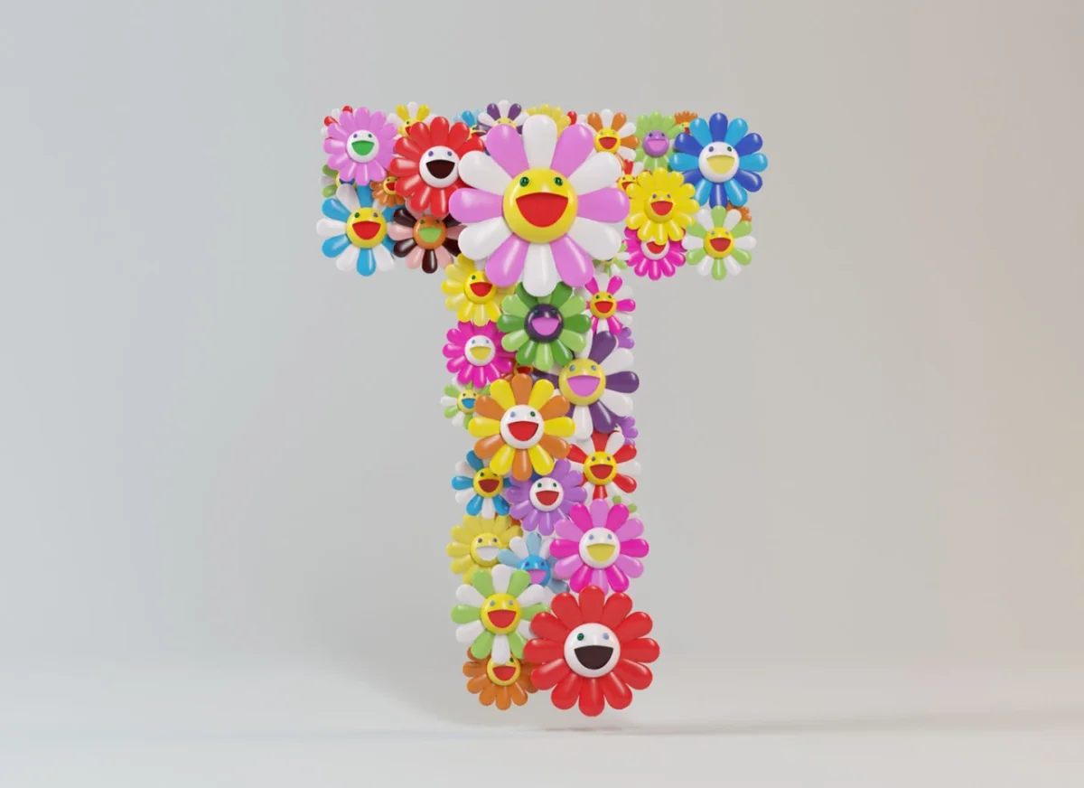
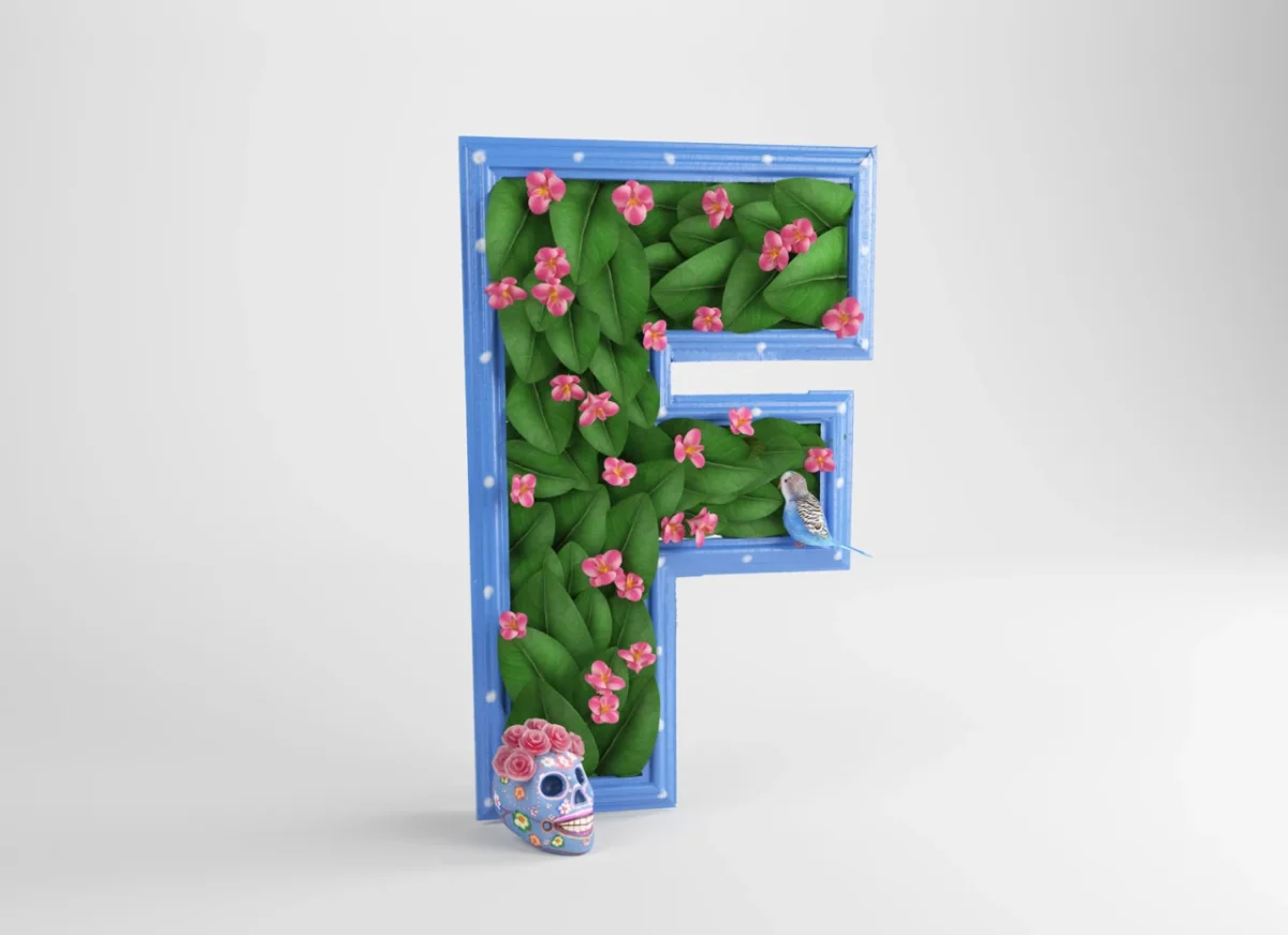
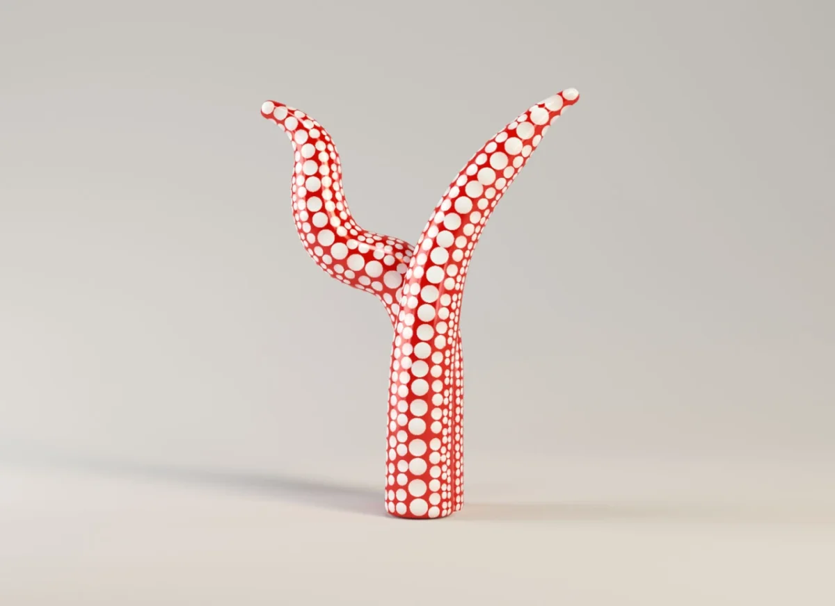
Other pieces shift the balance between image and letter in different ways. Takashi Murakami’s smiling flower motifs gather into T, making repeated faces and saturated colour carry the reference. Keith Haring’s paired figures form H through their bodies and a connecting horizontal line. Frida Kahlo’s F incorporates foliage, pink flowers and a skull motif, while Yayoi Kusama’s Y uses a red-and-white dotted sculptural shape. Across the set, the alphabet becomes a practical way to compare how artists use repetition, line, colour and figure.

After all 26 artworks were complete, the project found an international audience and expanded into physical prints. Cid says that seeing people choose the pieces for their homes has been especially rewarding. He also reports that a “substantial number” of canvas prints are being bought through private sales and online auctions; the source gives no figures, so the scale remains qualitative.
A book of The Artphabet is planned for publication early next year, according to Cid. He has also described ongoing conversations about extending the collection into other formats and says he is open to work with publishers, brands and cultural organisations. The book will give the alphabet another setting, but the core design question remains the same: identify the marks that make an artwork distinct, then rebuild them as a letter that can stand on its own.


