Monday, October 26, 2026 · Graphic Design
Fjord’s San Francisco Bay Sauna Brand Turns a Degree Symbol Into a Visual System
Noted by Tom May · 952 reads
DutchScot gives Fjord a stark black-and-white identity built around custom type, temperature graphics and tactile details.
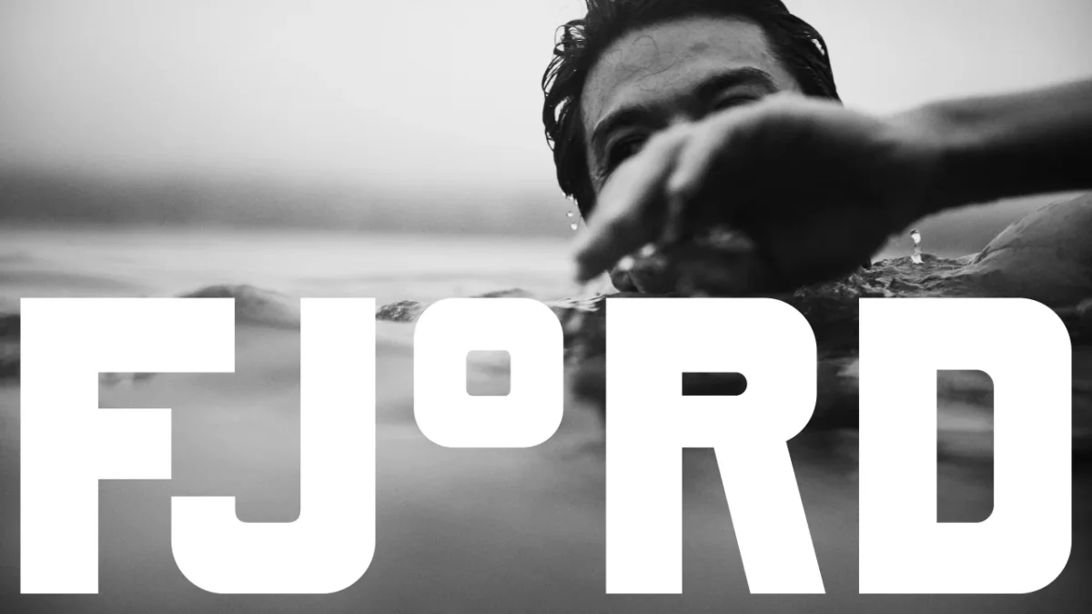
A single degree symbol gives Fjord’s identity a clear visual anchor. For the floating sauna and cold plunge in Sausalito, DutchScot has turned temperature into a graphic idea that travels from the wordmark to posters, signs, the website and even a gift of handmade soap. The result feels closer to a working waterfront than a conventional spa.
That distinction matters in a category where familiar visual cues can quickly blur together: muted colours, soft serif lettering and serene faces. Fjord takes another route, using high contrast, chunky typography and photographs that keep the bay and its changing conditions in view. The identity’s character comes from how consistently it develops one simple thought: hot and cold belong together.
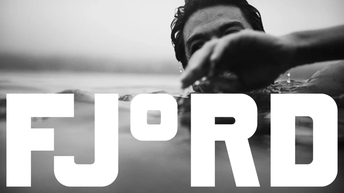

Fjord is a communal, self-guided sauna and cold-water plunge on San Francisco Bay. London-based DutchScot created the identity with the venue’s founders, Alex and Gabe. The studio describes Fjord as a place to experience heat and cold outdoors, then have a drink with friends; it says the venue isn’t a spa and doesn’t sell spa services. That framing steers the design toward a social waterfront setting rather than the polished calm often associated with spa branding.
A typeface built around temperature
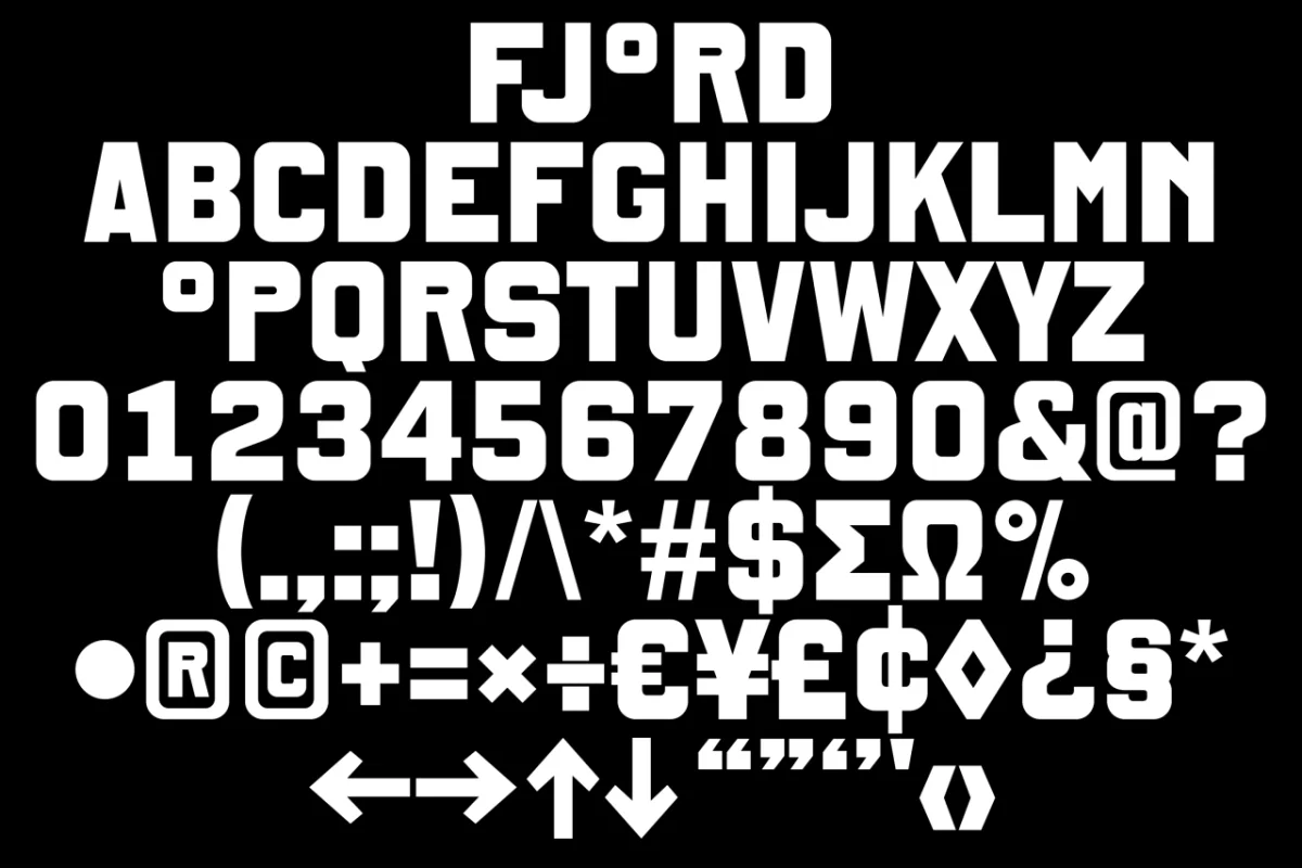
The identity’s core is a bespoke typeface developed with Danish type foundry Playtype. Its rounded-square forms are heavy and practical, with a sturdy, almost industrial presence. That quality supports the references to the area’s working past without leaning on literal maritime decoration.
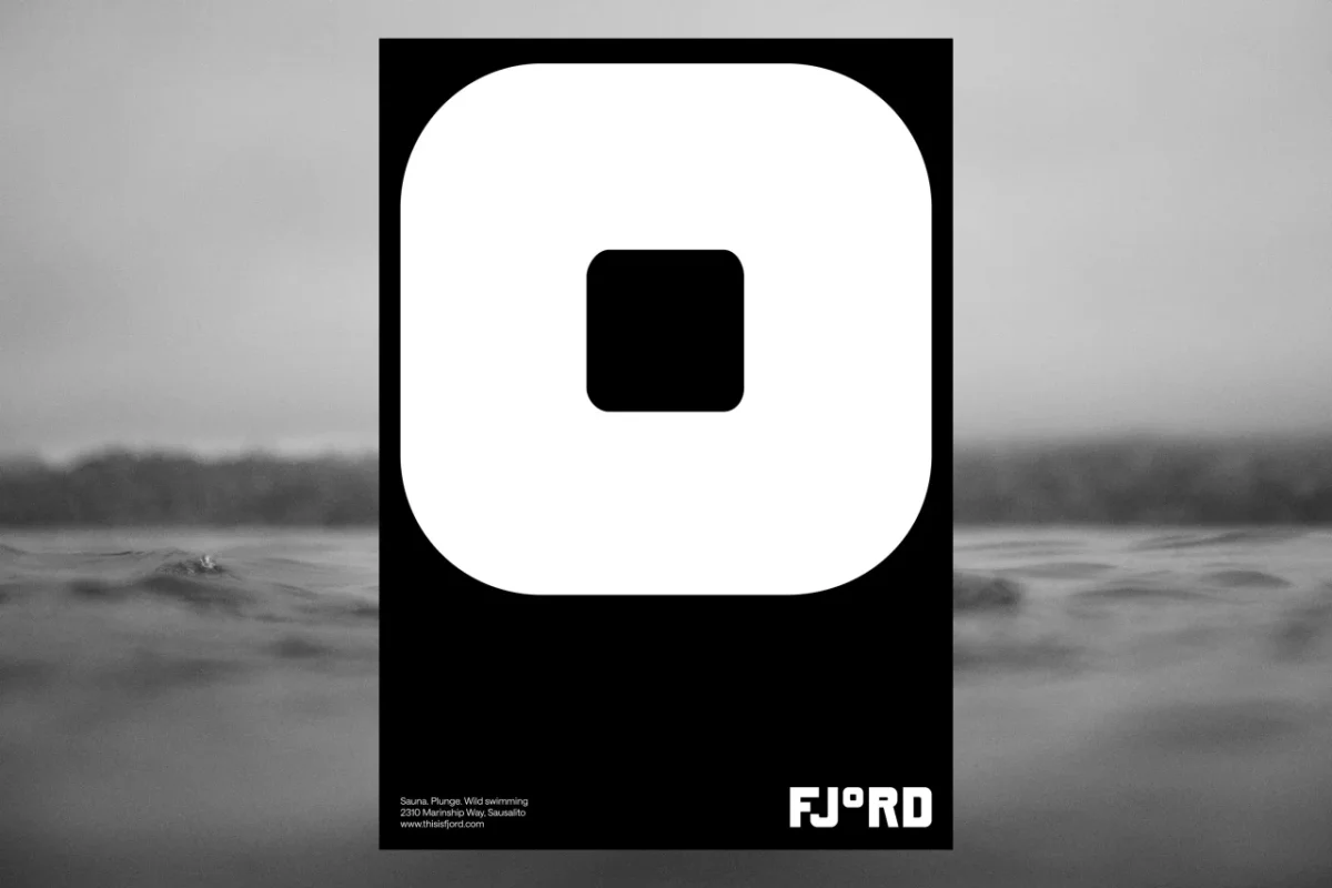
The wordmark makes the most of the typeface’s central idea: the “o” in Fjord becomes a degree symbol. It’s a small alteration with a clear connection to the experience the venue offers. Temperature isn’t just a detail to communicate; it becomes the brand’s shorthand. The symbol can stand alone as a graphic, or pair with the F to make a compact F° mark for signs and other tight spaces.
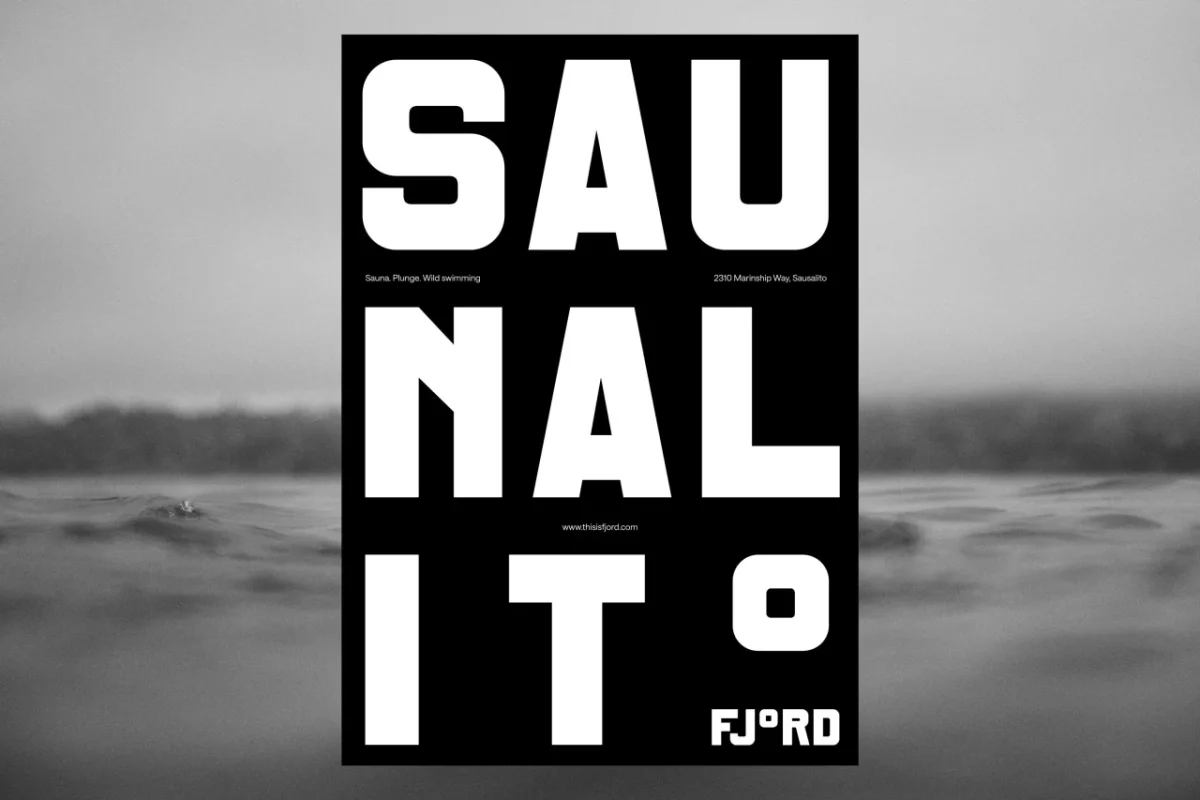
Posters turn that idea into an immediate read. One sets the sauna’s 189°F against the bay’s 55°F water, using oversized numerals and photographs of hot stones and a splash. The difference in temperature supplies the composition’s tension: two large figures, two distinct environments, one shared activity. Another design breaks “Saunalito” across three lines and lets a greatly enlarged degree symbol finish the stack.
These layouts show how a custom typeface can do more than make a name distinctive. Repeated across formats, the same letter shapes and symbol give the system a recognisable voice, while changes in scale and line breaks keep individual pieces from feeling like copies of one template.
From the screen to the shoreline
On the website, the temperature theme becomes part of the browsing experience. A gauge shifts as visitors scroll, and the navigation along the left side recalls the marks on a thermometer. Instead of treating the site as a separate layer of the brand, DutchScot carries the physical idea of rising and falling temperatures into the interface.
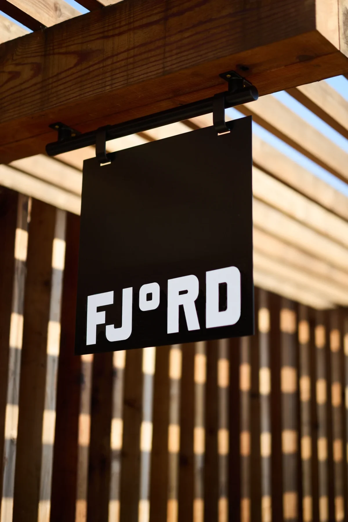
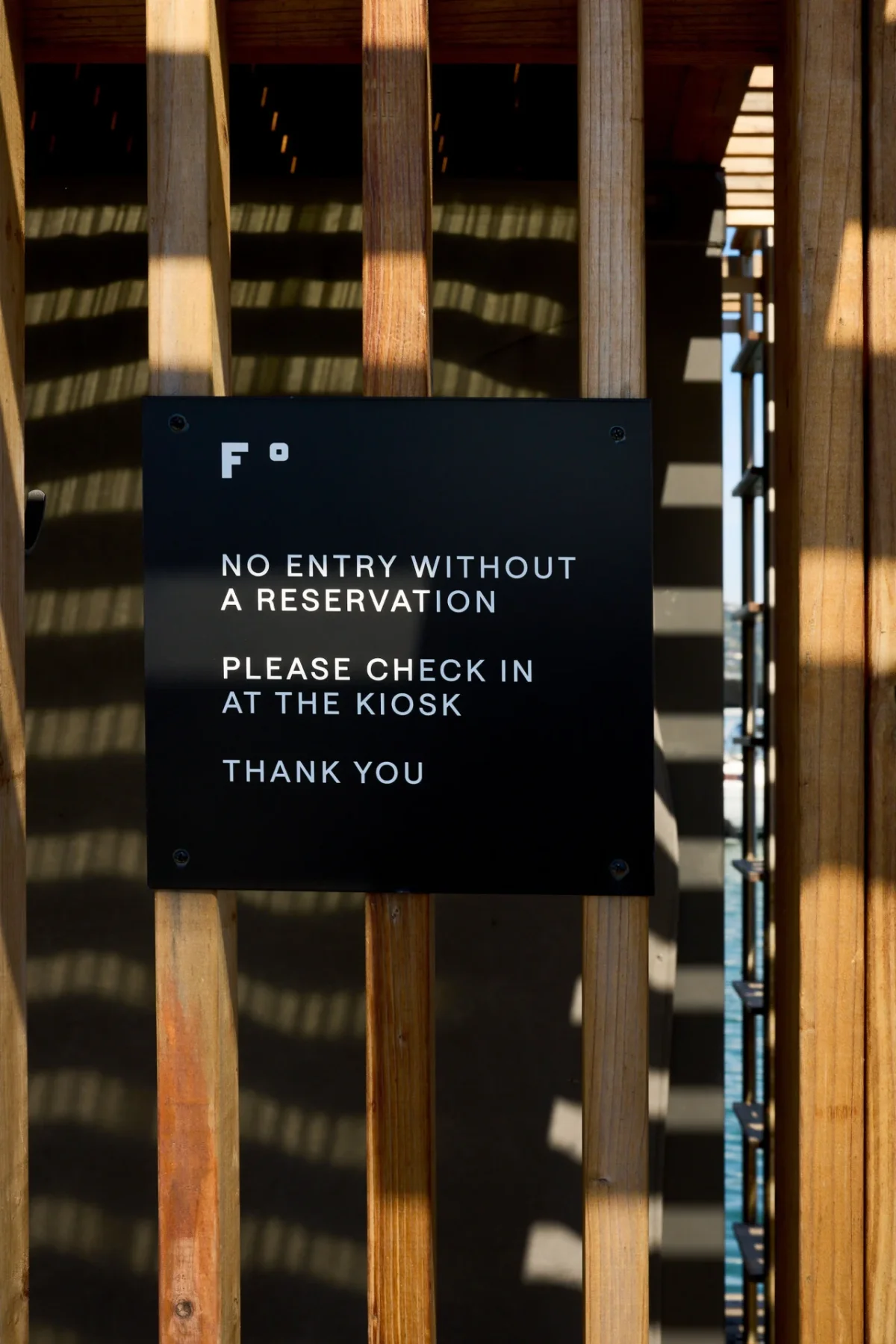
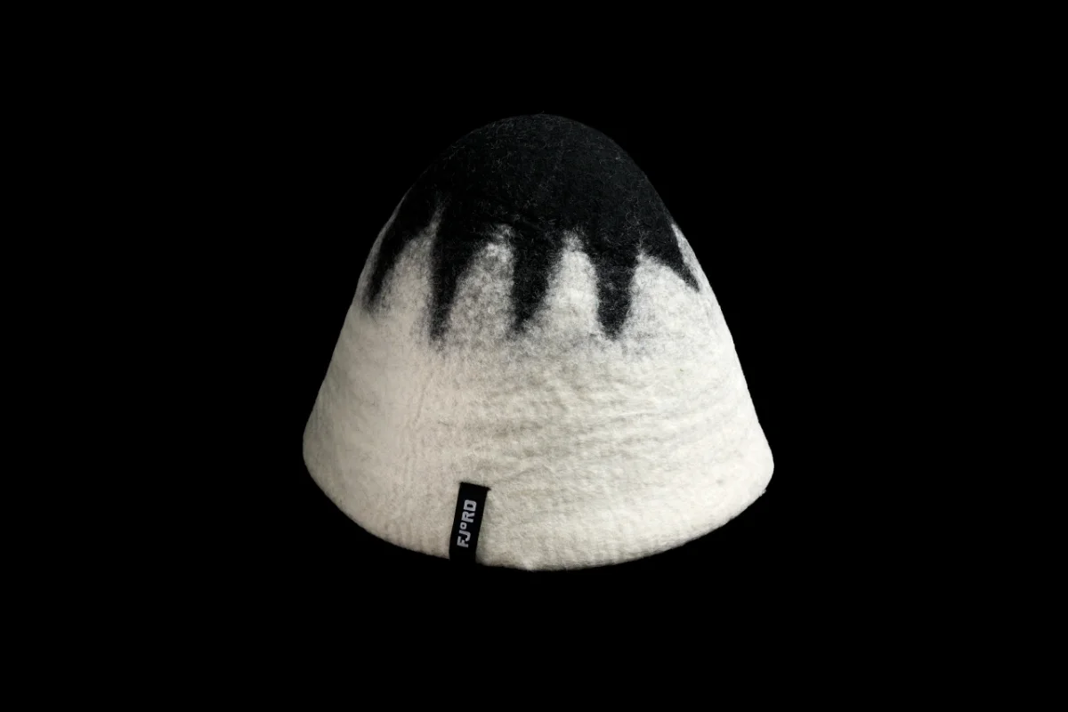
At the venue, black metal wayfinding signs sit against timber slats. The contrast makes the signs legible while linking them to the identity’s monochrome palette. The F° mark gives compact instructions a distinct signature. A black-and-white felted sauna hat extends the same treatment into merchandise, with a small FJ°RD label adding the typographic device to a practical object.
The gift tokens take a more tactile approach. DutchScot designed handmade soap in bespoke packaging instead of a plastic card or emailed voucher. It’s a detail that makes the brand tangible and suits a visit centred on heat, water and time spent together. The idea also shows how packaging can make a gift feel like part of an experience, rather than simply a way to pay for one.

Photographs by Alex Farnum carry the same mood into the imagery. Many are black and white, with swimmers seen at water level or gathered in the bay at sunset. Those viewpoints put the viewer close to the surface and capture the venue’s outdoor setting without relying on familiar spa signals such as quiet portraits or soft-focus interiors.
Fjord’s identity succeeds through a focused chain of decisions: a custom typeface with weight and character, a degree symbol that connects the name to the activity, and a monochrome palette that holds its own against wood, water and changing light. Each application adds something useful to the idea without needing a new visual language. For designers working on experience-led brands, the practical lesson is in that discipline: find a detail specific to the service, then give it enough room to shape the whole system.


