Monday, October 26, 2026 · UX & UI Design
Stocksy’s 2027 Visual Insights Report Turns Image Making Into a Grammar of Connection
Noted by Tom May · 411 reads
Stocksy’s five prepositions offer a practical way to brief images around authorship, audience, context, tension and convention.

A picture can show exactly what its keywords promise and still leave no impression. Stocksy’s Visual Insights 2027: Existential Grammar proposes a sharper way to think about why some images hold attention: focus on the relationships inside and around the frame, not just the things it depicts.
Stocksy is an artist-owned stock media co-operative whose collection contains three million assets, selected by its curators and 1,800 artist co-owners. It accepts 1.3% of artists who apply and says its library contains no AI-generated content. The report draws on that world of making and selecting images to argue that connection has a structure. Its tool for describing that structure is a set of five prepositions: by, for, with, between and against.

Stock imagery is often organised around nouns: a family, an office, a woman laughing. Those labels tell us what appears in the frame, but little about the choices that make an image feel specific. As the report puts it, “An image of connection shows people together. An image that connects is in conversation with its audience.” Prepositions help make that conversation visible: they point to authorship, intention, distance and the viewer’s role.
By: make authorship visible
Stocksy compares creative work to food and drink whose value is tied to its origins and production. It calls this a “farm-to-table era” for creative media: knowing who made an image and how it came to exist can matter as much as its subject. Authorship, in this view, is more than a credit line; it describes the process behind the finished work.


The report points to Hermès Kelly and Birkin bags, each made by a single artisan from first cut to last stitch, with that maker’s mark inside. It argues that the mark carries meaning because it signals how the object was made. For an image brief, the useful questions are direct: Who made this, and can we stand behind the way it was made?
For: picture a person, not a metric
Creative work has to reach people while also satisfying the systems that distribute it. Stocksy’s distinction is that distribution can put work in front of an audience, but can’t make that audience care or stay. The report invokes literary theorist Roland Barthes, who placed a text’s unity in its destination rather than its origin, then asks what happens when that destination includes both a human viewer and an automated platform.
Its example is Velvet Sundown. In 2025, the group released two albums on Spotify and drew more than a million monthly listeners despite never playing a show. In July, it confirmed that the group did not exist and that AI had generated the music. A year later, Deezer reported receiving around 90,000 fully AI-generated tracks each day, more than half of all uploads to the platform. It also found that up to 85% of streams on fully AI-generated music in 2025 were not human listeners, but bots. The report’s question for image makers is what human purpose remains when machines produce content for machine attention. Its prompt is practical: who is this for? Picture one person.
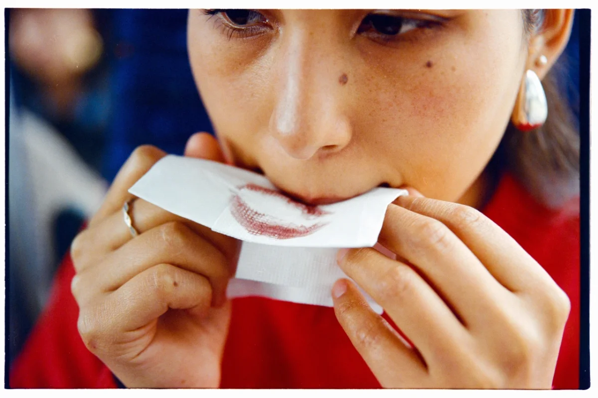
With: build meaning from what’s present
A frame is made from more than its main subject. Posture, light, season and signs of how a space is used all shape the viewer’s reading. Intimacy, tension or strangeness can emerge from the relationships between these visible elements, without a caption spelling out what to feel.
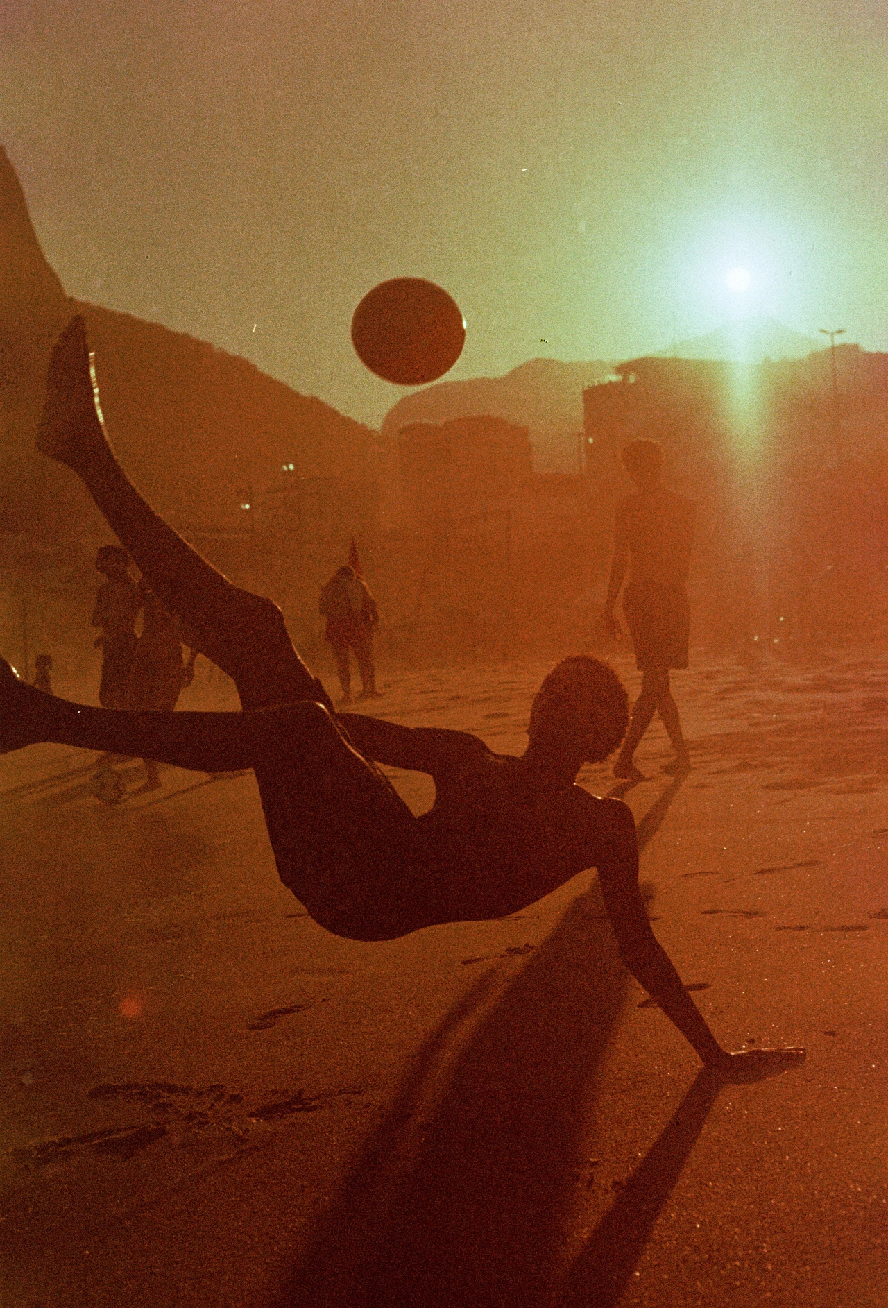


Stocksy also revisits a line often attributed to Gestalt psychologist Kurt Koffka. The report says he didn’t claim that a whole is greater than the sum of its parts; he described it as other than the sum. Put elements together and they create a quality neither held on its own. A useful edit test follows: remove one element and see what breaks.
Between: preserve the tension
Briefs often pair qualities that pull in different directions: polished and raw, accessible and specific, elevated and friendly. Splitting the difference can produce work that feels competent but forgettable. Stocksy’s alternative is to let one quality lead while the other complicates it. That push and pull gives the work its shape.
The report cites Boots’ Life Is Brutiful campaign, which places illness alongside pleasure and hot flushes alongside a night out. The contrast stays in the picture instead of being smoothed away. When a brief names opposing qualities, decide which one leads and ask whether the other still creates useful friction.
Against: choose what the image resists
Images inherit conventions about beauty, authority, progress, family and nature. If a team doesn’t identify those assumptions, they can quietly shape the work by default. Stocksy’s example is Bodyform and Libresse’s Blood Normal. Sanitary pad advertising had long used blue liquid to represent period blood; in 2017, the brands showed it in red. The work won the Glass Lion Grand Prix at Cannes, and the report says blue liquid has since become less common in this category.


The prompt for a creative team is to name the convention making its decisions for it, then decide what the work should push against. The point is not to add friction for its own sake, but to make a deliberate choice where a category has settled into a familiar visual answer.
Put the grammar into a brief
Stocksy’s framework becomes most useful when it changes the language teams use to commission images. Rather than asking for adjectives such as “warm, authentic, aspirational,” describe the relationships: who is in the frame, who made the image and who will look at it. Define one real person as the intended viewer. When values compete, choose which one leads. Then identify the convention the work needs to question.
Last year’s Stocksy report focused on five visual trends. The 2027 edition offers a way to look and make decisions. For designers and image makers working in a year when pictures can be generated in abundance, the lasting question is what the frame communicates about its maker, its audience and the assumptions it chooses to challenge.


