Monday, October 12, 2026 · UX & UI Design
14 Design Choices for a Distinctive Modern Calligraphy Style
Noted by Molly Suber Thorpe · 624 reads
From baseline bounce to stroke weight, 14 practical adjustments show how to shape modern calligraphy with intention.
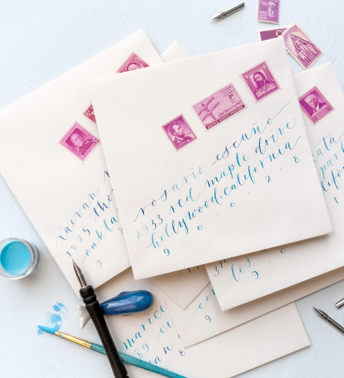
A distinctive modern calligraphy style often starts with a simple question: which parts of your lettering are deliberate, and which come from habit? Changing a few decisions about size, spacing, curves or slant can alter the character of a whole alphabet. The key is to notice those choices, then test them deliberately.
Traditional scripts offer established forms, proportions and stroke patterns. Modern calligraphy gives you room to adjust those conventions. That freedom works best with an understanding of letter construction: once you can see how a baseline, a curve or a connector affects the page, you can decide what to keep and what to change.
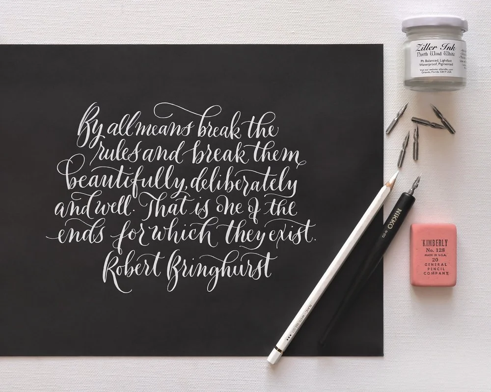
Brause EF 66 nib; Nikko N-20 penholder; Ziller North Wind White ink
Typographer and poet Robert Bringhurst made a case for purposeful experimentation in his 1992 book The Elements of Typographic Style. He wrote: “By all means break the rules and break them beautifully, deliberately and well. That is one of the ends for which they exist.” The same principle applies to lettering: learn the conventions well enough to bend them with intent.
Start by reading your own hand
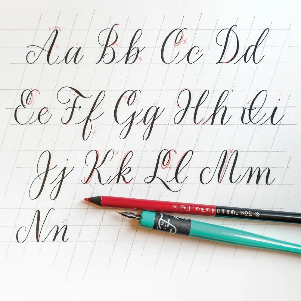
Choose a recent piece of your calligraphy and inspect it letter by letter. Look for repeated patterns and inconsistencies. Are the humps in each m the same height? Do the spaces between its strokes feel even? Does the crossbar of your t land in a consistent place? Compare the size of your lowercase letters with your capitals, and notice whether certain letters repeatedly feel too small or too wide.
Then step back to assess the character of the writing as a whole. It might be narrow, steeply slanted, close to a historical model, or loose along the baseline. Ask what makes it feel formal, playful or uneven. Specific observations are more useful than a general judgment that the lettering needs improvement. They point to choices you can test.
Repeat the same exercise with work by calligraphers you admire. Identify the qualities that draw you in: perhaps the changing rhythm of the baseline, a particular curve, or the way capitals relate to lowercase letters. Looking closely turns admiration into a working vocabulary for your own practice.
Pick a couple of elements to change at a time, so you can see what each adjustment does. Push the experiment far enough to reveal a different possibility; you can refine the result once you know what direction you want to take. Some attempts will look awkward. That’s useful information, too: it helps you distinguish a productive departure from a choice that doesn’t suit the lettering.
14 elements to experiment with
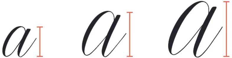
1. Overall letter size
Make your letters notably larger or smaller than usual. A new baseline grid can help you hold the experiment steady while you work. The source also points to a Free Lettering Toolkit as a place to find a grid. Changing scale can reveal proportions and spacing habits that are harder to see at your usual size.
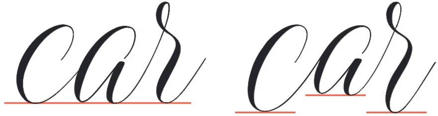
2. Baseline bounce
Move selected letters above the baseline, and let some connector strokes dip below it. A controlled rise and fall creates a lively rhythm across a word. Use the movement with intent so the page feels animated rather than accidental.
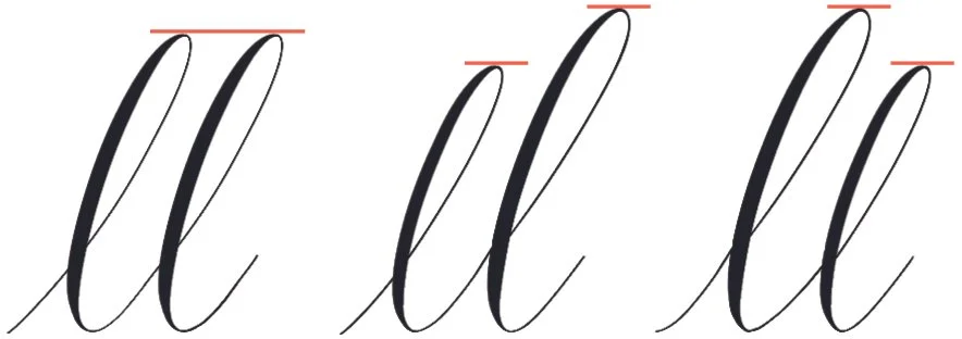
3. Varied double letters
When the same letter appears twice, make the pair visibly different. Varying their shapes interrupts repetition and gives the writing a more individual rhythm. Compare the pair in context to make sure the difference supports the word rather than distracting from it.
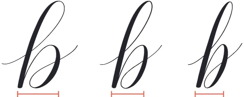
4. Letter width
Adjust letters that seem out of scale with the rest of your alphabet. The bowls of a, b, d, g, o, p and q can become too broad, particularly in beginner work. Narrowing them may help the letters sit together with greater elegance. Compare each revision beside neighbouring letters rather than judging it alone.
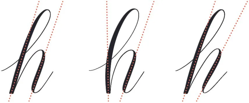
5. Parallel strokes
Letters such as H, h, m, n, u and y contain multiple straight strokes. Try curving one of those strokes instead of simply changing its slant. That small structural adjustment can give a familiar letter a different voice.
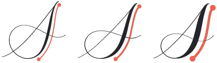
6. Stroke weight
Make the thick parts of your downstrokes heavier or lighter. You can change pressure as you write, or switch to a nib with more or less flexibility. Because stroke weight shapes contrast throughout a word, try the adjustment across several letters before deciding whether it fits the style.
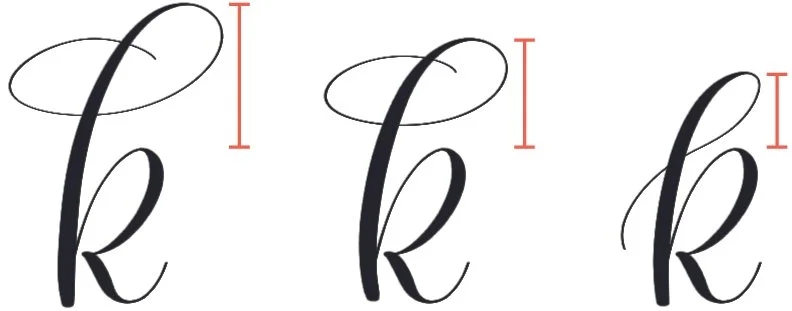
7. Ascender height
Change the height or shape of ascenders, and consider varying them between letters. Lowercase ascenders don’t need to match uppercase cap height. Adjusting those heights independently gives you another way to set the relationship between the two cases.
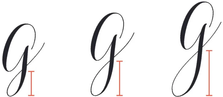
8. Descender length
Extend or shorten the strokes that fall below the baseline, and experiment with their shapes. If your descenders already vary, try making them uniform instead. The useful direction depends on what your current lettering is doing.
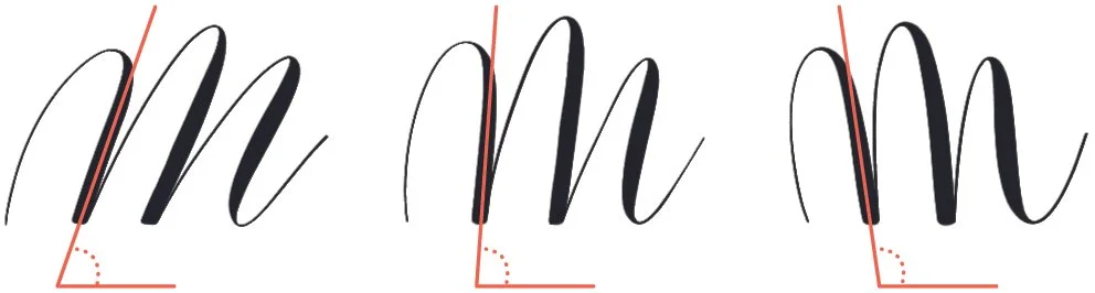
9. Axis slant
Shift the main slant of the alphabet, or vary it from one letter to another for a more playful result. The axis can change a letter’s character even when its stroke pattern stays the same. A backward tilt, known as a backhand or backslant, is another option. A video tutorial and written history of backhand lettering offers a place to explore that approach.
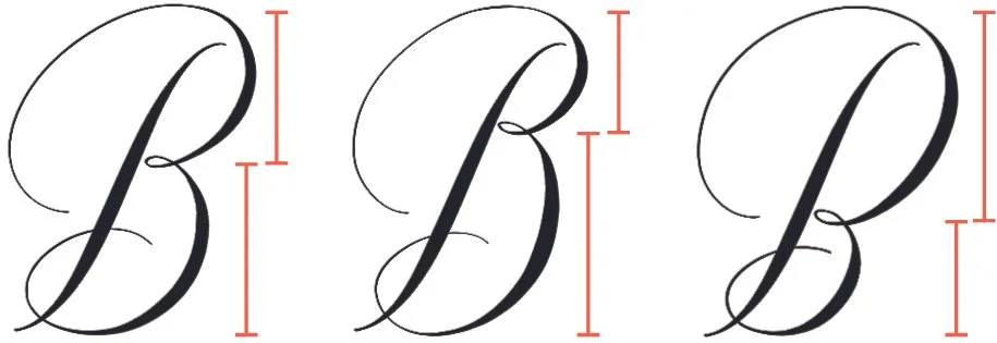
10. Letter proportion
Change the internal balance of a letter, especially in capitals. Repeated parts might be larger at the top or bottom; a form might widen on its left or right. Useful letters to try include B, E, f, K, k, M, m, N, n, P, R, S, W and w.
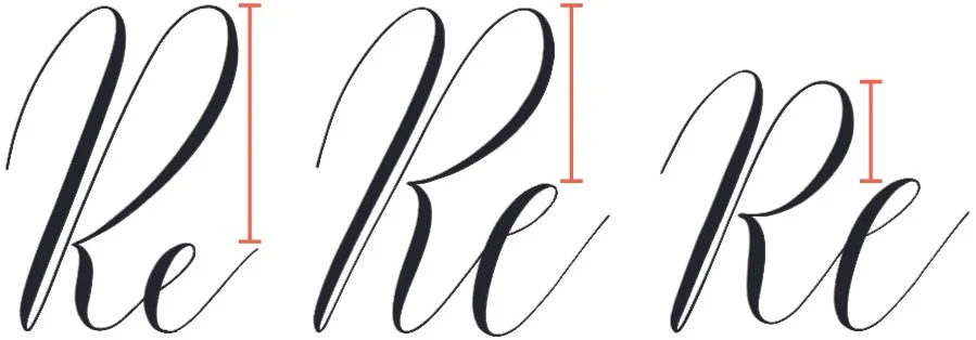
11. X-height and cap height
Change the height of lowercase letters in relation to capitals. A larger gap between x-height and cap height tends to read as more formal; bringing the heights closer can make the style feel more whimsical. This relationship affects the tone of the alphabet without requiring a change to every letter’s construction.
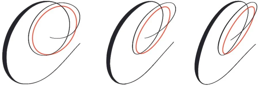
12. Curve shape
Pay attention to the roundness of curves and loops. Circular forms often feel playful and modern, while elliptical curves tend toward a more traditional, formal character. For further guidance on flourish forms, the source links to a workbook on the 8 Principles of Lettering Flourishes.
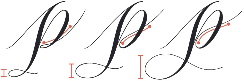
13. Flourish size
Decorative strokes need enough room to balance the letters around them. Small flourishes can leave a composition feeling lopsided, so test loops larger than your first instinct suggests. The same flourish workbook looks more closely at shape and scale.
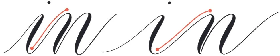
14. Connector stroke length
Lengthen the strokes that connect letters to create a more open, airy rhythm, even if you leave the letterforms themselves alone. Shorter connectors and a steeper slant can make the writing feel compact. A video demonstration of expanded modern calligraphy explores the more spacious approach.
These elements come from Molly Suber Thorpe’s practice; the source says the piece was adapted and expanded from her guide Mastering Modern Calligraphy. Her newsletter offers access to free calligraphy practice pages in different lettering and penmanship styles. The Lettering Toolkit includes worksheets, alphabet pages and Procreate brushes.
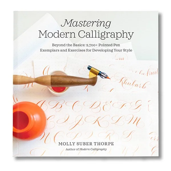
This article has been adapted and expanded from my bestselling how-to guide, Mastering Modern Calligraphy.
Free Modern Calligraphy Practice Sheets:
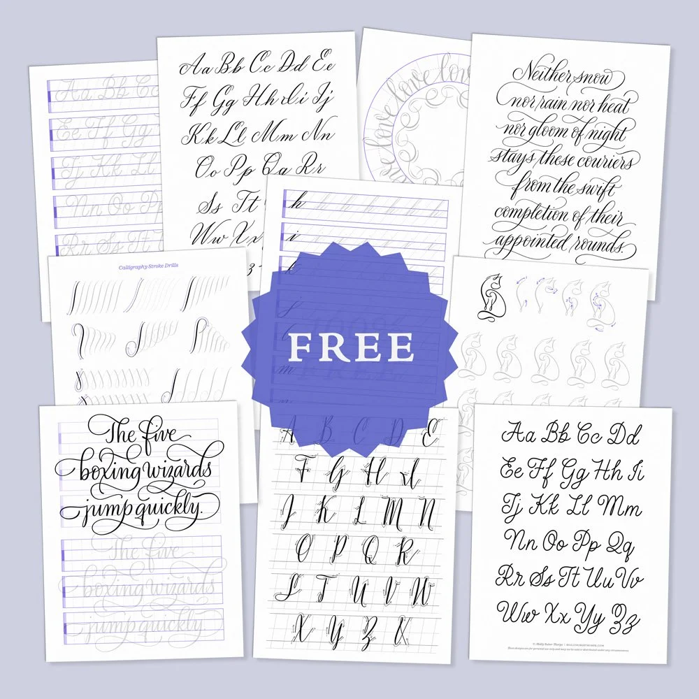
Subscribe to my newsletter to access free practice pages in various calligraphy and penmanship styles.
Molly’s Lettering Toolkit is an archive of free hand lettering worksheets, calligraphy alphabet pages, and Procreate brushes.
Sign UpKeep a record of each variation and compare it with your starting sample. The aim isn’t to change every feature at once, but to understand how a small set of choices gives the lettering its character. A few deliberate experiments can turn familiar habits into a style you recognize as your own.


