Monday, October 12, 2026 · UX & UI Design
Modern Calligraphy Alphabet: Build Letters from Repeated Strokes
Noted by Molly Suber Thorpe · 364 reads
A practical guide to the shared shapes, pen lifts and letter connections that make a modern calligraphy alphabet easier to practise and adapt.
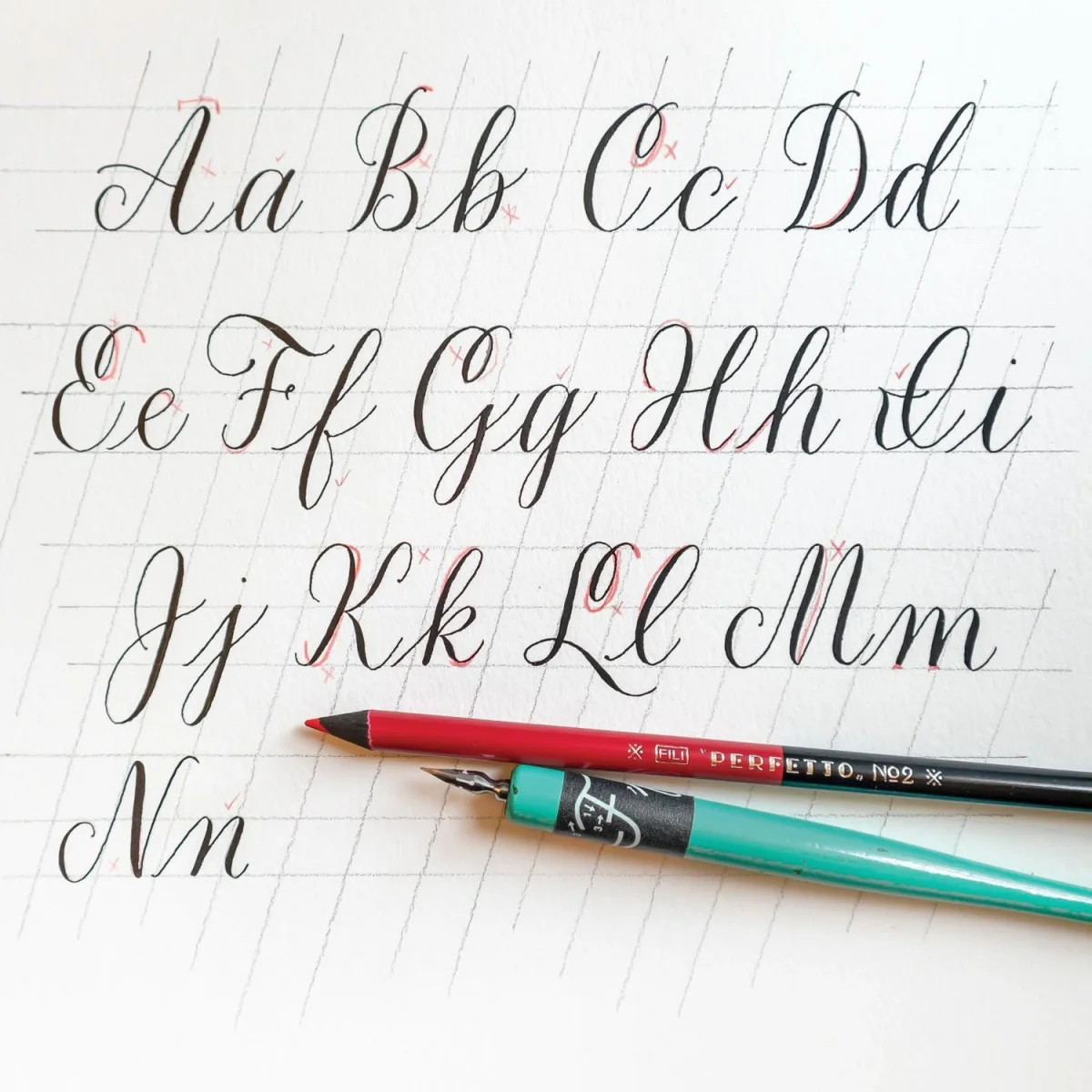
A modern calligraphy alphabet becomes easier to learn when you see its letters as combinations of familiar strokes. Molly Suber Thorpe’s lesson breaks a simple lowercase and uppercase script into reusable forms, with notes on stroke order, pen lifts, proportions and connections between letters. The approach gives learners a practical base for shaping their own style.
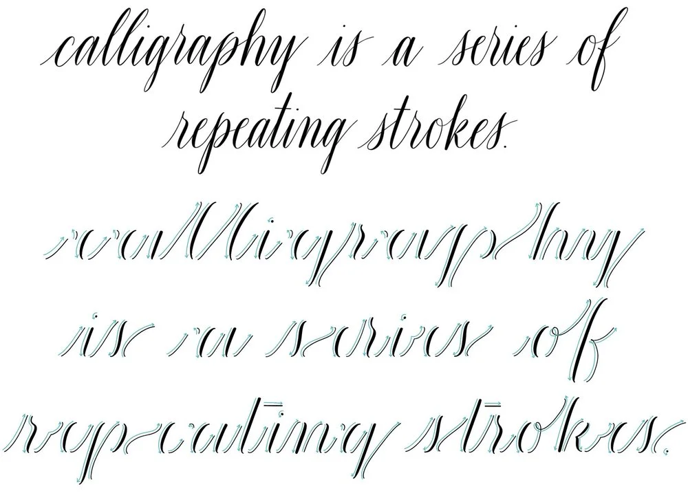
The point isn’t to make every repeated stroke identical. It’s to recognize where one form can inform another, then make deliberate choices about consistency and variation. Once the underlying shapes feel familiar, embellishment and personal adjustments have something solid to build on.
The lowercase alphabet as a set of forms
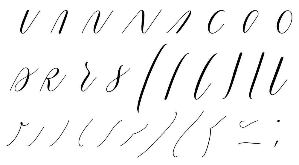
The basic strokes of a simple modern calligraphy lowercase alphabet. Click to enlarge.
The basic strokes of a simple modern calligraphy lowercase alphabet. Click to enlarge.
The lesson identifies 31 shapes that form the basis of its lowercase alphabet. Many recur across several letters, so a practice session focused on one shape can help with more than one character. That’s a useful shift in how you approach repetition: practise the form and its role in the alphabet, rather than treating each letter as an isolated drawing.
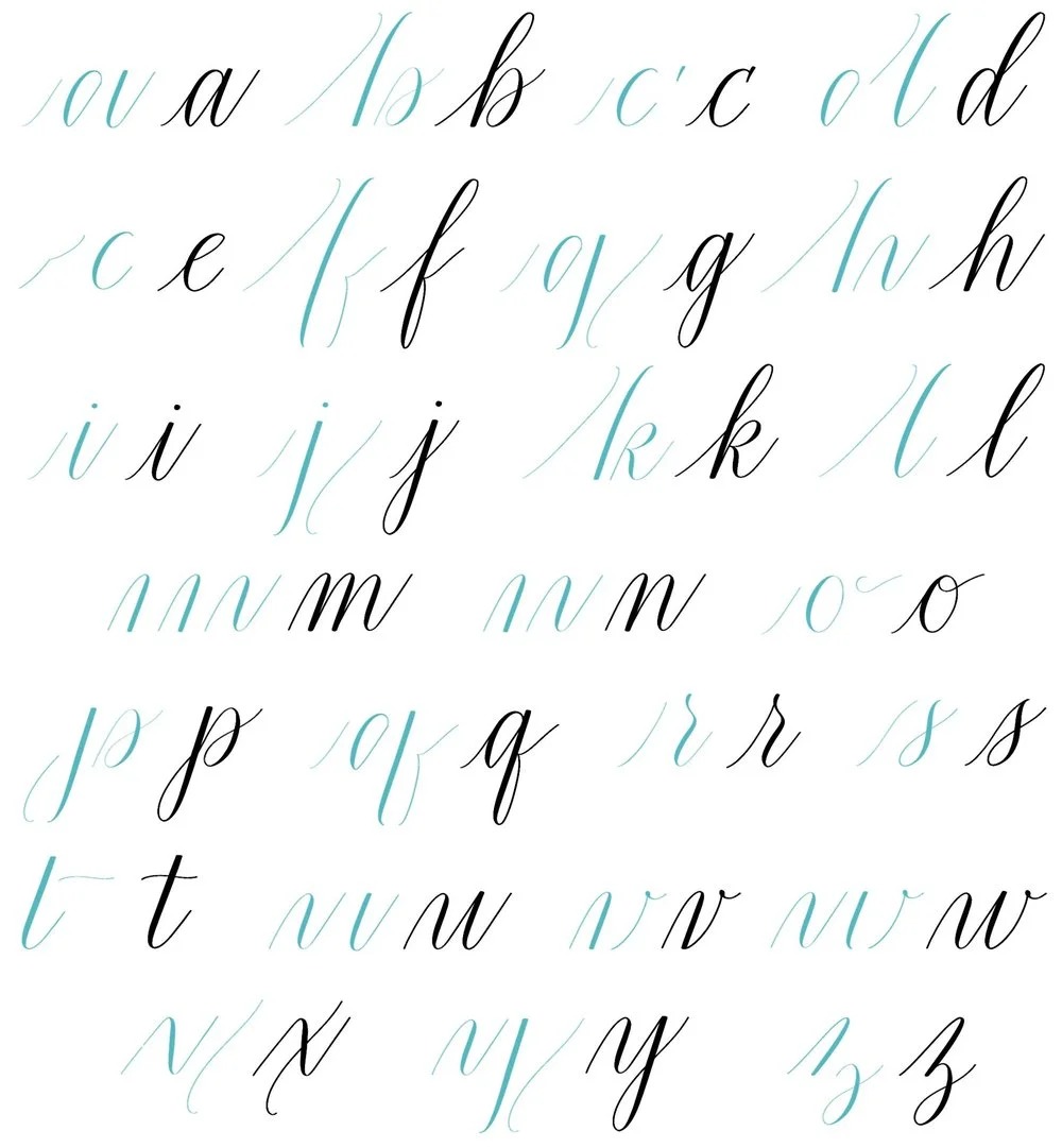
A lowercase modern calligraphy alphabet broken down into its essential strokes. Click to enlarge.
A lowercase modern calligraphy alphabet broken down into its essential strokes. Click to enlarge.
Look at the bowl of a: it also appears in d, g and q. Its straight stem can be understood as an undotted i. Extending the stem of u gives you a starting point for y; the stem of y, with a dot added, offers a route to j. The tall stem in d is the same basic form used in l, b, h and k.
These relationships make practice more efficient, but they also help a script hold together visually. If you adjust a shared bowl or stem, you can check how the change affects several letters. Repeated shapes provide a kind of visual logic for the alphabet, while small differences can keep the letters from feeling mechanical.
Suber Thorpe cautions against assuming that a reusable stroke must always be repeated in exactly the same way. An artist can adapt the forms across the 26 lowercase and 26 uppercase letters. The useful part is knowing which features connect them; that knowledge makes variation more intentional. For a related discussion, see The Elements of Modern Calligraphy Style.
Reading the alphabet’s stroke directions
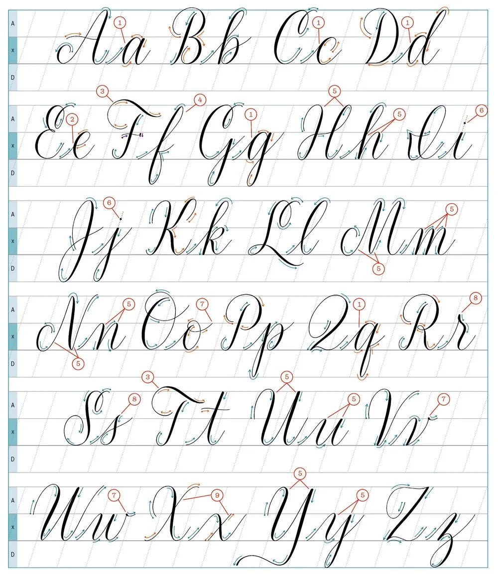
A basic modern calligraphy alphabet with directional arrows. Numbers lead to keyed notes below. Click to enlarge.
A basic modern calligraphy alphabet with directional arrows. Numbers lead to keyed notes below. Click to enlarge.
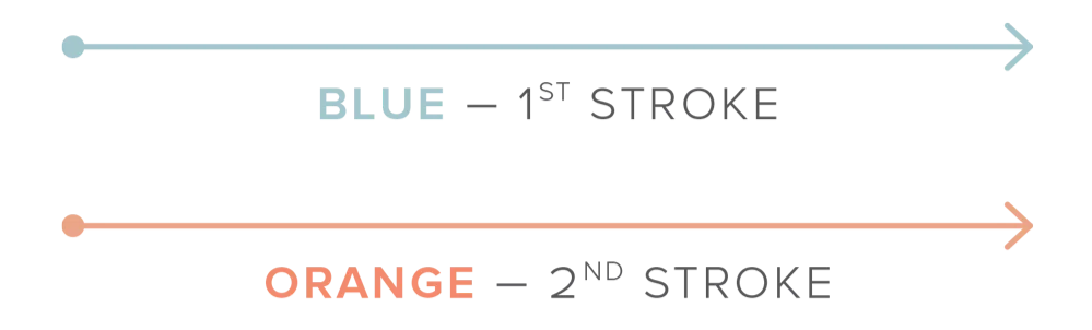
The diagram marks where each stroke begins, which direction it travels and the order in which to draw it. Dotted ends indicate starting points; blue marks the first stroke and orange the second. Use those cues to study the construction before practising the complete letter.
Pen lifts are part of the design. You can lift between strokes wherever it helps your control, but a fine hairline across the top curve of a, c, d, g and q requires a lift before that curve. For e, lifting after the entry stroke can help create a rounder eye, the enclosed loop at the top of the letter.
Uppercase F and T offer a choice in how the top bar reads. If you want it shaded rather than hairline-thin, turn your arm slightly as you draw the horizontal stroke so you don’t press down on the pen during that movement. The note is a reminder that stroke direction and body movement affect the weight of the mark.
Proportion, alignment and tricky joins
Lowercase f is the only letter in this alphabet with both an ascender and a descender. Many of the other letters share vertical strokes, and those strokes are customarily parallel even when the alphabet has a slant. The examples include H, h, M, m, N, n, U, u, Y and y. Keeping their straight strokes aligned gives the script a steadier rhythm.
Dot i and j by following the axis of each downstroke with your eye, then placing the dot along that imaginary line. It’s a small alignment decision, but it helps the dot feel connected to the letter rather than placed by guesswork.
The exit strokes of o, v and w leave from the waistline instead of the baseline. The next letter therefore begins higher than it would after a low exit stroke. Pay close attention to combinations such as or, os, vr and wr: the entry strokes of r and s contribute strongly to their legibility, so the join may need adjustment.
The top points of r and s sit slightly above the waistline to look proportional beside neighbouring lowercase letters. In some styles, the same adjustment works for p. And every letter should include at least one upstroke and one downstroke: their contrast creates the movement associated with calligraphy. For crossed forms of X and x, the crossbars should be upstrokes when both main strokes are downstrokes.
From practice to personal style
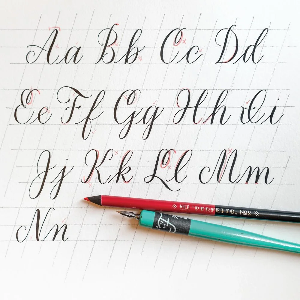
A useful way to work through the alphabet is to practise a recurring form, then compare the letters that use it. Follow the arrows for stroke order, notice where a lift changes the shape, and check parallel stems and joins as you write. When the forms feel familiar, introduce variations one at a time so you can see how each change affects both the individual letter and its neighbours.
This article has been adapted and expanded from my bestselling how-to guide, Mastering Modern Calligraphy.
Practice resources
The lesson presents a foundation for exploring letter variations and flourishing. Suber Thorpe also points readers to practice pages and lettering resources through her newsletter:
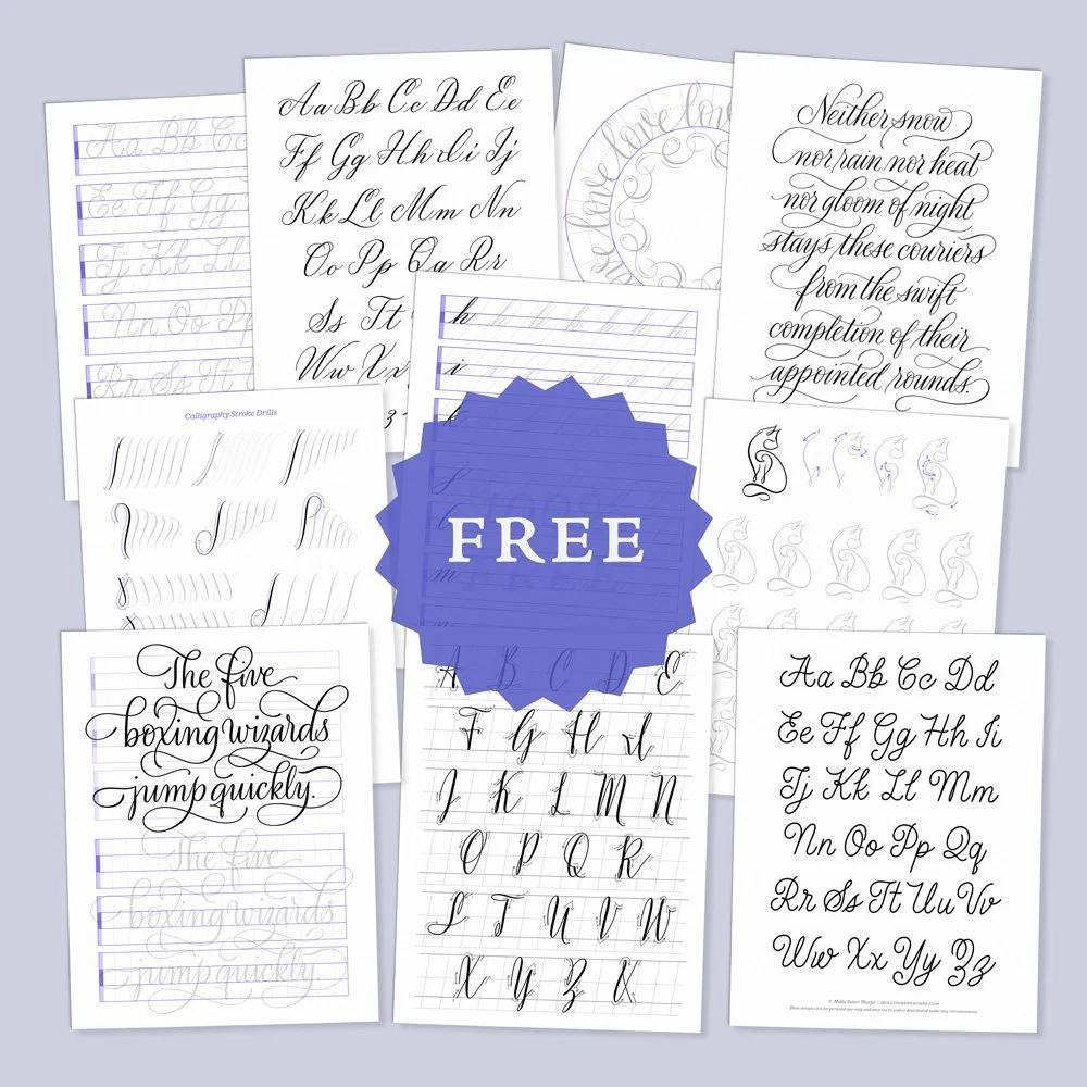
Subscribe to my newsletter to access free practice pages in various calligraphy and penmanship styles.
Molly’s Lettering Toolkit is an archive of free hand lettering worksheets, calligraphy alphabet pages, and Procreate brushes.
Sign UpStart with the shared forms and the way they connect. Once you can recognize those patterns on the page, you can make choices about proportion, stroke weight and flourishes with a clearer sense of how each change shapes the whole alphabet.
If you found this lesson helpful, consider sharing it with others. That’s the best, free way to support artists you appreciate. You could also buy me a coffee.


