Thursday, October 22, 2026 · Graphic Design
Apple Music’s Ripple Logo Turns Fred Again’s Composition Into a Visual Identity
Noted by Katy Cowan · 410 reads
Fred Again and NEST Acoustics shaped Apple Music’s new sound-led identity by recording musical notes as ripples in mineral oil.
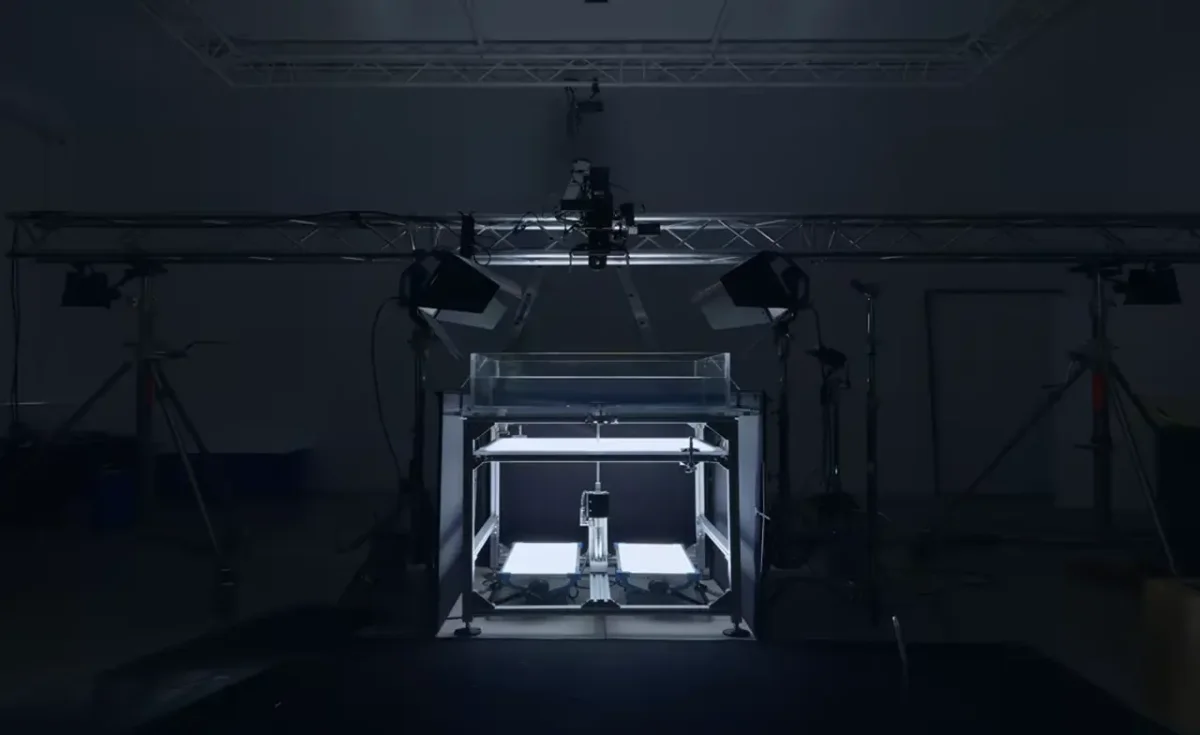
Apple Music’s new identity starts with a practical design question: what if the sound came before the picture? The answer is a musical note shaped by real vibrations in mineral oil, created through months of experiments with British producer Fred Again, collaborator NEST Acoustics and agency TBWA\Media Arts Lab.
The streaming service launched in 2015, and this is its first rebrand since then. Rather than begin with a graphic interpretation of music, the team made an original composition and used its notes to produce the visual material. That decision gives the logo a specific source: its fluid edges record the movement caused by sound.
Turning notes into visible movement
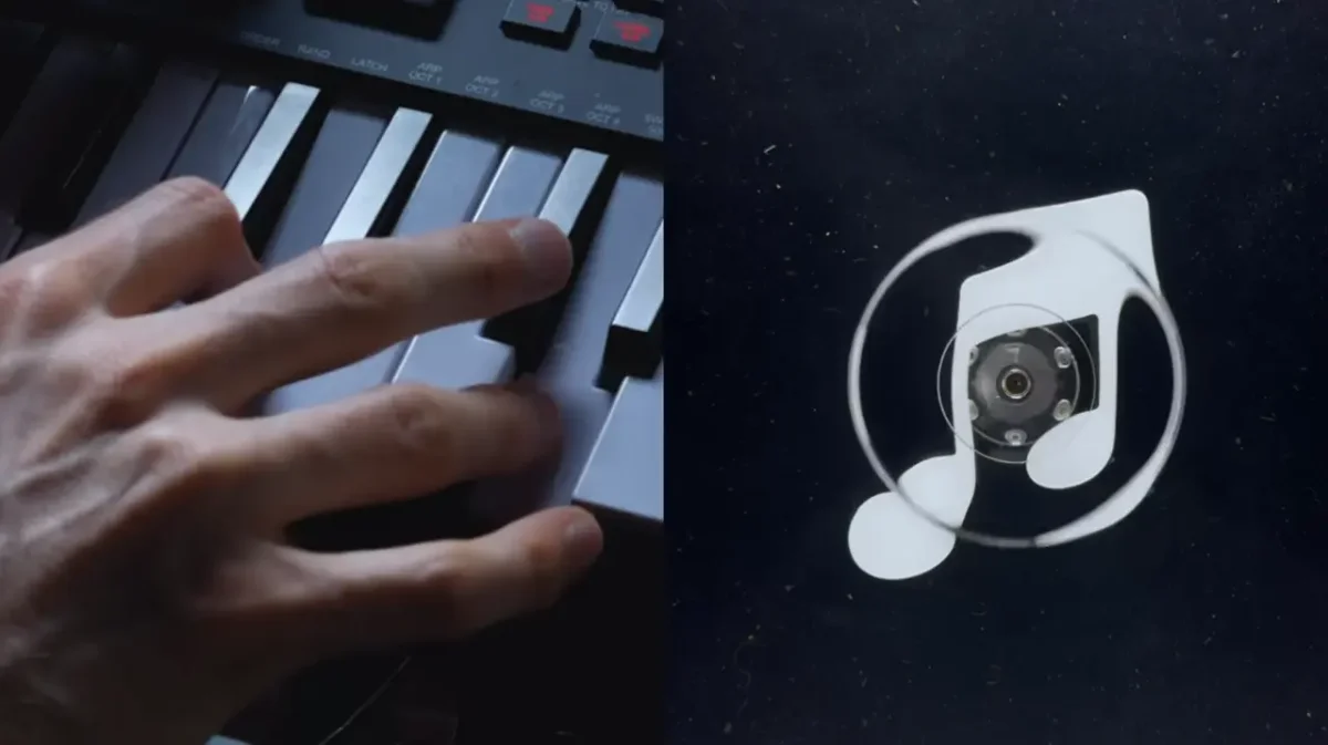
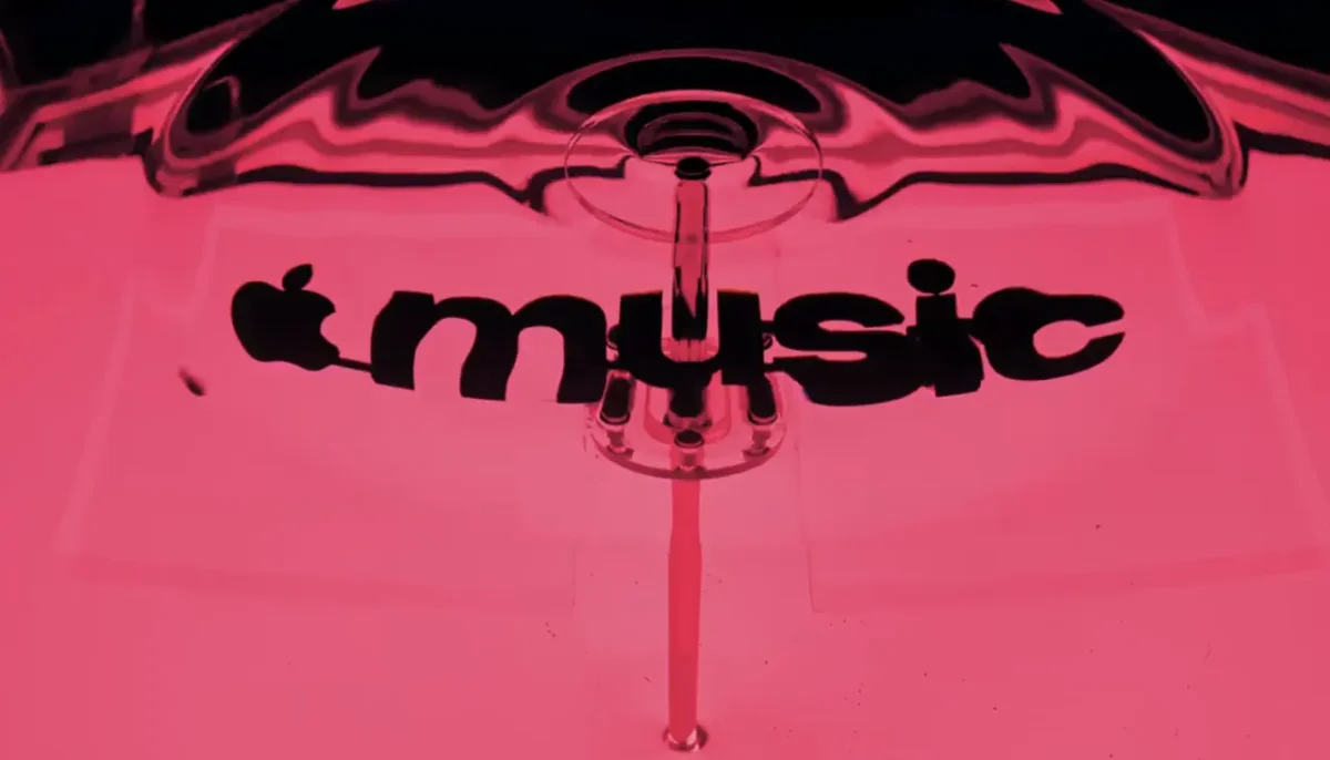
Fred Again and NEST Acoustics wrote a short piece, then separated it into individual notes. Each one played through a transducer, a device that converts an audio signal into physical vibration. The transducer sat above a shallow bath of mineral oil, where its movement formed ripples. The team filmed those patterns in camera, making the footage the starting point for the new identity.
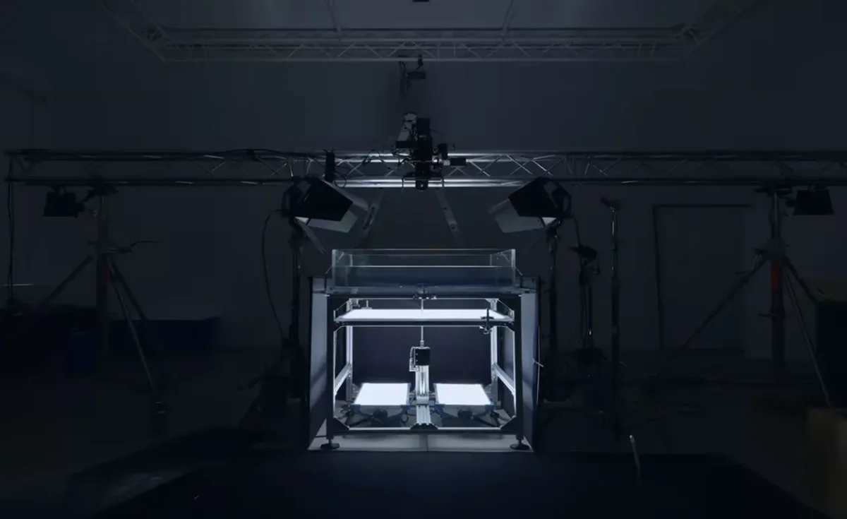
The setup sounds direct, but the results depended on careful tuning. Fast Company reports that the team spent months testing the relationship between the music and the image. Too many notes, or notes pitched too high, made the oil move so much that the resulting patterns became hard to read. The sound had to create movement while leaving a clear shape for the identity to use.
That constraint is central to the design. The footage wasn’t simply added as a decorative effect after the logo had been drawn. Instead, the team adjusted the musical material and the visual result together, working toward a mark that could hold onto its form while still showing the irregularity of the waves. For designers, it’s a reminder that a generative process often needs boundaries: here, the identity had to remain recognizable even as the oil responded to each vibration.
A mark with a physical source
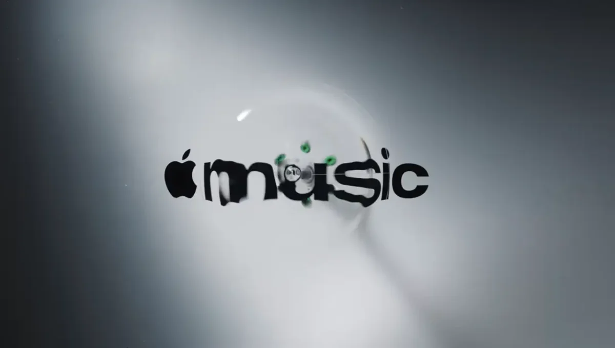
The finished icon keeps the familiar musical note, but gives its contours a more expressive, rippled character. Apple Music describes the identity as “made by sound”; the team’s stated aim was to make the finished mark feel like a physical record of music, rather than an illustration of what sound might look like. That distinction makes the process legible in the result: the waves have been recorded from a real material reacting to the composition.
The logo also sits within Apple’s Liquid Glass design language, so the fluid treatment has a broader visual context across the company’s work. The new mark appears to extend that language through a distinct process tied to the service’s central subject. There’s a useful balance here for identity designers: a recognizable symbol gives the work continuity, while the captured movement supplies a more individual texture.
The wordmark received a revision alongside the icon. It combines the Apple symbol with a custom version of SF Pro, Apple’s typeface, set in bold lowercase letters. The heavier weight gives the name more presence, while the letterforms keep it connected to Apple’s wider typographic system. Plau handled the type design consultation and vector logo reconstruction.

One composition, heard and seen
The music does more than generate the visuals. The same composition becomes Apple Music’s new sonic signature, linking what people hear with what they see. That gives the rebrand a shared foundation across two senses, and makes the original piece part of the identity rather than just background music for a launch film.
Apple Music introduced the new identity on X and Instagram, describing it as “physically shaped by an original composition” from Fred Again and NEST Acoustics. The launch included a behind-the-scenes film directed by Joe Jackson. Optical Arts produced the film, Time Based Arts handled the visual effects, Trafik worked on colour and finishing, and Model Citizen mixed the music.
Some London audiences had already seen the wordmark: it was first teased in September as part of the marketing for Apple Music Hall, the brand’s new live music venue in London. Apple Music will roll out the identity across its own content this week. It’s due to appear in the app with iOS 27.2, described as coming soon, followed by its use across marketing and product work.
The most useful takeaway for a design team may be the way the process kept sound, material and legibility in the same conversation. A transducer and a bath of oil supplied the raw visual behavior; repeated tests helped shape that behavior into a mark that still reads as Apple Music. The result makes the making visible, while the shared composition gives the visual identity and sonic signature a common source.


