Tuesday, October 20, 2026 · Graphic Design
Fulham FC’s Craven Cottage Lettering Becomes a Bespoke Identity System
Noted by Tom May · 470 reads
Music and type foundry F37 turn lettering from Fulham’s historic stadium into a flexible type family rooted in the club’s own visual history.
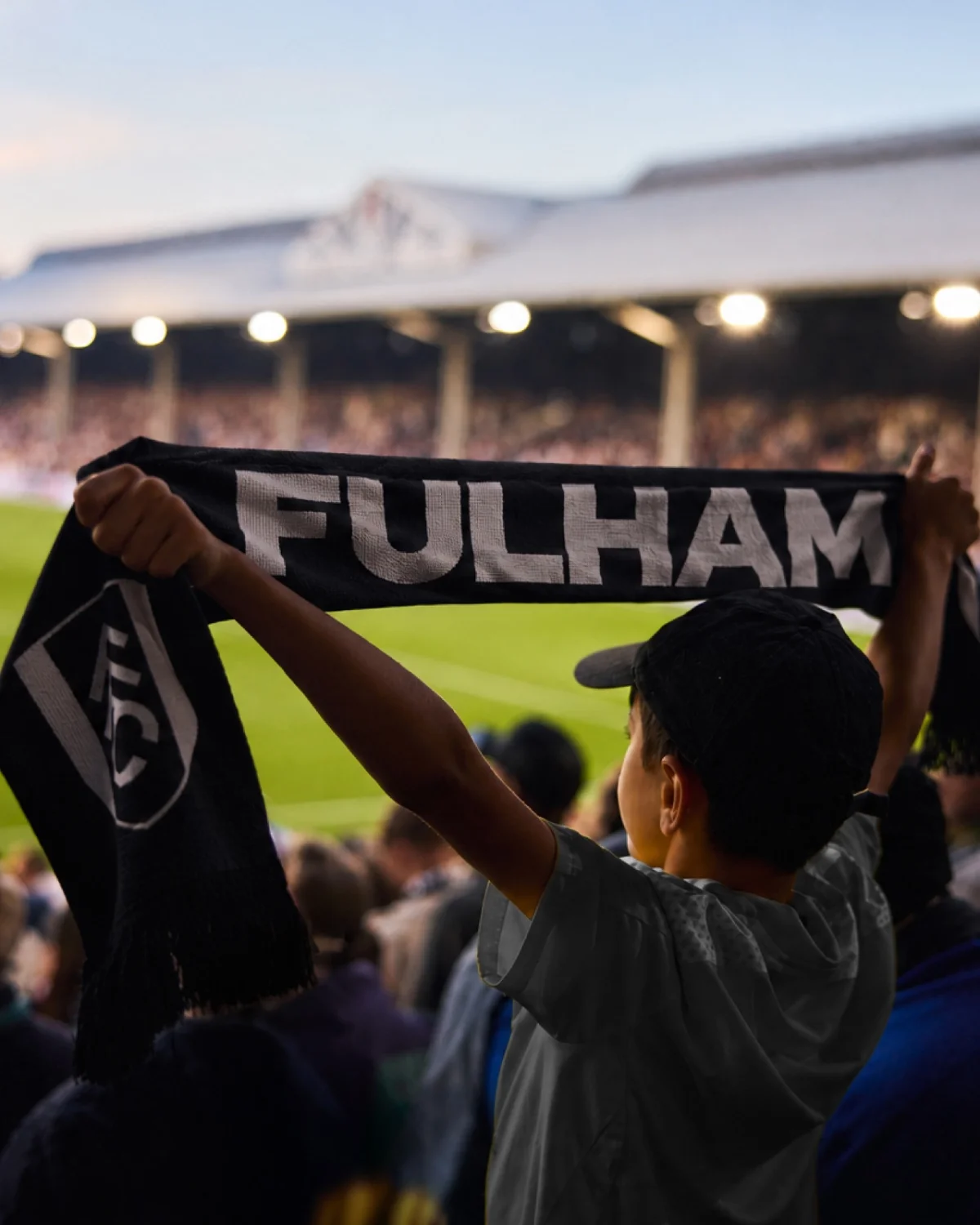
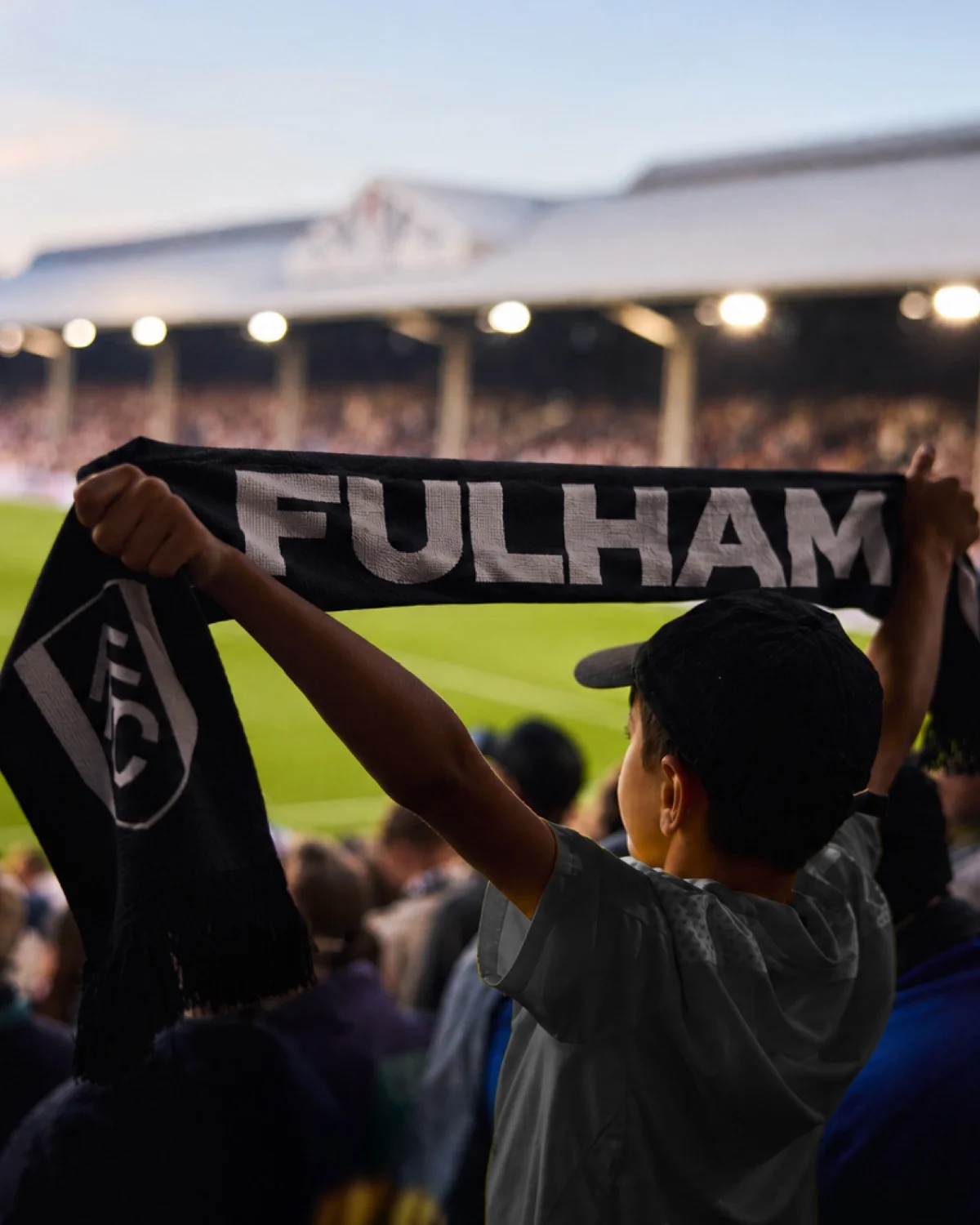
Fulham FC’s new identity starts with a design asset that was already part of the club: hand-rendered lettering on the walls of Craven Cottage. Manchester independent studio Music and type foundry F37 developed that lettering into a bespoke type family, giving the club a way to speak across matchday materials, digital products, merchandise and cultural experiences with one recognisable visual voice.
The useful idea here is that the identity’s contemporary character comes from its source material. Instead of adding a general-purpose retro style to suggest history, the designers began with lettering tied to Fulham’s home ground, which the article describes as London’s oldest football stadium. The result connects the club’s past to the growing range of places where supporters now encounter it.
A club identity for more than matchday
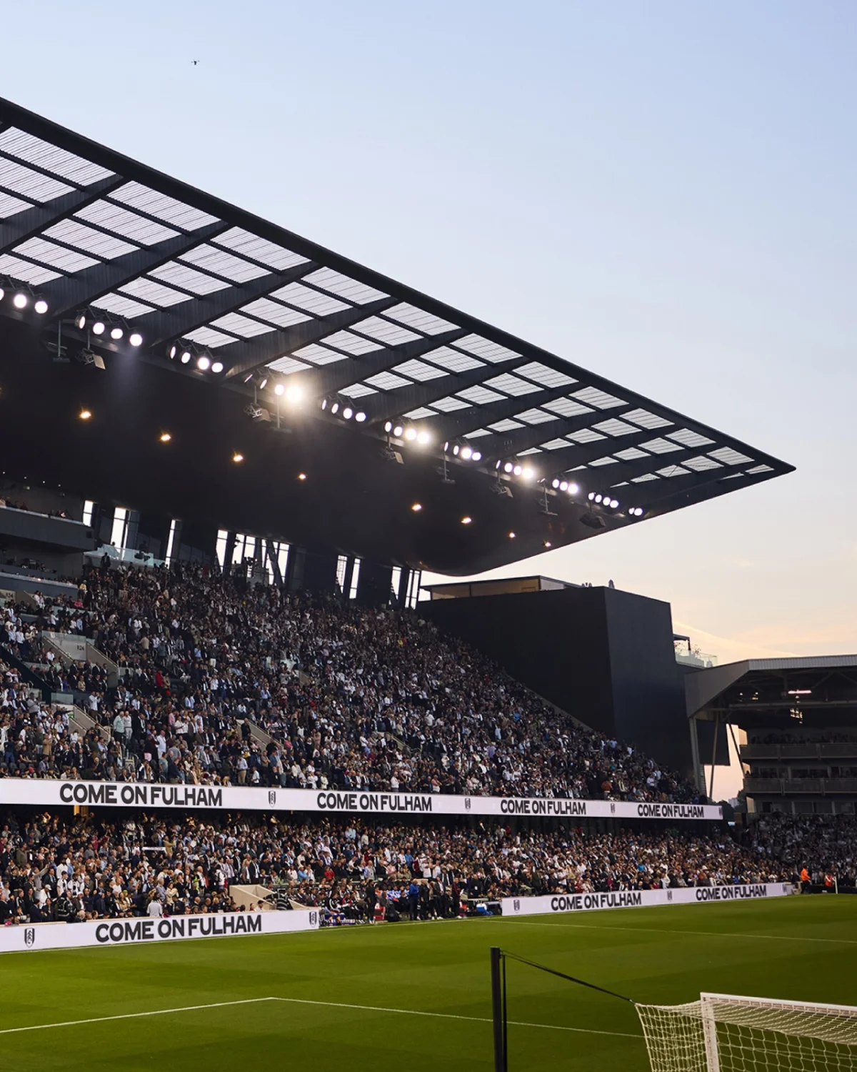
Fulham’s brief grew out of a change in how people experience the club. A supporter’s relationship may include the 90 minutes on the pitch, but it can also involve social and digital channels, merchandise, events and hospitality. The Riverside Stand redevelopment and Fulham Pier extend that experience with entertainment and cultural offerings alongside football.


Marketing director Jack Burrows says the club now communicates with lifelong supporters, newer fans, local and international audiences, and hospitality guests through different channels. Some people attend matches regularly; others may never visit Craven Cottage. That spread calls for a visual identity that can adapt to distinct settings while still feeling connected to the same club.
Music’s CEO and executive creative director Dave Simpson says the project didn’t begin with a plan to replace everything. The agency had worked with Fulham over a long period, and its task was to understand what had changed around the club, then find a more distinctive expression that retained what people valued. Research led the team back to the stadium’s own lettering.
From a piece of lettering to a type family
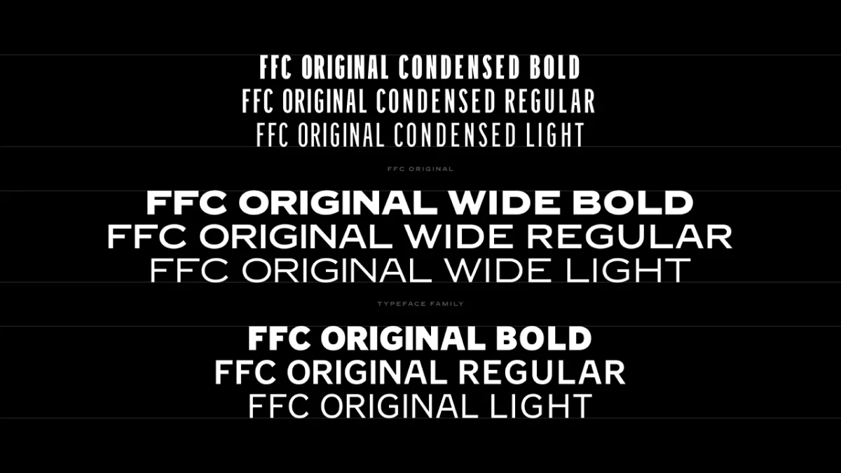
Music brought in F37 to develop the hand-rendered forms into a full type system. The source shows the FFC Original family in multiple weights and widths, including condensed, wide and standard versions in bold, regular and light. That range gives designers room to adjust the typography to the space and purpose at hand, while keeping a shared visual signature.



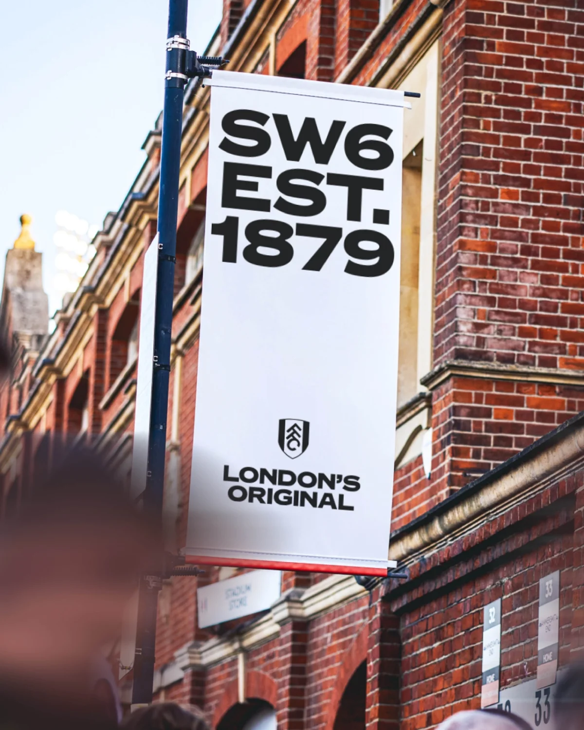
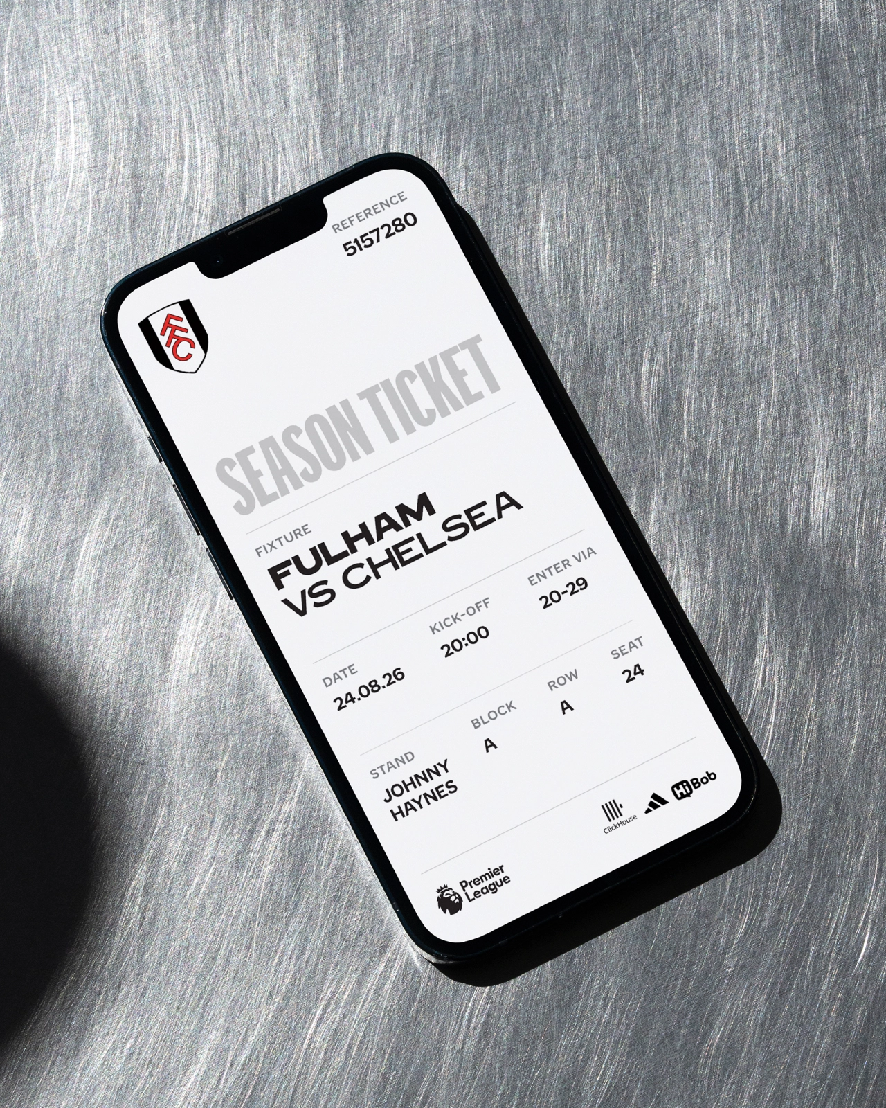
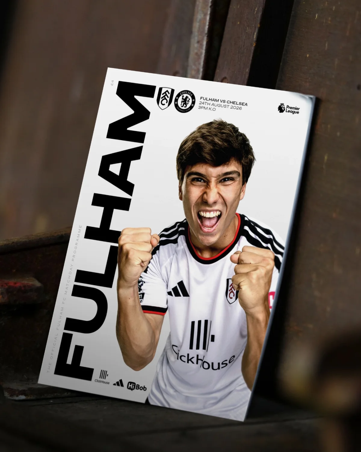
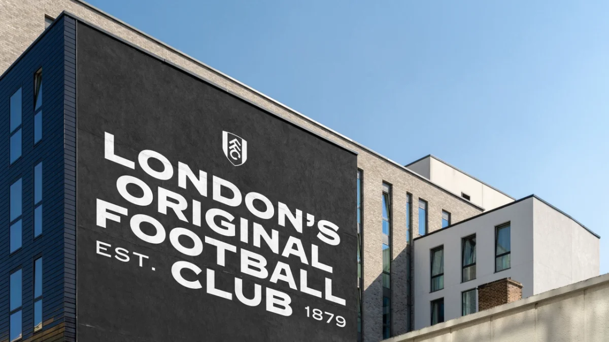
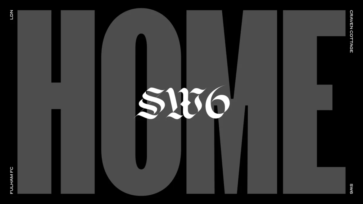
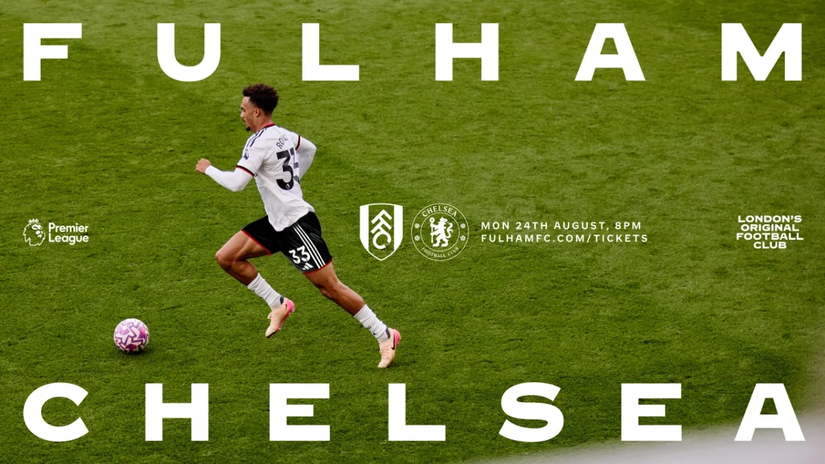
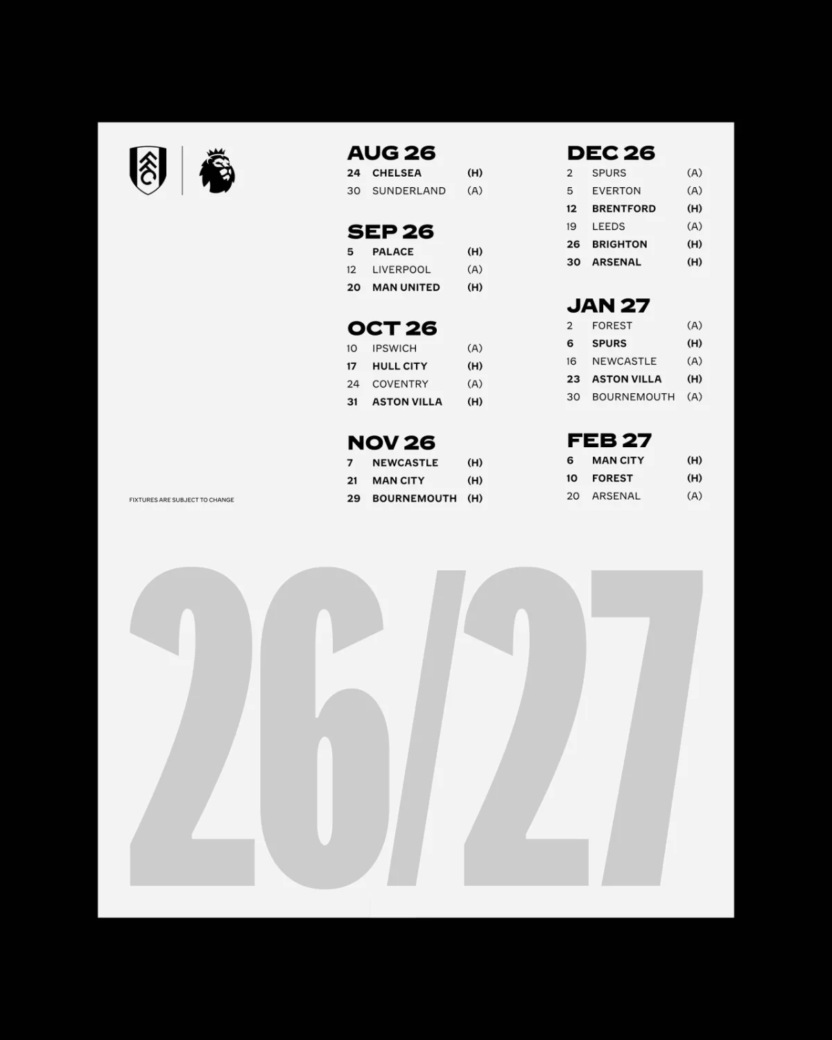
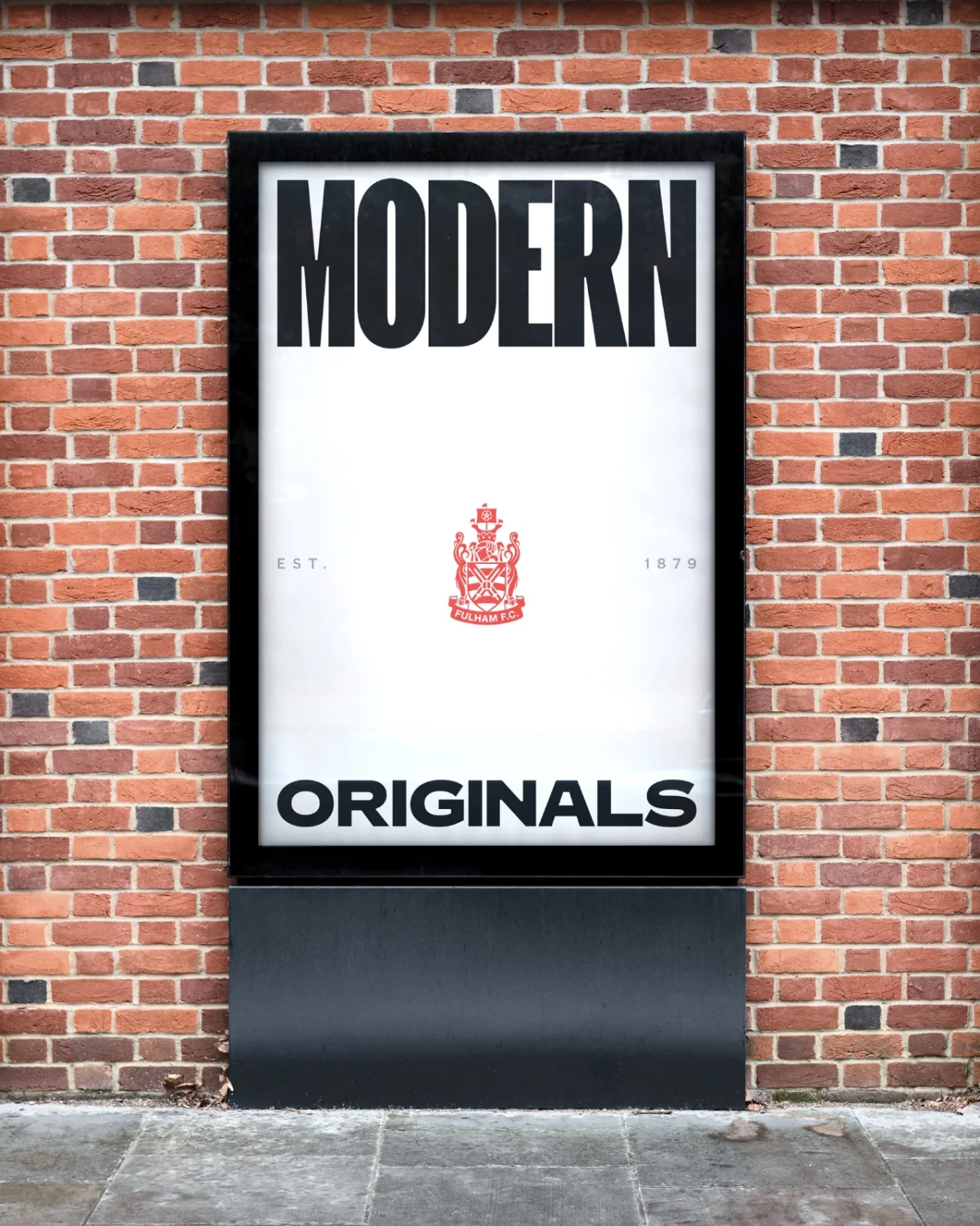
The supplied applications span very different formats: a stadium mural, sportswear, a billboard, a season ticket on a phone and a fixture list. The family’s breadth matters in those settings. A condensed style can give a headline a compact footprint; wider forms can bring emphasis to a larger surface. The range lets the club shift scale and tone without abandoning the lettering that anchors the system.
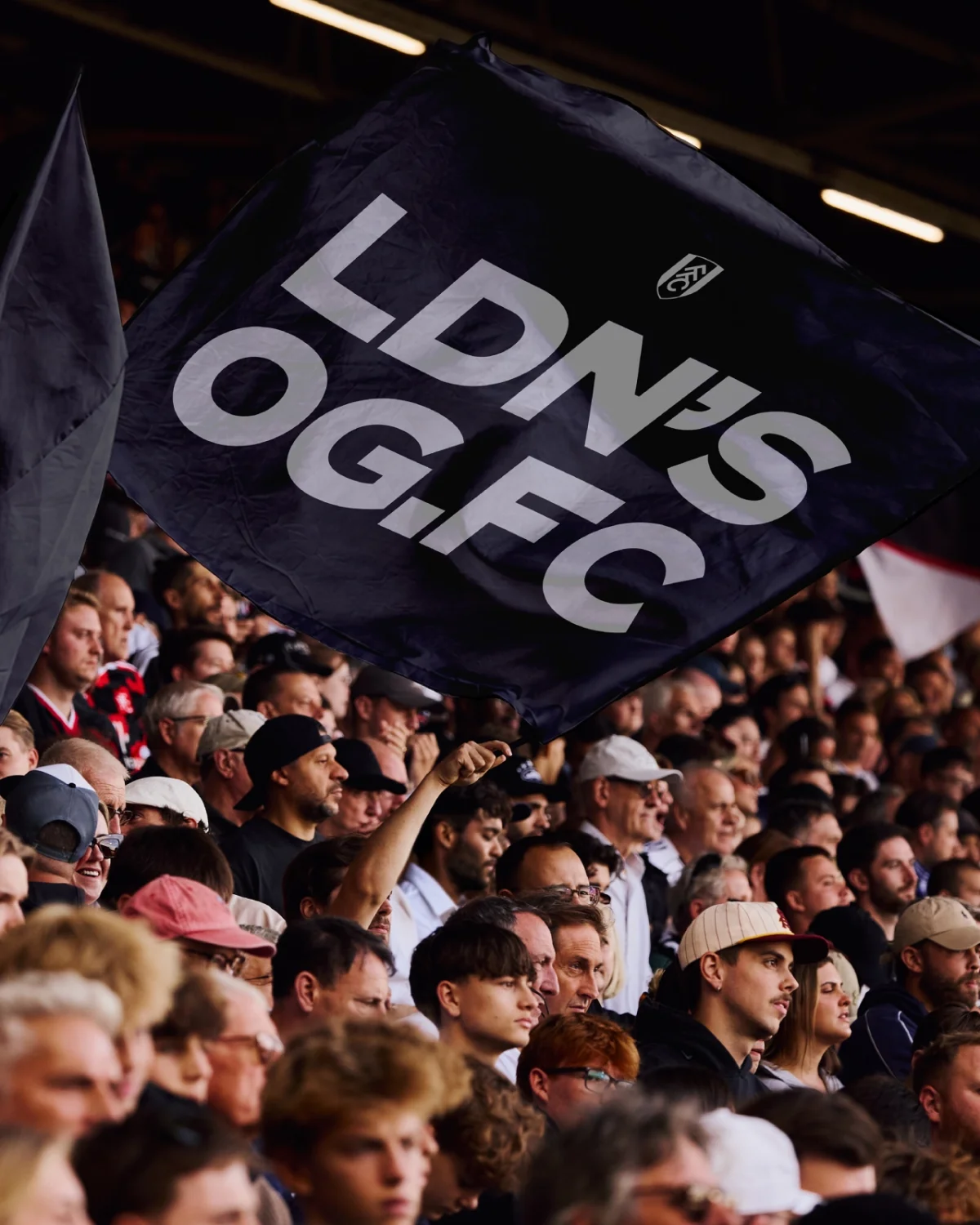
The club’s history is also expressed through lines such as “London’s Original” and “Est. 1879,” visible in the identity applications. Those details make the connection to place legible, while the custom type carries it into contemporary layouts. The article doesn’t specify a launch date or describe the production workflow in detail, so the work is best understood through the credited collaborators and the applications shown.

Heritage as the design material
For Simpson, the core concept and its visual form are inseparable: heritage isn’t an extra layer placed beside a modern identity; it produces the identity. That distinction gives the work a specific foundation. The lettering wasn’t selected simply because it looked old. It came from the club’s own stadium and carries a direct relationship to Fulham.
Burrows describes the system as a way to support the club’s growth while staying authentic, with consistency and room for more expressive uses. That balance is the practical test for a heritage-led identity: can its defining feature work in a match programme, a digital ticket and a large wall without becoming a decorative motif? Here, the expanded FFC Original family gives Fulham a flexible typographic toolkit, and Craven Cottage supplies the thread that ties those uses together.
For designers, the project’s clearest takeaway is to look for visual history in the place or object being represented. When a source detail has a real connection to its subject, developing it into a system can make the identity feel contemporary through its own history, rather than through borrowed nostalgia.


