Wednesday, October 21, 2026 · Graphic Design
Davy Denduyver Gives A Human Agency a Hand-Stamped Identity for Its Fifth Year
Noted by Katy Cowan · 836 reads
A hand-drawn wordmark, soft cream palette and “For Humans. By Humans.” motto give A Human Agency a crafted identity built to frame its artists’ work.
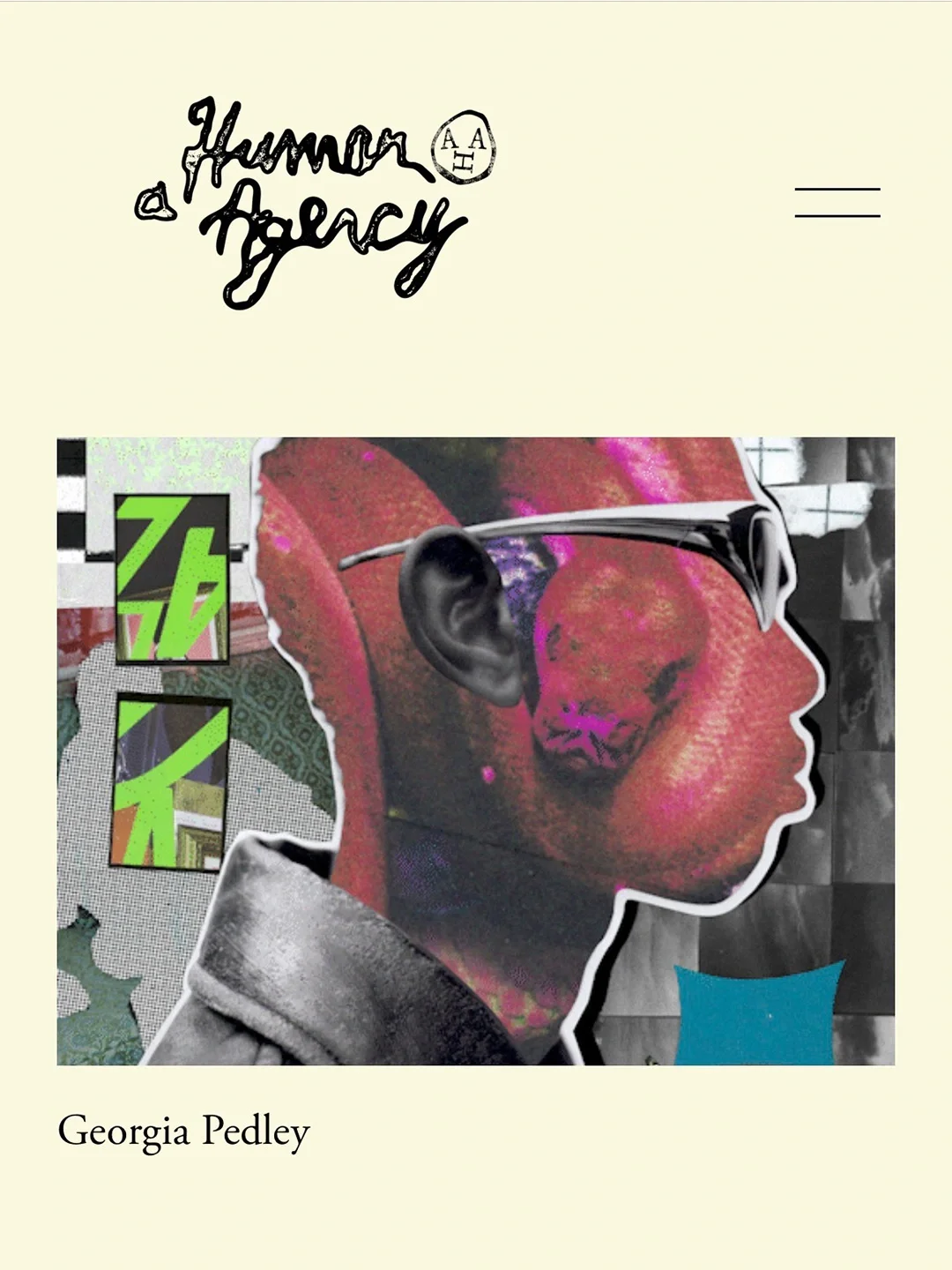
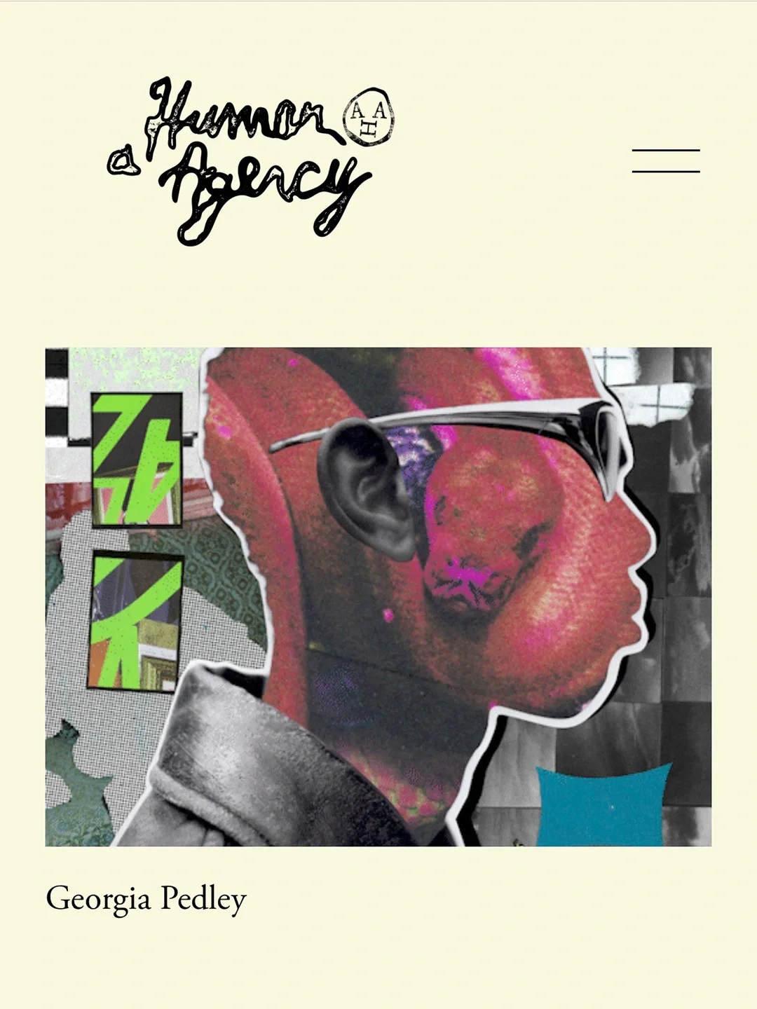
A Human Agency’s new identity treats the agency less like a visual author and more like a frame for the artists it represents. Belgian graphic designer Davy Denduyver built the system around hand-drawn marks, a restrained cream-and-black palette and a deliberately imperfect finish. The brief came from founder and agent Ryan Claydon as the agency approached its fifth birthday.
The commission began with a Creative Boom Instagram feature. Denduyver appeared in Ten Under 10K, a recurring series spotlighting creatives with fewer than 10,000 followers. Claydon, who had first noticed Denduyver’s identity for Barcelona restaurant Mina, later got in touch about refreshing A Human Agency’s look. The encounter is a reminder that a designer’s regular practice of sharing work can make the right connection without requiring a separate persona as a content creator.
“Davy’s work has a tactility to it,” Claydon says. He was drawn to the way Denduyver combines hand-drawn elements and typography. Their first conversation also established an easy rapport: both recall spending as much time joking as discussing the project. For Denduyver, the personal connection and a clear sense of why Claydon had approached him made the brief feel like a natural fit.
A clear brief with room to make
Claydon usually works between illustrators and clients, so commissioning the identity put him on the other side of that relationship. With 15 years of experience as an agent, he knew the frustration of clients who wait to recognize an idea without explaining what they need. He gave Denduyver a clear brief, then left space for him to shape the answer. The project needed only two minor changes.
That balance matters to the visual result. The identity had to express A Human Agency’s position while giving its roster room to speak. Illustration was ruled out early because a distinctive illustrative style might compete with the work of the agency’s 14 artists. Denduyver instead made typography and a simple emblem carry the identity.
Making the name visible
Claydon chose the name A Human Agency in 2020, during a redundancy process at his previous agency. He wanted to create a place that championed illustrators for their thinking and perspective, as well as for the finished work they make. Over time, the name has taken on added meaning for him: it signals a preference for human voices and a distinct authorial point of view amid a rising volume of AI-generated creative work.
The fifth anniversary, which falls in January, offered a natural moment to give that idea a clearer visual expression. Claydon describes the new identity as folk-like, crafted, strange and full of unexpected turns. Its irregular character is intentional: it gives the agency a distinct presence while keeping the artists’ work at the centre.
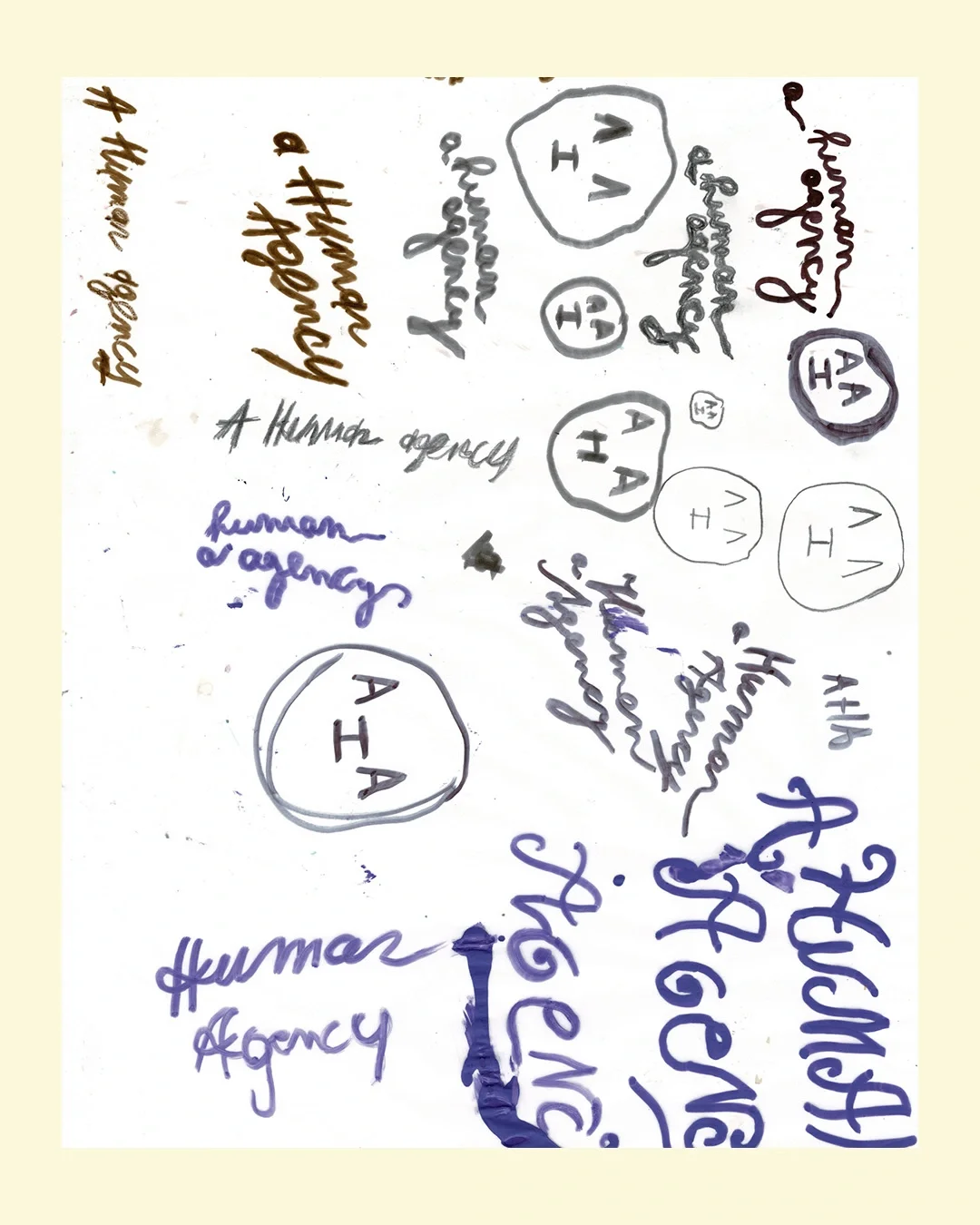
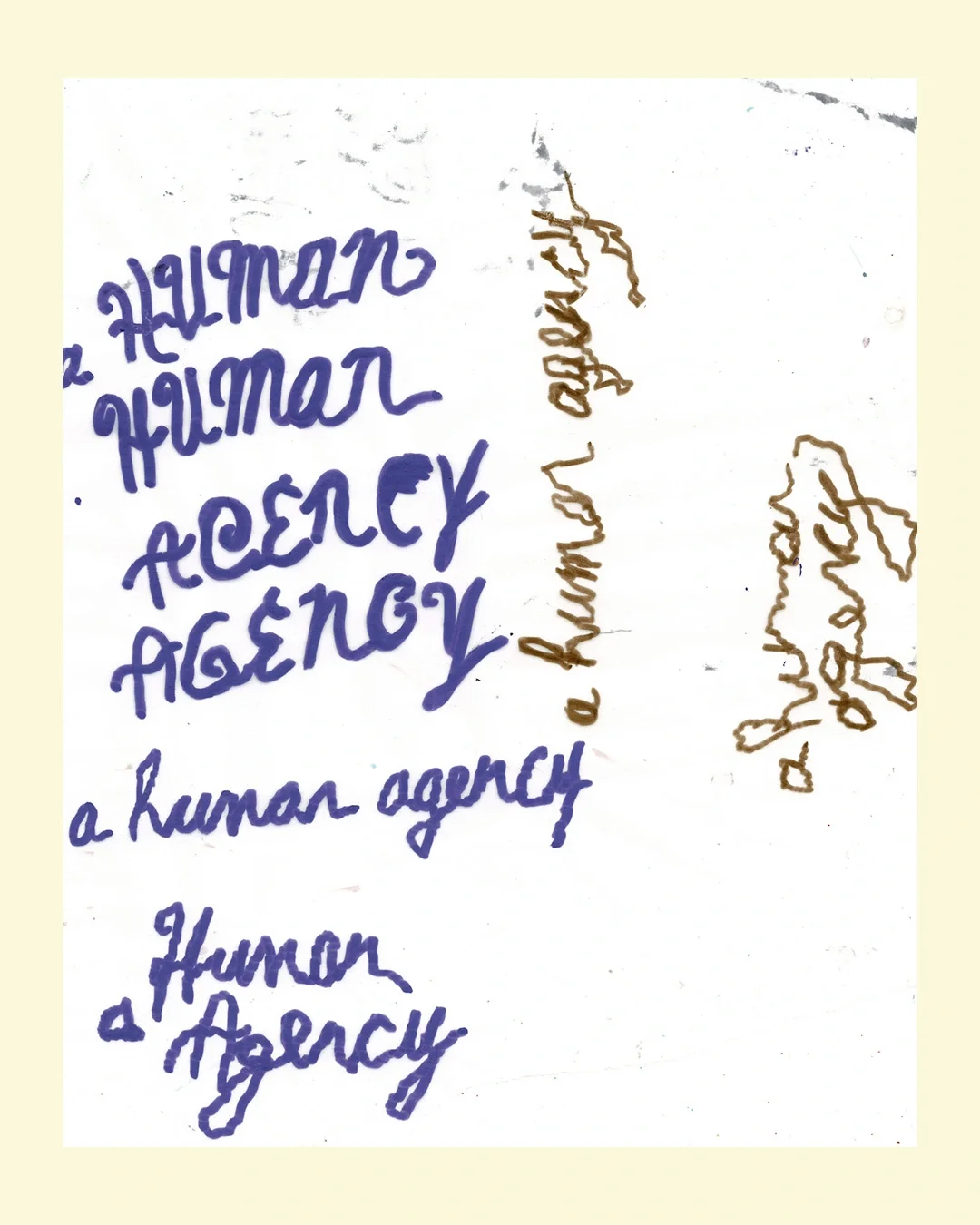
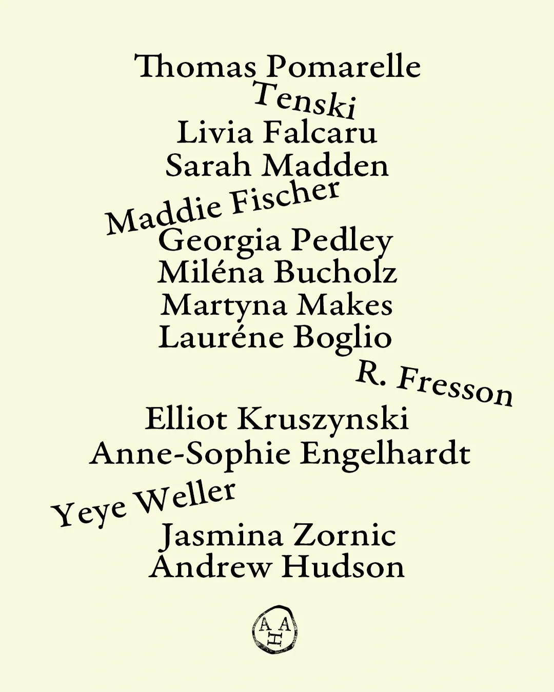
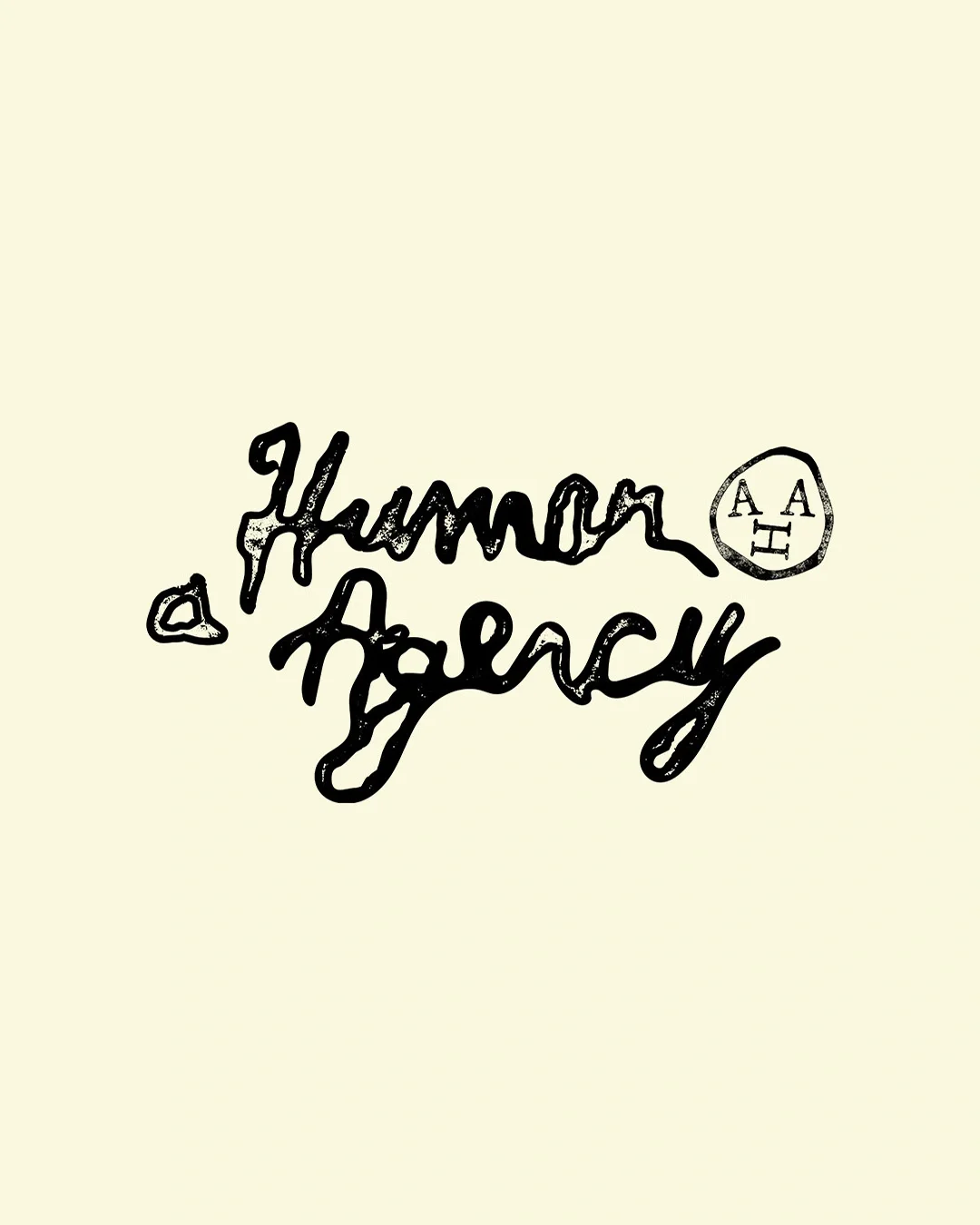
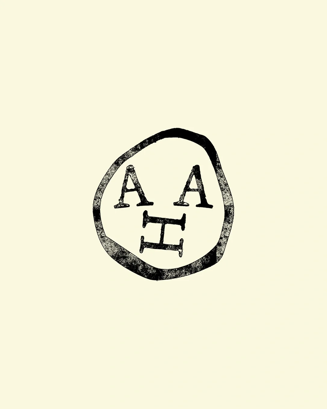
Denduyver drew the wordmark and emblem by hand, shaping both to resemble stamps. Serif lettering adds another human touch, with a slight tilt that loosens the typography. Cream and black provide a soft, quiet base for the marks and the varied artwork around them. Denduyver describes the agency as almost a museum: the identity should support what’s on display, like a pedestal, rather than take it over.
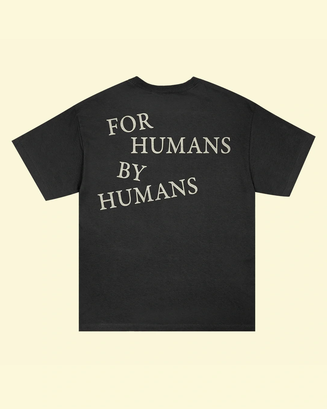
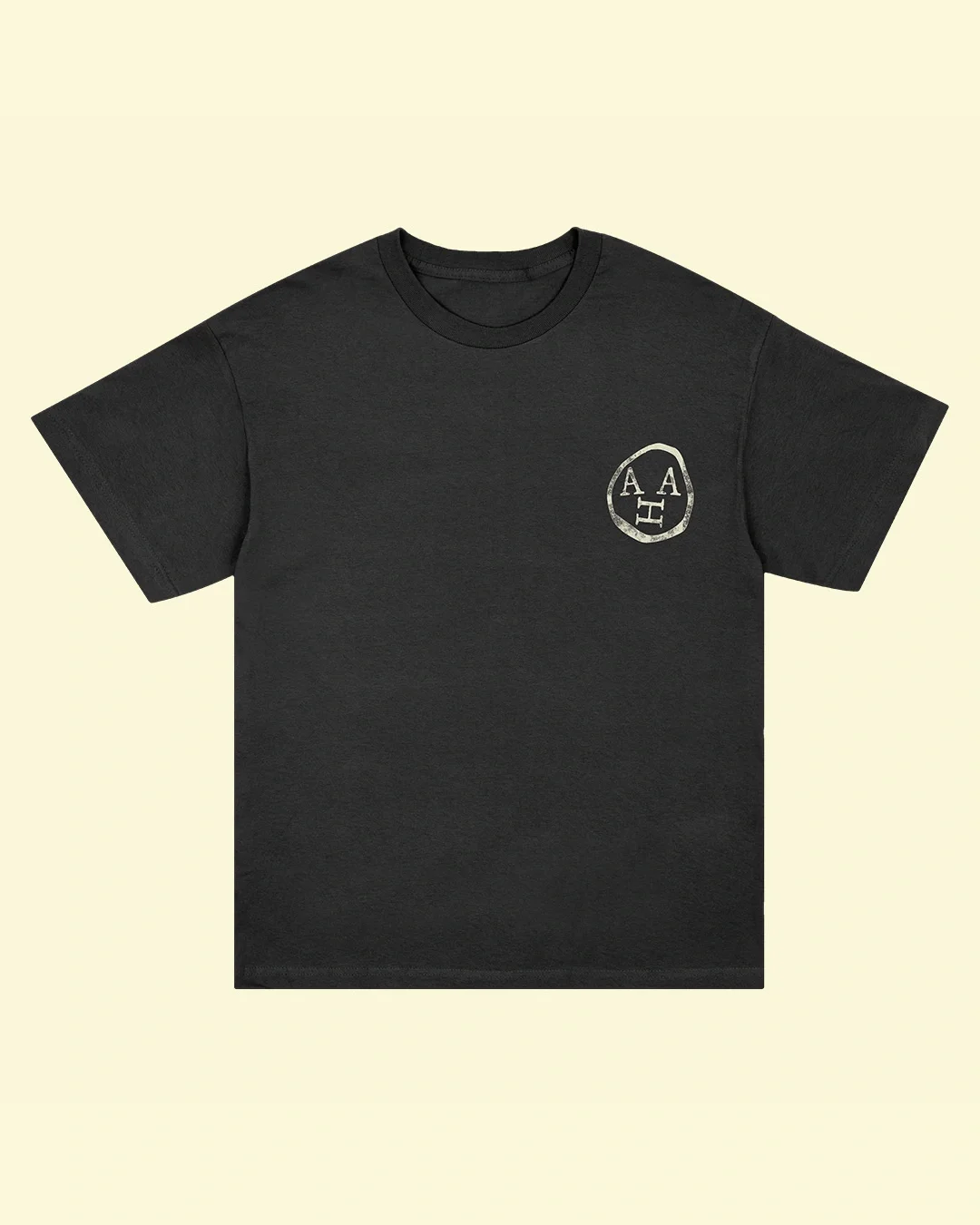
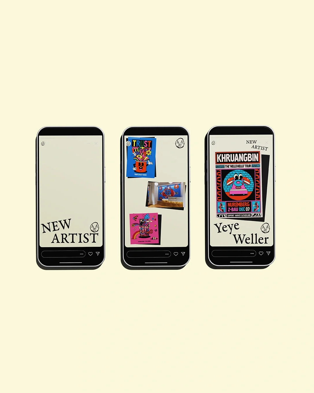
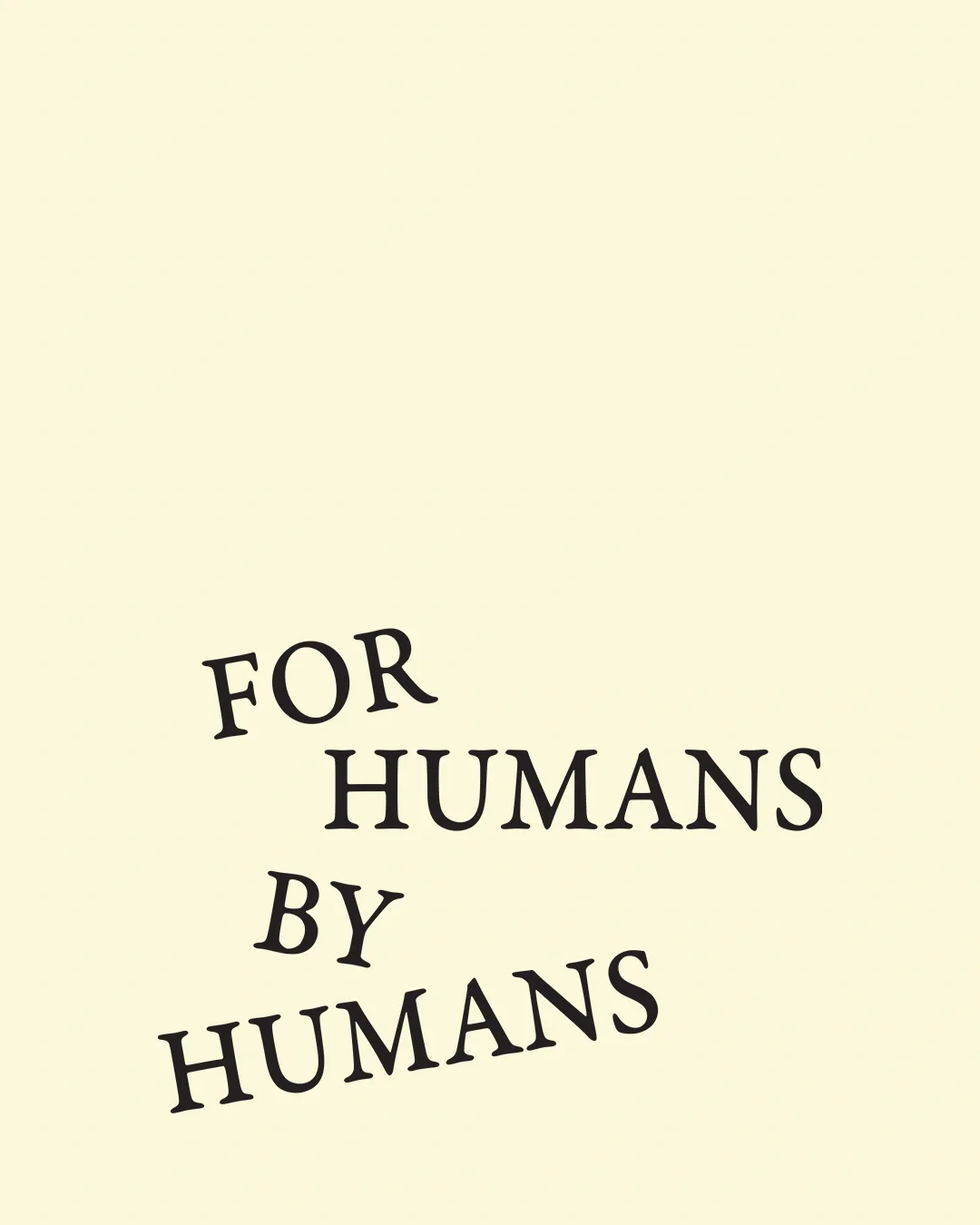
“For Humans. By Humans.” turns the agency’s position into a short, repeatable line. It appears across business cards, tote bags, caps, T-shirts and packing tape, allowing the same verbal cue to travel from introductions to everyday studio materials. The varied applications also show how a compact identity can live alongside artwork without relying on a single illustration style.
Imperfect by design
Denduyver says he doesn’t use AI in his work. For him, experimentation, conversation and the willingness to keep imperfections are part of the design process. That view is legible in the identity: the hand-drawn marks aren’t polished into mechanical uniformity, and their irregularity gives the agency’s name a personal voice.
Denduyver marks nine years working independently and will reach a decade in practice next year. He hopes to collaborate with more international musicians. Claydon plans to concentrate on charitable uses of illustration and mentoring. For A Human Agency, the new identity sets out a useful role for branding: make the agency recognizable, then leave enough space for its artists to be seen.


