Wednesday, November 11, 2026 · Graphic Design
Koto’s Giffgaff Rebrand Uses a Signpost to Make Choices Clearer
Noted by Tom May · 443 reads
Koto gives Giffgaff a sharper green identity, using an arrow motif, custom type and candid photography across its digital experience.
Koto’s Giffgaff refresh gives a practical job to a small graphic detail: the pointed end of the final “f” in the wordmark becomes an arrow, a signpost for a brand built around helping members choose what comes next. Repeated across the identity, that device can direct attention to prices and offers while giving the system a recognisable organising idea.
That clarity matters for a UK mobile operator that has expanded into broadband while keeping its challenger stance. Giffgaff has more than 4 million members and has been part of Virgin Media O2 since the brands merged in 2021. Its proposition centres on flexible plans: many SIM options roll monthly or use pay-as-you-go pricing, and members can move between plans as their needs change. The company also says it avoids mid-contract price rises and can point members towards a cheaper plan when one suits them better.
Those services give the visual identity a clear brief. It needs to make decisions feel straightforward, while preserving the informal energy that existing members recognise. Koto’s answer is not a new visual metaphor layered on top of the brand. It draws the signpost out of the wordmark and uses it as a functional cue throughout communications.

A wordmark with a job to do
The final “f” carries the identity’s central idea in miniature. Its pointed terminal reads as an arrow, then recurs elsewhere to guide the eye through information. The same shape can point towards an offer or a price, connecting the brand’s voice to the task a member is trying to complete.
“Giffgaff has always had a strong personality,” says Joe Ling, creative director at Koto. “The challenge was to give it room to evolve without losing the energy and attitude that makes it unmistakable. We took the idea of helping members decide what's next, and expressed it through a simple signpost.” Ling says the mark and wider system give the concept both a distinctive character and a practical role in communications.

The arrow also works on physical packaging. Green tape printed with “Your Next Move” crosses plain brown parcels, turning an ordinary delivery detail into another expression of the identity. That kind of application helps a visual system feel usable beyond screens: the core device remains recognisable even when it appears on a small, everyday surface.
Colour, type and photography
Black and white remain part of Giffgaff’s palette, joined by a vivid acid green. The stronger accent gives layouts a high-contrast focal point and sets the brand apart from the blues, reds and purples commonly used by telecoms companies. It also gives the signpost motif a natural home: green can carry the message, while black and white provide structure and contrast.
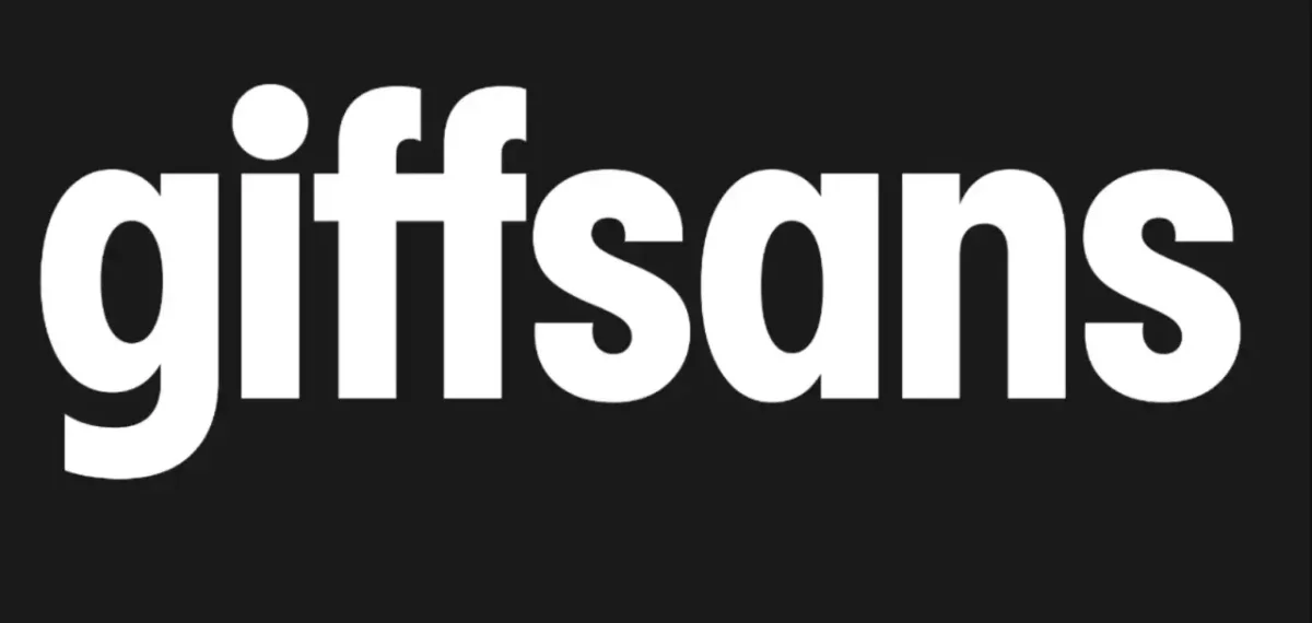
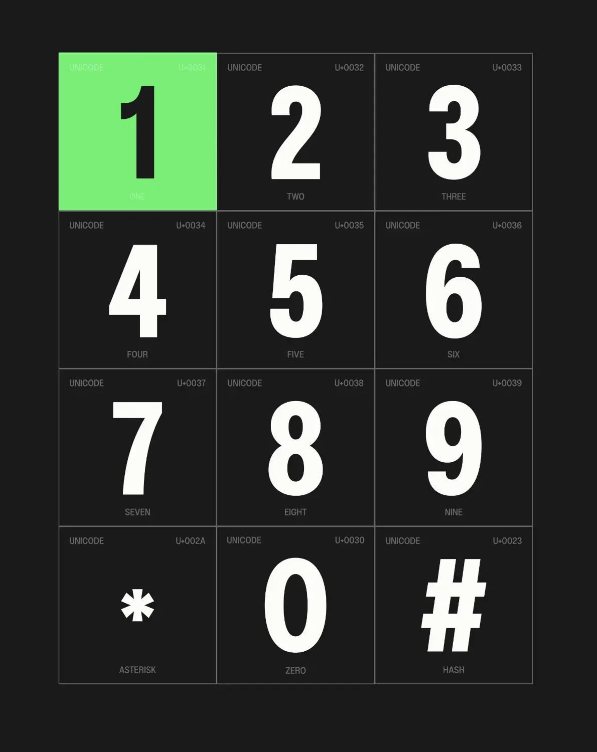
Koto created Giffsans, a custom typeface described as tall, condensed and punchy. Its proportions suit short phrases such as “Great tech. No traps.”, where a narrow, forceful line of type can make a small amount of copy feel direct. A distinctive “gg” ligature links the new font back to the existing mark, adding continuity within a broader visual change.

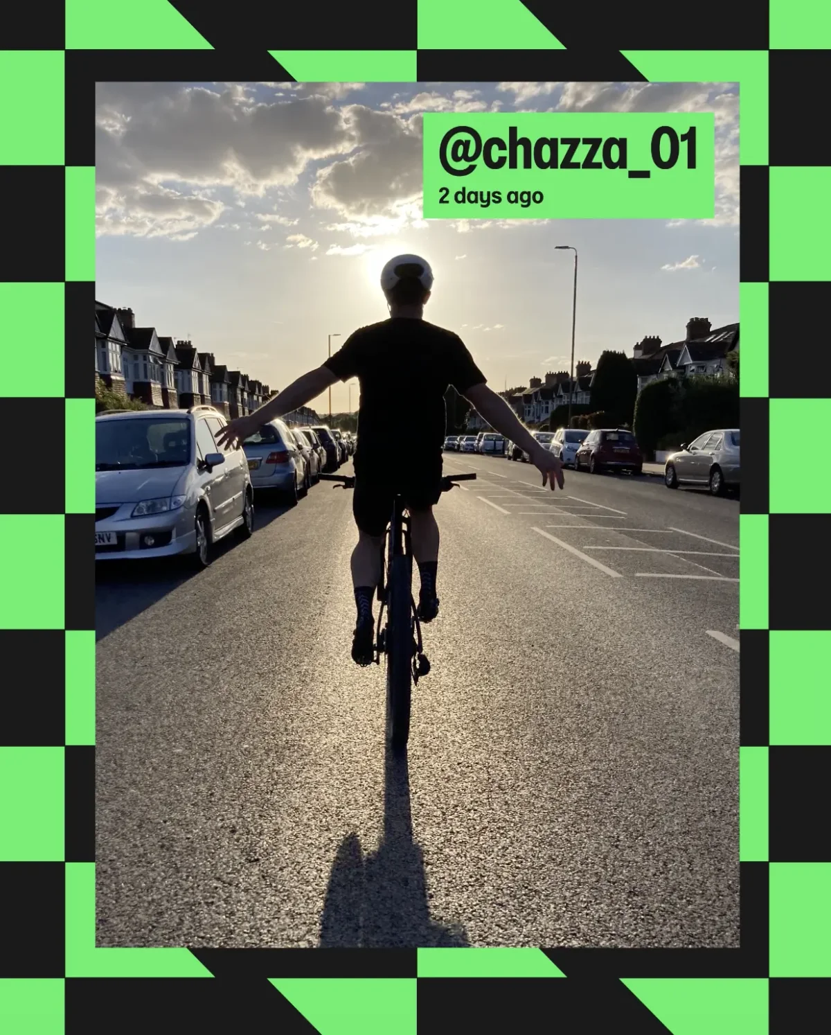
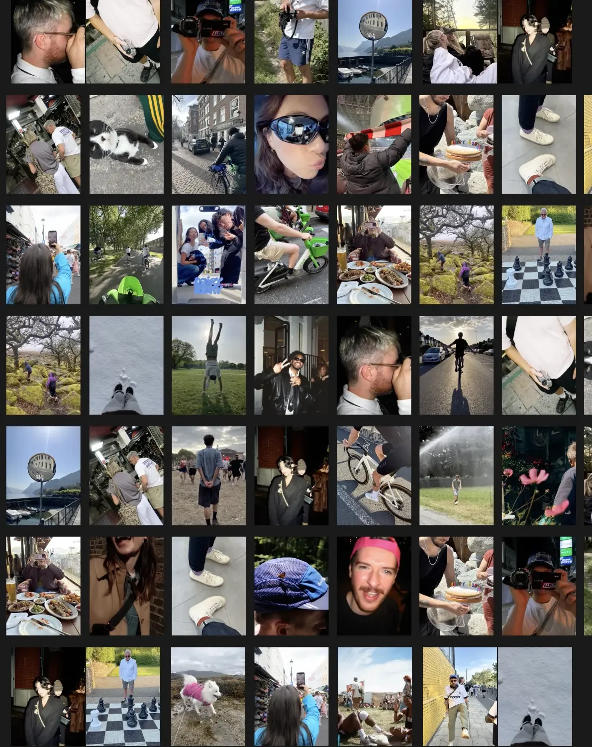
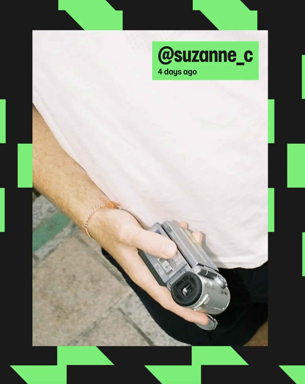
The photography takes a different route from polished studio imagery. Flash-lit, candid scenes show friends together, people on a night out and older men at the seaside. The pictures have the feel of moments captured by the people in them, which supports Giffgaff’s emphasis on its member community. Their informal quality also balances the precision of the custom type and graphic framing.
Built for the website and app
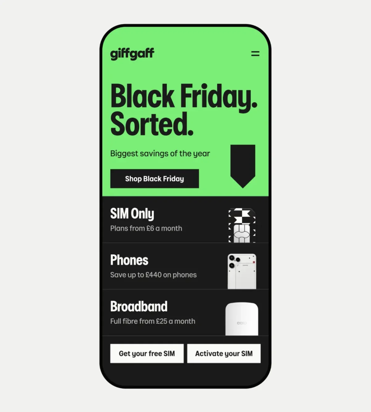
The digital work brings those elements into the places where members compare plans and manage accounts. Koto says the system uses Giffgaff’s existing design tokens and is ready for development, so the refreshed components can be put into use across the website and app. That implementation detail gives the identity a route from presentation into everyday product screens.
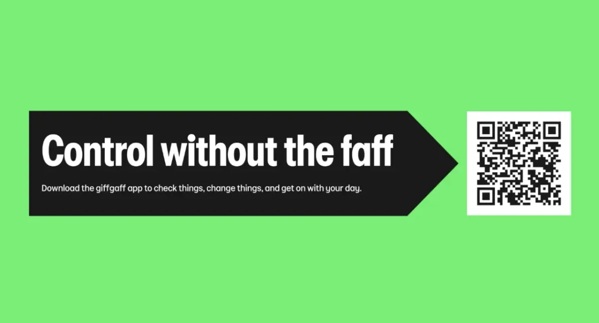
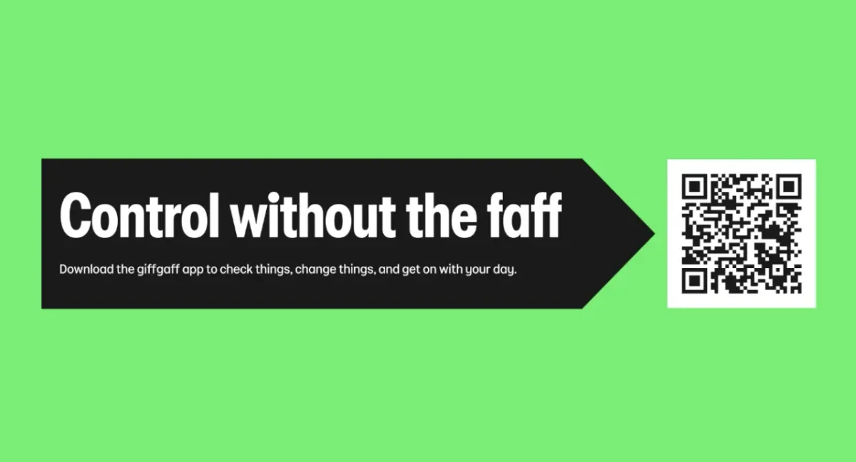
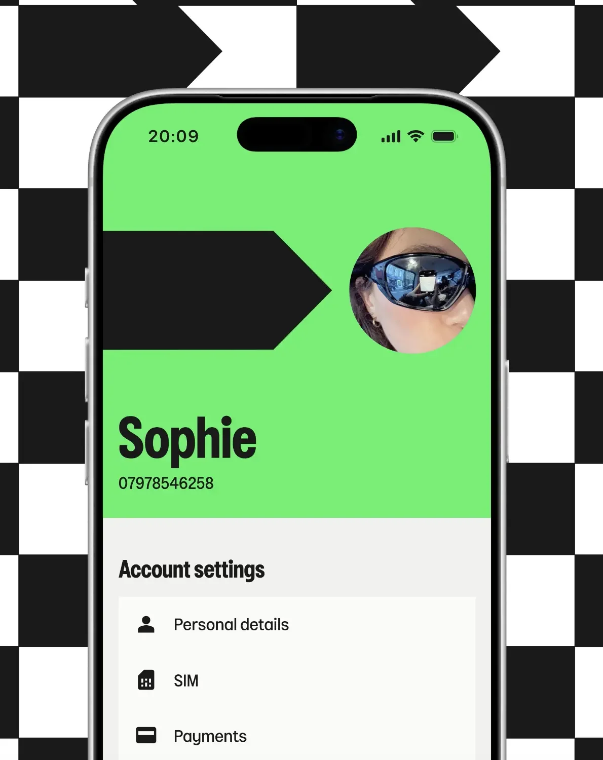
The message “Control without the faff” captures the intended tone: conversational, but tied to a concrete benefit. In the account interface, green highlights sit alongside profile details and settings, while promotional layouts use the same colour and arrow language to bring deals forward. The design challenge is to preserve that personality while keeping key choices easy to scan.

“Our over 4 million members have always been at the heart of Giffgaff, and this next chapter is no different,” says Georgina Bramall, chief marketing officer at Giffgaff. She says the new look is intended to make the brand’s value easier to see as members’ circumstances change. For a service with multiple plan types, that’s a useful measure for the design: personality has to help people find relevant information, not compete with it.
James Greenfield, founder and CEO of Koto, describes the aim as making “brand and offer” reinforce one another, while retaining what feels unmistakably Giffgaff. The refresh is rolling out across the website, app and email, with an upcoming Black Friday promotion set to put the system in front of customers at scale. Koto will continue developing the brand strategy and identity as the business changes. The signpost will be most convincing when its visual clarity holds up at that everyday decision point: choosing a plan, finding a price or managing an account.