Wednesday, November 11, 2026 · Graphic Design
Woven’s Triathlon Identity Braids Sport, Streetwear and Everyday Life
Noted by Tom May · 571 reads
Essential Viewing gives Woven a braided mark, club-inspired gradients and candid photography to make triathlon feel open to women at every level.
Woven makes a case for women’s triathlon with an identity built around how people actually experience the sport: as one part of a life with many roles, ambitions and starting points. New Zealand studio Essential Viewing designed the brand for the Ironman Group, giving its existing Women For Tri community a wider identity and a visual language that can extend across events, clothing and digital channels.
That shift matters because triathlon’s demanding format can make it seem reserved for a narrow type of athlete. An Ironman event combines a 3.8km swim, a 180km cycle and a 42.2km run in one day. The first took place in Hawaii in 1978; the Ironman Group has since expanded the series to hundreds of events worldwide. The organisation’s stated ambition is to reach equal participation by men and women, and Woven is intended to help bring more women into the sport.
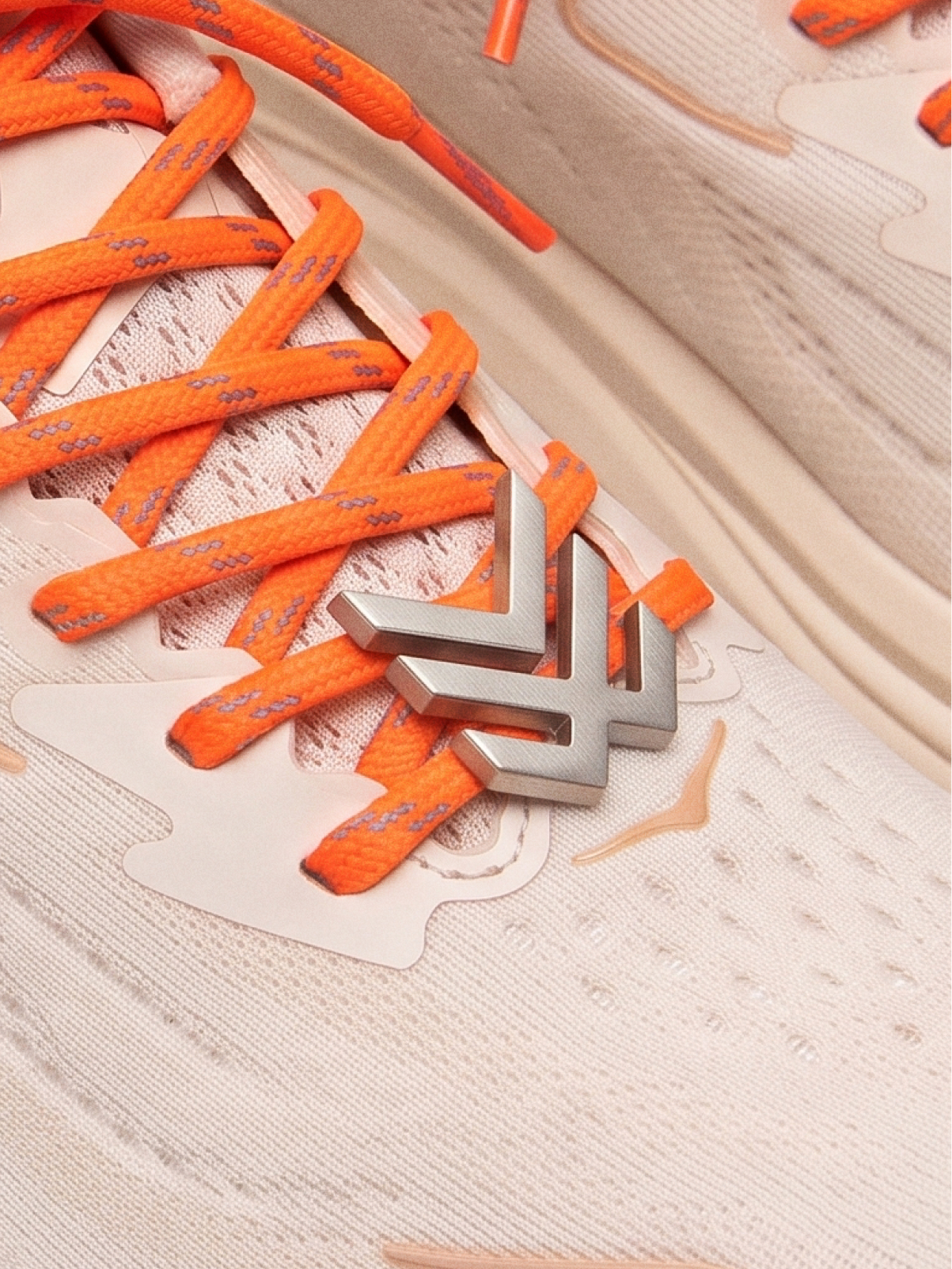
Essential Viewing developed the name, strategy, identity, voice, merchandise and launch campaign. Woven debuted at the Ironman World Championship in Kailua-Kona, Hawaii, in October and has rolled out across 45 territories. The scope gives the studio a chance to make the same idea work at very different scales: from a bold graphic on a billboard to a small mark on a lace charm.
A symbol built from three disciplines
The name links the sport’s structure to its community. Swimming, cycling and running are separate disciplines bound into one event; the identity extends that metaphor to women with different backgrounds and lives coming together through triathlon.
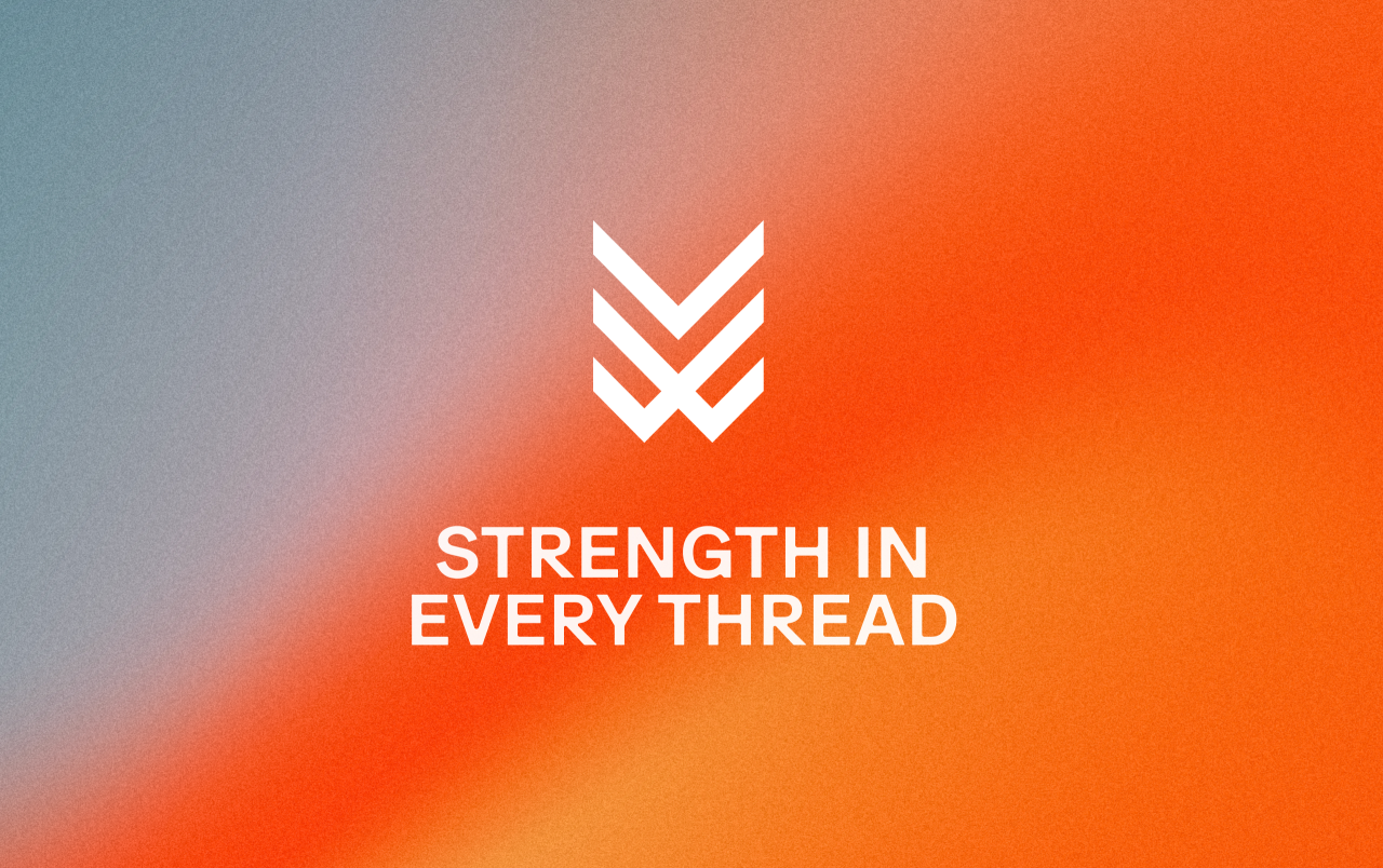
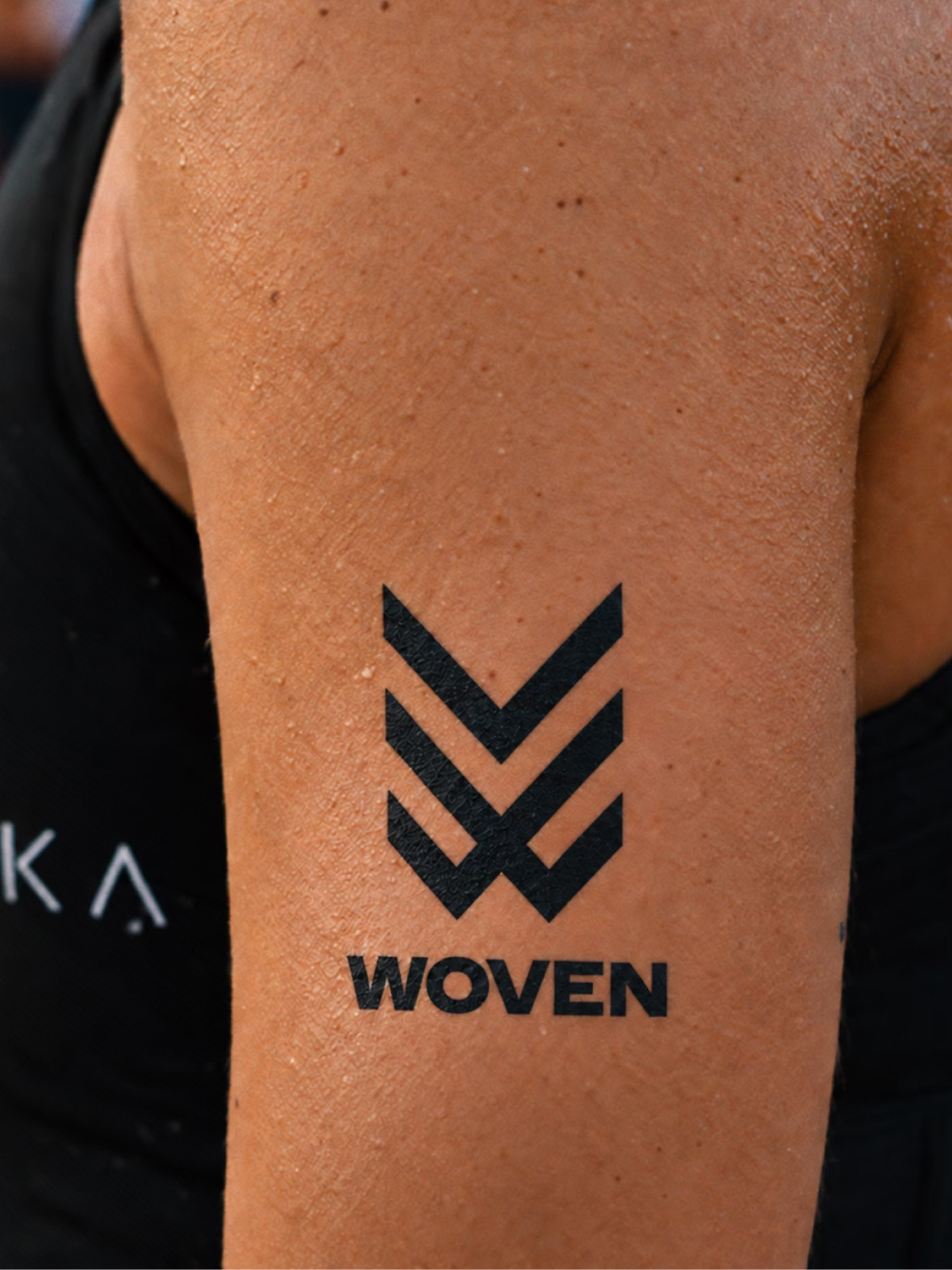
Its central mark comprises three interlocking chevrons, each standing for one discipline. Stacked together, the shapes suggest a “W” and form what Essential Viewing calls a “braid of resilience”. The tagline, “Strength in every thread”, makes the logic explicit without asking the symbol to carry the whole message.
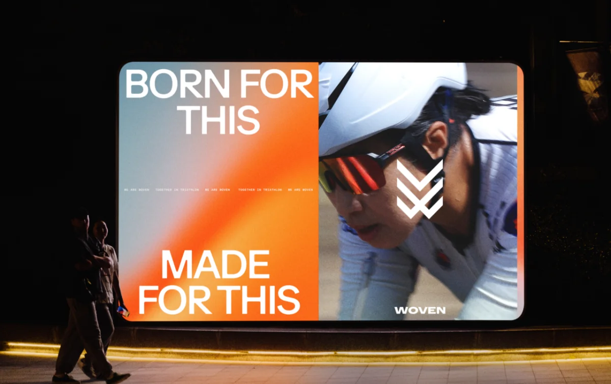
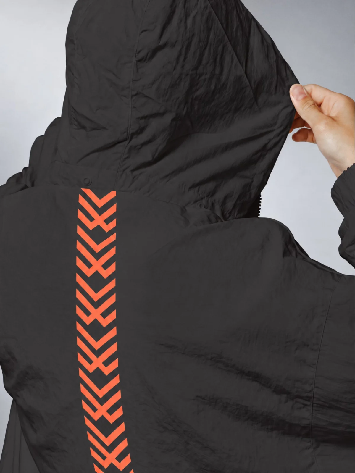
Its adaptability comes from a simple shape that can change material and scale while staying recognizable. On a black jacket, repeated orange chevrons become a stripe running down the spine. Rendered as a brushed metal charm threaded through laces, the mark takes on the feel of jewellery. As a temporary tattoo, it reads as a personal badge. These applications carry the identity beyond standard sportswear and into objects people might choose to wear outside training.
Speaking to the whole person
Woven’s voice gives the visual system its clearest point of view. Essential Viewing wanted language that could acknowledge ambition and uncertainty without relying on familiar cheerleading slogans. The studio describes its aim as validating the audience’s truths and ambitions, with the will to try as the threshold for belonging.
“I Am Not One Thing” puts that idea into a concise campaign line. It appears alongside “Neither Is My Sport”, connecting the complexity of a person’s identity with the mix of effort and experience in triathlon. The accompanying images move between a woman concentrating, a swimmer catching breath and a mother kissing her child. Another execution lists roles in small type—mother, friend, sister, runner, cyclist, swimmer, accountant and nurse—so participation doesn’t depend on presenting sport as someone’s entire life.
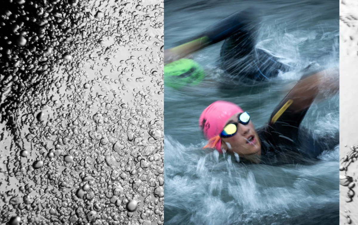
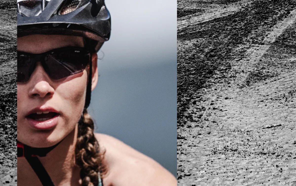
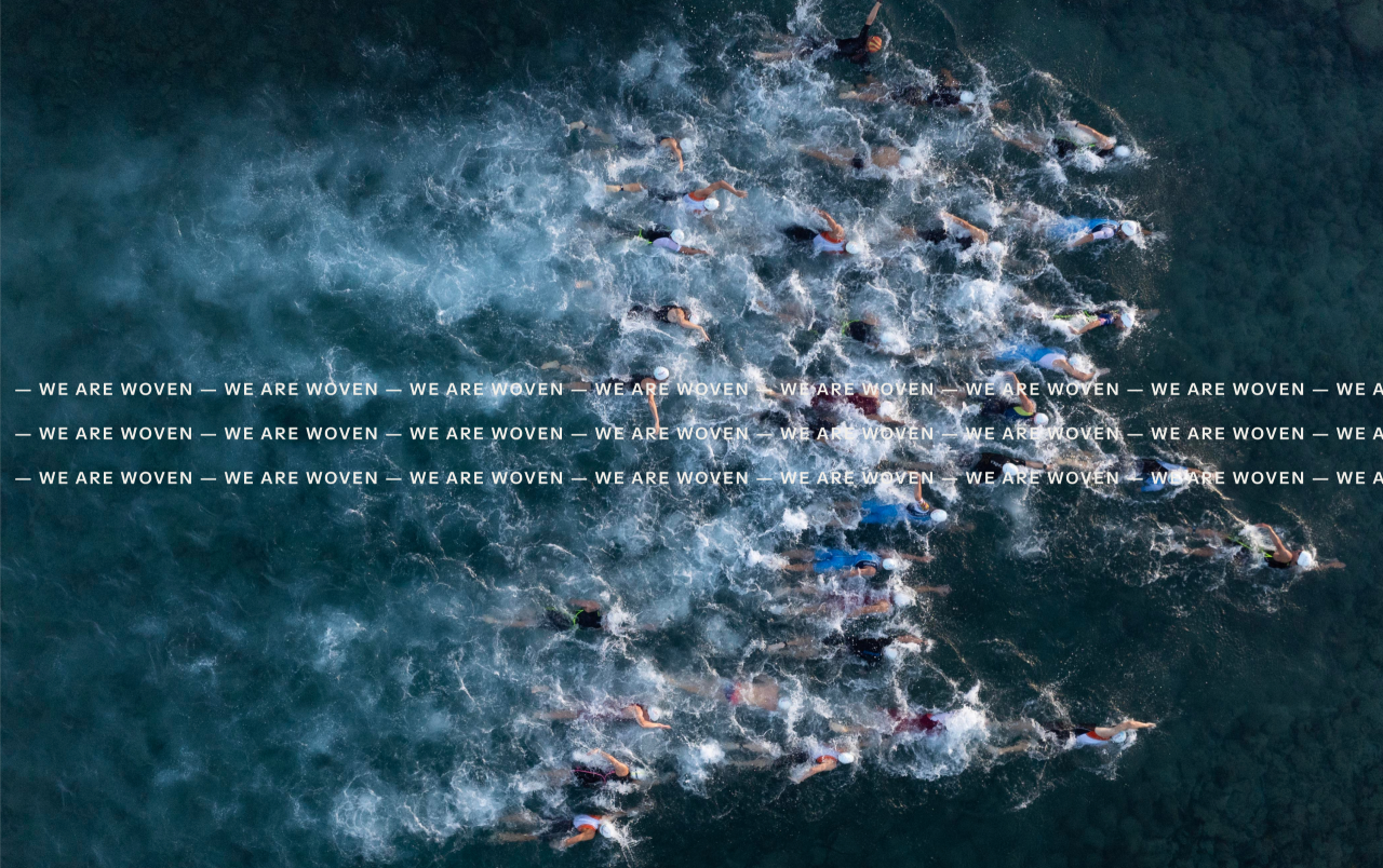
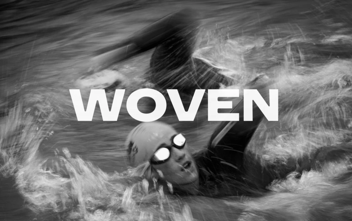
The photography reinforces that approach with close crops of freckled, sunburnt faces, swimmers cutting through turbulent water and textured views of bubbles and tarmac. Blur and grain keep the images close to physical experience. The result makes room for exertion and imperfection instead of presenting an airbrushed ideal of athletic performance.
Club colour, athletic form
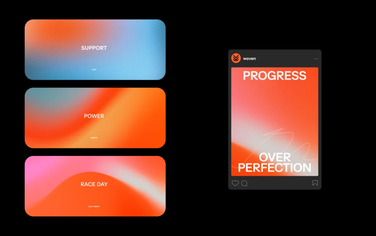
Essential Viewing looked to the raw, expressive feel of 1990s UK garage culture for the identity’s colour treatment. Grainy gradients of orange, pink, lilac and blue give the work an energy more often associated with a club flyer than a conventional sports brand. The colours also have defined roles: cool blues signal support and care, hot oranges suggest power and energy, while pink marks the anticipation of race day.
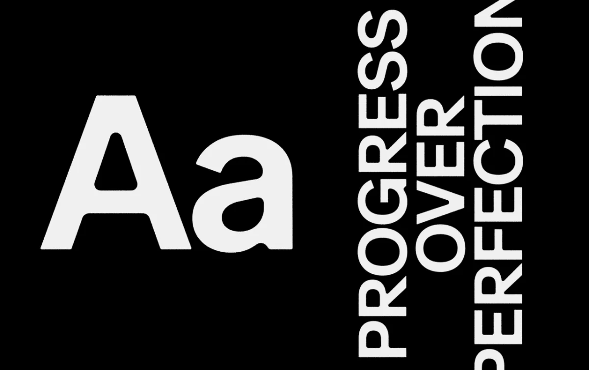
A wide sans serif carries headlines such as “Progress Over Perfection” and “Born For This, Made For This”. Smaller monospaced text runs across imagery like a ticker, repeating “We Are Woven. Together In Triathlon.” The contrast between broad headline lettering and narrow, continuous copy creates a clear hierarchy while giving layouts a sense of movement.
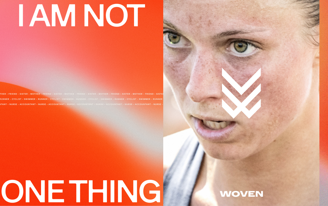
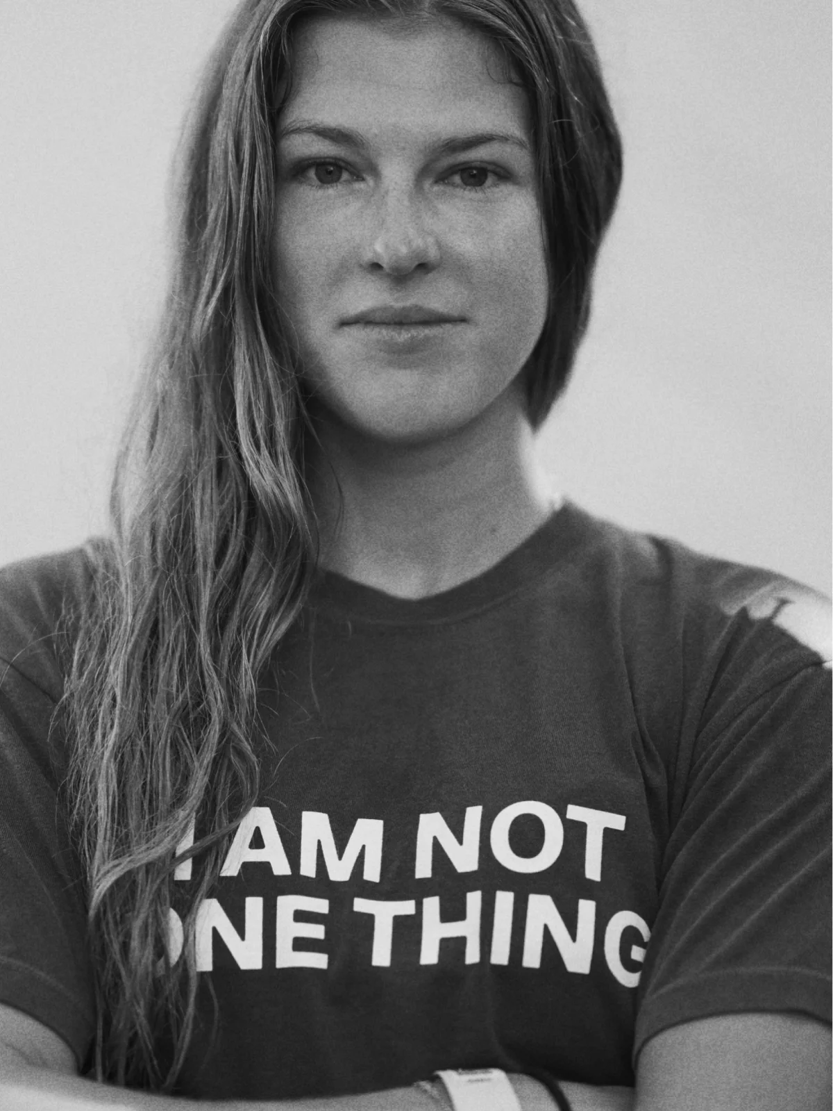
That club influence continues into merchandise, where the system crosses between athletic gear and streetwear. It helps the brand feel like a community with its own visual culture, rather than a set of performance messages placed on equipment.
Essential Viewing also wrote, directed and produced the hero film, Not One Thing. It anchors a 12-month rollout spanning digital, social, Strava, events and merchandise. The identity’s strongest practical lesson is how its parts work together: a symbol tied to the sport, candid imagery that shows its physical texture, and language that welcomes people whose lives extend well beyond training.