Thursday, November 12, 2026 · Graphic Design
Fifty Years at Springetts: Designing Food Brands to Outlast the Trend Cycle
Noted by Tom May · 331 reads
Springetts marks 50 years by relaunching with a refreshed identity and a field guide built on designing for longevity over novelty.
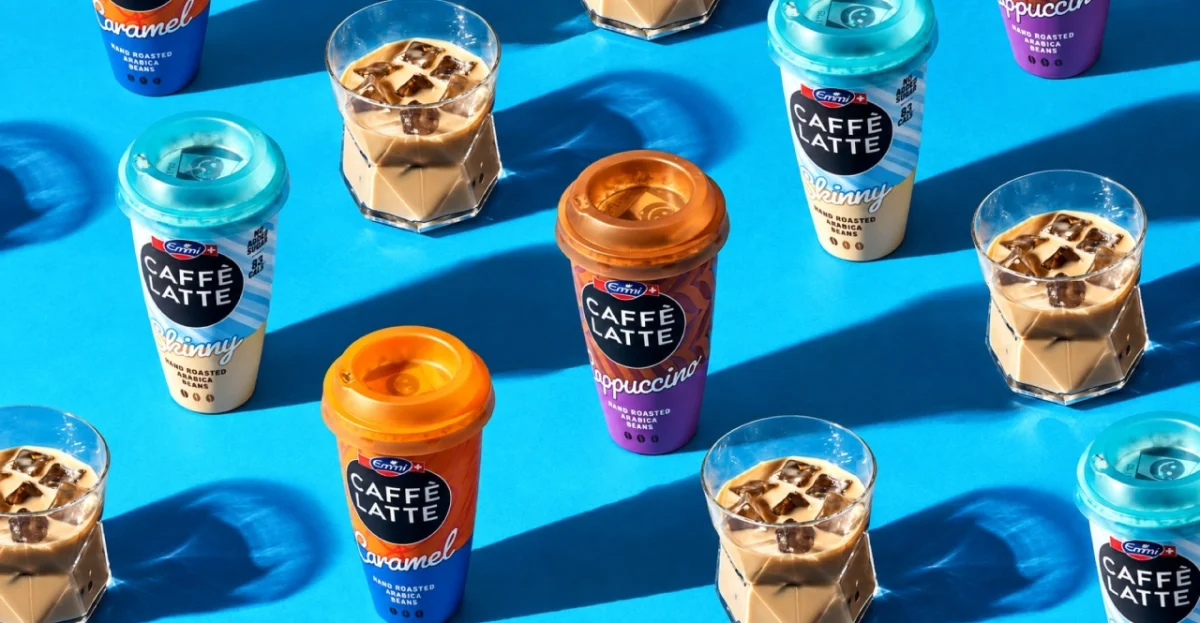
Most design studios would celebrate a half-century by showing off their greatest hits. Springetts is doing that too, but the more interesting part is what it's arguing for: that brands in food and drink should be built to last, not rebuilt every time the mood shifts. The agency, which named The Happy Egg Co., Nuii and Frubes, has spent 50 years working through recessions, retail upheaval and the arrival of social media. Its anniversary comes with a relaunch, a new identity and a field guide that tries to pass on what it has learned.
A client list that lives in the kitchen cupboard
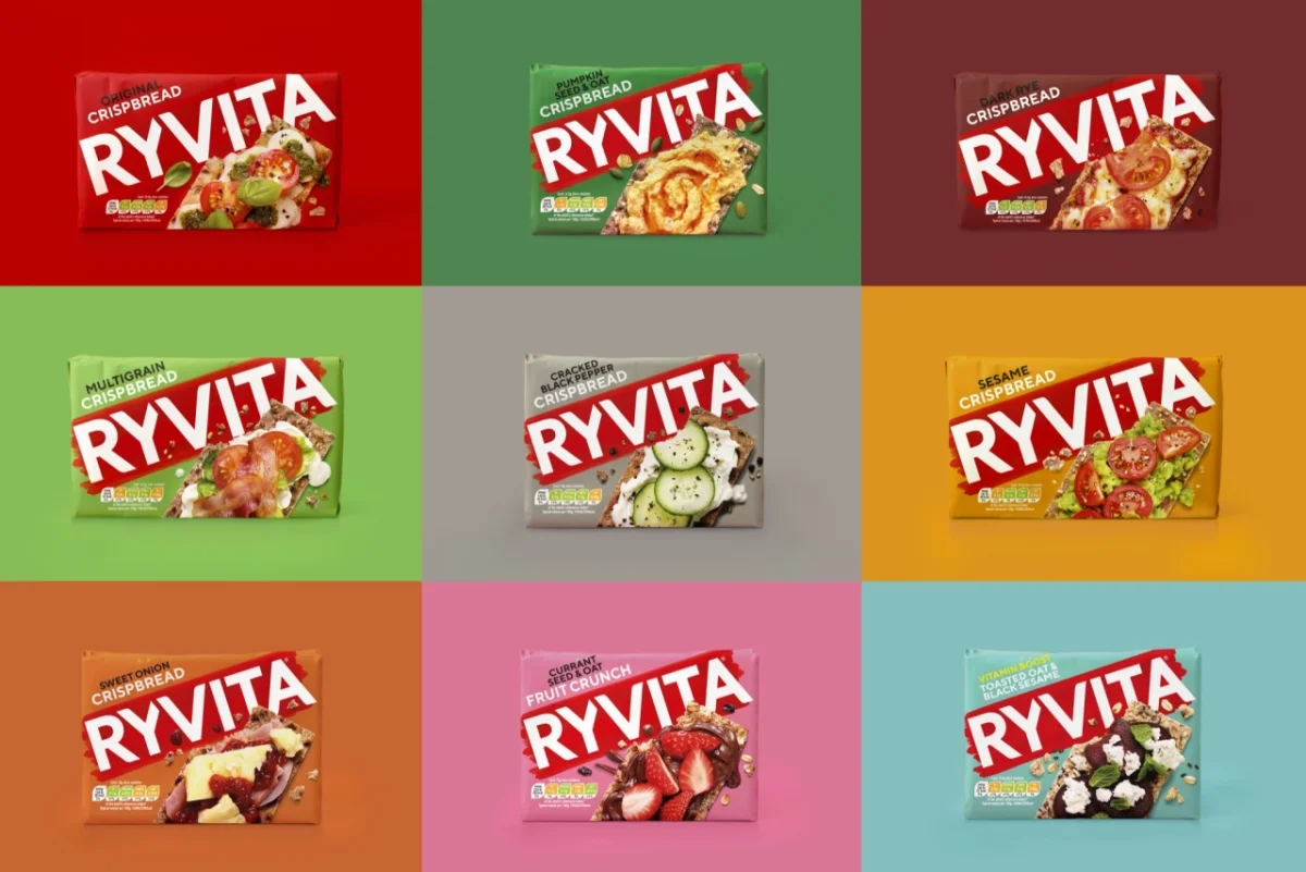
Springetts describes itself today as a "brand life-stage agency". It was founded in 1976 by Rod Springetts, and its client list is a tour of the everyday shelf: Weetabix, Walkers, Ryvita, Kettle Chips, McVitie's, Nestlé Fab, Linda McCartney and Rubicon among them. That range matters. Grocery and drinks packaging is some of the most unforgiving work in the industry. A pack sits on a shelf for a few seconds, competes with dozens of similar products, and has to hold its recognition across flavour variants, promotional seasons and regional listings.
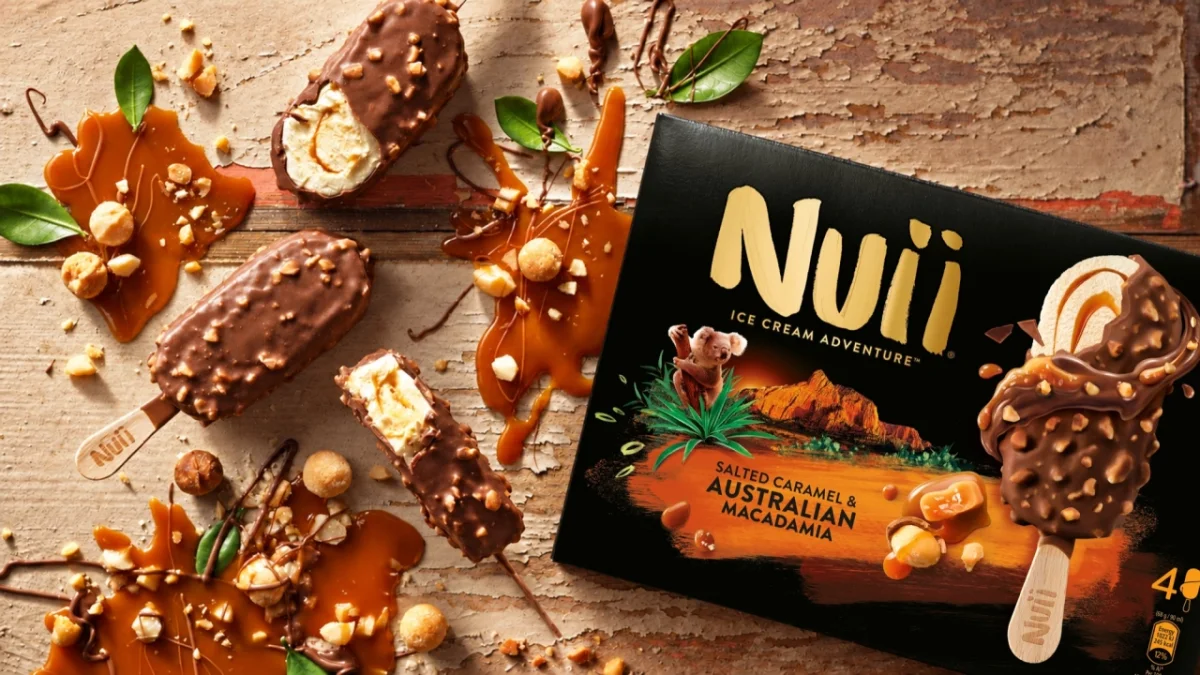
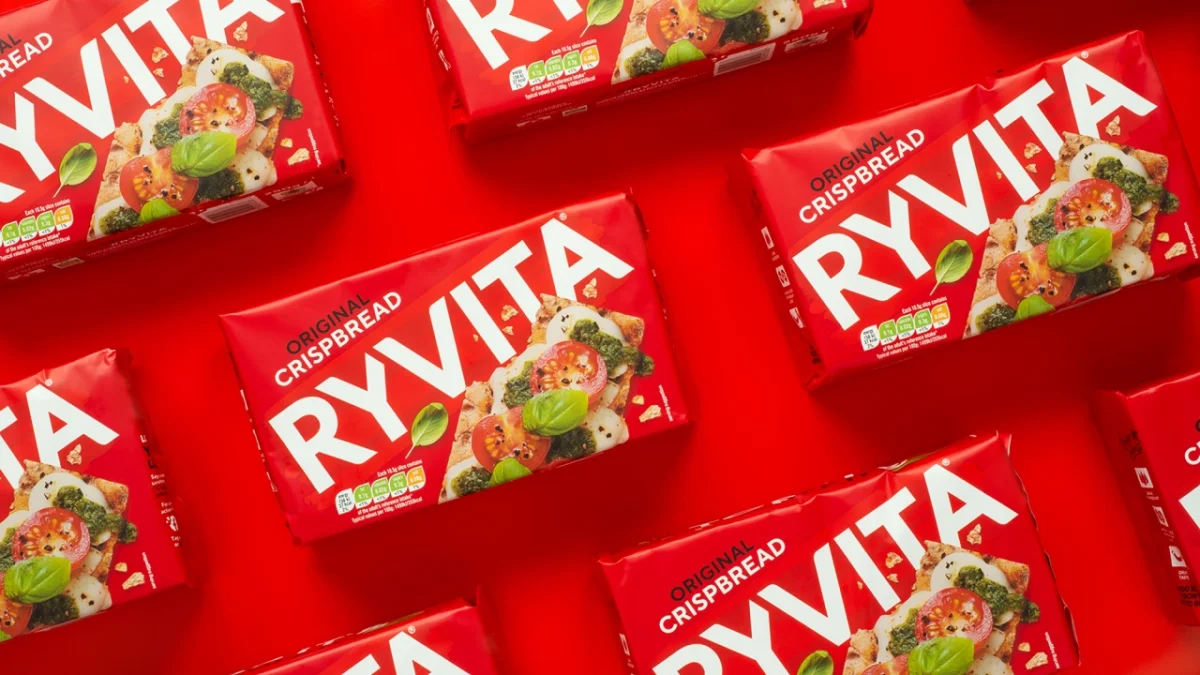
The studio has also built its own brands from scratch, including Frubes, Frijj, The Happy Egg Co., Walkers Salt & Lineker and, more recently, the premium ice cream brand Nuii. Along the way it has picked up 24 Pentawards and 19 Design Effectiveness Awards. Those numbers are impressive, but for working designers the more useful detail is the spread of work: a six-egg carton, a premium chocolate-coated ice cream, a crisp flavour range. Each one shows a different kind of problem being solved.
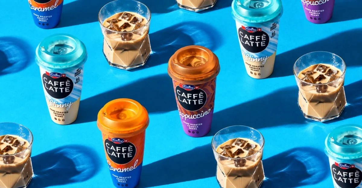
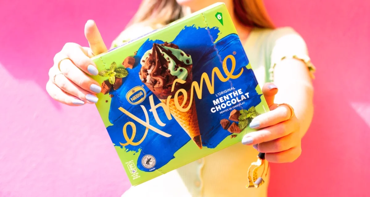

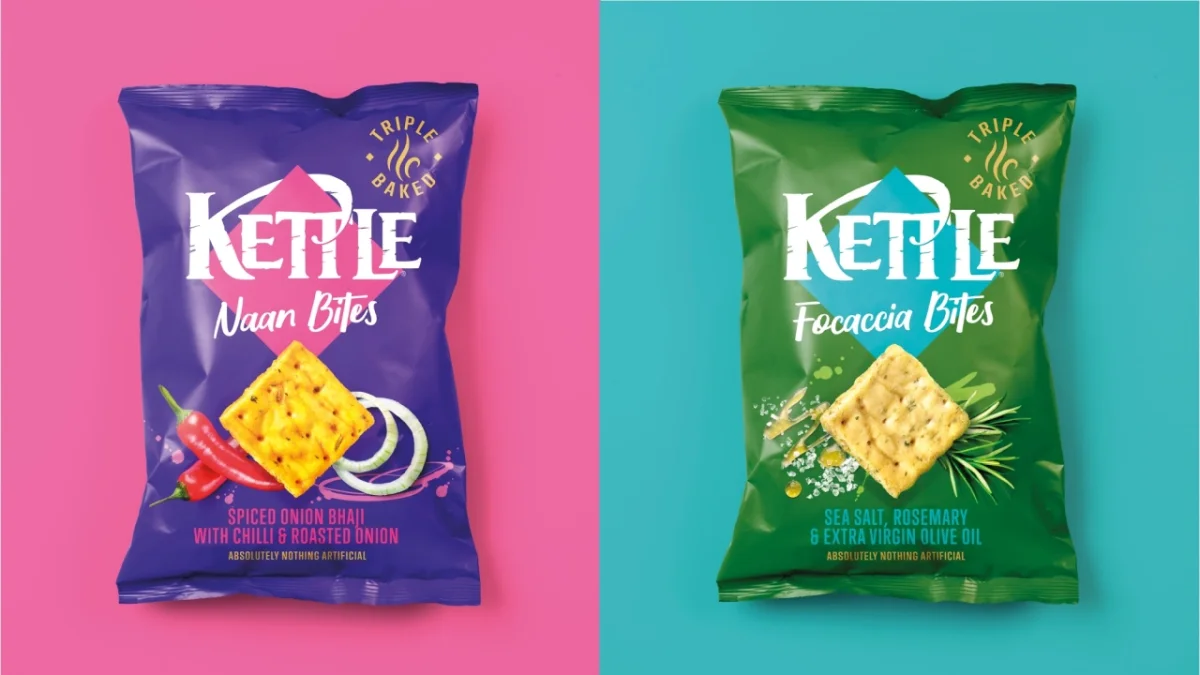
You'd forgive a studio with this record for getting comfortable. Springetts is doing the opposite. Rather than coasting on its reputation, it's using the anniversary to refresh its positioning and identity, and to put its working philosophy into a document that others can read.
Designing for forever, not for next season
The guide is called How Brands Live Forever, and it sets out a framework the agency calls Forever Brands. You can find the guide on the Springetts website. Its central argument is simple, and it's one that the industry often forgets: design for longevity rather than novelty.
That sounds obvious until you look at how many brand refreshes are driven by the internal need to do something new. A marketing team changes, a creative director wants a signature moment, and an identity that was working gets dismantled. The guide asks for restraint. In Springetts' framing, the job is to tie fresh ideas to what people already recognise and to protect the things existing customers love. That means going deeper into what a brand already has, rather than tearing it up every few years.
There's a practical reason this matters in food and drink. Shoppers often pick products by quick recognition, not careful reading. A colour, a shape or a character that people know can do more work than any single new idea. Restraint, in that context, is a strategic choice about where recognition lives.
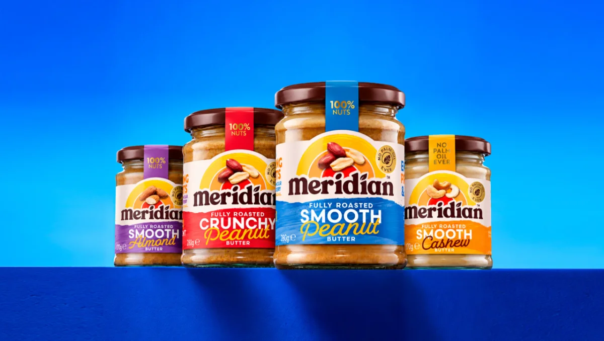
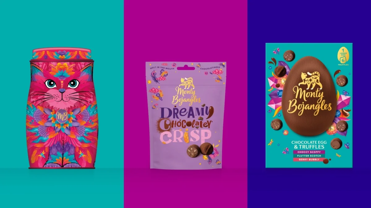
Paul Williams, CEO, puts the principle in storytelling terms: "A great brand story isn't just told. It's retold again and again. Food and drink brands are never purely functional. The job is understanding the emotional role they play, and the story people want to be part of. That's how you make brands loved for generations to come."
Here's the thing about that quote: it shifts the unit of design. If the story is retold, then the identity can't live only on a single pack. It has to work across packs, flavours, digital touchpoints and whatever channel comes next. The guide's answer is to build systems of recognition that flex across every channel and keep the story moving, rather than designing each execution as a standalone event.
Four life stages, four different jobs
At the heart of the framework is the idea that brands move through four life stages, and each one has its own job:
- Launch: make an entrance, create attraction and ignite the spark.
- Grow: build momentum, grow desire and make people want more.
- Extend: gain new ground, deepen attachment and give people more to love.
- Renew: reclaim relevance, reignite interest and make people fall in love again.
The guide opens its Launch section with a sobering line: "Every new brand enters a crowded room. When 85% of new brands fail, the challenge is not simply to exist; it's to be instantly understood, emotionally felt and easy to remember." For designers, that's a useful reset. A launch identity isn't judged on how clever it looks in a presentation. It's judged on whether a stranger gets it in a second.
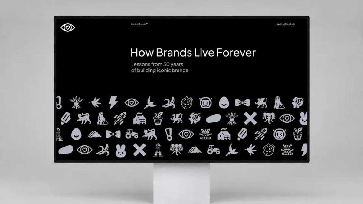
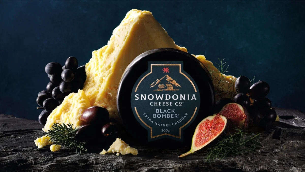
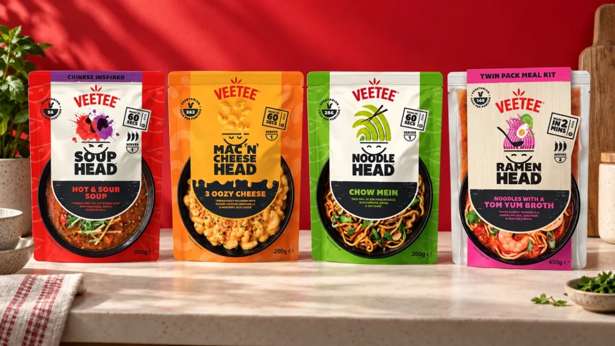
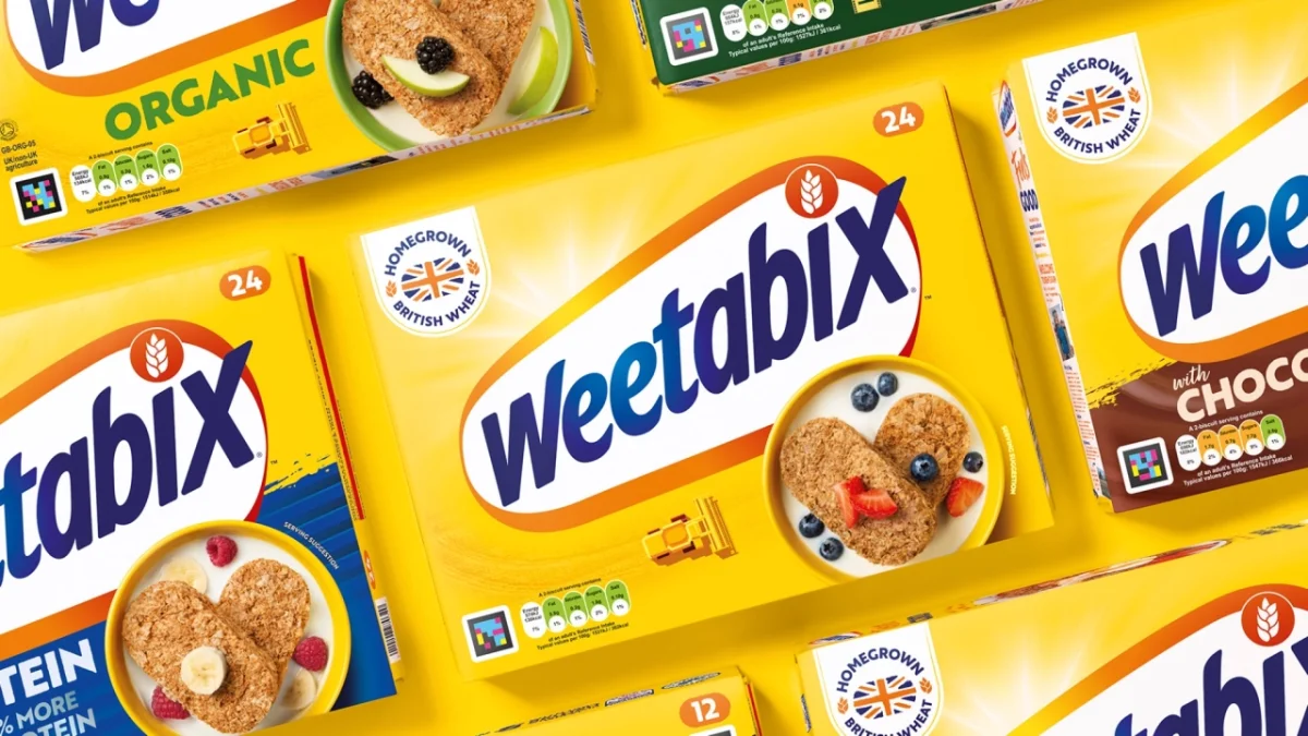
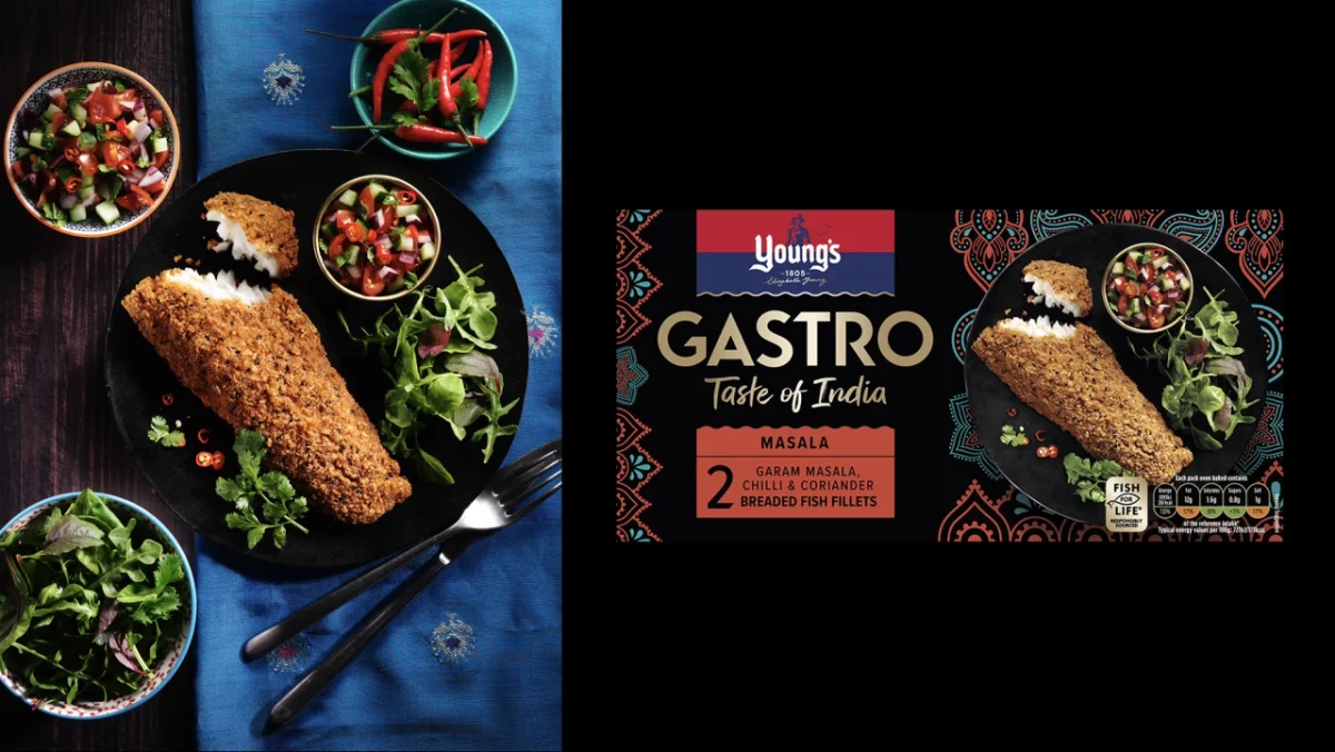
The Launch stage breaks down into four principles: start with a point of view, build memory blocks, bend category codes and design for becoming rather than just being. The last one is the most interesting to me. A launch identity needs room to grow into channels, products and audiences that don't exist yet. Many identities look finished on day one and then struggle the first time they're asked to stretch, so building in flexibility from the start is a real design decision, not a nice-to-have.
At the other end of the cycle sits Renew, which is about rescuing brands that have faded. Sophie Broderick, design director, frames the problem plainly: "The danger for legacy brands is not age, it's invisibility. Renewal gives a brand back its presence, its point of view and its reason to be chosen now." That reframing is worth taking into client conversations. Old isn't the problem. Forgettable is.
Why the designers run the conversation
Springetts also credits its culture for much of its longevity. The studio describes itself as fiercely designer-led and says it works without the usual layers of account management. Designers own client relationships and lead the strategic conversations about business challenges and opportunities.
That structure has a practical effect. It blends the thinking and the making, which the agency calls the 'designer brain'. When the person who sketched the idea is also the person explaining the business case, fewer things get lost in translation between a brief and a final pack. It's a model that suits studios where craft is the product, though it also asks more of designers, who need to be comfortable with commercial questions as well as visual ones.
The guide itself is the best place to go for the full framework. But my read on the main lesson is this: the brands that last don't get complacent, and they don't get reckless either. They adapt in small, deliberate steps while keeping the things people already love. Fifty years in, with a new look and a philosophy written down in plain terms, Springetts seems to be practising what it preaches.