Wednesday, November 4, 2026 · Graphic Design
Yinka Ilori’s Tottenham Hotspur Away Shirt Turns Club Culture into Colour
Noted by Tom May · 792 reads
Yinka Ilori’s 2026/27 Tottenham away shirt layers vivid geometry, fan chants and North London identity onto a deep navy base.
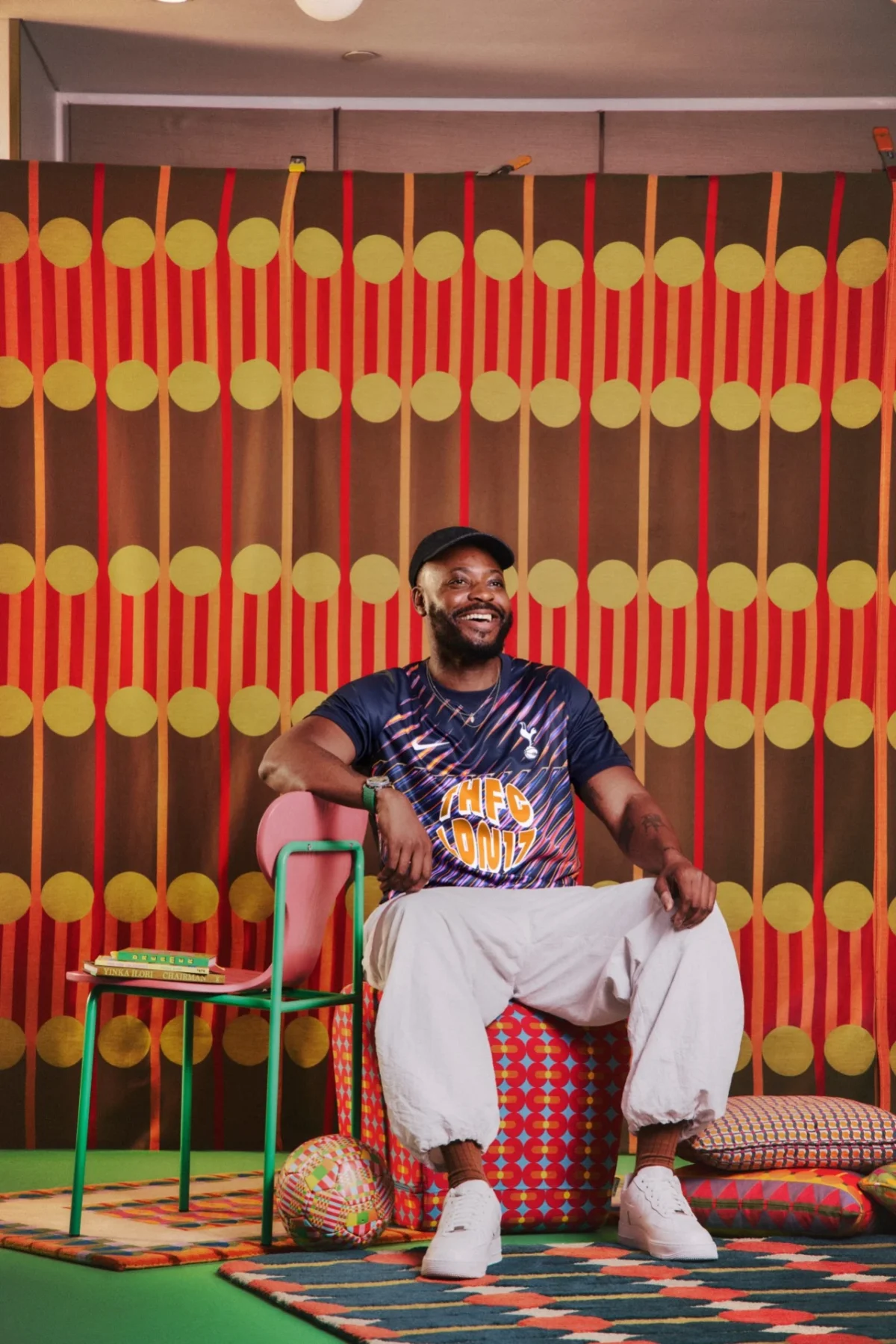
Yinka Ilori’s Tottenham Hotspur away shirt treats the football kit as a moving canvas for shared identity. Its deep navy ground carries streaks of pink, violet, orange and electric blue, while details on the back weave fan language into a circular graphic. The 2026/27 design, titled “We Are Tottenham, Wherever We Go”, brings Ilori’s interest in colour, pattern and storytelling to a garment that will travel with supporters.
For designers, the choice of canvas matters. A shirt is worn in public, seen from a distance and tied to a place and a group of people. Ilori’s design makes use of those conditions: bold colour gives the pattern presence, while references to the club and its supporters reward a closer look. The result connects visual expression with the collective rituals around football.
Pattern with a local address
Ilori is a British-Nigerian artist and designer who grew up on Essex Road in Islington. He has described that experience as a source of appreciation for North London’s mix of cultures and communities. His connection to Tottenham has also developed through his role as artist-in-residence at Heart of Hale, a mixed-use regeneration project in Tottenham Hale.
Those ties give the shirt’s local references a personal context. “THFC LDN17” expands to Tottenham Hotspur FC, London 17, pointing to the club’s N17 postcode. The lettering does useful visual work as well as identifying the team: it anchors the more free-flowing colour and geometry to a specific place.
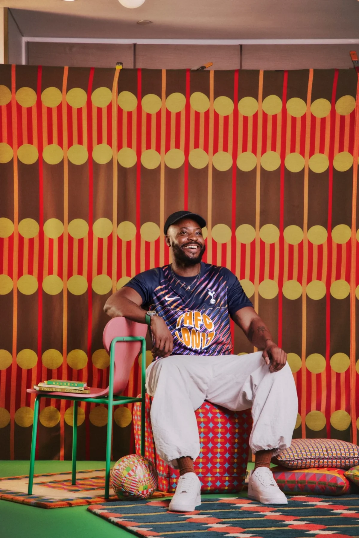
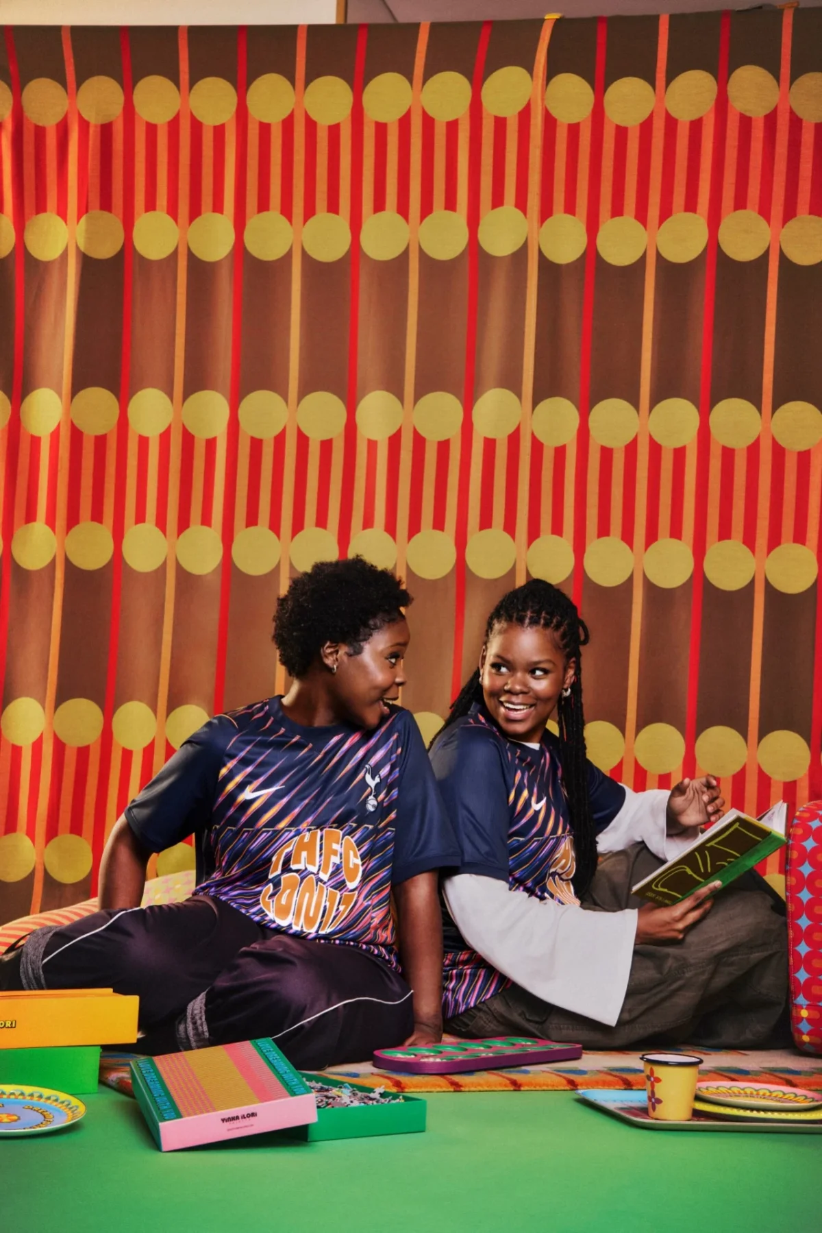
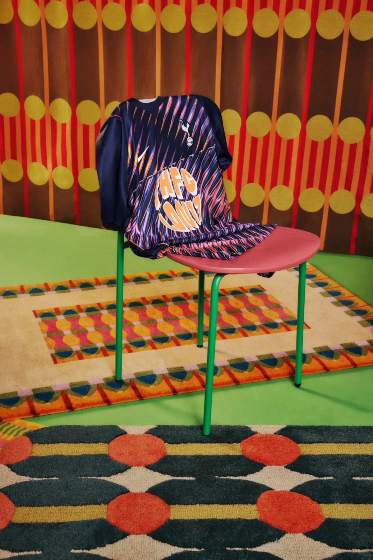
The shirt’s front uses a dark base as a field for sharp, high-energy colour. Streaks of pink, violet, orange and electric blue cut across the navy, setting up a strong contrast that makes the pattern legible at a glance. Ilori’s approach suits a garment that needs to read both on the body and in a crowd: large colour contrasts establish its character quickly, while the layered pattern keeps the surface from feeling like a simple graphic overlay.
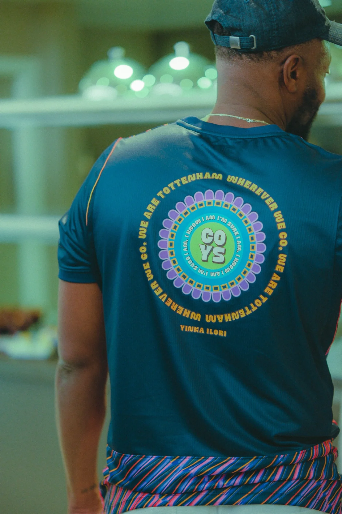
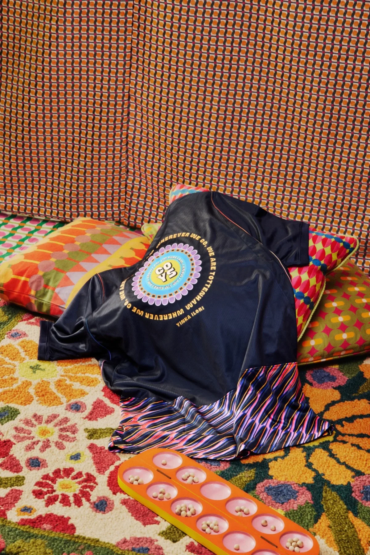
On the reverse, the composition shifts into a circular arrangement. Lilac petals, chequered rings and turquoise bands frame “COYS”, the familiar abbreviation for “Come On You Spurs”. A line from a Spurs chant, “I know I am, I’m sure I am”, circles the lettering. Around the outside, the title “We Are Tottenham, Wherever We Go” and Ilori’s name complete the motif.
That arrangement gives the back its own visual hierarchy. The central acronym is the first read; the surrounding words and shapes unfold around it. The rings echo the feeling of voices gathered together, while the petals and colour bands carry the artist’s decorative language into the lettering. Club references become part of the composition instead of sitting apart as labels.
Designing for the culture around the game
Ilori says his starting point was the experience around football rather than the sport itself. “This project is a celebration of belonging and the power of football to bring people together,” he explains. “For me, football is about the wider culture and the incredible sense of unity that comes from standing on the terraces, chanting alongside thousands of others. I wanted the design to honour Tottenham Hotspur’s heritage while capturing that collective joy and spirit.”
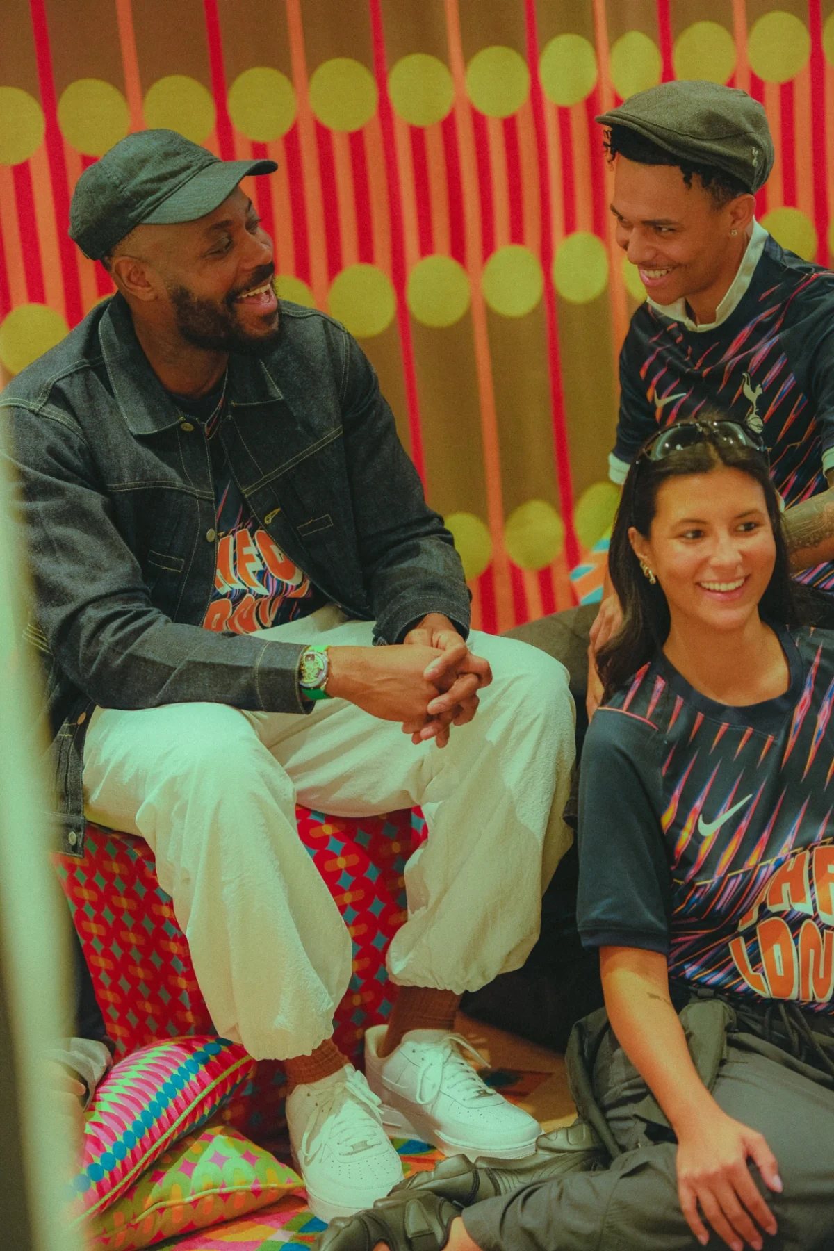
That emphasis on belonging connects the kit to a broader thread in Ilori’s practice. Over the past decade and a half, his work has included playgrounds and laundrettes, using colour and pattern to bring character to everyday settings. The football shirt extends that interest into a format that people can wear, rather than encounter in a fixed place.
Ilori’s work often uses colour, in his words, “as a way of starting a conversation”. Here, the conversation is built into the garment: place names, fan language and graphic motifs share space on a shirt designed for supporters to wear together. The underlying idea is straightforward, but the execution avoids flattening a varied community into one neutral symbol. Instead, it gives that idea an energetic, layered form.
A shirt in a wider body of work
The Tottenham design arrives during a productive period for Ilori. In September, he released Chairman, a book tracing the evolution of the chair practice that first brought him attention. An exhibition bringing together a decade of those chairs in one place is set to open in Islington. The shirt is another format for his recurring concerns with objects, colour and the ways people gather around them.
Last year, Ilori was appointed a Royal Designer for Industry by the RSA and launched the Yinka Ilori Foundation, which aims to create playful, inclusive and sustainable community spaces for children and young people. His recent projects have also ranged from the 100 Found Objects installation at Fulham Pier to a debut watch collection with MB&F’s M.A.D.Editions.
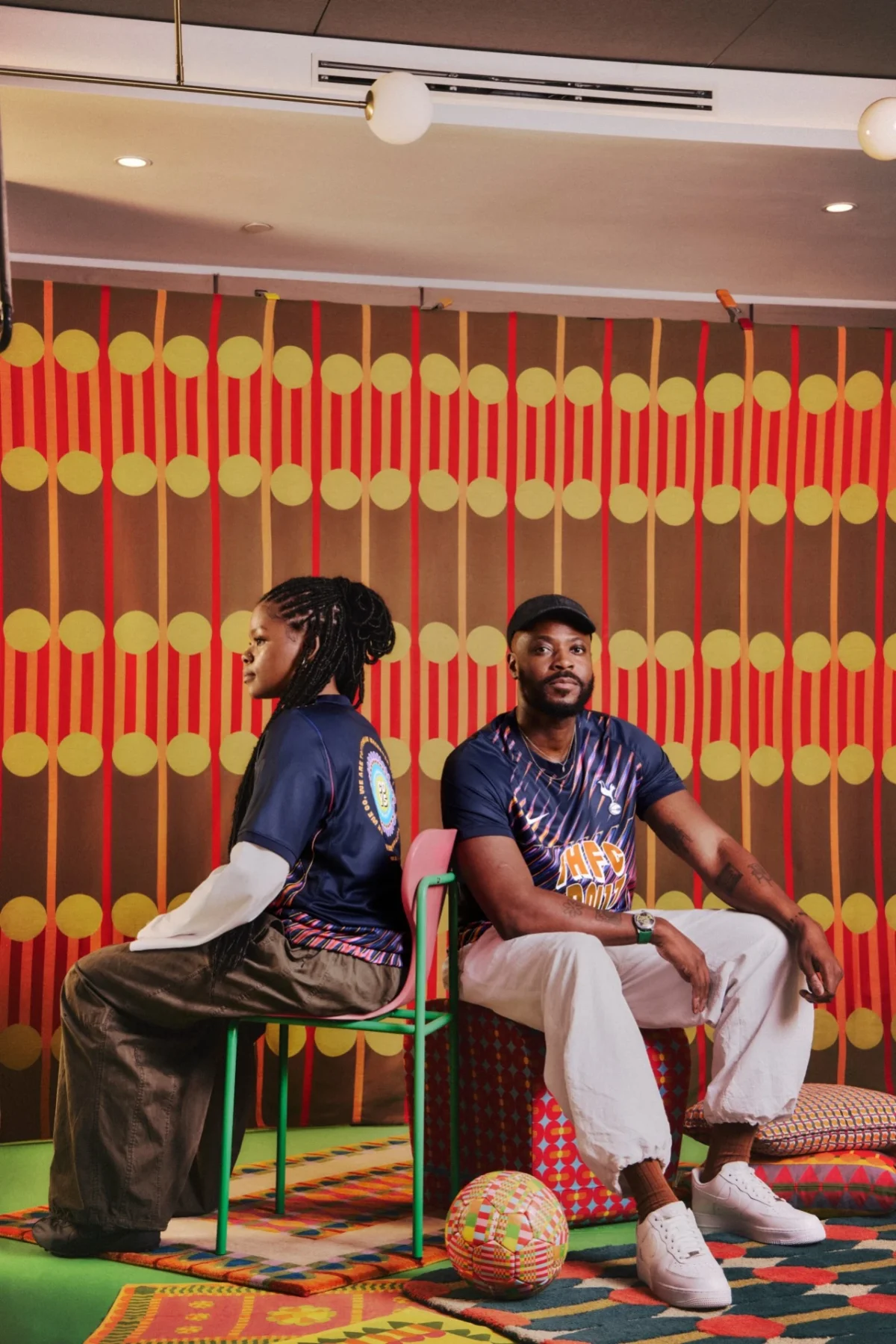

The shirt feels like a natural extension of that practice because it places the work directly into a shared setting. Its most effective decision may be the way it balances immediate impact with specific references: the bold palette catches the eye, while the postcode, chant and title connect the pattern to Tottenham and its supporters. For designers working on identity across physical objects, it offers a clear example of how local detail can give an expressive graphic system a sense of belonging.