Thursday, November 5, 2026 · Graphic Design
Tomáš Brousil’s Four Tests for Typefaces That Work in Real Projects
Noted by Tom May · 557 reads
Suitcase Type Foundry founder Tomáš Brousil explains how to test type systems, check small details and decide when custom lettering earns its place.
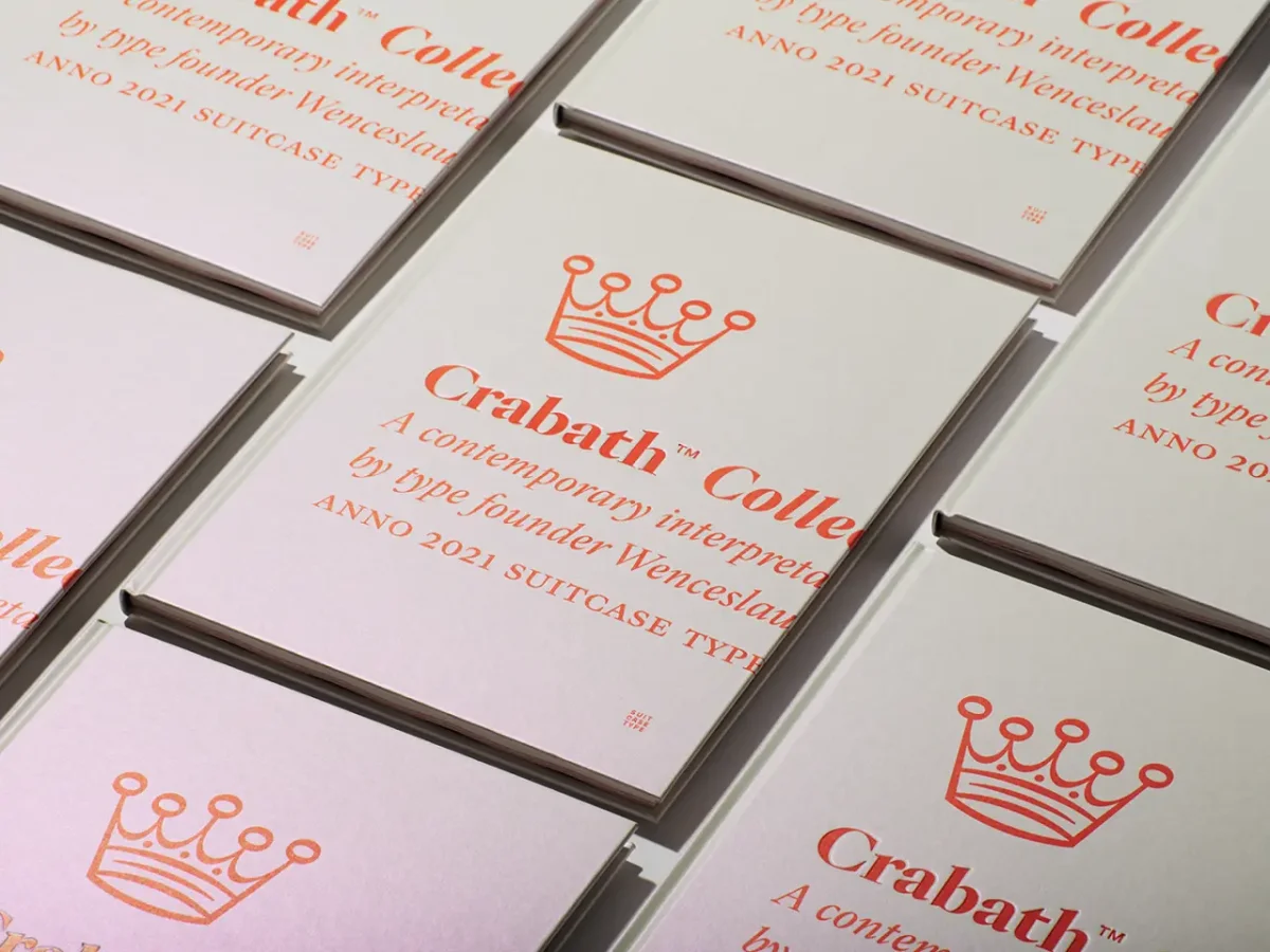
A typeface can look convincing in a polished specimen and still fail in a menu, footnote or navigation label. For Tomáš Brousil, founder of Prague’s Suitcase Type Foundry, choosing type means testing how it performs across the unglamorous parts of a real project.
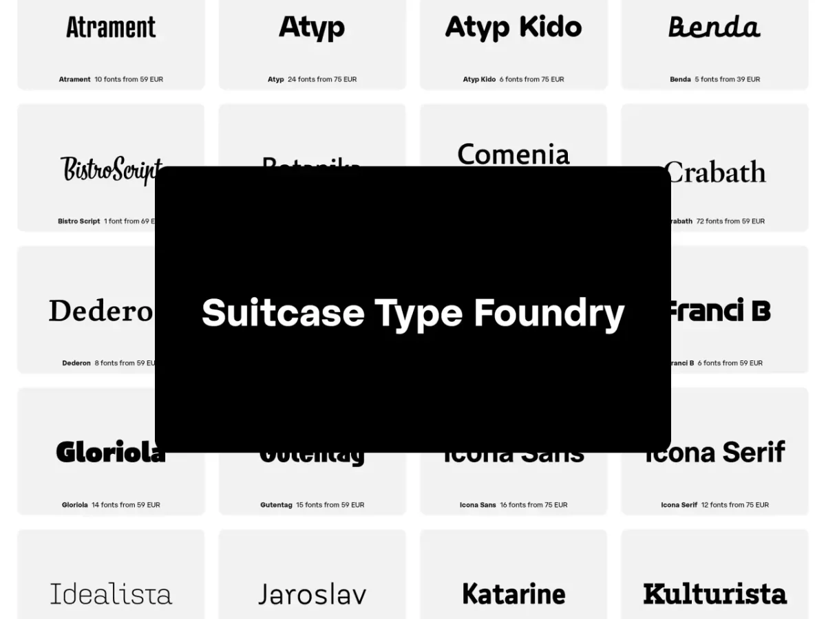
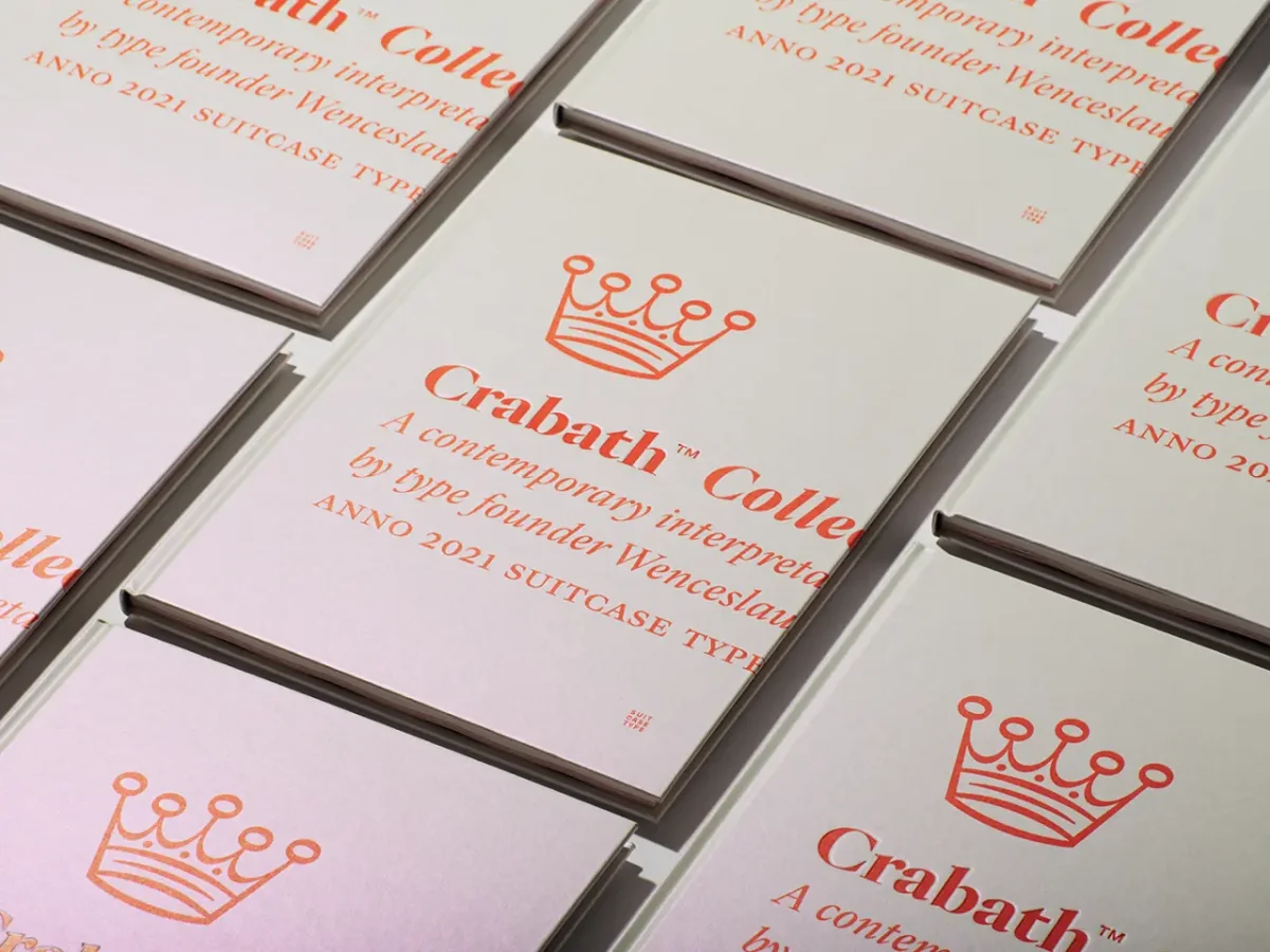
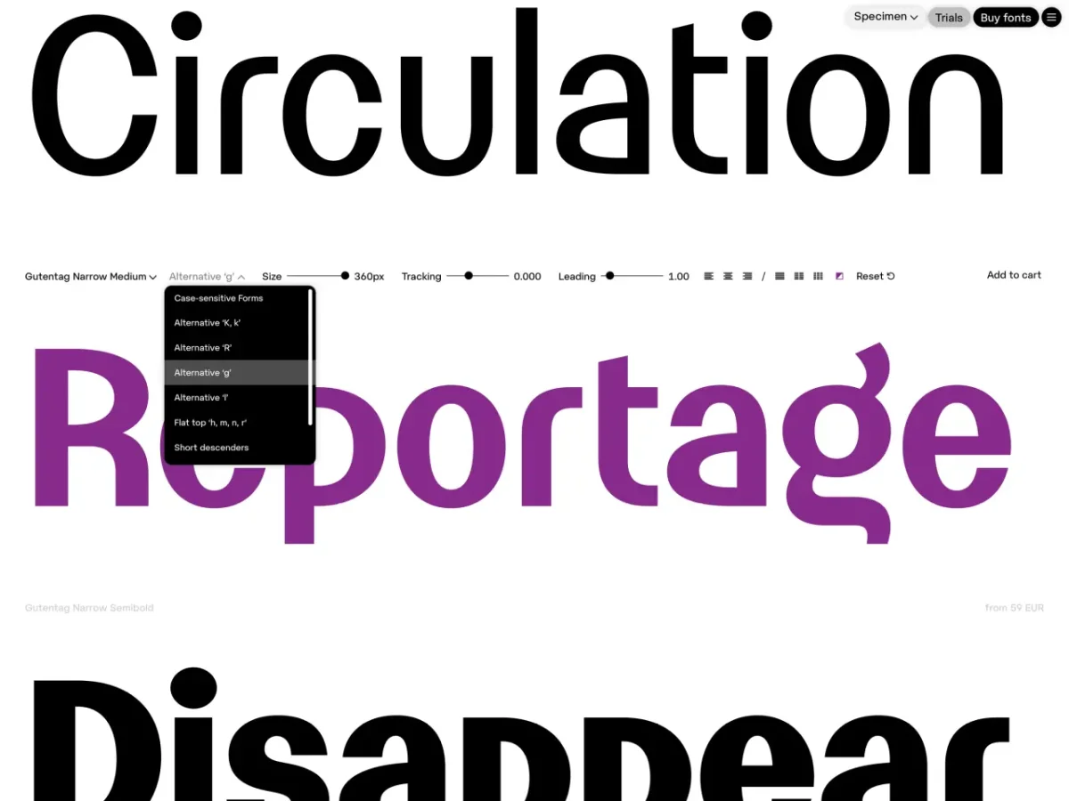
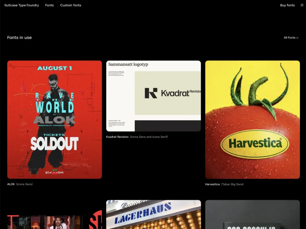
That practical focus shapes Suitcase’s website, which presents its 50 retail families alongside custom work. Interactive font testers, examples of type in use, editorial features and clearer licensing information give designers more ways to judge a family before committing. Brousil has run the foundry on his own since 2003, and his advice reflects the gap between an attractive showcase and the demands of day-to-day use.
Test the family as a system
A large menu of weights and styles doesn’t automatically make a type family a useful system. Brousil’s test is whether each part has a distinct job and can work in combination with the others. That means checking the type across a hierarchy: headline, subheading, body copy, caption and navigation.
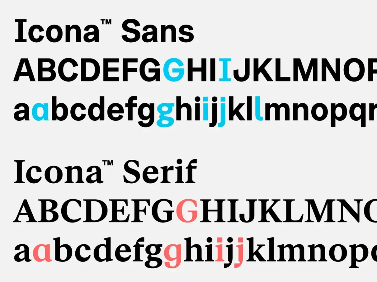
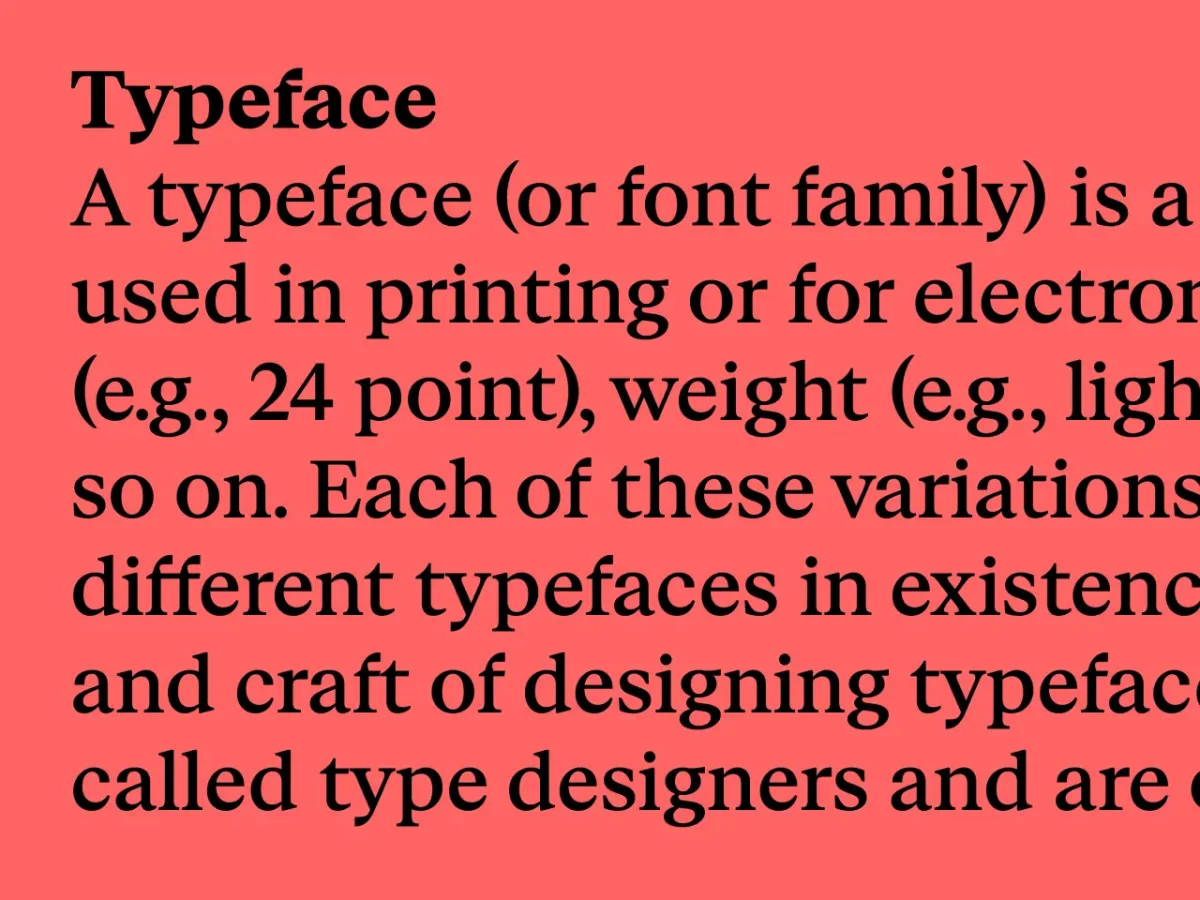
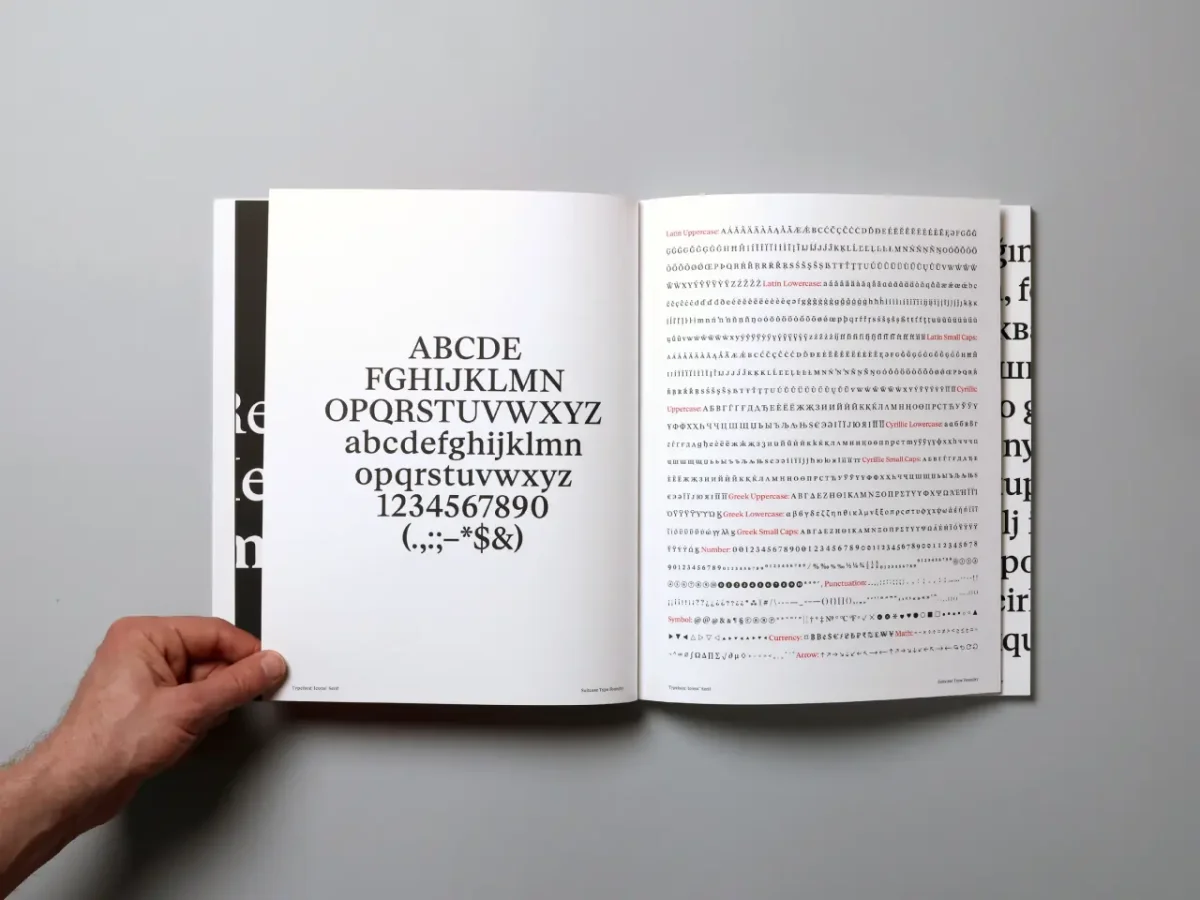
Try the type at different sizes and in the actual kinds of text the project will contain. A specimen can show a few striking characters under ideal conditions; it may tell you much less about whether the family stays legible in dense copy or feels appropriate in a caption. The useful question is how its parts behave together, from the main headline down to the smallest label.
Check the characters people overlook
Before choosing a face, inspect the details the project will depend on: numerals, currency signs, small caps, tabular figures and language coverage. Will the work include international names? Does the brand operate across languages? Those questions can reveal gaps that a display test won’t expose.
Suitcase offers basic trial fonts for early layout work, followed by full trials with the complete character set and OpenType features. Brousil’s Tabac family shows why that depth matters. He developed it over 10 years, expanding a diploma project into a superfamily with options for different settings.
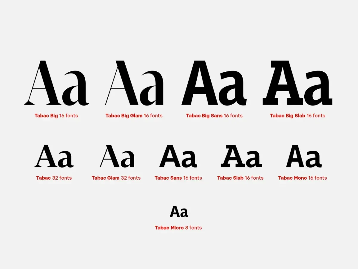
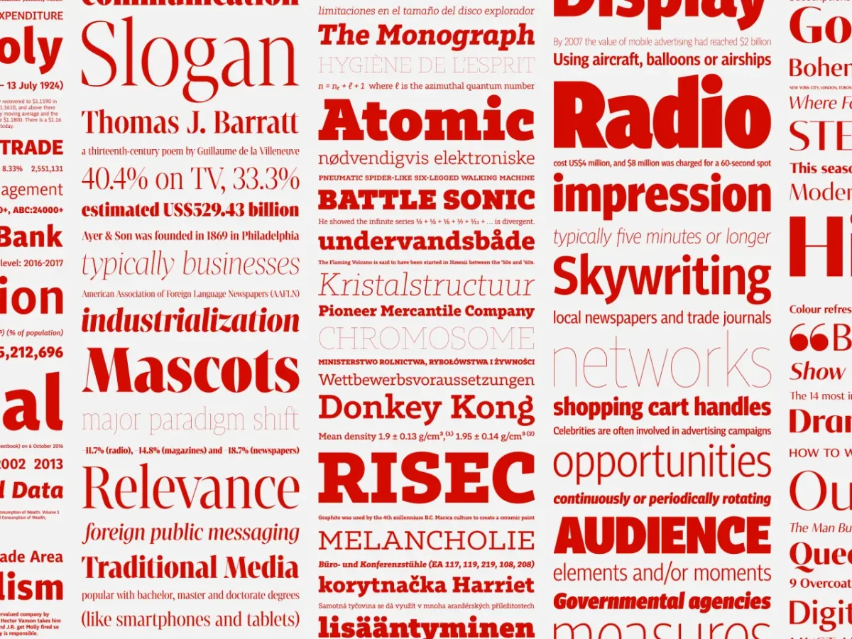
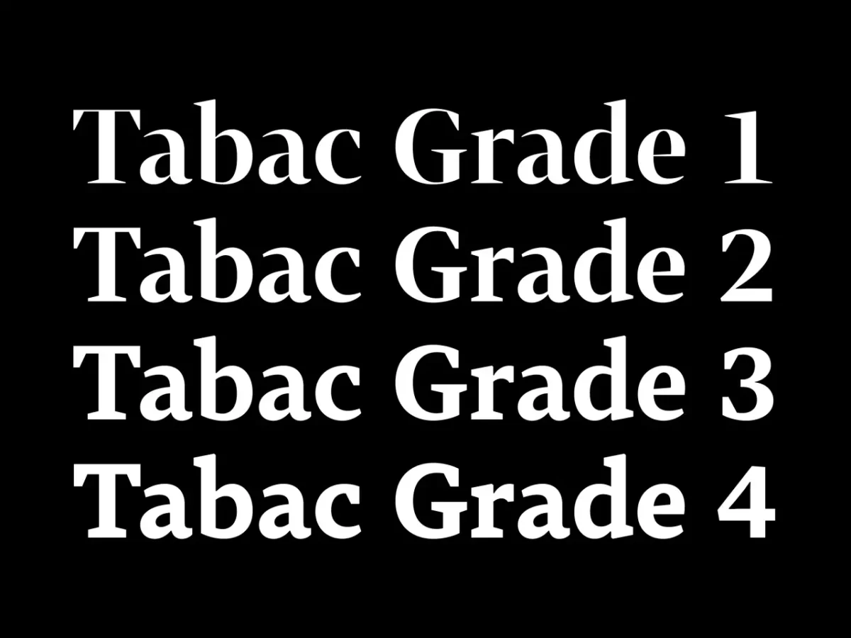

Tabac’s optical grades adjust the thickness of secondary strokes to suit different sizes, papers and printing methods, while keeping character widths stable. That last point matters in layout: when line lengths remain consistent, adapting the contrast doesn’t force new line breaks.
At the display end, Tabac Big uses extreme contrast, short terminals, a large x-height and compact forms to create a distinct headline voice. Tabac Micro takes the opposite approach for small text, with a larger x-height, more open spacing, clearer punctuation, ink traps and slightly condensed characters. These are functional choices as much as stylistic ones.
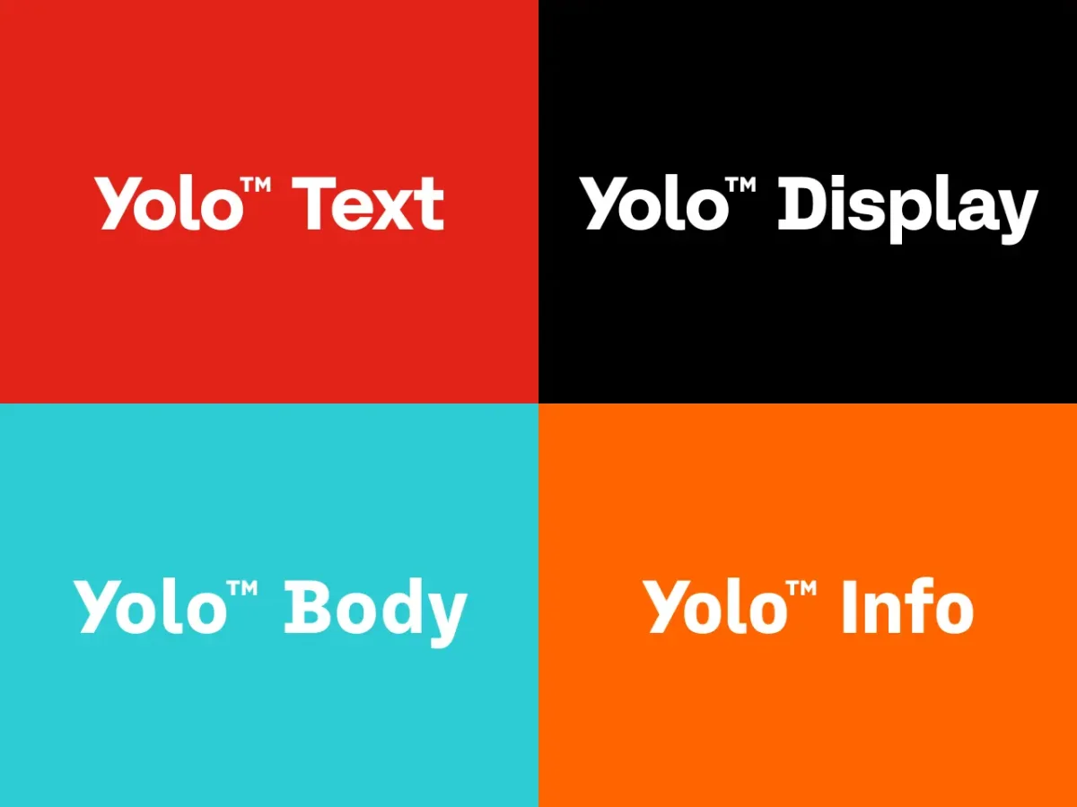
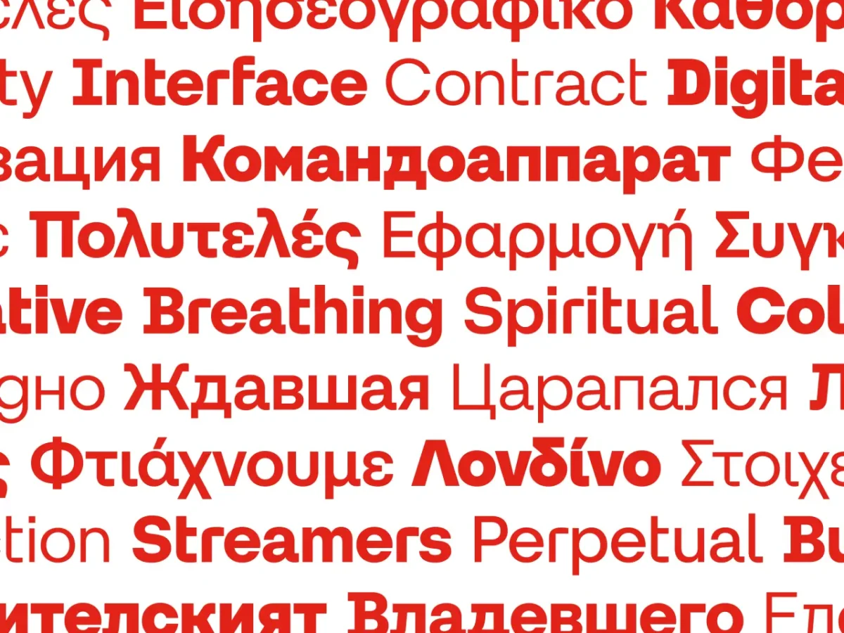
A hierarchy doesn’t have to rely on shifts in size or weight alone. Combining type classifications can create distinction while keeping a publication visually coherent.
Choose custom type for a lasting job
Custom type isn’t automatically the better choice. Brousil argues that a finished, well-designed retail family can meet most brand needs, and is already tested and ready to use. A commission makes sense when the work calls for a solution that an existing family can’t provide—not simply because a company has the means to pay for one.
Suitcase’s identity work for KRO, a growing Prague network of bistros, cafés and a bakery, shows how a custom system can grow from practical requirements. The project adapted three typefaces from Brousil’s Yolo family. KRO Crew was adjusted for the logotype and headlines, with changes to its proportions, contrast and distinctive characters. KRO Display was made chiefly for food and drinks menus.
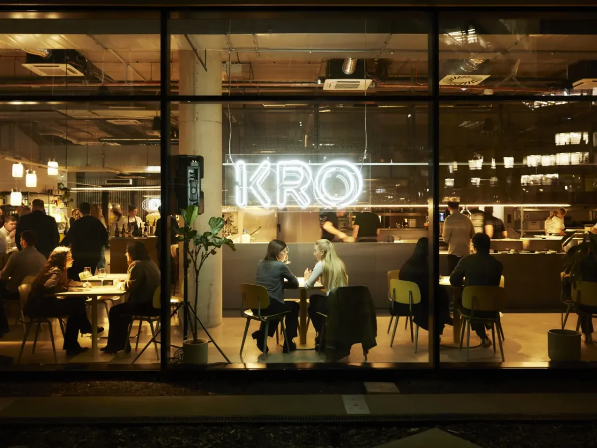
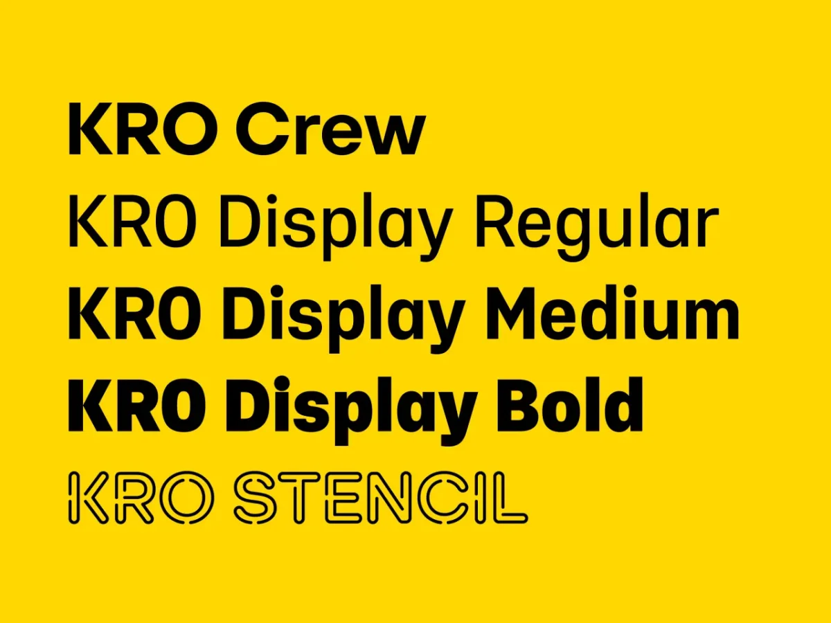
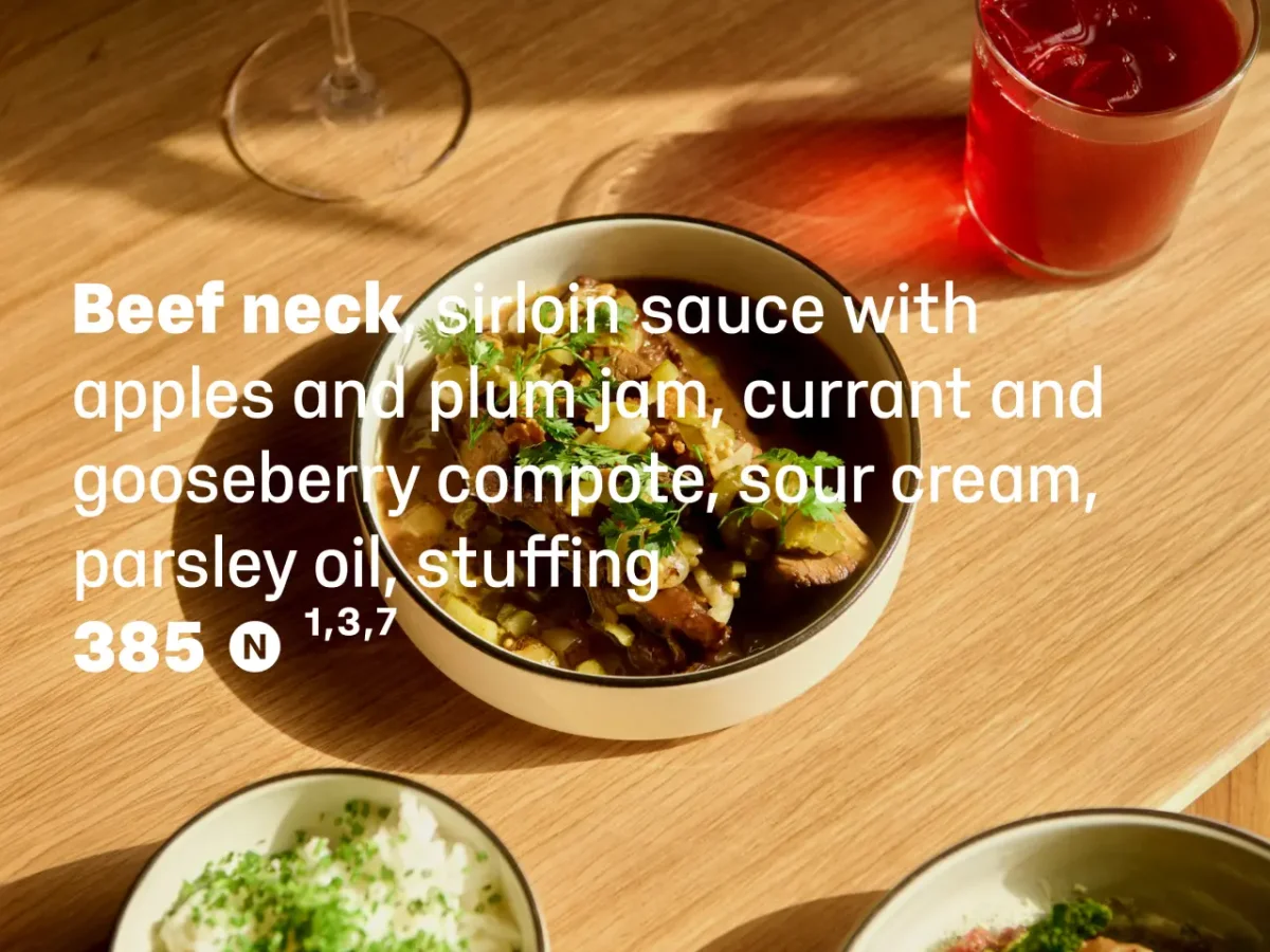
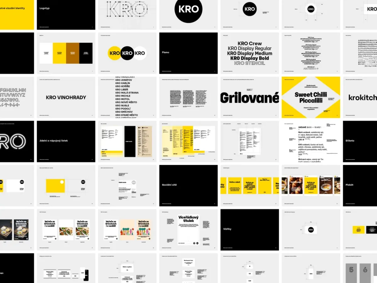
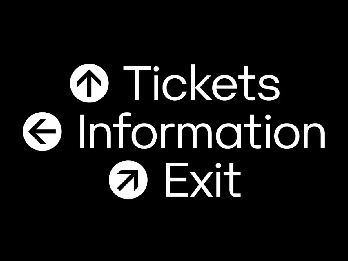
The third, KRO Stencil, began as a technical alteration to three letters for a neon logotype. Its distinctive construction led the team to extend it into uppercase characters, numerals, arrows and pictograms, now used for wayfinding, signs and other physical applications. The project’s strength, in Brousil’s view, lies in tailoring the type to the business’s continuing needs.
Make the technical checks before committing
A common selection mistake is falling for a typeface’s visual character without checking its technical and typographic capabilities. Optical sizes and OpenType features can go unused, even when they offer a better fit for the setting. Try the alternates and features in the intended context before deciding they’re unnecessary.
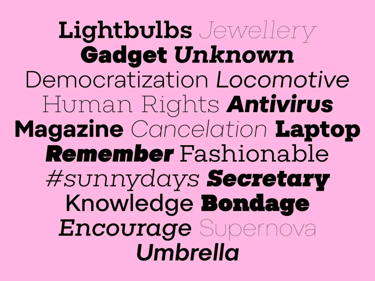
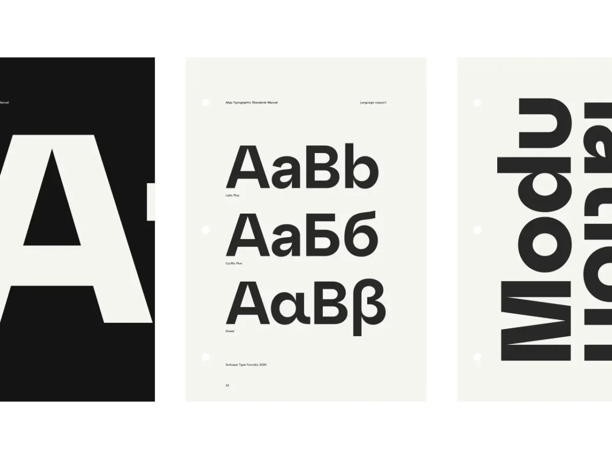
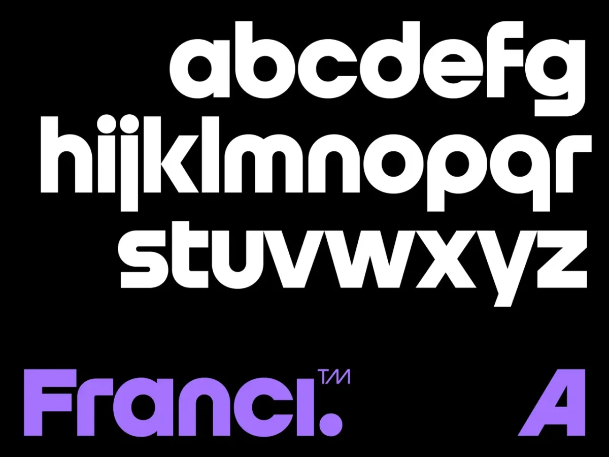
Licensing also deserves attention during selection. Brousil says misunderstandings are common across type foundries; clear terms, a useful FAQ and direct answers to customer questions can help designers choose the appropriate licence. For a working team, the practical takeaway is simple: test the family at real sizes, inspect the characters and features your project needs, and treat licensing as part of the type decision.