Thursday, November 5, 2026 · Graphic Design
Tatiana Egoshina Turns Folklore, Shop Signs and Colour into Playful Design
Noted by Ayla Angelos · 674 reads
From a mountain videomapping piece to a flexible agency identity, Egoshina draws on Italian folklore, everyday graphics and hands-on research.
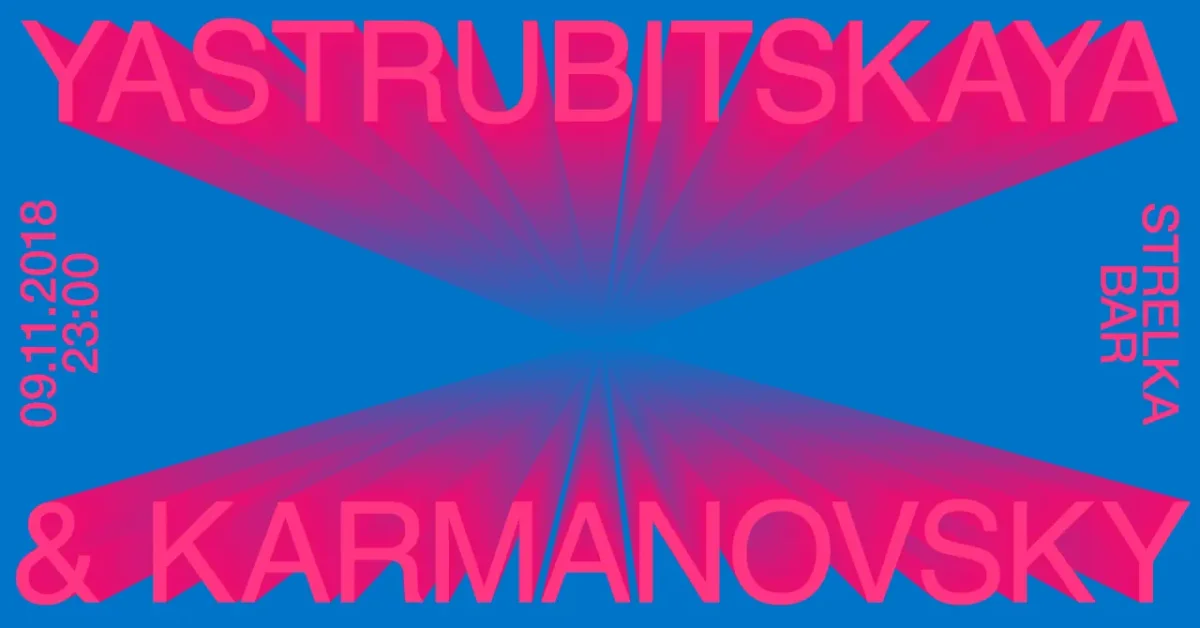
Tatiana Egoshina’s work finds its way from village stories and hand-painted shop signs into identities, posters and installations. The Milan-based designer follows those references with a mix of research and play: she starts with what she sees and hears, then shapes it into a visual system that can work across formats.
Stories drawn onto a mountain
For Ceneri di Pietra, Egoshina spent a week in Castelmezzano, a small village in southern Italy, gathering local legends over meals and coffee. The accounts she heard included herbal healers, fire, witches and white dogs. “These are things you simply cannot Google,” she says.
She worked with sound artist Livia Borzetti, who focused on the local dialect while Egoshina sketched symbols. Their videomapping piece brought light, poetry and quadraphonic sound to the cliffs of the Dolomiti Lucane. It was shown during The Breath of Light, an international rock-mapping residency run by the town and Basilicata Creativa in June 2026, and won first prize at the residency.
For Egoshina, the scale changed the experience of the work. “What I remember most vividly is standing in front of the mountain at night and seeing something that had existed only in our imagination become part of the landscape. Quite literally the biggest canvas I've ever worked on!”
Learning to compose across formats
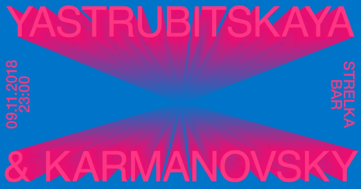
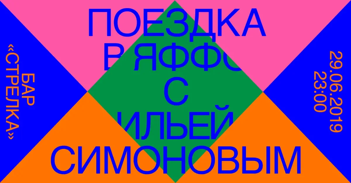
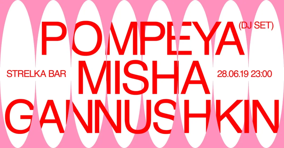
Before Italy, Egoshina studied visual communication in Moscow, earning a BA and learning to build compositions with black, white and one additional colour, often red. She studied under Anna Kulachek and later joined Strelka Institute, whose identity was designed by OK-RM. The work there taught her to think across formats, make bold compositions and tune typography closely. Her posters for Strelka’s bar make that training visible: neon pink and electric blue letters spread across the page like beams from stage lights.
At Readymag, she designed for a web publishing tool and an audience of designers she describes as “particularly curious and demanding”. Later projects included identities for film festivals, motion graphics for fashion titles, and art direction for Material Bank, Benetton and Condé Nast.
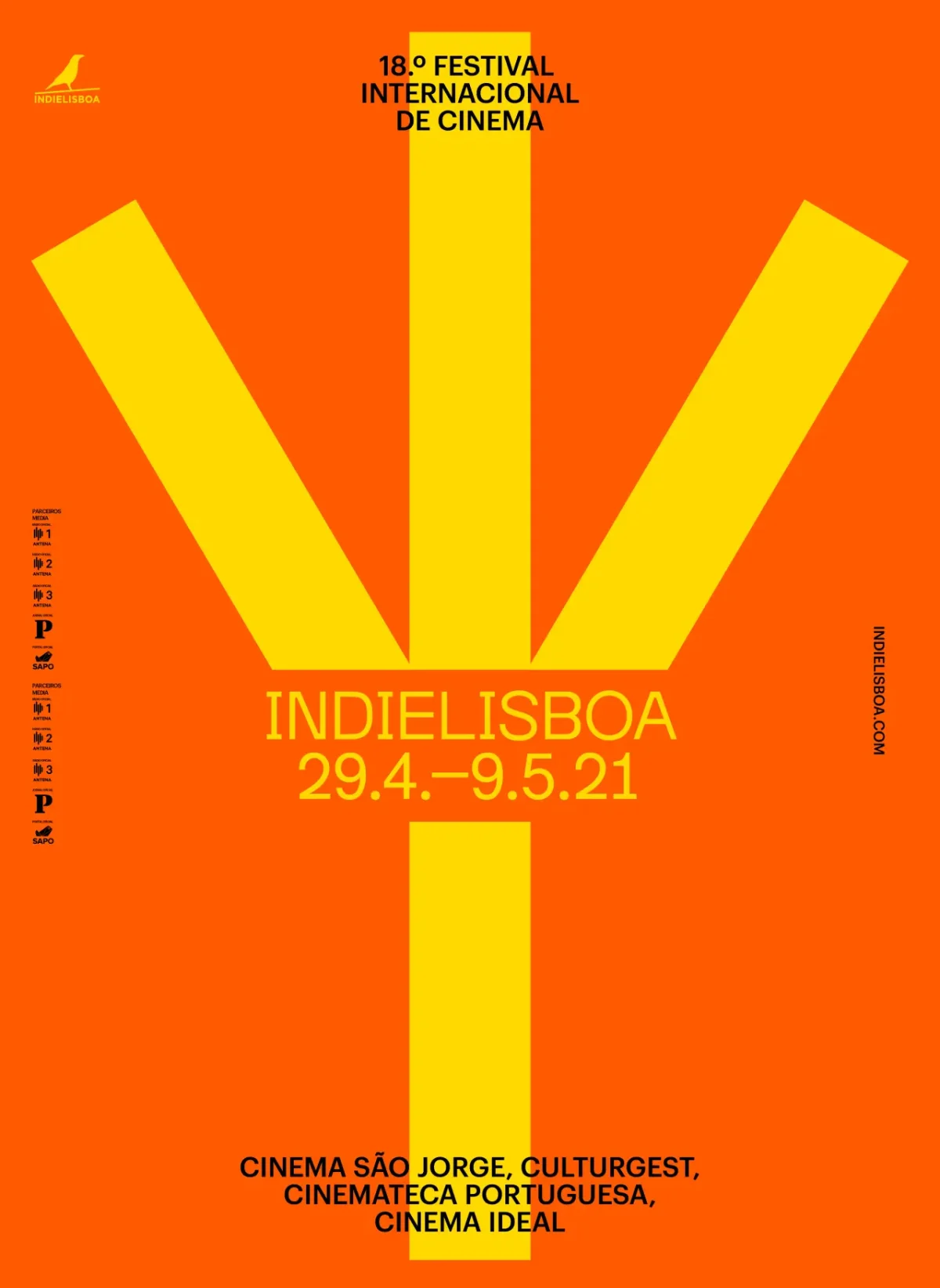
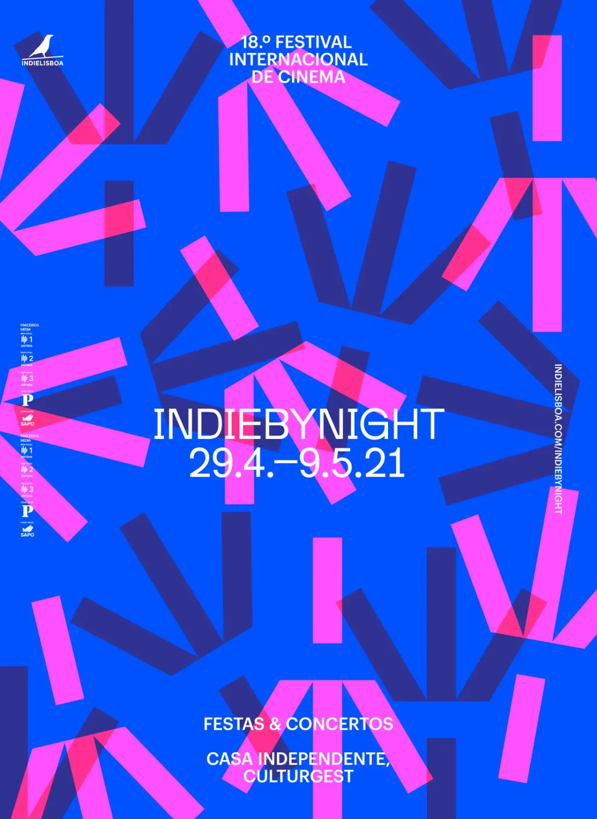
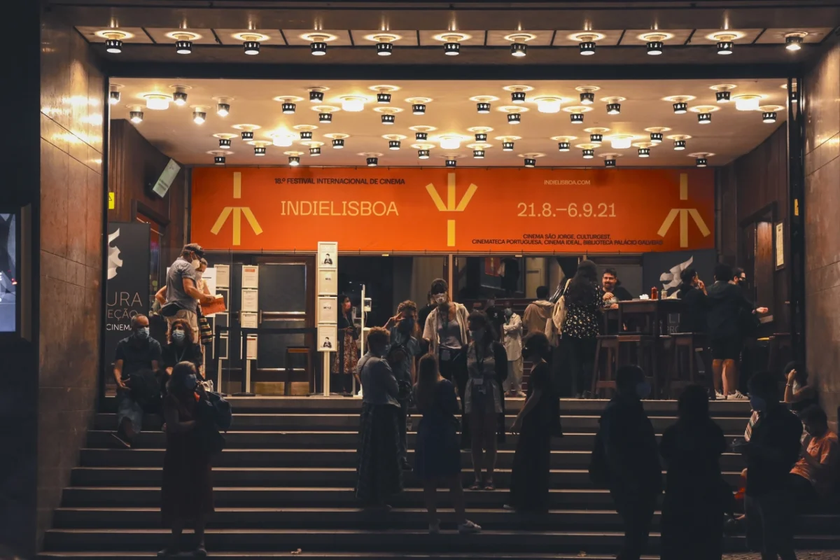
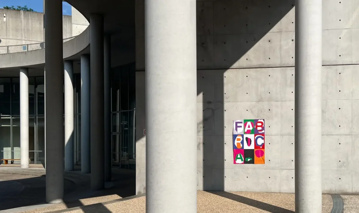
A trip to Palermo, about ten years ago, made colour feel less like a formula and more like an observation. Egoshina recalls the sky, sea, plants, fruit, painted walls and frescoes sitting together naturally. “I didn't so much understand how to use colour as feel it. Since then, colour, Italy and I have been pretty much inseparable.” That instinct shows in her IndieLisboa posters, where bright hues break into rectangular confetti, and in flower plates decorated with blue and gold petals.
Finding beauty in the imperfect
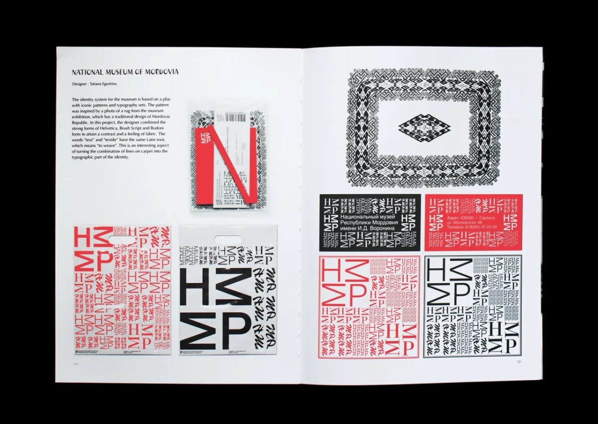
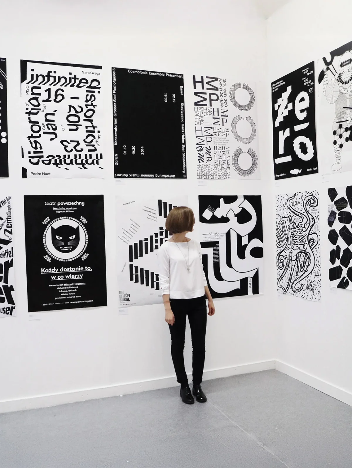
After moving to Milan, Egoshina started collecting visual details from the city: old signs, packaging, handwritten notes and displays made with more enthusiasm than technical skill. Shop windows held a particular pull. She sees care in the choice of a decorative font or the arrangement of objects, even when the result is rough around the edges. Susan Sontag’s Notes on “Camp” helped her name the attraction: “the unintentional, the sincere, the accidentally beautiful.”
Her reference points also include folklore, poetry and architecture, alongside fashion. A pink-and-red combination in a Prada collection, she observes, may appear in graphic design months later. She urges designers to look beyond their peers for ideas. Otherwise, she says, the work risks becoming references to other designers’ references. For an evening of conversation, she’d choose a forensic psychologist, poet or ballet dancer over another moodboard.
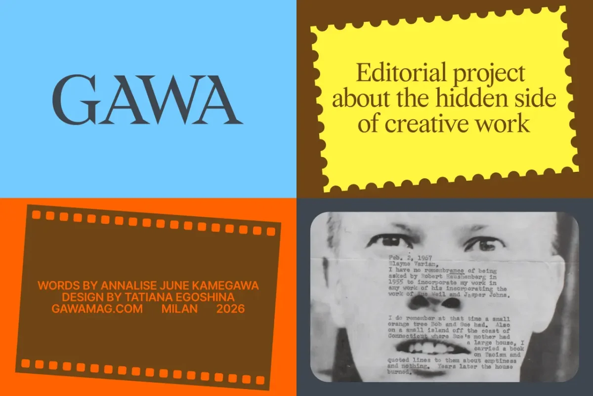
From pencil marks to a flexible identity
Egoshina begins by working through research until an idea emerges from the material. Then she reaches for a pencil. She likes starting by hand because it lets her think at the pace of the mark: “I draw with a pencil because my thoughts move at the same speed as my pencil across the paper.” She compares this stage to a sculptor assessing a block, testing its weight, texture and resistance before deciding what to do with it. The aim is to turn that early intuition into a visual system that can expand while keeping its character.
That process shaped the logo and website she designed for Italian communications agency Fortune Cookie between 2024 and 2026. The name suggested that the brand’s ideas were already inside it, waiting to be found. Egoshina translated that thought into folded ribbons of colour carrying messages such as “Do not panic”, “The end is near” and “You are loved”. In some graphics, a message takes the place of the brand name.

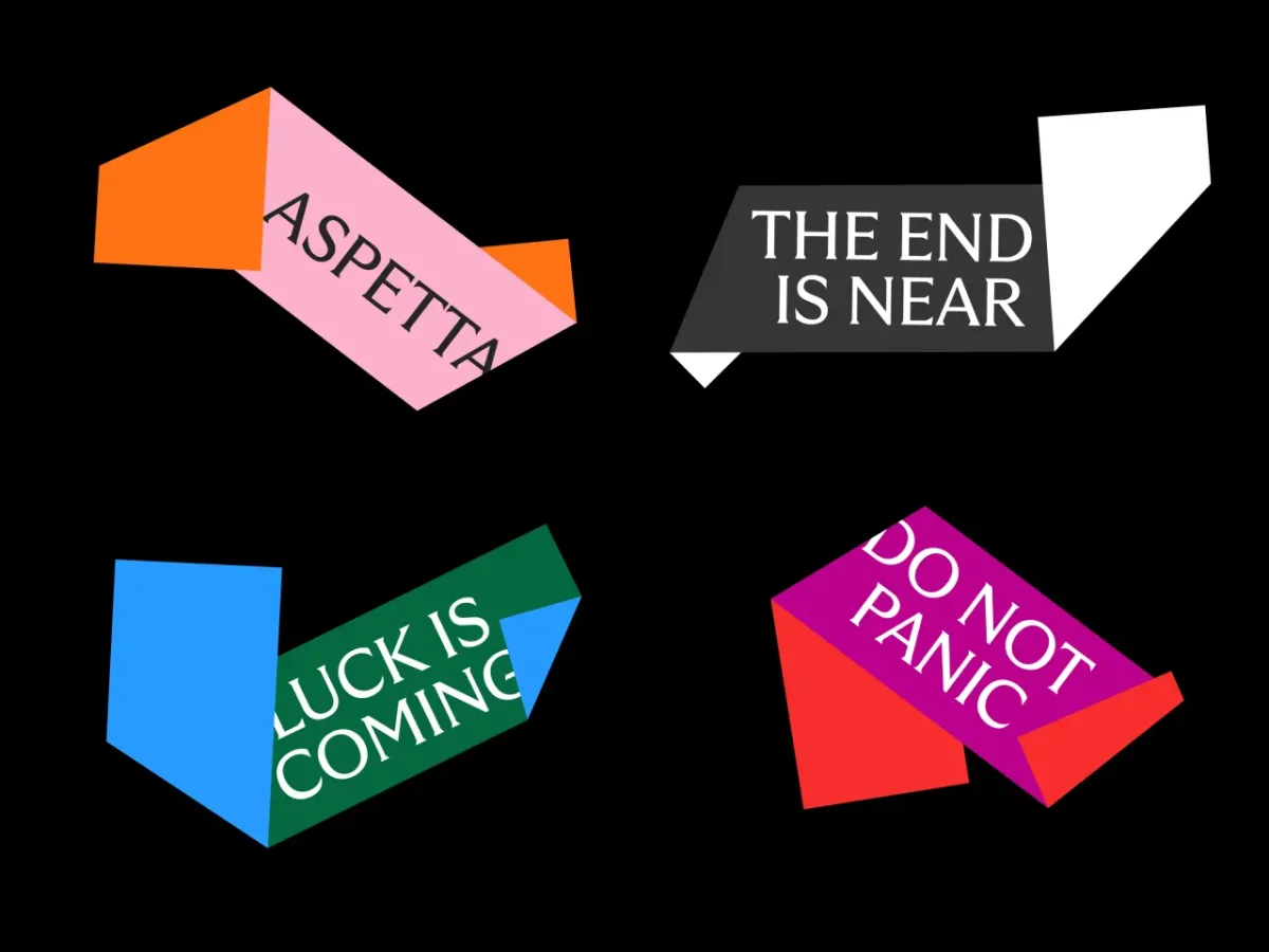
As the identity grew, the team began making graphics and drifting from its guidelines. Egoshina responded by vibe-coding an online tool that lets them generate fortune-cookie graphics within the system. The tool gives the team room to make new combinations while keeping the visual rules in view. Her principle is straightforward: “A good identity shouldn't depend on its designer being around forever. It should be able to grow on its own.”
Keeping play in the work
Egoshina wants to bring her commercial and artistic work closer together, with more installations and residencies ahead. Humour remains a thread through her identities, ceramics and posters. She sees playfulness as a way to acknowledge life’s harder parts without letting them occupy the whole picture: there is still room for beauty, absurdity, tenderness and laughter.
That balance is a useful prompt for designers: look closely at what people make and collect, follow references outside the studio, and let the material suggest the form. Sometimes the most distinctive visual language begins with an imperfect sign, a story heard at dinner or a pencil moving across paper.