Thursday, October 29, 2026 · Graphic Design
Dutchscot Builds a Dreamlike Brooklyn Identity for Bar Rêve
Noted by Emily Gosling · 553 reads
A wobbly script mark, maroon and sky blue, and hazy photography bring Belle Époque references into Bar Rêve’s Brooklyn identity.
Dutchscot’s identity for Bar Rêve makes atmosphere do the work of a conventional hospitality pitch. Instead of leaning on familiar Parisian motifs or crisp pictures of drinks and interiors, the London-based studio builds a visual world around dreams, memory and shifting perception. The result connects a Brooklyn cocktail bar to Belle Époque Paris while giving the references room to feel playful and contemporary.

Emily Gosling reviewed the project, published 29 October 2026. Dutchscot created Bar Rêve’s identity across print, digital design, signage, merchandise and art direction for the new Brooklyn bar.
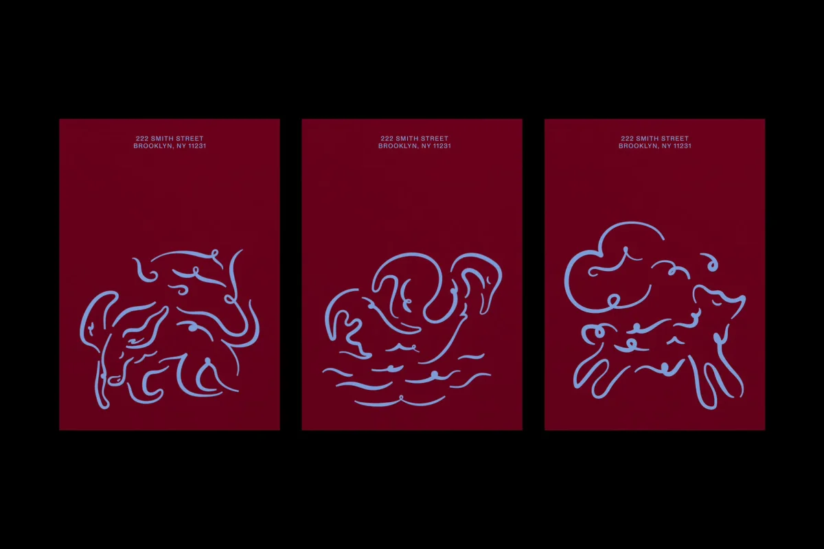
The studio says the bar draws on “Belle Époque Paris, a time known for optimism, style, and revelry.” The historical period, spanning 1871 to 1914, offers a broad set of references: Art Nouveau, cabaret, Impressionism and the visual culture of Paris. Dutchscot’s smart move is to draw on the mood and creative principles of the era without assembling a checklist of French signifiers.
food, wine and hospitality projects have featured in BP&O’s recent coverage. Dutchscot’s other work includes Fjord, Tameko and Sucre.

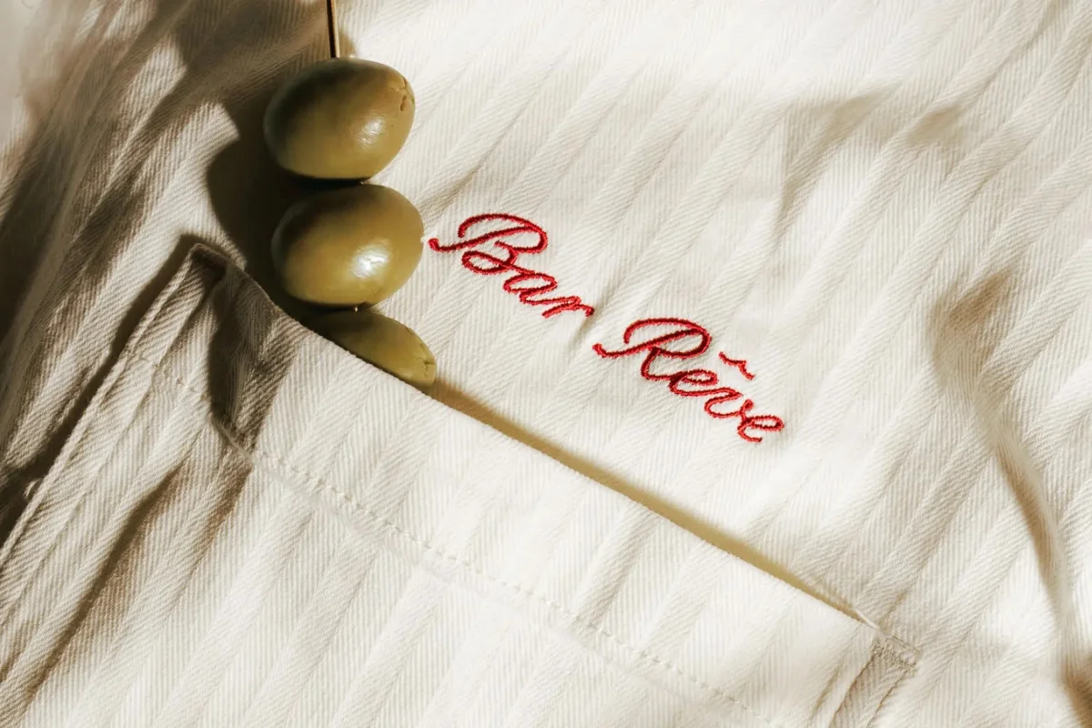
Lettering with a dreamlike wobble
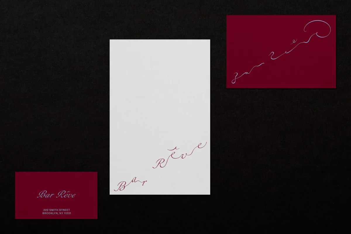
The identity’s bespoke wordmark takes the sweep of European script lettering and introduces a purposeful instability. Connected strokes give the name an air of occasion, while the loose, slightly rearranged letterforms keep the elegance from becoming stiff. It reads like a word caught between waking and sleep: decorative, but with a touch of oddness that gives it character.
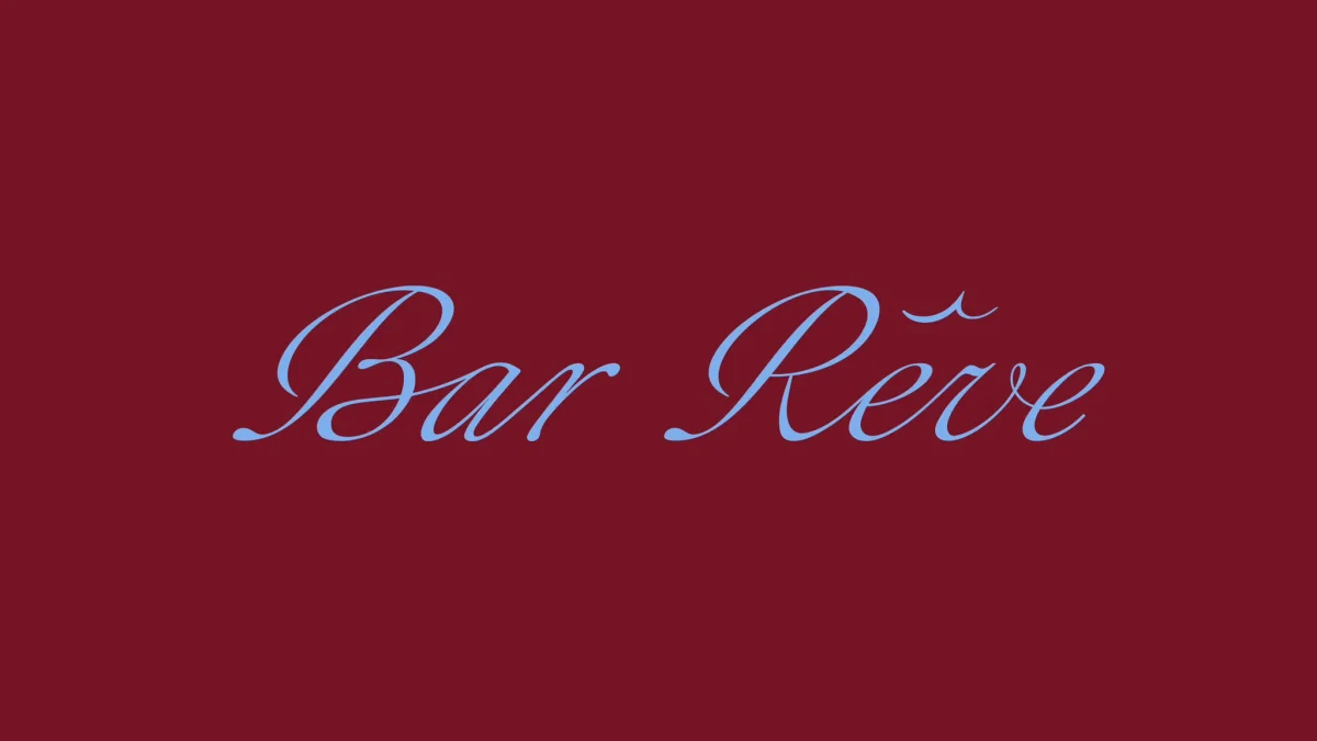
That balance matters in a bar identity, where script can easily become shorthand for old-world glamour. Here, the unusual movement in the lettering interrupts that expectation. The mark feels fluid without becoming precious, and its surreal quality gives the concept of “rêve”—French for dream—a visible form.
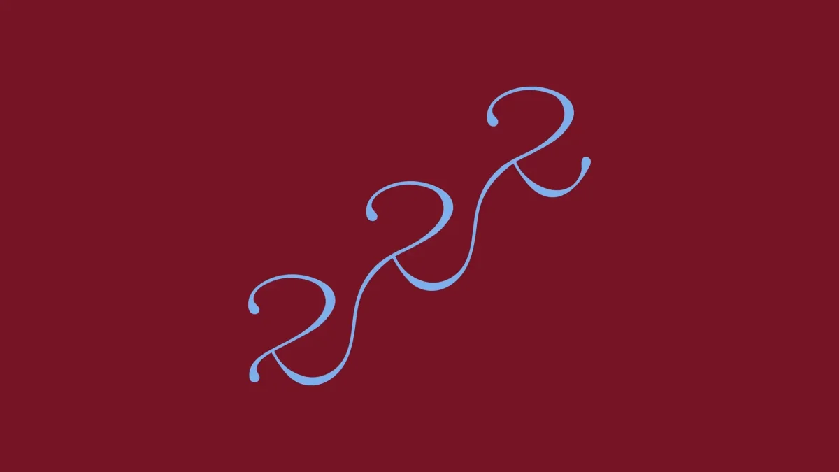
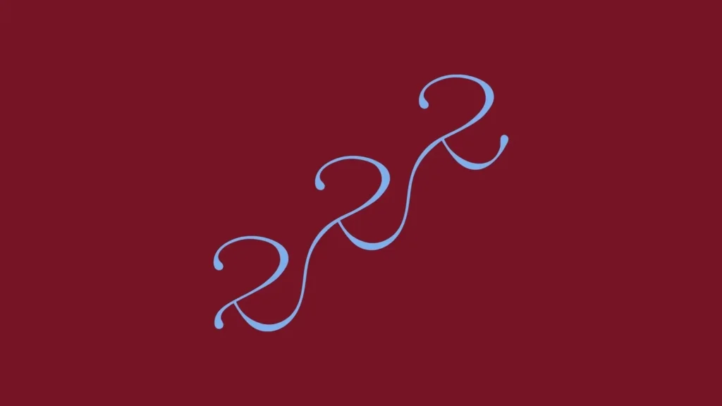
A secondary monogram extends the idea through the numerals “222,” taken from the bar’s Brooklyn address. Set into a flowing, semi-legible mark, the repeated figures also suggest “zzz,” the familiar visual shorthand for sleep. It’s a compact piece of concept work: the address becomes a graphic symbol, and the symbol links place to the identity’s dream motif.
For supporting typography, Dutchscot chose Salmanazar, designed by Lyon-based foundry 205TF. Its roots in 19th-century French typography make it a direct historical fit, but its sturdier construction also grounds the more fluid wordmark. Uneven shapes and asymmetrical counters lend it a crafted, human quality; heavier strokes supply authority. Its character brings together associations with American Gothic sans serifs and German humanist type design, helping the identity bridge European nostalgia and Brooklyn sensibility.

Colour, movement and perception

The palette is deliberately concise: full-bodied maroon paired with resonant sky blue. Together, the colours suggest richness without overloading the system. Maroon hints at smoking jackets and evening clothes; blue opens the composition toward clouds and reverie. The contrast keeps the identity polished while giving it an unexpected lift.
That sense of drifting carries into the website. Rather than moving down a familiar vertical page, visitors “drift up,” as Dutchscot describes it, through animated illustrations inspired by dream symbolism. The interaction makes the concept part of the browsing experience, not just a theme applied to a logo. It also gives the digital work a clear motion logic that connects to the identity’s unsettled lettering and atmospheric images.
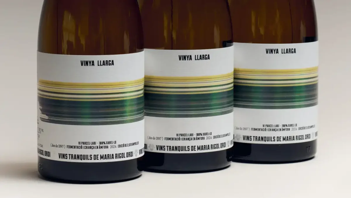
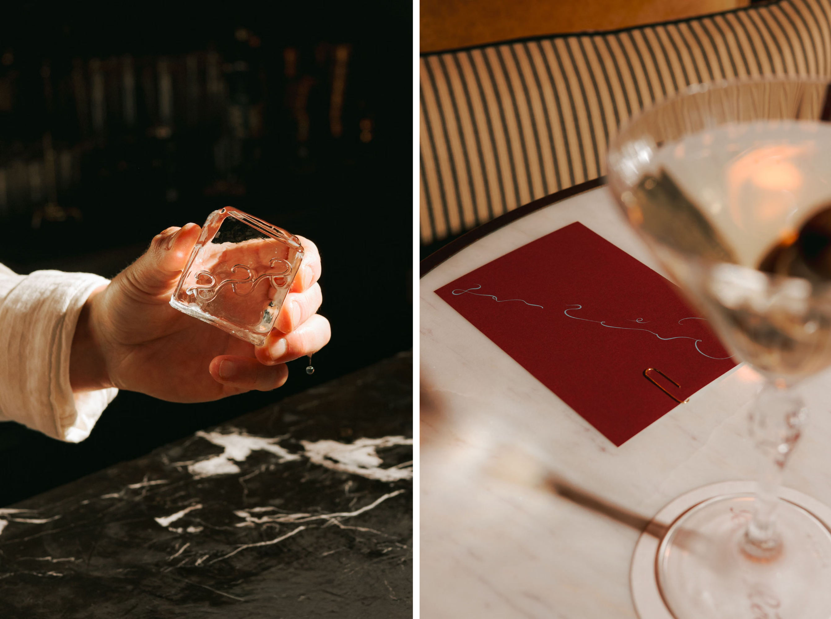
Photography and art direction, developed with New York City-based photographer McGuire McManus, bring Impressionist concerns into the brand without relying on direct quotations from paintings. The images use film, movement and intentional blur. Some remain readable; others dissolve until their subjects are hard to identify. Rather than functioning mainly as product shots, they suggest fleeting recollections, with light, colour and motion shaping the frame.

For a hospitality brand, that choice changes what photography promises. The imagery doesn’t always spell out exactly what a visitor will see or order. It establishes a feeling instead: romantic, hazy and a little elusive. That approach makes the Impressionist reference useful as a way of seeing—through light and movement—rather than a decorative period label.
A menu that extends the identity
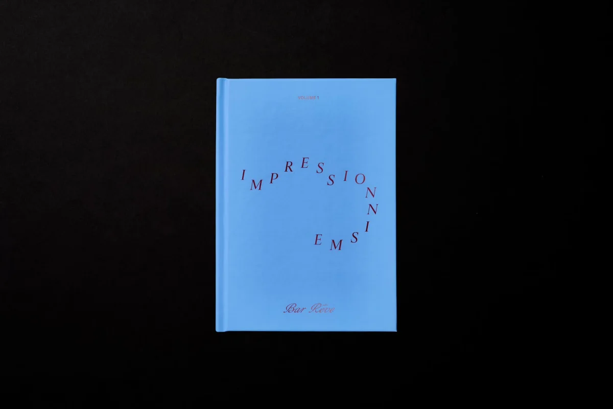
Bar Rêve’s first cocktail menu links the drinks to ten Impressionist paintings. Each is accompanied by a poem spoken from the perspective of someone waking from a vivid dream inside the artwork. The writing draws on Symbolist poetry, Stéphane Mallarmé and vers libre, an open poetic form without a fixed metre or rhyme scheme.
The menu adds cultural texture without making the references feel like a lesson. Across the identity, images and printed matter often suggest rather than describe. That’s a considered choice: where a tightly literal system might explain every detail, Dutchscot leaves some room for interpretation. The visual language stays coherent because the same qualities—fluidity, blur, contrast and dream imagery—recur across touchpoints.
Bar Rêve shows how a historical reference can shape a brand through its underlying ideas, not just its period styling. Dutchscot’s strongest decisions—the unstable script, address-based monogram, restrained two-colour palette, rising website and indistinct photography—each give the dream concept a different job. Together, they make the identity feel rooted in its references while still belonging to a Brooklyn bar.