Wednesday, October 28, 2026 · UX & UI Design
Eden Gold Gives the Pear a Storybook Identity
Noted by Lisa Cain · 988 reads
AUGE Design’s illustrated Eden Gold packaging uses imagined landscapes and art directed AI imagery to make a new pear variety easier to recognise.
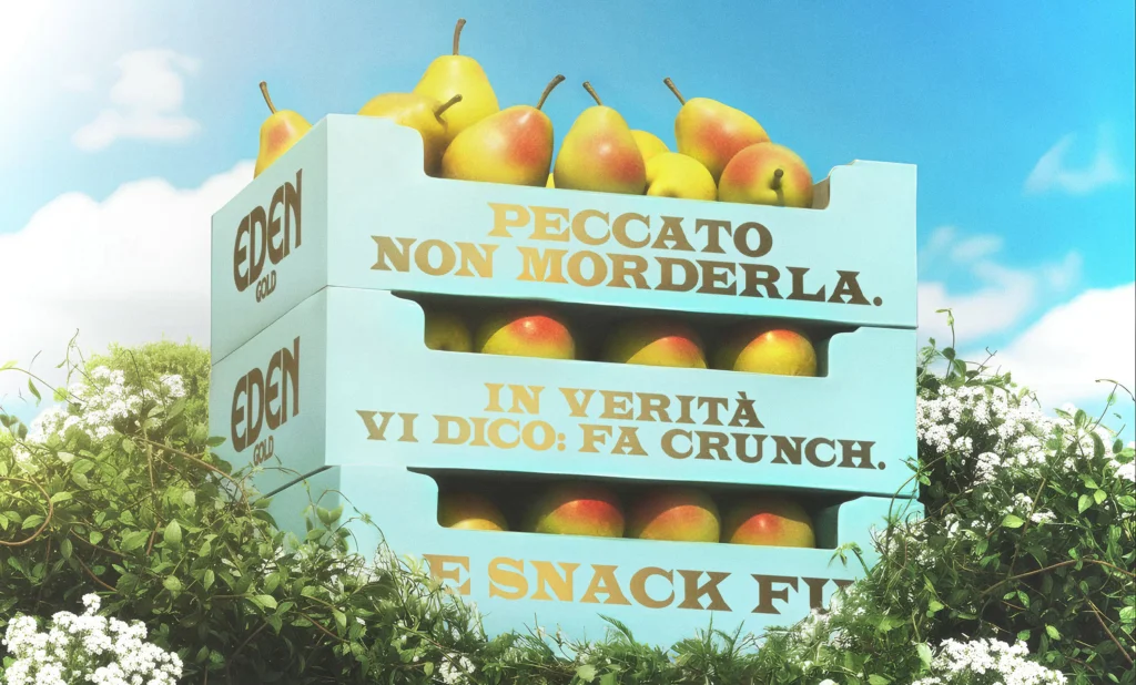
Eden Gold’s packaging makes a practical branding argument: a pear can be more memorable when it arrives with a world of its own. The new variety from Greenyard Fresh Italy is introduced with the line “la pera che cambia la storia” — “the pear that changes history” — and AUGE Design builds that claim into pale blue boxes filled with imagined scenery.
The concept draws on a familiar gap in the story of the forbidden fruit. Genesis doesn’t identify the fruit, yet many people picture an apple. Across centuries of retelling, language and art helped that association take hold. Figs, grapes, pomegranates, pears and other fruits have also been suggested. Eden Gold uses that uncertainty as a starting point, placing the pear back inside the Garden of Eden story without simply illustrating its most recognisable religious imagery.
A box that reads like a storybook
AUGE’s packaging looks closer to an illustrated book cover than a conventional produce tray. Its pale blue ground gives the artwork room to unfold: forests, architecture and other invented scenery create a setting in which pears can appear as part of the landscape. Some hang from trees; others turn up in places where fruit would not normally be expected. That play between the everyday product and the imagined setting gives the box an immediate visual hook.
The choice of a self-made paradise matters. Snakes, temptation and familiar biblical references would have made the connection easy to recognise, but they could also have reduced the design to a direct retelling. Instead, AUGE developed its own scenery. The result can point toward Eden while leaving space for a more open, playful interpretation.
For packaging, that distinction gives the illustration a useful job. It isn’t just decoration around a product name. The scenes provide a setting that can help a shopper connect the variety’s name, the pear itself and the larger idea behind the branding. When a product is often bought loose by weight, a distinctive box can make it easier to remember what to look for next time.
Art direction around AI imagery
AUGE developed the scenes through sketches and compositional studies, then used AI to refine the final artwork. The studio retained control over composition, light and mood. That sequence is significant: the images support a planned visual concept rather than setting its direction by themselves.
The finished scenes share a consistent visual language, so the package reads as one designed world instead of a stack of unrelated pictures. For designers working with AI image tools, the project offers a grounded example of where art direction can sit in the process. Sketching and composition establish the framework; the software assists with refining the imagery; decisions about how each scene fits the wider system remain with the designers.
That approach also shows why image generation alone doesn’t settle a packaging problem. A set of appealing pictures still needs a relationship between subject, product and layout. Here, the pear’s recurring presence ties the scenes back to the fruit, while the shared lighting and mood make the different settings feel connected. The box can offer visual variety without losing the identity of the range.
Making a variety recognisable
Eden Gold is part of a wider shift in how some fresh produce is presented. Names such as Pink Lady and Jazz have helped make apple varieties recognisable to shoppers, while grapes and tomatoes increasingly use variety names as part of their appeal. Pears have been slower to build that kind of name recognition, leaving room for a variety to distinguish itself through both a name and a visual identity.
The commercial challenge is straightforward: a new variety may be developed for qualities such as flavour, texture, resilience and shelf life, yet on the shelf it can look much like the fruit beside it. Packaging can’t communicate every quality of the fruit at a glance, but a distinctive identity gives shoppers a way to recognise and ask for a particular variety. Eden Gold’s storybook imagery makes that recognition part of the product’s presentation.
There’s a balance to keep. A rich story can attract attention, but it needs to remain attached to the fruit rather than overwhelm it. AUGE’s repeated pears and consistent visual treatment help hold that connection. The most useful lesson for designers is that a product story becomes stronger when the illustration system, packaging format and name reinforce the same idea.
With Eden Gold, the pear’s place in an old, unresolved story becomes a contemporary branding device. The package gives an unfamiliar variety a setting shoppers can remember, while its carefully directed imagery shows how AI can contribute to a visual system shaped by human choices. The next measure of the idea will be whether the name and its illustrated world stay with people after the box is gone.