Wednesday, October 28, 2026 · Graphic Design
Span Gives Illinois Human Rights Identity a Bold Equal Sign
Noted by Tom May · 577 reads
Span’s identity for Illinois Department of Human Rights pairs bold typography with an equal sign motif and ready-to-use materials for public events.
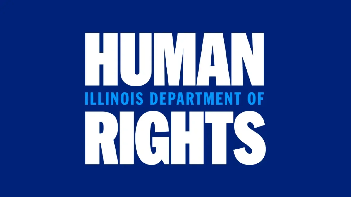
Span’s new identity for the Illinois Department of Human Rights puts its purpose into the logo itself: two emphatic lines of “Human Rights,” with “Illinois Department of” sitting between them like an equal sign. The Chicago studio has turned a familiar mark of fairness into a practical visual cue, then carried that idea across signs, clothing and public information.
IDHR has investigated discrimination in employment, housing, financial institutions and public spaces since 1980. Its work covers discrimination based on race, sex, disability, religion, national origin and age. The department wanted a people-centred identity that could make its purpose easier to recognise and its rights information easier to understand and use.
That need shaped the brief. Nick Adam, associate partner and design director at Span, says the department worried it was perceived as rigid and bureaucratic, leaving its work less visible. IDHR needed to act neutrally and fairly while making its commitment to human rights unmistakable. As Adam puts it, a right that people can’t see is harder to use.
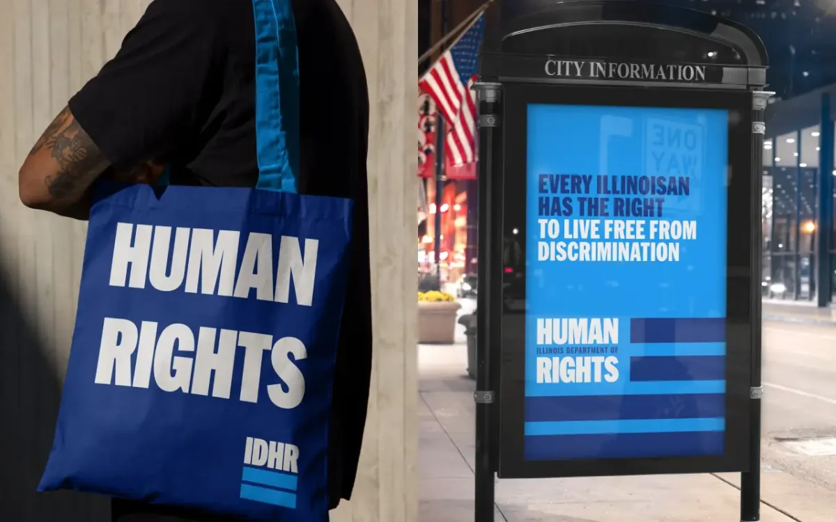
A logo built around equality
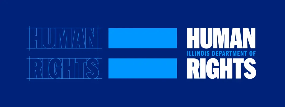
The identity draws on the visual language of civil rights efforts: posters, placards, banners and declarations designed to be read quickly and remembered. Its main typeface, HEX Franklin, gives the words weight and confidence. The name is arranged so “Human Rights” carries the message, while “Illinois Department of” identifies the organisation and links the larger lines.
That middle line also suggests an equal sign. The motif makes fairness legible before someone has read the full name, and gives the identity a simple device that can travel beyond the logo. Adam says its stripes recall both flags and the graphic language of Chicago designer Lester Beall, known for his work for the Rural Electrification Administration. The reference connects the mark to a history of public information design without requiring a viewer to know that history to read it.
The system’s visual directness matters because the work has to meet people in varied settings. A bold wordmark can be recognised across a room; repeated colours and typography can help connect that first impression to detailed information at a table, on a banner or in a social post. The identity gives IDHR a consistent starting point for those different encounters.
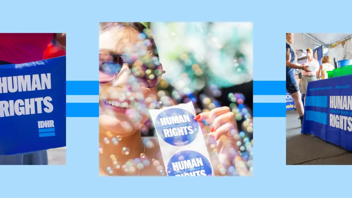
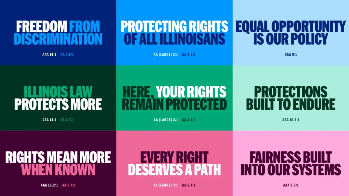
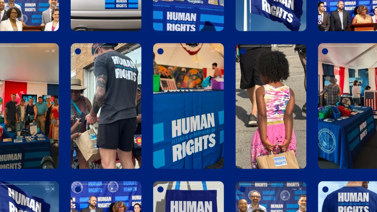
Materials designed to be put to work
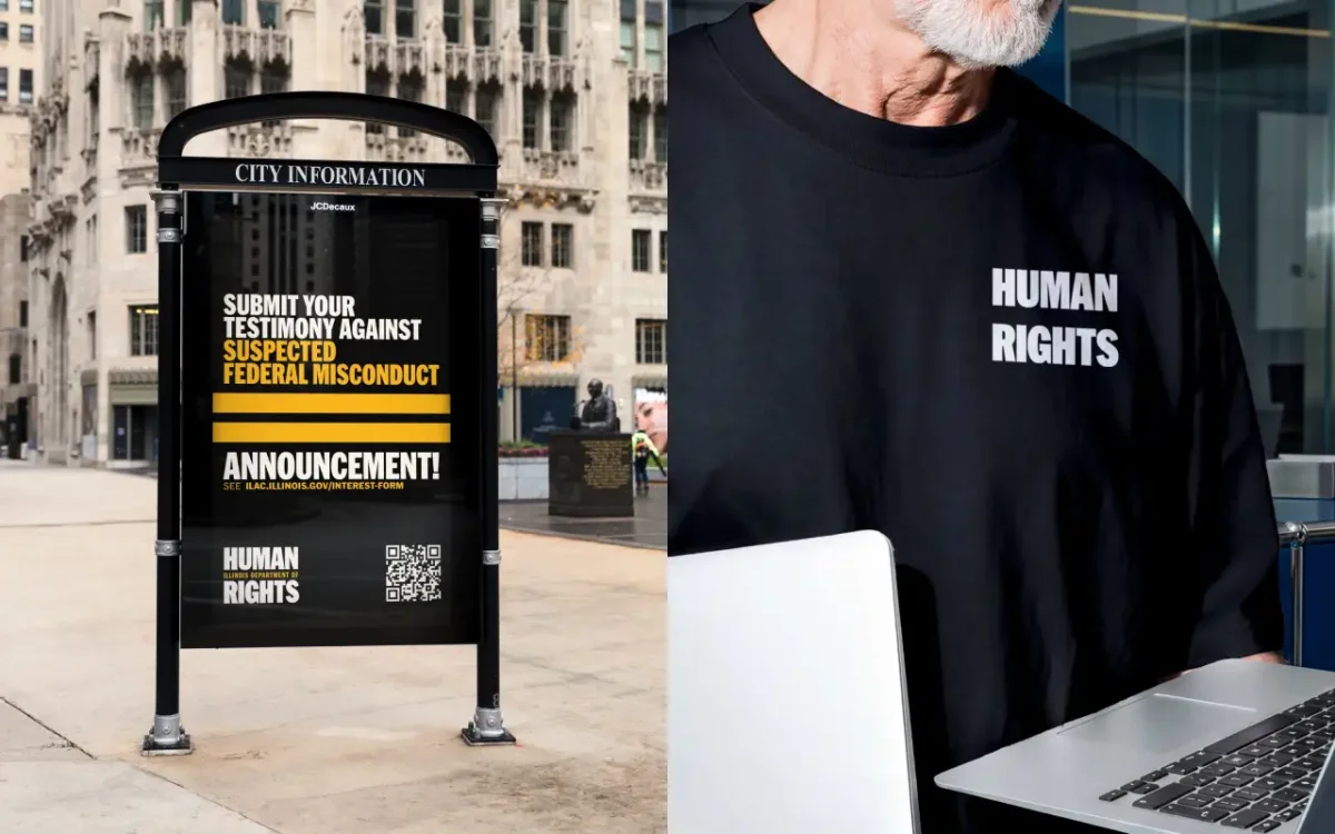
Span and IDHR have treated the identity as a working kit for communication, not just a logo. Social and rapid-response materials come with established formats for announcements, photography, rights information, events and urgent messages. Having those patterns ready gives teams a clear route to produce communications while keeping the visual voice recognisable across changing subjects.
In practice, that kind of system helps an organisation move between formats without rebuilding the design each time. A post, an event sign and a printed handout have different jobs, but a shared typeface, colour palette and hierarchy can help people understand that they come from the same source. The source describes the kit’s structure, though it doesn’t name additional typefaces or provide production specifications.
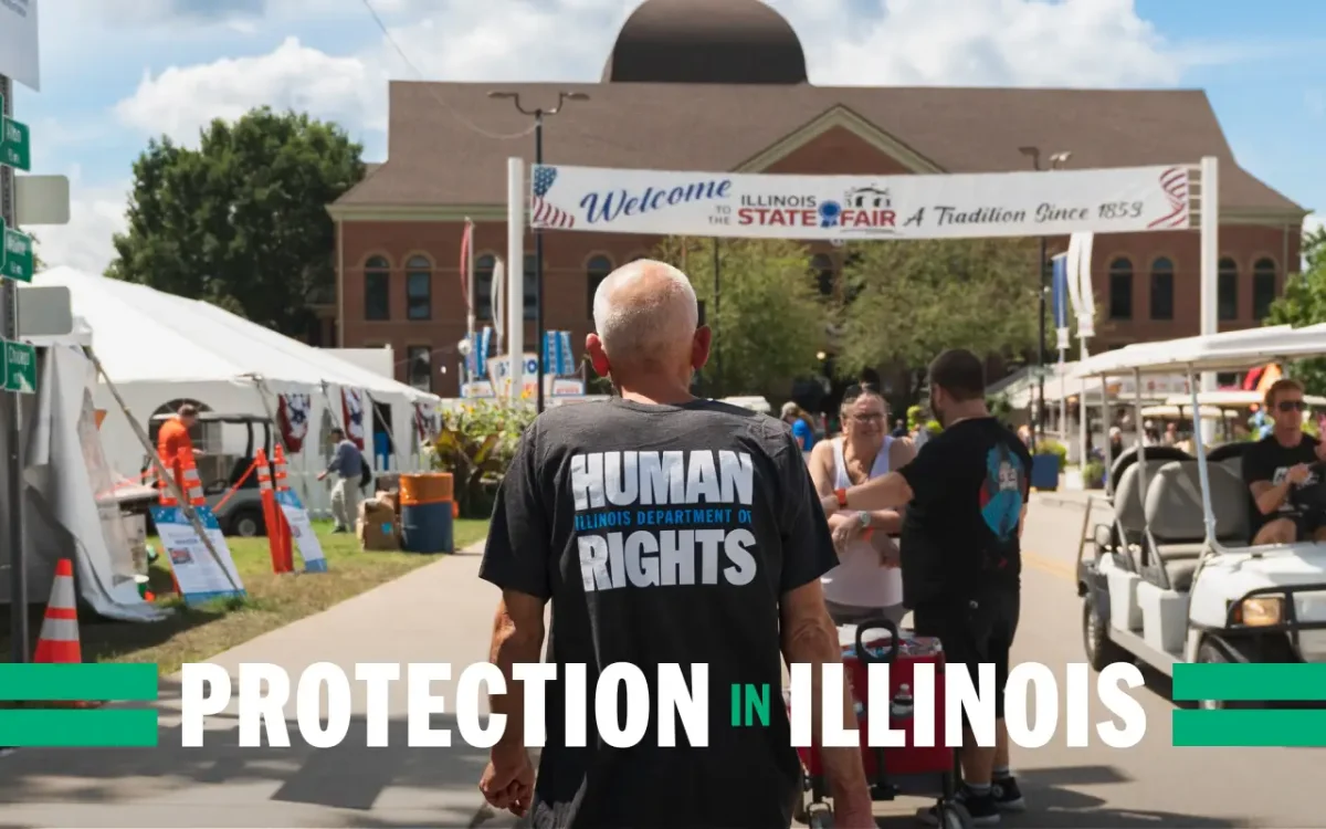
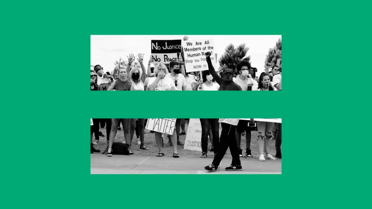
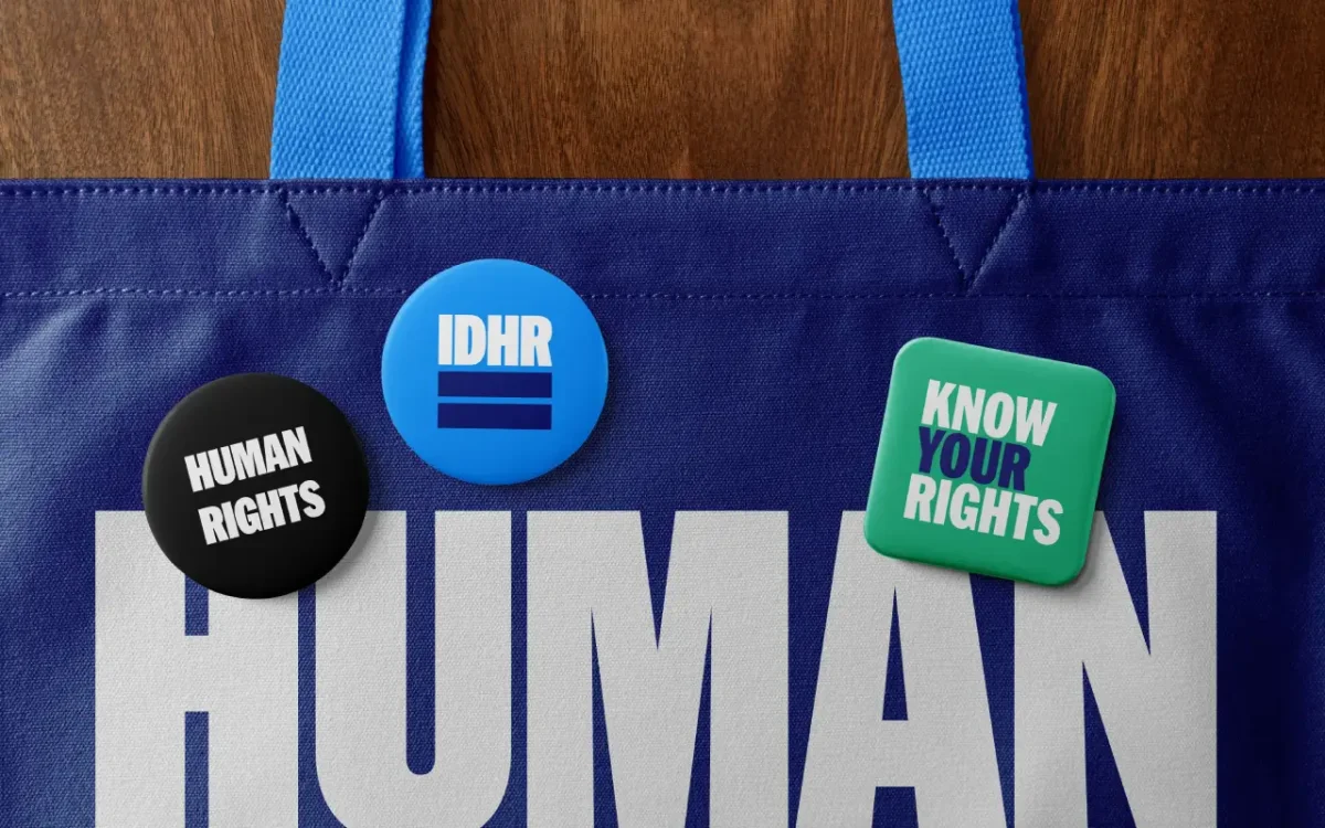
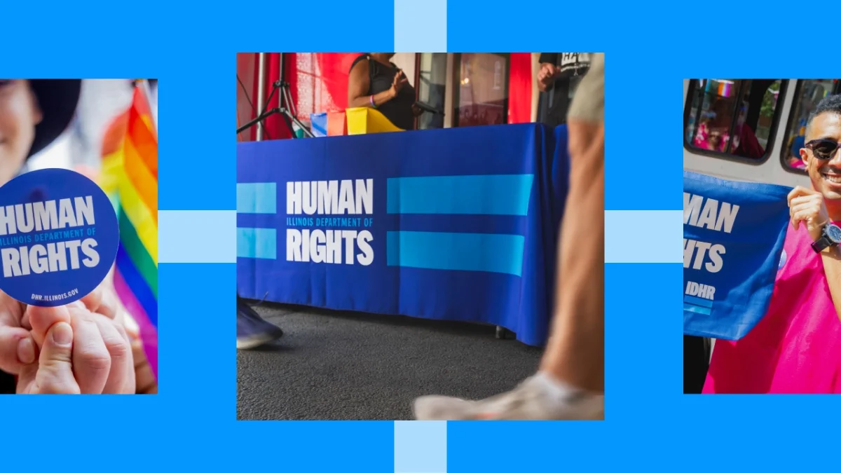
For in-person events, the toolkit includes banners, flags, step-and-repeats, table coverings, signage, presentations and printed pieces. IDHR has used these materials at Juneteenth events and the Illinois State Fair to put rights information directly in people’s hands. At Chicago’s Pride Parade, the team distributed stickers, buttons, apparel and other items.
Those objects give the identity a public, participatory scale. A banner carries the message across a space; a badge or sticker lets someone take a small piece of the visual system away. The consistent emphasis on “Human Rights” means each format can reinforce the same idea, even when people encounter it briefly or in a crowd.
Span had worked with IDHR before, helping launch the statewide support service Help Stop Hate. Adam describes the current project as built for the long haul and sums up its intended tone as “conviction without propaganda.” The identity’s strongest practical choice is its focus: a clear typographic hierarchy, a repeatable equality mark and ready-made formats for communication. Its value will depend on keeping those tools visible wherever people need to find and use the information.