Thursday, October 29, 2026 · UX & UI Design
Atipus Turns Vinya Llarga’s “Long Vineyard” Name into a Motion-Blur Wine Label
Noted by Tom May · 409 reads
Atipus translates Vinya Llarga’s name into bands of colour that wrap the bottle, pairing a lively landscape effect with restrained typography.
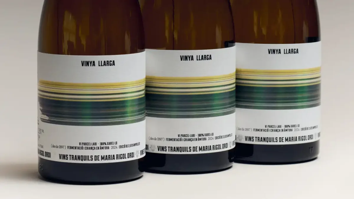
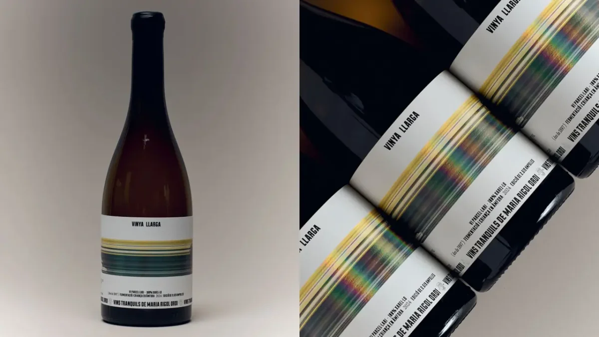
Atipus found the visual idea for Vinya Llarga in the wine’s name. The Barcelona studio turned “long vineyard” into a horizontal sweep of colour, wrapped around the bottle so the label suggests a landscape passing at speed. It’s a direct concept, but its success depends on control: the image supplies movement and presence while the rest of the label gives it room to breathe.
Vinya Llarga is the first still wine from Maria Rigol Ordi, a producer based in Sant Sadurní d’Anoia in Catalonia’s Penedès region, where the producer is known for specialising in cava. The launch marks a new direction for the brand. Fabiola Ureña of Atipus describes the brief as designing a label for “a new chapter with the same care for craft, but with a fresh point of view.” The result carries that shift through a single expressive graphic rather than a wholesale change in the bottle’s visual language.
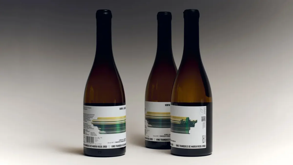
The name translates from Catalan as “long vineyard.” Atipus makes that length visible in a band of yellow, green and blue streaks that circles the bottle. Seen from the front, the colours blur into a suggestion of scenery viewed from a moving train: there’s a landscape in the image, but its details are stretched into horizontal marks. The wraparound format turns the label into a continuous strip, so the motion reads around the bottle instead of stopping at its front face.
Colour carries the movement
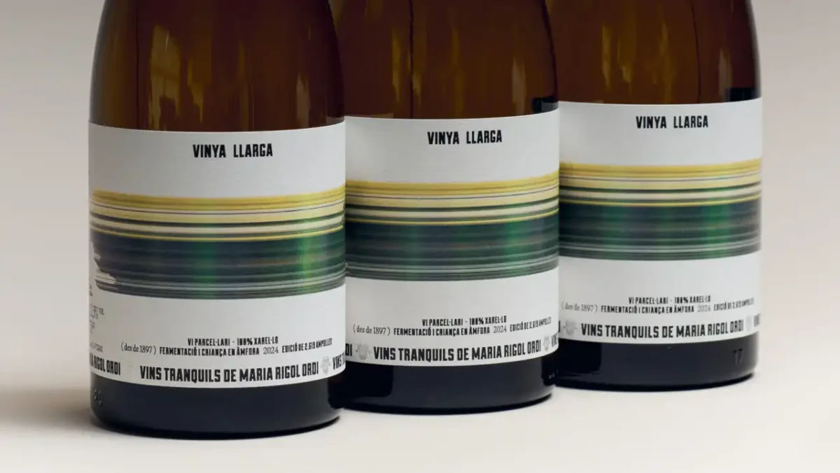
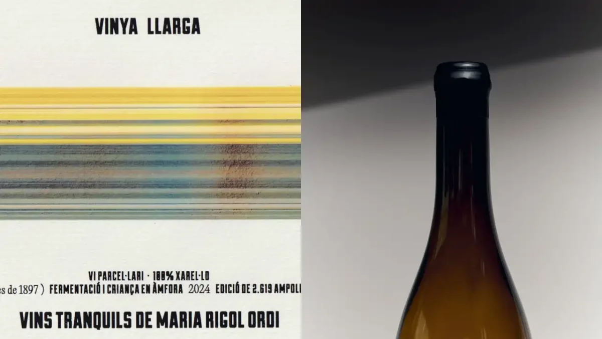
The image changes across the label rather than holding at one level of abstraction. On the front, the coloured streaks mostly read as speed and atmosphere. On the back, they resolve into something leafier and greener, as if the scene has come back into focus. That change gives the wrap a small visual progression: an abstract first impression gives way to a more legible reference to the vineyard.
For designers, the useful point is how much narrative the colour band handles. It connects the literal meaning of the name to the product’s landscape without relying on a detailed illustration or an explanatory block of copy. The long format reinforces the idea, while the colour shifts give the eye a route across the bottle. A graphic that could have become decorative instead serves as the main expression of the name and the place behind it.
Atipus keeps the supporting typography quiet. “Vinya Llarga” appears in small, condensed capitals near the top of the textured white label; the producer’s name, “Vins tranquils de Maria Rigol Ordi,” sits along the bottom. Between them, small type carries details such as the grape, fermentation and the size of the limited run, alongside a reference to the vineyard’s history, which dates back to 1897.
A restrained frame for a tactile finish
That information hierarchy lets the colour do the work of attracting attention while keeping the practical details available to a closer reader. The contrast between a small, orderly type scale and an expansive image also helps the label avoid competing messages. The name, producer and wine details remain distinct, but none has to overpower the central graphic.
The textured white stock adds another layer to the composition. It gives the broad colour band a quieter surface to sit against, and helps the bottle feel crafted without adding more visual detail. A wax-sealed capsule completes the tactile impression. Ureña says the bold colour creates immediate presence while retaining warmth; she points to the capsule as a handcrafted detail that balances the label’s more expressive, modern attitude with a sense of tradition.
There’s a practical lesson in the restraint. When a product name already contains a strong visual cue, a design team can build the identity around that cue and use typography, materials and supporting information to keep it focused. Here, Atipus doesn’t illustrate every aspect of the wine or crowd the label with competing symbols. It takes the idea of length, stretches the colour across the bottle, and lets the back label bring the image closer to the vineyard.
For Maria Rigol Ordi, that approach gives its first still wine a distinct look while maintaining a connection to the producer’s care for craft. For designers, the label shows how a name can provide both a concept and a layout direction: the words suggest a horizontal image, the wrap gives that image room to travel, and restrained type preserves clarity. The strongest part of the design is the way those choices work together, giving Vinya Llarga rhythm and character without taking attention away from the wine.