Wednesday, October 28, 2026 · Graphic Design
Mother Design builds Purple Garden’s identity around spiritual practice
Noted by Katy Cowan · 370 reads
A séance, automatic drawing and warm purple palette helped Mother Design turn Purple Garden into a digital home for ongoing spiritual practice.
A brand shaped by practice
Mother Design’s new identity for Purple Garden starts with a useful shift in perspective: the psychic services platform isn’t framed as a place to visit for a single reading, but as a home for an ongoing spiritual practice. That idea, named “A Living Practice,” gives the design a clear job. It needs to make digital guidance feel personal, atmospheric and connected to growth.
Purple Garden serves people Mother calls “Believers of the Bigger Picture” and describes as “seasoned seekers.” Their questions return as life changes, so the brand presents guidance as a process of reflection rather than a one-time answer. The identity translates that recurring rhythm into visual elements that feel active and in motion.
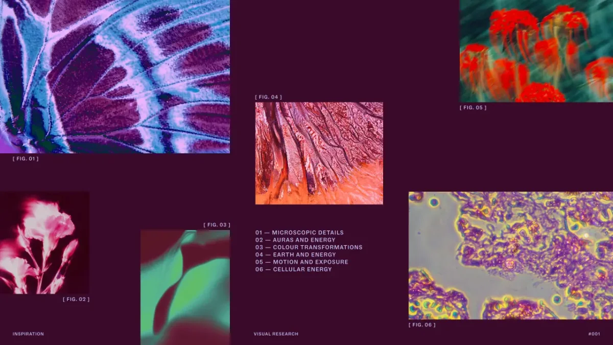
The London studio, part of the Mother Family, began the work with an unusual research session: a séance, a chakra reading, and an automatic drawing and writing workshop led by one of Purple Garden’s holistic practitioners. Designers used paper and charcoal to work instinctively, setting aside conscious control so that unexpected marks and associations could emerge.
That process addressed the central design challenge: how to suggest things people feel but can’t see, such as intuition, energy and connection, without leaning on familiar spiritual imagery. “If we wanted the identity to feel spontaneous and alive, we needed to allow some of that spontaneity into the way we designed it too,” says Joanna Tulej, creative director at Mother Design. The textures and forms from the session became raw material for the brand.
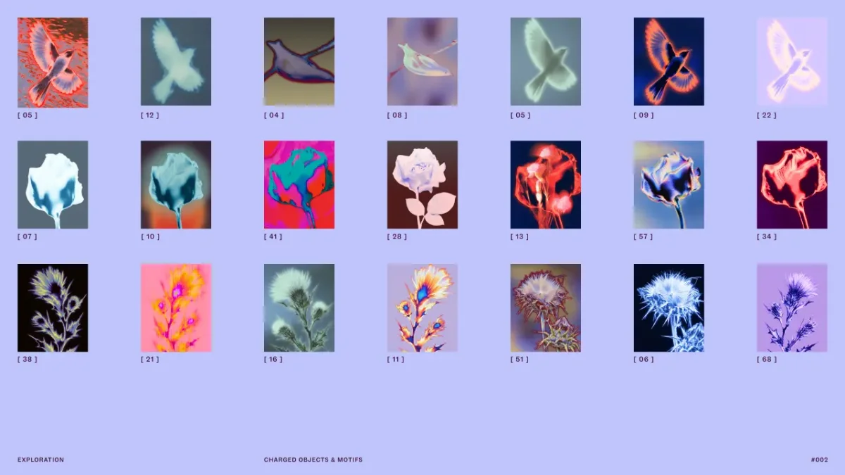
The approach drew inspiration from Swedish artist Hilma af Klint and The Five, a collective of women who explored trance-like states and automatic drawing. Their methods gave Mother Design a precedent for letting images develop without a fixed plan. The studio also moved between traditional design software and AI tools during development, using repeated iterations to introduce visual surprises.
Typography and colour with room to grow
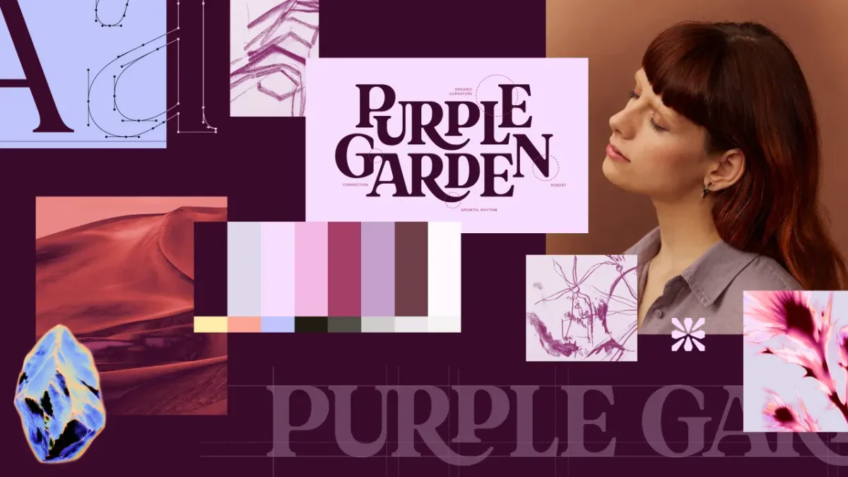
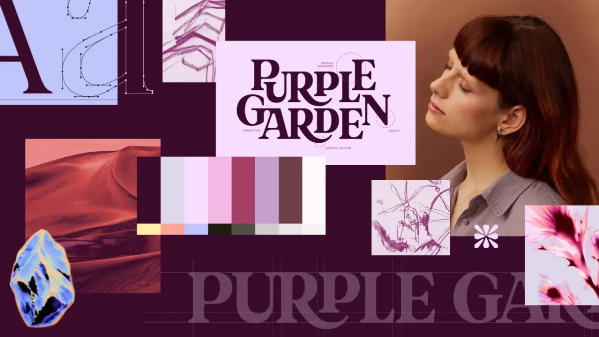
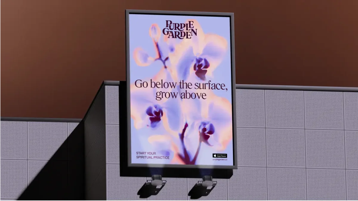
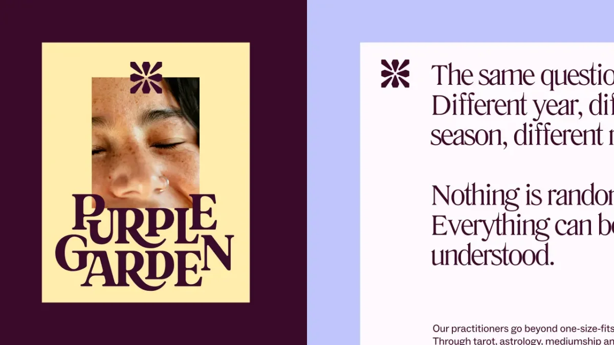
The wordmark mixes contemporary forms with a touch of whimsy. Its elongated serifs and rounded corners appear to extend outward, lending the lettering a sense of growth. A crystal-like glyph serves as a guidance symbol and anchors an icon system for navigating the platform’s services.
Two typefaces support the wordmark: Literatura Present brings flowing serifs and descenders, while ABC Social handles functional text and screen legibility. The contrast lets the identity feel expressive without making the interface harder to read.
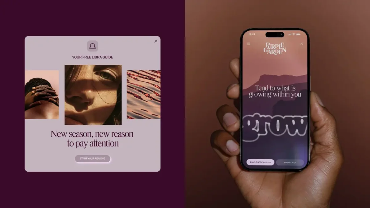
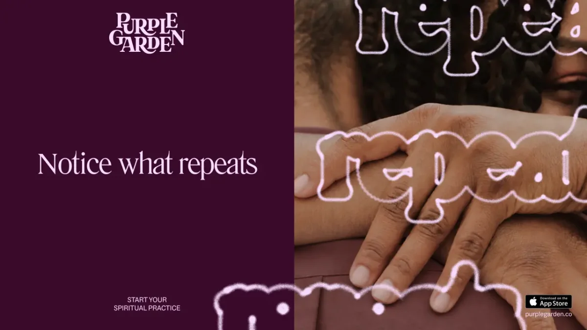
Mother Design also created “living type,” a detail inspired by cymatics: the patterns formed when sound vibrates through a surface. The effect gives the typography a visual pulse and connects the brand’s movement to its promise of personal growth.
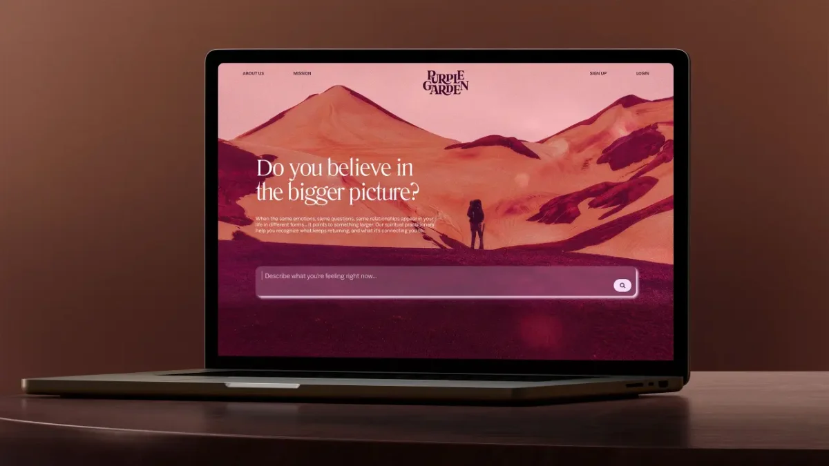
Purple leads the colour system, but the studio chose six warmer purple shades instead of the cooler, blue-toned purples common in this category. Botanical motifs, abstract forms and tactile imagery add variation to the palette. Motion carries the same idea into the digital experience, suggesting that growth is ongoing rather than fixed.
A distinct role in a shared portfolio
The rebrand follows Mother Design’s work for Keen, another spiritual guidance brand in the Ingenio portfolio. The two identities address different audiences: Keen speaks to people who are spiritually curious, while Purple Garden is aimed at people who already make spirituality part of daily life.
“We wanted the brand to reflect the depth of the experiences our guides provide and make that connection feel just as powerful in a digital environment,” says Ariana Hellebuyck, CMO at Ingenio. She says the new identity gives Purple Garden a more immersive platform for its next stage.
The rollout across the website, app, advertising and social channels is due to take place over the coming weeks. The project’s most practical lesson is in its process: when a brand needs to communicate an intangible feeling, a workshop outside the usual screen-based routine can give designers a richer set of visual starting points. Here, charcoal marks, sound patterns and a warmer palette turn a broad idea of spirituality into a recognisable system for repeated use.