Thursday, November 5, 2026 · Graphic Design
Purple Garden's Y2K Type and Cymatic Patterns Give a Spiritual App Its Glow
Noted by Emily Gosling · 418 reads
Mother Design pairs Y2K type with cymatic patterns and a seven-purple palette for Purple Garden, a spiritual app. The name is the weak link.

Mother Design has been getting spiritual lately, and honestly, it fits. Birth, nature, slow transformation: few subjects sit closer to the studio's usual territory of soft gradients and strange, glowing type. Its identity for Purple Garden, a spiritual wellness company that mostly lives as an app, is the most cohesive version of that instinct I've seen from them.

If the astrology app Co–Star is the reliable everyday tool, Purple Garden feels like its cooler, more experimental cousin. It's a product for people who want a reading, and also want something to sit with afterwards.

The brief and the problem behind it
Mother Design took on brand strategy, brand identity, photography direction, illustration, tone of voice and motion design. The platform connects people with spiritual practitioners and brings the feeling of a one-to-one reading onto phones and laptops.
According to Mother, the category is worth $2.3 billion and still carries some stubbornly dated habits. Psychic websites lean on visual clichés, and the pressure to book quickly and get an instant answer has become the default. The studio's response was a brand that could hold two things at once: immediate guidance, and the possibility of a longer spiritual practice.
The strategy they built around this is what Mother calls 'Active Contemplation'. It's a push and pull between nudging users forward and giving them space to slow down and reflect. That tension is interesting, and it gives the identity something to stand on. The app promises answers, but it also wants a more sustained relationship with yourself and the unseen world around you.

The studio says the project began with a séance. I'd like to think that's a joke, but it's a useful one. Starting from a ritual rather than a moodboard of crystals is a smart way to get the emotional register right.
Y2K type, used with a reason
Y2K lettering has become a Gen Z shorthand, and it's easy to reach for it as a shortcut to 'cool'. Mother has done it before, with the gradients and fades in its work for Reveri and the neon in Fhirst. Here, the treatment is restrained and tied to the product. The glowing, slightly blurred type reads as a screen-age version of a vision, and it stops feeling like nostalgia for its own sake.
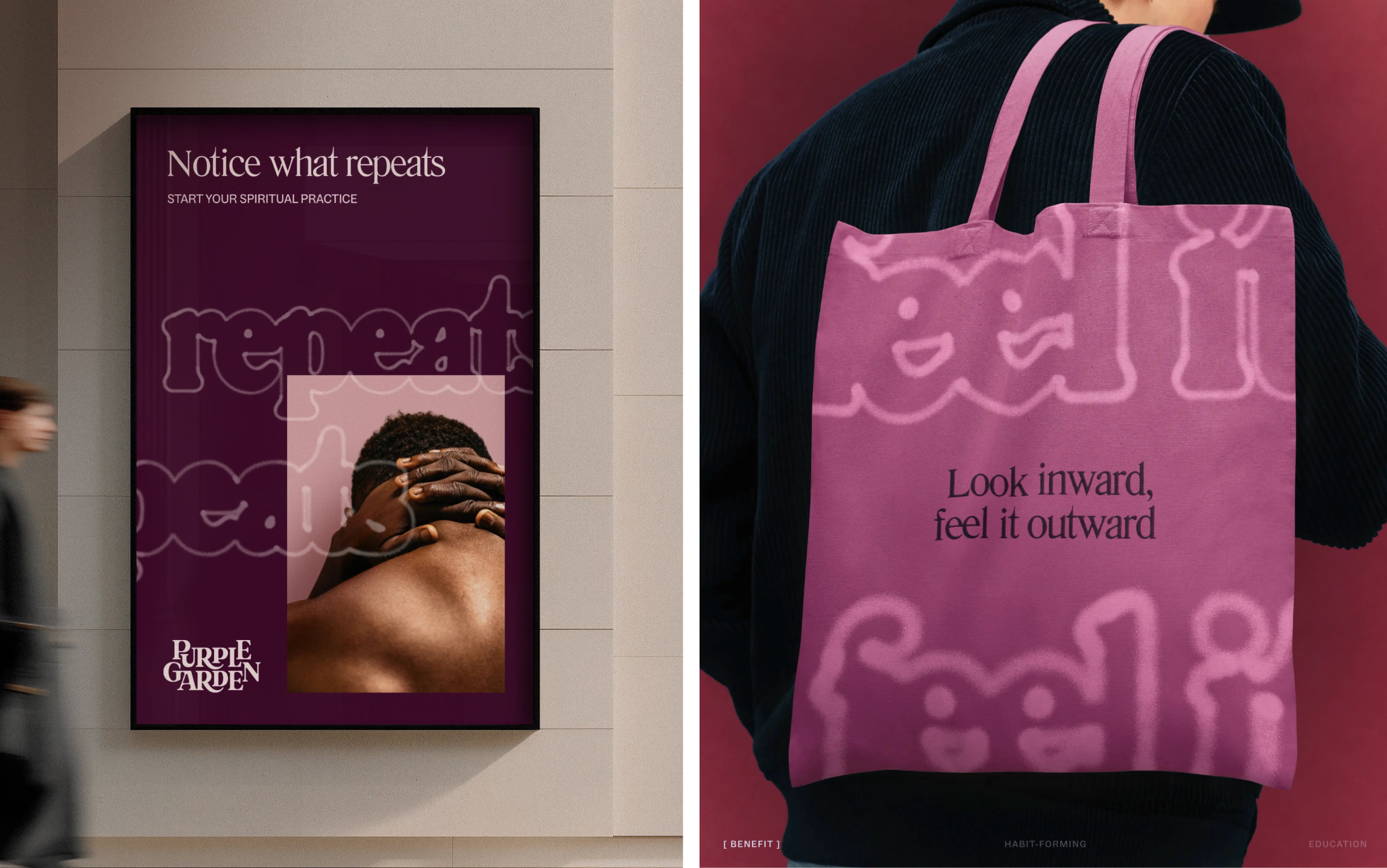
Typefaces: ABC Social and Literatura
The system pairs two typefaces with very different personalities. ABC Social, from the Berlin foundry ABC Dinamo, is a friendly, smooth grotesque with variable capabilities. The designers name it after how the project came about and how it felt to work on it, and they hope that more people connect through the font, whether spiritually, romantically or platonically. That's a lovely piece of brand logic, and it suits a product built on connection.
Literatura is the more striking partner. It was designed by Roman Gornitsky and released through his Leipzig foundry The Temporary State. It's a digital reinterpretation and expansion of Literaturnaya, a serif rooted in 19th-century Latin and Cyrillic typography and Soviet publishing history. The result feels antique but not dusty, and its slightly ornate, almost romantic forms carry the mystical side of the brand without tipping into costume.

The pairing works because ABC Social stays plain and warm while Literatura does the theatre. If you're building a similar system, that division of labour is worth copying: one face for clarity and touch, one for atmosphere.
Wordmark, logomark and a palette of purples
The wordmark balances organic growth with digital legibility. Sprouting ligatures and branching curves are wrangled carefully, so the letters feel alive without becoming hard to read. The logomark is a flower-like device with crystalline petals. It's the weakest standalone element in my view, because it reads more like a generic icon than the rest of the system does.
Purple is the obvious hue, but spiritual brands tend to reach for the same chilly, blue-leaning shade. Mother has pushed warmer, using seven purples that can shift across different moods and moments. The secondary colours are drawn from dawn, dusk and moonrise. In an experience that is almost entirely on screen, that gives the palette real atmosphere, and it reflects the cyclical logic that most spiritual practices are built on.
Cymatic patterns and charged objects
The illustrative and graphic elements draw on science and the cosmos to visualise the energy exchanged during a session. Charged objects and motifs recur across the identity, and solarised neon flourishes flash through the earthier palette where they're needed.
The cymatic patterns are the highlight for me. Cymatics is the study of how sound shapes matter. Picture sand scattered on a speaker, with different notes producing different patterns, each tied to a specific frequency. I got interested in the idea recently through the work of the musician and instrument builder Lia Mice, whose Soft Cymatics is a playable quilt. Its patches are stitched with cymatic patterns in conductive thread, and each one plays its frequency when touched. It's a neat explanation of the visual idea, and it's a good reminder that these patterns carry a sense of sound and touch as well as sight.
Those patterns suit a project about harmony, about synaesthetic spiritual experience, and about organic processes meeting modern technology. Mother uses them on the more experimental touchpoints, and that's where the identity looks most confident. The grainy type hovers in and out of legibility, so you have to work a little to read it. That effort feels right for a practice that is also about deciphering.

The name is the weak point
I'll be blunt: the name Purple Garden doesn't do the work the rest of the identity does. It's a cheerful, slightly awkward phrase that brings to mind a restaurant chain more than a spiritual service. The brand, though, is so consistent that you stop noticing it fairly quickly. The name is the one thing I'd have pushed back on in the room.
That said, the cycle of ideas here is satisfying. The Y2K glow, the cymatic geometry, the warm purples and the careful type all point back to the same idea: something invisible made visible on a screen. For a category that often looks like it was built from a stock catalogue, that's a strong result, and it's a useful lesson for anyone working on digital products that want to feel personal rather than generic.