Tuesday, November 3, 2026 · Graphic Design
Ragged Edge gives Tabby a playful identity built around its expanding money app
Noted by Emily Gosling · 781 reads
Ragged Edge's new Tabby identity swaps finance-world seriousness for a bright green, rounded type system and a cast of illustrated characters, with a bilingual typeface.
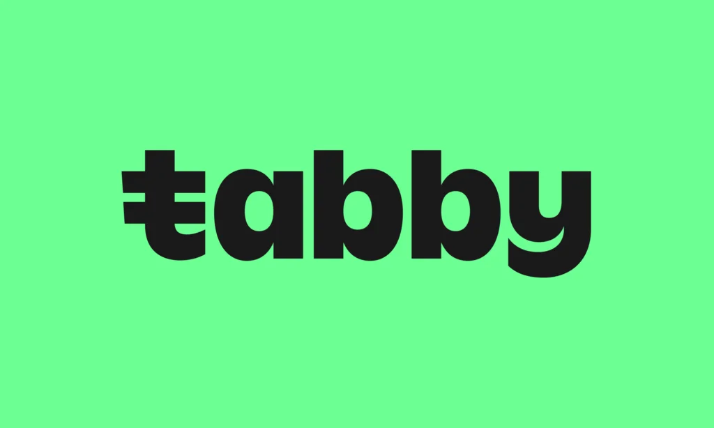
Tabby started as a way to split a purchase into four payments. Its new identity from Ragged Edge is built for a company that now wants to be your everyday money app, and it makes a clear bet: finance can look friendly without looking unserious.

A name that does some of the work
Tabby was founded in 2019 by Hosam Arab and Daniil Barkalov, and it now describes itself as the money app that lets you spend, send, save and boss money around. That strapline is a lot to carry, but the product list behind it is clear. Users can split purchases into four interest-free payments, spread larger buys over longer periods, manage spending through a payment card, earn cashback, send and receive money, and find deals from thousands of retailers.
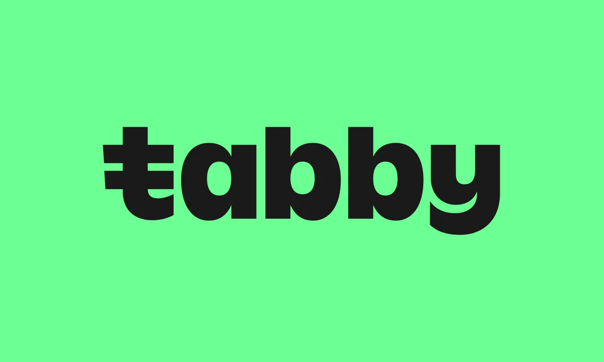
The name is the first thing the identity leans on. Tabby is soft, bouncy and easy to say, and it sits miles from the sober vocabulary of banking. That's the point. Ragged Edge didn't have to make the brand sound like a bank to make it feel trustworthy. It went the other way and let the name set the mood.
From checkout tool to money app
The old branding was built for the early business. Tabby began as a buy-now-pay-later service, offering shoppers a more flexible way to pay online and in physical stores. Ragged Edge was brought in earlier this year to develop an identity that reflects how far the company has moved since then. Tabby now operates across Saudi Arabia, the UAE and Kuwait, and it works with more than 65,000 retail partners, including Amazon, IKEA and Adidas.
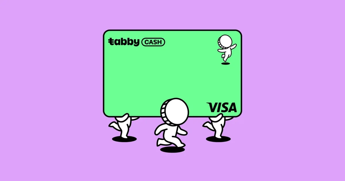
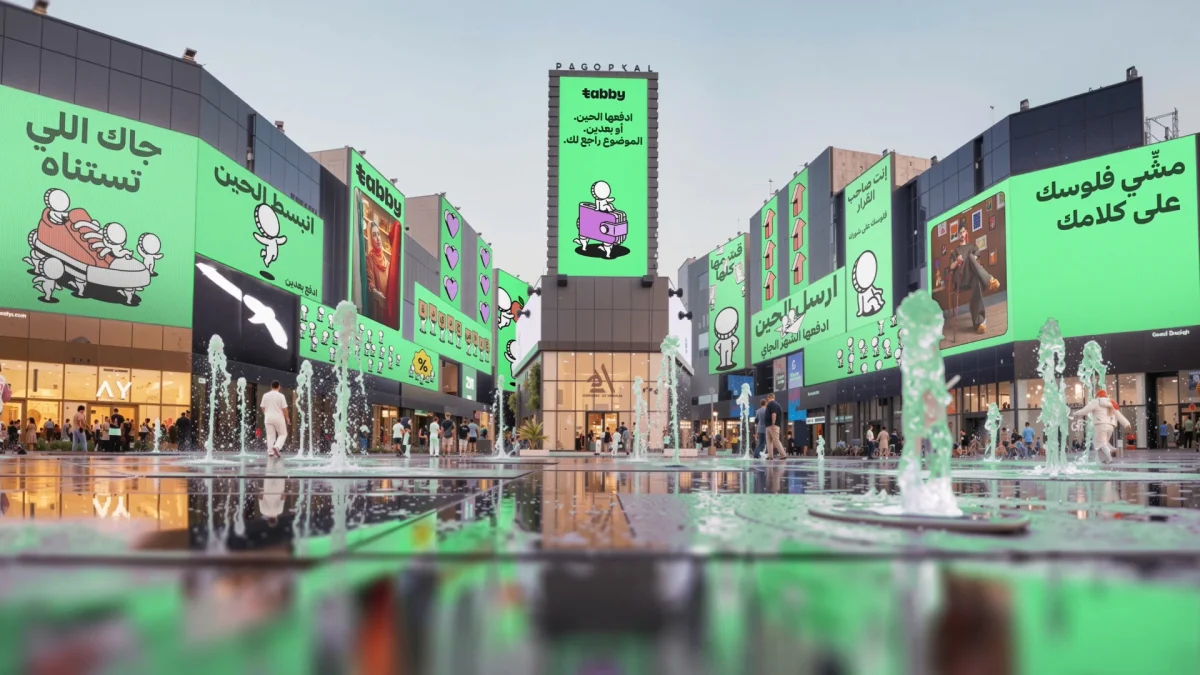
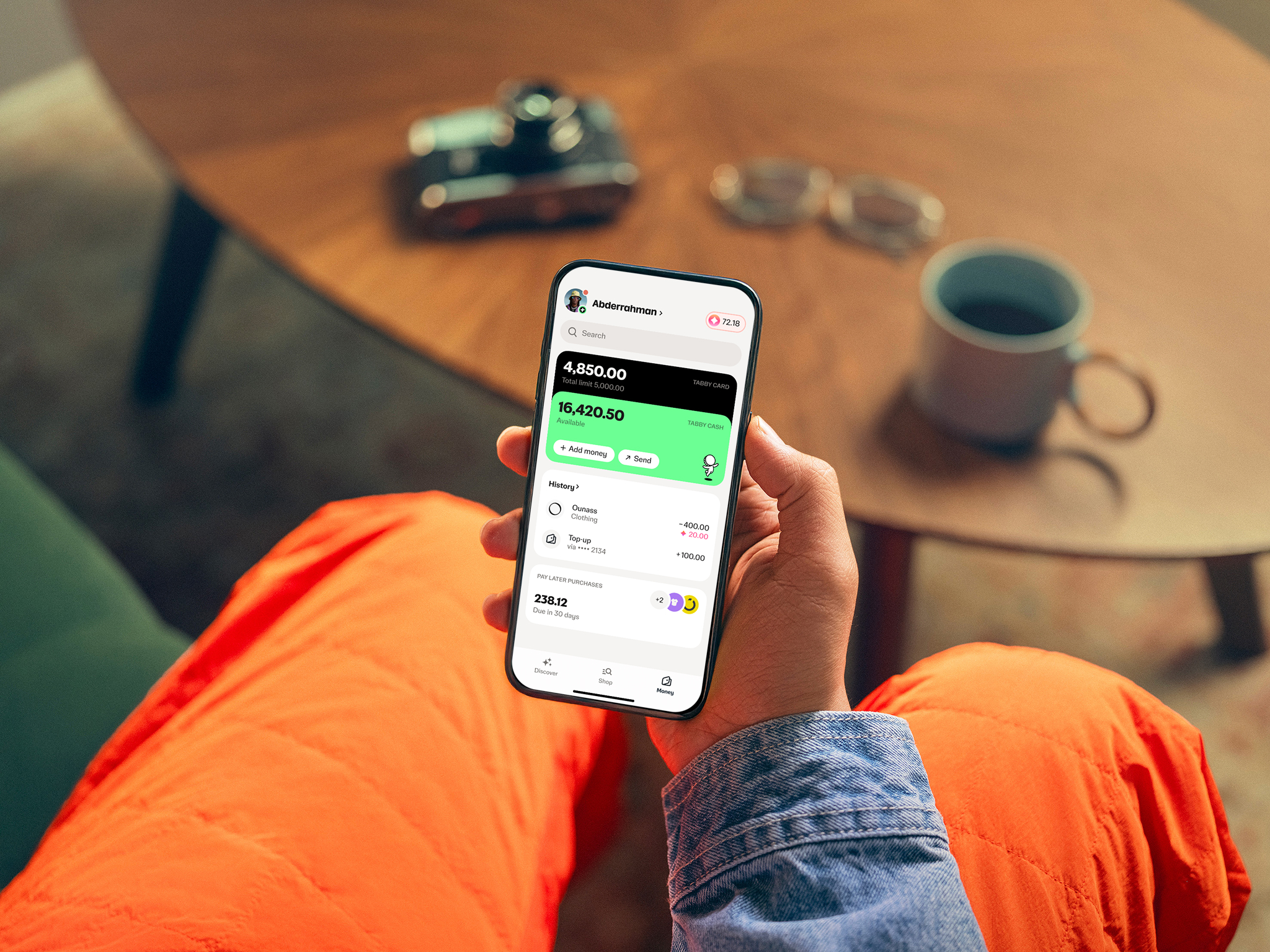
The latest step takes Tabby beyond payments and credit toward everyday money management. The launch of Tabby Cash, a spending account for holding, sending and spending money, is the clearest sign of that shift. An identity built around a checkout widget would struggle to carry an account product, so the brief was really about widening the brand's range. Ragged Edge's answer was to build a more distinctive personality in a category where many brands look interchangeable, and to make managing money feel less intimidating. Centred on the idea of putting people back in control of their money, the work covers strategy, verbal identity, typography, illustration, photography and motion.
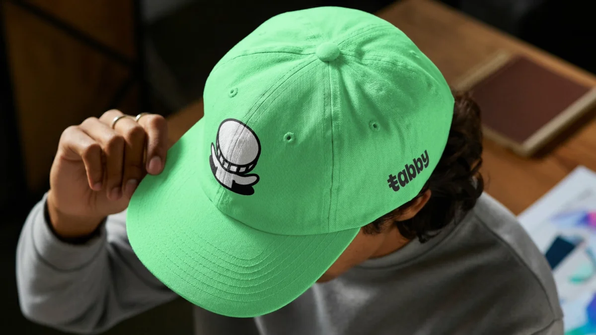
Voice: confident without the swagger tax
The strapline about showing money who's boss sets the tone for the whole system. It's sassy but not cocky, with some personality but not too much, which is a sensible limit for financial services. The voice is confident and direct. It avoids the three habits that make finance marketing tiresome: dense jargon, stuffy self-importance, and the recent run of self-deprecating ad copy that tries to be relatable by being a bit rubbish. Tabby's own guidelines describe its voice as firm but fair, and that phrase shows up in the typography more than you'd expect.
A typeface built for two scripts
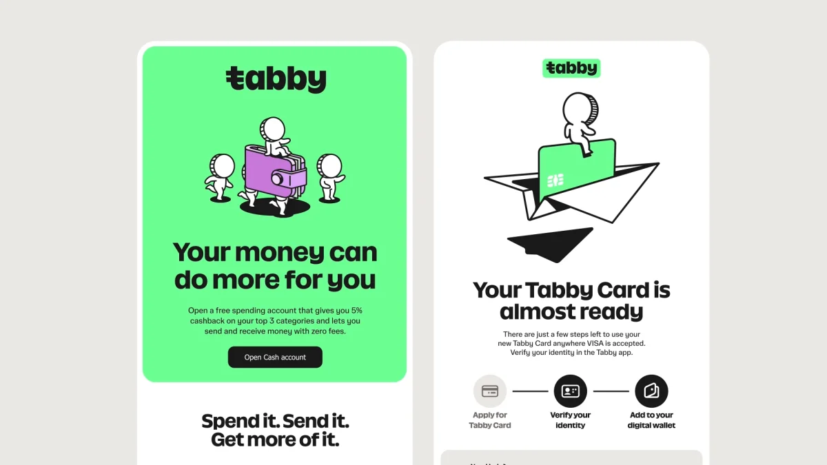
Ragged Edge developed a bespoke typeface, Tabby Sans, based on SuperX Sans by the Berlin-based foundry NaN. It comes in two styles. Tabby Sans Display handles larger headlines and has a chunky, rounded quality that gives headlines presence without tipping into cartoon territory. Tabby Sans Text is for smaller, more functional settings across the app and wider communications, where legibility matters more than personality.

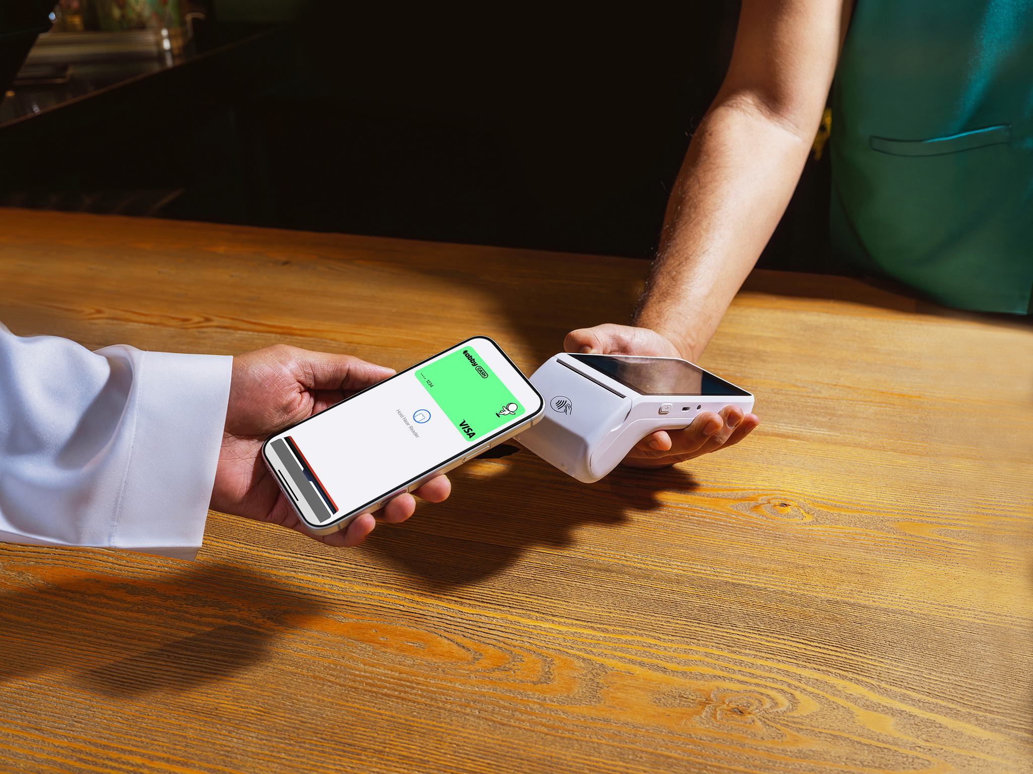
The more interesting decision is the type system's treatment of Latin and Arabic. Both scripts were given equal consideration in hierarchy, weight and overall presence. That sounds obvious, but many multilingual brands end up with a Latin headline face and an Arabic afterthought. For a brand running across a region where both scripts sit side by side on the same screen, parity between them is what makes the system work.
Monions and the iconography
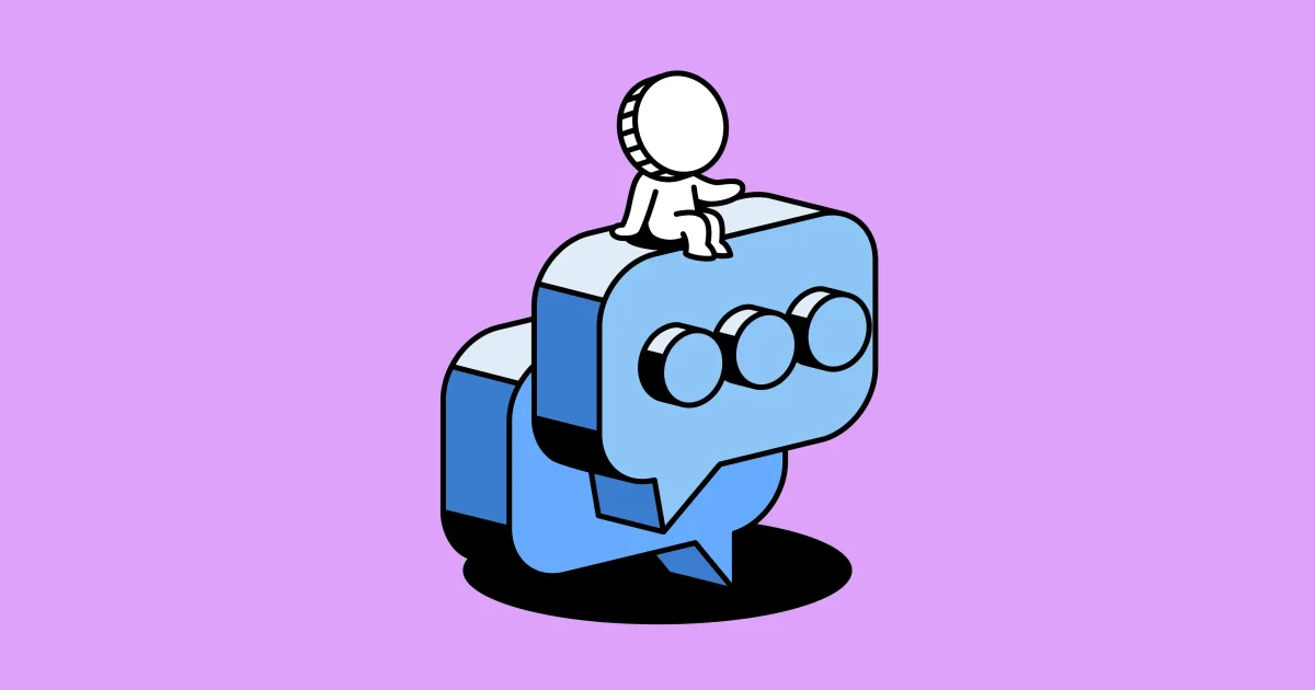
The illustration system is where the identity could easily have gone wrong. Playful characters can tip a fintech brand into looking like a children's app, and the line is thin when the product is a card and a payment schedule. Ragged Edge's cast, known as the Monions, mostly stays on the right side of it. They're bumbling, expressive characters that personify money as it's sent, spent, earned and saved. Their handmade feel and cartoon-like forms give the brand a clear personality, and they turn abstract financial actions into something a user can picture.

The characters are backed by an iconographic language drawn from the same visual approach, so the personality carries into small interface details as well. That matters in a digital product. A user might only see a single icon for a second or two, and recognition has to happen in that moment.
Green, black and a bit of bounce
Bright green is the hero colour, which is hardly a surprise for a money product. It's also distinctive within a sector where many brands lean on blue, navy or black. The core pairing of vivid green and black gives the system punch, while white and a supporting set of secondary colours give the illustrations and larger compositions room to breathe. The result is energetic and upbeat, and it carries from the app interface through to advertising.
Motion design extends the same temperament. Ragged Edge's animation is whimsical, bouncy and expressive, and it responds to both the user and the context. Done well, that kind of motion makes small moments in the app feel responsive rather than decorative.

What to take from it
My read is that this rebrand works because it commits to one idea and then keeps the illustration, type, colour and voice in line with it. The risk is that the Monions and the bouncy motion will wear thin for some users over time, and that's the trade-off any playful system carries. Still, for a designer working on a fintech product that's moving from transactions into accounts, the lesson is practical: pick a personality that matches the name, build the type system for every script you need from the start, and make sure your illustration system can work at the size of an icon.