Thursday, November 12, 2026 · Graphic Design
SMK's new identity runs on heavy condensed type, a flexible frame and a louder palette
Noted by Emily Gosling · 312 reads
Copenhagen studio eTypes shortens Statens Museum for Kunst to SMK, building a identity around Playtype's Hill, a flexible frame and bright colour.
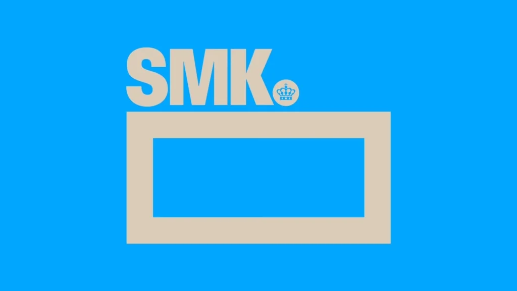
Denmark's National Gallery has traded its long name for three letters, and the identity eTypes built around the change makes a strong case for the move. Shortening Statens Museum for Kunst to SMK is the obvious headline, but the more interesting decisions sit in the type, the frame and the colour, which together give the institution a voice that's louder than most national museums allow themselves.
Why the name needed to change
SMK is Denmark's largest art museum, founded in 1896. Its collection covers roughly 700 years of Danish and international art, from Renaissance painting and sculpture through to contemporary work, plus an extensive holding of works on paper. That's a lot of history to carry in a logo. The full name is accurate but unwieldy, and as the source material points out, it can be a stumbling block for visitors who don't read Danish. A three-letter mark is far easier to repeat on a bus shelter, a tote bag or a social story, and it gives the brand room to breathe.
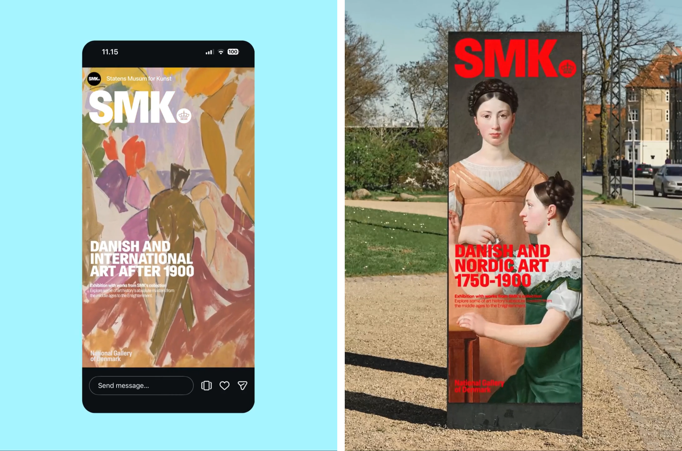
eTypes has worked with the museum for more than a decade, and this 2026 identity reads as a refresh of a system that already existed rather than a clean break. That continuity matters. Institutions with long relationships with a studio often end up with identities that feel like a series of one-off campaigns. Here the system is designed to flex across exhibitions while staying recognisably the same family.

Hill does the heavy lifting
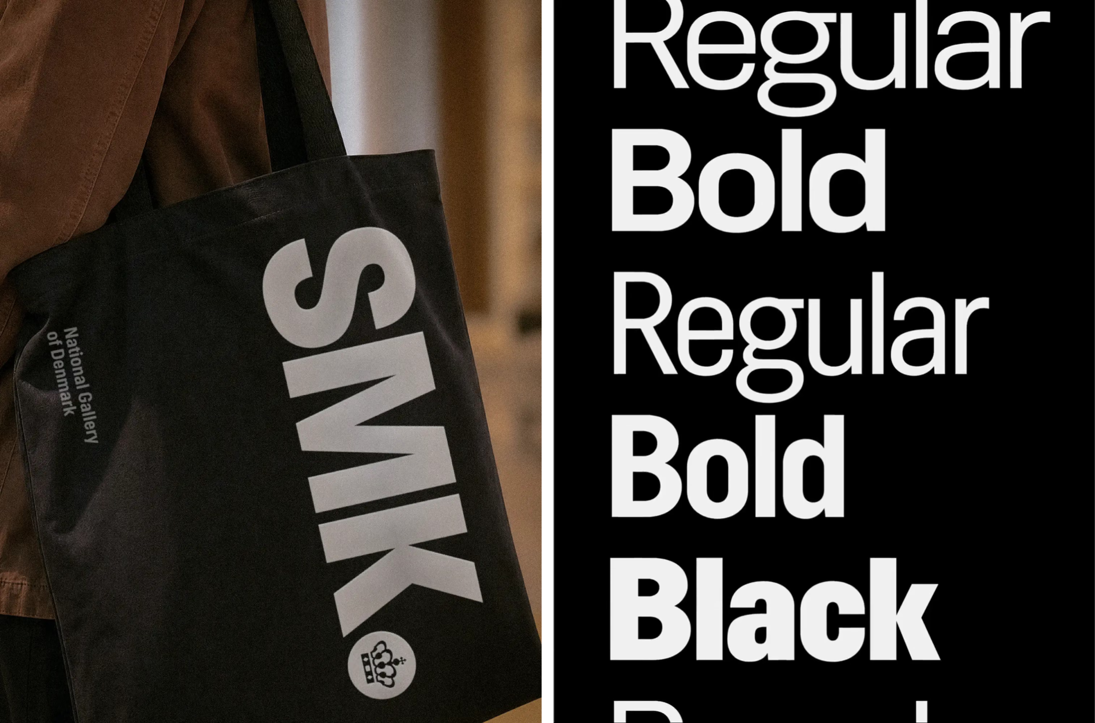
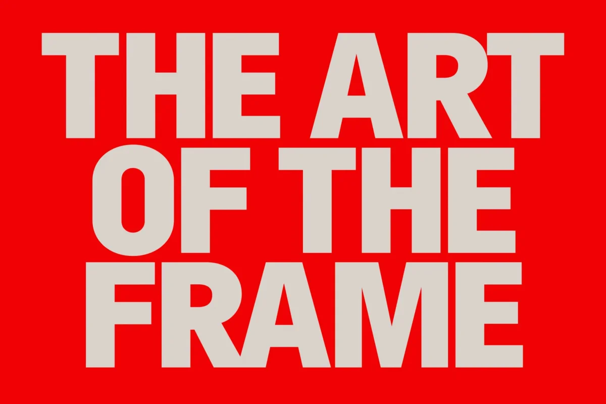
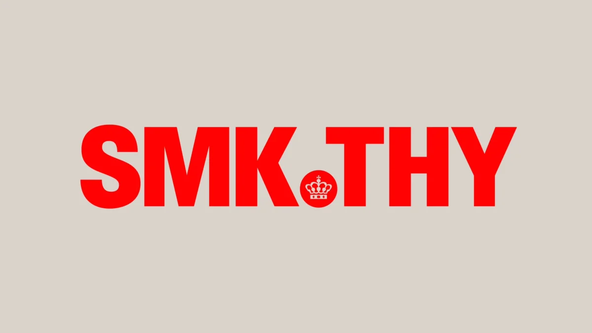
The three core elements are a crown emblem, a frame device and a new approach to typography. The type is the element that stays with you. The identity is set almost entirely in Hill, a typeface from Playtype, the foundry run by eTypes' sister company. Hill is a slightly condensed grotesque, and the museum uses it mostly in capitals and in the heavier weights.
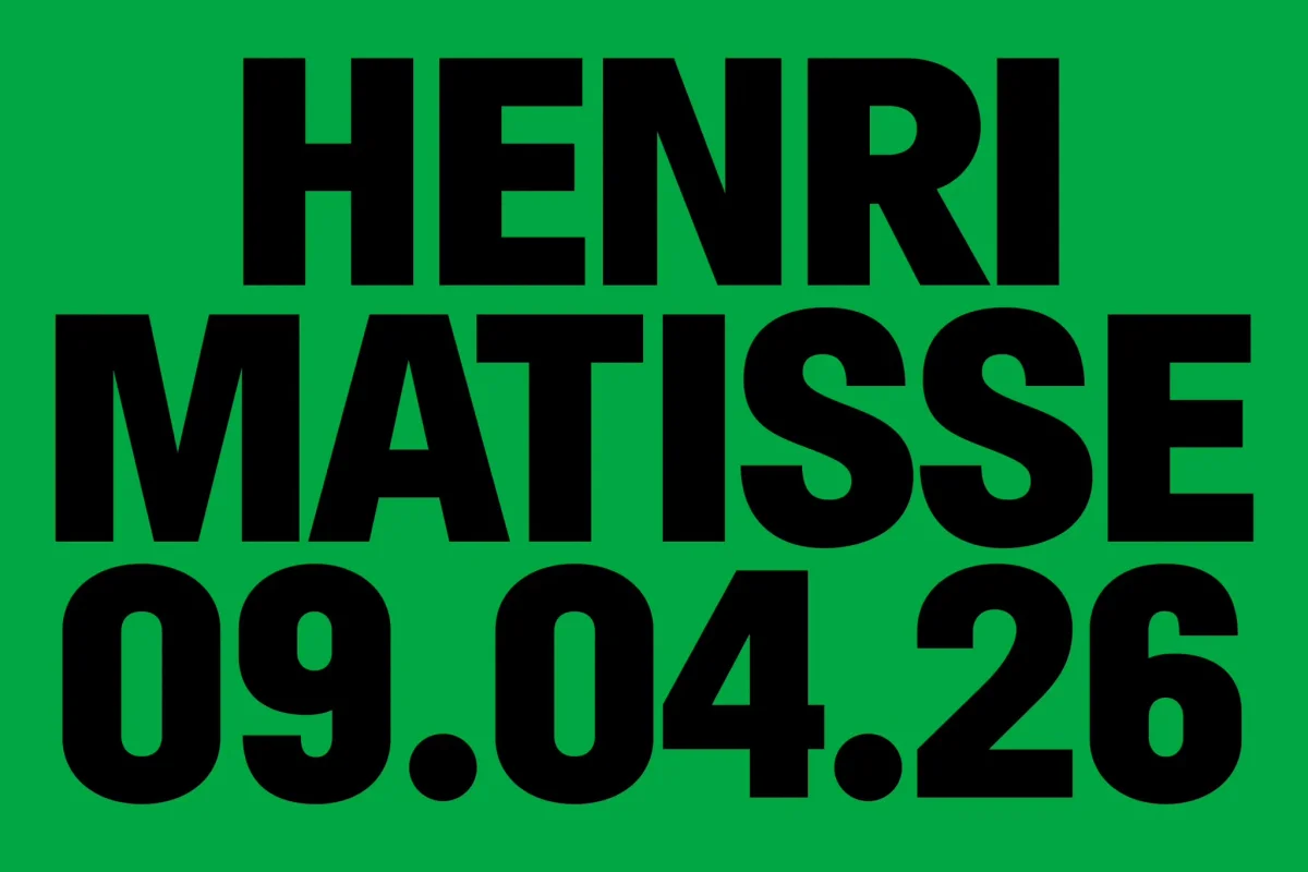
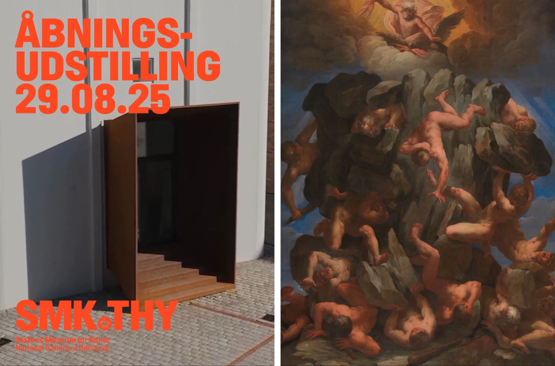
That choice goes against what most people expect from a national art institution. Heritage brands often reach for refined serifs or hairline sans, signalling quiet good taste. Hill does the opposite. Its chunky weights and tight proportions give the lettering a physical presence, and on exhibition posters the titles are often stacked over several lines until the type fills almost the whole layout. When the show needs the type to lead, it leads. When the artwork should dominate, the type steps back and lets the image do the work.
There's a practical lesson in this for anyone designing for cultural clients. A heavy condensed grotesque is efficient on a poster, because it packs a lot of words into a narrow column and reads at distance. It also gives a designer a single voice to hold across very different formats, from a glass bus shelter in Copenhagen to a phone screen. The trade-off is that heavy display type can get shouty if it's used at small sizes or in long passages, so the system needs clear rules about where the big settings end and the quieter ones begin.

A wordmark that doesn't need to shout
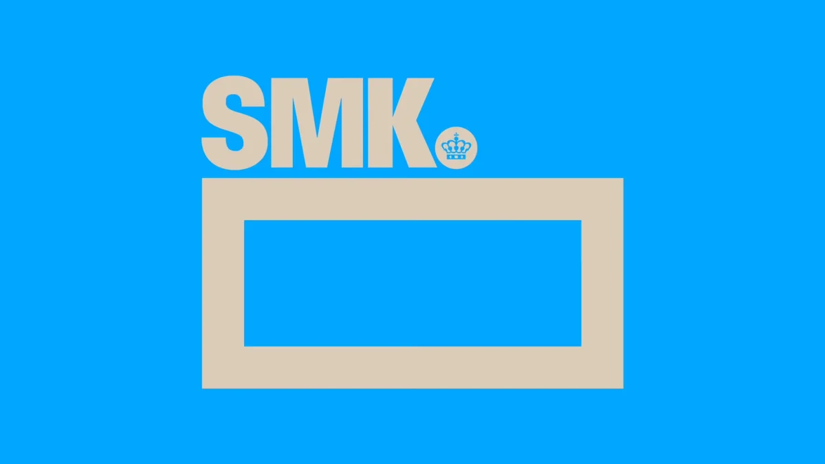
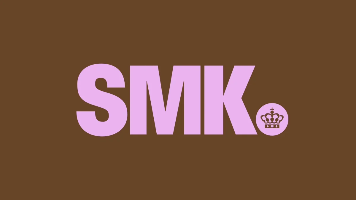
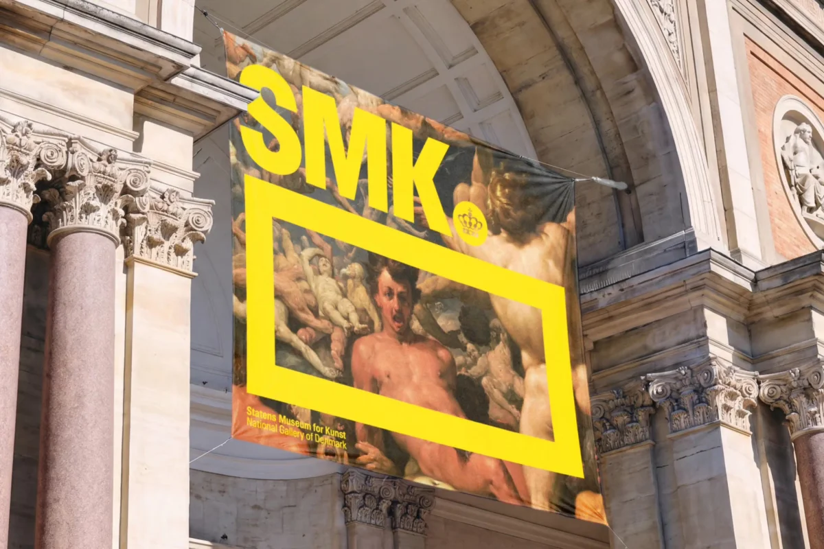
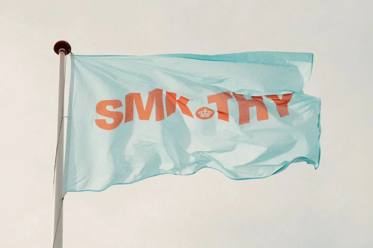
The SMK wordmark uses the same typeface, which keeps the logo and the exhibition work tied together. Set in capitals, the letters sit firmly and confidently. The crown emblem sits alongside it as a quiet nod to the museum's royal origins. The two together do a lot: they signal heritage without making the royal connection the story, and they keep the focus on the art.
Pairing a wordmark with a symbol like a crown is common in institutional identity, but it's easy to tip into pastiche. Here the crown is treated as one part of a system rather than a seal to stamp on everything. That restraint is what makes the mark feel contemporary.
The same logic carries over to merchandise. Clean, high-contrast type reproduces well on fabric and paper, and it stays legible when printed at small sizes on a bag or a mug. The studio's tote bag application shows the idea working in a physical product, which is a useful test. A tote bag is a small, everyday object that gets seen in public, and a brand that looks good there has earned its keep.
The frame holds the system together
The frame device is the element that ties the typography and the colour together. It's thick, it's used across applications, and it's easy to miss until you've seen it a few times. That's a sign of a system that works: it becomes a recognisable shape without demanding attention.
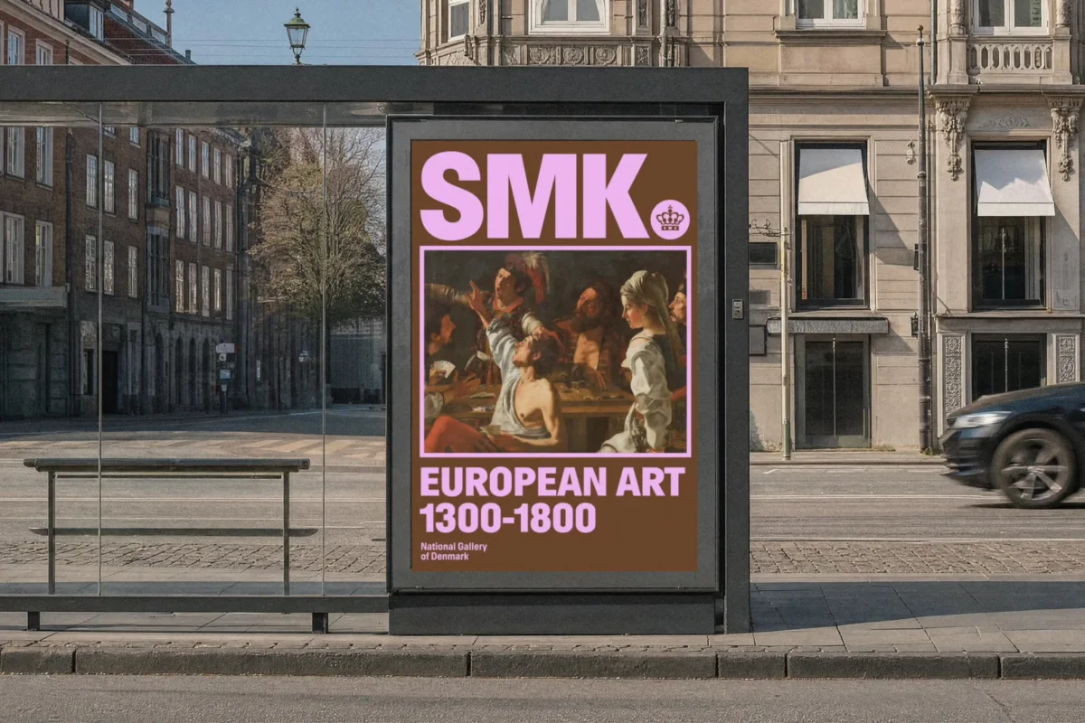
The treatment of the frame is where the identity gets playful. In some places it's a simple outline around an artwork. In others it shifts proportions and crops into a detail, sometimes at an angle, so the framed image becomes a fragment rather than a complete picture. On a building facade, the frame can take on architectural scale, which makes the metaphor literal: the museum is framing the work it wants you to come and look at.
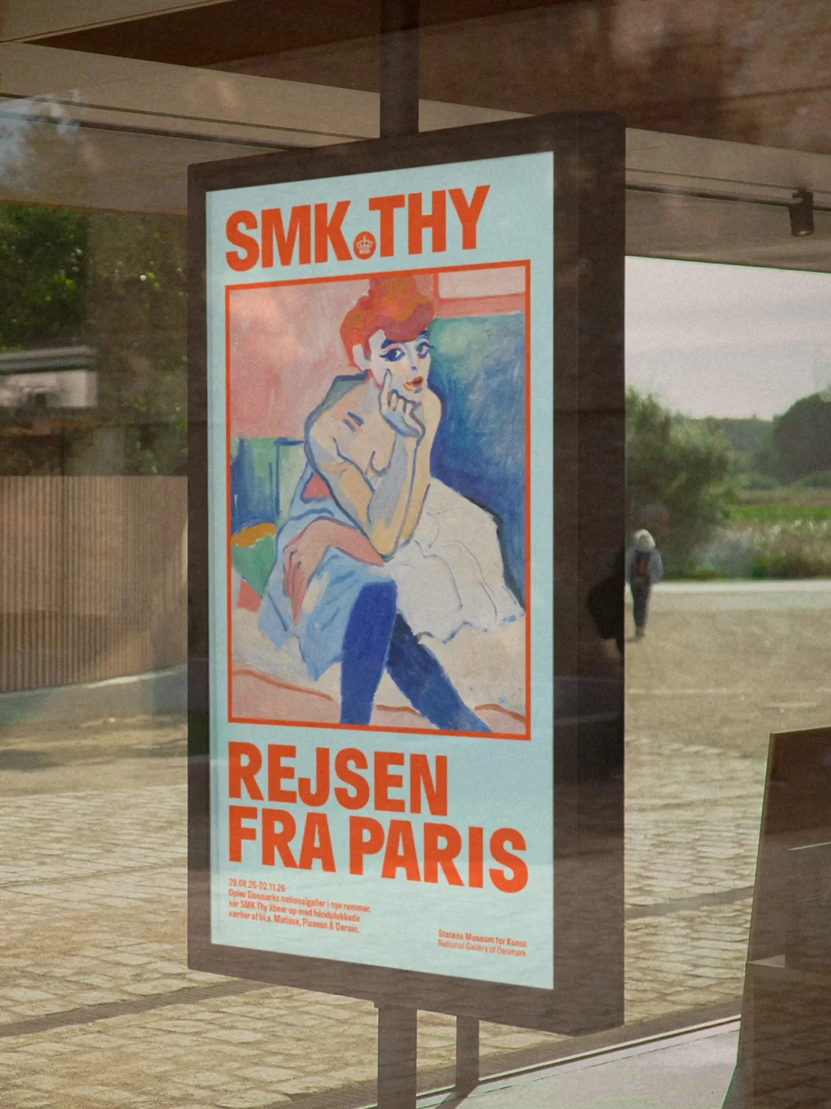
This approach changes how an image reads. A crop puts the viewer in a particular relationship with a painting, and it can be a strong editorial choice. For designers working with museum collections, the frame offers a way to reframe familiar works without altering the artwork itself. The risk is that a crop can distort the meaning of a piece if it's too aggressive, so a system like this needs a clear sense of which works get the wild treatment and which get a plain outline.
Colour that breaks the museum rulebook
The palette is the most unexpected part of the identity. eTypes uses acid yellow, vivid red, bright green and pale turquoise, alongside black and warm off-white. For a museum with this much history, that's a bold set of choices. Each campaign or exhibition picks its own combination, which gives individual projects a distinct character while the frame and the type keep everything connected.
That flexibility is the real achievement. Many museum identities struggle because they're built around one or two signature colours, and every new exhibition either fits the brand awkwardly or quietly drops it. Here the palette is a set of options rather than a single colour, which is easier to live with over years of programming.
Bright colour does come with an accessibility question. Pale turquoise and acid yellow can look striking in a studio or on a screen, but they can also reduce contrast for text and for readers with low vision. Any team adopting a palette like this should test every text and background pairing against accessibility guidelines, and should set minimum contrast rules for signage and wayfinding, where legibility matters most.
Scandi restraint with a louder edge
Scandinavian design is known for restraint, and this identity uses that tradition as a foundation. The grid is clean, the layouts are open and the typography is direct. Then the colour and the frame push it somewhere more energetic, closer to the visual language of club flyers and rave posters than to the hushed aesthetic people often associate with Nordic museums.
The combination works because the restraint is still there. The system doesn't need a lot of ornament, and that leaves space for the colour to do its job. eTypes shows that a museum can look serious and confident without looking conservative. That's a useful reminder for other institutions that feel pressure to look quiet in order to be taken seriously.
What I'd watch next is how this system holds up across a longer run of exhibitions, especially in digital formats where the heavy type and bright palette will sit beside a lot of other content. If the rules hold through the less glamorous applications, such as menus, labels and wayfinding, the identity will have proved itself. If they don't, the frame and the type will end up looking like a poster trick rather than a system. Based on the work shown so far, my read is that the studio has built something sturdy enough to find out.