Tuesday, November 10, 2026 · Graphic Design
Otherway's Whisky Exchange Identity Keeps the Lions and Lightens Everything Else
Noted by Emily Gosling · 414 reads
Otherway keeps The Whisky Exchange's twin-lion crest but pairs it with a lavender palette, variable type and playful print textures to make fine spirits feel open.
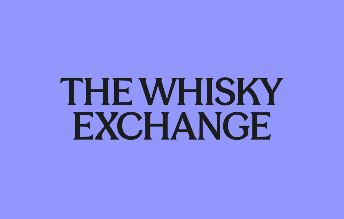
Specialist whisky retailers have a familiar look: dark greens, burgundy, gold foil and a serif that sounds like a bank manager. The Whisky Exchange, the London-based shop and online retailer, has now been given a identity from London studio Otherway that keeps the heritage cues and drops most of the gravitas. My read is that it's one of the more confident rebrands in the spirits sector this year, mainly because it doesn't seem to be trying very hard.
A business that grew out of a family off-licence
The Whisky Exchange was founded in 1999 by brothers Sukhinder and Rajbir Singh, who grew up working in their parents' off-licence in west London. It began as an online destination for whisky enthusiasts and has since grown into a set of physical shops alongside a large online operation with customers around the world. Its reputation rests on range, especially rare, vintage and discontinued bottles that are hard to find elsewhere. Pernod Ricard acquired the business in 2021, and it now spans retail, wholesale, auctions and events.
That history matters for a rebrand. A retailer like this has to sound knowledgeable without sounding exclusive, and it has to appeal to collectors while still welcoming someone buying a first bottle for a friend. Otherway's brief, as the studio framed it, was to show the depth of the brand's expertise while making fine spirits feel more inviting and accessible. The remit covered brand strategy, visual identity, tone of voice, digital design, signage and packaging, which is a full-system job rather than a logo refresh.

Keeping the lions, loosening the drawing
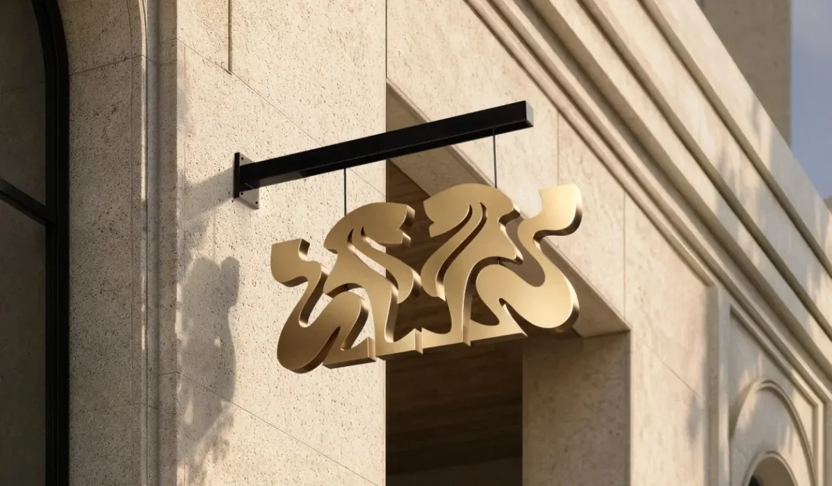
The most recognisable element is the crest-like central mark, two heraldic lions. It refers to the Singh surname, which derives from the Sanskrit word siṃha, meaning "lion," "hero" or "eminent person." Dropping that would have meant dropping the brand's most ownable asset, and Otherway kept it.
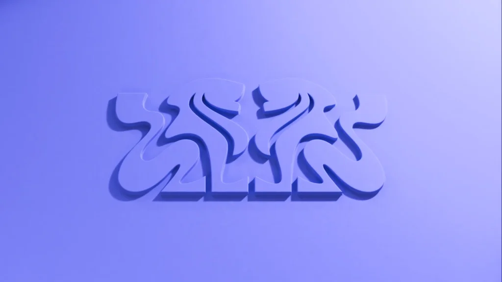
What changed is the drawing. The lions now have a lighter, more fluid treatment. That's a smart move, because the emblem is where the brand's sense of authority lives, and heraldic line work can easily tip into stiff, costume-drama territory. Softer contours keep the sense of formality while lowering the temperature. The lions still look like they belong on a bottle that cost a lot of money, but they don't look like they're guarding a country house library.
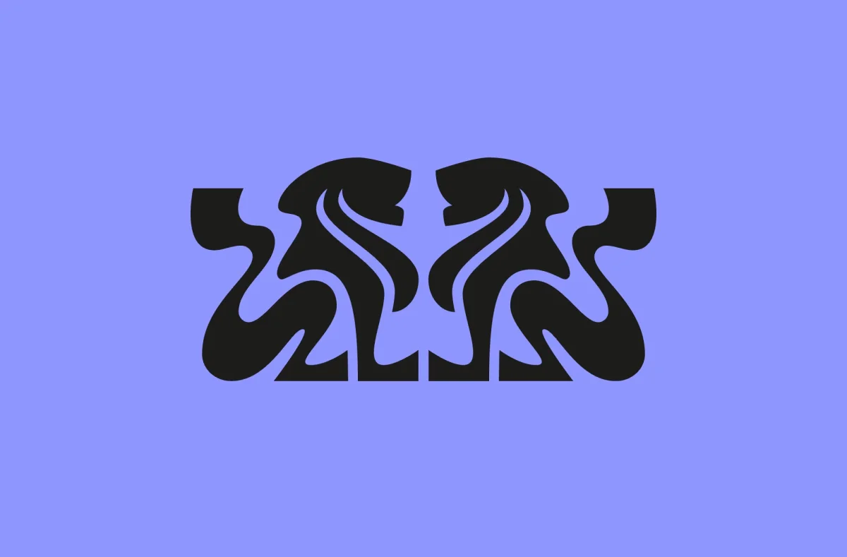
Here's the thing about heritage in this category: it often gets signalled through the same cluster of cues, including dark colours, ornate type and a certain amount of old-school masculine hush. Otherway keeps the icon and steps away from that cluster almost entirely, which is the more interesting choice.
Three typefaces that do different jobs
A lot of the contemporary feel comes from the type. The system uses Season Mix and Season Sans, both from Prague-based Displaay Type Foundry, along with Daily Slab from Berlin's Dinamo.
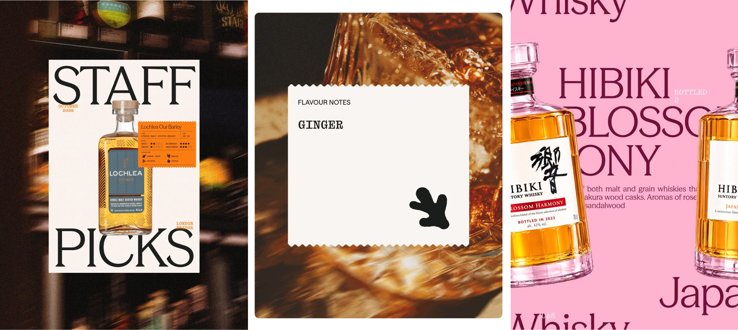
Season Mix is the interesting one. It's a variable font, so a single family can move between sans and serif forms. In practice that lets the brand swing between upright, traditional, editorial-feeling settings and something looser and stranger without changing typeface. For a retailer that has to handle a legal-size label on one screen and a playful social post on the next, that flexibility is a practical advantage as well as a stylistic one. Season Sans gives the system a clean, legible workhorse for body copy and interface text, and Daily Slab adds a slab with enough quirk to push the whole set toward the unexpected.
If you're working with variable fonts yourself, the lesson is about restraint in the rules. Pick a family whose axes do real work, then write a short guide that says which settings belong in which contexts. Otherwise, flexibility becomes a set of unrelated looks.

A lavender palette in a dark-bottle category
The palette is the boldest decision. The dominant brand colour is a bright, almost laundry-soft purple. Spirits branding overwhelmingly leans on deep greens, browns and blacks, the colours of aged wood and dim bars, so a lavender lead colour reads as a deliberate break.
It works, I think, because the lightness of the colour does the same job the lighter lions do. It makes the brand feel open and approachable, and it lets the product, with its amber liquid and glass, carry the visual weight. Lavender also has a useful property on shelves and in feeds: it stands out from the sea of dark packaging without needing a loud accent.
A caution for anyone trying this at home. A pale, saturated lead colour needs careful contrast management. Body text, buttons and small labels on lavender have to pass contrast checks on both screen and print, and the wording should not depend on colour alone to signal states such as selected or unavailable. Test on actual packaging stock as well as screens, because purples shift noticeably under different inks and finishes.
Wax, stamps and layered print
The wider graphic language draws on spirits labels, with wax seals and stamps, and the packaging leans into print's physical possibilities: layered type, textures and simple graphic devices stacked on boxes and labels. The same layering translates to motion, where elements slide and overlap in a way that feels like paper being handled rather than screens being scrolled.
That's a good example of heritage done through process rather than ornament. A wax seal is a reference to the past, but the layering and movement make it a contemporary gesture. It's the difference between copying a Victorian label and borrowing the logic of how those labels were made.
Digital: clarity first
The new website uses a set of simple, black linework icons to signpost things like awards, gift options and samples. The icons are plain on purpose. Otherway has kept the more expressive motion and typographic experiments for brand touchpoints and social, and has let the site prioritise clarity and legibility.
That restraint is sensible. The brand wants to reach younger and less experienced buyers without losing the trust that long-standing customers value. A shopper who doesn't know the difference between a single cask and a blend needs to find the gifting section quickly, and a collector hunting a discontinued bottle needs clean product data. Pushing the playful layouts into the core shopping flow would have made both jobs harder. The site becomes the calm, useful layer, and the more adventurous material lives around it.
Where the system lands
What makes the work hold together is the idea that heritage and contemporary relevance don't cancel each other out. The lions carry the origin story. The variable type, the lavender palette, the layered print and the plain icon set carry the 2020s. Each element does one job, and none of them has to be a museum piece or a billboard.
Otherway's wider portfolio, which the studio lists as including work for Loaf, Naked Paper and Robin, suggests a studio comfortable with brands that want personality without theatrics. The Whisky Exchange identity is a useful case study for any designer working in a category built on tradition. Keep the emblem that people recognise, change how it's drawn, and be willing to pick a colour your competitors wouldn't touch. I'd watch how the palette and type hold up across the shops and the wholesale side, because that's where a system like this either proves its flexibility or quietly drifts back toward dark green.