Tuesday, November 10, 2026 · Graphic Design
Hanneke Rozemuller's Two-Colour Palette and the Horizon That Keeps Moving
Noted by Dom Carter · 681 reads
Hanneke Rozemuller on tighter compositions, a blue-and-red palette and why she treats illustration as a practice with no finish line.
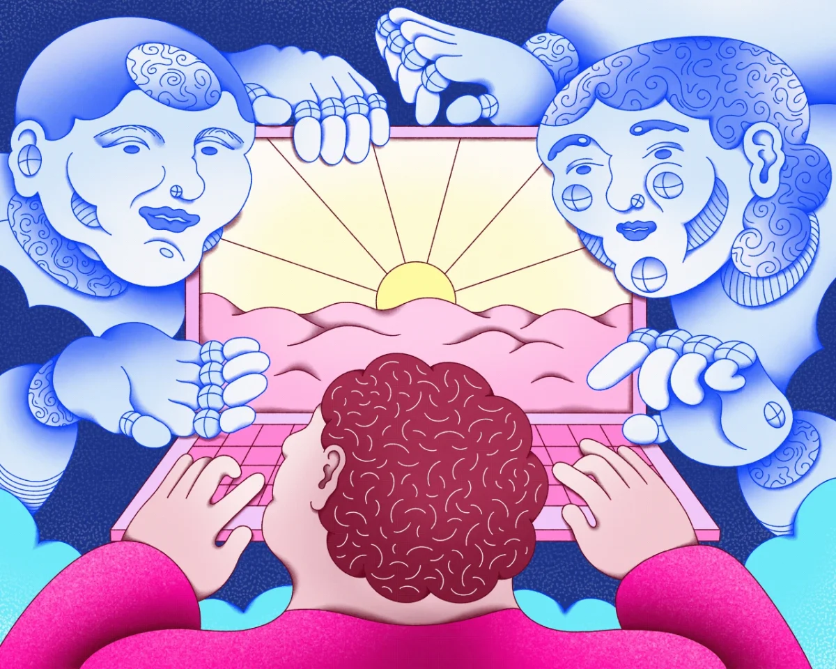
Hanneke Rozemuller started out as an illustrator working for herself, and her early work already had a strong sense of humour. Her absurd scenes draw on the rural farmland she grew up in. What's changed since then is the control. Her recent pieces read as more deliberate, with clearer ideas and a firmer grip on how an image holds together. That's the shift that stands out most when you look at her portfolio in sequence.
From pencil sketches to a clearer editorial voice
Rozemuller graduated from HKU University of the Arts and now works mainly in editorial. Her clients include Wired, The New York Times and The Wall Street Journal. Editorial briefs tend to be tight: a headline, a standfirst and a deadline, often with a single idea the picture has to carry. Working under those conditions tends to sharpen an illustrator's thinking. You learn to find the one image that makes a reader stop, and to cut everything that competes with it.
She has also taken on branding and commercial projects alongside editorial. Moving between those areas usually asks for a different kind of flexibility. A magazine opener can be experimental, while a brand system needs to repeat, scale and survive being printed on packaging, signage and screens. Rozemuller's broader range suggests she's comfortable with both sets of demands.
A palette built on blue and red
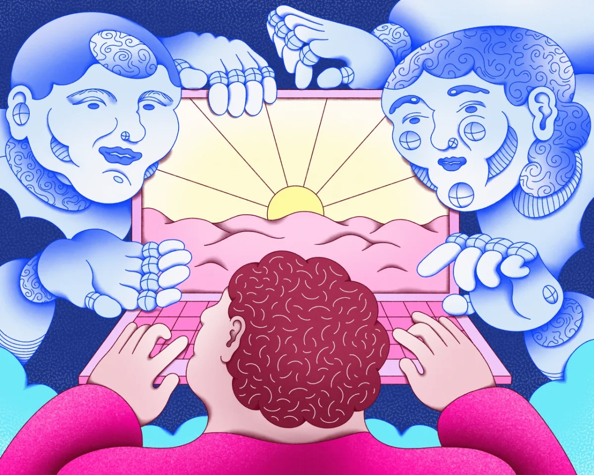
The most visible change is colour. Her recent work leans on a two-colour palette, mainly blues and reds. That's a deliberate limit, and it does a lot of work. With only two hues in play, value contrast and placement carry the image. A red figure sitting on blue reads instantly, and a small patch of the opposite colour pulls the eye to exactly where the illustrator wants it.
Rozemuller says her colour choices have opened up. "After having done this, I felt some more room to explore colour, and I've been having a lot of fun with that lately," she says. The restriction seems to have given her a foundation, so she can introduce more colour with confidence. "Knowing how to navigate all these separate elements of style has become more natural for me as a result."
That's a useful lesson for anyone working through a limited palette. Start with two colours and solve the composition first. Once the image holds without extra help, adding a third or fourth tone becomes an intentional decision rather than a way of covering up weak structure.
Composition as the real work
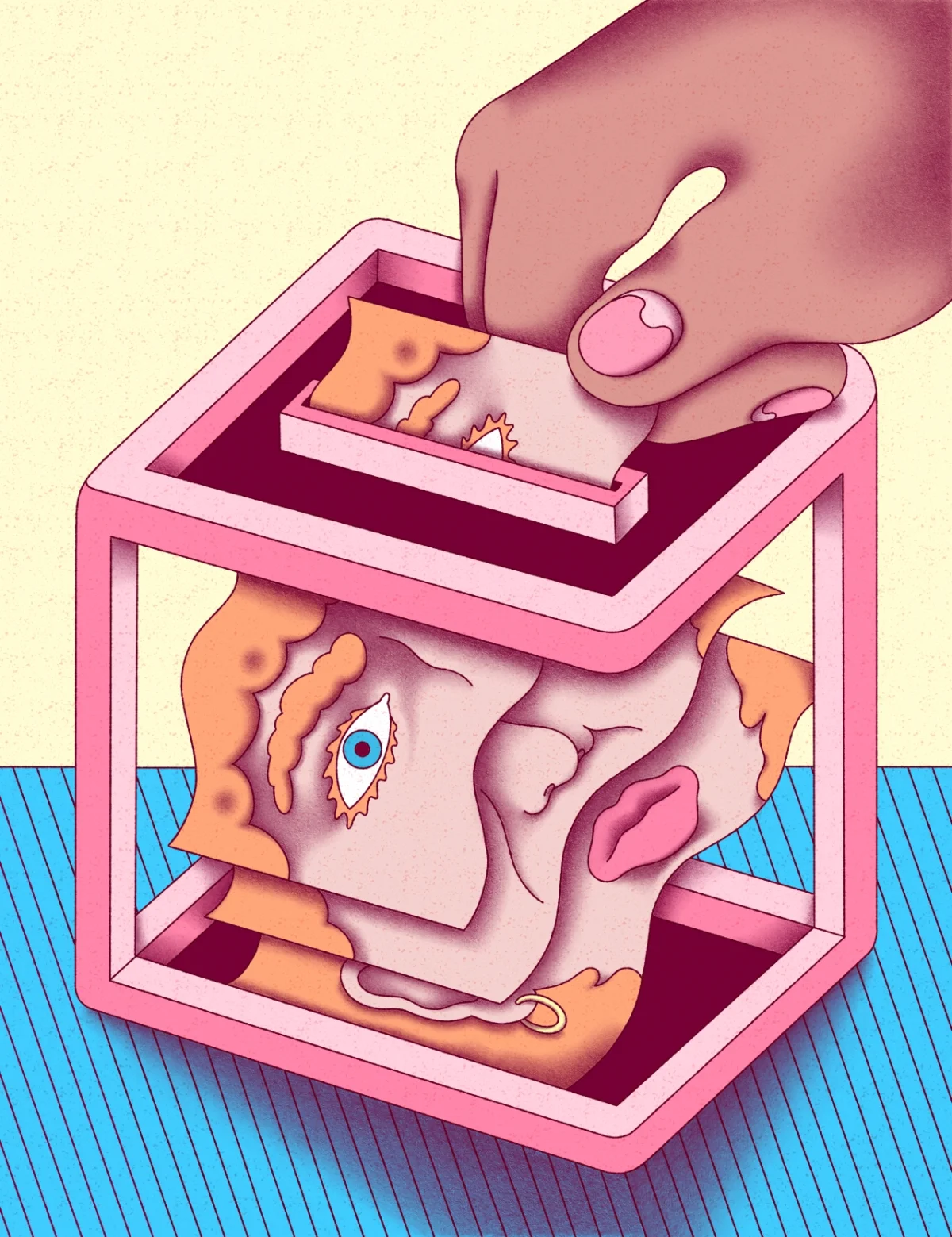
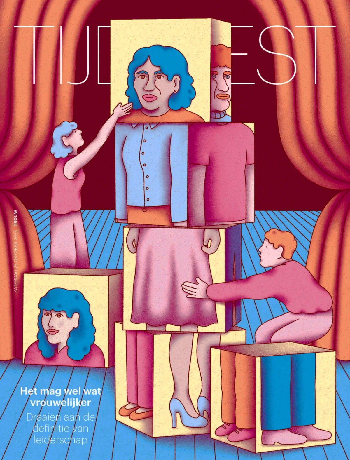
Rozemuller describes her compositions as stronger than before, and the examples bear that out. Look at how the layered box in one image frames the head inside it, or how the stage in another organises its figures into a readable hierarchy. Each piece gives the eye a clear entry point and a route through the scene.
Her approach to a difficult brief shows how she thinks about structure. For an illustration on the theme of 'emotion in class', she was wary of sentimentality. "I wanted to keep this illustration from looking too sentimental, which is a bit of a risk with this type of theme," she says. Her answer was to lean into whimsy and build distance into the image. "I think I solved that well here by making the whole look a bit whimsical, and keeping a 'cool distance' by using a nearly symmetrical composition and an index-like system of shapes."
Symmetry is a strong tool for emotional subjects. A near-symmetrical layout slows the viewer down and reads as considered rather than reactive. Repeating a shape system in place of illustrated expression lets the image hold a feeling without tipping into melodrama. Designers working on sensitive editorial topics could test the same idea by removing one expressive gesture and seeing whether the layout still carries the meaning.
Projects she's proudest of
Rozemuller's favourite work tends to be the pieces where her own strangeness comes through most clearly. "I'm most proud of the projects where the most idiosyncrasy and strangeness come through," she says. "It makes them feel more strongly like things that are truly mine."
Her cover for Hoofd magazine, 'Sporen', is one of those pieces. She describes it with real energy: "It was like running a 'what if' experiment with a pencil." Another highlight is an illustration for an article calling for more feminine leadership in the Netherlands. She singles out the composition, which pairs an architectural structure with a feminine face split apart across a field of paper slips. "I really like the composition, the architectural quality combined with the slightly weird separation of the feminine face by dividing it over the voting papers," she says.
Both examples show a pattern. The strongest editorial images in her portfolio rely on a clear idea, then add an odd, specific twist that makes the image hers. That combination is harder to teach than technique, but it's visible in the work.
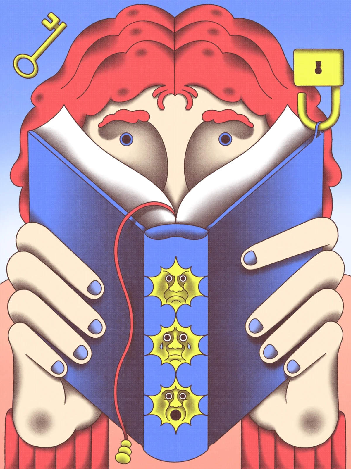
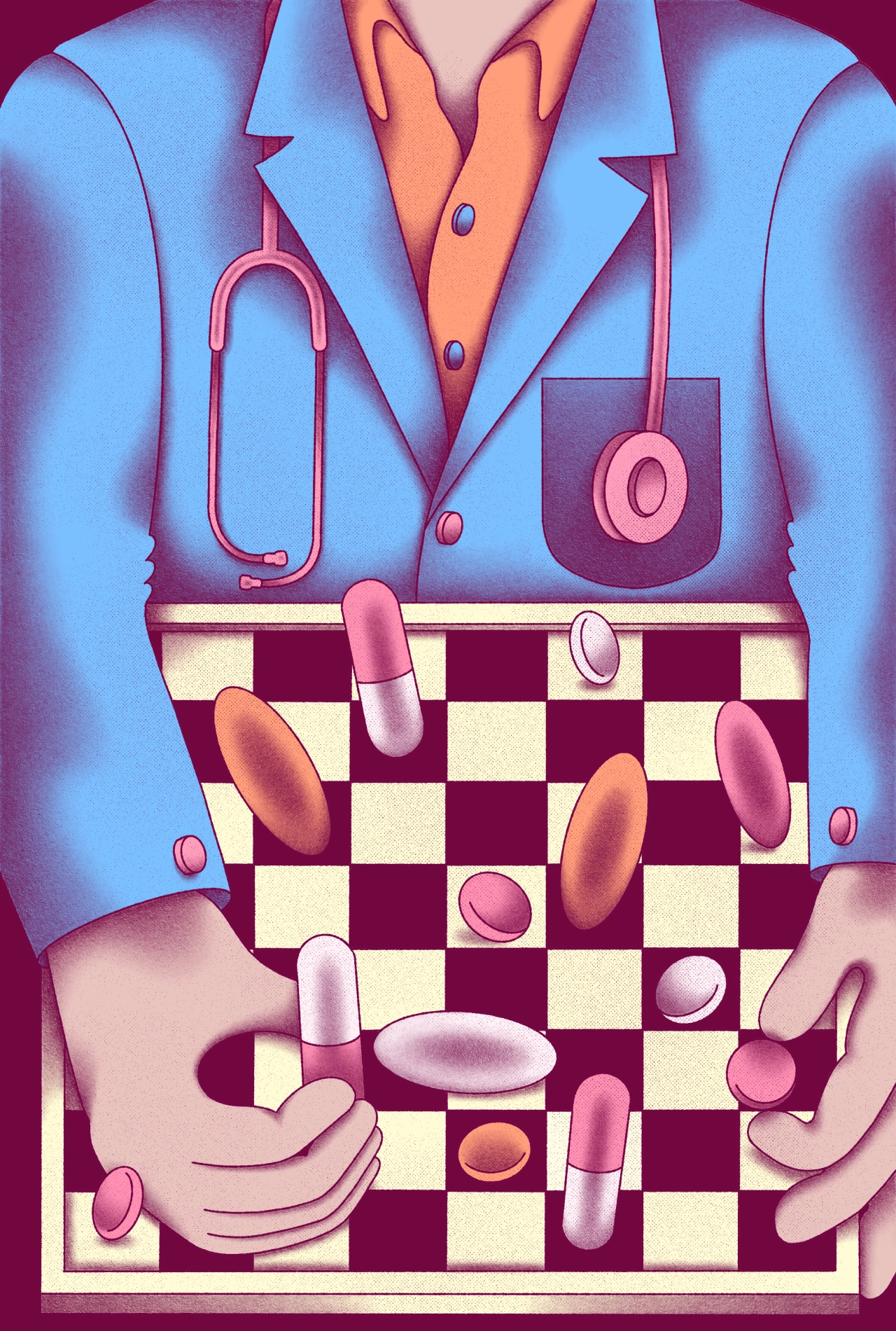
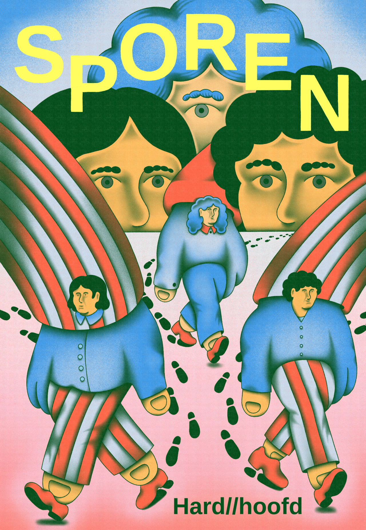
Illustration without a finish line
The most useful thing Rozemuller says may be about mindset rather than technique. She used to expect that being an illustrator would eventually feel like arriving somewhere. That expectation has changed. "Now I see it more as a practice without a finish line," she says. "There will always be people ahead of me, and I like that the horizon keeps moving."
Plenty of working designers and illustrators hit the same wall. A few years of steady commissions can create the sense that the hard part is over, and then a stronger peer's work makes the gap feel obvious. Treating the gap as a direction rather than a verdict tends to keep people producing. It also explains why her recent work looks more confident: she's no longer measuring herself against a finish line that doesn't exist.
Her current project points in the same direction. She's working on a series of drawings for a picture book that traces ten years of educational innovation in the Netherlands. The brief is abstract by nature. "The challenge is giving visual form to something as abstract as a decade of change," she says. Turning long-running change into images that a child or a reader can follow will test everything she's been building: a clear idea, a controlled palette and a composition that carries meaning without help from the text.
For designers following her work, the lesson is practical. Set the limits early, pick a palette you can defend, and let structure do the emotional work. Then keep looking at the people ahead, because that's where the next problem to solve usually is.