Tuesday, November 10, 2026 · Graphic Design
Julien Gobled's Warped Type and Uncanny Faces Push Design Toward Art
Noted by Ayla Angelos · 701 reads
Julien Gobled builds distorted imagery and warped type from archive finds and internet culture, blurring the line between graphic design and fine art.
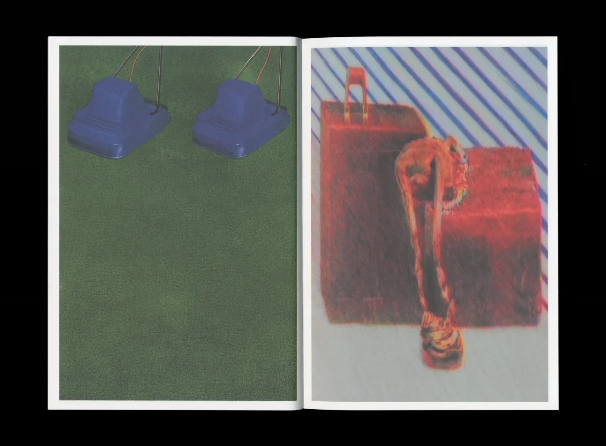
Julien Gobled works from a French base in Le Havre, and he's blunt about where his practice is heading. "I feel less and less like a designer and more like an artist," he says. Look at the work and that shift makes sense. He isn't simply placing type next to pictures. He's building a closed graphic world, with unsettling baby-like heads, airbrushed squiggles, heavy colour fields and photographs that look like they've been copied on a machine one time too many.
Type that behaves like an image
The typography is where his approach gets most interesting. Sometimes the text carries real information. Sometimes it's hand-drawn to match the shapes and tones on the facing page. Sometimes it's bent until it becomes an optical illusion. That range is what separates his work from a lot of experimental layouts. The distortion never feels random, because the type is always doing a job, even when that job is to disorient the reader for a moment.
My read is that this kind of work depends on a long apprenticeship. You can only break a grid convincingly once you know exactly what the grid is holding up. Gobled studied fine art before drifting towards design, then spent time as a working designer, splitting his week between an agency job and freelance commissions. He now works entirely on his own, and he says his artistic training pulled him towards image-making and visual research. Those two strands are visible in every spread.
Letting the process decide
The shift in his thinking is worth noticing. For a long stretch, Gobled wanted to control every stage of a project. More recently he has been learning to step back and accept that work can end up somewhere other than where he planned. "This has allowed me to take more risks and move beyond familiar habits," he says. That's a useful point for anyone who has ever over-specified a layout and then watched it lose its energy during production.
His working method reflects that looseness, but it's also disciplined. He keeps a fixed routine of focused work from 9am to 6pm, even when no commission is on the books. He treats that continuity as the thing that keeps experimentation going. The research itself is a steady habit: he goes looking for images in books, archives, internet culture and everyday life, then treats what he finds as raw material. "I manipulate them digitally, crop them, transform them or combine them with other elements to take them somewhere else," he explains.
What he's after, more than any single visual style, is a certain emotional pitch. "I try to find the moment when an image begins to evoke an emotion," he says. He admits he doesn't always know what he's looking for at the start. A direction often shows up partway through the process, and he chooses to follow it. For designers used to briefs that ask for a predictable outcome, that's a different way of working, and a demanding one.
A book built from three months of images
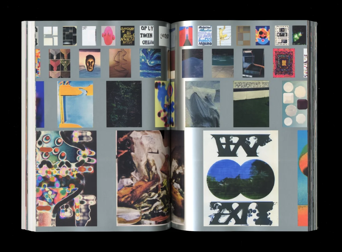
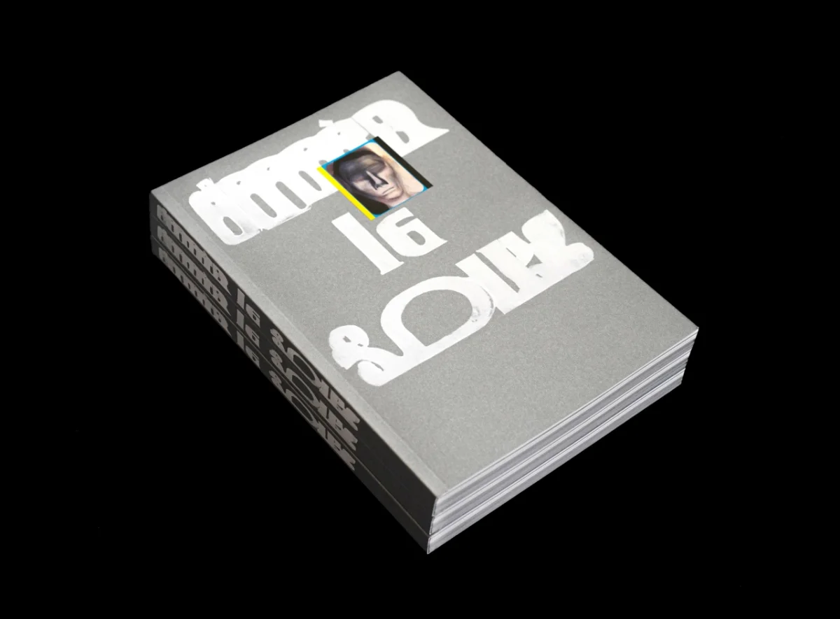
The clearest example of this method is Derrière le soleil. The project took two years to come together, working with Vincent from Fidèle Éditions. The book was co-published with Éditions Biceps, and Jean-Philippe Bretin led the editorial design and layout. It gathers several bodies of Gobled's work, and most of the image-making was compressed into one intense three-month period. The result is a dense publication, and the density is intentional.
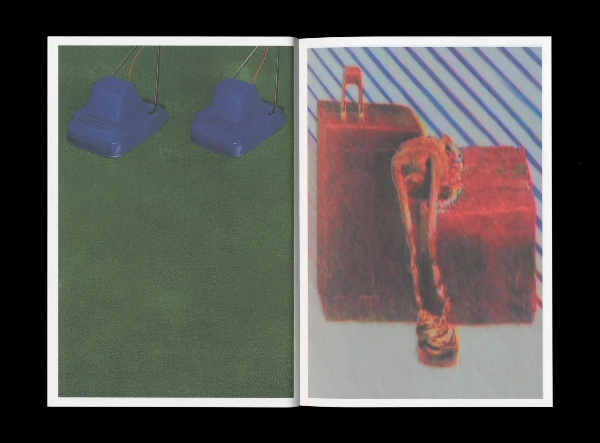
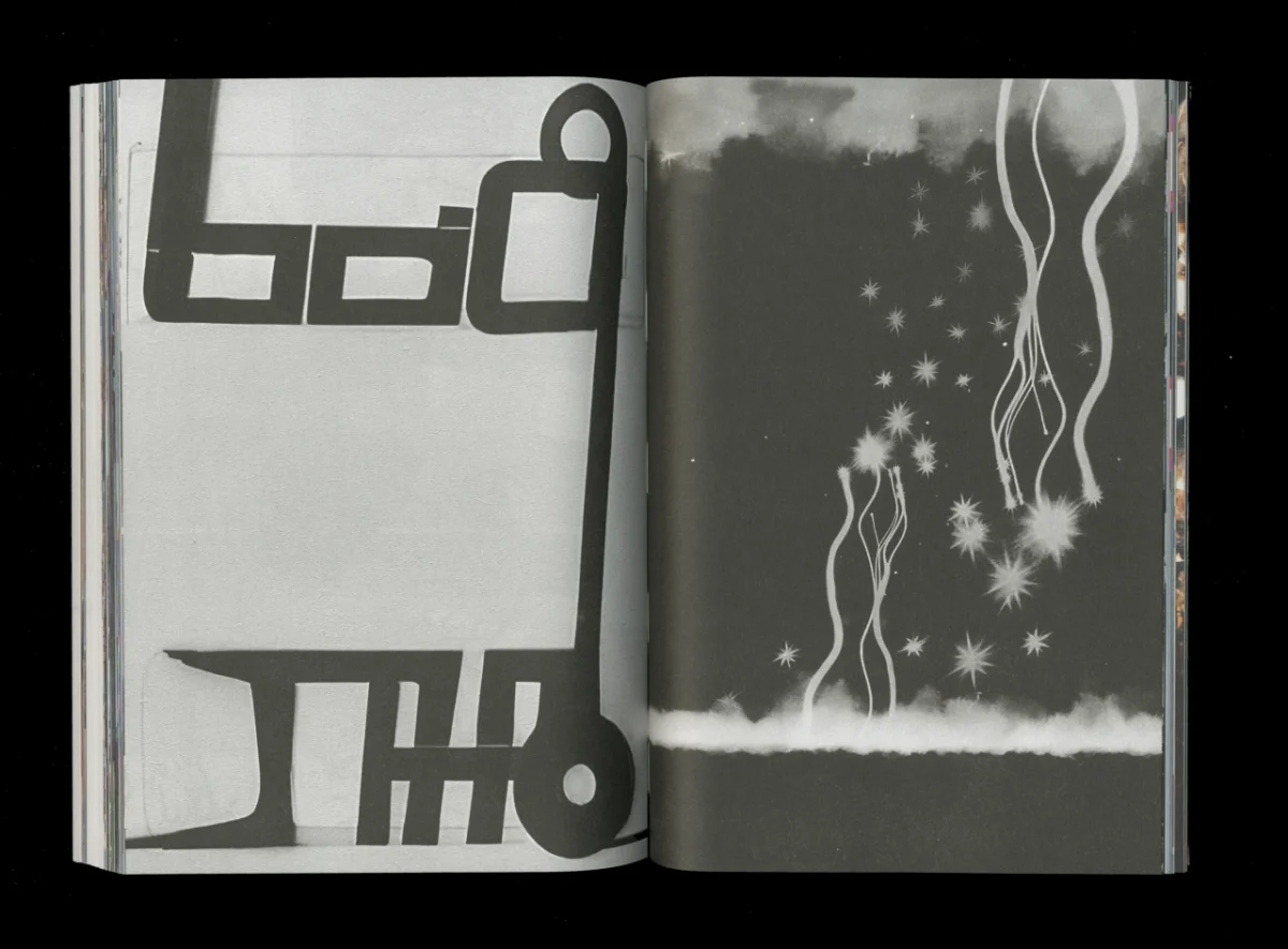
Gobled is generous about the role Bretin played. "The way [Jean-Philippe] interpreted the work and gave it a new dimension was essential; it was a real gift," he says. "The book became something greater than the sum of the images I had produced." That's a useful reminder that a book's sequencing and page architecture can change how images read, even when the images themselves stay the same. The spreads show it: a row of geometric line furniture sits against a night scene of wavy lines, and the pairing works because the rhythm carries across the gutter.
Album art and a brief built on modernism
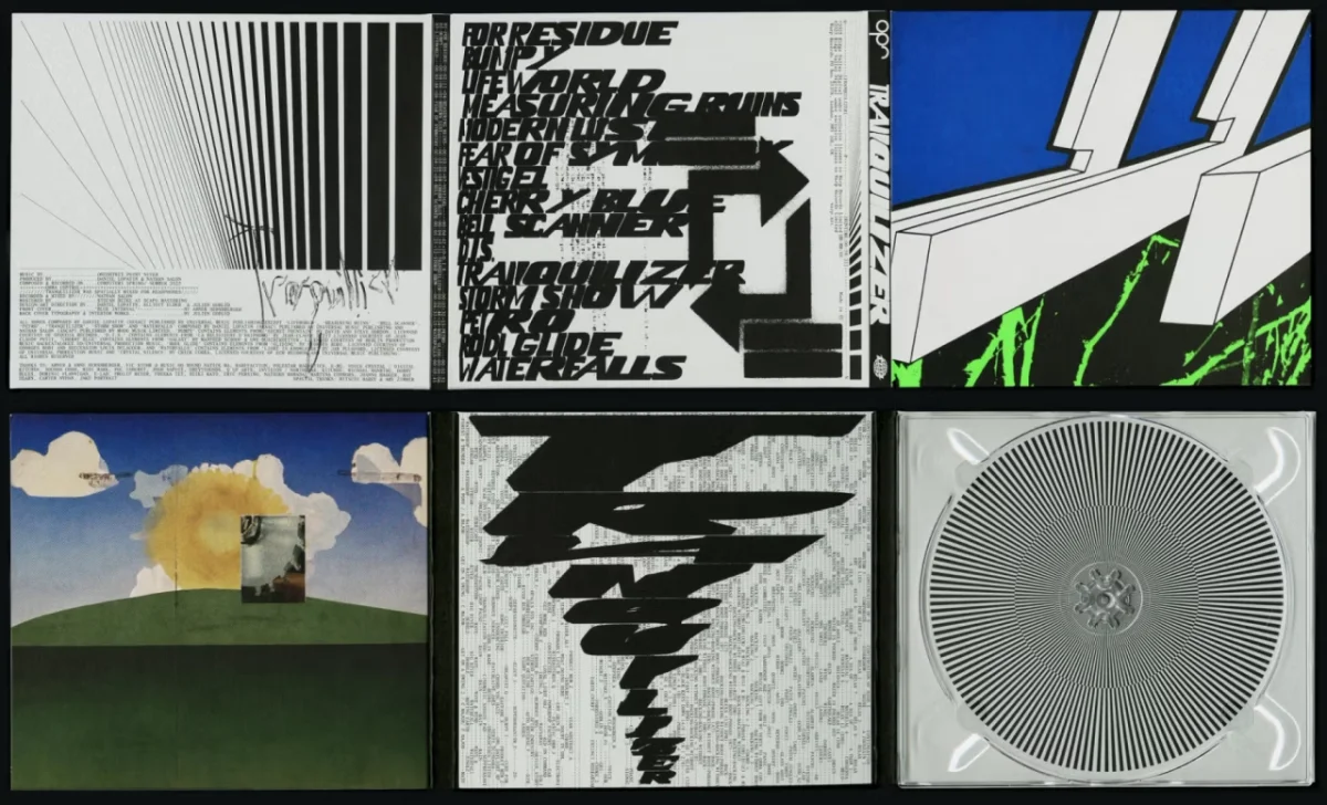
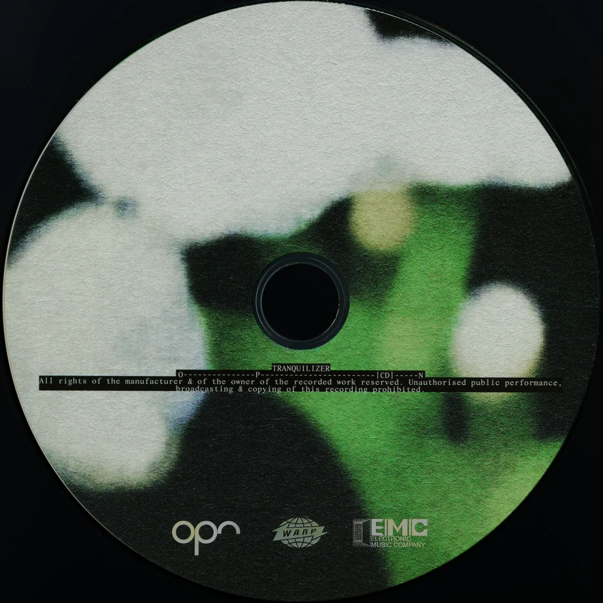
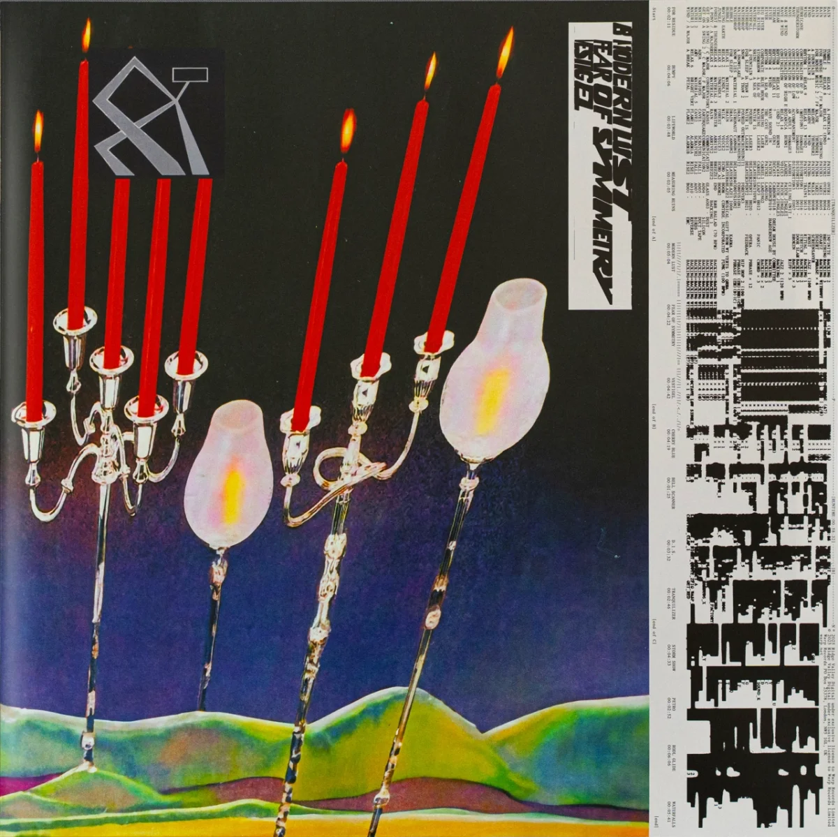
For Tranquilizer, the album by experimental musician Oneohtrix Point Never, Gobled worked with Daniel Lopatin and Elliott Elder of the studio Uncanny. Gobled handled art direction, typography and artwork. The cover uses a screen print by Abner Hershberger, and the rest of the packaging is a mash-up of layered type, digital drawing, distorted photography and chunky illustrative shapes. The CD, released on Warp Records, shows how that visual language holds up at small scale: a green and black abstraction with blurred white forms, set against manufacturing credits and logos.
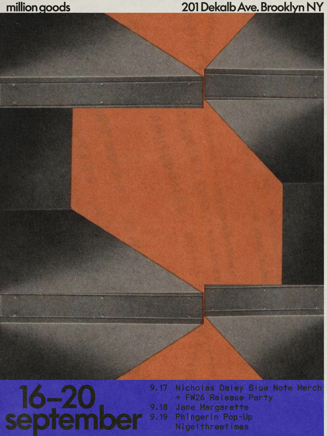
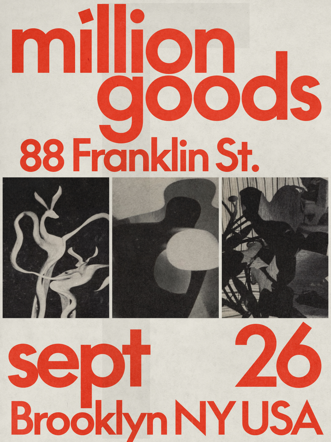
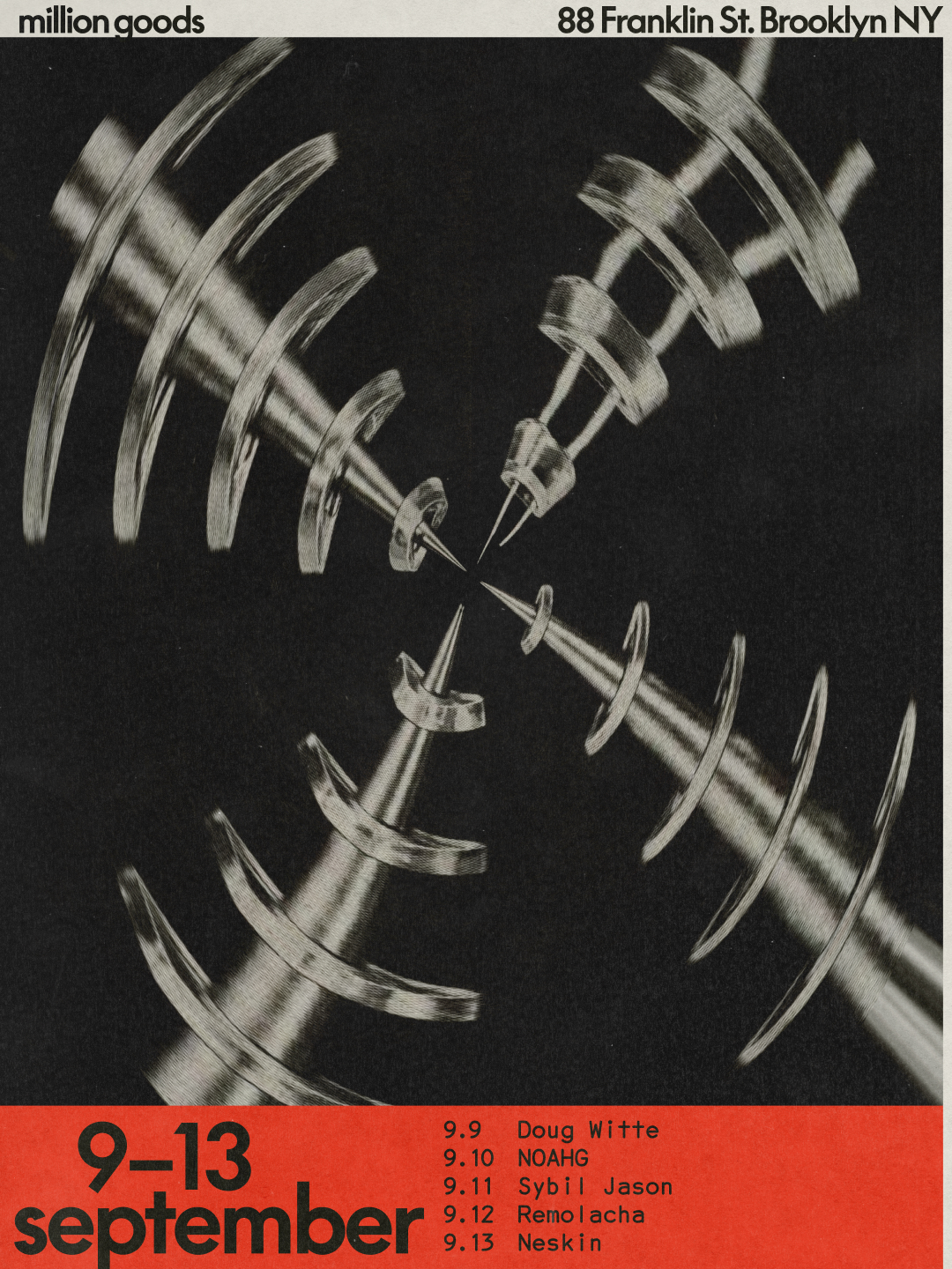
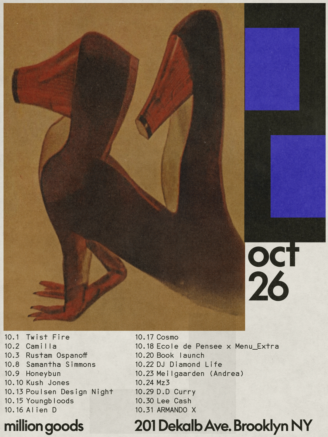
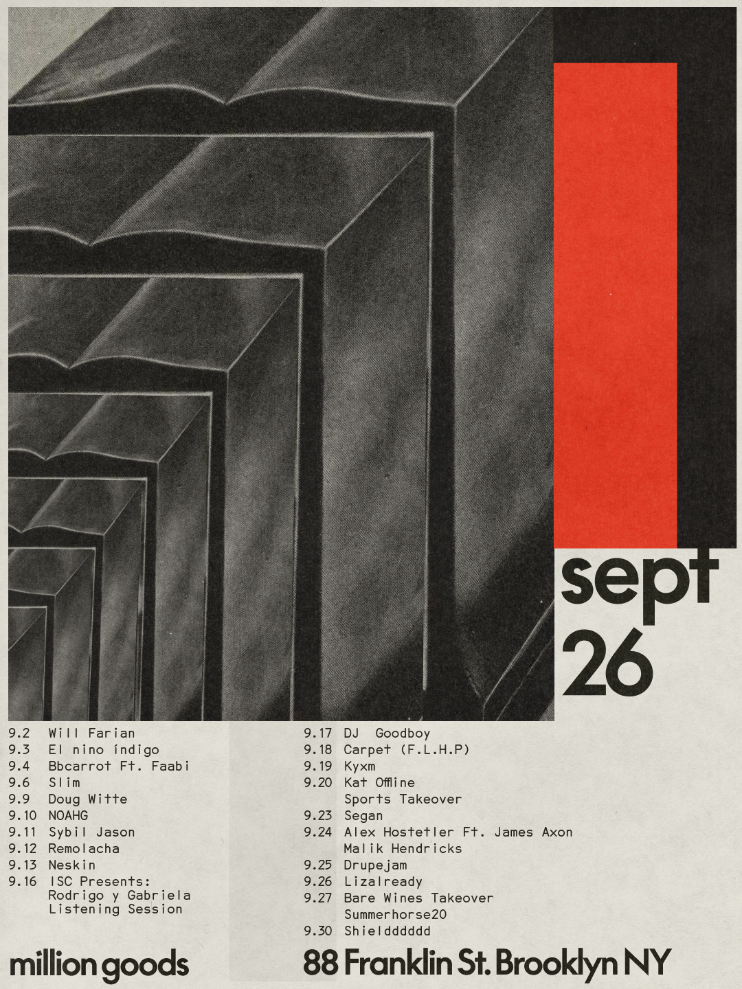
The retail identity work for Million Goods is a different kind of problem. The Brooklyn concept store and wine bar wanted to rethink its visual identity before opening a second location. Gobled worked with Gabriel Finotti of Sometimes Always. They shared the art direction, and Finotti focused on the design so Gobled could concentrate on the artwork. The brief pointed to Bauhaus, Brutalism and Modernism. Gobled's account of how they handled those references is one of the more useful notes in the whole project.
"It was interesting to work with such recognisable references while trying to avoid simply paying homage to them," he says. "Instead we treated them as a starting point, drawing out certain principles and bringing them into a contemporary context." The posters show that approach in practice. Stacked grey geometric forms and a bold red vertical block carry a modernist structure, while the event listings and dates stay clear. Other pieces use horizontal bands in orange and grey, or curved black and white lines against red text boxes. The family resemblance holds across formats without becoming a single repeated template.
What comes next
Gobled has several projects lined up. One is an exhibition based on Derrière le soleil, for which he has invited French designer Sylvia Tournerie to take the same material and manipulate it in her own way. That's an interesting move. It treats the book as a source rather than a finished statement, which fits his view that images are raw material. Whatever he makes next, he's likely to move between typographic, illustrative and photographic work rather than settle into one lane.
"I want to keep taking my work into different contexts, discovering new worlds and engaging with different kinds of challenges," he says. "I feel that these experiences take me somewhere new each time. They help me break out of familiar habits, see my work differently and keep experimenting."
For designers working on their own projects, the practical takeaway is less about copying the look and more about the habits behind it: keep a steady research routine, let type take on image-like roles when the content allows it, and be willing to let a project drift from the first sketch. If you want to see how far that can go, look at the Tranquilizer digipack, which runs six different experiments across one set of materials.