Monday, November 2, 2026 · Graphic Design
Swiss Post Sans: A Warmer Typeface Built to Fit Existing Layouts
Noted by Tom May · 597 reads
Swiss Typefaces spent more than three years shaping Swiss Post Sans around legacy layouts, multilingual needs and a new, more human voice.

Swiss Post Sans shows how a brand typeface can earn distinction through restraint. Swiss Typefaces designed it for Swiss Post to replace an existing font without forcing teams to rebuild their layouts, while giving the postal service a warmer voice across print, screens and public spaces. The project took more than three years.
That brief sits at a familiar tension in custom type design. A commissioned font is expected to feel ownable, yet it also has to carry information clearly and work across many formats. Swiss Post’s new face was asked to preserve the practical behavior of its predecessor while changing the mood around the words. The result’s character comes from that balance: subtle humanist details, carefully managed spacing and italics with a more expressive role.


Designed to replace a font file
The upright styles came first, with one demanding technical condition shaping their development: Swiss Post needed to be able to substitute the new font by swapping files, without adjusting existing designs or layouts. Swiss Typefaces therefore had to keep the overall typographic volume close to that of the old typeface. Letter shapes could evolve, but the text still needed to occupy much the same space.
That constraint matters in a large organization where a typeface appears in established templates and many kinds of communication. A font that runs longer or shorter can change line breaks, disrupt columns and force revisions across layouts. Matching typographic volume makes a replacement easier to adopt throughout a working system. Here, continuity was part of the design brief, not a detail to resolve after the letterforms were finished.
Language coverage added another layer. Swiss Post produces material in German, French, Italian and Romansh, so the family had to support accented characters and less common glyphs as well as the everyday alphabet. The numerals also needed to be tabular by default. That feature gives figures equal widths, helping prices and timetable information align in columns without extra formatting.

Swiss Post received beta files early so a group of experts could try the designs in real conditions. That testing gave the team a way to check how the family handled the demands of actual communications, including the numeral alignment and the broader range of characters. The source describes the collaboration and testing, but doesn’t specify the experts’ disciplines or provide results from individual trials.
A softer voice, without a loud signature
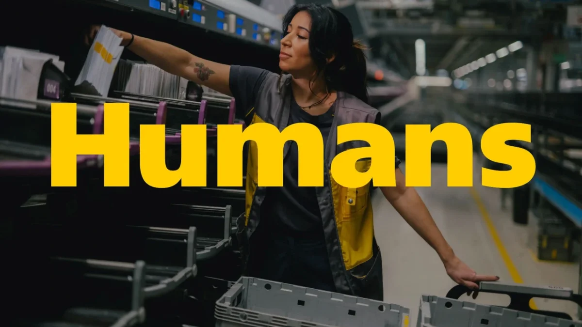
Swiss Post expects the typeface to serve for decades, so the redesign also offered a chance to adjust the brand’s tone. Swiss Typefaces introduced humanist qualities to make the letters feel warmer and more inviting, while avoiding quirky gestures that might draw attention away from the message. One visible adjustment came at Swiss Post’s request: the dots over the “i” and “j” changed from square to round.
That small detail is a useful example of the project’s wider approach. A brand can feel more approachable through a sequence of measured choices rather than a dramatic new shape. The upright styles retain the role and proportions needed for existing layouts, while the softer details shift their impression. For designers working on type for established systems, the project suggests a practical method: identify which behaviors must stay stable, then decide where carefully chosen changes can carry the new tone.
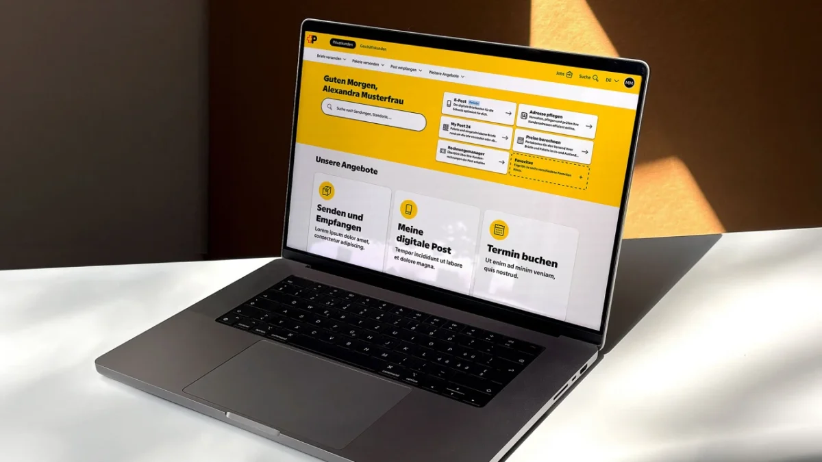
Italics find a new job
The upright designs were bound by the old font’s measurements. The italics had more room to develop: they didn’t need to match an existing italic style. That freedom also reflects a change in Swiss Post’s visual identity. The earlier logo used uppercase italics to suggest movement and speed; the redesigned logo centers on a bold, upright “P.” With that cue gone from the logo, italics could become a separate expression within the broader type system.
Swiss Typefaces built the italics as a hybrid, adding cursive qualities to letters such as “a,” “b,” “e” and “g” instead of simply slanting the upright forms. Their shapes combine curves with sharp, straight endings. The lowercase “f,” for example, descends below the baseline with a calligraphic feel, then ends in a clean cut rather than a traditional curved return.
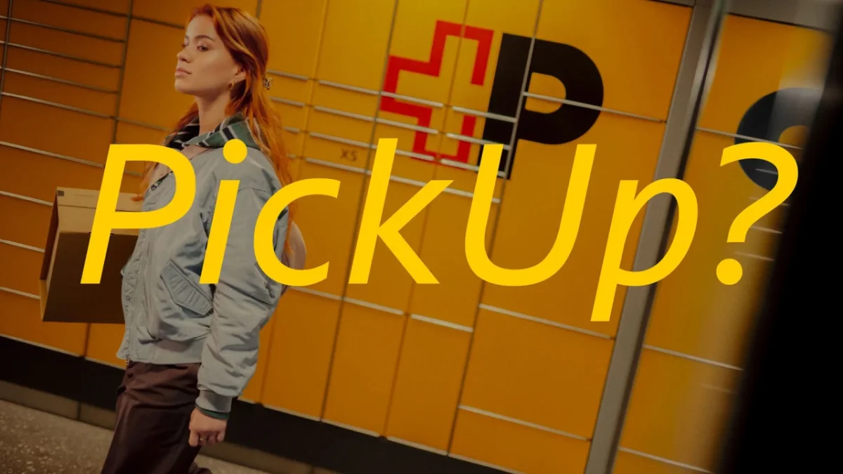
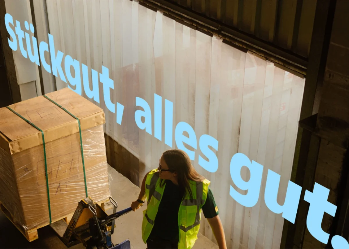
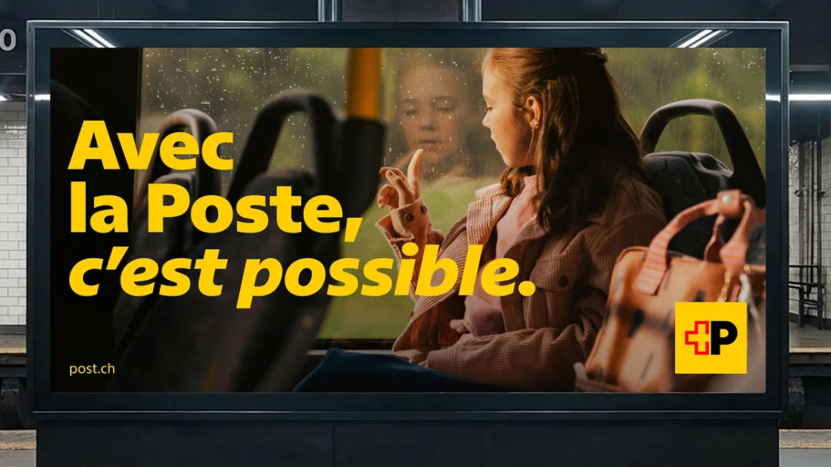
The family uses these italics for running text as well as headlines and very large signage. That range gives the style a visible part to play across the identity, including in digital settings where italics are less common in web design. The distinction comes from the letter construction itself, so it can read at different scales rather than depending on a single logo application.

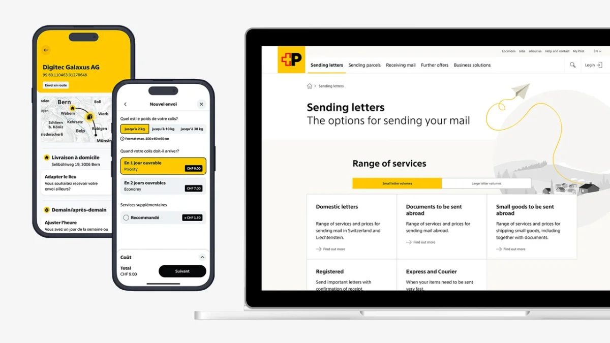
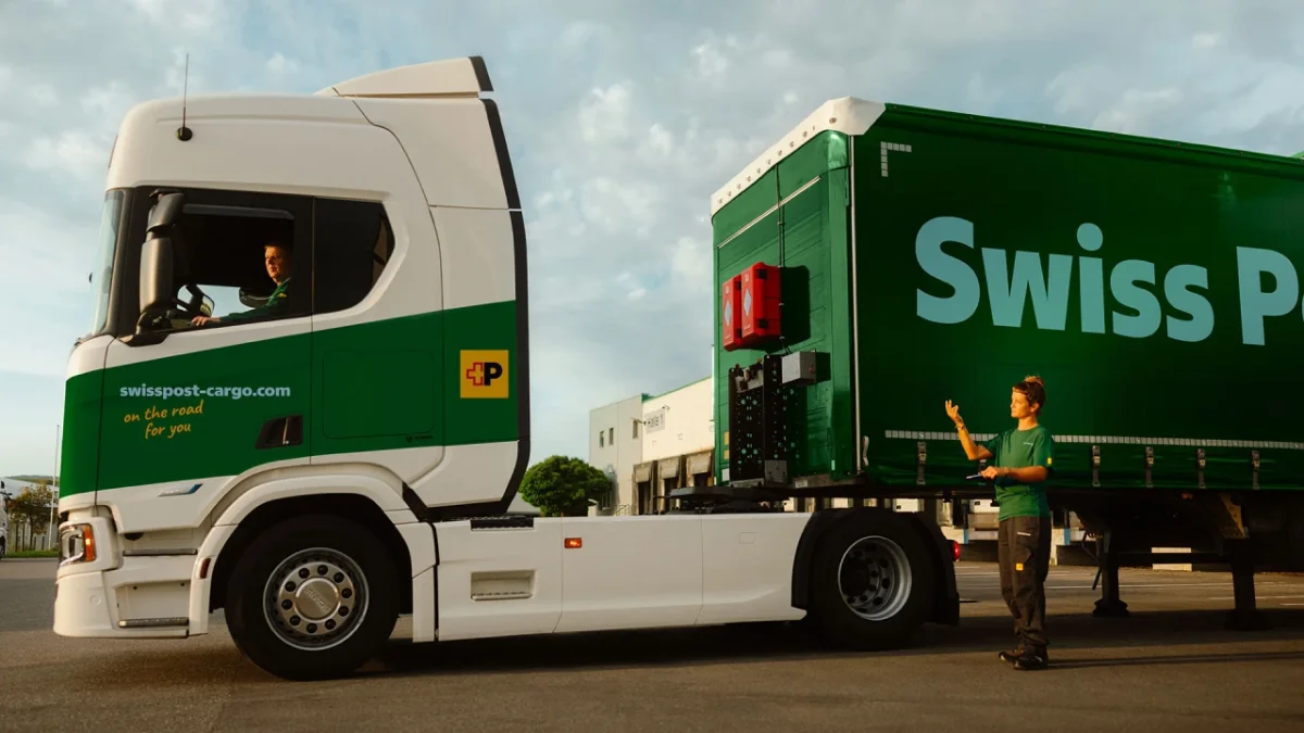


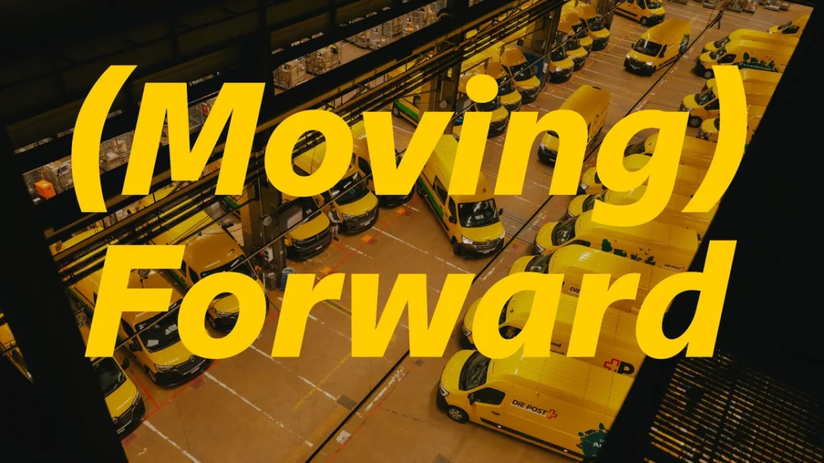
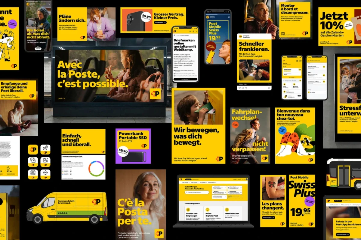
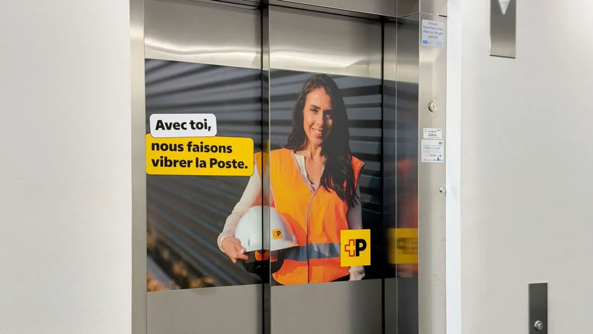
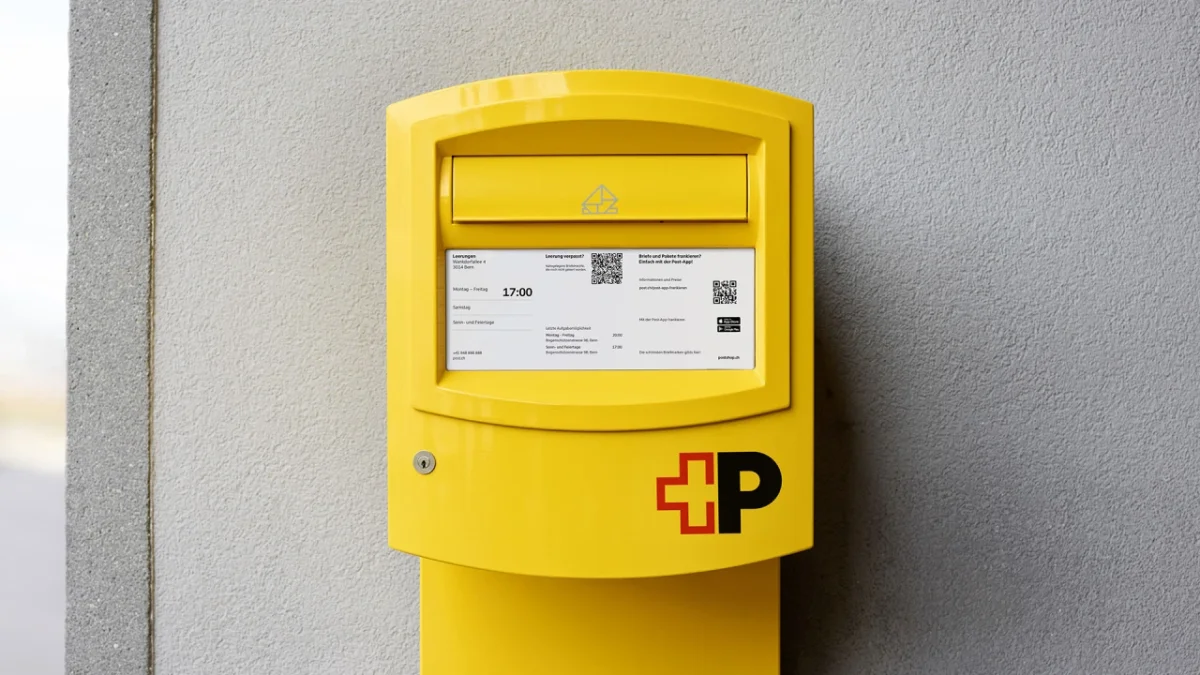
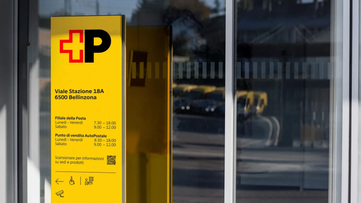
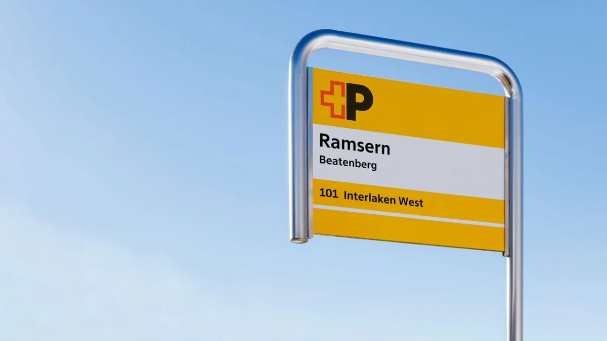
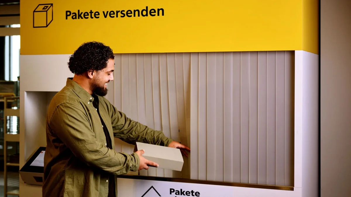
Swiss Post Sans now appears across street advertising, signs, trains, trucks, bus stops, pamphlets, stamps, mailboxes, websites and apps. Its reach makes the small decisions consequential: a typeface has to remain readable and consistent across settings that differ in scale, distance and format. The project’s most useful lesson is that a custom family can establish a distinct voice while doing the quiet work of keeping everyday information clear.
Emmanuel Rey, executive creative director at Swiss Typefaces, describes the typeface as “Swiss by nature, not only by design.” The phrase points to the project’s combination of typographic heritage and practical demands. For teams planning a long-lived identity, the work is a reminder to test the details that will carry the system day to day: line fit, language support, numeral alignment and how the type behaves at both reading size and display scale.