Monday, November 9, 2026 · UX & UI Design
Balbusso Twins Revisit The Handmaid’s Tale with New Illustrations for Folio Society
Noted by Tom May · 440 reads
The Balbusso Twins pair hand-painted textures, a tightly controlled palette and surreal imagery in Folio Society’s new two-book edition.
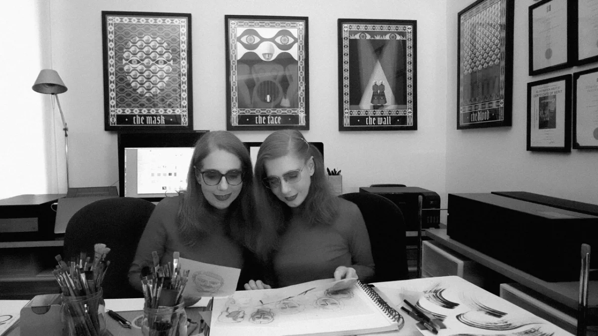
The Balbusso Twins’ return to Gilead shows how illustration can reshape a familiar story through composition, colour and visual callbacks. For Folio Society’s limited-edition box set of Margaret Atwood’s The Handmaid’s Tale and its sequel, The Testaments, the Milan-based duo have revisited their earlier images and built a new visual language for the later novel.
Anna and Elena Balbusso illustrated The Handmaid’s Tale for Folio Society in 2012. That edition earned them a gold medal from the Society of Illustrators. The new set retains those illustrations, adds a ninth plate to the first book and pairs them with a fresh group of images for The Testaments. Both books sit in a newly designed clamshell box. The edition is limited to 750 copies, each signed by the twins.
The return comes in a year that also marked the pair’s 25th anniversary. Their first solo exhibition in New York ran nine weeks longer than planned, and they became the first Italian artists to receive the Society of Illustrators’ Hamilton King Award.
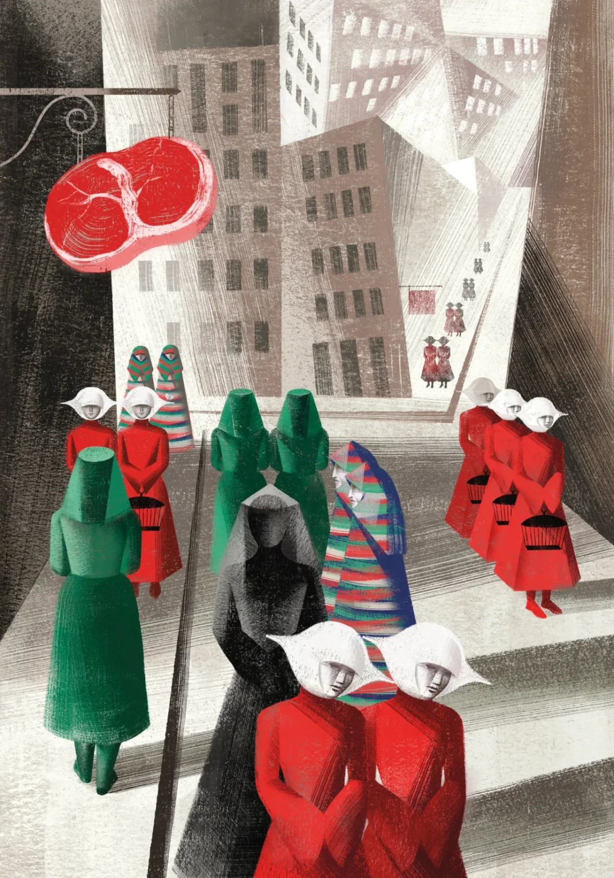
Building a world through scene choice
The twins describe making an illustrated book as similar to directing a film. They read the story closely, then choose scenes that carry the narrative and give them room to express an interpretation. The number and placement of images matter: each selection shapes what readers notice and how the story feels.
From there, they develop the world around those moments, considering character, setting, costume, set design, visual framing and colour as connected decisions. That approach makes the pictures more than a sequence of plot summaries. Their selection of scenes becomes an authored point of view, with the pacing of the book helping determine how that point of view unfolds.
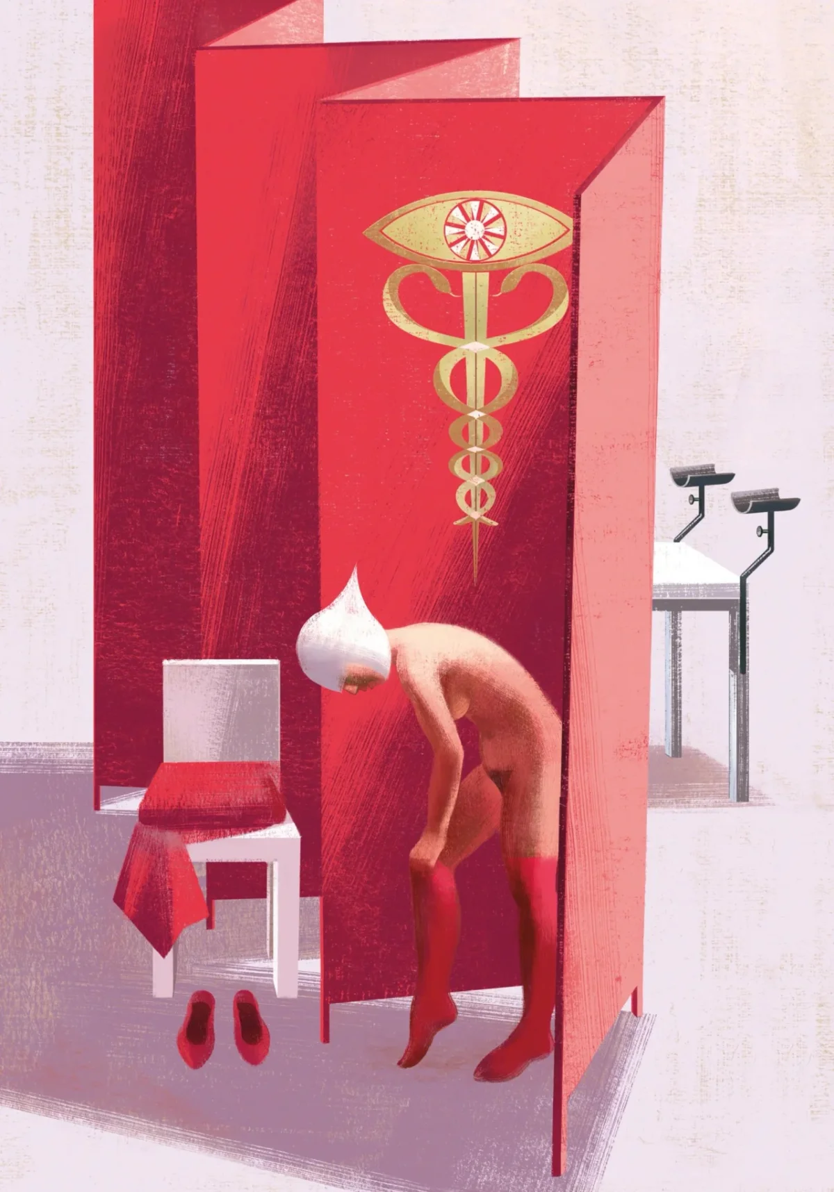
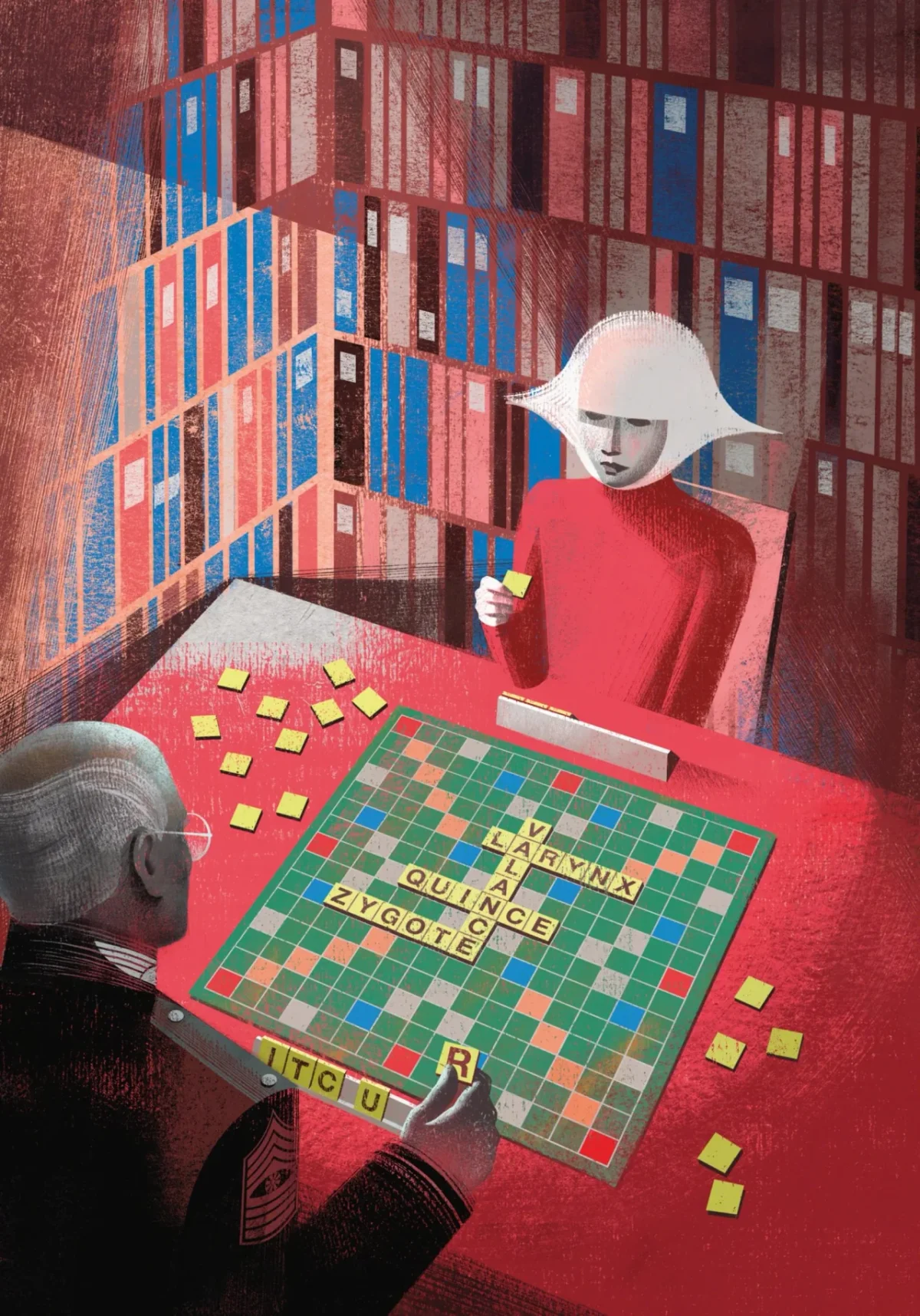
Architecture changed to sharpen the mood
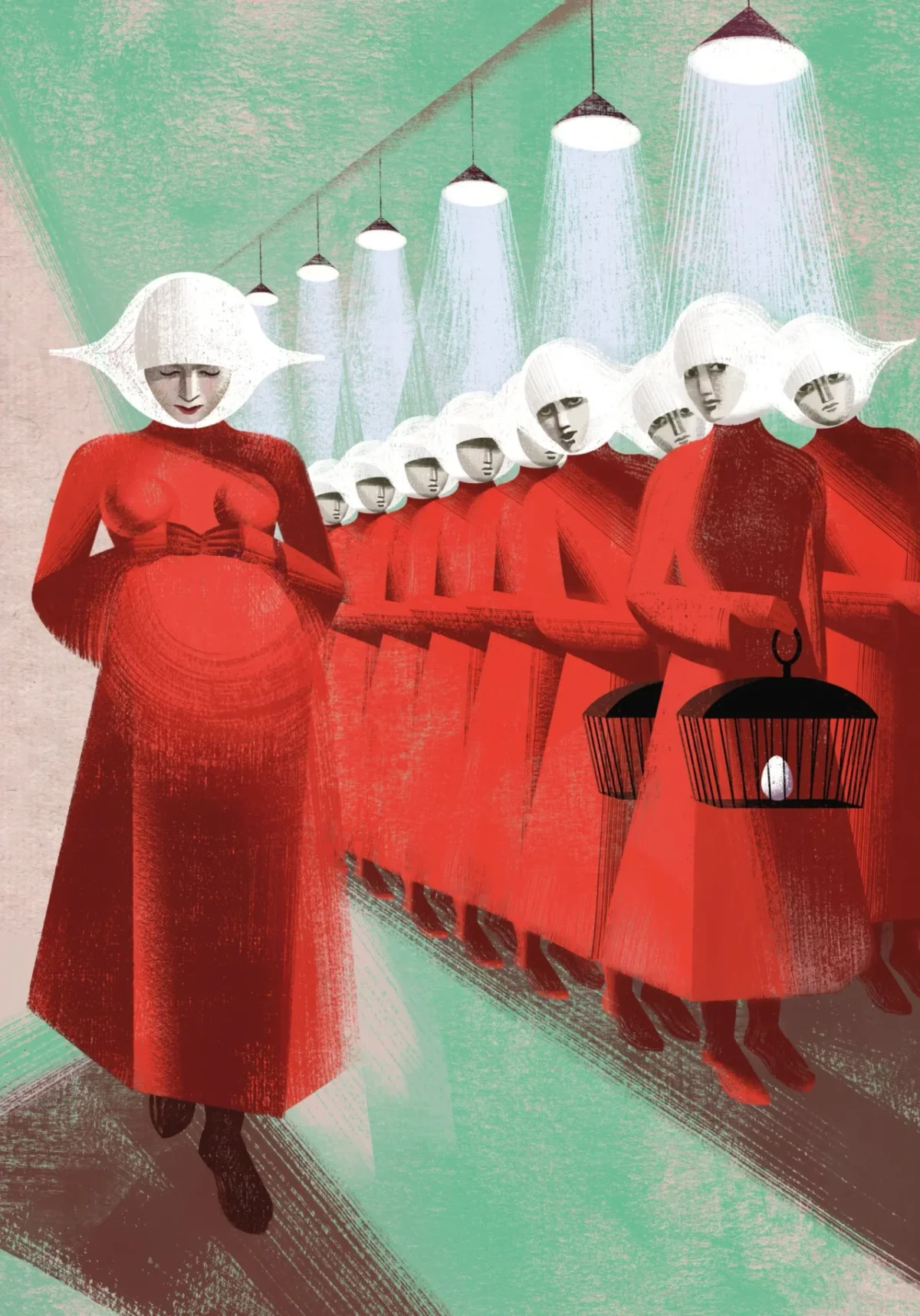
Atwood placed The Handmaid’s Tale among Georgian and Victorian architecture. The Balbussos chose a different visual reference: the hard geometry of Russian Constructivism and Italian Futurism. They say replacing the decorative architectural framework with straight lines and angles made Gilead’s oppression more forceful on the page.
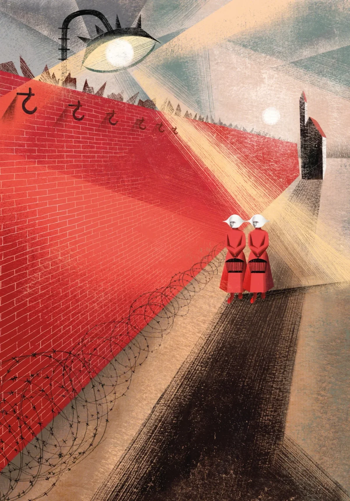
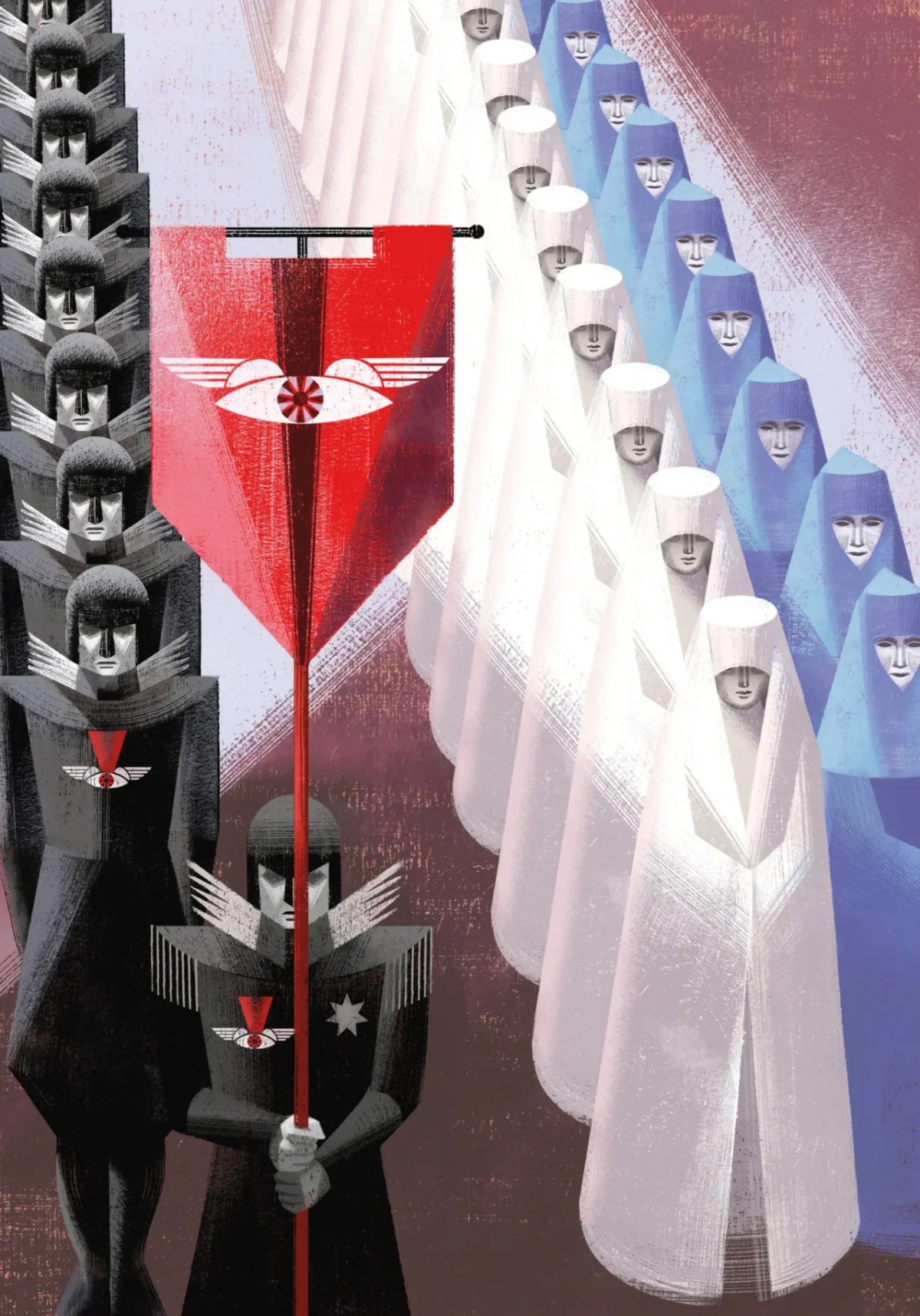
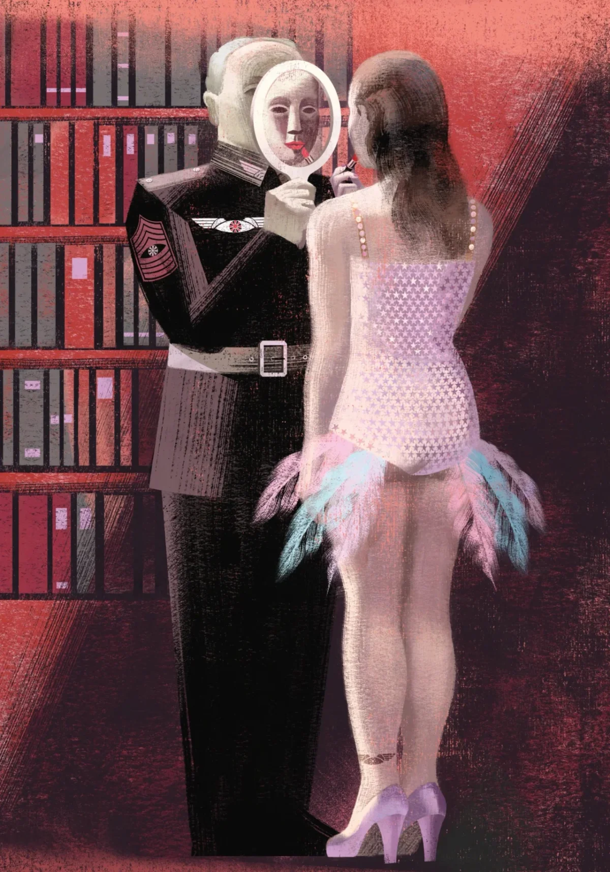
Their clearest departure from the text is the red wall where Gilead displays the bodies of its enemies. Atwood describes an old Harvard stone wall but gives it no red colour. The twins followed their own visual instinct, and the red image later appeared in the 2017 television series and in work by other artists. Their spare silhouette for the original cover also became a reference point for later covers, they say.
Research and a new nightmare palette
Their research begins with historical and art-historical sources. For the first book, references included Russian Constructivists such as Kazimir Malevich, Italian Futurists, Piero della Francesca’s volumes and light, and the grave presence of Novecento Italiano painters Felice Casorati and Mario Sironi.
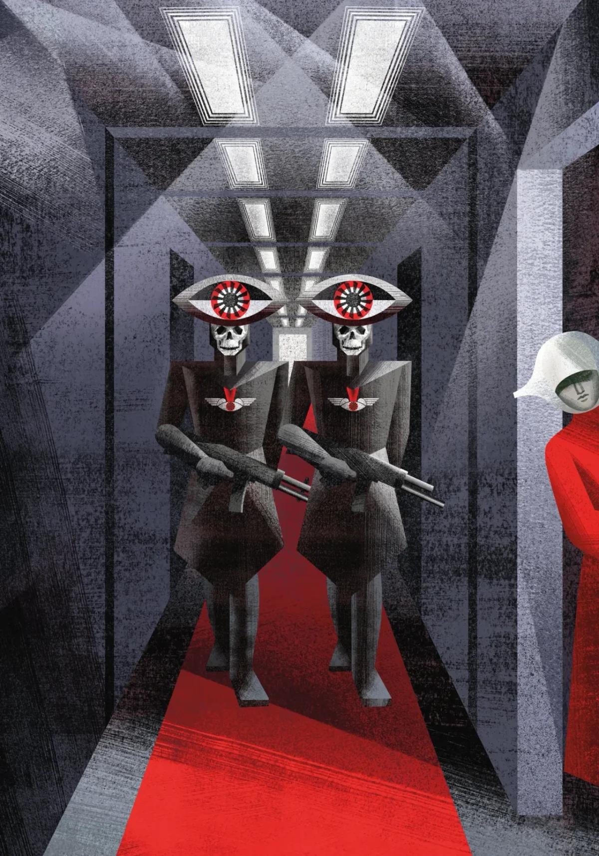
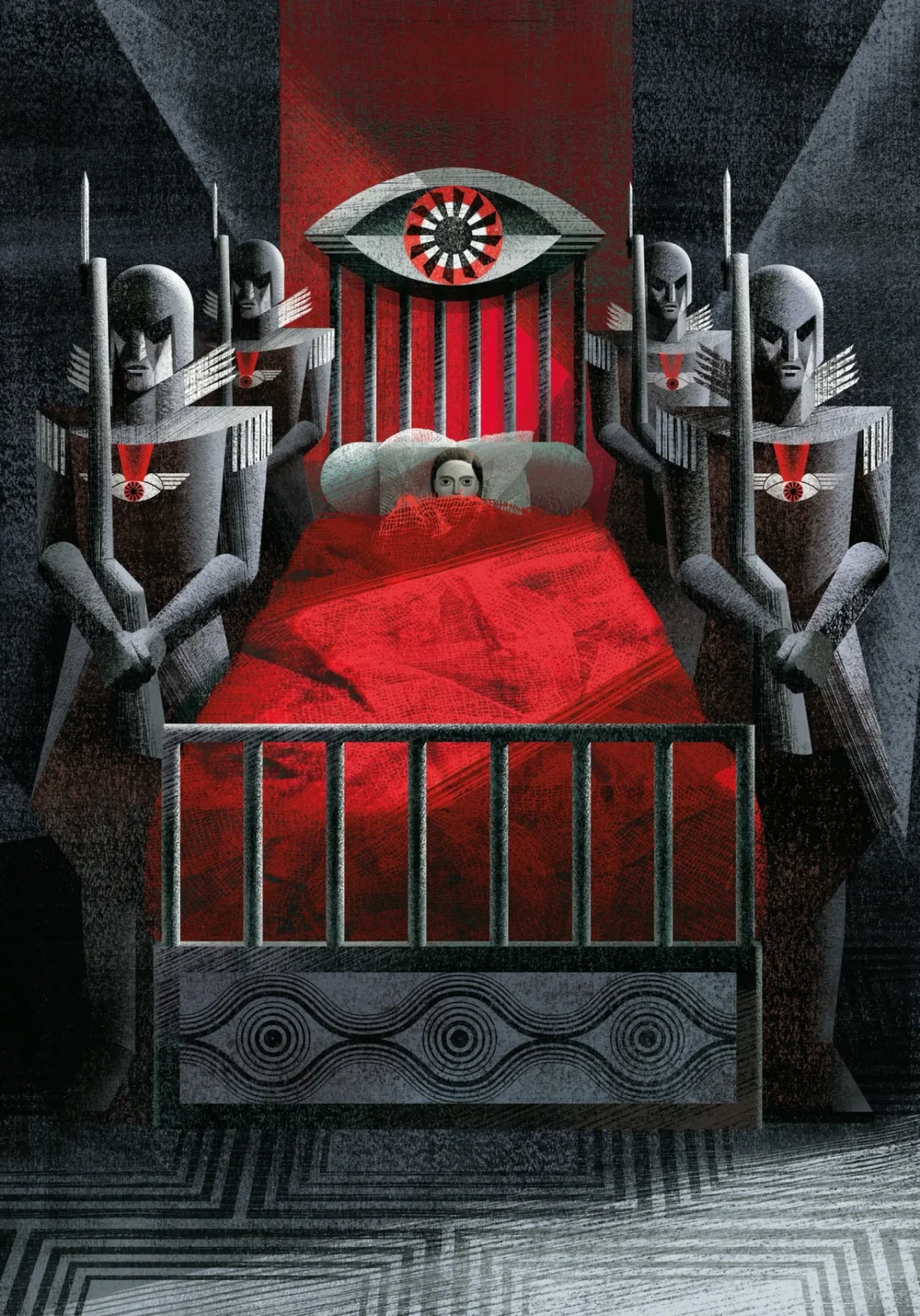
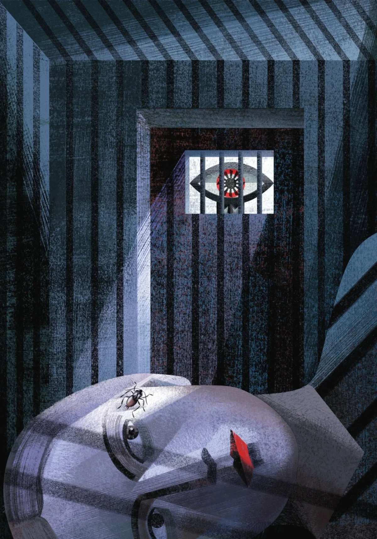
For The Testaments, they added Surrealism, which they describe as absent from the first book’s visual approach. Their guiding word for the new work was “Nightmare”: disembodied hands, skies full of eyes and guards whose headgear takes the shape of an enormous eye turn the book’s surveillance into strange, memorable forms.
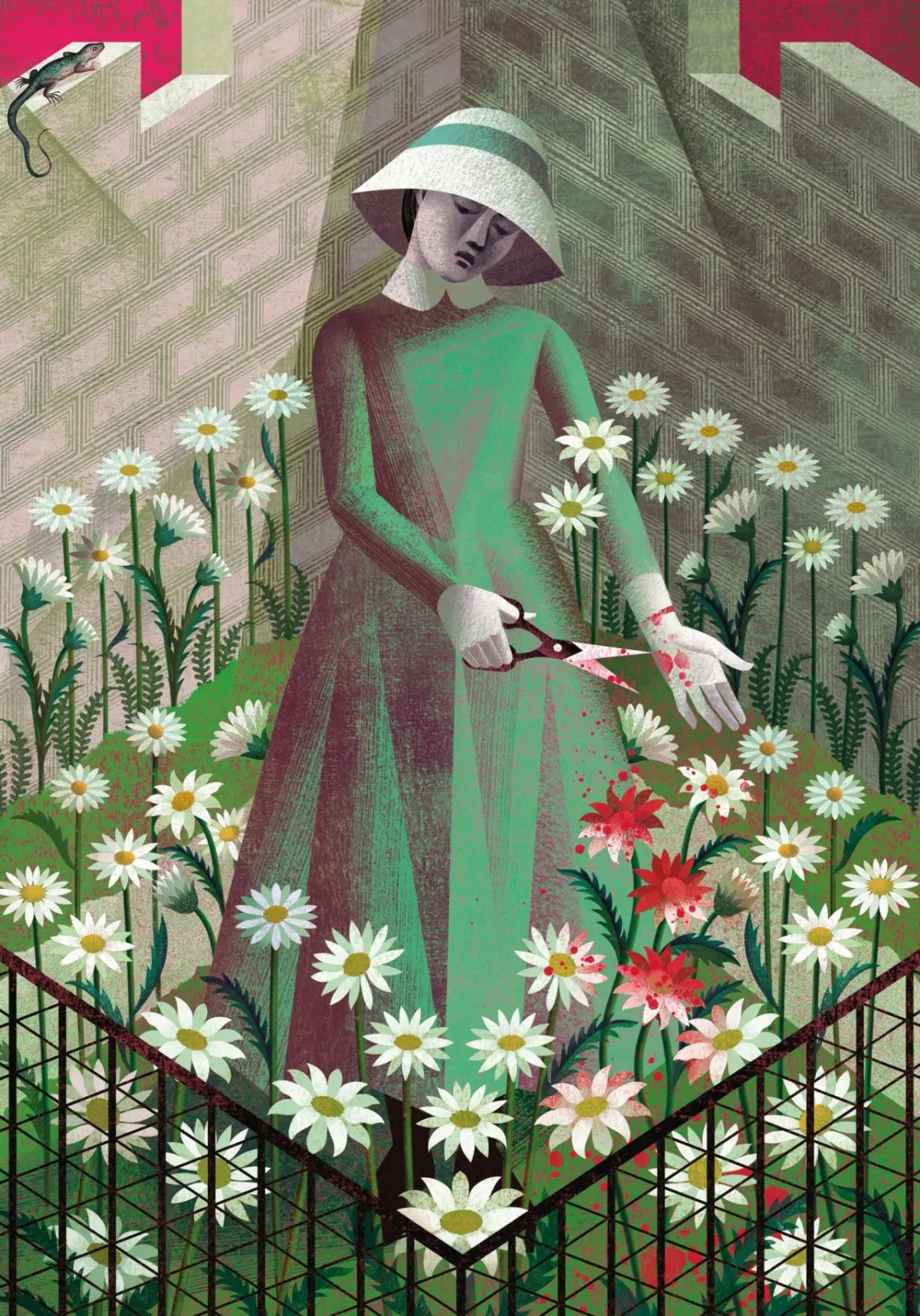
Colour keeps the two books in conversation. The first volume uses white, black, grey and red. The twins connect that restricted range to Gilead’s restriction of freedom of thought. In The Testaments, they assign green to girls approaching marriage, grey to Pearl Girls and pink to schoolchildren. Those colours also carry into the minimalist, Constructivist-inspired covers and slipcase, where green and grey sit against the first book’s red.
Handmade surfaces and visual callbacks
Their process combines pencil, pen, watercolour, gouache and tempera with work in Photoshop. They also spray acrylic onto paper, scan it and use the marks to make gradients with a fine grain. Textures and brushstrokes are made by hand, then scanned and layered; colour builds in stages to suggest the depth of a traditional fresco. The twins reject ready-made brushes and filters, describing the process as slow work grounded in care and patience.
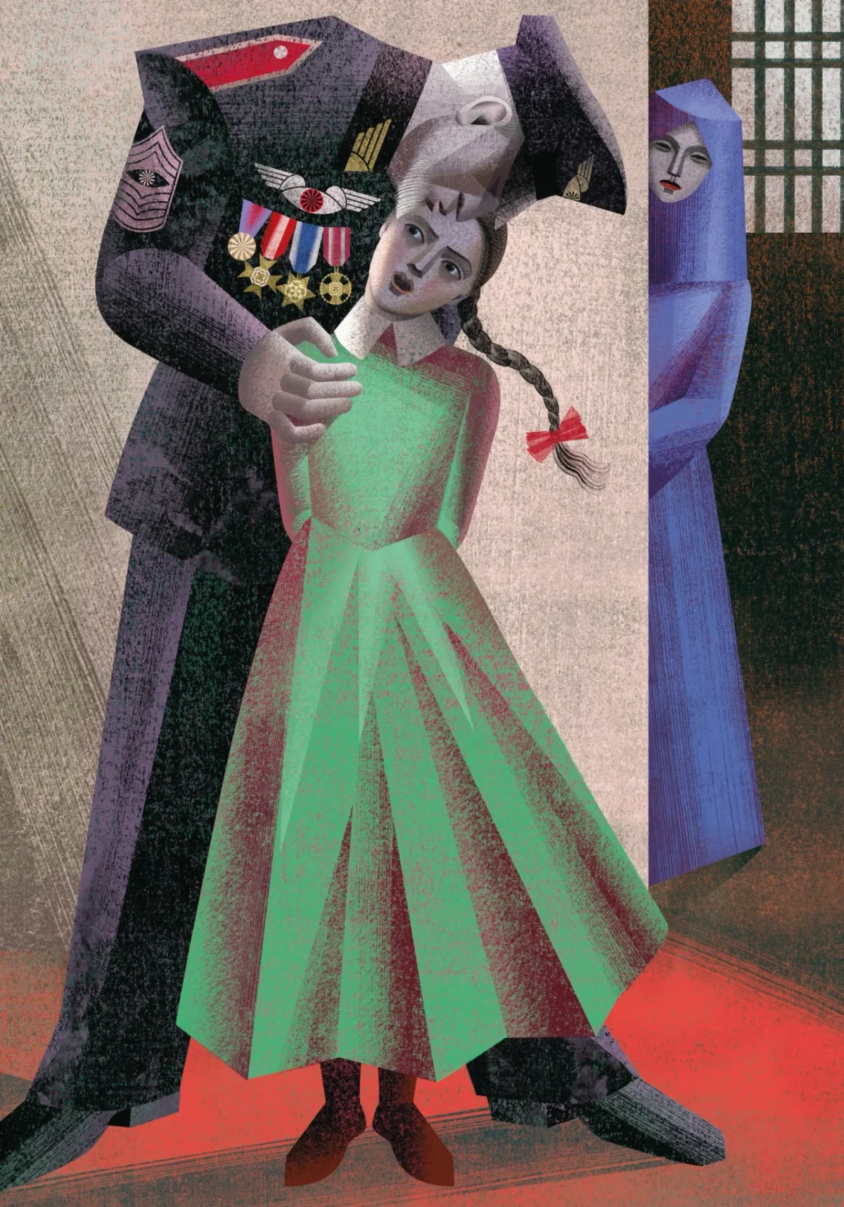
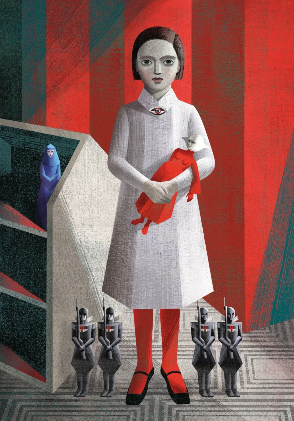
The new set also lets the artists echo their earlier work. In the frontispiece for The Testaments, young Agnes holds a doll of a pregnant handmaid, recalling the 2012 frontispiece, Pregnant. The twins describe the doll as a stand-in through which Agnes evokes her biological mother, Offred.
A new ninth image for The Handmaid’s Tale shows the Eyes coming to take Offred away. It answers the final plate in The Testaments, where the same guards meet an Aunt at night shortly before her arrest. The twins designed the images as a visual exchange between the books, giving the two-volume edition a frame.
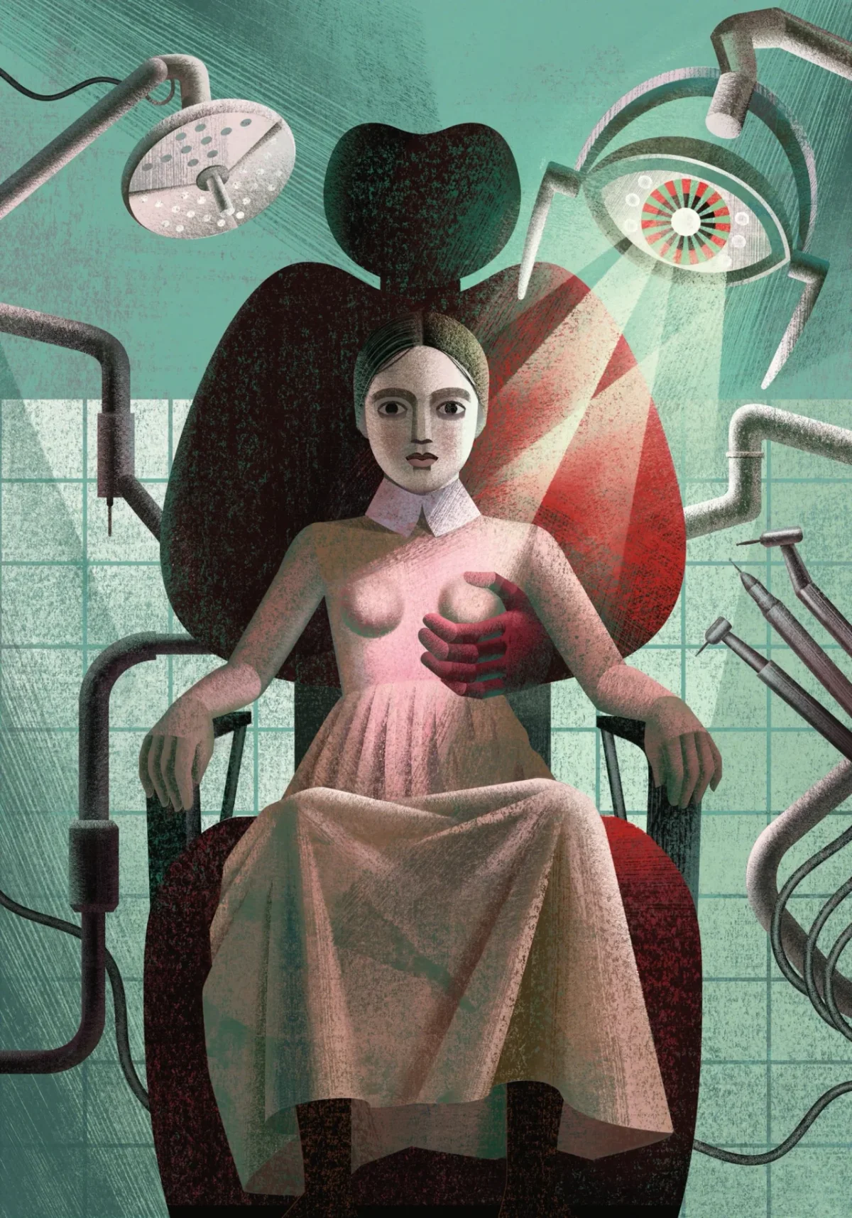
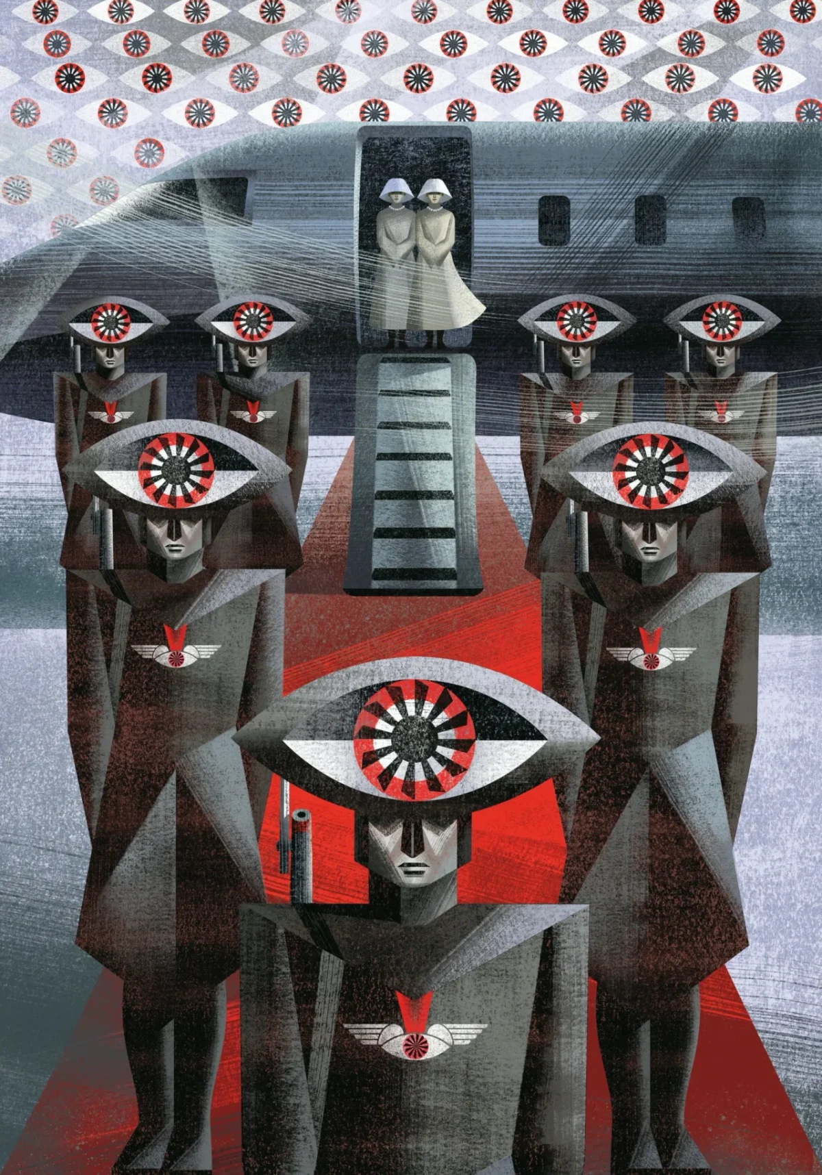
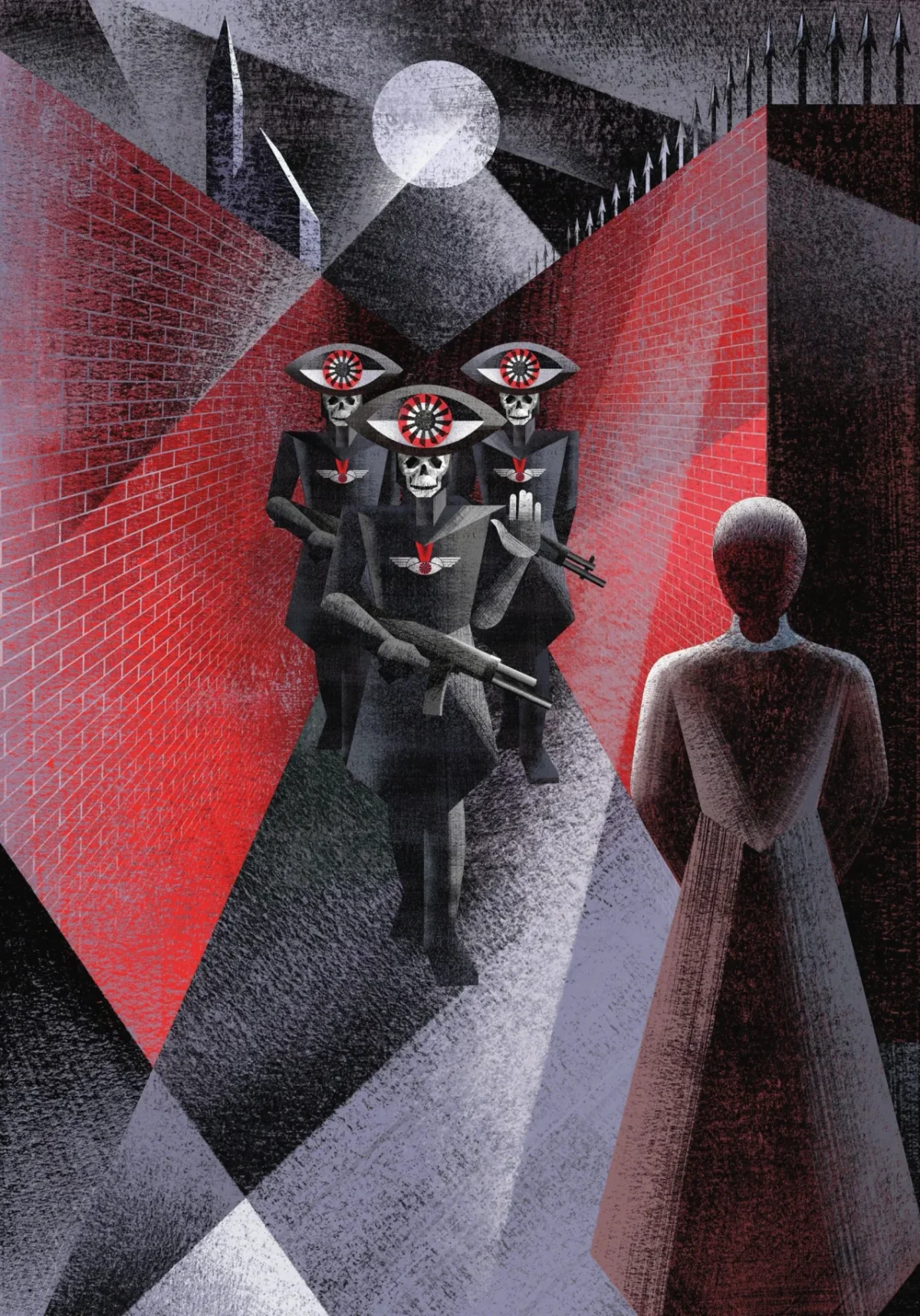
Atwood’s introduction praises the edition’s echoes of the look and colours of the 1930s and 1940s, when major dictatorships rose. The books were printed by Venice’s oldest book printer, then taken by gondola to Graphicom for leather binding. British writer Naomi Alderman, author of The Power, wrote the foreword.
For the Balbussos, the project also makes a case for range: they say they take on literary texts without being confined to genres labelled “female.” Their method makes that claim concrete. Each book’s images start with close reading, but the final world belongs to the artists’ research, materials and decisions about what a reader should see.