Monday, November 9, 2026 · Graphic Design
Chris Coombes Repaints Museum Postcards as Small Gouache Originals
Noted by Dom Carter · 603 reads
Chris Coombes turns familiar art postcards into A6 paintings, tracing how an artwork shifts between original, reproduction and handmade copy.
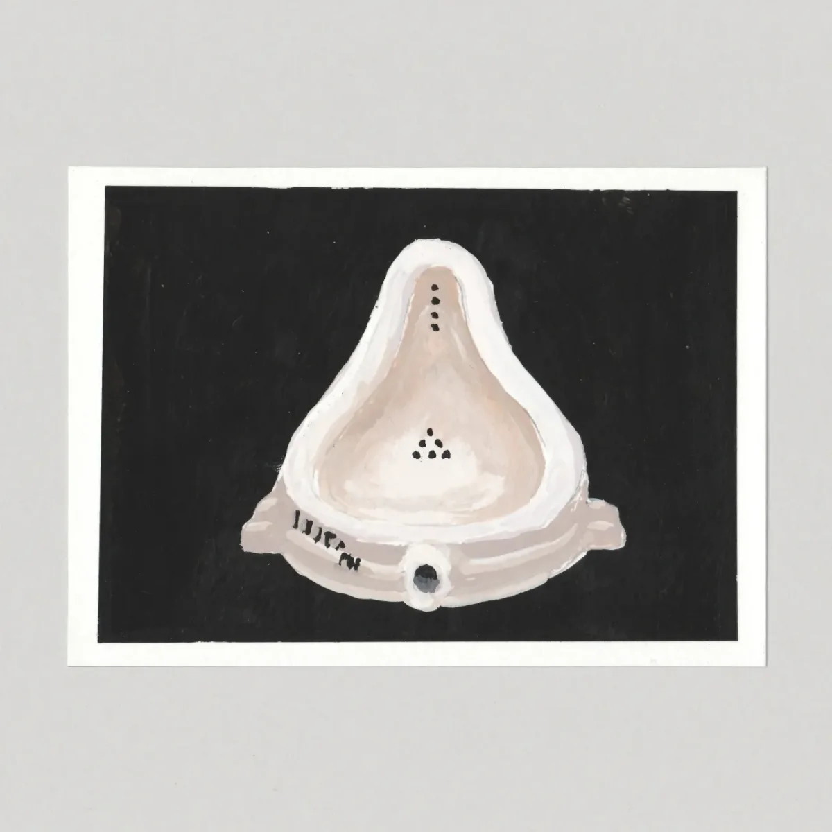
Chris Coombes’s Museum Postcards makes a familiar souvenir do double duty: each A6 gouache painting recalls a printed image while asking what changes when that image is made by hand again. The London-based artist keeps the postcard’s modest scale and framing, but replaces its mass-produced surface with a new original.
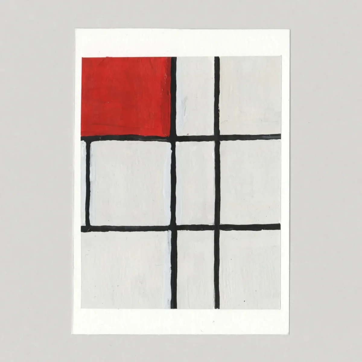
The series brings paintings and objects by artists including Gerhard Richter, Marcel Duchamp and Andy Warhol into the postcard format. Coombes doesn’t enlarge them into gallery-sized studies or redesign their compositions. Instead, he works within the proportions and margins of the cards that prompted each piece. That constraint makes the small format part of the idea: the paintings retain the look of souvenirs even as their handmade surfaces distinguish them from the reproductions.
Chris Coombes developed the project from Modern Britain, his artist-run online store, which grew partly out of his experience working at Tate. He describes Modern Britain as a museum shop for a museum that doesn’t exist. Earlier releases included tea towels with an English church-village aesthetic; Museum Postcards takes the familiar museum-shop object as its subject and starting point.
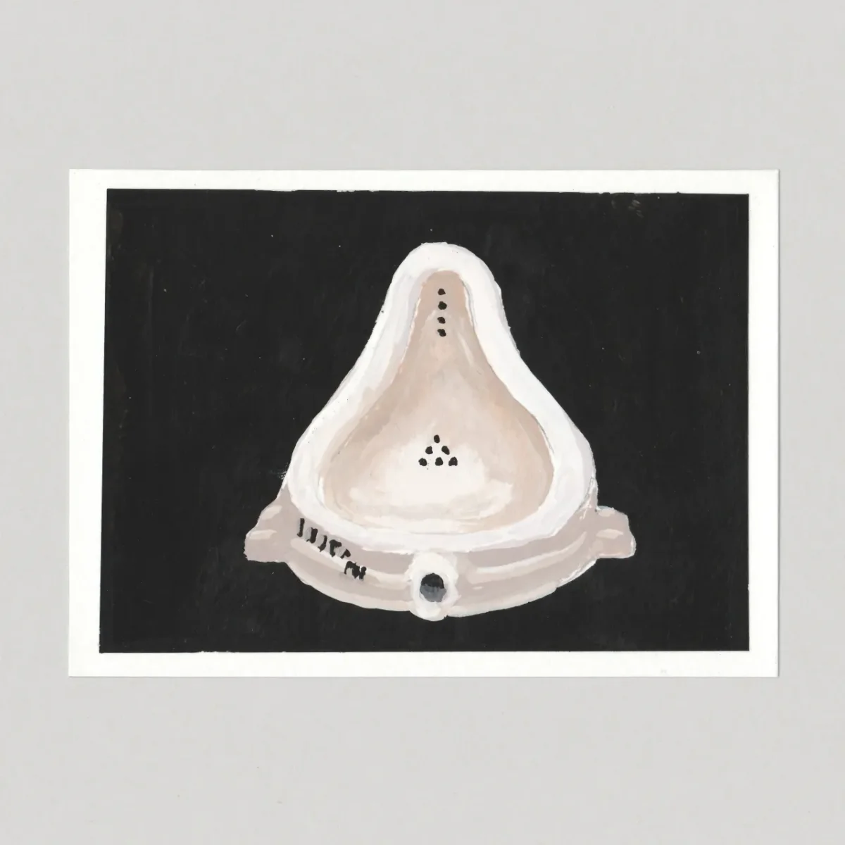
A reproduction becomes a painting again
Coombes began by thinking about how postcard images are selected and produced. Making the cards himself gave him control over that process, but it also raised a practical question: would anyone want these handmade versions? He chose images that would be recognisable as postcards, drawing on reproductions of artworks people might already know.
The object’s design matters as much as the image. Coombes points to the paper stock, printing, captions and credits as decisions that shape how an artwork appears before a visitor buys the card. These details may sit in the background, yet they help establish the card as a designed object with its own material character.
His process adds another link to the chain. An artwork enters a collection, is photographed and printed, and reaches the museum shop as a postcard. Coombes buys a card, photographs it, then uses that photograph as the basis for a painting. He photographs and scans the finished gouache for its online presentation, where it may find a home of its own. The route loops from original to reproduction and back to an original made by a different hand.
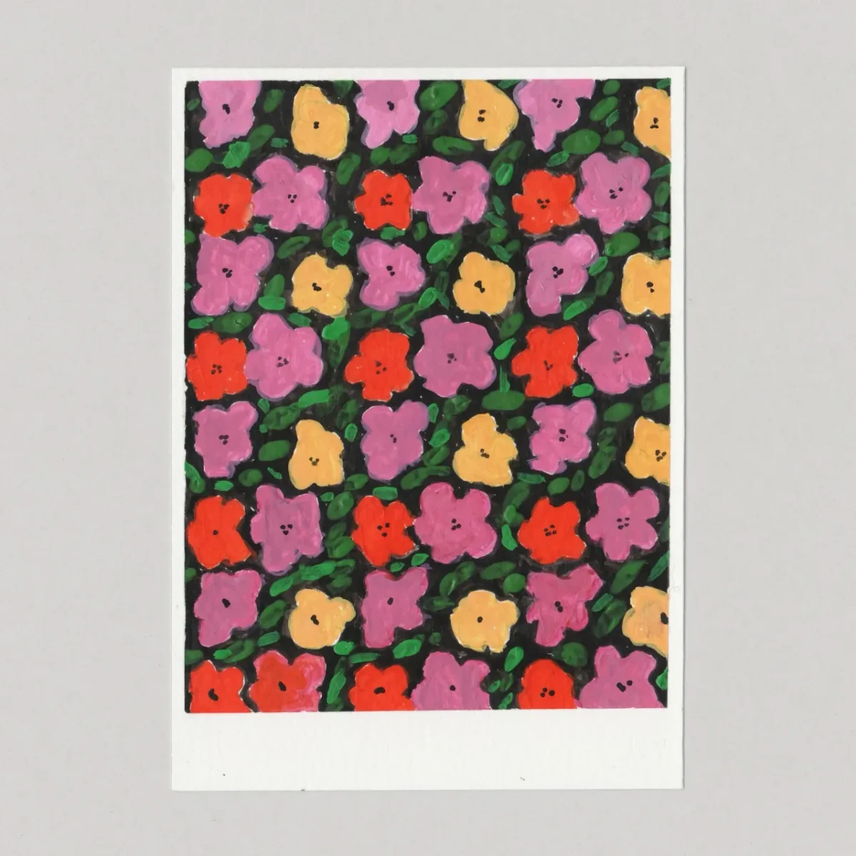
Painting to the card’s proportions
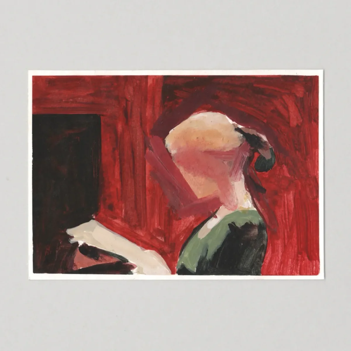
Keeping the postcard’s scale brings a close, hands-on workflow. Coombes photographs each card, then uses a camera lucida app on his phone to help draw its image onto watercolour paper cut to A6. He tapes the paper to a board and masks the white margins to match those on the postcard. After painting, he applies two coats of varnish to protect the gouache, then scans the piece for its online listing.
That sequence links the finished image to both the source card and the practical requirements of making and presenting a small painting. The taped paper and masked edges help preserve the postcard’s proportions; the scan lets the physical work appear online. Each step carries the format forward, while the brushwork introduces differences that a printed reproduction would not have.
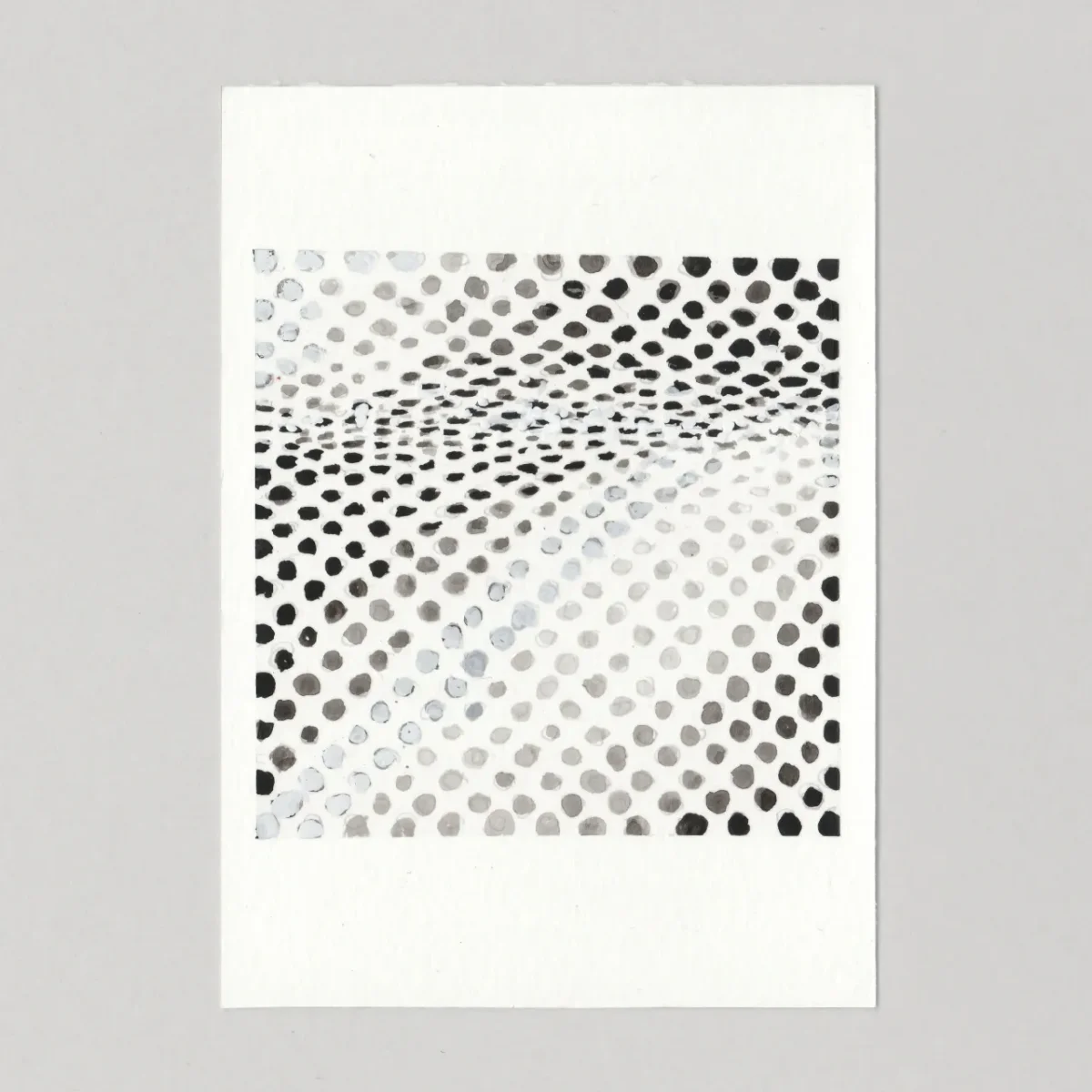
Bridget Riley’s Hesitate tested the limits of that approach. Its dots shift in tone and shape across the composition, and Coombes found the pattern especially difficult to reproduce. He eventually accepted that he had taken the painting as far as he could. The challenge came from translating an image that appears mechanically made through a manual process. In that mismatch, the series’ central tension becomes visible: a hand-painted copy can follow a printed image closely, but it cannot become the same kind of object.
Beyond familiar gallery images
Coombes first turned to recognisable works associated with Tate, including Henri Matisse’s The Snail and Salvador Dalí’s Lobster Telephone. The selection has since widened. A Richter postcard came from the Whitechapel Gallery shop, showing that the source images don’t need to belong to a collection in the UK. Coombes has also mentioned National Gallery examples and images from the Imperial War Museum as possible subjects, extending the project beyond paintings.
That expansion gives the series room to examine how different kinds of images travel through museum shops and into private homes. The postcard acts as a compact record of that journey, while the painting makes its material stages easier to notice: printed paper, a photographed reference, gouache on watercolour paper, and a scanned image offered online.
For designers and artists, the project’s useful prompt is to look closely at objects that seem too ordinary to deserve attention. Coombes builds a body of work from a souvenir’s size, paper, margins and production history. The paintings don’t erase the postcard’s identity; they make its format and circulation part of the subject. See the full series at the Museum Postcards website.