Tuesday, November 17, 2026 · Graphic Design
Everleaf’s Reworked Aperitif Packaging Uses Cyanotype Plants and Embossed Glass
Noted by Tom May · 520 reads
Love’s redesign pairs sun-made botanical prints with tactile, lighter recycled-glass bottles to help Everleaf stand out at home and behind the bar.
Everleaf’s packaging refresh makes its connection to plants tangible: botanical silhouettes begin with real leaves exposed to sunlight, while embossed glass gives the bottle a texture people can feel. Manchester and New York agency Love developed the new identity for the non-alcoholic aperitif brand as it looked to build on its presence in bars and restaurants and reach more shoppers.
Everleaf was founded by conservation biologist and bartender Paul Mathew. The brief called for packaging that could express the drinks’ premium positioning and relationship with nature while making the brand more distinctive for consumers. Love chose to develop the existing visual world rather than replace it, bringing the botanical cues into the bottle, labels and cartons.
Glass that signals the brand by touch
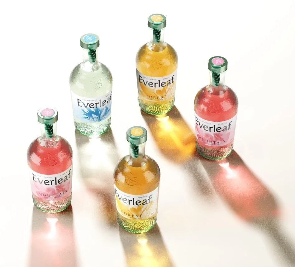
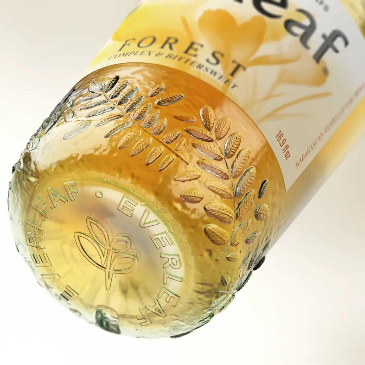
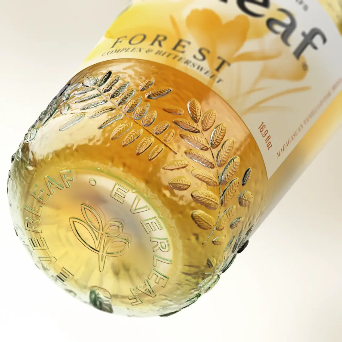
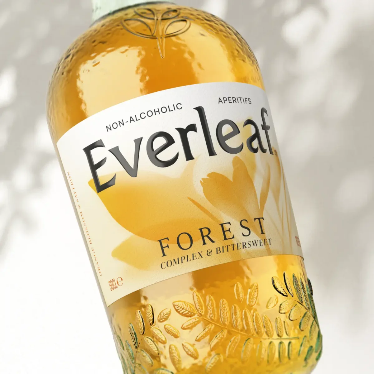
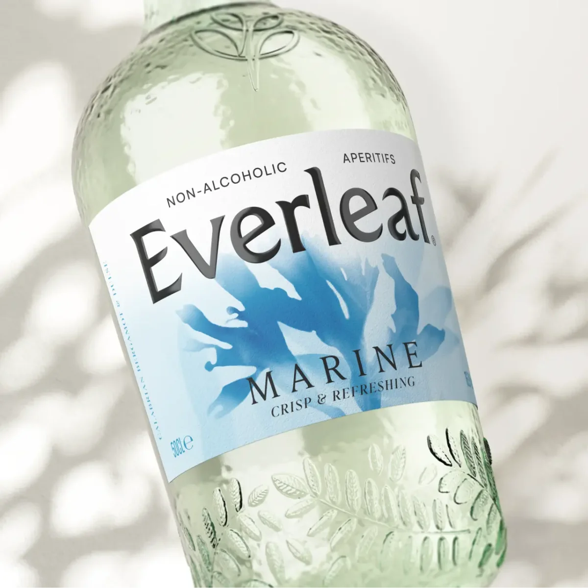
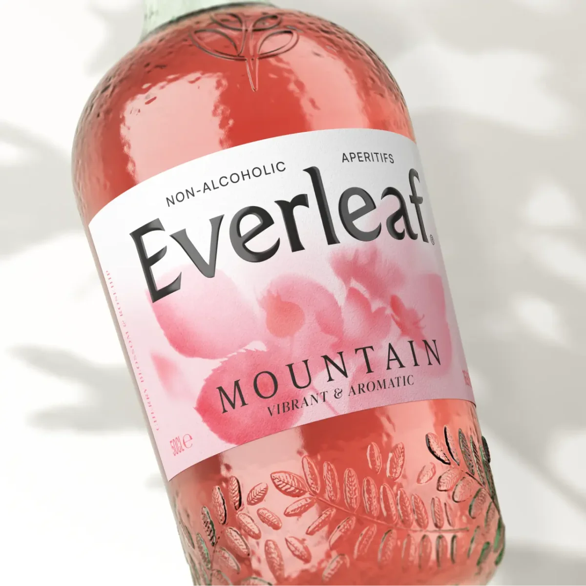
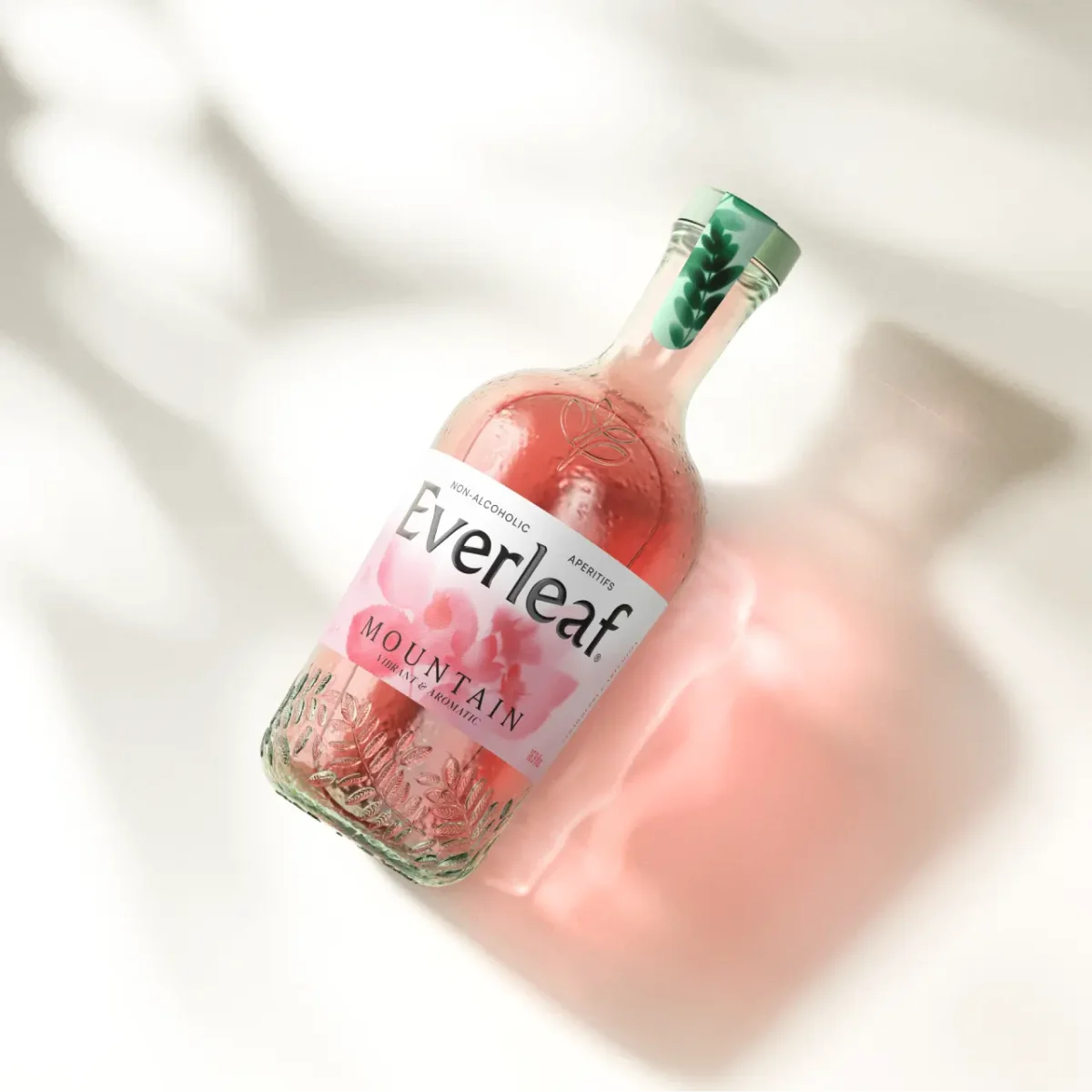
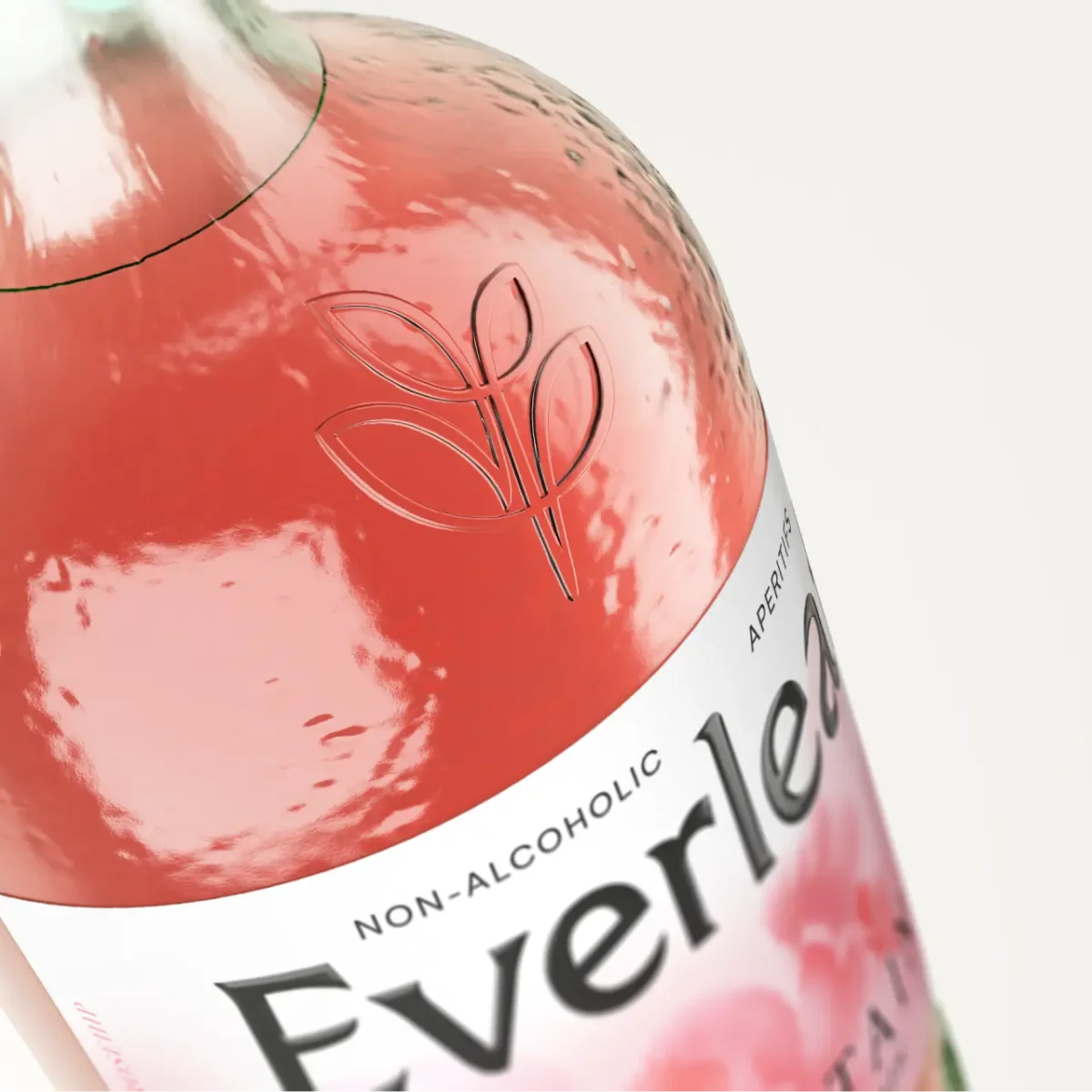
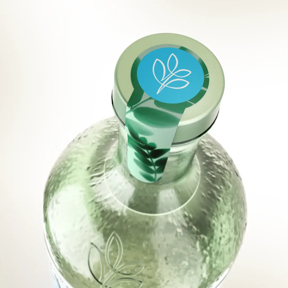
The redesigned bottle has a softer, more curved silhouette, with embossed acacia leaves running around its base. A subtle neck texture and a leaf mark moulded into the glass at the shoulder extend the botanical identity beyond the printed label. These details also give the bottle a more tactile presence in the hand and on a shelf.
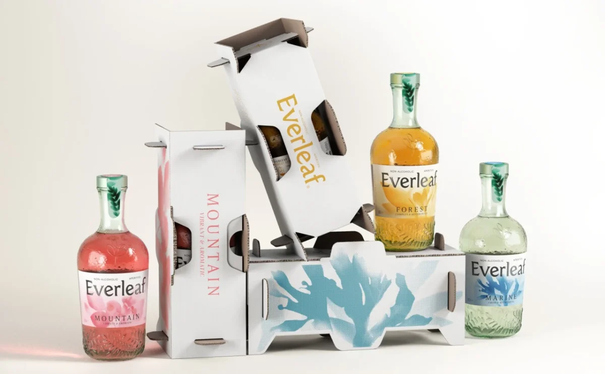
Practical changes sit alongside the visual ones. The neck is longer and easier to grip, a detail intended to help bartenders handle the bottle. Colour coding makes the three varieties quicker to distinguish: blue for Marine, orange for Forest and pink for Mountain. The label colours are echoed by a coloured disc on each cap, so the distinction remains visible at the top of the bottle too.
Real plants become printed artwork
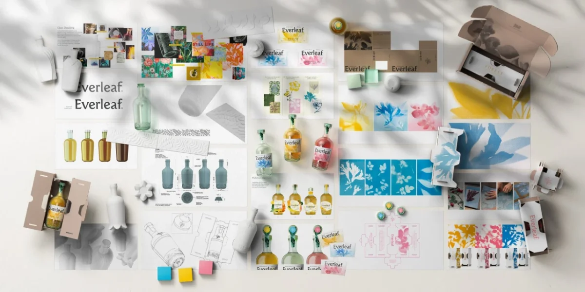
Love made the new botanical imagery in-house using cyanotype, a photographic process that dates to the 1840s. The designers placed real plants on light-sensitive paper and left them in sunlight to create silhouettes. They then scanned and refined the resulting prints for use across the packaging.
That process gives the artwork a visual character between a botanical specimen and a pressed flower. Soft-edged plant shapes sit in washes of colour behind the refreshed wordmark, giving each label its own composition while keeping the range visually connected. The plant pairings are specific to each flavour: saffron and orchid leaves for Forest, rosehip and cherry blossom for Mountain, and seaweed and olive branch for Marine.
A system for cartons and shipping boxes
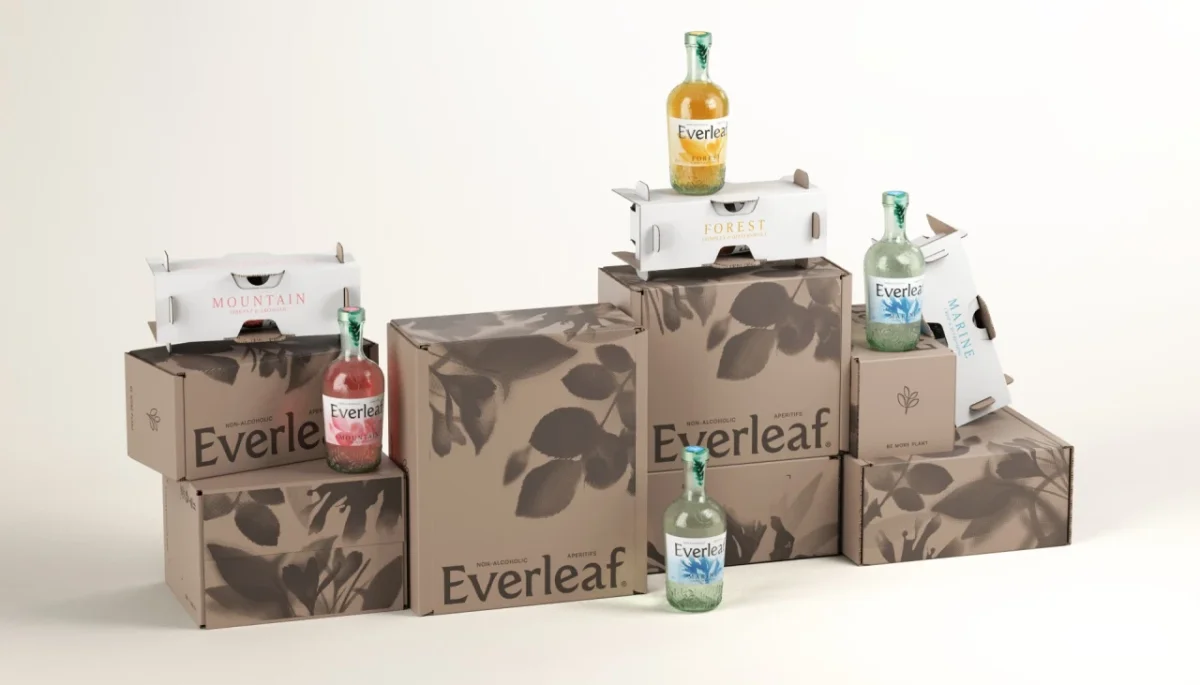
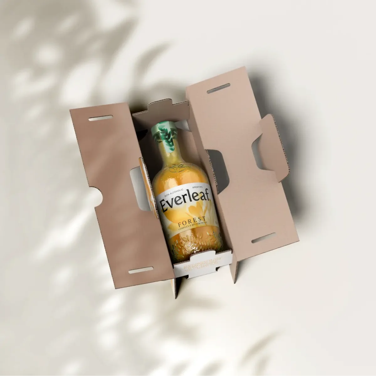
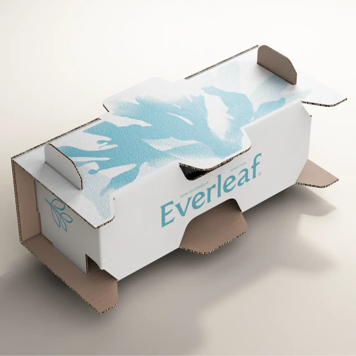
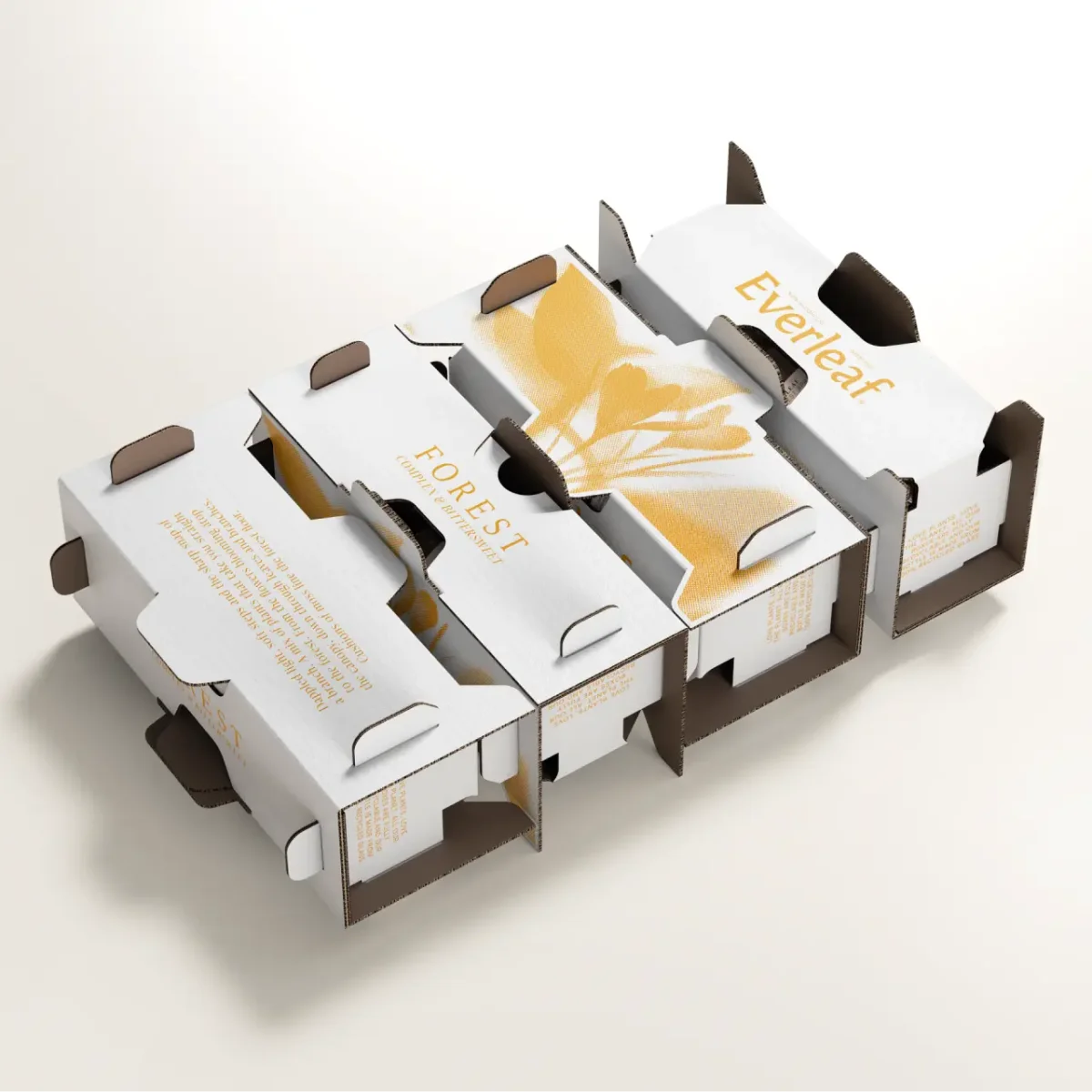
The visual language carries through to the cartons and delivery packaging. Single-bottle cartons use white board, with the cyanotype artwork reproduced as a halftone in the corresponding flavour colour. Evocative copy adds a verbal cue to the plant imagery; Mountain’s carton, for example, describes “Blossom, sharp air and anticipation brought in on the breeze.”
Shipping boxes use kraft-brown cardboard printed in one dark colour. Foliage silhouettes spread across the surfaces, and a QR code sits inside the lid. The limited palette and low ink coverage give the set a restrained finish, while the consistent plant imagery links the outer box to the bottle a customer eventually handles.
Sustainability was part of the brief, and Love’s in-house sustainability manager worked with the structural, design and illustration teams. The new bottle weighs 385g, down from 500g for its predecessor, a reduction of 23%. It is made from 100% post-consumer recycled glass. Labels continue to use wood-free stock made from 100% recycled pulp, while the secondary and tertiary packaging uses recyclable cardboard and single-colour, low-ink printing.
Designed to work across bar and retail
Mathew says the refresh is intended to maintain Everleaf’s position in bars while supporting expansion into shops and building brand affinity with new consumers. He describes the repositioning and bottle as a way to reinforce the brand’s luxury positioning and connect drinks with the natural world through aroma, flavour and texture.
For Love senior design director Nick Johnson, the challenge was to make the natural identity work harder without losing what was already there. The plants and sunlight shaped the printed artwork; the moulded glass carries that idea into the hand; and clearer colour coding helps identify each variety quickly. It’s a coordinated set of choices, with tactile detail serving both the brand story and the bottle’s use behind a bar.
The packaging is rolling out across bars and restaurants, Everleaf’s own website, Ocado and Majestic. As the brand reaches more home settings, the test for this design system will be whether its details stay legible at shelf distance while rewarding a closer look in the hand.