Tuesday, November 10, 2026 · Graphic Design
Sitting Wren's Book Burners Wanted Campaign Turns Matchboxes Into Conversation Pieces
Noted by Dom Carter · 852 reads
Sitting Wren's Book Burners Wanted campaign pairs matchboxes, vintage illustration and a provocative double meaning to draw readers into its novels.
Most publishers would hesitate before putting the words "burn the books" on a billboard. Sitting Wren did it anyway, and the reason tells you a lot about how a small house can make a modest budget work harder than a big one.
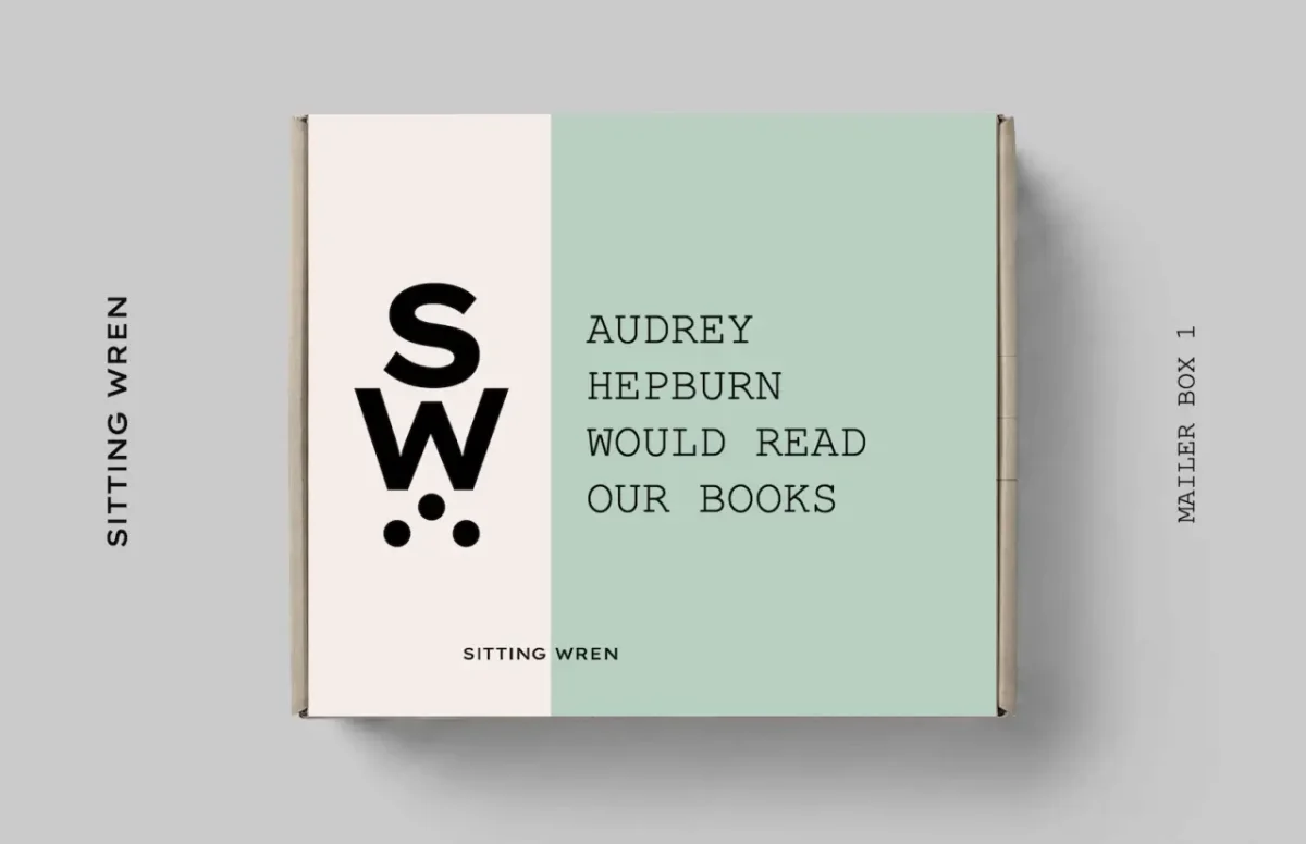
The publisher, which specialises in new novels set in vintage eras, relies on creative director and author Ryan Hewlett to turn small ideas into loud ones. Its latest push, Book Burners Wanted, is built around an object most people already know well: the book of matches. The campaign leans on that familiar shape and the faint thrill of anything that might catch fire.
A promo that people keep
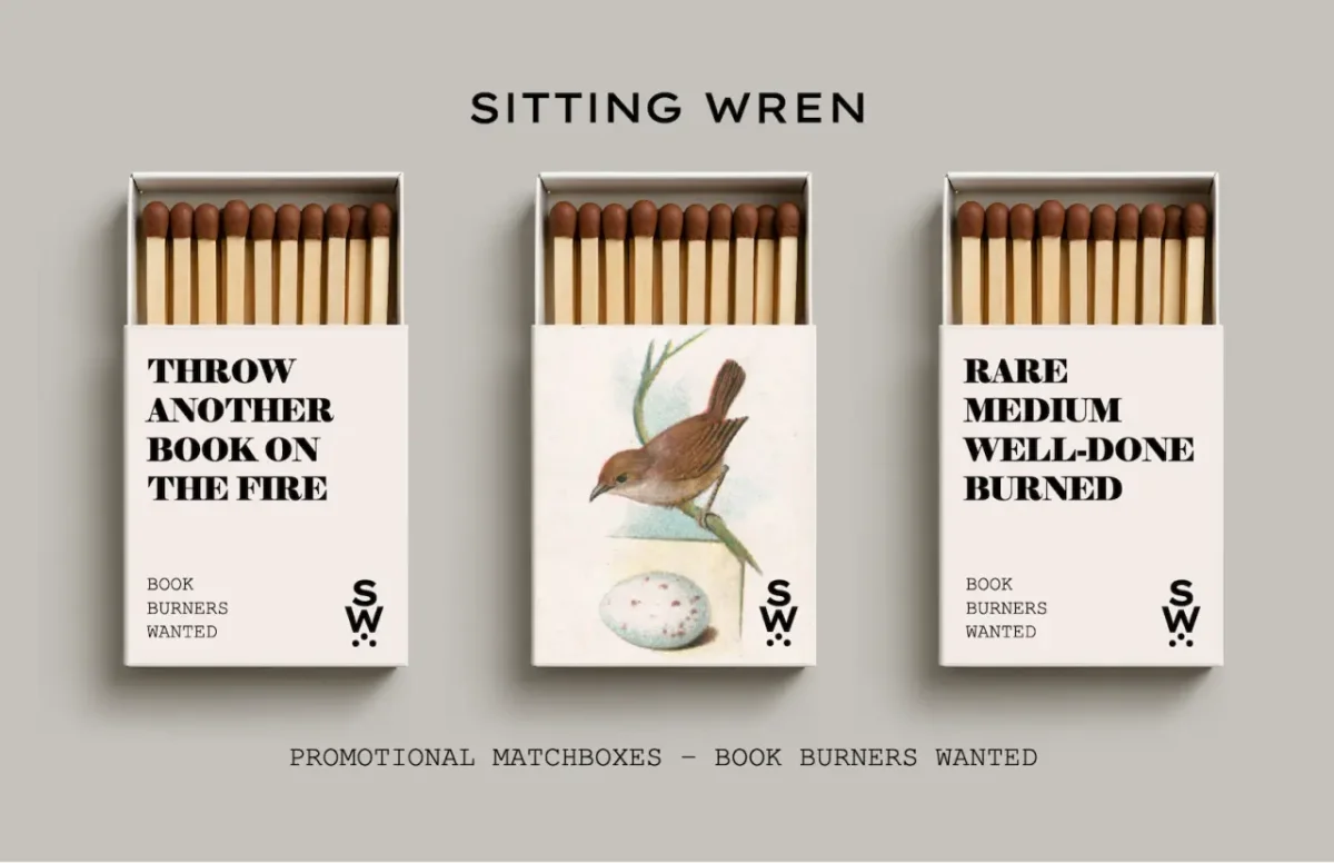
Ryan's brief was simple to state and harder to execute. He wanted something physical that people would hang on to rather than drop in the recycling. Promotional giveaways tend to end up in the bin within a day, so the team aimed for an item that looks good on a shelf or a coffee table and invites a question from a visitor.
"The goal was to create something physical, tangible, and highly collectable," Ryan says. "Too many promos go straight into the trash. These matchboxes can sit comfortably on a shelf or a coffee table as decorative conversation pieces that get people talking about the brand."
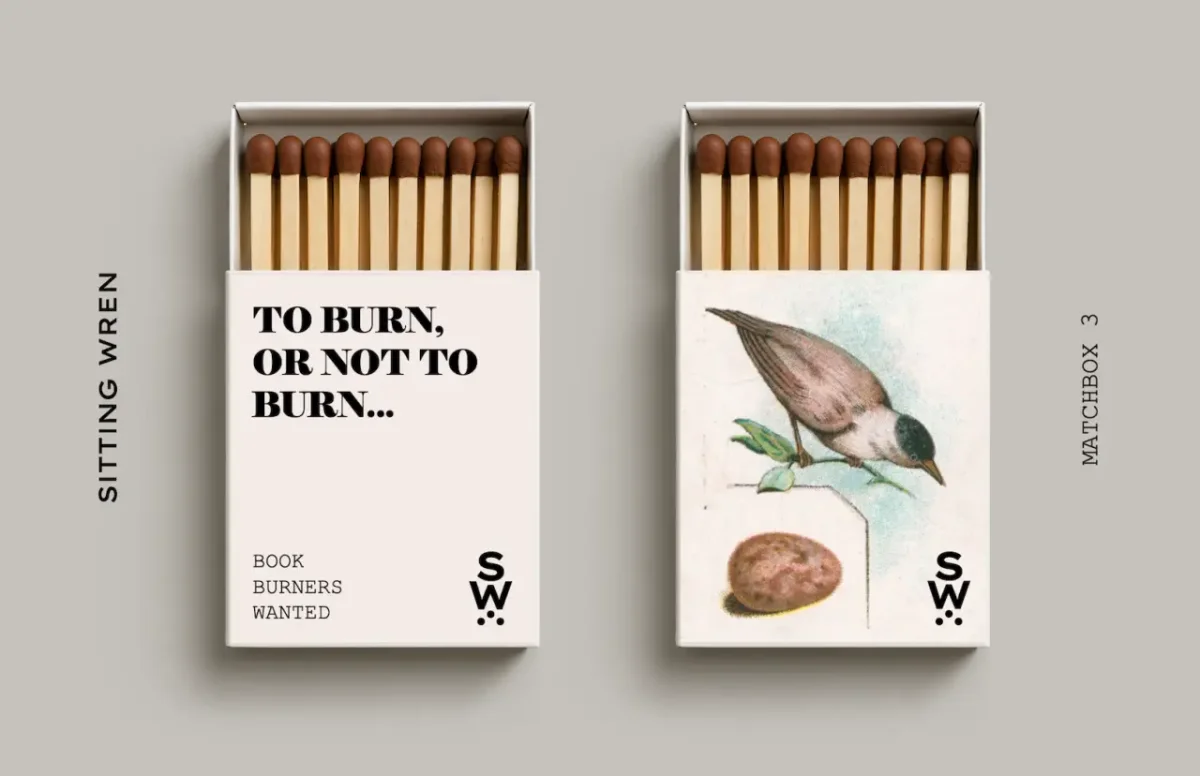
There's a second layer that makes the object more than a novelty. Ryan points out that the boxes are proportionally the same as a book, so each one works as a miniature stand-in for the product. That's a smart piece of thinking. A matchbox is small enough to pocket, but its size and shape still say "book" to anyone who looks twice.
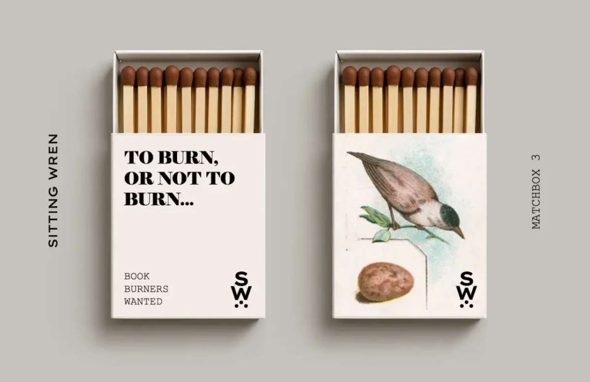
The matchboxes also reflect the campaign's sense of humour. The copy on the sleeves plays with the idea of disposing of books in ways that are obviously silly, and the joke lands because the packaging is so carefully made. A bird illustration sits on the centre box of the set, giving the group a clear focal point when they're laid out together.
The double meaning in "burn"
On paper, a publisher asking people to burn books looks like a misstep. Book burning carries heavy associations with censorship and oppression, so the tagline is deliberately uncomfortable. Ryan's argument is that the discomfort is the point. If you want to know who truly cares about a thing, you ask what happens when someone threatens to take it away.
"A call to 'burn the books' is really a call to see who cares about them the most," he says. "It is also a play on words, referencing another meaning of 'burning' a book: the slow, etching process of burning a good story into your mind, one chapter at a time, whenever you find a book that feels like it was written just for you."
That reading works on two levels, and I think the second one does most of the heavy lifting. Anyone who has ever stayed up past midnight with a novel knows the feeling Ryan describes. The phrase gets a reader to laugh at the first meaning and then, a beat later, to recognise the second.
Ryan also acknowledges the cultural reference underneath. He says the idea draws on the familiar image of book burning popularised by novels such as Fahrenheit 451, which he expects many readers of classic literature will recognise straight away. Borrowing a reference that well-read people already carry is a useful shortcut. It means the joke doesn't need a long explanation, and it rewards the audience the campaign is most likely to reach.
Birds, nostalgia and the vintage look
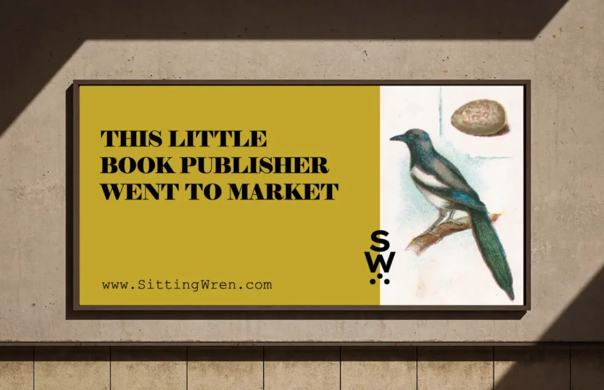
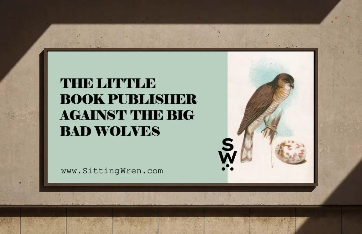
The billboards show how the wider brand holds together. Birds run through the whole identity, and they do a lot of work. The billboards position a small publisher as a little bird facing down bigger rivals, a David-and-Goliath framing that fits a house this size. Ryan sees birds as a strong natural symbol, and the illustrations' soft, charming style brings an emotional pull of nostalgia and connection.
The illustration style is deliberate too. Ryan says the vintage approach is meant to pull viewers back into an earlier period, one he associates with elegance and sophistication. He points to the Edwardian era, the Gilded Age and the Mid-Century Modern period as moments when design was not only attractive but carefully made, with a level of attention to detail he feels is rare now.
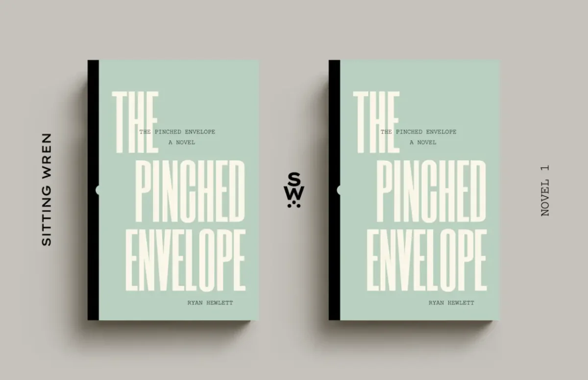
That matters for a publisher whose books are set in those same eras. The covers, the illustrations and the novels reinforce one another, so a reader who picks up a matchbox and then a book gets a consistent tone from start to finish. The cover of The Pinched Envelope, shown in mint green with black spines, sits comfortably in that palette.
What designers can take from it
The most transferable idea here is the matchbox itself. Small publishers and studios often assume collectable merchandise is out of reach, but this campaign shows that a format with a clear everyday function can carry a brand further than a flyer. If you're planning a giveaway, ask whether people will keep it, display it or explain it to someone else. If the answer is no, the object probably needs a different job.
The copy strategy is worth studying as well. A provocative line works when the reader can reach the intended meaning quickly and the brand has earned enough trust that the risk feels playful rather than careless. Ryan's double meaning does that. It keeps the surface shock while giving the more sincere reading room to arrive.
The campaign will also be a useful test of whether a playful, object-led approach can keep a niche audience engaged over time. Watch whether the matchboxes move from giveaway to collectable, and whether the bird motif starts to stand for the publisher in the way Ryan hopes. That's where the idea will prove itself.