Monday, November 2, 2026 · Graphic Design
Swiss Post Sans: A Warmer Custom Typeface Built for Everyday Use
Noted by Tom May · 983 reads
Swiss Typefaces spent more than three years shaping Swiss Post Sans to fit existing layouts, support four languages and give the brand a warmer typographic voice.

A typeface built around a service
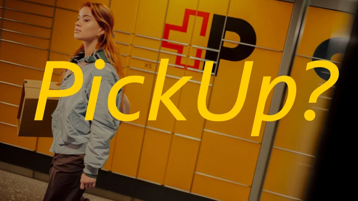
Swiss Post Sans is designed to do two jobs at once: sit quietly inside the everyday communications of Switzerland’s postal service, while giving the brand a more welcoming voice. Swiss Typefaces developed the family over more than three years, balancing strict layout requirements with a softer feel and a distinctive italic style. That’s a demanding brief for a typeface expected to serve a public institution across routine information and brand communication.
That balance is the interesting part. A custom typeface can be asked to stand out, but Swiss Post needed one that could replace its existing fonts without forcing teams to rebuild their designs. The new face had to work across a national service’s many touchpoints, from timetables and prices to signs, apps and printed materials. Its character would have to come through in the details rather than through a dramatic change in scale or shape.
In identity work, that kind of restraint can be harder to achieve than a conspicuous redesign. The typeface has to be recognizable enough to give communications a shared voice, yet familiar enough that people can keep reading notices and service information without stopping to admire the lettering. This is more significant than it looks: a font used across daily services shapes the tone of the brand through repeated, ordinary encounters.

A replacement that had to fit
The first phase focused on upright styles. Swiss Post wanted to replace the previous typeface through a straightforward font-file change, without adjusting existing layouts. That made typographic volume a firm constraint: the new letters had to occupy much the same space as the old ones, so line breaks and page structures would remain usable. The practical goal was continuity for the people who produce materials as well as for the people who read them.
This kind of constraint reaches into the shapes of individual characters. A typeface that runs wider or taller can alter a headline’s line endings, push text into a new column, or change how much content fits in a fixed area. Even when the words stay the same, these shifts can affect hierarchy and spacing throughout a design. Keeping the overall volume close makes a transition easier for teams working across a large set of established materials.
That’s a useful reminder for designers commissioning a replacement family: matching a font’s general mood doesn’t guarantee that it will work in a production system. The dimensions of letters affect the geometry of the page, and small changes can accumulate when a design is repeated across many formats. A replacement that respects existing layouts gives teams room to adopt the new identity without treating every asset as a fresh design problem.
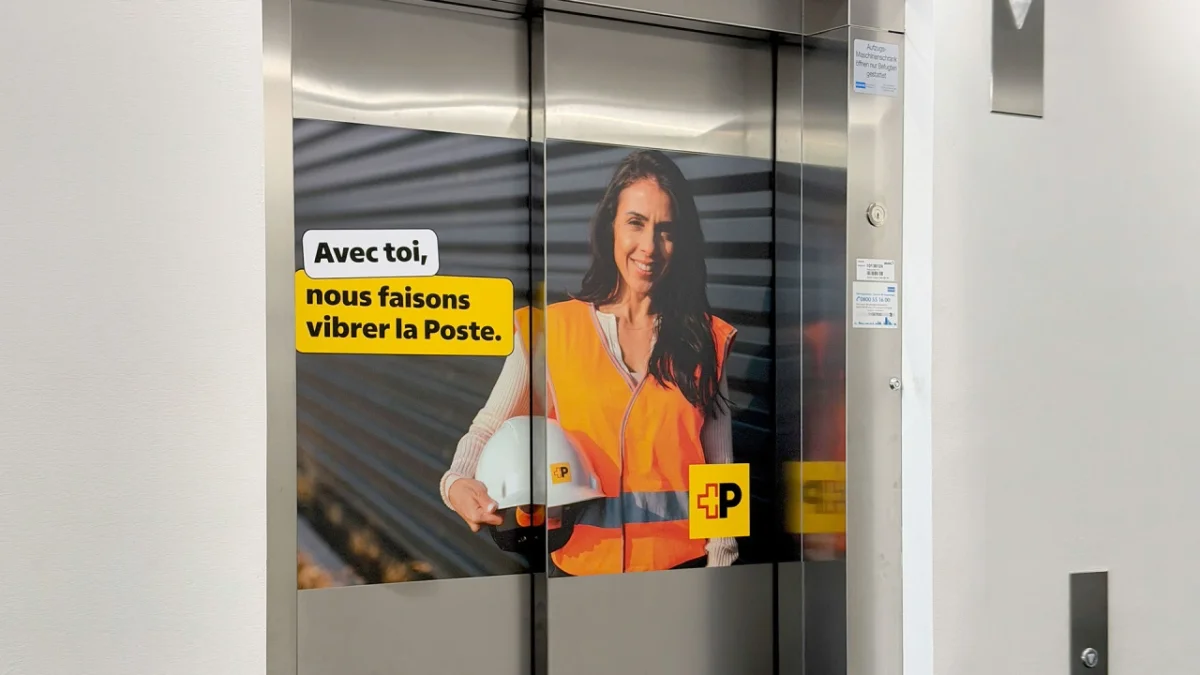
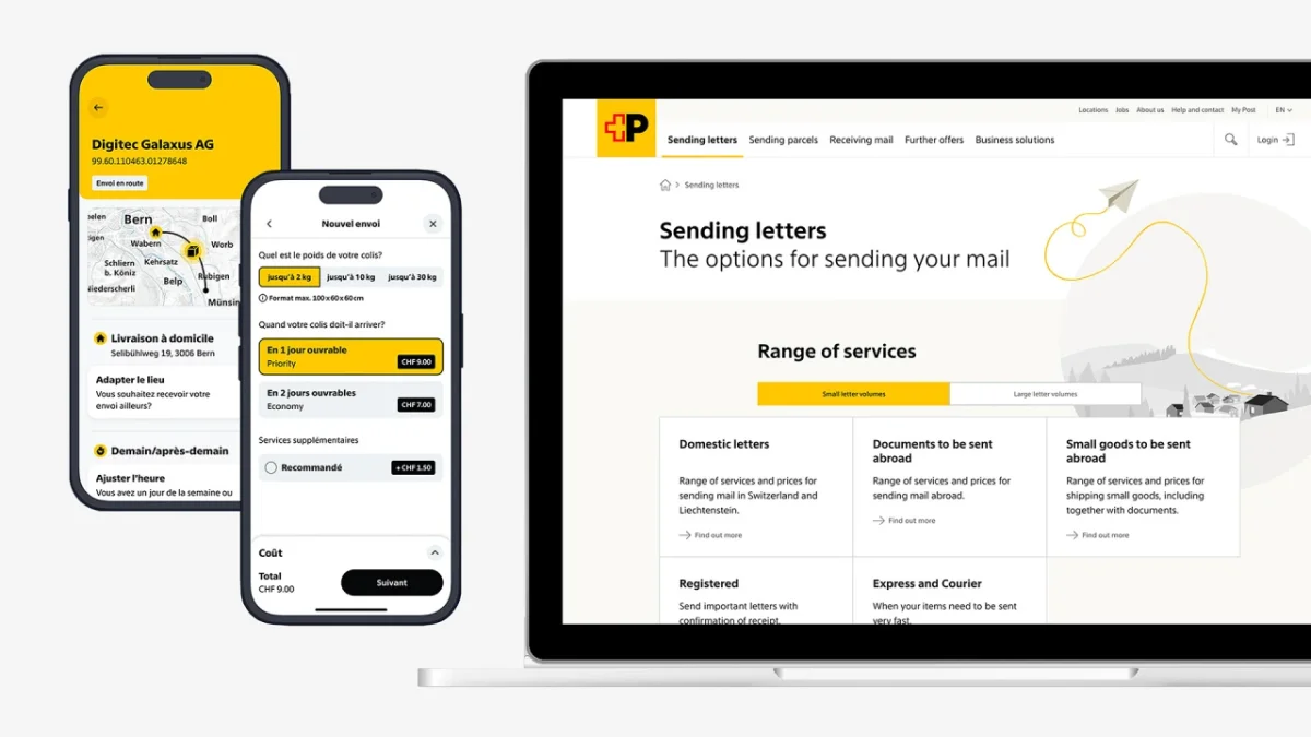
Language coverage added another layer. Swiss Post communicates in German, French, Italian and Romansh, so the family needed to include accents and less common glyphs that could hold up in real text. Numerals also needed to align in columns by default. That matters in a service where prices and timetables are frequent design elements: tabular figures make columns easier to scan because each digit takes the same width.
These details are easy to miss in a display specimen, where letters can be judged one by one. In actual use, language coverage and numeral behavior decide whether a family feels finished across the whole job. Swiss Post received beta font files early so a group of experts could try them in practical settings. That testing helped expose how the designs behaved beyond specimen sheets, where multilingual content, aligned numbers and existing layouts all meet.

A warmer tone, without a novelty look
Swiss Post expects the typeface to serve for decades, so the redesign also offered a chance to shift the brand’s tone. Swiss Typefaces introduced humanist qualities intended to make the letters feel warmer and more inviting, while keeping the design restrained. One small, visible adjustment came at the client’s request: the dots on the lowercase “i” and “j” changed from square to round. It’s a modest intervention, but precisely the kind of detail that can soften a typeface without turning it into a gimmick.
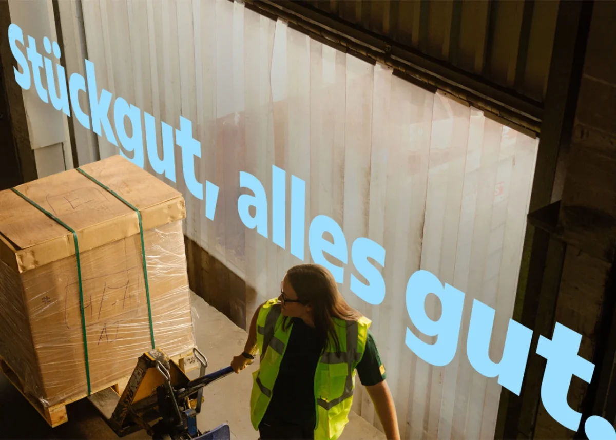
The italics gave the designers more room to explore. Unlike the upright styles, they did not need to match the old family. The change also made sense alongside the logo: the earlier mark used uppercase italics to suggest speed, while the redesigned logo centers on a steady, bold, upright “P.” The italic styles could therefore develop a separate role within the wider identity.
Rather than simply slanting the upright letters, Swiss Typefaces built cursive traits into forms including “a,” “b,” “e” and “g.” Across the set, rounded curves meet clean, straight terminals. The lowercase “f” drops below the baseline with a calligraphic gesture, then ends in a crisp cut instead of returning in a traditional stroke. Those choices give the italics a distinct texture while keeping their construction deliberate.
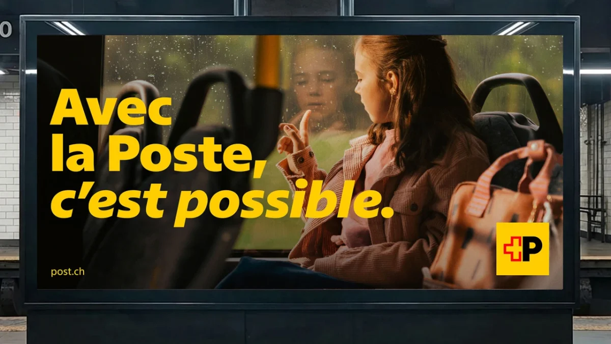
That distinction matters because slanted text often gets asked to do too much: mark emphasis, add energy and separate a voice, all at once. Here, the cursive forms give the family a more expressive register without requiring a second typeface. The italics can work at different sizes, from running text to large headlines and oversized signs. Their use also gives Swiss Post a way to create typographic emphasis online, where italic styles are less common in many design systems.
Here's the thing: a typographic contrast only helps if it remains legible and purposeful in context. A bespoke italic can become a recognizable brand cue, but its unusual forms need to survive both small text and large applications. Swiss Post’s approach appears to treat that range as part of the design brief, not as a later production detail.
One family across many settings
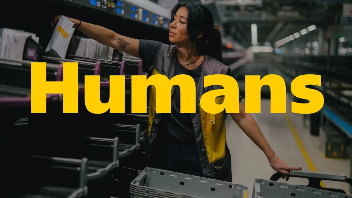
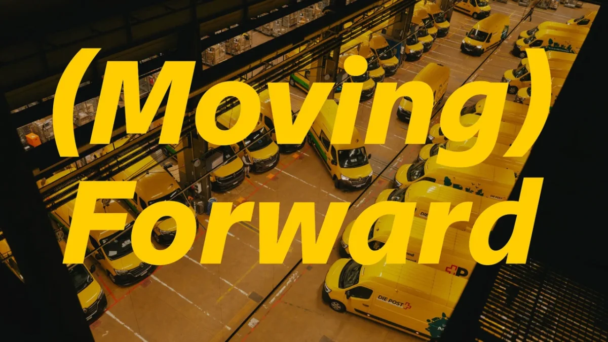
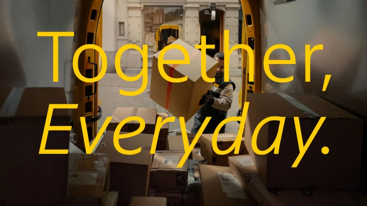
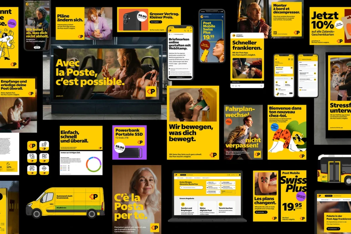
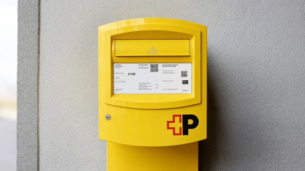
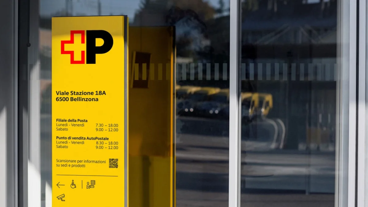
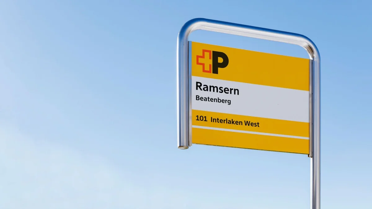
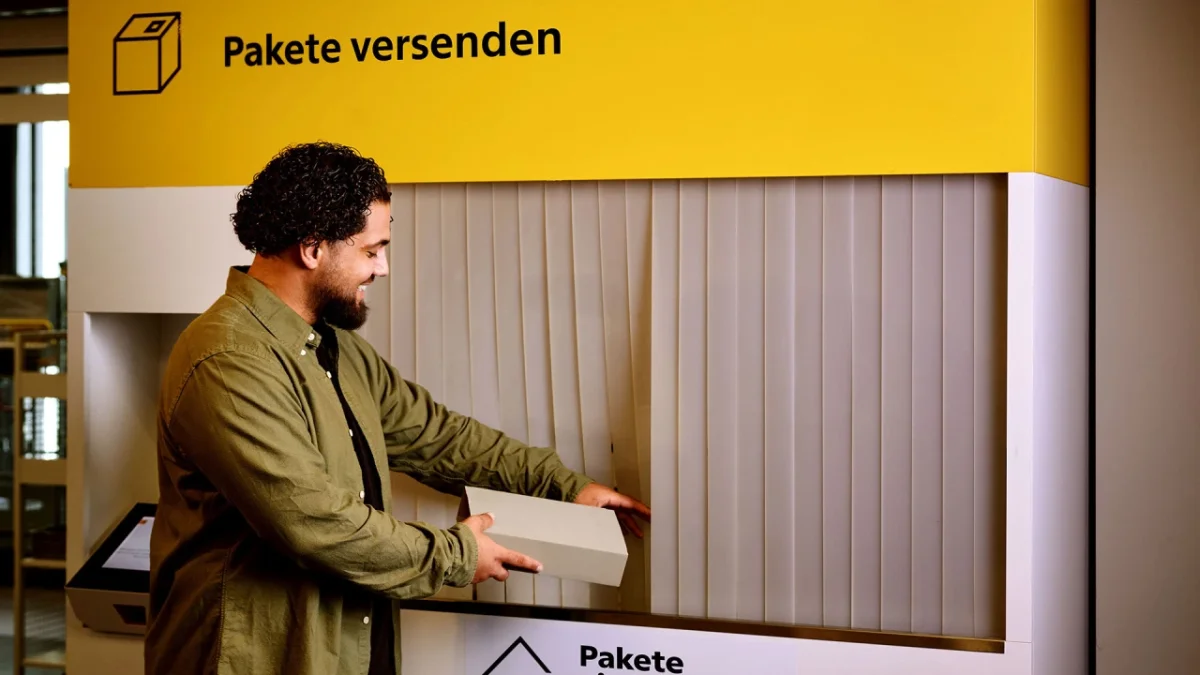
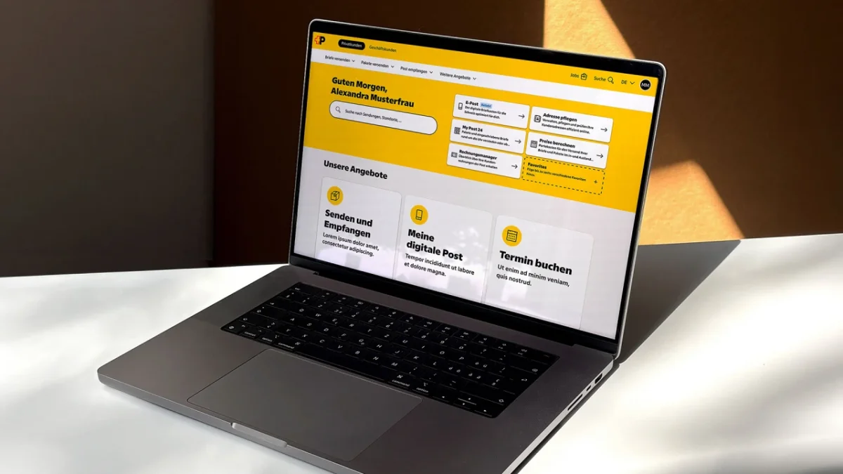
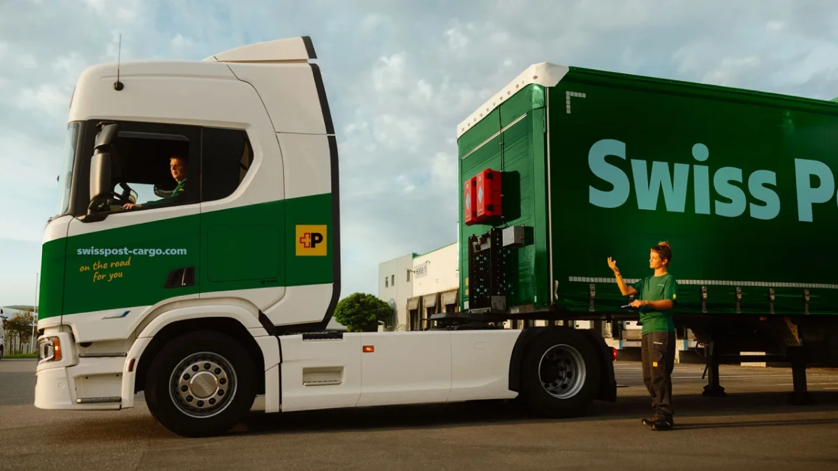
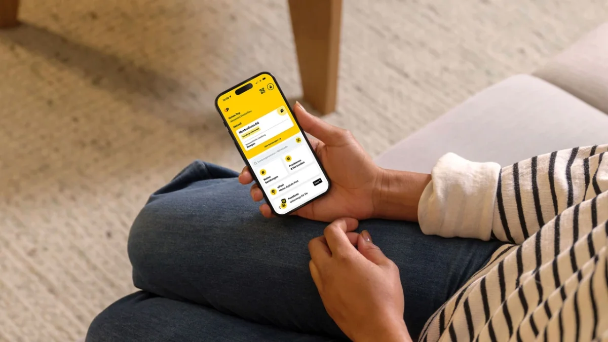
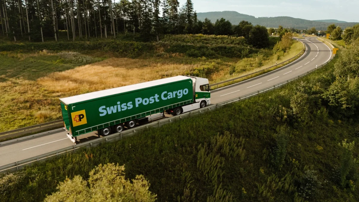
Swiss Post Sans now appears across the service’s physical and digital communications: street advertising, signs, trains, trucks, bus stops, pamphlets, stamps, mailboxes, websites and apps. That range makes the less visible production decisions matter. Consistent spacing, language support and aligned figures need to function alongside expressive headlines and prominent brand colors. A family that holds together across these contexts has to support both quick recognition and practical reading.
The typeface’s personality comes from those practical decisions accumulating. The upright styles preserve the space existing layouts depend on; the softer details adjust the tone; and the more cursive italics provide a distinct voice when a message needs emphasis. It’s a measured approach to identity, with enough flexibility for very different formats and little dependence on decorative effects.
There’s a trade-off here. A family designed to fit existing materials may have less room for dramatic formal gestures in its core styles, while expressive italics can’t carry every communication. The design’s success will depend on how well its different registers are used: familiar enough for routine information, distinctive enough to make the identity feel intentional. (And this is the part most people overlook.) A type family’s range is only useful when teams can apply it consistently across the many places where the brand appears.

What the project asks of identity teams
For designers working on a long-lived identity, Swiss Post Sans points to a practical sequence: understand the layouts and languages already in use, define what must remain stable, then decide where the new voice can become more expressive. That can make a type project less visually dramatic at launch, but more useful in daily production. The evidence of the redesign is distributed across details rather than concentrated in one bold gesture.
If you're working in this space, the project is a reminder to test typography where it will actually be used: in dense information, multilingual text, fixed layouts and different sizes. A typeface’s character is partly what it looks like in isolation, but also what it makes easy for a team to produce. The broader implication is straightforward: brand typography earns its place when its personality and operating requirements support each other over time.
Swiss Typefaces executive creative director Emmanuel Rey described Swiss Post Sans as “Swiss by nature, not only by design.” The line points to a typeface shaped by its working conditions: multilingual text, daily service information and a brand that needs to stay recognizable across formats. For teams planning a long-lived identity, the project shows how a font can gain character through carefully managed constraints—and how that character has to keep working at every size. A quiet system, then. With a point of view.