Wednesday, October 21, 2026 · Graphic Design
Sue Todd’s Digital Linocut Illustrations Bring Song to the Picture Book Page
Noted by Marika Lind · 701 reads
For Blue Boat Home, Sue Todd pairs digital ink with linocut texture, carrying Peter Mayer’s song through bold lines, layered color and shifting scenes.
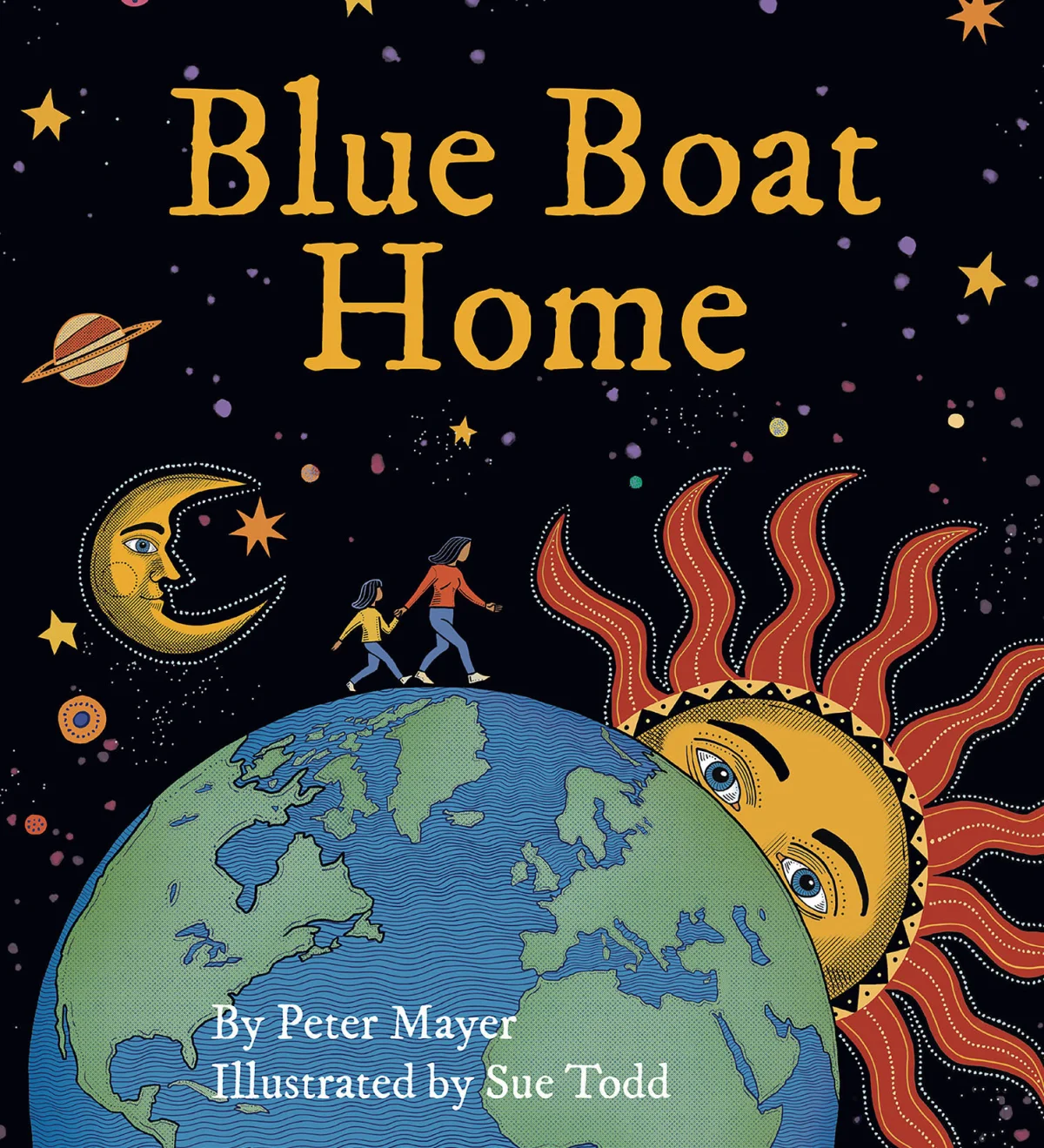
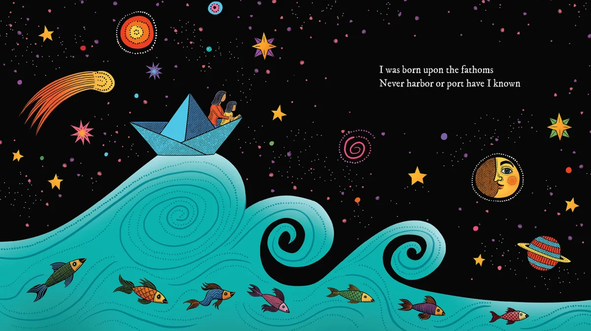
Sue Todd’s illustrations for Blue Boat Home turn a song into a sequence of textured, page-sized scenes. The picture book, published by Skinner House Books, pairs Todd’s images with lyrics by musician Peter Mayer. Its recognition includes a Silver Nautilus Book Award in Children’s Picture Books Fiction and a Merit Award in the 3×3 Illustration Annual, Professional Show No. 22.

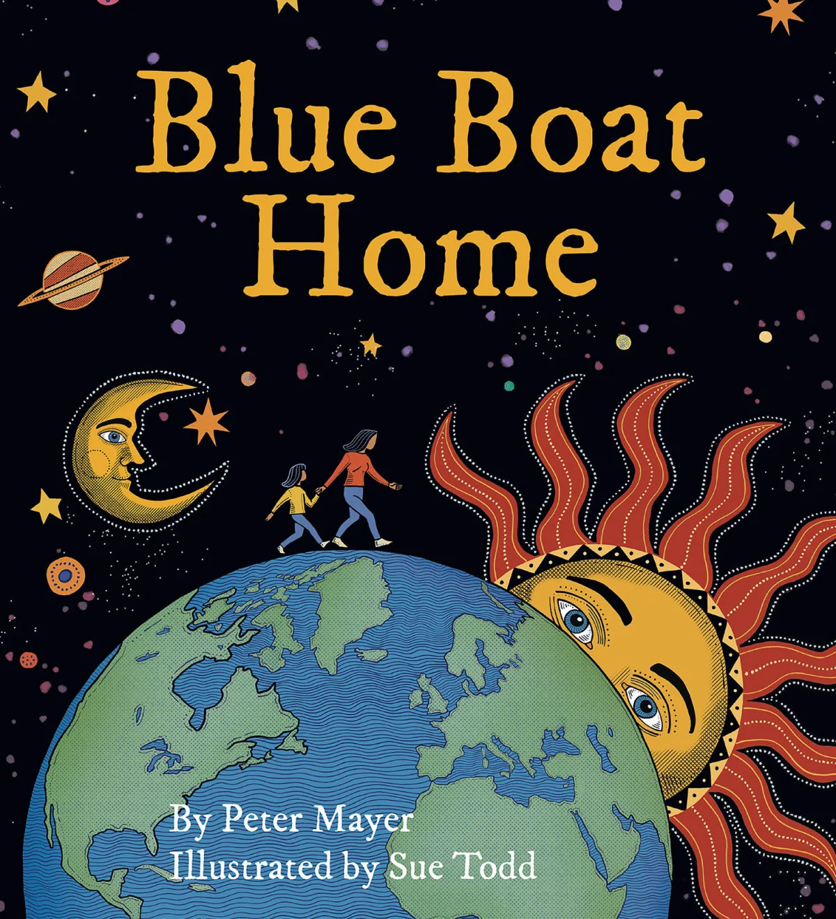
The book’s central image casts the planet as a shared vessel moving through space. That idea gives Todd a visual thread to follow: water and sky can carry the reader between the song’s larger themes and scenes that feel concrete to a young audience. The result is a picture book shaped by both musical pacing and the practical rhythm of turning pages.
Giving lyrics a visual rhythm
Adapting a song for a picture book asks the illustrator to make time visible. A lyric can suggest motion, atmosphere or a change in perspective without spelling out every detail. Todd’s compositions answer with flowing waters and starry skies, translating those abstractions into settings that children and adults can read together.
Here, page turns do some of the work of musical phrasing. A scene can carry a thought across the spread, while a change of image gives the reader a fresh beat. That approach lets the visuals respond to the song rather than simply decorate it. The book’s movement between earthly water and open sky also gives its shared-planet idea a clear visual form.

Digital tools, printmaking character
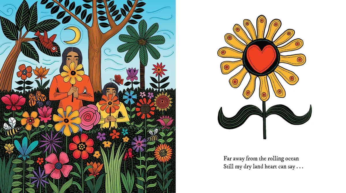
Todd made the illustrations on an iPad using her digital ink technique. The finished work draws on the visual language of woodcut and linocut: strong contrast, crisp edges and lines with an irregular, hand-worked quality. Digital production gives her a way to build the images while keeping that relief-print character at the center.
The effect depends on several choices working together. Bold line work provides a graphic structure, while its organic movement keeps the scenes from feeling mechanically uniform. Textured color layers recall the variation of printmaking ink on paper. Composition and line weight shape how each image reads, lending the illustrations the character of carved marks even though the process was digital.
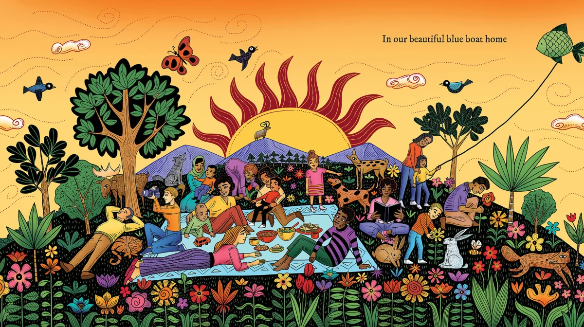
For illustrators exploring a similar balance, the useful reference is the relationship between mark and surface. A digital image can evoke print through deliberate contrasts, uneven texture and variation in the lines. The goal is not to make every edge look uniform; the small differences help the work retain a sense of touch. Todd’s method shows how a digital workflow can support a distinctive hand rather than smoothing it away.
A practice across formats
Todd is a Toronto-based illustrator whose practice moves between analog and digital work. Her bio describes a linocut process that she colors digitally, a combination that brings drawing, carving and image-making into the same visual vocabulary. Among her influences are medieval woodcuts, Jim Flora, and the woodcuts of Frans Masereel and Jose Francisco Borges.
Her work has appeared in books, magazines, posters, T-shirts, a television commercial and on a bus. The client list includes Barnes and Noble, Crown Publishing, Pearson Education, Klutz Press, Andrews McMeel Accord, The Wall Street Journal, the American Bar Association, Houghton Mifflin Harcourt and Walmart Canada. The range of formats puts the graphic clarity of her approach to use at different scales, from the sustained sequence of a book to a single printed image.
Todd is also writing and illustrating her own children’s stories, which are works in progress. Outside illustration, she paints oil portraits in both analog and digital forms. She is an associate of the Ontario College of Art, now OCADU. These details point to a practice grounded in image-making across materials and subjects, with problem solving through imagery as a stated source of creative energy.
What the book’s recognition highlights
The two honors recognize different aspects of the project: the Silver Nautilus award names the picture book category, while the 3×3 Illustration Annual Merit Award places the work in a professional illustration show. Together, they bring attention to an approach that connects literary pacing with a tactile visual style.
For art directors and illustrators, Blue Boat Home offers a specific example of how a recognizable printmaking aesthetic can work in contemporary children’s publishing. Todd’s digital ink keeps line, texture and color under the artist’s control while giving the pages a strong material presence. The practical takeaway is to let technique serve the reading experience: a distinctive mark matters most when it helps the image carry the story’s rhythm and meaning.
Explore Sue Todd’s Directory of Illustration profile for portfolio examples, or visit her portfolio and website.


