Tuesday, October 13, 2026 · Graphic Design
Tropicana’s 2009 Packaging Redesign Shows Why Shelf Recognition Matters
Noted by Peter Makeshoff · 572 reads
A new bottle erased Tropicana’s familiar orange-and-straw image and cap colors. Sales fell, and the brand returned to its previous packaging within two months.
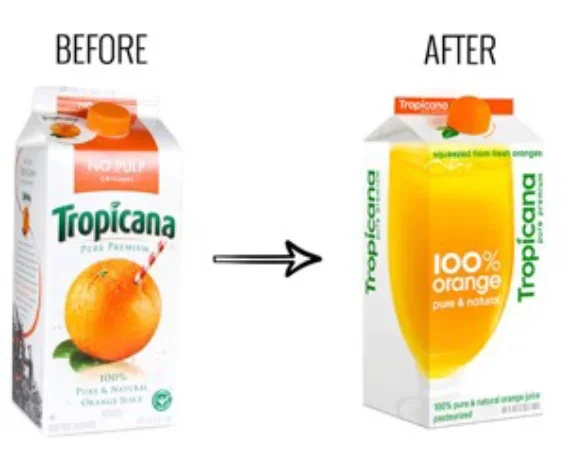
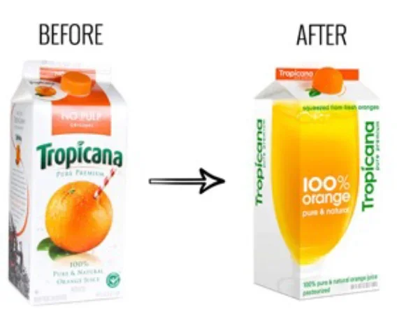
Tropicana’s 2009 packaging redesign shows how a cleaner-looking bottle can make a familiar product harder to find. The redesign replaced a distinctive orange and straw image with a glass of juice, while making the caps across product lines the same color. Consumers lost quick visual cues they had relied on in the supermarket, and Tropicana Pure Premium sales fell 20% year over year between late December 2008 and February 2009. By the end of February, the company had announced a return to the previous design.
The episode is a useful reminder for designers working on established products: packaging has to do more than express a brand’s current ambitions. It also helps people recognize the item, understand which version they’re looking at and find it among competing products. Changing those cues can affect all three tasks at once.
A familiar image had a job to do
Launched in January 2009 as part of a PepsiCo “modernization” strategy, the new design followed an effort that cost $35 million, according to the source article. On the previous pack, a red straw entered a fresh orange. The image was direct and easy to read, and decades of use had made it a familiar marker for Tropicana shoppers.
The replacement pictured a glass of pale orange juice. That choice shifted the package’s central image from a distinctive piece of fruit to a more general serving suggestion. It may have supported the design team’s stated aim of making the packaging feel “more modern, more natural,” but it also removed a visual shorthand people associated with the product.
That distinction matters on a crowded shelf. A shopper doesn’t necessarily read every label before choosing a familiar item. Color, silhouette and a recognizable graphic can help them spot it at a glance. Tropicana’s orange and straw had become part of that finding process. Removing it meant the new package had to earn attention through its other visual features, and the redesign appears to have made that harder.
One cap color blurred product differences
The redesign also changed how Tropicana’s different varieties were distinguished. The previous packaging used blue caps for added calcium, green for pulp and orange for original. The new packaging made every cap orange. In simplifying one part of the pack, the redesign weakened a quick way to tell products apart.
For a range of products sold together, small repeated cues can carry practical information. Cap color is especially visible when bottles sit side by side or when shoppers already know which color to seek. When all the caps match, people have to rely more on other information on the package. That can add effort at the point of choice, particularly if the rest of the design has also changed.
Here’s the thing: simplicity is useful when it makes an object easier to understand. A more uniform system can look orderly in a design presentation, but order alone doesn’t tell you whether the package is working for people. Tropicana’s color coding had a functional role as well as a visual one. The redesign reduced that distinction in the name of a more consistent appearance.
The sales decline and reversal
After the new bottles reached stores, consumers complained that Tropicana was difficult to spot and that the packaging looked generic or cheap. The source article also reports that shoppers struggled to distinguish the calcium, pulp and original varieties after the cap colors changed.
Sales of Tropicana Pure Premium dropped 20% year over year from late December 2008 to February 2009. By the end of that month, Tropicana had announced it would abandon the redesign and bring back the old packaging. The new design’s time on shelves was less than two months.
An academic journal study cited by the source estimated that the redesign cost Tropicana up to $27 million. That figure does not include the $35 million spent on design and promotion, also reported in the source. These numbers describe separate costs and estimates; together, they show why a packaging change can carry consequences beyond the time spent developing it.
What a redesign needs to test
The central issue was not simply that people preferred one image over another. The old package’s familiar graphic and cap colors helped shoppers locate and select a product. Replacing them changed both brand recognition and the information system on the bottle. A redesign review that focuses mainly on whether the new package looks more current can miss those everyday functions.
For design teams, the case points to a practical question: which elements are decorative, and which ones help people act? The answer may come from observing how shoppers find a product, asking whether they can tell varieties apart, and testing a new pack beside the old one. Those checks can reveal whether a visual element is carrying more meaning than its appearance suggests.
Changes to established packaging also benefit from being evaluated as a system. The illustration, cap color, typography and product naming work together. Removing a familiar image might be manageable if other cues remain clear; standardizing colors might work if the package makes differences between varieties easier to read elsewhere. In Tropicana’s redesign, several familiar cues changed together, leaving shoppers with fewer shortcuts.
Familiarity can be a design asset
The source places Tropicana alongside Gap’s 2010 logo change, which the company reversed after a week, and a 2025 Cracker Barrel logo change that it says was also reversed within a week. Each case involved an established visual identity and a short-lived redesign. The comparisons point to a recurring challenge: designers may see a long-used element as dated, while customers depend on it to recognize the product.
That doesn’t mean every familiar feature must stay forever. It does mean that familiarity has practical value, and removing it calls for a clear account of what will replace its work. Tropicana’s redesign changed the image people looked for and weakened the color cues separating its varieties. The result is a reminder to test packaging in the context where it will be used: among alternatives, at a glance, with the decisions shoppers need to make in mind.
Original packaging design article: packaging examples. Related coverage: Gap’s logo redesign.


